
Search results for "Decorative objects" in Home Design Ideas

 China Furniture and Arts
This rustic Ming chest is a convenient size and works perfectly as a foyer cabinet or chest to decorate an empty wall. Install a vessel bowl or mirror and it is also the perfect height to use as a vanity for a powder room.

 Neil Kelly Company
The main objective for this project was to create a beautiful outdoor cooking and entertaining space. The clients wanted the new space to have an open concept while being protected from the elements year round. Stylistically they wanted the design to have a Pacific Northwest feel, to blend with the existing house and work well among their natural, forested backyard. We needed to include a BBQ, smoker, sink, refrigerator, gas fireplace and wall mounted heater as well as a large screen TV. The details were going to be a main focus for the design process, as we knew this would ensure the cohesive blend of function and aesthetic appeal.
One of the main challenges was working with the existing deck. The 1000 SF deck needed new decking and guardrails as well as some framing repair. We were worried that the existing deck structure would not support the weight of the new construction.
Another challenge we faced was designing the roof planes to aesthetically blend with the existing house. The layout of the first and second floor had us working through multiple design revisions until we landed on the final stepped roof structure.
We designed the new roof to be supported by the house and columns set directly on the ground, thereby minimizing weight added to the existing deck. This allowed us to use the deck to support the lighter components, including the kitchen and BBQ area.
Oversized beams, exposed raw wood rafters, and sealed car decking worked well with the new cedar deck surface. Stainless steel cabinetry and appliances are accented by solid surface countertops and small mosaic backsplash. All colors were selected to fall within the natural hues of the seasonally changing foliage surrounding the clients’ property.
Maintaining the same footprint of the existing deck, we used the angles to our advantage and created additional seating with a custom built storage bench. New powder coated posts and cable guardrails were topped with an LED lined wood handrail. A decorative chandelier and subtle metal pendants provide ambient light. An electric heater mounted to the inside of one of the beams as well as the gas fireplace provides ample heat for colder months.
The clerestory windows between the two roof planes provide additional light to the space while protecting against the elements. The gas fireplace and cultured stone wrapped chimney is a visual anchor and centerpiece for the deck. The chimney provided an opportunity to hide one of the supporting columns as well as a protected space for the wall mounted TV and soundbar.
The cabinetry layout was selected to offer plenty of storage and special features including a pull out garbage and recycling center, drawers for dishes and utensils, and a concealed paper towel holder.

 EcoDomo
Utility room - contemporary utility room idea in DC Metro with flat-panel cabinets, gray cabinets, wood countertops, a side-by-side washer/dryer and beige walls
Find the right local pro for your project

 Crystal Kitchen + Bath
Objectives
· 55+ living with future aging in place requirements
· One bathroom on this level of home for both guests and clients
· Lots of storage and lighting
Design Challenges
· This room was a bedroom, all mechanicals needed to be moved or added. The soil stack could only be in one location. Could not move the window
· Client wanted a large roll in shower
· Contemporary styling with walnut , white and marble
Design Solutions
· 2-Pocket doors were added, from hallway and to master bedroom. this also helped with floor space and door swing with aging-in place
· Large curb less shower with trench drain, bench, 2-grab bars, heated tile floor, niche, hand-held shower head and heavy clear glass shower door. Everything accessible for aging-in-place
· Long vanity with 2 sinks. Height of vanity was to be under the window trim. Taller and deeper toe kicks for better wheelchair access. Vanity looks like all drawers-but the 2 sink cabinets are doors.
· Ample Storage: each drawer has a drawer with in the drawer (extra 6 drawers), wall cabinets next to each vanity, 3 recess medicine cabinets, tall linen cabinet (open shelves below because the doors would hit the toilet and a place to store scale on bottom)
· Toilet has a washlet to help with clean-up in the future and grab paper holder
Special Features
· Heated towel bar
· Heated floors
· Marble tile on floor and walls of shower and vanity mirror surround
· Niche under recess medicine cabinets
Lighting: Thin wall sconces, decorative ceiling fan and puck light
 KDD | Kim Dee Designs
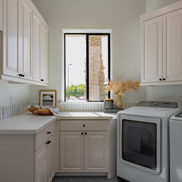
Inspiration for a large transitional ceramic tile and gray floor dedicated laundry room remodel in Phoenix with an utility sink, shaker cabinets, quartz countertops, green backsplash, ceramic backsplash, white walls and white countertops
 Neil Kelly Company
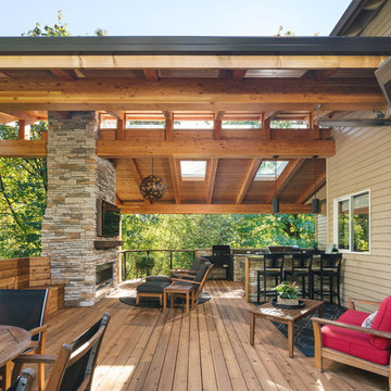
The main objective for this project was to create a beautiful outdoor cooking and entertaining space. The clients wanted the new space to have an open concept while being protected from the elements year round. Stylistically they wanted the design to have a Pacific Northwest feel, to blend with the existing house and work well among their natural, forested backyard. We needed to include a BBQ, smoker, sink, refrigerator, gas fireplace and wall mounted heater as well as a large screen TV. The details were going to be a main focus for the design process, as we knew this would ensure the cohesive blend of function and aesthetic appeal.
One of the main challenges was working with the existing deck. The 1000 SF deck needed new decking and guardrails as well as some framing repair. We were worried that the existing deck structure would not support the weight of the new construction.
Another challenge we faced was designing the roof planes to aesthetically blend with the existing house. The layout of the first and second floor had us working through multiple design revisions until we landed on the final stepped roof structure.
We designed the new roof to be supported by the house and columns set directly on the ground, thereby minimizing weight added to the existing deck. This allowed us to use the deck to support the lighter components, including the kitchen and BBQ area.
Oversized beams, exposed raw wood rafters, and sealed car decking worked well with the new cedar deck surface. Stainless steel cabinetry and appliances are accented by solid surface countertops and small mosaic backsplash. All colors were selected to fall within the natural hues of the seasonally changing foliage surrounding the clients’ property.
Maintaining the same footprint of the existing deck, we used the angles to our advantage and created additional seating with a custom built storage bench. New powder coated posts and cable guardrails were topped with an LED lined wood handrail. A decorative chandelier and subtle metal pendants provide ambient light. An electric heater mounted to the inside of one of the beams as well as the gas fireplace provides ample heat for colder months.
The clerestory windows between the two roof planes provide additional light to the space while protecting against the elements. The gas fireplace and cultured stone wrapped chimney is a visual anchor and centerpiece for the deck. The chimney provided an opportunity to hide one of the supporting columns as well as a protected space for the wall mounted TV and soundbar.
The cabinetry layout was selected to offer plenty of storage and special features including a pull out garbage and recycling center, drawers for dishes and utensils, and a concealed paper towel holder.

 Wall Bed Place
Best twin wall bed-murphy style cabinet multi-functional, ergonomic, compact-home or commercial use.Does your home computer room, family room or office need to double as a guest room? Would you like to find an alternative to the uncomfortable sleep sofa or working in a cramped corner of a guest bedroom? Here’s a way to have the best of all worlds. This style wall bed has a bed neatly stored inside a cabinet that can create an extra wall in your home or can fit against an existing wall in just of floor space. The front of the cabinet has a display shelf wide enough for pictures and decor accessories and the top of the cabinet is wide enough for books, plants, accessories or collectibles. This collection comes in either a light, natural wood-grain or a high-gloss white laminate finish which will blend with almost any home color scheme and design. These wall beds are designed with longevity in mind, using certified, thick laminated chipboard, heavy-duty hardware and strong aluminum bed frame with solid wood slats. You can even open and close the bed with 1 hand with ergonomic new generation gas shocks mechanism. Easy-elegant-ergonomic. You really can have it all. When closed the cabinet creates an extra wall, complete with shelf. So, you can add home decor accessories to the top of the cabinet and the shelf. When open, you have a bedroom.
Sponsored
Sunbury, OH

J.Holderby - Renovations
Franklin County's Leading General Contractors - 2X Best of Houzz!

 Advance Design Studio, Ltd.
After six years of living in their Huntley IL home, Chris and Meghan were tired of their dark, dingy, outdated kitchen and it was finally time for a long-anticipated change. “The kitchen is the place where we live, it’s where we do everything,” Meghan said. “It was important that it be a space where we wanted to be.” Meghan loves cooking and enjoys including their girls in healthy meal prepping, this led them to want a brighter, more enjoyable kitchen with increased functionality and improved storage.
For Chris especially, the laundry room was an entirely dysfunctional eyesore. “We had a washer and a dryer, but it was all kind-of cobbled together!” Chris said. “There were always laundry piles everywhere, we weren’t really sure what we wanted to do in there, but it was time for us to make a change.” The mess of the space was stressful every time they walked in the door from the garage each day. Kids’ backpacks and shoes piled up haphazardly in the makeshift boot-bench closet left the family feeling disorganized and stressed. They needed space for folding clothes and locker cubbies to help keep the family organized.
Having known Christine and Todd in the Huntley community for years, Chris and Meghan were familiar with their work. “We already trusted them personally and having seen their projects for years we knew they did top notch work. After we reviewed the initial round of designs, we knew that hiring them was definitely the right choice,” Meghan and Chris said. Although Chris had done a lot of work in their home himself, the kitchen and laundry room renovation was such a large undertaking that he didn’t want to steal time away from his family to spend what would surely be many long weekends doing the job himself. “That would not have been a wise choice for us,” Chris laughed.
“Our designer, Michelle was very, very, easy to work with; anything we wanted to see or weren’t sure about, she went above and beyond to make this easy for us. She was easy to get hold of and always quick to respond,” the couple said. Michelle pulled ideas that mirrored the couple’s taste and style and was adept at directing the couple to limited choices that didn’t overwhelm them and kept the process moving. “I have a hard time making decisions. Michelle made the decision-making process so easy. I loved how she listened to what I liked and then presented three great options for me to choose from,” Meghan said.
The main objectives for the kitchen were better storage solutions, they wanted the space to reflect their lifestyle and taste, and they wanted it to last for years with low maintenance. One of the first steps in creating a more functional kitchen was relocating the refrigerator, creating an improved workflow for the busy family.
“We didn’t know that we could even move the refrigerator to a new location where it is now, that was something that we never would have thought of,” Chris said. “The new refrigerator location makes the kitchen feel so much bigger. We didn’t add any space, but our whole kitchen with the new design just seems like it’s so much larger than before!” Meghan said.
The perimeter mist colored cabinets helped warm and brighten the entire room, while the graphite colored cabinets on the island added contrast. Using this fresh, clean color palette satisfied the couple’s desire for a bright space that was the exact opposite of what they had before. Organization accessories were also added to the cabinets such as a spice drawer tray and roll outs to create hidden convenience.
“I absolutely love the hidden spices – it makes cooking so much more enjoyable!” Chris said. “And all the pull outs, and the double trash bin, who would think you could get so excited about organization!” the couple said in unison.
One thing they hated in their original kitchen was how dark the space felt. Added lighting on the ceiling with the new light fixtures combined with the lighter cabinetry colors throughout solved this problem. “Our new kitchen has this warm, almost cozy feeling that our old kitchen never had, it’s just a space that I love spending my time in now,” Meghan said. The light airy feeling was accentuated with the use of floating white shelves on either side of the decorative range hood. “We have so much cabinetry space, the new design is amazing we actually have more storage space than we will ever need,” Meghan said.
The island was extended to create more work surface and added space for stool seating. “The new island changes how we live. Now the kids can be in the kitchen with us, doing homework, eating breakfast, and the three of us have special dinners there when Chris is working late,” Meghan said.
The Carrara Marmi Quartz countertops were chosen because they are, not only beautiful, but are made from hard-working material that doesn’t require maintenance. The white subway tile backsplash that wraps to the ceiling behind the focal point cooktop range/hood compliments the crisp white countertops perfectly, while brushed brass hardware and light fixtures keep the design fresh and new.
The couple had a few fears at the beginning of the project, as most homeowners do. Their biggest fear was being out of their kitchen and laundry room for an extended time. The crew made it very easy for the family to work in a limited space keeping the washer and dryer hooked up the majority of the time, and also getting appliances working with minimal downtime.
“They above and beyond accommodated us to get us through the process,” Meghan said. “They did a great job making sure we were as comfortable as possible throughout the process,” Chris added.
“Our project manager DJ did a great job. He was very good at updating us on schedule changes, getting guys in as quickly as possible. Everyone that stepped in the house was nice and did great work,” said Chris. They thought Advance’s carpenter was phenomenal and were impressed when he took a conceptual idea from a photograph and worked with designer Michelle to create a one of a kind range/hood that has become the topic of conversation with friends and family who visit the new kitchen. “He was in our house literally every day for several weeks. He was easy to work with and good at what he did,” Meghan and Chris said.
The focal point of the kitchen; a hand-crafted, custom-built ventilation hood was clad with handpicked reclaimed barnwood. Advance Design’s carpenter built the framework and the cladding to create a one-of-a-kind design element that the couple loves.
“I think it was especially fun for him to create something unique from scratch, showcasing his talent in this area,” Meghan said. “I love that my kitchen is not like everyone else’s. I got to pick out the wood on my hood and watch it being built and was able to choose what pieces of wood went where on it. It’s totally unique.”
Red Oak flooring was toothed-in throughout the kitchen and the rest of the first floor anywhere changes were made. Then the whole floor was refinished to tone down the orange undertones in the existing floor stain, ultimately changing the color complexion of the entire first floor. The result is a completely new feeling to the entire home.
Renovating the laundry room was extremely important to Meghan and Chris, but they had trouble visualizing what the possibilities were for the seemingly small space. Michelle produced beautiful 3D illustrations that helped them envision the space in a whole new way.
“I must have told Michelle 100 times that I am a visual person, seeing the designs in 3D made it so easy to make decisions and see what we could really do with our space,” Meghan said.
A dividing wall and doorway were removed between the existing laundry room and hallway formerly containing a coat closet, providing space to design specialized graphite colored cabinetry matching the kitchen island to house custom storage cubbies for each family member. Adding the tall utility cabinetry in the new laundry area helped solve the storage issue, tucking away cleaning supplies, household items, and even the cat got its own cubby.
“I love how everything is now hidden in its own space. I can’t tell you how much I hated coming home and seeing everything sitting around on counters,” Chris said.
Electrical outlets were planned for the inside of utility cabinets, so devices could charge in hidden locations. Stacking the washer and dryer allowed for wider countertop space to provide a folding area and a special space for clothes to hang. “The way I do laundry has been completely transformed! I can actually fold clothes and hang them now right out of the washer and dryer,” Meghan said.
“The end result in the kitchen and the laundry/mud room was an updated light and bright space, with a smarter work flow that better meets the needs of this family,” Michelle said.
“I would totally recommend Advance Design,” Meghan said. “Sometimes I sit and just look at my kitchen and laundry room and think ‘Wow, I can’t believe I get to live here!’ It’s an understatement to say we love our new space.”
 Neumann & Rudy Architecture
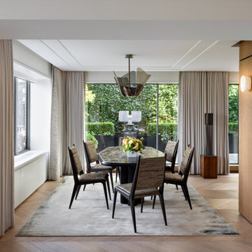
This dining room operates as a processional volume, choreographed along a deep axial sightline that terminates not in a wall but in a garden — an ivy-clad plane of green glimpsed through full-height glazing. The architecture is fundamentally additive rather than decorative: a coffered, stepped ceiling plane with recessed reveal channels floats above the seating zone, its subtle datum lines describing a rectangular "room within a room" that anchors the table without recourse to enclosing partitions. Flanking this central passage, two millwork pylons — one clad in pale limed oak on the right, one in a fine bone-toned wallcovering on the left — function as vestigial pilasters, compressing the entry threshold before releasing into the loftier dining volume. The floor reinforces this directionality through a wide-plank chevron parquet laid on the primary axis, its herringbone rhythm accelerating the eye toward the terrace. The furniture plan is deliberately non-orthogonal: an elongated oval table on twin cylindrical pedestals softens the room's rectilinear discipline, while the loosely arrayed chairs break parade-ground symmetry in favor of a more inhabited, gestural composition. Deep-set corner windows and a low banquette-height sill with integrated casework at left introduce a secondary spatial episode, a quieter alcove that relieves the room's axial insistence.
## II. Materiality, Color & Texture
The palette is a study in warm neutrality calibrated across a narrow tonal band, with contrast delivered through texture rather than hue. The foundational register is greige-to-oatmeal: floor-to-ceiling drapery in a heavy, densely gathered linen falls in pin-sharp cartridge pleats, its matte drape absorbing light and softening the glass wall's hard geometry. Against this, the dining chairs are upholstered in a slubbed, striated fabric — likely a raw silk or abaca-like bast fiber — whose horizontal grain reads almost as bark, and which is set in taut opposition to the ebonized, tapered hardwood frames in the Italian mid-century idiom of Gio Ponti or Ico Parisi. The tabletop, a mottled verdigris-and-bronze stone or fossilized surface, introduces the room's only earth-toned saturation, echoed by the burl-and-walnut plinth supporting a slender fluted bronze sculpture. The oak millwork is limed and open-grained, deliberately dry and tactile beside the high-polish patinated brass of the pendant. Underfoot, a hand-knotted silk rug in cloud-grey with charcoal ombré edges introduces atmospheric perspective — a painterly gradient that dematerializes the floor plane. Chromatic release arrives entirely from two sources: the framed abstract expressionist canvas at right, with its viridian, cobalt and violet gestural detonations, and the living wall of ivy beyond the glass. Both function as color events, not color schemes.
## III. Lighting, Atmosphere & Style Profile
Daylight is the primary luminaire here, entering as a broad, north-soft wash through the terrace glazing and diffused further by the ivy screen, which acts as a natural lambrequin filtering glare into a cool, even green-tinted light. Artificial sources are deployed sculpturally rather than functionally: the pendant — a folded, petal-form composition of smoked glass and patinated metal — reads as a suspended object of art, throwing a warm downward pool onto the table while its dark bronze silhouette provides essential visual weight against the white ceiling. Wall-mounted alabaster sconces bracket the room at both thresholds, their translucent stone glowing with a low-lumen, candle-adjacent warmth that establishes perimeter intimacy after dusk. The resulting atmosphere is serene, curated and quietly patrician — a room engineered for extended conversation rather than display. Stylistically, the project synthesizes a **contemporary Soft Minimalism** with a strongly collected **Mid-Century Italian** sensibility: the restraint of the architectural envelope and monochromatic textile program provides a gallery-like neutral ground, upon which a small number of high-character objects — the sculptural pendant, the Ponti-esque seating, the abstract canvas, the exterior stone sculpture — perform as museum-grade punctuation. It is an interior that achieves luxury through material integrity and negative space rather than ornament.
 Drury Design
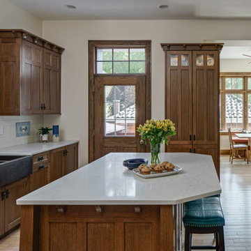
The 100-year old home’s kitchen was old and just didn’t function well. A peninsula in the middle of the main part of the kitchen blocked the path from the back door. This forced the homeowners to mostly use an odd, U-shaped corner of the kitchen.
Design objectives:
-Add an island
-Wow-factor design
-Incorporate arts and crafts with a touch of Mid-century modern style
-Allow for a better work triangle when cooking
-Create a seamless path coming into the home from the backdoor
-Make all the countertops in the space 36” high (the old kitchen had different base cabinet heights)
Design challenges to be solved:
-Island design
-Where to place the sink and dishwasher
-The family’s main entrance into the home is a back door located within the kitchen space. Samantha needed to find a way to make an unobstructed path through the kitchen to the outside
-A large eating area connected to the kitchen felt slightly misplaced – Samantha wanted to bring the kitchen and materials more into this area
-The client does not like appliance garages/cabinets to the counter. The more countertop space, the better!
Design solutions:
-Adding the right island made all the difference! Now the family has a couple of seats within the kitchen space. -Multiple walkways facilitate traffic flow.
-Multiple pantry cabinets (both shallow and deep) are placed throughout the space. A couple of pantry cabinets were even added to the back door wall and wrap around into the breakfast nook to give the kitchen a feel of extending into the adjoining eating area.
-Upper wall cabinets with clear glass offer extra lighting and the opportunity for the client to display her beautiful vases and plates. They add and an airy feel to the space.
-The kitchen had two large existing windows that were ideal for a sink placement. The window closest to the back door made the most sense due to the fact that the other window was in the corner. Now that the sink had a place, we needed to worry about the dishwasher. Samantha didn’t want the dishwasher to be in the way of people coming in the back door – it’s now in the island right across from the sink.
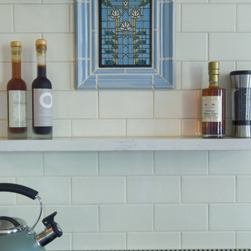
-The homeowners love Motawi Tile. Some fantastic pieces are placed within the backsplash throughout the kitchen. -Larger tiles with borders make for nice accent pieces over the rangetop and by the bar/beverage area.
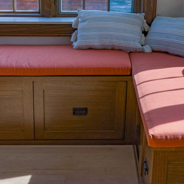
-The adjacent area for eating is a gorgeous nook with massive windows. We added a built-in furniture-style banquette with additional lower storage cabinets in the same finish. It’s a great way to connect and blend the two areas into what now feels like one big space!

 Suzanne Tullock Interiors
Matt Harrer Photography
Transitional family room photo in St Louis with gray walls
Transitional family room photo in St Louis with gray walls
 Drury Design
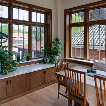
The 100-year old home’s kitchen was old and just didn’t function well. A peninsula in the middle of the main part of the kitchen blocked the path from the back door. This forced the homeowners to mostly use an odd, U-shaped corner of the kitchen.
Design objectives:
-Add an island
-Wow-factor design
-Incorporate arts and crafts with a touch of Mid-century modern style
-Allow for a better work triangle when cooking
-Create a seamless path coming into the home from the backdoor
-Make all the countertops in the space 36” high (the old kitchen had different base cabinet heights)
Design challenges to be solved:
-Island design
-Where to place the sink and dishwasher
-The family’s main entrance into the home is a back door located within the kitchen space. Samantha needed to find a way to make an unobstructed path through the kitchen to the outside
-A large eating area connected to the kitchen felt slightly misplaced – Samantha wanted to bring the kitchen and materials more into this area
-The client does not like appliance garages/cabinets to the counter. The more countertop space, the better!
Design solutions:
-Adding the right island made all the difference! Now the family has a couple of seats within the kitchen space. -Multiple walkways facilitate traffic flow.
-Multiple pantry cabinets (both shallow and deep) are placed throughout the space. A couple of pantry cabinets were even added to the back door wall and wrap around into the breakfast nook to give the kitchen a feel of extending into the adjoining eating area.
-Upper wall cabinets with clear glass offer extra lighting and the opportunity for the client to display her beautiful vases and plates. They add and an airy feel to the space.
-The kitchen had two large existing windows that were ideal for a sink placement. The window closest to the back door made the most sense due to the fact that the other window was in the corner. Now that the sink had a place, we needed to worry about the dishwasher. Samantha didn’t want the dishwasher to be in the way of people coming in the back door – it’s now in the island right across from the sink.
-The homeowners love Motawi Tile. Some fantastic pieces are placed within the backsplash throughout the kitchen. -Larger tiles with borders make for nice accent pieces over the rangetop and by the bar/beverage area.
-The adjacent area for eating is a gorgeous nook with massive windows. We added a built-in furniture-style banquette with additional lower storage cabinets in the same finish. It’s a great way to connect and blend the two areas into what now feels like one big space!
 Neil Kelly Company
The main objective for this project was to create a beautiful outdoor cooking and entertaining space. The clients wanted the new space to have an open concept while being protected from the elements year round. Stylistically they wanted the design to have a Pacific Northwest feel, to blend with the existing house and work well among their natural, forested backyard. We needed to include a BBQ, smoker, sink, refrigerator, gas fireplace and wall mounted heater as well as a large screen TV. The details were going to be a main focus for the design process, as we knew this would ensure the cohesive blend of function and aesthetic appeal.
One of the main challenges was working with the existing deck. The 1000 SF deck needed new decking and guardrails as well as some framing repair. We were worried that the existing deck structure would not support the weight of the new construction.
Another challenge we faced was designing the roof planes to aesthetically blend with the existing house. The layout of the first and second floor had us working through multiple design revisions until we landed on the final stepped roof structure.
We designed the new roof to be supported by the house and columns set directly on the ground, thereby minimizing weight added to the existing deck. This allowed us to use the deck to support the lighter components, including the kitchen and BBQ area.
Oversized beams, exposed raw wood rafters, and sealed car decking worked well with the new cedar deck surface. Stainless steel cabinetry and appliances are accented by solid surface countertops and small mosaic backsplash. All colors were selected to fall within the natural hues of the seasonally changing foliage surrounding the clients’ property.
Maintaining the same footprint of the existing deck, we used the angles to our advantage and created additional seating with a custom built storage bench. New powder coated posts and cable guardrails were topped with an LED lined wood handrail. A decorative chandelier and subtle metal pendants provide ambient light. An electric heater mounted to the inside of one of the beams as well as the gas fireplace provides ample heat for colder months.
The clerestory windows between the two roof planes provide additional light to the space while protecting against the elements. The gas fireplace and cultured stone wrapped chimney is a visual anchor and centerpiece for the deck. The chimney provided an opportunity to hide one of the supporting columns as well as a protected space for the wall mounted TV and soundbar.
The cabinetry layout was selected to offer plenty of storage and special features including a pull out garbage and recycling center, drawers for dishes and utensils, and a concealed paper towel holder.

 Drury Design
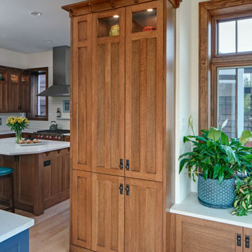
The 100-year old home’s kitchen was old and just didn’t function well. A peninsula in the middle of the main part of the kitchen blocked the path from the back door. This forced the homeowners to mostly use an odd, U-shaped corner of the kitchen.
Design objectives:
-Add an island
-Wow-factor design
-Incorporate arts and crafts with a touch of Mid-century modern style
-Allow for a better work triangle when cooking
-Create a seamless path coming into the home from the backdoor
-Make all the countertops in the space 36” high (the old kitchen had different base cabinet heights)
Design challenges to be solved:
-Island design
-Where to place the sink and dishwasher
-The family’s main entrance into the home is a back door located within the kitchen space. Samantha needed to find a way to make an unobstructed path through the kitchen to the outside
-A large eating area connected to the kitchen felt slightly misplaced – Samantha wanted to bring the kitchen and materials more into this area
-The client does not like appliance garages/cabinets to the counter. The more countertop space, the better!
Design solutions:
-Adding the right island made all the difference! Now the family has a couple of seats within the kitchen space. -Multiple walkways facilitate traffic flow.
-Multiple pantry cabinets (both shallow and deep) are placed throughout the space. A couple of pantry cabinets were even added to the back door wall and wrap around into the breakfast nook to give the kitchen a feel of extending into the adjoining eating area.
-Upper wall cabinets with clear glass offer extra lighting and the opportunity for the client to display her beautiful vases and plates. They add and an airy feel to the space.
-The kitchen had two large existing windows that were ideal for a sink placement. The window closest to the back door made the most sense due to the fact that the other window was in the corner. Now that the sink had a place, we needed to worry about the dishwasher. Samantha didn’t want the dishwasher to be in the way of people coming in the back door – it’s now in the island right across from the sink.
-The homeowners love Motawi Tile. Some fantastic pieces are placed within the backsplash throughout the kitchen. -Larger tiles with borders make for nice accent pieces over the rangetop and by the bar/beverage area.
-The adjacent area for eating is a gorgeous nook with massive windows. We added a built-in furniture-style banquette with additional lower storage cabinets in the same finish. It’s a great way to connect and blend the two areas into what now feels like one big space!
 Neil Kelly Company
The main objective for this project was to create a beautiful outdoor cooking and entertaining space. The clients wanted the new space to have an open concept while being protected from the elements year round. Stylistically they wanted the design to have a Pacific Northwest feel, to blend with the existing house and work well among their natural, forested backyard. We needed to include a BBQ, smoker, sink, refrigerator, gas fireplace and wall mounted heater as well as a large screen TV. The details were going to be a main focus for the design process, as we knew this would ensure the cohesive blend of function and aesthetic appeal.
One of the main challenges was working with the existing deck. The 1000 SF deck needed new decking and guardrails as well as some framing repair. We were worried that the existing deck structure would not support the weight of the new construction.
Another challenge we faced was designing the roof planes to aesthetically blend with the existing house. The layout of the first and second floor had us working through multiple design revisions until we landed on the final stepped roof structure.
We designed the new roof to be supported by the house and columns set directly on the ground, thereby minimizing weight added to the existing deck. This allowed us to use the deck to support the lighter components, including the kitchen and BBQ area.
Oversized beams, exposed raw wood rafters, and sealed car decking worked well with the new cedar deck surface. Stainless steel cabinetry and appliances are accented by solid surface countertops and small mosaic backsplash. All colors were selected to fall within the natural hues of the seasonally changing foliage surrounding the clients’ property.
Maintaining the same footprint of the existing deck, we used the angles to our advantage and created additional seating with a custom built storage bench. New powder coated posts and cable guardrails were topped with an LED lined wood handrail. A decorative chandelier and subtle metal pendants provide ambient light. An electric heater mounted to the inside of one of the beams as well as the gas fireplace provides ample heat for colder months.
The clerestory windows between the two roof planes provide additional light to the space while protecting against the elements. The gas fireplace and cultured stone wrapped chimney is a visual anchor and centerpiece for the deck. The chimney provided an opportunity to hide one of the supporting columns as well as a protected space for the wall mounted TV and soundbar.
The cabinetry layout was selected to offer plenty of storage and special features including a pull out garbage and recycling center, drawers for dishes and utensils, and a concealed paper towel holder.
 Drury Design
The 100-year old home’s kitchen was old and just didn’t function well. A peninsula in the middle of the main part of the kitchen blocked the path from the back door. This forced the homeowners to mostly use an odd, U-shaped corner of the kitchen.
Design objectives:
-Add an island
-Wow-factor design
-Incorporate arts and crafts with a touch of Mid-century modern style
-Allow for a better work triangle when cooking
-Create a seamless path coming into the home from the backdoor
-Make all the countertops in the space 36” high (the old kitchen had different base cabinet heights)
Design challenges to be solved:
-Island design
-Where to place the sink and dishwasher
-The family’s main entrance into the home is a back door located within the kitchen space. Samantha needed to find a way to make an unobstructed path through the kitchen to the outside
-A large eating area connected to the kitchen felt slightly misplaced – Samantha wanted to bring the kitchen and materials more into this area
-The client does not like appliance garages/cabinets to the counter. The more countertop space, the better!
Design solutions:
-Adding the right island made all the difference! Now the family has a couple of seats within the kitchen space. -Multiple walkways facilitate traffic flow.
-Multiple pantry cabinets (both shallow and deep) are placed throughout the space. A couple of pantry cabinets were even added to the back door wall and wrap around into the breakfast nook to give the kitchen a feel of extending into the adjoining eating area.
-Upper wall cabinets with clear glass offer extra lighting and the opportunity for the client to display her beautiful vases and plates. They add and an airy feel to the space.
-The kitchen had two large existing windows that were ideal for a sink placement. The window closest to the back door made the most sense due to the fact that the other window was in the corner. Now that the sink had a place, we needed to worry about the dishwasher. Samantha didn’t want the dishwasher to be in the way of people coming in the back door – it’s now in the island right across from the sink.
-The homeowners love Motawi Tile. Some fantastic pieces are placed within the backsplash throughout the kitchen. -Larger tiles with borders make for nice accent pieces over the rangetop and by the bar/beverage area.
-The adjacent area for eating is a gorgeous nook with massive windows. We added a built-in furniture-style banquette with additional lower storage cabinets in the same finish. It’s a great way to connect and blend the two areas into what now feels like one big space!


Sponsored
Sunbury, OH
J.Holderby - Renovations
Franklin County's Leading General Contractors - 2X Best of Houzz!
 Advance Design Studio, Ltd.
After six years of living in their Huntley IL home, Chris and Meghan were tired of their dark, dingy, outdated kitchen and it was finally time for a long-anticipated change. “The kitchen is the place where we live, it’s where we do everything,” Meghan said. “It was important that it be a space where we wanted to be.” Meghan loves cooking and enjoys including their girls in healthy meal prepping, this led them to want a brighter, more enjoyable kitchen with increased functionality and improved storage.
For Chris especially, the laundry room was an entirely dysfunctional eyesore. “We had a washer and a dryer, but it was all kind-of cobbled together!” Chris said. “There were always laundry piles everywhere, we weren’t really sure what we wanted to do in there, but it was time for us to make a change.” The mess of the space was stressful every time they walked in the door from the garage each day. Kids’ backpacks and shoes piled up haphazardly in the makeshift boot-bench closet left the family feeling disorganized and stressed. They needed space for folding clothes and locker cubbies to help keep the family organized.
Having known Christine and Todd in the Huntley community for years, Chris and Meghan were familiar with their work. “We already trusted them personally and having seen their projects for years we knew they did top notch work. After we reviewed the initial round of designs, we knew that hiring them was definitely the right choice,” Meghan and Chris said. Although Chris had done a lot of work in their home himself, the kitchen and laundry room renovation was such a large undertaking that he didn’t want to steal time away from his family to spend what would surely be many long weekends doing the job himself. “That would not have been a wise choice for us,” Chris laughed.
“Our designer, Michelle was very, very, easy to work with; anything we wanted to see or weren’t sure about, she went above and beyond to make this easy for us. She was easy to get hold of and always quick to respond,” the couple said. Michelle pulled ideas that mirrored the couple’s taste and style and was adept at directing the couple to limited choices that didn’t overwhelm them and kept the process moving. “I have a hard time making decisions. Michelle made the decision-making process so easy. I loved how she listened to what I liked and then presented three great options for me to choose from,” Meghan said.
The main objectives for the kitchen were better storage solutions, they wanted the space to reflect their lifestyle and taste, and they wanted it to last for years with low maintenance. One of the first steps in creating a more functional kitchen was relocating the refrigerator, creating an improved workflow for the busy family.
“We didn’t know that we could even move the refrigerator to a new location where it is now, that was something that we never would have thought of,” Chris said. “The new refrigerator location makes the kitchen feel so much bigger. We didn’t add any space, but our whole kitchen with the new design just seems like it’s so much larger than before!” Meghan said.
The perimeter mist colored cabinets helped warm and brighten the entire room, while the graphite colored cabinets on the island added contrast. Using this fresh, clean color palette satisfied the couple’s desire for a bright space that was the exact opposite of what they had before. Organization accessories were also added to the cabinets such as a spice drawer tray and roll outs to create hidden convenience.
“I absolutely love the hidden spices – it makes cooking so much more enjoyable!” Chris said. “And all the pull outs, and the double trash bin, who would think you could get so excited about organization!” the couple said in unison.
One thing they hated in their original kitchen was how dark the space felt. Added lighting on the ceiling with the new light fixtures combined with the lighter cabinetry colors throughout solved this problem. “Our new kitchen has this warm, almost cozy feeling that our old kitchen never had, it’s just a space that I love spending my time in now,” Meghan said. The light airy feeling was accentuated with the use of floating white shelves on either side of the decorative range hood. “We have so much cabinetry space, the new design is amazing we actually have more storage space than we will ever need,” Meghan said.
The island was extended to create more work surface and added space for stool seating. “The new island changes how we live. Now the kids can be in the kitchen with us, doing homework, eating breakfast, and the three of us have special dinners there when Chris is working late,” Meghan said.
The Carrara Marmi Quartz countertops were chosen because they are, not only beautiful, but are made from hard-working material that doesn’t require maintenance. The white subway tile backsplash that wraps to the ceiling behind the focal point cooktop range/hood compliments the crisp white countertops perfectly, while brushed brass hardware and light fixtures keep the design fresh and new.
The couple had a few fears at the beginning of the project, as most homeowners do. Their biggest fear was being out of their kitchen and laundry room for an extended time. The crew made it very easy for the family to work in a limited space keeping the washer and dryer hooked up the majority of the time, and also getting appliances working with minimal downtime.
“They above and beyond accommodated us to get us through the process,” Meghan said. “They did a great job making sure we were as comfortable as possible throughout the process,” Chris added.
“Our project manager DJ did a great job. He was very good at updating us on schedule changes, getting guys in as quickly as possible. Everyone that stepped in the house was nice and did great work,” said Chris. They thought Advance’s carpenter was phenomenal and were impressed when he took a conceptual idea from a photograph and worked with designer Michelle to create a one of a kind range/hood that has become the topic of conversation with friends and family who visit the new kitchen. “He was in our house literally every day for several weeks. He was easy to work with and good at what he did,” Meghan and Chris said.
The focal point of the kitchen; a hand-crafted, custom-built ventilation hood was clad with handpicked reclaimed barnwood. Advance Design’s carpenter built the framework and the cladding to create a one-of-a-kind design element that the couple loves.
“I think it was especially fun for him to create something unique from scratch, showcasing his talent in this area,” Meghan said. “I love that my kitchen is not like everyone else’s. I got to pick out the wood on my hood and watch it being built and was able to choose what pieces of wood went where on it. It’s totally unique.”
Red Oak flooring was toothed-in throughout the kitchen and the rest of the first floor anywhere changes were made. Then the whole floor was refinished to tone down the orange undertones in the existing floor stain, ultimately changing the color complexion of the entire first floor. The result is a completely new feeling to the entire home.
Renovating the laundry room was extremely important to Meghan and Chris, but they had trouble visualizing what the possibilities were for the seemingly small space. Michelle produced beautiful 3D illustrations that helped them envision the space in a whole new way.
“I must have told Michelle 100 times that I am a visual person, seeing the designs in 3D made it so easy to make decisions and see what we could really do with our space,” Meghan said.
A dividing wall and doorway were removed between the existing laundry room and hallway formerly containing a coat closet, providing space to design specialized graphite colored cabinetry matching the kitchen island to house custom storage cubbies for each family member. Adding the tall utility cabinetry in the new laundry area helped solve the storage issue, tucking away cleaning supplies, household items, and even the cat got its own cubby.
“I love how everything is now hidden in its own space. I can’t tell you how much I hated coming home and seeing everything sitting around on counters,” Chris said.
Electrical outlets were planned for the inside of utility cabinets, so devices could charge in hidden locations. Stacking the washer and dryer allowed for wider countertop space to provide a folding area and a special space for clothes to hang. “The way I do laundry has been completely transformed! I can actually fold clothes and hang them now right out of the washer and dryer,” Meghan said.
“The end result in the kitchen and the laundry/mud room was an updated light and bright space, with a smarter work flow that better meets the needs of this family,” Michelle said.
“I would totally recommend Advance Design,” Meghan said. “Sometimes I sit and just look at my kitchen and laundry room and think ‘Wow, I can’t believe I get to live here!’ It’s an understatement to say we love our new space.”

 New Ravenna
Arabella, a natural stone waterjet and hand cut mosaic shown in Carrara and Thassos, is part of the Silk Road Collection by Sara Baldwin for New Ravenna Mosaics.
 Drury Design
The 100-year old home’s kitchen was old and just didn’t function well. A peninsula in the middle of the main part of the kitchen blocked the path from the back door. This forced the homeowners to mostly use an odd, U-shaped corner of the kitchen.
Design objectives:
-Add an island
-Wow-factor design
-Incorporate arts and crafts with a touch of Mid-century modern style
-Allow for a better work triangle when cooking
-Create a seamless path coming into the home from the backdoor
-Make all the countertops in the space 36” high (the old kitchen had different base cabinet heights)
Design challenges to be solved:
-Island design
-Where to place the sink and dishwasher
-The family’s main entrance into the home is a back door located within the kitchen space. Samantha needed to find a way to make an unobstructed path through the kitchen to the outside
-A large eating area connected to the kitchen felt slightly misplaced – Samantha wanted to bring the kitchen and materials more into this area
-The client does not like appliance garages/cabinets to the counter. The more countertop space, the better!
Design solutions:
-Adding the right island made all the difference! Now the family has a couple of seats within the kitchen space. -Multiple walkways facilitate traffic flow.
-Multiple pantry cabinets (both shallow and deep) are placed throughout the space. A couple of pantry cabinets were even added to the back door wall and wrap around into the breakfast nook to give the kitchen a feel of extending into the adjoining eating area.
-Upper wall cabinets with clear glass offer extra lighting and the opportunity for the client to display her beautiful vases and plates. They add and an airy feel to the space.
-The kitchen had two large existing windows that were ideal for a sink placement. The window closest to the back door made the most sense due to the fact that the other window was in the corner. Now that the sink had a place, we needed to worry about the dishwasher. Samantha didn’t want the dishwasher to be in the way of people coming in the back door – it’s now in the island right across from the sink.
-The homeowners love Motawi Tile. Some fantastic pieces are placed within the backsplash throughout the kitchen. -Larger tiles with borders make for nice accent pieces over the rangetop and by the bar/beverage area.
-The adjacent area for eating is a gorgeous nook with massive windows. We added a built-in furniture-style banquette with additional lower storage cabinets in the same finish. It’s a great way to connect and blend the two areas into what now feels like one big space!
199