
Search results for "Deliberate" in Home Design Ideas

 CENTURY CUSTOM HOMES LLC
The master bedroom in this custom home remodel features strong, dark colors and soft luxury fabrics, appealing to both masculine and feminine. The tufted fabric wall and dark gold metallic ceiling create dramatic focal points in this Paradise Valley, Arizona home.

 Manomin Resawn Timbers
A single Weathered Antique Box Beam in silvered gray brown tones with deep checking and naturally aged surface texture runs across the ceiling of this bright, contemporary lake home living room as a deliberate and minimal accent. Against the white ceiling, black window frames, and expansive lake views, the one beam does exactly what great reclaimed wood does in a refined space: it adds just enough warmth and history to make the room feel complete.
This install is a perfect example of how even a single reclaimed wood beam can change the character of a contemporary interior without disrupting its clean, polished palette. At Manomin Resawn Timbers, every piece goes through a detailed process of denailing, kiln drying, and precision milling so that antique character is preserved while performing beautifully in a modern home.
Whether you are a homebuilder, a home remodeling contractor, or a homeowner looking to add a single reclaimed wood accent beam to a contemporary living room or lake home interior, Manomin Resawn Timbers has been helping people discover the antique charm of reclaimed wood since 2002. We serve homebuilders, contractors, and designers across the country. Visit our showroom in Hugo, MN or reach out to us with a call or a message to get started.
Mark D. Williams Custom Home

 Natural Stone Institute
As Sheila Gibson Stoodley writes in an article about this project in Robb Report, “Brian Hemingway is sensitive to light in the best way possible.”
“The Vancouver, British Columbia-based architect wanted this 22,000-square-foot home near Boston to glow like a lantern at night, and he attained that goal on behalf of the homeowners.” The wood and stone
that Hemingway favored for the home informed the space’s color palette. So critical were these materials that settling on a shade of stain for the Douglas fir and the finishes to be used on the Virginia Mist granite took
months of consultation.
Walker Zanger, the stone supplier, worked with the owner and with Colin Flavin, a Boston-based architect who partnered with Hemingway, to choose, detail, and fabricate the granite.
The stone is used indoors and out, heightening the boundary-blurring effect that the design team desired. Though the owners are ardent art collectors, they did not build their home to showcase specific works; the
real artists here are the architects, Hemingway and Flavin. So deft were they at inviting nature into their creation that, from certain angles, it can be hard to tell where the outdoors stops and starts.
“There are deliberately no window treatments so that Mother Nature weaves the most beautiful textural backgrounds,” said interior designer Andrew Sheinman, of New York’s Pembrooke & Ives. He oversaw the
interiors, working alongside his colleague Michael Lewis. “The seasons change the look and aspect of the house,” said Sheinman, “and we wanted to play on this.”
Bleu de Savoie marble, from France, is used in the baths, to contrast with the Virginia Mist granite and soften the palette and give the baths a spa-like serenity. Hand-chiseled Oxford Black granite is used on exterior landscape walls, to tie the Virginia Mist seamlessly to the natural stone outcroppings.
Find the right local pro for your project

 Studio TOOP
design: Carrie Preston (Studio TOOP) and Jasper Helmantel (Cruydt Hoeck), 2011
location: Appeltern, NL
status: built in 2012 by Appeltern Model Garden Complex
photos: Olga van Saane, October 2013
Designed as assignment from both the Dutch gardening magazine Groei & Bloei and the television and radio nature program Vara's Vroege Vogels, this garden serves as a model of how homeowners can incorporate lots of plant life and wildlife into the design but without sacrificing practicality or aesthetics. The garden is deliberately contemporary in its style to emphasize that nature-rich gardens need not look a certain way - insects and birds don't care if the lines are straight or curved.
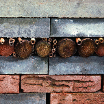
At the same time the garden makes use of affordable, simple, no-nonsense materials. The 40x60 cm paving stones are one of the most common and affordable paving options in the Netherlands, available en masse for free on the Internet. Conceptually we imagined a garden completely paved with the tiles (as to many gardens are) and what would happen if took out some of these stones, used them to build benches and structure and added plants where the tiles had been. In the construction of the benches we include other materials such as bamboo sticks and insulation bricks that create habitat for insects such as solitary bees.
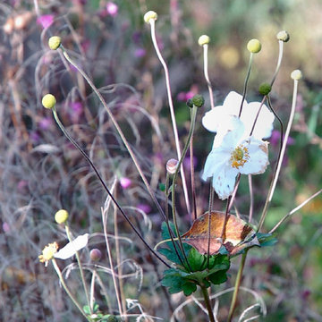
The plant palette is based on a selection of native and host plants in combination with the 26 plants plan set up by Groei & Boei -- a list of plants aimed at making the use of more plants in gardens accessible and less intimidating. The choice for the number 26 corresponds with the number of letters in the alphabet in line with the famous Dutch garden designer Mien Ruy's comment that if we only need 26 letters to create a whole language, we should be able to combine and mix 26 plants to express far more than we think.

 Karen Berkemeyer Home
Wanting some of the familiarity of British country living, we deliberately incorporated details that echoed homeland into the design such as a ceramic farm sink. Amy designed the cabinetry using Signature Custom Cabinets, the construction is inset with a recessed panel door style. The simple shaker style door she modified with fuller stiles and rails to provide that country look and by alternating flush toe kicks and furniture legs also helped to achieve details and the country look the client was after. Adding subzero drawers at the end of the island offers quick access to snacks and drinks for the boys! The pretty green island was a color the client identified with her British roots. Bringing memories together with color really connects the homeowner personally to the space.
This distressed butternut island top with bread board ends is complete with natural wormholes, a true Raging River work of art. It really warms up the space and will patina further over time. The simplicity of the ultra modern Gaggenau induction cook top and sleek lines of the exhaust hood really allows that feature counter to take all the glory!
Lastly, the backsplash is crafted with textured, hand-made ceramic tiles that add a subtle bit of charm along with the warm touch of the antiqued brass cabinet hardware! Leaving the client with a beautiful and functional new kitchen.
 Studio TOOP
design: Carrie Preston (Studio TOOP) and Jasper Helmantel (Cruydt Hoeck), 2011
location: Appeltern, NL
status: built in 2012 by Appeltern Model Garden Complex
photos: Olga van Saane, October 2013
Designed as assignment from both the Dutch gardening magazine Groei & Bloei and the television and radio nature program Vara's Vroege Vogels, this garden serves as a model of how homeowners can incorporate lots of plant life and wildlife into the design but without sacrificing practicality or aesthetics. The garden is deliberately contemporary in its style to emphasize that nature-rich gardens need not look a certain way - insects and birds don't care if the lines are straight or curved.
At the same time the garden makes use of affordable, simple, no-nonsense materials. The 40x60 cm paving stones are one of the most common and affordable paving options in the Netherlands, available en masse for free on the Internet. Conceptually we imagined a garden completely paved with the tiles (as to many gardens are) and what would happen if took out some of these stones, used them to build benches and structure and added plants where the tiles had been. In the construction of the benches we include other materials such as bamboo sticks and insulation bricks that create habitat for insects such as solitary bees.
The plant palette is based on a selection of native and host plants in combination with the 26 plants plan set up by Groei & Boei -- a list of plants aimed at making the use of more plants in gardens accessible and less intimidating. The choice for the number 26 corresponds with the number of letters in the alphabet in line with the famous Dutch garden designer Mien Ruy's comment that if we only need 26 letters to create a whole language, we should be able to combine and mix 26 plants to express far more than we think.
 Studio TOOP
design: Carrie Preston (Studio TOOP) and Jasper Helmantel (Cruydt Hoeck), 2011
location: Appeltern, NL
status: built in 2012 by Appeltern Model Garden Complex
photos: Olga van Saane, October 2013
Designed as assignment from both the Dutch gardening magazine Groei & Bloei and the television and radio nature program Vara's Vroege Vogels, this garden serves as a model of how homeowners can incorporate lots of plant life and wildlife into the design but without sacrificing practicality or aesthetics. The garden is deliberately contemporary in its style to emphasize that nature-rich gardens need not look a certain way - insects and birds don't care if the lines are straight or curved.
At the same time the garden makes use of affordable, simple, no-nonsense materials. The 40x60 cm paving stones are one of the most common and affordable paving options in the Netherlands, available en masse for free on the Internet. Conceptually we imagined a garden completely paved with the tiles (as to many gardens are) and what would happen if took out some of these stones, used them to build benches and structure and added plants where the tiles had been. In the construction of the benches we include other materials such as bamboo sticks and insulation bricks that create habitat for insects such as solitary bees.
The plant palette is based on a selection of native and host plants in combination with the 26 plants plan set up by Groei & Boei -- a list of plants aimed at making the use of more plants in gardens accessible and less intimidating. The choice for the number 26 corresponds with the number of letters in the alphabet in line with the famous Dutch garden designer Mien Ruy's comment that if we only need 26 letters to create a whole language, we should be able to combine and mix 26 plants to express far more than we think.


 JUMA architects
JUMA architects were contacted for the interior design of a shell-state apartment on the coast. The structural construction, the plastering, the floor screed and the technical fittings (heating ducts, plumbing, electricity and ventilation) of the apartment had already been realised.
It soon became apparent, however, that the assignment could not be limited to the interior decoration only, as the placement of kitchen, bathroom and dressing room in the existing plan turned out to be entirely impractical. More extensive renovation work was needed to meet the needs of the customer. The structure of the unit was therefore slightly adjusted to make the bathroom and dressing larger and more functional.
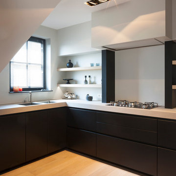
Also, the living room was dominated by a huge radiator that drew all the attention. To solve this problem, new pipes were laid to accommodate an integrated heating element in the sideboard. Gas pipes were fitted in the kitchen for the gas cooker which JUMA included in the design as a real eye-catcher. The sinks, in contrast, were given a more discreet placement.
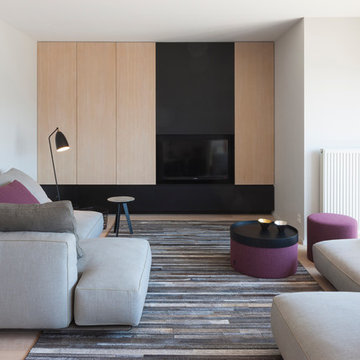
Light oak parquet was selected for the floors throughout the apartment. The natural appearance of the wood gives all the rooms a warm feel. The built-in furniture was custom made and is finished in black satin lacquer to contrast the light-coloured wood. The dominant colour palette is deliberately kept very simple and neutral and is complemented with light grey tones and colour accents. The colour choice was in fact inspired by a beautiful picture of the coast.
The freestanding furniture and overall decorations were also selected or designed by JUMA architects. The arrangement of the seating area is very playful and atypical. JUMA did not want to put in a couch that would divide the space in two. The composition is meant to create a very open ambiance. A round table was chosen for the same reason. The round shape does not divide the space but allows fluid circulation.
Pictures © Liesbet Goetschalckx
 Studio TOOP
design: Carrie Preston (Studio TOOP) and Jasper Helmantel (Cruydt Hoeck), 2011
location: Appeltern, NL
status: built in 2012 by Appeltern Model Garden Complex
photos: Olga van Saane, October 2013
Designed as assignment from both the Dutch gardening magazine Groei & Bloei and the television and radio nature program Vara's Vroege Vogels, this garden serves as a model of how homeowners can incorporate lots of plant life and wildlife into the design but without sacrificing practicality or aesthetics. The garden is deliberately contemporary in its style to emphasize that nature-rich gardens need not look a certain way - insects and birds don't care if the lines are straight or curved.
At the same time the garden makes use of affordable, simple, no-nonsense materials. The 40x60 cm paving stones are one of the most common and affordable paving options in the Netherlands, available en masse for free on the Internet. Conceptually we imagined a garden completely paved with the tiles (as to many gardens are) and what would happen if took out some of these stones, used them to build benches and structure and added plants where the tiles had been. In the construction of the benches we include other materials such as bamboo sticks and insulation bricks that create habitat for insects such as solitary bees.
The plant palette is based on a selection of native and host plants in combination with the 26 plants plan set up by Groei & Boei -- a list of plants aimed at making the use of more plants in gardens accessible and less intimidating. The choice for the number 26 corresponds with the number of letters in the alphabet in line with the famous Dutch garden designer Mien Ruy's comment that if we only need 26 letters to create a whole language, we should be able to combine and mix 26 plants to express far more than we think.
 JUMA architects
JUMA architects were contacted for the interior design of a shell-state apartment on the coast. The structural construction, the plastering, the floor screed and the technical fittings (heating ducts, plumbing, electricity and ventilation) of the apartment had already been realised.
It soon became apparent, however, that the assignment could not be limited to the interior decoration only, as the placement of kitchen, bathroom and dressing room in the existing plan turned out to be entirely impractical. More extensive renovation work was needed to meet the needs of the customer. The structure of the unit was therefore slightly adjusted to make the bathroom and dressing larger and more functional.
Also, the living room was dominated by a huge radiator that drew all the attention. To solve this problem, new pipes were laid to accommodate an integrated heating element in the sideboard. Gas pipes were fitted in the kitchen for the gas cooker which JUMA included in the design as a real eye-catcher. The sinks, in contrast, were given a more discreet placement.
Light oak parquet was selected for the floors throughout the apartment. The natural appearance of the wood gives all the rooms a warm feel. The built-in furniture was custom made and is finished in black satin lacquer to contrast the light-coloured wood. The dominant colour palette is deliberately kept very simple and neutral and is complemented with light grey tones and colour accents. The colour choice was in fact inspired by a beautiful picture of the coast.
The freestanding furniture and overall decorations were also selected or designed by JUMA architects. The arrangement of the seating area is very playful and atypical. JUMA did not want to put in a couch that would divide the space in two. The composition is meant to create a very open ambiance. A round table was chosen for the same reason. The round shape does not divide the space but allows fluid circulation.
Pictures © Liesbet Goetschalckx
 Karen Berkemeyer Home
Wanting some of the familiarity of British country living, we deliberately incorporated details that echoed homeland into the design such as a ceramic farm sink. Amy designed the cabinetry using Signature Custom Cabinets, the construction is inset with a recessed panel door style. The simple shaker style door she modified with fuller stiles and rails to provide that country look and by alternating flush toe kicks and furniture legs also helped to achieve details and the country look the client was after. Adding subzero drawers at the end of the island offers quick access to snacks and drinks for the boys! The pretty green island was a color the client identified with her British roots. Bringing memories together with color really connects the homeowner personally to the space.
This distressed butternut island top with bread board ends is complete with natural wormholes, a true Raging River work of art. It really warms up the space and will patina further over time. The simplicity of the ultra modern Gaggenau induction cook top and sleek lines of the exhaust hood really allows that feature counter to take all the glory!
Lastly, the backsplash is crafted with textured, hand-made ceramic tiles that add a subtle bit of charm along with the warm touch of the antiqued brass cabinet hardware! Leaving the client with a beautiful and functional new kitchen.
 AIA Pittsburgh
SUSTAINABLE DESIGN: Award of Excellence
PROJECT: Energy Innovation Center
CLIENT: Pittsburgh Gateways, Inc.
ARCHITECTURE FIRM: DLA+ Architecture & Interior Design
ENGINEERS: Atlantic Engineering Services; CJL Engineering; The Gateway Engineers, Inc.
CONTRACTORS: Mascaro Construction Company, L.P.
PHOTOGRAPHER: Jim Schafer Location Photography
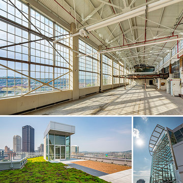
DESCRIPTION: Originally built in 1930 as the Clifford B. Connelley Trade School, the facility was an educational landmark and nationwide model for vocational training. With a vision for revitalization, the Energy Innovation Center (EIC) renews the region’s tradition in workforce development during today’s age of advancing technology. The 6.6 acre complex will promote energy-sector research and innovation and create direct and deliberate bridges to job creation, entrepreneurship, and urban economic revitalization. The mechanical, electrical, and plumbing design provide a state-of-the-art, historically sensitive, energy efficient design that provides superior indoor air quality and maximizes the use of rentable floor space.
JURY COMMENTS: The project demonstrates an intense pallet of sustainable technology while respecting the original building’s forms. The use of the old swimming pool volume for the large equipment is an excellent example of creative problem solving. The goal of fostering knowledge by opening the project to the public through the large glass atrium addition is admirable.
 Tara McCauley Interior Design
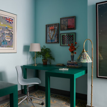
Conceived as an intimate retreat within a prewar Upper West Side classic seven, this home office rethinks the traditional study through a lens of saturated color, material richness, and small-scale glamour. The clients wanted a shared workspace that felt both serene and inspiring. We designed custom his-and-hers desks in hand-applied grasscloth and finished in a deep emerald lacquer.
On the floor, an antique Chinese Art Deco rug introduces a softened palette of blues and ochres and brings in the sense of history I love weaving into tighter spaces. I love how it contrasts with the more modern design elements. Overhead, a marbleized Voutsa wallpaper transforms the ceiling into a swirling canopy, an unexpected design detail that lifts the eye up and makes the room feel more airy.
The lighting is a deliberate mix of eras: a vintage brass floor lamp fitted with a custom patterned Pierre Frey shade sits alongside newer collectible pieces, including a Gubi table lamp. Thoughtfully framed children’s artwork adds warmth and personality. The finished space is a tranquil, highly personal workspace for busy parents. It’s compact but highly considered, and designed to feel like its own little world.
 JUMA architects
JUMA architects were contacted for the interior design of a shell-state apartment on the coast. The structural construction, the plastering, the floor screed and the technical fittings (heating ducts, plumbing, electricity and ventilation) of the apartment had already been realised.
It soon became apparent, however, that the assignment could not be limited to the interior decoration only, as the placement of kitchen, bathroom and dressing room in the existing plan turned out to be entirely impractical. More extensive renovation work was needed to meet the needs of the customer. The structure of the unit was therefore slightly adjusted to make the bathroom and dressing larger and more functional.
Also, the living room was dominated by a huge radiator that drew all the attention. To solve this problem, new pipes were laid to accommodate an integrated heating element in the sideboard. Gas pipes were fitted in the kitchen for the gas cooker which JUMA included in the design as a real eye-catcher. The sinks, in contrast, were given a more discreet placement.
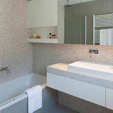
Light oak parquet was selected for the floors throughout the apartment. The natural appearance of the wood gives all the rooms a warm feel. The built-in furniture was custom made and is finished in black satin lacquer to contrast the light-coloured wood. The dominant colour palette is deliberately kept very simple and neutral and is complemented with light grey tones and colour accents. The colour choice was in fact inspired by a beautiful picture of the coast.
The freestanding furniture and overall decorations were also selected or designed by JUMA architects. The arrangement of the seating area is very playful and atypical. JUMA did not want to put in a couch that would divide the space in two. The composition is meant to create a very open ambiance. A round table was chosen for the same reason. The round shape does not divide the space but allows fluid circulation.
Pictures © Liesbet Goetschalckx
 Strom Architects
Waystation is a new-build family home that replaces a dilapidated 1960’s modernist house in Kent. The existing house has some architectural merit but fails to respond to the family’s needs. The entrance level and bedrooms are disconnected from the living space which makes for torturous circulation and a lack of connection with the garden. After full evaluation, it has proved to be too expensive to adapt and repair the existing house.
Starting from scratch gave us the opportunity to develop a detailed brief with our client, to create a warm and open family home that maximises the site’s potential and forms a meaningful connection to the garden.
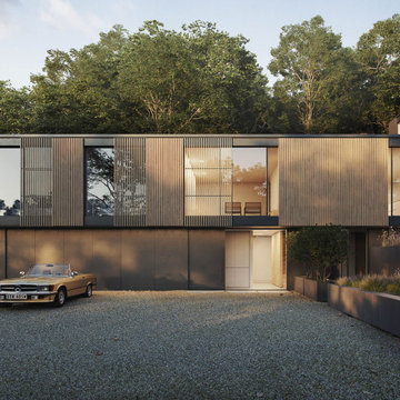
The design of the proposed house seeks to acknowledge the legacy of the existing with a clarity of form and elegant use of natural materials. The horizontal design respects the form and ethos of the existing house, with the timber cladding providing a warm and contemporary aesthetic. The upper and lower forms are proposed in a contrasting black render.
The design concept seeks to create a building with a deliberately lightweight appearance which floats above the landscape and sits harmoniously in the wooded setting.
The lower ground floor contains garage, entrance, guest rooms and ancillary spaces. The upper ground floor comprises the children’s bedrooms and the open plan living spaces which connect seamlessly to the outdoor terrace and garden. The master bedroom suite at first floor is orientated south and designed with an intimate terrace that enjoys panoramic views of the countryside.
For the external spaces, the design intention is to create a sense of space and elegance, allowing light to penetrate the areas around the house but also to create a great sense of privacy and calm. Thus, architecture and landscape combine to create a place for the family to come together and enjoy.
The house is scheduled to start on site late spring 2020.
 Natural Stone Institute
As Sheila Gibson Stoodley writes in an article about this project in Robb Report, “Brian Hemingway is sensitive to light in the best way possible.”
“The Vancouver, British Columbia-based architect wanted this 22,000-square-foot home near Boston to glow like a lantern at night, and he attained that goal on behalf of the homeowners.” The wood and stone
that Hemingway favored for the home informed the space’s color palette. So critical were these materials that settling on a shade of stain for the Douglas fir and the finishes to be used on the Virginia Mist granite took
months of consultation.
Walker Zanger, the stone supplier, worked with the owner and with Colin Flavin, a Boston-based architect who partnered with Hemingway, to choose, detail, and fabricate the granite.
The stone is used indoors and out, heightening the boundary-blurring effect that the design team desired. Though the owners are ardent art collectors, they did not build their home to showcase specific works; the
real artists here are the architects, Hemingway and Flavin. So deft were they at inviting nature into their creation that, from certain angles, it can be hard to tell where the outdoors stops and starts.
“There are deliberately no window treatments so that Mother Nature weaves the most beautiful textural backgrounds,” said interior designer Andrew Sheinman, of New York’s Pembrooke & Ives. He oversaw the
interiors, working alongside his colleague Michael Lewis. “The seasons change the look and aspect of the house,” said Sheinman, “and we wanted to play on this.”
Bleu de Savoie marble, from France, is used in the baths, to contrast with the Virginia Mist granite and soften the palette and give the baths a spa-like serenity. Hand-chiseled Oxford Black granite is used on exterior landscape walls, to tie the Virginia Mist seamlessly to the natural stone outcroppings.
 EAG Studio
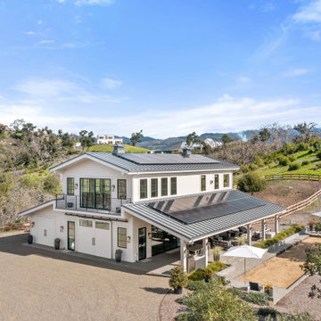
Serenity Farm, where celebrations and purposeful can come alive in a the most peaceful setting, surrounded by the best Sonoma has to offer and grazing donkeys and other invited wildlife. It’s contemporary farm style exterior and interior exudes warmth, with soaring interior ceilings and exposed glulam beams, mezzanine walkways, and steel open staircase, all create an inviting atmosphere, mixed with intelligent building design aimed at sustainability, resiliency, durability and energy and resource efficiency. Adjacent to the barn, a sun-kissed bocce ball court invites friendly competition under the California sky.
The adjoined guest house seamlessly marries contemporary design with farmhouse sensibilities. Clean lines, expansive windows, and a standing-seam metal roof define its character.
The barn spills onto a vast covered patio with heaters and BBQ area and fire table a seating for many
A dedicated section of the barn houses miniature ponies. Children and adults alike delight in their playful presence. Outdoor pastures provide ample space for the ponies to roam freely. The orchard, with its fruit-laden trees, adds to the bucolic charm.
A meandering brook winds through the front of the property, providing a soothing soundtrack that echoes through its serpentine old olive tree grove.
Deliberately modest, tucked into the hillside for minimal impact, the structure and hardscaping embraces its surroundings without imposing on it. But just walk to the edge of the gardens one can contemplate the Sonoma Valley all the way down to San Francisco. Both in terms of design and construction, Serenity Farm invites you to escape the ordinary and embrace the extraordinary.
Designed by EAG Studio | Built by Character Builders
 EAG Studio
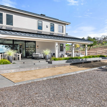
Serenity Farm, where celebrations and purposeful can come alive in a the most peaceful setting, surrounded by the best Sonoma has to offer and grazing donkeys and other invited wildlife. It’s contemporary farm style exterior and interior exudes warmth, with soaring interior ceilings and exposed glulam beams, mezzanine walkways, and steel open staircase, all create an inviting atmosphere, mixed with intelligent building design aimed at sustainability, resiliency, durability and energy and resource efficiency. Adjacent to the barn, a sun-kissed bocce ball court invites friendly competition under the California sky.
The adjoined guest house seamlessly marries contemporary design with farmhouse sensibilities. Clean lines, expansive windows, and a standing-seam metal roof define its character.
The barn spills onto a vast covered patio with heaters and BBQ area and fire table a seating for many
A dedicated section of the barn houses miniature ponies. Children and adults alike delight in their playful presence. Outdoor pastures provide ample space for the ponies to roam freely. The orchard, with its fruit-laden trees, adds to the bucolic charm.
A meandering brook winds through the front of the property, providing a soothing soundtrack that echoes through its serpentine old olive tree grove.
Deliberately modest, tucked into the hillside for minimal impact, the structure and hardscaping embraces its surroundings without imposing on it. But just walk to the edge of the gardens one can contemplate the Sonoma Valley all the way down to San Francisco. Both in terms of design and construction, Serenity Farm invites you to escape the ordinary and embrace the extraordinary.
Designed by EAG Studio | Built by Character Builders
 Lindy Design Build
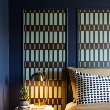
Navy walls and a camel painted ceiling make this guest bedroom the quietest room in a very loud house. The main level of this historic Denver home is bright and full of pattern. Upstairs we dropped the tone on purpose, so the guest suite feels nothing like the floor below.
The color runs everywhere. Walls, trim, crown molding, window casing, and baseboards all take the same deep navy, which makes the room feel enveloping rather than decorated. Color drenching a small bedroom like this is one of the cheapest ways to make it feel deliberate instead of cramped, and it works better in an older house where there is a lot of trim to begin with.
The ceiling is where the room turns. Warm camel overhead, picked up again in the bedding, balances all that cool blue. Without it the room would read cold. A painted ceiling costs very little next to everything else in a renovation and it is one of the most overlooked decisions in a bedroom.
Behind the bed, three panels of geometric wallpaper sit inside custom trim so they read as framed artwork rather than an accent wall. The pattern is mint, black, and ochre, and that black and white geometry repeats in the bedding and again in the ensuite next door, which holds the suite together.
Brass dome table lamps, dark stained floors, original window casing. Historic home renovation in Denver, Colorado by Lindy Design Build. Photography by Jess Blackwell Photography.
61