
Search results for "Deliberate" in Home Design Ideas
 CraftedWild Cabinetry
Photo credit: PDET Photography, Pawel Dmytrow
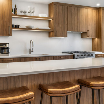
Designed for a home in the Chicago suburbs, this kitchen was created around the client’s desire for clean, minimal lines, visual balance, and highly functional storage.
A warm, high-end European textured TFL brings depth and natural character to the cabinetry, with careful grain matching from panel to panel reinforcing the seamless, tailored appearance. Floating shelves were introduced to break up the cabinetry and create a lighter composition, while integrated dimmable lighting adds warmth and ambiance—especially important given the kitchen’s connection to the surrounding great room.
Function was considered at every level. A custom utensil storage solution was stained to coordinate with the cabinetry finish, while a concealed integrated outlet in the island keeps everyday power readily available without interrupting the clean exterior. Generous drawer and pantry storage maximize usability, including a reduced-depth pantry positioned near the window to provide additional capacity without unnecessarily projecting into the room or compromising natural light.
Every element—from proportions and lighting to storage, material transitions, and grain direction—was considered to create a kitchen that feels calm, cohesive, and deliberately understated.
 Mediterrasian Landscapes
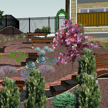
The client wanted a garden that carried the spirit of her homeland — the forms, textures, and quiet drama of a Japanese garden — set down in a subdivision of Western-style homes enclosed by matching aluminum fences. The site itself posed the real challenge: a backyard on a 55% slope, with little natural sense of arrival or destination.
The design answers with a meandering gravel pathway that winds down, across, and up the grade through a series of distinct micro-environments, each defined by its own plant grouping. Hairpin turns and boulder retaining walls hold the banks in place, with beds of reddish mulch tying the slope together visually. An arched wooden footbridge, finished with copper post caps, serves as the garden's focal point and carries the design's Japanese sensibility — echoed in the curved, layered railings that continue along the stairways above and below it. A single Japanese maple stands as a deliberate nod to the tradition, set among a bolder planting of agaves, aloes, and other drought-tolerant succulents suited to the Bay Area climate — together transforming a steep, awkward backyard into a serene, immersive retreat.
The installation, by Arborist Now, has required the kind of grading, stonework, and structural skill a slope this steep demands — the craft is as much a part of the story as the design.
 FiveSTAR Landscape
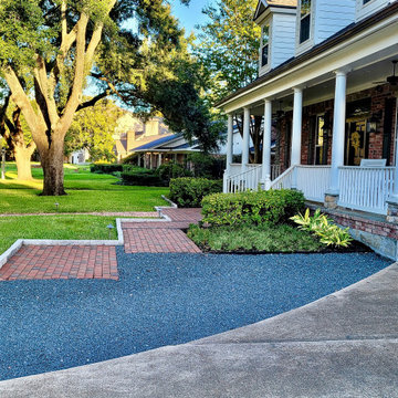
We recently finished this landscape design and installation project in the Tanglewood neighborhood of Houston, Texas. Our client, a Louisiana native who loves entertaining and wanted to stay connected to her NOLA roots, desired a space that could comfortably accommodate 30+ guests on a regular basis.
We deliberately designed the outdoor kitchen without a cover to preserve the view of the magnificent oak trees. Our aim was to create a kitchen that is both durable and visually appealing. The countertop is made of leathered granite, a material that can withstand the unpredictable Texas weather. All the appliances, including the grill, refrigerator, sink, and double side burner, were locally sourced and are made of stainless steel. Additionally, we utilized Austin limestone, which was quarried right here in Texas.
To infuse a touch of New Orleans charm into the backyard, we incorporated a fountain. The surrounding black star gravel was designed as a versatile space that can be used for additional dining, seating, or even as a meditation area.
To ensure privacy and shade as the plants mature, we strategically planted Eaglestone Holly and Japanese Yew along the fence line. Completing the landscape, we selected Amerishade grass for its excellent shade tolerance.
Find the right local pro for your project
 FiveSTAR Landscape
We recently finished this landscape design and installation project in the Tanglewood neighborhood of Houston, Texas. Our client, a Louisiana native who loves entertaining and wanted to stay connected to her NOLA roots, desired a space that could comfortably accommodate 30+ guests on a regular basis.
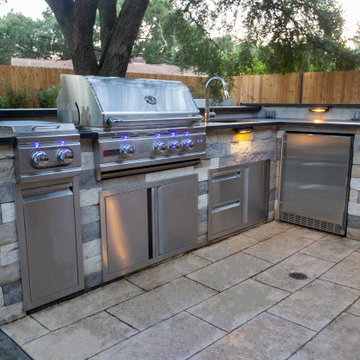
We deliberately designed the outdoor kitchen without a cover to preserve the view of the magnificent oak trees. Our aim was to create a kitchen that is both durable and visually appealing. The countertop is made of leathered granite, a material that can withstand the unpredictable Texas weather. All the appliances, including the grill, refrigerator, sink, and double side burner, were locally sourced and are made of stainless steel. Additionally, we utilized Austin limestone, which was quarried right here in Texas.
To infuse a touch of New Orleans charm into the backyard, we incorporated a fountain. The surrounding black star gravel was designed as a versatile space that can be used for additional dining, seating, or even as a meditation area.
To ensure privacy and shade as the plants mature, we strategically planted Eaglestone Holly and Japanese Yew along the fence line. Completing the landscape, we selected Amerishade grass for its excellent shade tolerance.
 CraftedWild Cabinetry
Photo credit: PDET Photography, Pawel Dmytrow
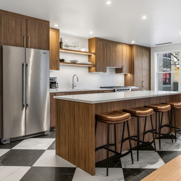
Designed for a home in the Chicago suburbs, this kitchen was created around the client’s desire for clean, minimal lines, visual balance, and highly functional storage.
A warm, high-end European textured TFL brings depth and natural character to the cabinetry, with careful grain matching from panel to panel reinforcing the seamless, tailored appearance. Floating shelves were introduced to break up the cabinetry and create a lighter composition, while integrated dimmable lighting adds warmth and ambiance—especially important given the kitchen’s connection to the surrounding great room.
Function was considered at every level. A custom utensil storage solution was stained to coordinate with the cabinetry finish, while a concealed integrated outlet in the island keeps everyday power readily available without interrupting the clean exterior. Generous drawer and pantry storage maximize usability, including a reduced-depth pantry positioned near the window to provide additional capacity without unnecessarily projecting into the room or compromising natural light.
Every element—from proportions and lighting to storage, material transitions, and grain direction—was considered to create a kitchen that feels calm, cohesive, and deliberately understated.
 Mediterrasian Landscapes
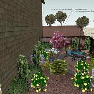
The client wanted a garden that carried the spirit of her homeland — the forms, textures, and quiet drama of a Japanese garden — set down in a subdivision of Western-style homes enclosed by matching aluminum fences. The site itself posed the real challenge: a backyard on a 55% slope, with little natural sense of arrival or destination.
The design answers with a meandering gravel pathway that winds down, across, and up the grade through a series of distinct micro-environments, each defined by its own plant grouping. Hairpin turns and boulder retaining walls hold the banks in place, with beds of reddish mulch tying the slope together visually. An arched wooden footbridge, finished with copper post caps, serves as the garden's focal point and carries the design's Japanese sensibility — echoed in the curved, layered railings that continue along the stairways above and below it. A single Japanese maple stands as a deliberate nod to the tradition, set among a bolder planting of agaves, aloes, and other drought-tolerant succulents suited to the Bay Area climate — together transforming a steep, awkward backyard into a serene, immersive retreat.
The installation, by Arborist Now, has required the kind of grading, stonework, and structural skill a slope this steep demands — the craft is as much a part of the story as the design.
 CraftedWild Cabinetry
Photo credit: PDET Photography, Pawel Dmytrow
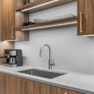
Designed for a home in the Chicago suburbs, this kitchen was created around the client’s desire for clean, minimal lines, visual balance, and highly functional storage.
A warm, high-end European textured TFL brings depth and natural character to the cabinetry, with careful grain matching from panel to panel reinforcing the seamless, tailored appearance. Floating shelves were introduced to break up the cabinetry and create a lighter composition, while integrated dimmable lighting adds warmth and ambiance—especially important given the kitchen’s connection to the surrounding great room.
Function was considered at every level. A custom utensil storage solution was stained to coordinate with the cabinetry finish, while a concealed integrated outlet in the island keeps everyday power readily available without interrupting the clean exterior. Generous drawer and pantry storage maximize usability, including a reduced-depth pantry positioned near the window to provide additional capacity without unnecessarily projecting into the room or compromising natural light.
Every element—from proportions and lighting to storage, material transitions, and grain direction—was considered to create a kitchen that feels calm, cohesive, and deliberately understated.
 Phoenix Home Remodeling
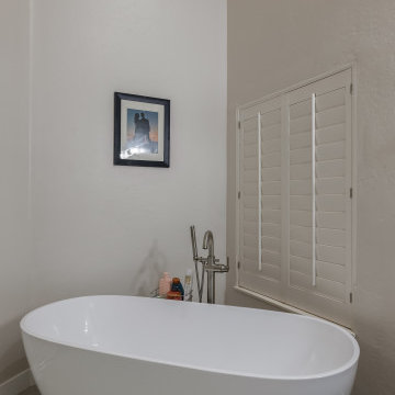
Ryan & Nicole took on the challenge to refresh their master bathroom. Their goal extended beyond mere looks to achieve a perfect balance between functionality and elegance.
The renovation kicked off with an in-depth demolition, removal, and cleanup process. The area, especially the shower walls, was completely cleared down to the studs, setting the stage for the installation of a custom shower.
Custom cabinets from Sollid Designer Series in Napa Iron Clear Alder were chosen for the vanity area, with a Fairy White quartz countertop and under-mount sinks. The thoughtful selection of finishes underscored their refined taste.
Special attention was paid to the shower, where new plumbing fixtures, a glass enclosure, and tailored niches for bath products were added.
The choice of materials was deliberate, with Tru Marmi Extra matte tiles for the walls, curb, and niche, and a combination of Hex Keystones for the shower floor, enhancing the bathroom's aesthetic appeal.
Central to their vision was a Wyndham Collection Juno 71" freestanding soaking tub, complemented by a sleek, freestanding ground-mounted tub filler faucet, embodying the dreamy oasis they envisioned.
old master bathroom remodel before and after photo
The renovation featured Shibusa Bianco 12" x 24" tile flooring across the bathroom and closet, complemented by new baseboards and a fresh paint job. Durability was ensured with a protective Hydroshield coating application.

 Living Stone Design + Build
Sophisticated home office within the award-winning Bronder Residence that balances professional functionality with mountain modern aesthetics. The thoughtfully designed workspace features sustainable materials and large windows offering forest views, while incorporating Living Stone's commitment to energy efficiency and ID.ology's expertise in creating harmonious work environments.

 Studio TOOP
design: Carrie Preston (Studio TOOP) and Jasper Helmantel (Cruydt Hoeck), 2011
location: Appeltern, NL
status: built in 2012 by Appeltern Model Garden Complex
photos: Olga van Saane, October 2013
Designed as assignment from both the Dutch gardening magazine Groei & Bloei and the television and radio nature program Vara's Vroege Vogels, this garden serves as a model of how homeowners can incorporate lots of plant life and wildlife into the design but without sacrificing practicality or aesthetics. The garden is deliberately contemporary in its style to emphasize that nature-rich gardens need not look a certain way - insects and birds don't care if the lines are straight or curved.
At the same time the garden makes use of affordable, simple, no-nonsense materials. The 40x60 cm paving stones are one of the most common and affordable paving options in the Netherlands, available en masse for free on the Internet. Conceptually we imagined a garden completely paved with the tiles (as to many gardens are) and what would happen if took out some of these stones, used them to build benches and structure and added plants where the tiles had been. In the construction of the benches we include other materials such as bamboo sticks and insulation bricks that create habitat for insects such as solitary bees.
The plant palette is based on a selection of native and host plants in combination with the 26 plants plan set up by Groei & Boei -- a list of plants aimed at making the use of more plants in gardens accessible and less intimidating. The choice for the number 26 corresponds with the number of letters in the alphabet in line with the famous Dutch garden designer Mien Ruy's comment that if we only need 26 letters to create a whole language, we should be able to combine and mix 26 plants to express far more than we think.

 Karen Berkemeyer Home
Wanting some of the familiarity of British country living, we deliberately incorporated details that echoed homeland into the design such as a ceramic farm sink. Amy designed the cabinetry using Signature Custom Cabinets, the construction is inset with a recessed panel door style. The simple shaker style door she modified with fuller stiles and rails to provide that country look and by alternating flush toe kicks and furniture legs also helped to achieve details and the country look the client was after. Adding subzero drawers at the end of the island offers quick access to snacks and drinks for the boys! The pretty green island was a color the client identified with her British roots. Bringing memories together with color really connects the homeowner personally to the space.
This distressed butternut island top with bread board ends is complete with natural wormholes, a true Raging River work of art. It really warms up the space and will patina further over time. The simplicity of the ultra modern Gaggenau induction cook top and sleek lines of the exhaust hood really allows that feature counter to take all the glory!
Lastly, the backsplash is crafted with textured, hand-made ceramic tiles that add a subtle bit of charm along with the warm touch of the antiqued brass cabinet hardware! Leaving the client with a beautiful and functional new kitchen.

 RHEINZINK
Photos images: Courtesy of the Homeowners
At the end of a dirt road in southern Vermont is a stunning timber and stone residence designed to resemble a small medieval Anglo-Norman manor house originally constructed in the 16th century. According to the owners, a husband and wife with a keen interest in both ancient and modern architecture, the 5,000 sq. ft. home was built slowly over eleven years by highly skilled craftsmen in order to complete all of the authentic hand-planed interior details. The craftsmen then spent an additional two years building the adjacent “ancient“ barn. “We always knew we wanted to take down a delapidated 19th-century hay barn and replace it with something of the period of the house,“ the husband said.
The owners designed the barn and began to consider zinc for the roof after looking at northern European architecture and discovering that zinc has been used extensively in Europe for 300 years. Approximately 4,200 sq. ft. of RHEINZINK prePATINA bright rolled Double Lock Standing Seam Roof Panels were utilized to roof the white oak structure. The bright rolled material was selected deliberately in order to achieve the “naturally aged look“ that the owners were seeking. “It’s gone almost immediately to a soft grey which is what we hoped would happen. As the years go by, the color of the weathering white oak and the aging zinc will come together in a dusty grey. Seeing this building in the fog five years from now will feel like seeing a 500-year-old ghost barn floating in the hills of Vermont.“
Installation of the RHEINZINK panels was done by Cold Hollow Contracting, Burlington, VT. “These folks had serious zinc-roofing experience and were clearly the most craft-oriented of all the roofers we met with,“ according to the husband.
The main focus was getting an “old look“ as quickly as possible, said Tim Heaghney, co-owner of Cold Hollow Contracting. “That’s really what makes the bright rolled so special—it ages quickly. We fabricated the 28 ft. panels on site and did the flashing fabrication in our shop. Many of the normal sheet metal skills apply to the zinc although we relied heavily on the RHEINZINK installation manual as well as personal support from their technical people. We used a radius cut and fold at the eve termination as opposed to the typical detail used in steel and copper where it‘s just cut at the 90 for the drip edge. The roof was steep but we do a lot of steeples and domes so we’re comfortable working at heights.“
The installers also utilized RHEINZINK’s AIR-Z structured underlayment to provide an air-gap behind the zinc.
The RHEINZINK distributor on the project was Beacon Sales, Shelburne, VT
 Studio TOOP
design: Carrie Preston (Studio TOOP) and Jasper Helmantel (Cruydt Hoeck), 2011
location: Appeltern, NL
status: built in 2012 by Appeltern Model Garden Complex
photos: Olga van Saane, October 2013
Designed as assignment from both the Dutch gardening magazine Groei & Bloei and the television and radio nature program Vara's Vroege Vogels, this garden serves as a model of how homeowners can incorporate lots of plant life and wildlife into the design but without sacrificing practicality or aesthetics. The garden is deliberately contemporary in its style to emphasize that nature-rich gardens need not look a certain way - insects and birds don't care if the lines are straight or curved.
At the same time the garden makes use of affordable, simple, no-nonsense materials. The 40x60 cm paving stones are one of the most common and affordable paving options in the Netherlands, available en masse for free on the Internet. Conceptually we imagined a garden completely paved with the tiles (as to many gardens are) and what would happen if took out some of these stones, used them to build benches and structure and added plants where the tiles had been. In the construction of the benches we include other materials such as bamboo sticks and insulation bricks that create habitat for insects such as solitary bees.
The plant palette is based on a selection of native and host plants in combination with the 26 plants plan set up by Groei & Boei -- a list of plants aimed at making the use of more plants in gardens accessible and less intimidating. The choice for the number 26 corresponds with the number of letters in the alphabet in line with the famous Dutch garden designer Mien Ruy's comment that if we only need 26 letters to create a whole language, we should be able to combine and mix 26 plants to express far more than we think.
 Studio TOOP
design: Carrie Preston (Studio TOOP) and Jasper Helmantel (Cruydt Hoeck), 2011
location: Appeltern, NL
status: built in 2012 by Appeltern Model Garden Complex
photos: Olga van Saane, October 2013
Designed as assignment from both the Dutch gardening magazine Groei & Bloei and the television and radio nature program Vara's Vroege Vogels, this garden serves as a model of how homeowners can incorporate lots of plant life and wildlife into the design but without sacrificing practicality or aesthetics. The garden is deliberately contemporary in its style to emphasize that nature-rich gardens need not look a certain way - insects and birds don't care if the lines are straight or curved.
At the same time the garden makes use of affordable, simple, no-nonsense materials. The 40x60 cm paving stones are one of the most common and affordable paving options in the Netherlands, available en masse for free on the Internet. Conceptually we imagined a garden completely paved with the tiles (as to many gardens are) and what would happen if took out some of these stones, used them to build benches and structure and added plants where the tiles had been. In the construction of the benches we include other materials such as bamboo sticks and insulation bricks that create habitat for insects such as solitary bees.
The plant palette is based on a selection of native and host plants in combination with the 26 plants plan set up by Groei & Boei -- a list of plants aimed at making the use of more plants in gardens accessible and less intimidating. The choice for the number 26 corresponds with the number of letters in the alphabet in line with the famous Dutch garden designer Mien Ruy's comment that if we only need 26 letters to create a whole language, we should be able to combine and mix 26 plants to express far more than we think.
 Neumann & Rudy Architecture
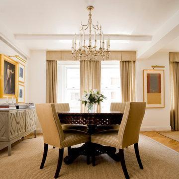
**I. Spatial Composition & Architectural Volume**
This is a pre-war Manhattan dining room whose proportions have been surgically clarified rather than reinvented. The room reads as a compressed rectilinear volume, its ceiling plane articulated by a shallow dropped soffit and a single exposed transverse beam — a candid acknowledgment of the building's structural grid, left legible rather than concealed behind a coved plaster surround. That beam performs a quiet spatial function: it registers the threshold between the dining zone and the adjoining passage at right, where a sliver of herringbone parquet and a second curtained aperture extend the sightline into a further room, relieving the enclosure and establishing a discreet enfilade. The composition is emphatically axial and symmetrical — chandelier, floral centerpiece, pedestal table and central window mullion align on a single spine — yet the symmetry is deliberately imperfect: the flanking chairs are turned inward on the diagonal, the sideboard weights the left wall, and the artwork on the right hangs off-axis. The result is a Beaux-Arts discipline softened by a decorator's asymmetry. Most consequential is the pelmet, a deep upholstered box valance carried nearly wall-to-wall, which annexes the window into a single monumental glazed field and visually raises the ceiling by drawing the eye above the actual head height of the sash.
**II. Materiality, Color & Texture**
The palette is a study in monochromatic warmth held within a narrow tonal band of buff, oatmeal, flax and champagne, with saturation kept deliberately low so that texture carries the burden of variety. Underfoot, a wall-to-wall seagrass or sisal matting with a coarse basketweave provides the room's tactile bass note — hard-wearing, faintly agricultural, and set in productive tension with the refined silk-and-linen sheen of the curtains and pelmet. The chairs are a masterstroke of dual upholstery: matte sand-toned fabric on the outside back and a subtle self-striped ottoman weave on the seat and inner face, a device that renders the seating both plush and graphic. Against this envelope of pale neutrals, two dark accents supply the necessary chromatic gravity: the deeply carved, pierced-apron rosewood or mahogany center table, almost Anglo-Indian in its fretwork and baluster pedestal, and the ebonized klismos-splayed chair legs that echo it. The left wall introduces a painted, dry-brushed Gustavian-style commode with lozenge-fretwork doors, its chalky grey-green a cool counterpoint, while gilt frames, a burnished picture light and the silvered chandelier thread a metallic warmth through the whole.
**III. Lighting, Atmosphere & Style Profile**
Daylight is the room's primary illuminant and it is handled with restraint: the curtains are dressed open but the roman-like sheer inner treatment diffuses the light into a milky, north-facing wash that flattens shadow and flatters the neutral surfaces. Artificial lighting is layered and entirely decorative in expression — the tall, attenuated candle-arm chandelier, hung low and generously scaled, functions as sculpture and as the room's compositional keystone, while two swing-arm brass picture lights provide directional accents that anchor the art as evening focal points. There is no visible downlighting or recessed apparatus; the mood is candlelit, hushed and faintly nocturnal even in daytime. Stylistically the room resolves into what might be termed **Refined Neutral Traditionalism** — an American-classical, Bilhuber-adjacent idiom that marries eighteenth-century Swedish and Anglo-colonial furniture archetypes with contemporary tailoring, tonal upholstery and humble natural-fiber flooring. Its sophistication lies precisely in that calibration: heirloom silhouettes stripped of pattern and color noise, so that carving, weave and gilding become the sole ornamental language.
 Karen Berkemeyer Home
Wanting some of the familiarity of British country living, we deliberately incorporated details that echoed homeland into the design such as a ceramic farm sink. Amy designed the cabinetry using Signature Custom Cabinets, the construction is inset with a recessed panel door style. The simple shaker style door she modified with fuller stiles and rails to provide that country look and by alternating flush toe kicks and furniture legs also helped to achieve details and the country look the client was after. Adding subzero drawers at the end of the island offers quick access to snacks and drinks for the boys! The pretty green island was a color the client identified with her British roots. Bringing memories together with color really connects the homeowner personally to the space.
This distressed butternut island top with bread board ends is complete with natural wormholes, a true Raging River work of art. It really warms up the space and will patina further over time. The simplicity of the ultra modern Gaggenau induction cook top and sleek lines of the exhaust hood really allows that feature counter to take all the glory!
Lastly, the backsplash is crafted with textured, hand-made ceramic tiles that add a subtle bit of charm along with the warm touch of the antiqued brass cabinet hardware! Leaving the client with a beautiful and functional new kitchen.
 JUMA architects
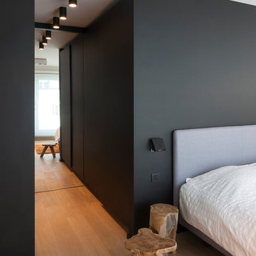
JUMA architects were contacted for the interior design of a shell-state apartment on the coast. The structural construction, the plastering, the floor screed and the technical fittings (heating ducts, plumbing, electricity and ventilation) of the apartment had already been realised.
It soon became apparent, however, that the assignment could not be limited to the interior decoration only, as the placement of kitchen, bathroom and dressing room in the existing plan turned out to be entirely impractical. More extensive renovation work was needed to meet the needs of the customer. The structure of the unit was therefore slightly adjusted to make the bathroom and dressing larger and more functional.
Also, the living room was dominated by a huge radiator that drew all the attention. To solve this problem, new pipes were laid to accommodate an integrated heating element in the sideboard. Gas pipes were fitted in the kitchen for the gas cooker which JUMA included in the design as a real eye-catcher. The sinks, in contrast, were given a more discreet placement.
Light oak parquet was selected for the floors throughout the apartment. The natural appearance of the wood gives all the rooms a warm feel. The built-in furniture was custom made and is finished in black satin lacquer to contrast the light-coloured wood. The dominant colour palette is deliberately kept very simple and neutral and is complemented with light grey tones and colour accents. The colour choice was in fact inspired by a beautiful picture of the coast.
The freestanding furniture and overall decorations were also selected or designed by JUMA architects. The arrangement of the seating area is very playful and atypical. JUMA did not want to put in a couch that would divide the space in two. The composition is meant to create a very open ambiance. A round table was chosen for the same reason. The round shape does not divide the space but allows fluid circulation.
Pictures © Liesbet Goetschalckx
 contact7524
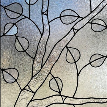
This stained glass window was created as part of our signature Aspen Stained Glass line. These windows look beautiful in cottage style or contemporary homes and are a great way for outdoor enthusiasts to celebrate their love of nature. The textured appearance of the glass provides the homeowners with a high level of privacy and comfort.
 Studio TOOP
design: Carrie Preston (Studio TOOP) and Jasper Helmantel (Cruydt Hoeck), 2011
location: Appeltern, NL
status: built in 2012 by Appeltern Model Garden Complex
photos: Olga van Saane, October 2013
Designed as assignment from both the Dutch gardening magazine Groei & Bloei and the television and radio nature program Vara's Vroege Vogels, this garden serves as a model of how homeowners can incorporate lots of plant life and wildlife into the design but without sacrificing practicality or aesthetics. The garden is deliberately contemporary in its style to emphasize that nature-rich gardens need not look a certain way - insects and birds don't care if the lines are straight or curved.
At the same time the garden makes use of affordable, simple, no-nonsense materials. The 40x60 cm paving stones are one of the most common and affordable paving options in the Netherlands, available en masse for free on the Internet. Conceptually we imagined a garden completely paved with the tiles (as to many gardens are) and what would happen if took out some of these stones, used them to build benches and structure and added plants where the tiles had been. In the construction of the benches we include other materials such as bamboo sticks and insulation bricks that create habitat for insects such as solitary bees.
The plant palette is based on a selection of native and host plants in combination with the 26 plants plan set up by Groei & Boei -- a list of plants aimed at making the use of more plants in gardens accessible and less intimidating. The choice for the number 26 corresponds with the number of letters in the alphabet in line with the famous Dutch garden designer Mien Ruy's comment that if we only need 26 letters to create a whole language, we should be able to combine and mix 26 plants to express far more than we think.
 Studio TOOP
design: Carrie Preston (Studio TOOP) and Jasper Helmantel (Cruydt Hoeck), 2011
location: Appeltern, NL
status: built in 2012 by Appeltern Model Garden Complex
photos: Jolanthe Lalkens, June 2013
Designed as assignment from both the Dutch gardening magazine Groei & Bloei and the television and radio nature program Vara's Vroege Vogels, this garden serves as a model of how homeowners can incorporate lots of plant life and wildlife into the design but without sacrificing practicality or aesthetics. The garden is deliberately contemporary in its style to emphasize that nature-rich gardens need not look a certain way - insects and birds don't care if the lines are straight or curved.
At the same time the garden makes use of affordable, simple, no-nonsense materials. The 40x60 cm paving stones are one of the most common and affordable paving options in the Netherlands, available en masse for free on the Internet. Conceptually we imagined a garden completely paved with the tiles (as to many gardens are) and what would happen if took out some of these stones, used them to build benches and structure and added plants where the tiles had been. In the construction of the benches we include other materials such as bamboo sticks and insulation bricks that create habitat for insects such as solitary bees.
The plant palette is based on a selection of native and host plants in combination with the 26 plants plan set up by Groei & Boei -- a list of plants aimed at making the use of more plants in gardens accessible and less intimidating. The choice for the number 26 corresponds with the number of letters in the alphabet in line with the famous Dutch garden designer Mien Ruy's comment that if we only need 26 letters to create a whole language, we should be able to combine and mix 26 plants to express far more than we think.
60