
Search results for "Deliberation" in Home Design Ideas
 Wiltshire Garden & Interior Design
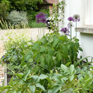
Borders were created around the entire house perimeter. The scheme was kept deliberately simple with bulbs for spring colour, easy care perennials to fill out quickly and a few key evergreens to provide structure. Climbers were also included to soften large areas of rendered wall.
 Century Stair Company
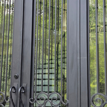
A single curve does a lot of work here. Rising from the main level to a wraparound balcony above, this staircase earns its place at the center of the home — not just structurally, but visually. Black iron balusters and handrails push against crisp white risers in a contrast that feels deliberate rather than decorative. The open floor plan gives it room to breathe, letting the curve read as architecture rather than furniture. The result is a staircase that creates movement even when no one is on it.
1976-2026 © Century Stair Company
 Benjamin Berk
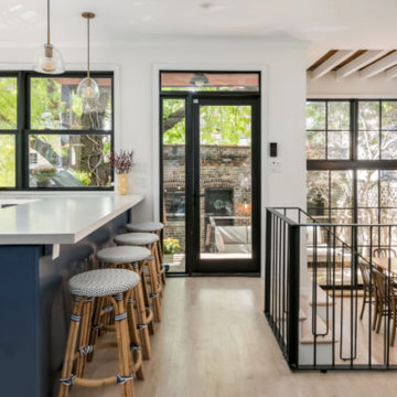
The kitchen sits one step above the breakfast nook — a deliberate multilevel strategy that creates distinct zones while keeping the house visually open from living room through kitchen through nook to backyard beyond. Navy cabinetry; custom wood range hood built from salvaged kitchen wall planks (not pictured); brass hardware.
Find the right local pro for your project
 Wendel Klein Builders, Inc.
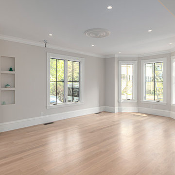
This expansive Cambridge residence was ready for a new chapter, and Wendel Klein Design Build was honored to lead the transformation. By meticulously remodeling both the interior and exterior, we struck a deliberate balance between modern functionality and historic charm. The result is a home that feels entirely current while honoring its original soul.

 Eugene Pintail LLC
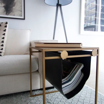
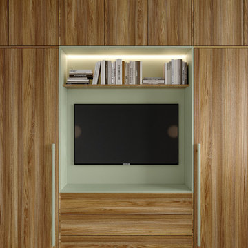
Minimalism isn’t supposed to be vanilla—this one actually earns the label. Clean, modern simplicity is the core, but it’s rich in intention. Every line, surface, and texture is deliberate; emptiness feels calculated, not lazy. The subdued palette and essentialist layout speak to refined restraint, yet the space still communicates a quiet, confident presence. Real minimalism with character—not stripped, but sharpened.
 EAG Studio
Reimagining an Urban Classic
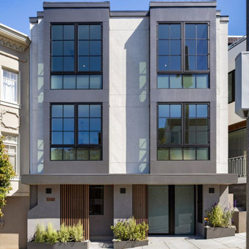
Perched high above San Francisco’s Cow Hollow neighborhood, this meticulously reimagined residence represents a thoughtful transformation of a classic urban home into a contemporary, light-filled sanctuary. The project involved a comprehensive renovation paired with both vertical and horizontal expansion, dramatically increasing the home’s footprint while enhancing its relationship to sweeping views of the Bay, the Palace of Fine Arts, and the surrounding hillside neighborhoods.
The design strategy focused on opening the home to light, air, and vistas—elements often constrained in the dense urban fabric of San Francisco. By extending the structure upward and outward, the architects created a dynamic four-level residence that unfolds gradually, culminating in expansive living spaces and rooftop terraces oriented toward panoramic city and water views.
Architecture that Frames the View
At the heart of the design is a careful orchestration of sightlines and natural light. Large black-framed windows punctuate the façade and interior spaces, deliberately positioned to capture iconic San Francisco vistas while flooding the home with daylight. The architecture prioritizes openness, allowing rooms to flow seamlessly while maintaining a strong visual connection to the surrounding landscape.
A dramatic skylight above the central stairwell anchors the vertical circulation of the home. This architectural gesture not only brings daylight deep into the interior but also reinforces the sense of spatial continuity between floors.
Warm Modern Interiors
Inside, the home balances architectural clarity with warm materiality. Wide-plank oak floors run throughout the residence, creating visual cohesion and grounding the interiors with natural warmth. Custom walnut millwork—integrated shelving, cabinetry, and wall panels—introduces depth and texture while complementing the clean lines of the architecture.
The interiors are intentionally restrained yet richly layered. Contemporary furnishings, sculptural lighting, and curated artwork add personality while maintaining the calm, sophisticated palette that defines the home.
The Social Heart of the Home
The main living level serves as the social centerpiece of the residence. An open-plan kitchen, dining area, and lounge space unfold toward the view, creating an environment that feels both expansive and intimate.
A sculptural marble island anchors the kitchen, functioning as both workspace and gathering hub. Surrounded by walnut cabinetry and professional-grade appliances, the kitchen merges elegance with functionality. Above, a cascading chandelier introduces a sense of vertical movement, reflecting the home’s emphasis on light and architectural rhythm.
Living areas are arranged to encourage conversation and connection. Generous seating, layered rugs, and thoughtful lighting define distinct zones within the open plan while maintaining uninterrupted sightlines toward the cityscape beyond.
Private Retreats Above the City
Upper levels of the home are dedicated to quieter, more intimate spaces. The primary suite is conceived as a private retreat, where expansive windows frame treetop views and invite natural light throughout the day.
The accompanying bathroom continues the home’s refined material palette. Marble surfaces, warm wood cabinetry, and brushed brass fixtures create a spa-like environment that balances luxury with tranquility.
Additional bedrooms and flexible living spaces offer comfort for family and guests, each designed with the same attention to light, proportion, and material richness.
Spaces for Entertaining
Lower levels provide additional areas for gathering and entertaining. A lounge and bar area offer a relaxed setting for hosting, while custom wine storage adds a sophisticated touch for collectors and enthusiasts.
These spaces transition easily to outdoor areas, reinforcing the home’s emphasis on indoor-outdoor living.
A Rooftop Above the Neighborhood
The transformation extends beyond the interior to include thoughtfully designed outdoor spaces. A landscaped rear yard introduces greenery and privacy at ground level, offering a serene urban escape.
Above it all, the rooftop terrace becomes the crown jewel of the residence. Elevated above the neighborhood, it provides sweeping views of the San Francisco Bay and the Palace of Fine Arts. Comfortable seating areas, lush planters, and open sky create an ideal setting for outdoor entertaining, sunset gatherings, or quiet moments overlooking the city.
A Contemporary Urban Sanctuary
The completed residence demonstrates the power of thoughtful renovation and expansion within a historic urban neighborhood. By combining contemporary architecture, warm materiality, and an intentional relationship to the surrounding landscape, the project transforms a traditional San Francisco home into a modern sanctuary above the city.
 Century Stair Company
A single curve does a lot of work here. Rising from the main level to a wraparound balcony above, this staircase earns its place at the center of the home — not just structurally, but visually. Black iron balusters and handrails push against crisp white risers in a contrast that feels deliberate rather than decorative. The open floor plan gives it room to breathe, letting the curve read as architecture rather than furniture. The result is a staircase that creates movement even when no one is on it.
1976-2026 © Century Stair Company
 Just the Thing
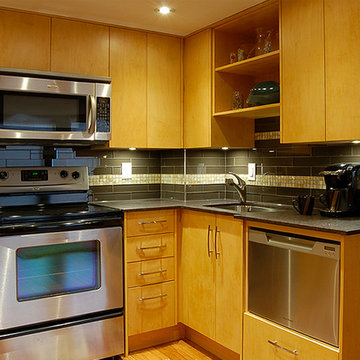
AFTER: Although the cabinet doors are plain, the light maple offers warmth and subtle interest. We deliberately kept the upper cabinets hardware-free to minimize clutter. Dark brown Caesarstone counters add contrast and drama. The backsplash of dark brown glass subway tiles, with an accent band of onyx mosaic, bridges the tones of wood and stone. And we have used every available inch for storage!
 Hyde Evans Design
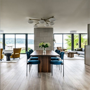
Open-concept dining room in a Lake Washington waterfront remodel by Hyde Evans Design, Seattle. A dramatic statement light fixture anchors the space above the dining table, compensating for the low ceilings with vertical presence. Deep blue upholstered chairs bring the clients' desired color into an otherwise neutral palette, and vintage mid-century end tables ground the room with warmth and character. The main level flows seamlessly between living, dining, and kitchen — a deliberate open-plan layout designed for both active family life and effortless entertaining. Photography: Andrew Giammarco. Architecture: CAST Architecture. Build: Align Builds. Interior Design: Hyde Evans Design, Seattle, WA.
 Century Stair Company
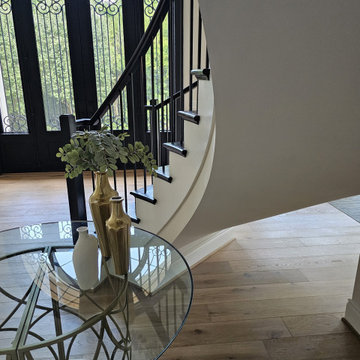
A single curve does a lot of work here. Rising from the main level to a wraparound balcony above, this staircase earns its place at the center of the home — not just structurally, but visually. Black iron balusters and handrails push against crisp white risers in a contrast that feels deliberate rather than decorative. The open floor plan gives it room to breathe, letting the curve read as architecture rather than furniture. The result is a staircase that creates movement even when no one is on it.
1976-2026 © Century Stair Company
 Klopf Architecture
Built for the Bluff, A Sea Ranch Home is Remade from the Inside Out
The house had always been grounded, on an ocean bluff at The Sea Ranch. It sits unencumbered, adjacent to one of the most dramatic stretches of the Sonoma coast with protected commons meadow to the east, uninterrupted Pacific views to the west, and a bluff trail running alongside. What it lacked was the feeling of home, one that could hold up its own against the natural landscape.
The owners are entrepreneurs with deep involvement across tech, real estate, and development and they know how things are built. The Sea Ranch house had been in their lives for years, a second residence and a place for family to gather. Built for a different time, it felt more compromising than comfortable. Sitting in a closed off nook, the kitchen fit one cook at a time and turned its back on the rest of the house. The entry was dim and compressed, divided by a structural column that presented itself at exactly the wrong moment. The primary suite was small relative to the view outside it. A large rear bedroom sat behind a lowered ceiling with a bathroom that had never been added. The house was certainly worth the trouble of doing it right.
What followed was not one project but four, each with its own design challenge, each addressed over a period of time.
Where the House Meets the Ocean
The most complex piece of the project, in both structural and spatial terms, was the kitchen expansion. The existing room was a single-person galley squeezed in as an afterthought with no meaningful connection to the dining room, the living space, or the deck outside. To make it useful for a family that cooks and gathers, it needed to grow outward into an existing patio and flow into the rooms around it.
A big challenge was the roofline. Several planes at different pitches and angles converged directly where additional volume was needed. A new form had to join that geometry without reading as a correction. The solution found the simplest possible connection between the existing angles, a roofline that from outside the structure, appears entirely original. From the bluff trail where the addition is visible, there is no discernible seam.
Inside, the kitchen is now open to the living and dining rooms without interruption. A large sliding glass door connects the space onto the rear deck. The deck itself was expanded and oriented so that the body of the house shields it from the coastal wind which is a common consideration that determines whether outdoor space at The Sea Ranch actually gets used. The result is a room that works for large family gatherings where no one feels cutoff, and one that makes the boundary between being inside and outside easy to ignore.
Welcoming Light
A structural column stood at the convergence of eight distinct roof planes in the entry. It was load-bearing, but it was also the reason the entry had always felt like a hallway rather than a welcoming arrival.
With the structural engineer, a custom steel connector was designed to receive beams from six separate directions, redistributing the load through a single new continuous beam. The column was surgically removed. Three triangular skylights were then cut into the roof above, their shapes drawn from the
existing geometry of the planes around them. The entry is now bright and open. The skylights feel native to the structure because they follow the logic already present in the roof.
Two Suites, Two Views
At opposite ends of the house, the two bedroom suites were each reconfigured, and each found a different way to introduce more of the landscape into the room.
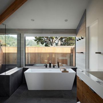
An addition to the primary suite extended the structure outward to create a wraparound plan with a loop from the bedroom through bath and closet that had not been possible before. The expansion opened a slot view from the tub and shower toward the ocean. The view is precise and private. The ocean view is present and deliberate.
The rear bedroom absorbed an adjacent storage room to transform it into a full second suite with a vaulted ceiling, a large bathroom with a tub, a shower, and a sauna. A private fenced garden courtyard sits just beyond the glass bringing the outdoors inside. The tub was placed so that, looking past the courtyard and through the bedroom beyond, the ocean is visible at the far end. It is a long view and it makes the room feel larger and more settled than its footprint would suggest.
Glass on Four Sides, Fire at the Center
The main living and gathering room had always been caught between two competing facts: glass on four sides meant exceptional views but at The Sea Ranch, it also meant a cold room. A 360-degree cylindrical fireplace was added at the center on a raised stone base, providing radiant heat in every direction and giving the room a focal point around which a group naturally orients itself, whether that means two people at the end of the day or the whole family after dinner.
Owners Who Picked Up the Tools
The owner was not a passive client. they came with construction knowledge, specific ideas, and the desire to be an active part of the process, a dynamic that other architects may had found difficult, which Klopf Architecture accepted as an asset. They took it upon themselves to complete some of the work during construction, including the installation of a new radiant heating system beneath the floors.
The radiant system added to the older and less-desirable forced-air setup. At The Sea Ranch, that change matters as the house sits close enough to the ocean and moving air competes with the sound of it, where radiant heat does not. Solar panels were added to the roof as part of the new system. Insulation was upgraded throughout the walls, roof, and crawl space. The house that had always had the right setting now holds warmth the way a house on the bluff should.
They were also deeply involved in the design and selections throughout, and the finished house reflects both of them in ways that are specific rather than generic. The process took longer and moved through more iterations than a more arms-length relationship might have allowed. The result is more defined and personal because of it.
The Landscape Holds Priority
Every exterior decision was shaped by The Sea Ranch Design Standards, which require that buildings defer to the landscape around them rather than compete with it. Because this house sits on the bluff and is visible from the public trail, the additions faced a close review. Existing materials were matched. Geometries were resolved. The additions had to become indistinguishable from the original building.
From the trail, the house reads exactly as it always has — low, cedar-clad, secondary to the meadow and the water. The setting holds priority. Inside, the house has been remade.
Klopf Architecture Project Team: Geoff Campen and Trenton Jewett
Contractor: Shawn Bettega Construction
Photography: ©2025 Mariko Reed
Year Completed: 2023
Location: The Sea Ranch, CA
 Leicht Westchester-Greenwich
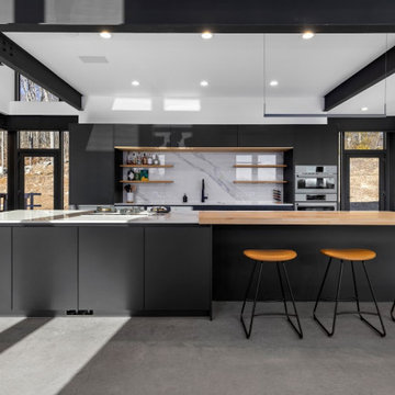
This trailblazing kitchen adds architectural beauty and structure to this newly built modern home surrounded by rural scenery in the Connecticut countryside. Distinctly and deliberately modern, the kitchen and cabinet design play a major role in the interior spatial composition. Skillful planning creates visual and functional zones that allow the stunning views through the large glass walls to abound.
Modern Minimalism
Beautifully balanced cabinets form the vast and open kitchen space, custom bar, and pantry room. Black Slate finished cabinets are combined with natural Alpine Wild Oak cabinets and white marble porcelain countertops and backsplash. This amazing space has a cool modern edge yet feels warm and comforting with its celebration of nature.
 Wendel Klein Builders, Inc.
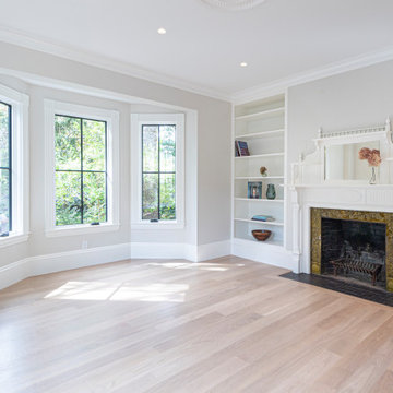
This expansive Cambridge residence was ready for a new chapter, and Wendel Klein Design Build was honored to lead the transformation. By meticulously remodeling both the interior and exterior, we struck a deliberate balance between modern functionality and historic charm. The result is a home that feels entirely current while honoring its original soul.
 Ward+Blake Architects
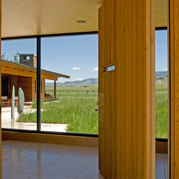
Located on a flat, open, grass-covered site amid wraparound views of the Teton and Gros Ventre ranges, the deliberately unobtrusive Tennican residence facilitates a clear dialogue between enclosed and natural space. Designed by Ward+Blake Architects in Jackson, Wyoming.
Photo Credit: Douglas Khan
 Ashley HomeStore
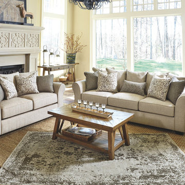
ROOTED IN CLASSIC STYLE. Warm and welcoming, these spaces reflect a well-traveled lifestyle. Rustic details and bohemian accents style each room.
Example of a living room design in Tampa
Example of a living room design in Tampa
 Klopf Architecture
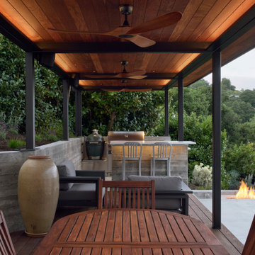
Set in a quiet neighborhood and framed by mature trees, this residence presented a unique opportunity: to thoughtfully evolve a custom mid-century modern home into a space that supports the everyday rhythms of a growing family. With a deep respect for the home’s original architecture, Klopf Architecture reimagined the house to better meet the needs of its owners—introducing functional improvements while preserving the spirit and character of its mid-century roots.
The clients approached Klopf Architecture with a clear vision: refresh their home while seamlessly integrating new programmatic elements. Key goals included clarifying and enhancing the entry sequence; connecting the detached garage to the main house with a practical yet architecturally intentional intervention; adding functional spaces such as a mudroom and laundry room; expanding and remodeling the primary suite’s bathroom and closet; and creating a more engaging outdoor space that capitalized on the site’s impressive views, featuring a fire pit and outdoor kitchen.
As a couple with distinct yet complementary perspectives—one focused on modern functionality and technology, and the other dedicated to preserving the home’s architectural integrity—their collaboration with Klopf Architecture resulted in a solution that harmonized both ideals. Their shared commitment to improving the livability of their home led to a design dialogue rooted in balance. This dynamic partnership shaped the direction of the renovation, ensuring that every decision honored the spirit of the original home while aligning with the practical needs of their growing family.
Designing within the constraints of the sloped site posed one of the project’s central challenges. The detached garage sat at a higher elevation than the main house, requiring a solution that ensured architectural and geometric compatibility between the two structures. Rather than create a purely utilitarian link, Klopf Architecture introduced an intentional connection that contributes to the overall architectural language. A notable pinch point in the plan—where differing geometries converged—was treated as a hinge point, turning a potentially awkward juncture into an architectural feature. This area now functions as both a transition and a moment of design interest that unifies the overall plan.
The design also addressed the underutilized outdoor area, which was located in a shadowed portion of the site with geometrical limitations. A new connection to the rear deck was created in this same area, making the outdoor space more useful and inviting. Klopf Architecture introduced carefully positioned openings and spatial improvements that forged a strong visual and functional connection between indoor and outdoor spaces. The outdoor area now reads as a deliberate extension of the home, embracing natural light and emphasizing the dramatic views.
Working through multiple design iterations, Klopf Architecture crafted a solution that preserved the architectural language of the original home while supporting the functional needs of modern life. The garage-to-house connection became more than a passage—it evolved into an architectural moment of transition. A new mudroom and laundry space enhanced convenience without compromising the clean lines of the design. The primary suite was expanded to create a private, serene retreat. The reimagined backyard, complete with fire pit and kitchen, now plays a vital role in the family’s daily routine and social life.
Outcomes and Lasting Impact
The result is a home that balances heritage with contemporary design, technical precision with design sensibility. The redesign not only met the clients’ initial goals but also exceeded expectations in its ability to seamlessly blend past and present, function and beauty, making the outdoor kitchen a favorite gathering place.
Beyond aesthetics, the renovation has significantly improved daily life for the family. The newly integrated garage connection has streamlined routines, providing a seamless transition between arriving home, storing belongings, and entering the main living spaces. The expanded primary suite offers a retreat-like atmosphere, creating a private space to unwind at the end of the day. The redesigned outdoor areas have also become an extension of their lifestyle—whether it's casual family dinners around the fire pit, entertaining friends in the outdoor kitchen, or simply enjoying the view from the reimagined backyard.
Through a thoughtful and strategic approach, the house has been successfully evolved into a home that remains true to its mid-century modern roots while enhancing livability, functionality, and the overall quality of life for the modern-day owners.
Klopf Architecture Team: Geoffrey Campen, Fernanda Bernardes
Architectural Interior Design: Klopf Architecture
Structural Engineer: Base Design Inc.
Contractor: Golden Snail Builders
Photography: Mariko Reed
Year Completed:2022
 Ward+Blake Architects
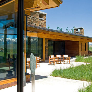
Located on a flat, open, grass-covered site amid wraparound views of the Teton and Gros Ventre ranges, the deliberately unobtrusive Tennican residence facilitates a clear dialogue between enclosed and natural space. Designed by Ward+Blake Architects in Jackson, Wyoming.
Photo Credit: Douglas Khan
 HAC Arquitectura
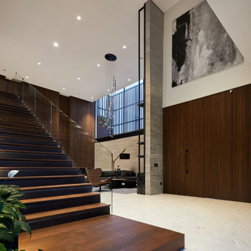
The unique design concept of A139 is rooted in the basic geometric idea of two interlocking rectangles. This distinctive feature, along with the incorporation of rectangular geometries into the natural environment, sets it apart. The deliberate placement of a few windows in the front enhances privacy, while the addition of wooded and water elements to the facade creates a sober and elegant aesthetic. The project maintains a common language in its materiality: apparent concrete, steel, and wood. The three materials are presented sincerely from the outside of the house and continue on a constant journey through the interior. A139 is adjacent to the spring forest, privileged in its geographical position. We considered that the project’s purpose was that from any point of the house, we would have panoramic views that would serve as ambiance for itself and thus generate “natural pictures.” Our design philosophy for A139 was to seamlessly integrate the forest into the house. To achieve this, we created interior courtyards and spaces, blurring the boundary between the exterior and the interior. This approach not only enhances the living experience but also fosters a harmonious relationship with the natural surroundings. The house’s program is characterized by its social areas on the first floor, which can be combined to generate larger spaces if necessary. On the first floor are four bedrooms, each with a dressing room, bathroom, and terraces overlooking the spring forest. Casa A139 speaks for itself and presents itself honestly, subtly setting the views and ample spaces in the hierarchy by the natural textures of the materials.
 Ridgewood Home Construction
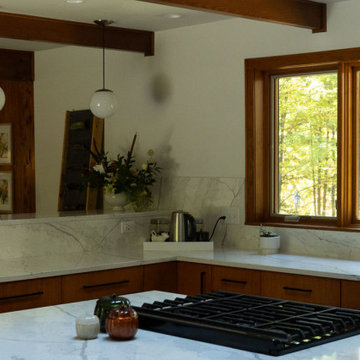
This mid-century modern Rockford home was updated in stages, and the kitchen needed a complete remodel. The homeowners desired a kitchen that felt current without breaking from the character that defined the rest of the house. That meant we needed to choose materials that fit the home and highlighted the home’s character.
Our team sourced pecky cypress and natural slate tile from non-traditional suppliers to get the exact look the home called for. The wood cabinetry was paired with a granite island, providing a gathering space in the kitchen without overpowering it. Because both materials required careful handling during installation, the crew worked more slowly and deliberately through this phase than a standard remodel. The result connected the kitchen directly to the living area, so the two spaces feel like one continuous room built in the same style as the rest of the home.
26