
Search results for "Deliberation" in Home Design Ideas
 Building Designers Association of Australia
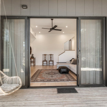
The knock down & rebuild revolution is here to stay. This new modern family home replaces a tired old house that was not designed to capitalise on its location, whereas this new contemporary modern building has been designed to capitalise on the natural environment – natural sunlight, sea breezes & sea views, to create a very liveable coastal family home. This new residence with its contemporary coastal styling utilises the natural finishes of modern materials to ground this family home’s context into this locations evolving executive seaside neighbourhood. This buildings design is a balance of form & function with a deliberate consideration of passive solar liveable design techniques, designed to capture the natural sunlight, sea breezes & sea views that this property offers. This new residence has been designed with a variety of indoor & outdoor living areas to capitalise on the natural environment & climate of this property’s location. This house incorporates design elements to allow the house to be comfortable all year round, providing a variety of areas for occupants to utilise, whether it be capturing natural sunlight & warmth in winter, creating cooling cross ventilation from sea breezes in summer & then there is the direct access to a beautifully natural landscaped garden, this new house will provide the occupants with a low maintenance, healthy living environment for years to come.
 Karv One Design
The Mid-Levels of Hong Kong Island is one of the most prominent luxury residential areas. This project - Estoril Court in Mid-Levels Central is one of the rare heritage mansions in Hong Kong with a "thousand-year lease," comprising a total of 240 units.
The young couple, with their two daughters, have settled here. For the wide experience husband, the most important aspect of a home is that it carries the "depth of love." His wife's preferences and the children's interests were frequently mentioned during this project. "I hope the design can break through conventions and avoid falling into the trap of popular but clichéd styles. Kyle and I resonate deeply on this point; we both pursue a 'more personal expression.' Family life should be relaxing, natural, and bringing joy to my family members."
This residence features a square layout and excellent natural lighting, with a practicality rate of nearly 90%. However, its over 40-year-old structure poses numerous constraints on renovations. Adhering to the existing structure and the wisdom of geomancy, Karv One Design has re-examined the relationship among the landscape, windows, and functional flow within the home. They have integrated practicality, beauty, and self-expression into every corner, enhancing the happiness of living.
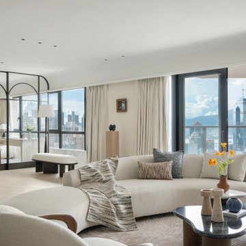
Once stepping into the living room, you are greeted by Hong Kong's most spectacular vistas. The ever-changing scenery of Victoria Harbour, both day and night, the immense skyscrapers of different banks and commercial buildings and the panoramic views of the Peak are all within sight. The expansive dimensions of the living room are a response to the surrounding environment, providing ample space for family bonding and companionship, while also allowing the breathtaking skyline views to seamlessly integrate into daily life.
Unlike traditional whole-house decoration, the design of Hong Kong homes emphasizes collage and customization. The minimalist aesthetic of the space corresponds to the luxurious craftsmanship and time costs involved. Elements such as natural stone, artistic paint, parquet flooring, wood veneer, and leather have all been meticulously coordinated in terms of color and proportion, while a significant amount of storage space has been cleverly concealed within the walls.
The study room is deliberately positioned to one side of the living room, embracing the gentle stretch of sunlight. The arched iron partition, exuding a vintage flavor and traces of time, not only serves as a natural divider of space but also becomes a highlight of the interior decoration with its unique artistic form, creating a serene yet stylish atmosphere. It ensures privacy without compromising on openness, allowing the home owner to work in the study room while still keeping an eye on the children playing in the living room.
Custom-made artisanal furniture offers a whole new expression of comfort and practicality to the space. The Giorgetti HUG armchair combines a sculptural sense of form with a flowing sense of shape. When natural light filters in, a rich artistic atmosphere permeates and grows within, making the home a place of tranquility and peace of mind.
The original open-plan layout of the master bedroom has been reconfigured and divided. The ultimate goal of the enclosed space is to provide comfort and ease of sleep. The pale green color is also carefully coordinated, focusing on creating a serene and pleasant atmosphere. The combination of "green," "wood," and "metal elements" is based on Feng Shui considerations, serving to stabilize and concentrate the energy flow.
The children's room is simple yet cozy, where sunlight awakens the space and transparent glass windows bring in the ocean view. The palette of pale blue and white adds warmth and vitality to the space, inspiring children's boundless imagination about the unknown world and giving them the courage to see mountains, seas, and the world beyond.
The moment when the door is open, the magic of lighting begins. What greets the eye is an elegant and tastefully designed artistic foyer. The pace of work in Hong Kong is fast and efficient, often causing people to overlook family time. Therefore, the entrance is adorned with a large area of gentle ivory white, featuring sculptural-like display stands and flowers and vignettes that can be arranged according to the owner's mood. As night falls, the panoramic view of the Victoria Harbour's night scene comes into view, elevating the enjoyment to the utmost.
The lighting system in the space brings more enjoyable experiences to "living as you desire." The smart system caters to various states of living scenarios at different times, as well as to the subtle needs of ambient temperature, brightness, and tactile atmosphere. Whether it's solo time or family moments, day or night, everyone has a comfortable place to be.
The "Estoril Court" project is a full-service case that last for 12 months. We had hundreds of communications and exchanges with the home owner, and continuously coordinated and collaborated with the property management, on-site construction and installation workers, manufacturers, and various suppliers, striving for perfection in craftsmanship and meticulous attention to detail in execution. Finally, seeing the satisfied expressions of the home owner and their family, we felt that it was an ideal conveyance.
 Gallery KBNY
In this Manhattan pied-à-terre renovation, Gallery tackled the entire apartment. A true full renovation, we updated the kitchen, master bathroom, and powder room, installed new flooring throughout the entire space, and built the entertainment center in the living room.
DESIGN DETAILS
The clients wanted their pied-à-terre to have some modern touches, but not too sleek or contemporary. Since it combines a number of styles and elements, transitional turned out to be their ideal aesthetic. Whites, grays, and earthy tones carried this color theme throughout the apartment.
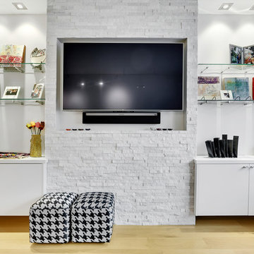
One of the clients is an artist and wanted wall space to display their original work, visible in the dining area and powder room in the photos below. The entertainment center is another highlight, with its white mosaic brick tile accent wall and glass open shelves to display family photos on both sides.
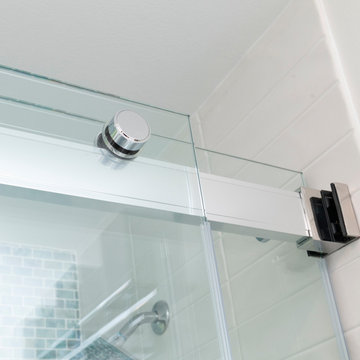
Instead of tiles, the new powder room walls received a textured concrete application, resulting in an almost industrial vibe. In the master bathroom renovation, glass mosaic tile accent walls bring a touch of personality to both the shower and a storage nook opposite the vanity.
UNIQUELY-SHAPED ROOMS
We specialize in adapting to every potential challenge, including uniquely-shaped rooms like the nearly-triangular kitchen in this Manhattan pied-à-terre renovation.
It’s important to design an uncommonly-shaped space as practically as possible, including specs seemingly as small as sink positioning. Every little detail counts tenfold in a room that’s not rectangular!
Other design details in the kitchen renovation include the classic combination of Shaker-style cabinets and quartz countertops, with a glass mosaic backsplash that matches the one used in the bathroom.
VISIBILITY = TRUST
Communication is always a core value at Gallery, but it’s even more vital when working with bi-coastal clients who were in another state throughout almost the entire process. We met with them once; everything else was done virtually thanks to JobTracker, our project management system.
The client had complete visibility into the renovation, including all design renderings, scheduled installations, and daily progress videos and photos. Even though they were 3000 miles away, they had a direct line to everyone on the team at all times.
SOME HIGHLIGHTS
- Entertainment center designed and built to serve as focal point, with white brick mosaic accent wall and open shelves made of glass
- Track lighting for ease of displaying art and to preserve ceiling height instead of the dropped ceiling that recessed lighting would necessitate
- Deliberate consideration of space in the unusually-shaped, nearly triangular kitchen
- Glass mosaic tile accent walls in the master bathroom with matching tile for the backsplash in the kitchen
Thinking about renovating your bathroom? Contact us today to find out how you can benefit from our expertise in remodeling New York City bathrooms. As a design-and-build firm with a full-scale approach, we handle every single aspect of your home renovation from start to finish.
Find the right local pro for your project
 Wendel Klein Builders, Inc.
This expansive Cambridge residence was ready for a new chapter, and Wendel Klein Design Build was honored to lead the transformation. By meticulously remodeling both the interior and exterior, we struck a deliberate balance between modern functionality and historic charm. The result is a home that feels entirely current while honoring its original soul.
 Curated Nest
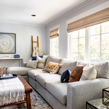
This project design was all about that zen, well-traveled lifestyle. We softened chunky, farmhouse furniture pieces with down-to-earth boho details and lots of layered textures. We stayed within an earthy color palette with hints of cool blue to keep it calming and added lots of soft, natural textures. We layered in lots of throw pillows to balance the masculine lines of the furniture. Most of the final elements we chose feature natural materials with hand-crafted details such as raw marble, iron, brass, glass, wood, wool, cotton, leather, grass, etc. We deliberately mixed metals to achieve that eclectic collected-over-time effect.

 Benjamin Berk
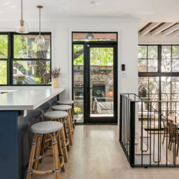
The kitchen sits one step above the breakfast nook — a deliberate multilevel strategy that creates distinct zones while keeping the house visually open from living room through kitchen through nook to backyard beyond. Navy cabinetry; custom wood range hood built from salvaged kitchen wall planks (not pictured); brass hardware.
 Leicht Westchester-Greenwich
Grounded Aesthetic
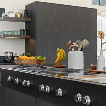
Modern clean lines juxtaposed with natural texture and materials, create a warm and inviting kitchen that feels casual and luxurious at the same time.
Leicht Minera Kiruna cabinets with natural wood and woven elements define the kitchen in this vast open space. Floating wood shelves highlight the functional items that add character and personality to the space.
The distinctive large island includes the prestigious Gaggenau gas & induction combination cooktops for the homeowners’ culinary and entertainment lifestyle.
Bold Neutrals
The deliberate kitchen palette of natural neutral colors is a nod to the Modern Rustic high style. Textured deep grays and black hues combined with an organic natural wood palette, evokes sophistication and warmth.
Neolith Nero Zimbabwe Riverwashed countertop and low backsplash with its deep rich color and rough texture adds to the curated mix. Minera Kiruna panels complete the backsplash composition with its natural metal vibe.
 Century Stair Company
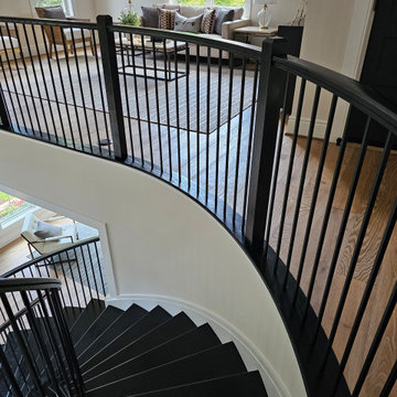
A single curve does a lot of work here. Rising from the main level to a wraparound balcony above, this staircase earns its place at the center of the home — not just structurally, but visually. Black iron balusters and handrails push against crisp white risers in a contrast that feels deliberate rather than decorative. The open floor plan gives it room to breathe, letting the curve read as architecture rather than furniture. The result is a staircase that creates movement even when no one is on it.
1976-2026 © Century Stair Company
 Century Stair Company
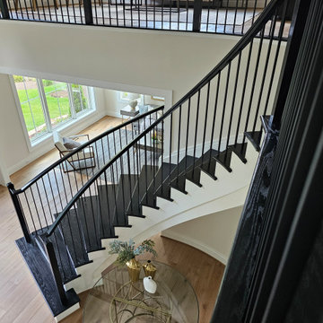
A single curve does a lot of work here. Rising from the main level to a wraparound balcony above, this staircase earns its place at the center of the home — not just structurally, but visually. Black iron balusters and handrails push against crisp white risers in a contrast that feels deliberate rather than decorative. The open floor plan gives it room to breathe, letting the curve read as architecture rather than furniture. The result is a staircase that creates movement even when no one is on it.
1976-2026 © Century Stair Company
 Wiltshire Garden & Interior Design
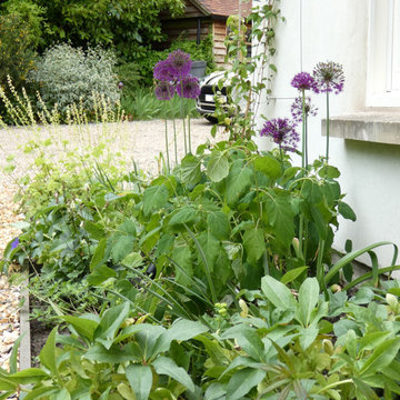
Borders were created around the entire house perimeter. The scheme was kept deliberately simple with bulbs for spring colour, easy care perennials to fill out quickly and a few key evergreens to provide structure. Climbers were also included to soften large areas of rendered wall.
 Century Stair Company
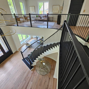
A single curve does a lot of work here. Rising from the main level to a wraparound balcony above, this staircase earns its place at the center of the home — not just structurally, but visually. Black iron balusters and handrails push against crisp white risers in a contrast that feels deliberate rather than decorative. The open floor plan gives it room to breathe, letting the curve read as architecture rather than furniture. The result is a staircase that creates movement even when no one is on it.
1976-2026 © Century Stair Company
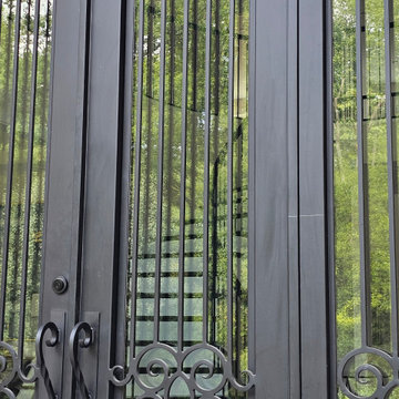 Century Stair Company
A single curve does a lot of work here. Rising from the main level to a wraparound balcony above, this staircase earns its place at the center of the home — not just structurally, but visually. Black iron balusters and handrails push against crisp white risers in a contrast that feels deliberate rather than decorative. The open floor plan gives it room to breathe, letting the curve read as architecture rather than furniture. The result is a staircase that creates movement even when no one is on it.
1976-2026 © Century Stair Company
 Jason Straw Woodworker
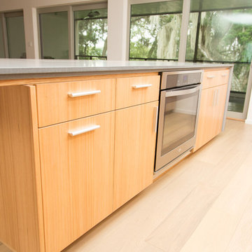
In collaboration with an excellent architect and a shop of craftsmen working with intent and deliberation, wonderful things happen. This is an example.
 Wendel Klein Builders, Inc.
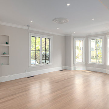
This expansive Cambridge residence was ready for a new chapter, and Wendel Klein Design Build was honored to lead the transformation. By meticulously remodeling both the interior and exterior, we struck a deliberate balance between modern functionality and historic charm. The result is a home that feels entirely current while honoring its original soul.
 George Ocampo
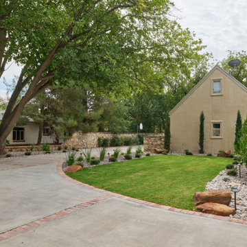
Upper Valley Estate Curb Appeal – El Paso, Texas
This curb appeal transformation was conceived as a deliberate sequence—an arrival experience where architecture, landscape, and lighting work together as one. Every element was designed to honor the home’s stone construction, turreted forms, and Old World character while responding precisely to the Upper Valley climate and lifestyle.
By day, the experience is grounded and composed. Brick-edged concrete drives establish order and permanence, guiding movement through the property with clarity and intention. Natural stone walls and columns anchor the architecture, while layered gravel beds, drought-tolerant plantings, and manicured turf soften transitions and connect the home to its desert setting. Mature trees were preserved and carefully integrated, providing scale, shade, and a sense of continuity.
As afternoon shifts toward sunset, the materials begin to speak differently. Stone warms, textures deepen, and sightlines subtly draw the eye toward the front entry. The landscape narrows the focus, creating a moment of pause before arrival—calm, quiet, and refined.
At night, the design reveals its final layer. Low-voltage lighting is integrated with precision, washing stone surfaces, tracing architectural curves, and uplighting specimen trees to create depth without glare. The drive, walkways, and entry feel safe, legible, and inviting, while the home itself glows with a restrained elegance. Coming home after dark feels intentional—protected, welcoming, and unmistakably yours.
What was created is more than curb appeal. It is a cohesive design-build solution where nothing is ornamental without purpose and nothing is built without intention. A daily experience of arrival that reflects craftsmanship, care, and the enduring character of the Upper Valley.
 FiveSTAR Landscape
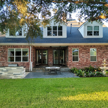
We recently finished this landscape design and installation project in the Tanglewood neighborhood of Houston, Texas. Our client, a Louisiana native who loves entertaining and wanted to stay connected to her NOLA roots, desired a space that could comfortably accommodate 30+ guests on a regular basis.
We deliberately designed the outdoor kitchen without a cover to preserve the view of the magnificent oak trees. Our aim was to create a kitchen that is both durable and visually appealing. The countertop is made of leathered granite, a material that can withstand the unpredictable Texas weather. All the appliances, including the grill, refrigerator, sink, and double side burner, were locally sourced and are made of stainless steel. Additionally, we utilized Austin limestone, which was quarried right here in Texas.
To infuse a touch of New Orleans charm into the backyard, we incorporated a fountain. The surrounding black star gravel was designed as a versatile space that can be used for additional dining, seating, or even as a meditation area.
To ensure privacy and shade as the plants mature, we strategically planted Eaglestone Holly and Japanese Yew along the fence line. Completing the landscape, we selected Amerishade grass for its excellent shade tolerance.
 Morningside Architects LLP
Architect: Morningside Architects, LLP
Contractor: Vick Construction & Remodeling, Inc
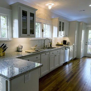
Example of a small transitional kitchen design in Houston
Example of a small transitional kitchen design in Houston

 Lindy Architect
This project was never really about the architecture. It was about a family that collects — art, ceramics, books, ideas — and needed a home that could hold all of that without turning into a museum.
The existing unit had good bones: generous ceiling heights, a floating stair, and enough square footage to work with. What it lacked was a coherent logic — a way of moving through the space that felt intentional, where each transition earned its moment.
We rebuilt that logic from the ground up.
The ground floor is organized around a single corridor that runs from the kitchen island through to the living room, with the staircase serving as the spine of the whole sequence. Rather than treating the stair as purely functional, we kept the glass balustrade open and lit the treads from below, so it reads as a light source as much as a passage. The console beneath it became a natural landing for ceramics and found objects — not styled, just placed.
In the living room, the brief was simple: make room for a very large painting without the room feeling like a gallery. The answer was to keep everything else quiet — a white built-in that does its job, sheer linen curtains that diffuse the light, black leather chairs that anchor the space without competing. The painting does the rest.
Upstairs, the landing is lit by a skylight that washes the hallway in natural light through most of the day. We lined one side with a burl wood console and let the ceramics and framed works speak for themselves. The mix of abstract prints, a bold red canvas, and handmade vessels gives the corridor a rhythm that feels accumulated over time rather than installed all at once — because it was.
Throughout, the material palette is deliberately restrained: white oak floors, white walls, white millwork. The restraint isn't minimalism for its own sake — it's a backdrop. The owners bring the color, texture, and personality. Our job was to give them the right walls to hang things on.
 Wendy Glaister Interiors
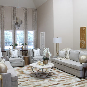
The verticality of this room was deliberately enhanced with repeating vertical lines: floor to ceiling drapery with waves of subtle sequins and embroidery, the floor lamp, and the bamboo triptych work in concert to create a lofty feeling.
This beautiful room began with great bones and was inspired by the lucite chandelier...a gift from the client's grandmother. Color cues and graphic inspiration from the fixture informed the hide rug selection, embroidered and sequined linen drapery and lucite drapery rod, and the geometric Palecek fossil shell coffee table
27