
Search results for "Deliberation" in Home Design Ideas
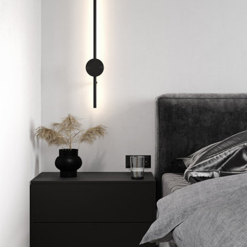
 Eugene Pintail LLC
Demeter Apartment is an exploration of refined minimalism with a subtle eclectic edge. The design focuses on clarity and balance, creating a space that feels calm, deliberate, and highly livable.
Clean architectural lines and a restrained palette set the foundation, while carefully chosen accents add individuality without overwhelming the sense of order. Every detail—from the flow of light to the textures of surfaces—was designed with precision, giving the interior a timeless, intelligent character.
This project proves that minimalism doesn’t have to feel cold: it can be warm, layered, and deeply personal when executed with discipline and vision.
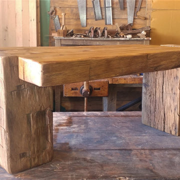
 Paul's Green Barn
Two sections of hand hewn white oak barn beam — shaped by adze in the late 19th or early 20th century, the tool marks clearly visible on every face — support a thick oak plank top from the same material source.
The adze marks are not decorative. They are the record of a specific person doing specific work at a specific moment in American agricultural history. This material exists in finite and diminishing supply as the barns that held it continue to come down.
The form is deliberately restrained. Nothing competes with the material. Proportions were determined by the beams themselves — their weight, their scale, their presence — rather than imposed from outside.
Functions equally as a coffee table, entry bench, or display surface. Significant as furniture and as object.
Available for commission as hand hewn beam material is sourced. Each piece differs because the material differs.
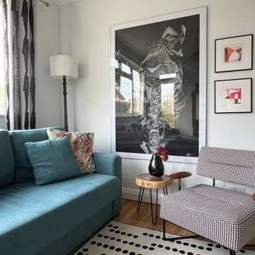
 DYR Studio by Alex Blidarus
A secondary living space designed around one bold decision: a large-scale pastel and charcoal work on paper as the room's architectural anchor. The scale is deliberate - this isn't art that decorates the room, it's art that defines one.
Everything else responds to it: the graphic black and white curtains, the houndstooth QT chair, the dotted rug that keeps the floor from competing. Collected, not matched. Considered, not coordinated.
This is the DYR Studio approach - find the one thing the room wants to say, then let every other element support it.
Find the right local pro for your project
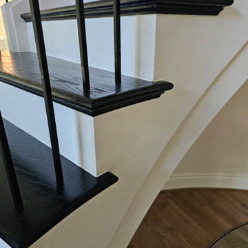
 Century Stair Company
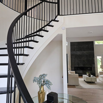
A single curve does a lot of work here. Rising from the main level to a wraparound balcony above, this staircase earns its place at the center of the home — not just structurally, but visually. Black iron balusters and handrails push against crisp white risers in a contrast that feels deliberate rather than decorative. The open floor plan gives it room to breathe, letting the curve read as architecture rather than furniture. The result is a staircase that creates movement even when no one is on it.
1976-2026 © Century Stair Company
 Century Stair Company
A single curve does a lot of work here. Rising from the main level to a wraparound balcony above, this staircase earns its place at the center of the home — not just structurally, but visually. Black iron balusters and handrails push against crisp white risers in a contrast that feels deliberate rather than decorative. The open floor plan gives it room to breathe, letting the curve read as architecture rather than furniture. The result is a staircase that creates movement even when no one is on it.
1976-2026 © Century Stair Company
 LeichtUSA
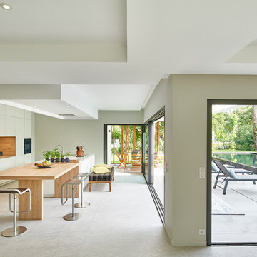
Insights, vistas, perspectives. This private house in France
can be divided into two clear architectural axes – inside
and outside – fusing seamlessly together. Large window
frontages as well as entrance and pool areas separated
by solid wood struts play with light and shadow, now revealing
now concealing. The modern building exudes a
friendly, welcoming atmosphere while creating a harmonious
the interplay of intimate homeliness and prestigious
openness.
The clear lines, handle-less fronts, and soft color scheme in the kitchen are very appealing. Everything revolves around the central island unit, which connects the functional area with sink and hob to an adjoining wooden table. As the very
heart of the design, the cooking and dining island is deliberately reduced to essentials. Continuing the color concept and playing with the natural warmth of Highland oak and a light, softly matt frosty white, the large yet minimalist unit run with an integrated sideboard is a perfect fit.
 Key Associates
Designers: Key Associates
Photography: Max Cooper
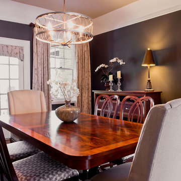
Example of a mid-sized classic medium tone wood floor enclosed dining room design in Other with gray walls and no fireplace
Example of a mid-sized classic medium tone wood floor enclosed dining room design in Other with gray walls and no fireplace
 Klopf Architecture
Built for the Bluff, A Sea Ranch Home is Remade from the Inside Out
The house had always been grounded, on an ocean bluff at The Sea Ranch. It sits unencumbered, adjacent to one of the most dramatic stretches of the Sonoma coast with protected commons meadow to the east, uninterrupted Pacific views to the west, and a bluff trail running alongside. What it lacked was the feeling of home, one that could hold up its own against the natural landscape.
The owners are entrepreneurs with deep involvement across tech, real estate, and development and they know how things are built. The Sea Ranch house had been in their lives for years, a second residence and a place for family to gather. Built for a different time, it felt more compromising than comfortable. Sitting in a closed off nook, the kitchen fit one cook at a time and turned its back on the rest of the house. The entry was dim and compressed, divided by a structural column that presented itself at exactly the wrong moment. The primary suite was small relative to the view outside it. A large rear bedroom sat behind a lowered ceiling with a bathroom that had never been added. The house was certainly worth the trouble of doing it right.
What followed was not one project but four, each with its own design challenge, each addressed over a period of time.
Where the House Meets the Ocean
The most complex piece of the project, in both structural and spatial terms, was the kitchen expansion. The existing room was a single-person galley squeezed in as an afterthought with no meaningful connection to the dining room, the living space, or the deck outside. To make it useful for a family that cooks and gathers, it needed to grow outward into an existing patio and flow into the rooms around it.
A big challenge was the roofline. Several planes at different pitches and angles converged directly where additional volume was needed. A new form had to join that geometry without reading as a correction. The solution found the simplest possible connection between the existing angles, a roofline that from outside the structure, appears entirely original. From the bluff trail where the addition is visible, there is no discernible seam.
Inside, the kitchen is now open to the living and dining rooms without interruption. A large sliding glass door connects the space onto the rear deck. The deck itself was expanded and oriented so that the body of the house shields it from the coastal wind which is a common consideration that determines whether outdoor space at The Sea Ranch actually gets used. The result is a room that works for large family gatherings where no one feels cutoff, and one that makes the boundary between being inside and outside easy to ignore.
Welcoming Light
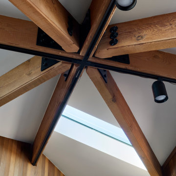
A structural column stood at the convergence of eight distinct roof planes in the entry. It was load-bearing, but it was also the reason the entry had always felt like a hallway rather than a welcoming arrival.
With the structural engineer, a custom steel connector was designed to receive beams from six separate directions, redistributing the load through a single new continuous beam. The column was surgically removed. Three triangular skylights were then cut into the roof above, their shapes drawn from the
existing geometry of the planes around them. The entry is now bright and open. The skylights feel native to the structure because they follow the logic already present in the roof.
Two Suites, Two Views
At opposite ends of the house, the two bedroom suites were each reconfigured, and each found a different way to introduce more of the landscape into the room.
An addition to the primary suite extended the structure outward to create a wraparound plan with a loop from the bedroom through bath and closet that had not been possible before. The expansion opened a slot view from the tub and shower toward the ocean. The view is precise and private. The ocean view is present and deliberate.
The rear bedroom absorbed an adjacent storage room to transform it into a full second suite with a vaulted ceiling, a large bathroom with a tub, a shower, and a sauna. A private fenced garden courtyard sits just beyond the glass bringing the outdoors inside. The tub was placed so that, looking past the courtyard and through the bedroom beyond, the ocean is visible at the far end. It is a long view and it makes the room feel larger and more settled than its footprint would suggest.
Glass on Four Sides, Fire at the Center
The main living and gathering room had always been caught between two competing facts: glass on four sides meant exceptional views but at The Sea Ranch, it also meant a cold room. A 360-degree cylindrical fireplace was added at the center on a raised stone base, providing radiant heat in every direction and giving the room a focal point around which a group naturally orients itself, whether that means two people at the end of the day or the whole family after dinner.
Owners Who Picked Up the Tools
The owner was not a passive client. they came with construction knowledge, specific ideas, and the desire to be an active part of the process, a dynamic that other architects may had found difficult, which Klopf Architecture accepted as an asset. They took it upon themselves to complete some of the work during construction, including the installation of a new radiant heating system beneath the floors.
The radiant system added to the older and less-desirable forced-air setup. At The Sea Ranch, that change matters as the house sits close enough to the ocean and moving air competes with the sound of it, where radiant heat does not. Solar panels were added to the roof as part of the new system. Insulation was upgraded throughout the walls, roof, and crawl space. The house that had always had the right setting now holds warmth the way a house on the bluff should.
They were also deeply involved in the design and selections throughout, and the finished house reflects both of them in ways that are specific rather than generic. The process took longer and moved through more iterations than a more arms-length relationship might have allowed. The result is more defined and personal because of it.
The Landscape Holds Priority
Every exterior decision was shaped by The Sea Ranch Design Standards, which require that buildings defer to the landscape around them rather than compete with it. Because this house sits on the bluff and is visible from the public trail, the additions faced a close review. Existing materials were matched. Geometries were resolved. The additions had to become indistinguishable from the original building.
From the trail, the house reads exactly as it always has — low, cedar-clad, secondary to the meadow and the water. The setting holds priority. Inside, the house has been remade.
Klopf Architecture Project Team: Geoff Campen and Trenton Jewett
Contractor: Shawn Bettega Construction
Photography: ©2025 Mariko Reed
Year Completed: 2023
Location: The Sea Ranch, CA
 George Ocampo
Upper Valley Estate Curb Appeal – El Paso, Texas
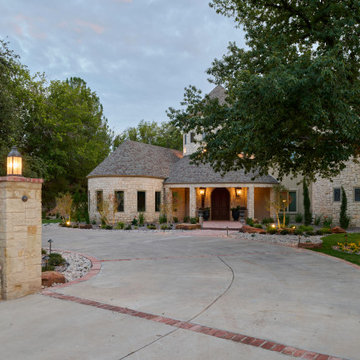
This curb appeal transformation was conceived as a deliberate sequence—an arrival experience where architecture, landscape, and lighting work together as one. Every element was designed to honor the home’s stone construction, turreted forms, and Old World character while responding precisely to the Upper Valley climate and lifestyle.
By day, the experience is grounded and composed. Brick-edged concrete drives establish order and permanence, guiding movement through the property with clarity and intention. Natural stone walls and columns anchor the architecture, while layered gravel beds, drought-tolerant plantings, and manicured turf soften transitions and connect the home to its desert setting. Mature trees were preserved and carefully integrated, providing scale, shade, and a sense of continuity.
As afternoon shifts toward sunset, the materials begin to speak differently. Stone warms, textures deepen, and sightlines subtly draw the eye toward the front entry. The landscape narrows the focus, creating a moment of pause before arrival—calm, quiet, and refined.
At night, the design reveals its final layer. Low-voltage lighting is integrated with precision, washing stone surfaces, tracing architectural curves, and uplighting specimen trees to create depth without glare. The drive, walkways, and entry feel safe, legible, and inviting, while the home itself glows with a restrained elegance. Coming home after dark feels intentional—protected, welcoming, and unmistakably yours.
What was created is more than curb appeal. It is a cohesive design-build solution where nothing is ornamental without purpose and nothing is built without intention. A daily experience of arrival that reflects craftsmanship, care, and the enduring character of the Upper Valley.
 Refresh Renovations Auckland West
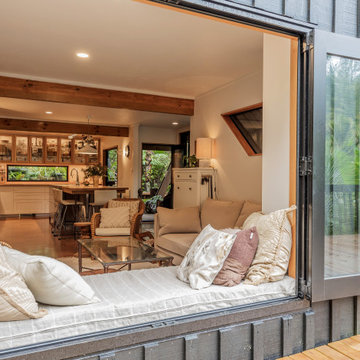
It takes a special kind of client to embrace the eclectic design style. Eclecticism is an approach to design that combines elements from various periods, styles, and sources. It involves the deliberate mixing and matching of different aesthetics to create a unique and visually interesting space. Eclectic design celebrates the diversity of influences and allows for the expression of personal taste and creativity.
The client a window dresser in her former life her own bold ideas right from the start, like the wallpaper for the kitchen splashback.
The kitchen used to be in what is now the sitting area and was moved into the former dining space. Creating a large Kitchen with a large bench style table coming off it combines the spaces and allowed for steel tube elements in combination with stainless and timber benchtops. Combining materials adds depth and visual interest. The playful and unexpected elements like the elephant wallpaper in the kitchen create a lively and engaging environment.
The swapping of the spaces created an open layout with seamless integration to the adjacent living area. The prominent focal point of this kitchen is the island.
All the spaces allowed the client the freedom to experiment and showcase her personal style.
 Ridgewood Home Construction
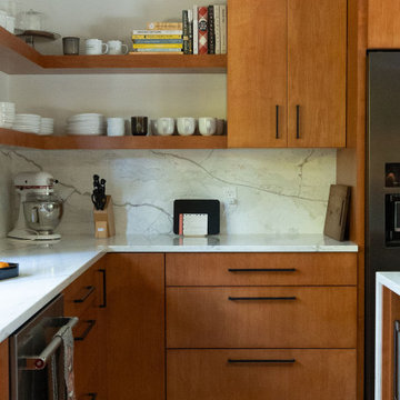
This mid-century modern Rockford home was updated in stages, and the kitchen needed a complete remodel. The homeowners desired a kitchen that felt current without breaking from the character that defined the rest of the house. That meant we needed to choose materials that fit the home and highlighted the home’s character.
Our team sourced pecky cypress and natural slate tile from non-traditional suppliers to get the exact look the home called for. The wood cabinetry was paired with a granite island, providing a gathering space in the kitchen without overpowering it. Because both materials required careful handling during installation, the crew worked more slowly and deliberately through this phase than a standard remodel. The result connected the kitchen directly to the living area, so the two spaces feel like one continuous room built in the same style as the rest of the home.
 Century Stair Company
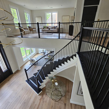
A single curve does a lot of work here. Rising from the main level to a wraparound balcony above, this staircase earns its place at the center of the home — not just structurally, but visually. Black iron balusters and handrails push against crisp white risers in a contrast that feels deliberate rather than decorative. The open floor plan gives it room to breathe, letting the curve read as architecture rather than furniture. The result is a staircase that creates movement even when no one is on it.
1976-2026 © Century Stair Company
 Amanda Martocchio Architecture
Photo credit Jane Beiles
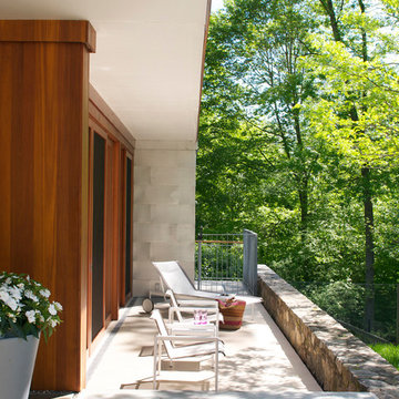
Located on a beautiful property with a legacy of architectural and landscape innovation, this guest house was originally designed by the offices of Eliot Noyes and Alan Goldberg. Due to its age and expanded use as an in-law dwelling for extended stays, the 1200 sf structure required a renovation and small addition. While one objective was to make the structure function independently of the main house with its own access road, garage, and entrance, another objective was to knit the guest house into the architectural fabric of the property. New window openings deliberately frame landscape and architectural elements on the site, while exterior finishes borrow from that of the main house (cedar, zinc, field stone) bringing unity to the family compound. Inside, the use of lighter materials gives the simple, efficient spaces airiness.
A challenge was to find an interior design vocabulary which is both simple and clean, but not cold or uninteresting. A combination of rough slate, white washed oak, and high gloss lacquer cabinets provide interest and texture, but with their minimal detailing create a sense of calm.
 SM Design
Bridle Path Residence — Primary Bedroom Suite
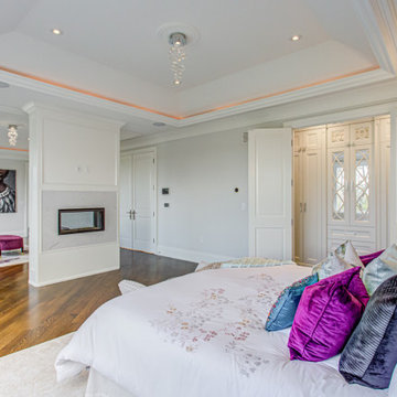
This Bridle Path Residence primary bedroom is designed as a quietly luxurious private retreat, balancing the architectural formality of the home with a softer, more intimate residential atmosphere. The space demonstrates how classical detailing can be paired with expressive colour, layered textiles, and contemporary lighting to create a bedroom that feels both elegant and personal.
The architecture establishes a calm, cohesive backdrop. Crisp white wall panelling, substantial crown moulding, and a carefully detailed recessed ceiling create a sense of proportion and permanence. Rather than competing with the furnishings, these architectural elements provide a restrained framework that allows texture, colour, and light to become the defining layers.
A custom fireplace creates an architectural focal point within the bedroom. Its clean, linear treatment is deliberately understated, allowing the fire itself to introduce warmth and atmosphere without overwhelming the room. The fireplace also visually connects the bedroom to the adjoining sitting area, creating a sense of continuity across the suite.
The recessed ceiling is an important design feature. Layered moulding frames the central ceiling plane, while concealed perimeter lighting creates a soft architectural glow. This indirect illumination gives the room a warmer evening character and highlights the geometry of the ceiling without relying solely on decorative fixtures.
The upholstered bed provides a substantial yet comfortable centrepiece. Its tall, softly rounded headboard introduces a tactile quality against the crisp architectural envelope, while the layered bedding and collection of jewel-toned cushions bring personality into the otherwise neutral setting.
Colour is used selectively but confidently. Deep fuchsia, sapphire blue, plum, and charcoal accents create a sophisticated jewel-tone palette that contrasts with the white architecture and pale textiles. These richer colours make the room feel curated and expressive while maintaining an overall sense of serenity.
The adjoining sitting area extends the bedroom beyond its sleeping function. A pair of sculptural upholstered chairs and a richly coloured ottoman create a small private lounge, allowing the suite to function as a complete retreat rather than simply a bedroom. Artwork introduces another layer of personality and creates a visual transition between the two spaces.
The hardwood flooring provides warmth and continuity, grounding the predominantly light palette and connecting the bedroom with the rest of the residence. The combination of wood, upholstered surfaces, reflective accents, architectural millwork, and soft lighting creates a carefully balanced sensory experience.
Overall, the design is an expression of refined residential luxury with a more personal and intimate character. Classical millwork establishes timelessness, while jewel-toned textiles, sculptural furnishings, contemporary lighting, and curated artwork prevent the room from feeling overly traditional. The result is a sophisticated primary suite designed for comfort, privacy, and understated glamour.
 Lindy Architect
This project was never really about the architecture. It was about a family that collects — art, ceramics, books, ideas — and needed a home that could hold all of that without turning into a museum.
The existing unit had good bones: generous ceiling heights, a floating stair, and enough square footage to work with. What it lacked was a coherent logic — a way of moving through the space that felt intentional, where each transition earned its moment.
We rebuilt that logic from the ground up.
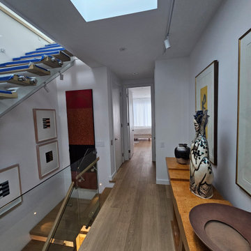
The ground floor is organized around a single corridor that runs from the kitchen island through to the living room, with the staircase serving as the spine of the whole sequence. Rather than treating the stair as purely functional, we kept the glass balustrade open and lit the treads from below, so it reads as a light source as much as a passage. The console beneath it became a natural landing for ceramics and found objects — not styled, just placed.
In the living room, the brief was simple: make room for a very large painting without the room feeling like a gallery. The answer was to keep everything else quiet — a white built-in that does its job, sheer linen curtains that diffuse the light, black leather chairs that anchor the space without competing. The painting does the rest.
Upstairs, the landing is lit by a skylight that washes the hallway in natural light through most of the day. We lined one side with a burl wood console and let the ceramics and framed works speak for themselves. The mix of abstract prints, a bold red canvas, and handmade vessels gives the corridor a rhythm that feels accumulated over time rather than installed all at once — because it was.
Throughout, the material palette is deliberately restrained: white oak floors, white walls, white millwork. The restraint isn't minimalism for its own sake — it's a backdrop. The owners bring the color, texture, and personality. Our job was to give them the right walls to hang things on.
 Wolfgang Pichler Design Inc.
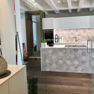
A vacant, worn office space should be transformed into a show apartment / showroom. The existing space had been used as an office structure since the 1960s. Located on the 4th floor of a ten-floor reinforced concrete skeleton, the area is already high enough to receive a great amount of light, which is particularly noticeable at dawn and dusk: sunrises and sunsets conjure up the most spellbinding blends of light.
The existing structure and also the technical equipment were completely outdated and needed to be completely rebuilt: suspended ceilings were removed and walls changed. The result is a modern city apartment of almost 100 m2 (about 1,070 sqft) – divided into a large living space, 2 rooms, 1 bathroom, 1 powder room and 1 utility room. The existing window facades could not be changed, but they are part of the concept anyway, namely to bring as much light as possible into the room. A controlled ventilation system ensures optimal air quality even with closed windows. The central kitchen element serves as a kind of separation of the living area and the dining area. Here customers and guests are served, people communicate, cook together, drink a glass of wine. Clients experience living.
The rough reinforced concrete ribbed slaps were uncovered and painted white to give the room more height, which is accentuated by the lighting concept with ceiling-mounted spotlights. The dark oak floor creates a successful contrast to the brightly designed rooms. The wittily positioned pedestal areas hide all technical elements, such as the supply air openings of the living room ventilation. Flush-fitting door elements in the walls with a chalked brick look show in detail the special feature of the room. The central wall elements were deliberately not pulled up to the ceiling, but are separated by a glass element to show the continuity of the construction.
Most of the furniture was designed by Wolfgang Pichler. Within the course of this project he was able to implement his holistic approach in the field of construction technology, architecture and furniture design and skillfully combine it with design classics. Scandinavian classics can be found in the concept just as much as pieces he collected during his career and furniture he developed for the company VITEO, which he founded in 2002. The project illustrates the added value of an architectural holistic approach.
 George Ocampo
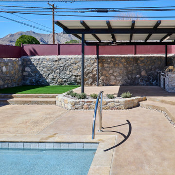
Central El Paso Backyard Renovation:
Fifteen years is a long time for a backyard to quietly wait.
At first, it was full of intention—a pool that promised summers, laughter, and long evenings. But time has a way of settling in. The water turned still, then green. Edges cracked. The space became less of a destination and more of something you looked past. Life moved forward, but the backyard stayed behind.
Then came the decision: it was time.
Not a patch job. Not a quick fix. A complete reset.
The transformation didn’t begin beautifully—it began with demolition. The old pool was drained, exposing years of neglect etched into its surface. Crews stepped in, breaking, clearing, reshaping. What once held stagnant water became an open cavity of possibility. Steel rebar formed a new skeleton, precise and intentional. Every line measured. Every elevation reconsidered.
This wasn’t just construction—it was rethinking how the space should live.
The shell was rebuilt. Surfaces were refined. Plumbing, structure, and flow were corrected at their core. What had once been outdated and failing was now engineered to last.
Then the shift happened.
Hardscape came in—clean, warm-toned concrete replacing worn decking. Stone walls, once just boundaries, were elevated into features. Subtle textures, intentional lines. A visual language that matched the architecture of the home instead of competing with it.
The pool returned—but not as it was.
Now it was sharp, modern, and inviting. A long, clean body of water with a shallow tanning ledge that catches the sun just right. Stainless steel scuppers arc water into the pool—movement, sound, life. Steps are crisp, geometry is balanced, and the water reflects clarity instead of neglect.
Around it, the yard found purpose.
Artificial turf introduced contrast—green, controlled, low-maintenance. A pergola structure rose in the corner, creating a destination within the destination. Beneath it, a built-in outdoor kitchen turned the backyard into a place to gather, not just pass through. Lighting stitched everything together, making the space just as alive at dusk as it is under the midday sun.
By the end, nothing felt accidental.
What was once forgotten is now deliberate. What was once avoided is now the center of attention.
Fifteen years later, the backyard didn’t just come back—it finally became what it was always supposed to be.
 George Ocampo
Upper Valley Estate Curb Appeal – El Paso, Texas
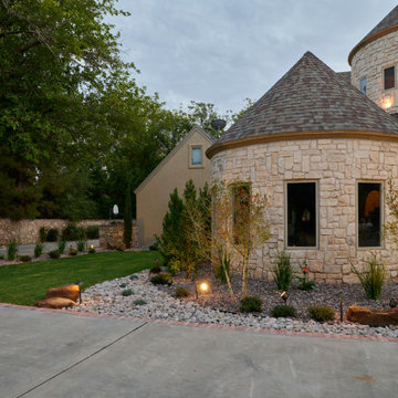
This curb appeal transformation was conceived as a deliberate sequence—an arrival experience where architecture, landscape, and lighting work together as one. Every element was designed to honor the home’s stone construction, turreted forms, and Old World character while responding precisely to the Upper Valley climate and lifestyle.
By day, the experience is grounded and composed. Brick-edged concrete drives establish order and permanence, guiding movement through the property with clarity and intention. Natural stone walls and columns anchor the architecture, while layered gravel beds, drought-tolerant plantings, and manicured turf soften transitions and connect the home to its desert setting. Mature trees were preserved and carefully integrated, providing scale, shade, and a sense of continuity.
As afternoon shifts toward sunset, the materials begin to speak differently. Stone warms, textures deepen, and sightlines subtly draw the eye toward the front entry. The landscape narrows the focus, creating a moment of pause before arrival—calm, quiet, and refined.
At night, the design reveals its final layer. Low-voltage lighting is integrated with precision, washing stone surfaces, tracing architectural curves, and uplighting specimen trees to create depth without glare. The drive, walkways, and entry feel safe, legible, and inviting, while the home itself glows with a restrained elegance. Coming home after dark feels intentional—protected, welcoming, and unmistakably yours.
What was created is more than curb appeal. It is a cohesive design-build solution where nothing is ornamental without purpose and nothing is built without intention. A daily experience of arrival that reflects craftsmanship, care, and the enduring character of the Upper Valley.
 Jason Straw Woodworker
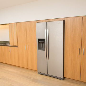
In collaboration with an excellent architect and a shop of craftsmen working with intent and deliberation, wonderful things happen. This is an example.
 Century Stair Company
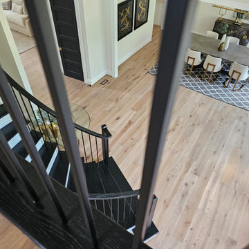
A single curve does a lot of work here. Rising from the main level to a wraparound balcony above, this staircase earns its place at the center of the home — not just structurally, but visually. Black iron balusters and handrails push against crisp white risers in a contrast that feels deliberate rather than decorative. The open floor plan gives it room to breathe, letting the curve read as architecture rather than furniture. The result is a staircase that creates movement even when no one is on it.
1976-2026 © Century Stair Company
28