
Search results for "Deliberation" in Home Design Ideas
 Georgia Zikas Design
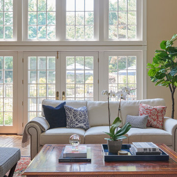
Youthful tradition for a bustling young family. Refined and elegant, deliberate and thoughtful — with outdoor living fun.
Living room - transitional medium tone wood floor and brown floor living room idea in Other with beige walls
Living room - transitional medium tone wood floor and brown floor living room idea in Other with beige walls
 Harmony Design Northwest
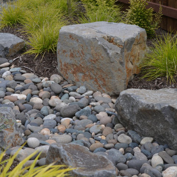
Transforming the blank canvas of a basic builder’s backyard into a captivating retreat, we turned a grass-dominated space into an effortlessly elegant low-maintenance haven with a distinct Asian flair. At the heart of this metamorphosis is the expanded patio and walkway, featuring offset architectural pavers that not only captivate the eye but also contribute to a dynamic sense of flow throughout the elongated backyard.
A key focal point is the thoughtfully designed rain garden, adorned with strategically placed boulders that manages stormwater runoff in an aesthetically pleasing way.
The carefully curated plant palette plays a pivotal role in achieving the desired aesthetic. The deliberate choice of low grasses and foliage-forward perennials, coupled with the inclusion of small evergreen plants and vibrant Japanese maples, creates a harmonious blend of colors, shapes, and sizes. This contrasting arrangement not only ensures visual interest year-round but also infuses the space with a timeless allure inspired by Asian design principles.
The result is a backyard oasis that transcends the ordinary, offering a serene escape with minimal upkeep requirements. The strategic combination of hardscape elements, lush greenery, and carefully selected plants transforms this space into a sanctuary where the beauty of nature meets the sophistication of thoughtful design.
 Arcturus, LLC
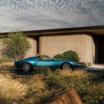
Set low and horizontal against the landscape, the residence reveals itself gradually along the approach. Curved walls and planted edges soften the architecture’s presence, while the restrained palette and continuous roofline emphasize calm, proportion, and a deliberate relationship to the ground. Arrival becomes a moment of quiet transition rather than declaration.
Find the right local pro for your project
 Wolfgang Pichler Design Inc.
A vacant, worn office space should be transformed into a show apartment / showroom. The existing space had been used as an office structure since the 1960s. Located on the 4th floor of a ten-floor reinforced concrete skeleton, the area is already high enough to receive a great amount of light, which is particularly noticeable at dawn and dusk: sunrises and sunsets conjure up the most spellbinding blends of light.
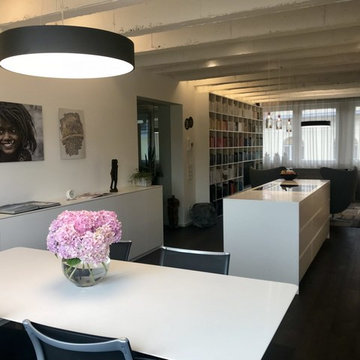
The existing structure and also the technical equipment were completely outdated and needed to be completely rebuilt: suspended ceilings were removed and walls changed. The result is a modern city apartment of almost 100 m2 (about 1,070 sqft) – divided into a large living space, 2 rooms, 1 bathroom, 1 powder room and 1 utility room. The existing window facades could not be changed, but they are part of the concept anyway, namely to bring as much light as possible into the room. A controlled ventilation system ensures optimal air quality even with closed windows. The central kitchen element serves as a kind of separation of the living area and the dining area. Here customers and guests are served, people communicate, cook together, drink a glass of wine. Clients experience living.
The rough reinforced concrete ribbed slaps were uncovered and painted white to give the room more height, which is accentuated by the lighting concept with ceiling-mounted spotlights. The dark oak floor creates a successful contrast to the brightly designed rooms. The wittily positioned pedestal areas hide all technical elements, such as the supply air openings of the living room ventilation. Flush-fitting door elements in the walls with a chalked brick look show in detail the special feature of the room. The central wall elements were deliberately not pulled up to the ceiling, but are separated by a glass element to show the continuity of the construction.
Most of the furniture was designed by Wolfgang Pichler. Within the course of this project he was able to implement his holistic approach in the field of construction technology, architecture and furniture design and skillfully combine it with design classics. Scandinavian classics can be found in the concept just as much as pieces he collected during his career and furniture he developed for the company VITEO, which he founded in 2002. The project illustrates the added value of an architectural holistic approach.
 Otani Ninja Deterrent™
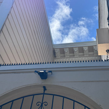
Set within a low-traffic residential street, this apartment building carries classical mouldings, an arched portal, and weathered siding. The client sought to reinforce entry security without disrupting the historic character. We specified a wrought-iron gate for ornamental softness and installed a Ninja Deterrent™ spike line above the arch—low-profile yet highly effective in deterring balcony access.
The Ninja Deterrent™ profile adds a crisp linear accent that complements both the scrollwork of the gate and the classical cornice above. Finished in matte black, the spike line reads as a deliberate architectural detail rather than an afterthought.
Behind the gate, a stair leads to the upper units. The open sky well ensures daylight penetration, while a compact floodlight secures visibility after dusk. The Ninja Deterrent™ spike line secures the intermediate landing without obstructing the view.
 Murphy Bros. Design | Build | Remodel
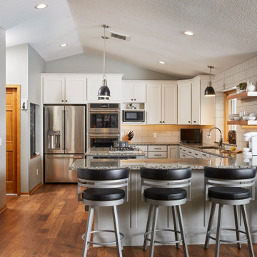
When these homeowners moved from a newer home to an older home they knew some changes were needed. The problem was would it be the kitchen, the bathrooms, or the laundry? The list was long and everything seemed important.
Flooring: New pre-finished engineered hardwood flooring 5" Mountain View Hickory Random -Autumn (MVR06AT1)
“After a lot of deliberation she focused on the kitchen, while her husband targeted the laundry,” explained Murphy Bros. design/build consultant Theresa Mann. “It just so happens he works for Hirshfields and liked to tinker with projects. Having a place to wash up helped keep the mess from going any further into the home,” explains Mann, who always likes to point out every remodel is truly unique.
Design/Build Consultant — Theresa Mann
Project Manager — Jamie Rosenlund
Lead Carpenter — Ivan Sass
Field Painters — Rick Dame
 Eugene Pintail LLC
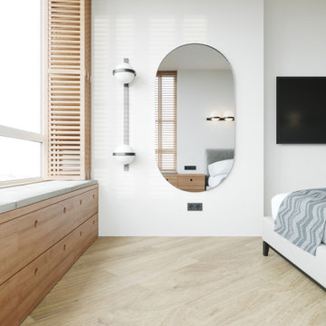
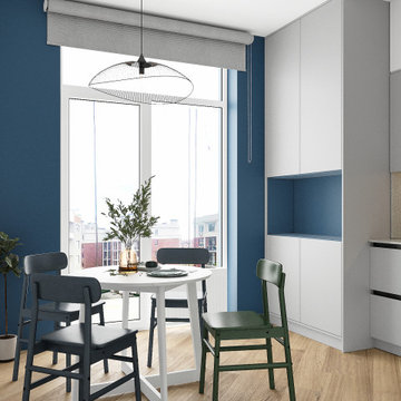
Gylden æra embraces the timeless elegance of Scandinavian minimalism in a compact apartment. By streamlining layout and materials, it creates a serene, deliberate environment where simplicity speaks volumes.
Every detail is intentionally crafted—from the seamless integration of functional areas to the uncluttered circulation paths. The design presents a visual calm that enhances both daily living and quiet reflection.
Soft woods, matte surfaces, and warm neutrals anchor the scheme. Subtle use of light tones amplifies natural light and expands spatial perception. Textural variations—like woven textiles, fine-grain wood, and matte finishes—add depth without compromising simplicity.
Minimalist lighting design—wall-mounted fixtures, linear pendants—complements the space's architectural rhythm without drawing attention away. Strategic layering of natural and ambient light enhances mood while maintaining visual clarity.
Gylden æra feels both peaceful and poised—moderated yet expressive. It captures a balance of restrained luxury and everyday comfort, honoring Scandinavian roots.
 Jackson Design & Remodeling
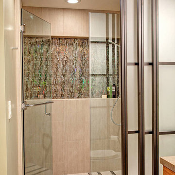
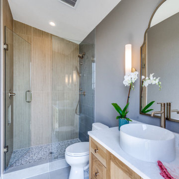
The shower niche was deliberately designed to evoke a window with an extra wide span to expand the space visually. The tile was selected in a slightly uneven composition to give the sense of water and movement.
 Mudan Interior Design
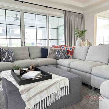
The first floor open space consists of the family room, the dining room and the kitchen. The expansive sectional seating arrangement in the family room was a deliberate choice, providing an ideal setting for family gatherings and leisurely moments, enhanced by the inclusion of a custom upholstered ottoman designed to accommodate their young children’s active play.
 Gallery KBNY
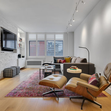
In this Manhattan pied-à-terre renovation, Gallery tackled the entire apartment. A true full renovation, we updated the kitchen, master bathroom, and powder room, installed new flooring throughout the entire space, and built the entertainment center in the living room.
DESIGN DETAILS
The clients wanted their pied-à-terre to have some modern touches, but not too sleek or contemporary. Since it combines a number of styles and elements, transitional turned out to be their ideal aesthetic. Whites, grays, and earthy tones carried this color theme throughout the apartment.
One of the clients is an artist and wanted wall space to display their original work, visible in the dining area and powder room in the photos below. The entertainment center is another highlight, with its white mosaic brick tile accent wall and glass open shelves to display family photos on both sides.
Instead of tiles, the new powder room walls received a textured concrete application, resulting in an almost industrial vibe. In the master bathroom renovation, glass mosaic tile accent walls bring a touch of personality to both the shower and a storage nook opposite the vanity.
UNIQUELY-SHAPED ROOMS
We specialize in adapting to every potential challenge, including uniquely-shaped rooms like the nearly-triangular kitchen in this Manhattan pied-à-terre renovation.
It’s important to design an uncommonly-shaped space as practically as possible, including specs seemingly as small as sink positioning. Every little detail counts tenfold in a room that’s not rectangular!
Other design details in the kitchen renovation include the classic combination of Shaker-style cabinets and quartz countertops, with a glass mosaic backsplash that matches the one used in the bathroom.
VISIBILITY = TRUST
Communication is always a core value at Gallery, but it’s even more vital when working with bi-coastal clients who were in another state throughout almost the entire process. We met with them once; everything else was done virtually thanks to JobTracker, our project management system.
The client had complete visibility into the renovation, including all design renderings, scheduled installations, and daily progress videos and photos. Even though they were 3000 miles away, they had a direct line to everyone on the team at all times.
SOME HIGHLIGHTS
- Entertainment center designed and built to serve as focal point, with white brick mosaic accent wall and open shelves made of glass
- Track lighting for ease of displaying art and to preserve ceiling height instead of the dropped ceiling that recessed lighting would necessitate
- Deliberate consideration of space in the unusually-shaped, nearly triangular kitchen
- Glass mosaic tile accent walls in the master bathroom with matching tile for the backsplash in the kitchen
Thinking about renovating your bathroom? Contact us today to find out how you can benefit from our expertise in remodeling New York City bathrooms. As a design-and-build firm with a full-scale approach, we handle every single aspect of your home renovation from start to finish.
 Next Stage Design + Build
Designer: Kristie Schneider CKBR, UDCP
Photographer: Nathan Lewis
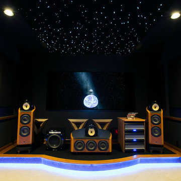
Task and accent lighting was added to the toe kicks of the raised stages which housed the speakers and seating while it incorporated a deliberate zone to assure movie seekers where to sit as well as ensured the screen was at perfect eye level of the opposed seating. Multiple acoustic panels and diffusers were added on each wall to enhance the quality of sound as this was paramount to the design.
 Allen Irvin - Designer
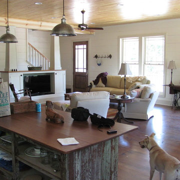
the butcher's table is an antique purchased before the house was designed.
Example of a cottage living room design in Houston
Example of a cottage living room design in Houston
 Holly Alexander Signature Design
An #organicmodern escape perched on The Edge of a deep blue pool - inviting you to experience the cool weightlessness of the water while simultaneously being pulled into the cozy comfort of the quiet indoor space. The casita was designed to feel like a retreat, the kind of space that slows you down the moment you step into it.
Warm materials, deliberate lines, and an indoor-outdoor flow that blurs the boundary between built and natural.
Designed by Holly Alexander Signature Design, a division of 708 Studios.

 Elevated Outdoors
In deliberate contrast to the home’s midcentury modern aesthetic, the client wanted to add an eclectic, cottage-inspired perennial border. Layered against the structured boxwood hedge, this planting strategy softens the landscape while adding depth, texture, and seasonal variation.
 Georgia Zikas Design
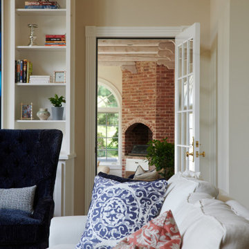
Youthful tradition for a bustling young family. Refined and elegant, deliberate and thoughtful — with outdoor living fun.
Transitional medium tone wood floor and brown floor living room photo in Other with beige walls
Transitional medium tone wood floor and brown floor living room photo in Other with beige walls
 Klopf Architecture
Built for the Bluff, A Sea Ranch Home is Remade from the Inside Out
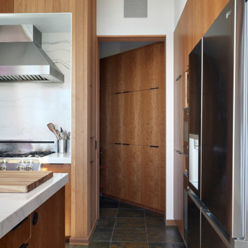
The house had always been grounded, on an ocean bluff at The Sea Ranch. It sits unencumbered, adjacent to one of the most dramatic stretches of the Sonoma coast with protected commons meadow to the east, uninterrupted Pacific views to the west, and a bluff trail running alongside. What it lacked was the feeling of home, one that could hold up its own against the natural landscape.
The owners are entrepreneurs with deep involvement across tech, real estate, and development and they know how things are built. The Sea Ranch house had been in their lives for years, a second residence and a place for family to gather. Built for a different time, it felt more compromising than comfortable. Sitting in a closed off nook, the kitchen fit one cook at a time and turned its back on the rest of the house. The entry was dim and compressed, divided by a structural column that presented itself at exactly the wrong moment. The primary suite was small relative to the view outside it. A large rear bedroom sat behind a lowered ceiling with a bathroom that had never been added. The house was certainly worth the trouble of doing it right.
What followed was not one project but four, each with its own design challenge, each addressed over a period of time.
Where the House Meets the Ocean
The most complex piece of the project, in both structural and spatial terms, was the kitchen expansion. The existing room was a single-person galley squeezed in as an afterthought with no meaningful connection to the dining room, the living space, or the deck outside. To make it useful for a family that cooks and gathers, it needed to grow outward into an existing patio and flow into the rooms around it.
A big challenge was the roofline. Several planes at different pitches and angles converged directly where additional volume was needed. A new form had to join that geometry without reading as a correction. The solution found the simplest possible connection between the existing angles, a roofline that from outside the structure, appears entirely original. From the bluff trail where the addition is visible, there is no discernible seam.
Inside, the kitchen is now open to the living and dining rooms without interruption. A large sliding glass door connects the space onto the rear deck. The deck itself was expanded and oriented so that the body of the house shields it from the coastal wind which is a common consideration that determines whether outdoor space at The Sea Ranch actually gets used. The result is a room that works for large family gatherings where no one feels cutoff, and one that makes the boundary between being inside and outside easy to ignore.
Welcoming Light
A structural column stood at the convergence of eight distinct roof planes in the entry. It was load-bearing, but it was also the reason the entry had always felt like a hallway rather than a welcoming arrival.
With the structural engineer, a custom steel connector was designed to receive beams from six separate directions, redistributing the load through a single new continuous beam. The column was surgically removed. Three triangular skylights were then cut into the roof above, their shapes drawn from the
existing geometry of the planes around them. The entry is now bright and open. The skylights feel native to the structure because they follow the logic already present in the roof.
Two Suites, Two Views
At opposite ends of the house, the two bedroom suites were each reconfigured, and each found a different way to introduce more of the landscape into the room.
An addition to the primary suite extended the structure outward to create a wraparound plan with a loop from the bedroom through bath and closet that had not been possible before. The expansion opened a slot view from the tub and shower toward the ocean. The view is precise and private. The ocean view is present and deliberate.
The rear bedroom absorbed an adjacent storage room to transform it into a full second suite with a vaulted ceiling, a large bathroom with a tub, a shower, and a sauna. A private fenced garden courtyard sits just beyond the glass bringing the outdoors inside. The tub was placed so that, looking past the courtyard and through the bedroom beyond, the ocean is visible at the far end. It is a long view and it makes the room feel larger and more settled than its footprint would suggest.
Glass on Four Sides, Fire at the Center
The main living and gathering room had always been caught between two competing facts: glass on four sides meant exceptional views but at The Sea Ranch, it also meant a cold room. A 360-degree cylindrical fireplace was added at the center on a raised stone base, providing radiant heat in every direction and giving the room a focal point around which a group naturally orients itself, whether that means two people at the end of the day or the whole family after dinner.
Owners Who Picked Up the Tools
The owner was not a passive client. they came with construction knowledge, specific ideas, and the desire to be an active part of the process, a dynamic that other architects may had found difficult, which Klopf Architecture accepted as an asset. They took it upon themselves to complete some of the work during construction, including the installation of a new radiant heating system beneath the floors.
The radiant system added to the older and less-desirable forced-air setup. At The Sea Ranch, that change matters as the house sits close enough to the ocean and moving air competes with the sound of it, where radiant heat does not. Solar panels were added to the roof as part of the new system. Insulation was upgraded throughout the walls, roof, and crawl space. The house that had always had the right setting now holds warmth the way a house on the bluff should.
They were also deeply involved in the design and selections throughout, and the finished house reflects both of them in ways that are specific rather than generic. The process took longer and moved through more iterations than a more arms-length relationship might have allowed. The result is more defined and personal because of it.
The Landscape Holds Priority
Every exterior decision was shaped by The Sea Ranch Design Standards, which require that buildings defer to the landscape around them rather than compete with it. Because this house sits on the bluff and is visible from the public trail, the additions faced a close review. Existing materials were matched. Geometries were resolved. The additions had to become indistinguishable from the original building.
From the trail, the house reads exactly as it always has — low, cedar-clad, secondary to the meadow and the water. The setting holds priority. Inside, the house has been remade.
Klopf Architecture Project Team: Geoff Campen and Trenton Jewett
Contractor: Shawn Bettega Construction
Photography: ©2025 Mariko Reed
Year Completed: 2023
Location: The Sea Ranch, CA
 Colorworks Landscaping, L.L.C.
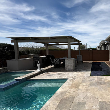
Details are the whole job. A hundred linear feet of silver travertine border now frames the turf in a crisp, deliberate line, with paver borders doing the same out front against fresh Apache Brown granite. New platinum-grade synthetic turf went in with a ten-year warranty behind it. And in the outdoor kitchen, a larger sink with proper hot and cold water lines — because a prep space you actually want to cook in changes everything.
 Eugene Pintail LLC
Minimalism isn’t supposed to be vanilla—this one actually earns the label. Clean, modern simplicity is the core, but it’s rich in intention. Every line, surface, and texture is deliberate; emptiness feels calculated, not lazy. The subdued palette and essentialist layout speak to refined restraint, yet the space still communicates a quiet, confident presence. Real minimalism with character—not stripped, but sharpened.
 Ridgewood Home Construction
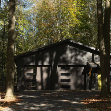
This mid-century modern Rockford home was updated in stages, and the kitchen needed a complete remodel. The homeowners desired a kitchen that felt current without breaking from the character that defined the rest of the house. That meant we needed to choose materials that fit the home and highlighted the home’s character.
Our team sourced pecky cypress and natural slate tile from non-traditional suppliers to get the exact look the home called for. The wood cabinetry was paired with a granite island, providing a gathering space in the kitchen without overpowering it. Because both materials required careful handling during installation, the crew worked more slowly and deliberately through this phase than a standard remodel. The result connected the kitchen directly to the living area, so the two spaces feel like one continuous room built in the same style as the rest of the home.
 Fiorito Interior Design
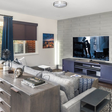
It’s rare when a client comes to me with a brief for a complete home from scratch, but that is exactly what happened here. My client, a professional musician and singer, was having a luxury three-story condo built and wanted help choosing not only all the hardscape materials like tile, flooring, carpet, and cabinetry, but also all furniture and furnishings. I even outfitted his new home with plates, flatware, pots and pans, towels, sheets, and window coverings. Like I said, this was from scratch!
We defined his style direction for the new home including dark colors, minimalistic furniture, and a modern industrial sensibility, and I set about creating a fluid expression of that style. The tone is set at the entry where a custom laser-cut industrial steel sign requests visitors be shoeless. We deliberately limited the color palette for the entire house to black, grey, and deep blue, with grey-washed or dark stained neutral woods.
The navy zellige tiles on the backsplash in the kitchen add depth between the cement-textured quartz counters and cerused cabinetry. The island is painted in a coordinating navy and features hand-forged iron stools. In the dining room, horizontal and vertical lines play with each other in the form of an angular linear chandelier, lighted acrylic light columns, and a dining table with a special faceted wave edge. Chair backs echo the shape of the art maps on the wall.
We chose a unique, three dimensional wall treatment for the living room where a plush sectional and LED tunable lights set the stage for comfy movie nights. Walls with a repeating whimsical black and white whale skeleton named Bruce adorn the walls of the powder room. The adjacent patio boasts a resort-like feeling with a cozy fire table, a wall of up-lit boxwoods, and a black sofa and chairs for star gazing.
A gallery wall featuring a roster of some of my client’s favorite rock, punk, and jazz musicians adorns the stairwell. On the third floor, the primary and guest bathrooms continue with the cement-textured quartz counters and same cerused cabinetry.
We completed this well-appointed home with a serene guest room in the established limited color palette and a lounge/office/recording room.
All photos by Bernardo Grijalva
30