
Search results for "Deliberation" in Home Design Ideas
 Boyenga Team / Compass
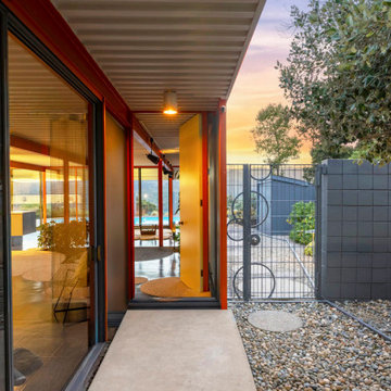
Eichler X-100 Entry: A Threshold Between Architecture and Experience
The entry to the Eichler X-100 is not a conventional front door—it’s an intentional transition, a carefully choreographed sequence that shifts you from the outside world into a fully immersive architectural environment.
Designed by A. Quincy Jones and Frederick Emmons for Joseph Eichler, the entry reflects a core principle of Eichler design: arrival should be felt, not just seen.
A Garden Before the Door
Rather than approaching a traditional façade, visitors are guided into an entry courtyard—a private, inward-facing space that immediately softens the transition from street to home. This space acts as a buffer, both visually and emotionally, creating a sense of calm and separation.
The path is often defined by concrete stepping pads set within planted areas, reinforcing the home’s circular and geometric design language. Movement becomes deliberate—slowed, grounded, and connected to the landscape.
Light as a Guide
Above, translucent skylights filter natural light into the entry sequence, creating shifting patterns of brightness and shadow throughout the day. This interplay of light transforms the entry into something dynamic—never static, always evolving.
Rather than a single moment, the entry unfolds over time.
Blurring Interior and Exterior
The X-100’s entry challenges the idea of where the home actually begins. With interior gardens visible from the moment you arrive, the boundary between outside and inside becomes intentionally ambiguous.
Glass, open sightlines, and planted spaces work together so that by the time you reach the front door, you are already inside the architectural experience.
A Compressed-to-Open Reveal
True to mid-century modern design principles, the entry creates a subtle sense of compression before release. The approach is quiet and modest—almost understated—before opening into the expansive, light-filled interior beyond.
This contrast heightens the impact of arrival, making the interior feel even more dramatic.
A Philosophy of Arrival
The Eichler X-100 entry is not about grandeur—it’s about intention. It invites you to slow down, to notice light, material, and landscape, and to engage with the home on a deeper level.
It’s a reminder that in great architecture, even the act of entering becomes part of the design itself.
 lavish
This Raleigh, NC home was reimagined from the ground up — not room by room, but as a single, cohesive expression of how a family lives, gathers, and rests.
The architecture drove every decision. Custom millwork and panel molding were carried through every space, creating a visual language that connects the entry to the living room, the dining room to the primary suite. It's what makes the home feel complete — not like a collection of individually finished rooms.
In the kitchen, a full marble slab backsplash reads as one uninterrupted surface — giving the room its presence without competing with the custom white inset cabinetry and brushed nickel hardware. The dining room lives in deliberate contrast: deep-toned oak table, delicate botanical wallpaper, antique mirror. Light and organic, yet entirely considered.
The living room was designed around its connection to the outside — French doors that open directly to a substantial outdoor kitchen and entertaining space, anchored on the interior by a cast stone fireplace with an arched surround that commands the room.
The entry sets the expectation for everything that follows: a double-height foyer, geometric pendants cascading from above, large-scale original artwork, and a carved console that makes the first impression without overstating it.
Designed and executed by Lavish — Raleigh, NC's full-service interior design and remodeling firm.
 Scott Edwards Architecture
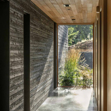
The interplay of light and shadows influences how the house is experienced, with darker materials, deliberate screening, and warm tones ensuring a calm interior illumination that encourages appreciation of the views outside.
Find the right local pro for your project
 Refresh Renovations Auckland West
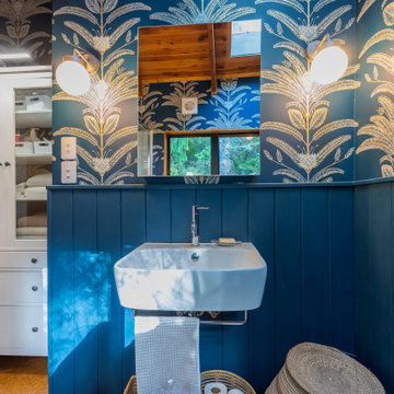
It takes a special kind of client to embrace the eclectic design style. Eclecticism is an approach to design that combines elements from various periods, styles, and sources. It involves the deliberate mixing and matching of different aesthetics to create a unique and visually interesting space. Eclectic design celebrates the diversity of influences and allows for the expression of personal taste and creativity.
The bold colour choice and pattern of the wallpaper in this en-suite create an immersive and invigorating atmosphere. Blue is a great choice for a bathroom. This colour is often associated with feelings of calmness, tranquility, and serenity. It can evoke a sense of peace, stability, and relaxation.
 Metropolis Drafting and Construction Inc
Today’s investment landscape in California features a surge in transforming single-family lots into vibrant multi-family residences, facilitated by recent SB9 and ADU laws. This project exemplifies how a modest 6,750-square-foot lot can accommodate a 1,500-square-foot primary home alongside a 2,500-square-foot duplex, seamlessly integrating design, functionality, and neighborhood aesthetics.
The primary residence underwent a meticulous interior transformation, evolving from a 3-bedroom, 1.5-bath layout into a spacious 4-bedroom, 2-bath home. Strategic reconfigurations centered around creating an expansive great room—an open-concept space adorned with vaulted ceilings—where the kitchen, dining, and living areas converge into a magnificent communal zone.
Exterior updates further distinguish the property. The front and side yards are enclosed with fencing and privacy hedges, linked by concrete pathways that enhance outdoor functionality while compensating for backyard space lost during renovations. The exterior façade was refreshed with darker tones, deliberately contrasting with the duplex to emphasize architectural separation.
Designed to preserve the suburban charm, the duplex visually mimics a single-family home from the street. Its facade creates an illusion of a two-story residence, maintaining harmony within the neighborhood fabric. The main unit, developed under SB9 guidelines, features three bedrooms and two bathrooms, with a luxurious parents’ suite situated upstairs. Downstairs, two bedrooms share a full bath, creating a balanced family-oriented layout.
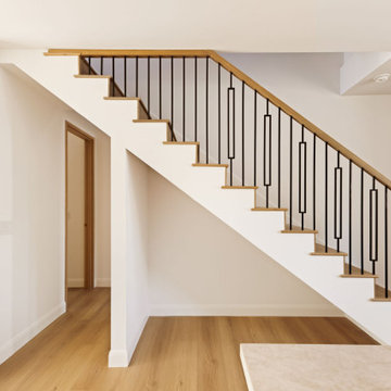
The duplex’s interior boasts 9-foot ceilings throughout, elevating the sense of space and openness. The design thoughtfully places the kitchen at the front, inviting guests into the home, while stairs on the right lead to the private upstairs bedroom suite.
The ADU offers a two bedroom and two & half baths. the unit is accessible via a private side entrance with a dedicated walkway. Its layout includes a ground-floor living room, a galley kitchen, and a discreet powder room beneath the stairs, designed to contain guest traffic and maintain privacy upstairs. The upstairs bedrooms each feature luxurious bathrooms with expansive showers, adding an element of modern elegance.
Both units enjoy thoughtfully landscaped outdoor spaces—private patios, backyard areas, and gated front yards—creating welcoming environments for residents and visitors alike.
This project exemplifies innovative urban infill solutions, blending architectural elegance with legal compliance and community harmony—an inspiring blueprint for the future of residential development in California.
 Ridgewood Home Construction
This mid-century modern Rockford home was updated in stages, and the kitchen needed a complete remodel. The homeowners desired a kitchen that felt current without breaking from the character that defined the rest of the house. That meant we needed to choose materials that fit the home and highlighted the home’s character.
Our team sourced pecky cypress and natural slate tile from non-traditional suppliers to get the exact look the home called for. The wood cabinetry was paired with a granite island, providing a gathering space in the kitchen without overpowering it. Because both materials required careful handling during installation, the crew worked more slowly and deliberately through this phase than a standard remodel. The result connected the kitchen directly to the living area, so the two spaces feel like one continuous room built in the same style as the rest of the home.
 Metropolis Drafting and Construction Inc
Today’s investment landscape in California features a surge in transforming single-family lots into vibrant multi-family residences, facilitated by recent SB9 and ADU laws. This project exemplifies how a modest 6,750-square-foot lot can accommodate a 1,500-square-foot primary home alongside a 2,500-square-foot duplex, seamlessly integrating design, functionality, and neighborhood aesthetics.
The primary residence underwent a meticulous interior transformation, evolving from a 3-bedroom, 1.5-bath layout into a spacious 4-bedroom, 2-bath home. Strategic reconfigurations centered around creating an expansive great room—an open-concept space adorned with vaulted ceilings—where the kitchen, dining, and living areas converge into a magnificent communal zone.
Exterior updates further distinguish the property. The front and side yards are enclosed with fencing and privacy hedges, linked by concrete pathways that enhance outdoor functionality while compensating for backyard space lost during renovations. The exterior façade was refreshed with darker tones, deliberately contrasting with the duplex to emphasize architectural separation.
Designed to preserve the suburban charm, the duplex visually mimics a single-family home from the street. Its facade creates an illusion of a two-story residence, maintaining harmony within the neighborhood fabric. The main unit, developed under SB9 guidelines, features three bedrooms and two bathrooms, with a luxurious parents’ suite situated upstairs. Downstairs, two bedrooms share a full bath, creating a balanced family-oriented layout.
The duplex’s interior boasts 9-foot ceilings throughout, elevating the sense of space and openness. The design thoughtfully places the kitchen at the front, inviting guests into the home, while stairs on the right lead to the private upstairs bedroom suite.
The ADU offers a two bedroom and two & half baths. the unit is accessible via a private side entrance with a dedicated walkway. Its layout includes a ground-floor living room, a galley kitchen, and a discreet powder room beneath the stairs, designed to contain guest traffic and maintain privacy upstairs. The upstairs bedrooms each feature luxurious bathrooms with expansive showers, adding an element of modern elegance.
Both units enjoy thoughtfully landscaped outdoor spaces—private patios, backyard areas, and gated front yards—creating welcoming environments for residents and visitors alike.
This project exemplifies innovative urban infill solutions, blending architectural elegance with legal compliance and community harmony—an inspiring blueprint for the future of residential development in California.
 Century Stair Company
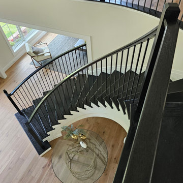
A single curve does a lot of work here. Rising from the main level to a wraparound balcony above, this staircase earns its place at the center of the home — not just structurally, but visually. Black iron balusters and handrails push against crisp white risers in a contrast that feels deliberate rather than decorative. The open floor plan gives it room to breathe, letting the curve read as architecture rather than furniture. The result is a staircase that creates movement even when no one is on it.
1976-2026 © Century Stair Company
 Seed
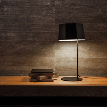
SeedThe metal lampshade is meticulously and deliberately hand welded together to resemble a cluster or rocks. Look closely and notice how each metal plate is a bit asymmetrical yet they all fit seamlessly together. Wooden stoppers under each frosted diffuser not only introduce warm elements of the wood, but functionally they soften up the overall light source. ZHE Table Lamp is small in scale but substantial in design.
 Georgia Zikas Design
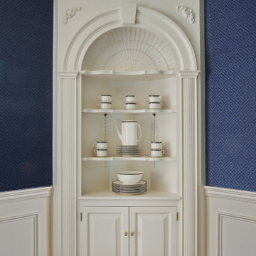
Youthful tradition for a bustling young family. Refined and elegant, deliberate and thoughtful — with outdoor living fun.
Dining room - transitional medium tone wood floor and brown floor dining room idea in Other with blue walls
Dining room - transitional medium tone wood floor and brown floor dining room idea in Other with blue walls
 4Ever Remodeling
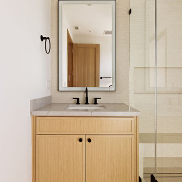
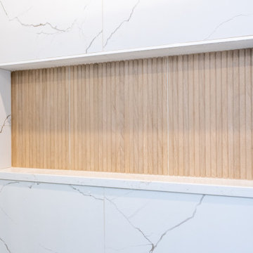
The shower niche is lined with Urbanslat natural wood-look tile from MSI Surfaces, a porcelain product that replicates the warmth and grain of natural wood without any of the moisture sensitivity that real wood would present in a wet environment. Against the Marble Lincoln tile surrounding it, the niche reads as a deliberate material contrast rather than an accent afterthought.
 LeichtUSA
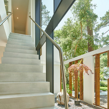
Insights, vistas, perspectives. This private house in France
can be divided into two clear architectural axes – inside
and outside – fusing seamlessly together. Large window
frontages as well as entrance and pool areas separated
by solid wood struts play with light and shadow, now revealing
now concealing. The modern building exudes a
friendly, welcoming atmosphere while creating a harmonious
the interplay of intimate homeliness and prestigious
openness.
The clear lines, handle-less fronts, and soft color scheme in the kitchen are very appealing. Everything revolves around the central island unit, which connects the functional area with sink and hob to an adjoining wooden table. As the very
heart of the design, the cooking and dining island is deliberately reduced to essentials. Continuing the color concept and playing with the natural warmth of Highland oak and a light, softly matt frosty white, the large yet minimalist unit run with an integrated sideboard is a perfect fit.
 Leicht Westchester-Greenwich
Grounded Aesthetic
Modern clean lines juxtaposed with natural texture and materials, create a warm and inviting kitchen that feels casual and luxurious at the same time.
Leicht Minera Kiruna cabinets with natural wood and woven elements define the kitchen in this vast open space. Floating wood shelves highlight the functional items that add character and personality to the space.
The distinctive large island includes the prestigious Gaggenau gas & induction combination cooktops for the homeowners’ culinary and entertainment lifestyle.
Bold Neutrals
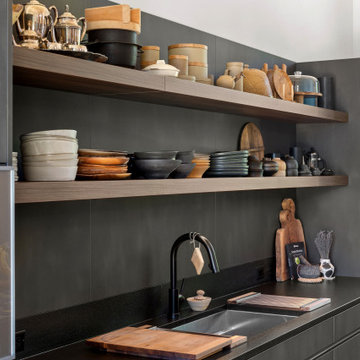
The deliberate kitchen palette of natural neutral colors is a nod to the Modern Rustic high style. Textured deep grays and black hues combined with an organic natural wood palette, evokes sophistication and warmth.
Neolith Nero Zimbabwe Riverwashed countertop and low backsplash with its deep rich color and rough texture adds to the curated mix. Minera Kiruna panels complete the backsplash composition with its natural metal vibe.
 Natural Stone Institute
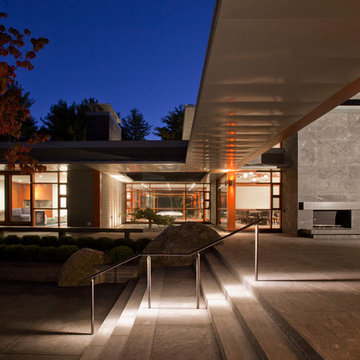
As Sheila Gibson Stoodley writes in an article about this project in Robb Report, “Brian Hemingway is sensitive to light in the best way possible.”
“The Vancouver, British Columbia-based architect wanted this 22,000-square-foot home near Boston to glow like a lantern at night, and he attained that goal on behalf of the homeowners.” The wood and stone
that Hemingway favored for the home informed the space’s color palette. So critical were these materials that settling on a shade of stain for the Douglas fir and the finishes to be used on the Virginia Mist granite took
months of consultation.
Walker Zanger, the stone supplier, worked with the owner and with Colin Flavin, a Boston-based architect who partnered with Hemingway, to choose, detail, and fabricate the granite.
The stone is used indoors and out, heightening the boundary-blurring effect that the design team desired. Though the owners are ardent art collectors, they did not build their home to showcase specific works; the
real artists here are the architects, Hemingway and Flavin. So deft were they at inviting nature into their creation that, from certain angles, it can be hard to tell where the outdoors stops and starts.
“There are deliberately no window treatments so that Mother Nature weaves the most beautiful textural backgrounds,” said interior designer Andrew Sheinman, of New York’s Pembrooke & Ives. He oversaw the
interiors, working alongside his colleague Michael Lewis. “The seasons change the look and aspect of the house,” said Sheinman, “and we wanted to play on this.”
Bleu de Savoie marble, from France, is used in the baths, to contrast with the Virginia Mist granite and soften the palette and give the baths a spa-like serenity. Hand-chiseled Oxford Black granite is used on exterior landscape walls, to tie the Virginia Mist seamlessly to the natural stone outcroppings.
 Luce Spaces LLC
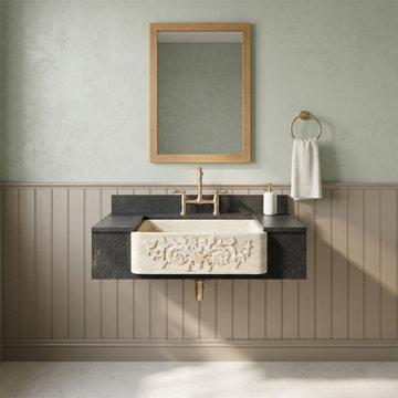
Troia Light travertine forms over geological timescales through the slow accumulation of mineral-rich deposits, producing the warm ivory and shell-toned strata that define this rectangular apron-front natural stone vessel sink. The honed, partially filled surface presents a matte tactile plane across the basin interior, while the apron facade is hand-carved in low-relief botanical detail — a precision gesture that reads as architectural ornament rather than decoration. At 30 inches in length and 10 inches in depth, the geometry of this kitchen farmhouse sink occupies a minimalist space with deliberate visual weight, its zero-faucet-hole configuration allowing clean integration with wall-mount or counter-mount fittings.
 SM Design
Bridle Path Residence — Family Room & Media Lounge
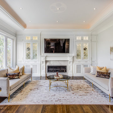
This Bridle Path Residence family room is conceived as a sophisticated yet comfortable gathering space, balancing the formality of the home's architectural language with a more relaxed approach to everyday living. The design creates a sense of quiet luxury through symmetry, tailored millwork, layered texture, and restrained glamour, rather than relying on excessive decoration.
The built-in fireplace and media wall form the architectural centre of the room. Custom white cabinetry frames the television and fireplace with carefully proportioned panels, glass-front display niches, and decorative moulding. This integrated approach allows technology to become part of the architecture rather than visually dominating the room.
The fireplace surround introduces a natural stone focal point beneath the television, adding subtle movement and material depth to an otherwise crisp white composition. Its placement establishes a strong central axis, while the symmetrical cabinetry on either side reinforces the room's sense of order and balance.
The expansive window along the left side is equally important to the design. It floods the room with natural light and establishes a direct visual connection to the mature landscape outside. This relationship with nature softens the structured architecture and prevents the room from feeling overly formal.
Two generously proportioned sofas are positioned opposite one another to create an intentional conversational arrangement. Their light upholstery keeps the room visually open, while layered cushions introduce warmer tones, pattern, and tactile contrast. The symmetry of the seating arrangement gives the space a composed architectural quality while remaining highly functional for family gatherings and entertaining.
The metallic furniture introduces a subtle note of contemporary glamour. Gold-toned frames, sculptural side tables, and glass surfaces reflect light throughout the room without overwhelming the neutral palette. The combination of transparent glass and polished metal also keeps the furniture visually light against the substantial architectural detailing.
A large area rug anchors the seating group and introduces an organic pattern that contrasts with the linear wall panelling and cabinetry. Its muted tones create continuity between the soft furnishings, wood flooring, and architectural finishes.
The lighting strategy is deliberately layered. Recessed lighting provides functional illumination, while decorative lamps and concealed architectural lighting create a softer atmosphere. The result is a room capable of transitioning easily from bright daytime family use to a more intimate evening setting.
The overall design is an expression of contemporary comfort within a classic architectural framework. Custom millwork, symmetry, traditional detailing, natural stone, warm hardwood, sculptural furniture, and soft textiles come together to create a family room that feels polished without becoming precious. It is designed as a room for both everyday life and elevated entertaining, comfortable enough to live in, yet refined enough to belong naturally within a luxury Bridle Path residence.
 lavish
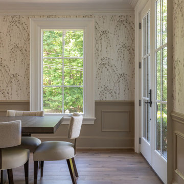
This Raleigh, NC home was reimagined from the ground up — not room by room, but as a single, cohesive expression of how a family lives, gathers, and rests.
The architecture drove every decision. Custom millwork and panel molding were carried through every space, creating a visual language that connects the entry to the living room, the dining room to the primary suite. It's what makes the home feel complete — not like a collection of individually finished rooms.
In the kitchen, a full marble slab backsplash reads as one uninterrupted surface — giving the room its presence without competing with the custom white inset cabinetry and brushed nickel hardware. The dining room lives in deliberate contrast: deep-toned oak table, delicate botanical wallpaper, antique mirror. Light and organic, yet entirely considered.
The living room was designed around its connection to the outside — French doors that open directly to a substantial outdoor kitchen and entertaining space, anchored on the interior by a cast stone fireplace with an arched surround that commands the room.
The entry sets the expectation for everything that follows: a double-height foyer, geometric pendants cascading from above, large-scale original artwork, and a carved console that makes the first impression without overstating it.
Designed and executed by Lavish — Raleigh, NC's full-service interior design and remodeling firm.
 LeichtUSA
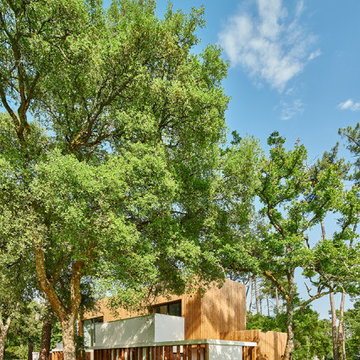
Insights, vistas, perspectives. This private house in France
can be divided into two clear architectural axes – inside
and outside – fusing seamlessly together. Large window
frontages as well as entrance and pool areas separated
by solid wood struts play with light and shadow, now revealing
now concealing. The modern building exudes a
friendly, welcoming atmosphere while creating a harmonious
the interplay of intimate homeliness and prestigious
openness.
The clear lines, handle-less fronts, and soft color scheme in the kitchen are very appealing. Everything revolves around the central island unit, which connects the functional area with sink and hob to an adjoining wooden table. As the very
heart of the design, the cooking and dining island is deliberately reduced to essentials. Continuing the color concept and playing with the natural warmth of Highland oak and a light, softly matt frosty white, the large yet minimalist unit run with an integrated sideboard is a perfect fit.
 George Ocampo
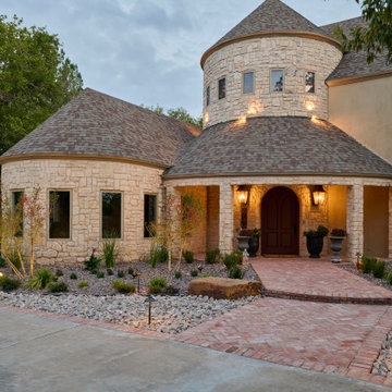
Upper Valley Estate Curb Appeal – El Paso, Texas
This curb appeal transformation was conceived as a deliberate sequence—an arrival experience where architecture, landscape, and lighting work together as one. Every element was designed to honor the home’s stone construction, turreted forms, and Old World character while responding precisely to the Upper Valley climate and lifestyle.
By day, the experience is grounded and composed. Brick-edged concrete drives establish order and permanence, guiding movement through the property with clarity and intention. Natural stone walls and columns anchor the architecture, while layered gravel beds, drought-tolerant plantings, and manicured turf soften transitions and connect the home to its desert setting. Mature trees were preserved and carefully integrated, providing scale, shade, and a sense of continuity.
As afternoon shifts toward sunset, the materials begin to speak differently. Stone warms, textures deepen, and sightlines subtly draw the eye toward the front entry. The landscape narrows the focus, creating a moment of pause before arrival—calm, quiet, and refined.
At night, the design reveals its final layer. Low-voltage lighting is integrated with precision, washing stone surfaces, tracing architectural curves, and uplighting specimen trees to create depth without glare. The drive, walkways, and entry feel safe, legible, and inviting, while the home itself glows with a restrained elegance. Coming home after dark feels intentional—protected, welcoming, and unmistakably yours.
What was created is more than curb appeal. It is a cohesive design-build solution where nothing is ornamental without purpose and nothing is built without intention. A daily experience of arrival that reflects craftsmanship, care, and the enduring character of the Upper Valley.
 Whitefish Architecture
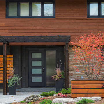
This garage addition and rehabilitation of a mid century modern home expands and enhances the original while respecting the scale and low, linear feel.
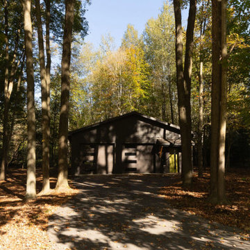
All exterior finishes are updated with the exception of the stone. A new entrance creates layers of screening to invite inquiry as well as create privacy and a sense of place. The garage is downplayed with dark materials to allow it to recede relative to the main house, which is deliberately brighter, warmer, and varied to remain the visual focus.
Lead Designer - Alex Jenkins
Designer - Valerie Wright
Photography - Steve Edgar
23