
Search results for "Depth background" in Home Design Ideas

Inspiration for a large coastal open concept light wood floor, gray floor and shiplap wall living room remodel with green walls, a ribbon fireplace, a shiplap fireplace and a wall-mounted tv

 Jeffrey Smalley Architect
Example of a mid-sized beach style medium tone wood floor, gray floor and exposed beam kitchen/dining room combo design in Los Angeles with white walls

 Sullivan Building & Design Group
Design Build by Sullivan Building & Design Group. Custom Cabinetry by Cider Press Woodworks. Photographer: Todd Mason / Halkin Mason Photography
Large farmhouse l-shaped dark wood floor eat-in kitchen photo in Philadelphia with shaker cabinets, white cabinets, white backsplash, stainless steel appliances, an undermount sink, wood countertops and an island
Large farmhouse l-shaped dark wood floor eat-in kitchen photo in Philadelphia with shaker cabinets, white cabinets, white backsplash, stainless steel appliances, an undermount sink, wood countertops and an island
Find the right local pro for your project

 June DeLugas Interiors
A built-in desk with storage can be hidden by pocket doors when not in use. Custom-built with wood desk top and fabric backing.
Photo by J. Sinclair

 J Design Group - Interior Designers Miami - Modern
Modern Guest Bedroom, Miami Beach.
Ocean front, Luxury home in Miami Beach.
Projects by J Design Group, Your friendly Interior designers firm in Miami, FL. at your service.
AVENTURA MAGAZINE selected our client’s luxury 5000 Sf ocean front apartment in Miami Beach, to publish it in their issue and they Said:
Story by Linda Marx, Photography by Daniel Newcomb
Light & Bright
New York snowbirds redesigned their Miami Beach apartment to take advantage of the tropical lifestyle.
New York snowbirds redesigned their Miami Beach apartment to take advantage of the tropical lifestyle.
WHEN INTERIOR DESIGNER JENNIFER CORREDOR was asked to recreate a four-bedroom, six-bath condominium at The Bath Club in Miami Beach, she seized the opportunity to open the rooms and better utilize the vast ocean views.
In five months last year, the designer transformed a dark and closed 5,000-square-foot unit located on a high floor into a series of sweeping waterfront spaces and updated the well located apartment into a light and airy retreat for a sports-loving family of five.
“They come down from New York every other weekend and wanted to make their waterfront home a series of grand open spaces,” says Jennifer Corrredor, of the J. Design Group in Miami, a firm specializing in modern and contemporary interiors. “Since many of the rooms face the ocean, it made sense to open and lighten up the home, taking advantage of the awesome views of the sea and the bay.”
The designer used 40 x 40 all white tile throughout the apartment as a clean base. This way, her sophisticated use of color would stand out and bring the outdoors in.
The close-knit family members—two parents and three boys in college—like to do things together. But there were situations to overcome in the process of modernizing and opening the space. When Jennifer Corredor was briefed on their desires, nothing seemed too daunting. The confident designer was ready to delve in. For example, she fixed an area at the front door
that was curved. “The wood was concave so I straightened it out,” she explains of a request from the clients. “It was an obstacle that I overcame as part of what I do in a redesign. I don’t consider it a difficult challenge. Improving what I see is part of the process.”
She also tackled the kitchen with gusto by demolishing a wall. The kitchen had formerly been enclosed, which was a waste of space and poor use of available waterfront ambience. To create a grand space linking the kitchen to the living room and dining room area, something had to go. Once the wall was yesterday’s news, she relocated the refrigerator and freezer (two separate appliances) to the other side of the room. This change was a natural functionality in the new open space. “By tearing out the wall, the family has a better view of the kitchen from the living and dining rooms,” says Jennifer Corredor, who also made it easier to walk in and out of one area and into the other. “The views of the larger public space and the surrounding water are breathtaking.
Opening it up changed everything.”
They clients can now see the kitchen from the living and dining areas, and at the same time, dwell in an airy and open space instead of feeling stuck in a dark enclosed series of rooms. In fact, the high-top bar stools that Jennifer Corredor selected for the kitchen can be twirled around to use for watching TV in the living room.
In keeping with the theme of moving seamlessly from one room to the other, Corredor designed a subtle wall of glass in the living room along with lots of comfortable seating. This way, all family members feel at ease while relaxing, talking, or watching sporting events on the large flat screen television. “For this room, I wanted more open space, light and a supreme airy feeling,” she says. “With the glass design making a statement, it quickly became the star of the show.”…….
….. To add texture and depth, Jennifer Corredor custom created wood doors here, and in other areas of the home. They provide a nice contrast to the open Florida tropical feel. “I added character to the openness by using exotic cherry wood,” she says. “I repeated this throughout the home and it works well.”
Known for capturing the client’s vision while adding her own innovative twists, Jennifer Corredor lightened the family room, giving it a contemporary and modern edge with colorful art and matching throw pillows on the sofas. She added a large beige leather ottoman as the center coffee table in the room. This round piece was punctuated with a bold-toned flowering plant atop. It effortlessly matches the pillows and colors of the contemporary canvas.
Jennifer Corredor also gutted all of the bathrooms, resulting in a major redesign of the master. She jettisoned the whirlpool and created the dazzling illusion of a floating tub. From an area where there were two toilets, she eliminated one to make a grand rectangular shower, which became an overall showpiece. The master bath went from being just a functional water closet to a sophisticated spa-like space. “The client said I was ‘delicious’ after seeing the change,” laughed Jennifer Corredor, who emphasized that her clients love their part-time life in South Florida more each time they come down. Even when the husband has to work from their Miami Beach digs, he is surrounded by tropical beauty. For instance, there are times when the master bedroom must double as the husband’s home office.
The room had to be large enough to accommodate a working space for this purpose. So Jennifer Corredor placed an appropriate table near the window and across from the king-size bed. “No blocking of the amazing water view was necessary,” she says. “I kept an open space with a lot of white so It functions well and the work space fits right in.” She repeated the bold modern art in the room as well as in the guest bedroom, which also has a workspace for the sons when they are home from school and need to study.
The designer is still happy and glowing with the results of her toil in this apartment. She gets a “spiritual feeling” when she walks inside. “It is so peaceful and serene, with subtle hints of explosive statements,” she says. “The entire space is open, yet anchored by the warmth of the exotic woods.” The client wrote Jennifer Corredor a letter at the end of the project congratulating her on a
job well done. She revealed that owning a Miami Beach home was her husband’s dream 30 years ago. “Now we have a quality perfect yet practical home,” she wrote to the designer. “You solved the challenges, and the end
result far exceeds our expectations. We love it.”
Thanks for your interest in our Contemporary Interior Design projects and if you have any question please do not hesitate to ask us.
http://www.JDesignGroup.com
305.444.4611
Modern Interior designer Miami. Contemporary
Miami
Miami Interior Designers
Miami Interior Designer
Interior Designers Miami
Interior Designer Miami
Modern Interior Designers
Modern Interior Designer
Modern interior decorators
Modern interior decorator
Contemporary Interior Designers
Contemporary Interior Designer
Interior design decorators
Interior design decorator
Interior Decoration and Design
Black Interior Designers
Black Interior Designer
Interior designer
Interior designers
Interior design decorators
Interior design decorator
Home interior designers
Home interior designer
Interior design companies
Interior decorators
Interior decorator
Decorators
Decorator
Miami Decorators
Miami Decorator
Decorators Miami
Decorator Miami
Interior Design Firm
Interior Design Firms
Interior Designer Firm
Interior Designer Firms
Interior design
Interior designs
home decorators
Interior decorating Miami
Best Interior Designers.
225 Malaga Ave.
Coral Gable, FL 33134
http://www.JDesignGroup.com
305.444.4611


 Northworks Architects + Planners
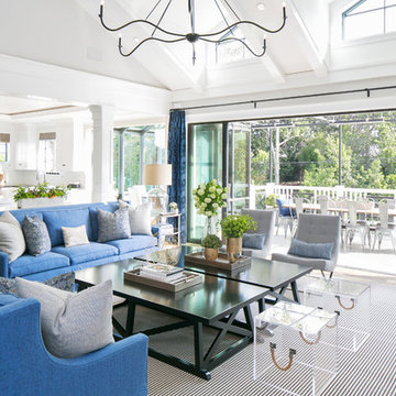
This new residence in Lincoln Park is designed for maximum efficiency of room-to-room layouts and floor-to-floor circulation. With an abundance of natural light, the main floor of kitchen-dining-living is set 10’ above street level and cantilevered out over the ground floor entry. This provides a comfortable separation from the busy activities below, while still connecting the home to the neighborhood.

 Erica Peale Design
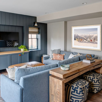
Inspiration for a mid-sized transitional look-out laminate floor and brown floor family room remodel in DC Metro with gray walls and no fireplace

 Joy Street Design
A colorful makeover for a little girl’s bathroom. The goal was to make bathtime more fun and enjoyable, so we opted for striking teal accents on the vanity and built-in. Balanced out by soft whites, grays, and woods, the space is bright and cheery yet still feels clean, spacious, and calming. Unique cabinets wrap around the room to maximize storage and save space for the tub and shower.
Cabinet color is Hemlock by Benjamin Moore.
Designed by Joy Street Design serving Oakland, Berkeley, San Francisco, and the whole of the East Bay.
For more about Joy Street Design, click here: https://www.joystreetdesign.com/

 Lars Remodeling & Design
Details, details, details! This traditional kitchen remodel is full of them! Though soft and neutral, the use of dark cabinetry in unexpected places lends warmth and depth to the space. Our eyes are drawn to the custom hood and rich island cabinetry. The corners of these cabinets have a beautifully carved post detailing. The pendant lights add the perfect touch of glam, creating a sparkle when lit that highlights the hint of color in the mosaic design of the backsplash. What do you think of this design?

 Jeri Koegel Photography
Jeri Koegel
Example of a trendy concrete exterior home design in Orange County
Example of a trendy concrete exterior home design in Orange County

 Mariani Landscape
A rich traditional garden flanking the asphalt driveway lined with a cushwa brick curb. The gardens are filled with 'Tina' crabapple, Hydrangea, boxwood, and Pachysandra ground cover. Photo Credit: Linda Oyama Bryan

 Craig O'Connell Architecture
This remodel of a three-story San Francisco Victorian honors the timeless design while breathing fresh, modern life into the home. The clients’ new favorite room - the kitchen - is now bathed in light due to a skylight and floor-to-ceiling bi-folding steel framed doors. Beautiful custom wood cabinets and wood details add warmth, gorgeous tiles insert rich color and personality while the handcrafted concrete counters and sink bring a modern and functional touch.


 URBAN BLUEPRINT
Freestanding bathtub - transitional gray tile, white tile and mosaic tile white floor freestanding bathtub idea in Toronto with purple cabinets, gray walls, an undermount sink, a hinged shower door and white countertops

 JWT Associates
We chose a deep soaking tub for the master bathroom. All of the tile is new, from B&W Tile in Los Angeles. The tub deck is marble. The skylight was added to bathe the space in natural light. Fixtures from Cal Faucets.

 Tim Brown Architecture
Casey Fry
Large farmhouse u-shaped concrete floor kitchen photo in Austin with an undermount sink, marble countertops, white backsplash, ceramic backsplash, stainless steel appliances, an island, shaker cabinets and turquoise cabinets
Large farmhouse u-shaped concrete floor kitchen photo in Austin with an undermount sink, marble countertops, white backsplash, ceramic backsplash, stainless steel appliances, an island, shaker cabinets and turquoise cabinets

 Robert Paige Cabinetry LLC
Photos by William Quarles
Designed by Interior Consultations
Built by Robert Paige Cabinetry
Architect Tyler Smyth
Bathroom - large contemporary beige tile bathroom idea in Charleston with an undermount sink, flat-panel cabinets and beige cabinets
Bathroom - large contemporary beige tile bathroom idea in Charleston with an undermount sink, flat-panel cabinets and beige cabinets

Sponsored
Columbus, OH

Hope Restoration & General Contracting
Columbus Design-Build, Kitchen & Bath Remodeling, Historic Renovations

 Friedman & Shields
Large trendy open concept porcelain tile and beige floor family room photo in Phoenix with beige walls, a ribbon fireplace, a concrete fireplace and a wall-mounted tv

 Vickers Pools of the Southeast, Inc.
Inspiration for a mid-sized contemporary backyard brick and rectangular pool fountain remodel in Birmingham


13