
Search results for "Desperation" in Home Design Ideas
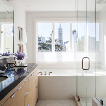
Example of a trendy master marble floor bathroom design in San Francisco with flat-panel cabinets, light wood cabinets, an undermount tub, white walls and an undermount sink
 Herron Horton Architects, Inc.
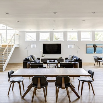
Great room - mid-sized contemporary light wood floor great room idea in Little Rock with white walls and no fireplace
 SV Design
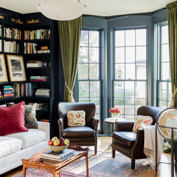
This historic 1840’s Gothic Revival home perched on the harbor, presented an array of challenges: they included a narrow-restricted lot cozy to the neighboring properties, a sensitive coastal location, and a structure desperately in need of major renovations.
The renovation concept respected the historic notion of individual rooms and connecting hallways, yet wanted to take better advantage of water views. The solution was an expansion of windows on the water siding of the house, and a small addition that incorporates an open kitchen/family room concept, the street face of the home was historically preserved.
The interior of the home has been completely refreshed, bringing in a combined reflection of art and family history with modern fanciful choices.
Adds testament to the successful renovation, the master bathroom has been described as “full of rainbows” in the morning.
Find the right local pro for your project
 The Kitchen Place
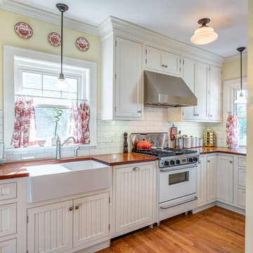
Built in the 1920's, this home's kitchen was small and in desperate need of a re-do (see before pics!!). Load bearing walls prevented us from opening up the space entirely, so a compromise was made to open up a pass thru to their back entry room. The result was more than the homeowner's could have dreamed of. The extra light, space and kitchen storage turned a once dingy kitchen in to the kitchen of their dreams.
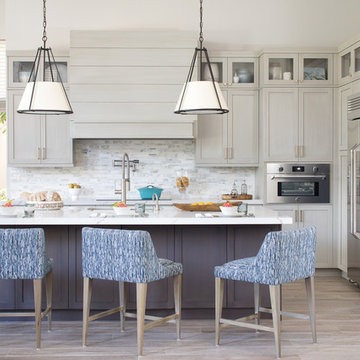
 Krista + Home
Based in Michigan full-time, a network television executive and his wife wanted a comfortable haven to escape the cold months in Palm Beach Gardens, Florida. Empty nesters, they wanted a spot where their adult children could all come together to gather and connect as a family.
The mediterranean-style home, located in a prestigious country club community, was in desperate need of modernizing when we saw the space. The home was dark and dated, with Tuscan style details, an awkward floor plan and mustard walls. A wonderful before and after story, the home is now a vibrant, beautiful, open and contemporary space, designed by Krista Watterworth Alterman of KRISTA + HOME. Recently featured in Modern Luxury Interiors Magazine. Photography by Jessica Glynn.
 Wynne Taylor Ford
www.johnbedellphotography.com
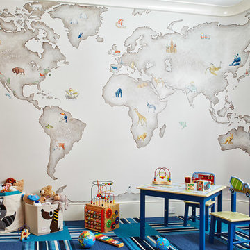
Mid-sized transitional boy carpeted kids' room photo in San Francisco with multicolored walls
Mid-sized transitional boy carpeted kids' room photo in San Francisco with multicolored walls
 Sun Soul Style Interiors
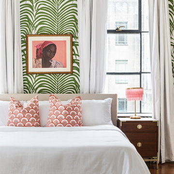
Transitional medium tone wood floor and brown floor bedroom photo in New Orleans with green walls
 StudioLAB
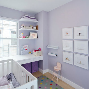
A young couple with three small children purchased this full floor loft in Tribeca in need of a gut renovation. The existing apartment was plagued with awkward spaces, limited natural light and an outdated décor. It was also lacking the required third child’s bedroom desperately needed for their newly expanded family. StudioLAB aimed for a fluid open-plan layout in the larger public spaces while creating smaller, tighter quarters in the rear private spaces to satisfy the family’s programmatic wishes. 3 small children’s bedrooms were carved out of the rear lower level connected by a communal playroom and a shared kid’s bathroom. Upstairs, the master bedroom and master bathroom float above the kid’s rooms on a mezzanine accessed by a newly built staircase. Ample new storage was built underneath the staircase as an extension of the open kitchen and dining areas. A custom pull out drawer containing the food and water bowls was installed for the family’s two dogs to be hidden away out of site when not in use. All wall surfaces, existing and new, were limited to a bright but warm white finish to create a seamless integration in the ceiling and wall structures allowing the spatial progression of the space and sculptural quality of the midcentury modern furniture pieces and colorful original artwork, painted by the wife’s brother, to enhance the space. The existing tin ceiling was left in the living room to maximize ceiling heights and remain a reminder of the historical details of the original construction. A new central AC system was added with an exposed cylindrical duct running along the long living room wall. A small office nook was built next to the elevator tucked away to be out of site.
 TOTAL CONCEPTS
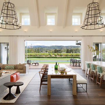
Example of a trendy dark wood floor great room design in San Francisco with white walls
 Workroom Couture Home
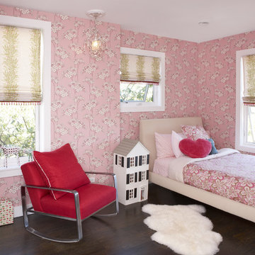
Bedding, Upholstered Chair, Roman Shade and Wallcoverings by Workroom Couture Home. Interiors by FC Studio.
Example of a classic girl dark wood floor kids' room design in Chicago with multicolored walls
Example of a classic girl dark wood floor kids' room design in Chicago with multicolored walls
 Hutker Architects
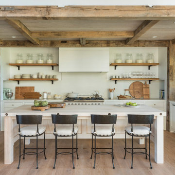
Country u-shaped medium tone wood floor and brown floor kitchen photo in Boston with a farmhouse sink, shaker cabinets, white cabinets, white backsplash, stone slab backsplash, paneled appliances, an island and white countertops
 User
UserRoger Davies Photography
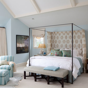
Example of a huge transitional master carpeted bedroom design in New York with blue walls
Example of a huge transitional master carpeted bedroom design in New York with blue walls
 HEYDT DESIGNS
David Duncan Livingston
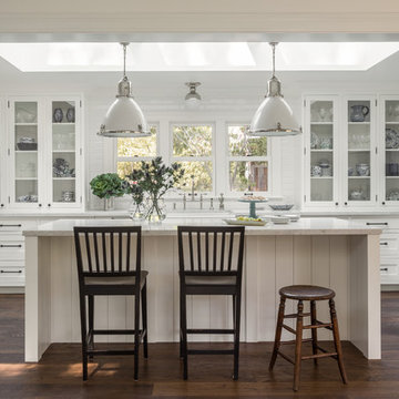
Example of a mid-sized country u-shaped dark wood floor kitchen design in San Francisco with glass-front cabinets, white cabinets, white backsplash, stainless steel appliances and an island
Example of a mid-sized country u-shaped dark wood floor kitchen design in San Francisco with glass-front cabinets, white cabinets, white backsplash, stainless steel appliances and an island
 ACM Design
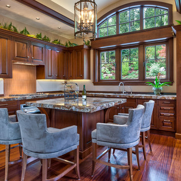
Example of a classic kitchen design in Other with an undermount sink, raised-panel cabinets, dark wood cabinets and beige backsplash
 MANDARINA STUDIO interior design
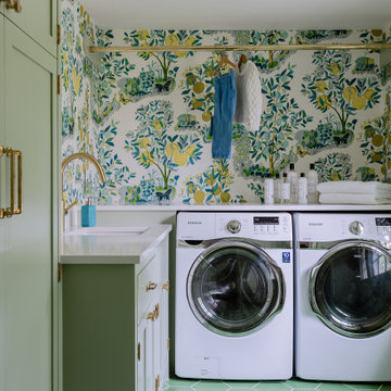
Summary of Scope: gut renovation/reconfiguration of kitchen, coffee bar, mudroom, powder room, 2 kids baths, guest bath, master bath and dressing room, kids study and playroom, study/office, laundry room, restoration of windows, adding wallpapers and window treatments
Background/description: The house was built in 1908, my clients are only the 3rd owners of the house. The prior owner lived there from 1940s until she died at age of 98! The old home had loads of character and charm but was in pretty bad condition and desperately needed updates. The clients purchased the home a few years ago and did some work before they moved in (roof, HVAC, electrical) but decided to live in the house for a 6 months or so before embarking on the next renovation phase. I had worked with the clients previously on the wife's office space and a few projects in a previous home including the nursery design for their first child so they reached out when they were ready to start thinking about the interior renovations. The goal was to respect and enhance the historic architecture of the home but make the spaces more functional for this couple with two small kids. Clients were open to color and some more bold/unexpected design choices. The design style is updated traditional with some eclectic elements. An early design decision was to incorporate a dark colored french range which would be the focal point of the kitchen and to do dark high gloss lacquered cabinets in the adjacent coffee bar, and we ultimately went with dark green.
 Heidi Caillier Design
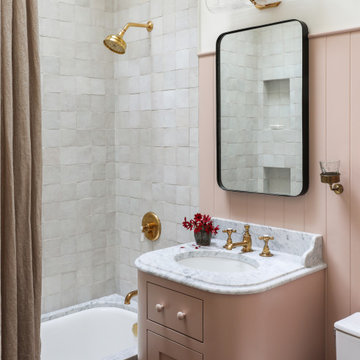
Bathroom - traditional white tile single-sink bathroom idea in Seattle with shaker cabinets, an undermount tub, white walls, an undermount sink, white countertops and a built-in vanity
 a.d.d. concept + design
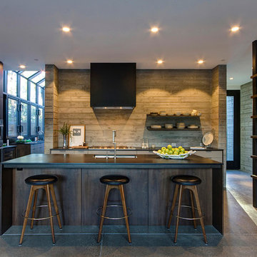
Large cottage l-shaped concrete floor open concept kitchen photo in San Francisco with an undermount sink, flat-panel cabinets, dark wood cabinets, paneled appliances and an island
 Apt2B
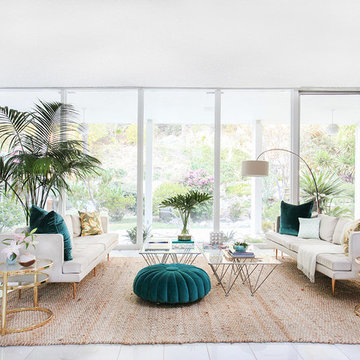
Apt2BLove the way Orlando mirrored the products in Kelly's living room. Photographs by Tessa Neustadt and Sean Gin. Styled by HOMEPOLISH.
Inspiration for a mid-century modern open concept living room remodel in Los Angeles
Inspiration for a mid-century modern open concept living room remodel in Los Angeles
 Tiffany Brooks, HGTV Host & Interior Designer
Inquire About Our Design Services
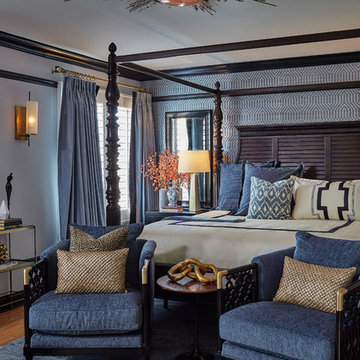
When we first started talking in the spring of 2015, I was impressed. She was witty, realistic, and understood that as much as she loves my shows on HGTV, design does not does not happen in 43 minutes! She told me about her space, and how she felt that her bedroom seemed “blah” to her. She had no retreat. Molly desperately longed for a place that she could spend time in, read in, play in and above all, relax in.
What we did:
Many people are terrified of hiring a designer. Rightfully so, they are investing a pretty penny in their homes. They want to make sure that everything, down to the last floral arrangement, is to their liking, because they will have to live it (and pay for it). Unfortunately, a client can unintentionally stifle a designer’s creativity through micro-management. This can produce lackluster results and ultimately cause more time (and money) to be spent on a project than is really necessary.
With Molly, that was never an issue. Before she even showed me the room in question, she said that I could have full creative license to do what I needed to do to her bedroom. SAY WHAAH!?
With Molly giving me complete creative freedom, I planned everything out and got down to business. The result: Bite-your-bottom-lip sexy. I don’t get jealous of too many of my clients’ spaces, but this one still takes my breath away every time I look at the pics!
The craziest part was that by adding more furniture, it actually made the space feel larger.
Molly and her husband Patrick loved the finished space, and promised me I will be back to finish the rest of the house!
Here’s the highlights of the rest of the project:
I came up with a space plan with three options.
Next, we reviewed mood boards and fabric schemes that would work for both Molly and her hubby Patrick.
We started with the bed. My goal was to add edge to its otherwise traditional style.
We decided to spice things up by painting the trim work in the room black.
We built in layers of lighting with dimmers. In a bedroom everything should be on dimmers, right? Right.
We designed and customized bedding, chairs and window treatments.
Together with Molly, we selected the most perfect wallpaper. This geometric “grasscloth” adds so much depth and dimension that was just missing before.
What I love:
That light fixture. I mean it is really, really amazing in person.
The porcupine mirror. This thing came packaged like it was the hope diamond, and everyone was terrified to handle it. But it really became a highlight of the room.
 J & J Design Group, LLC.
Photos by John Woodcock
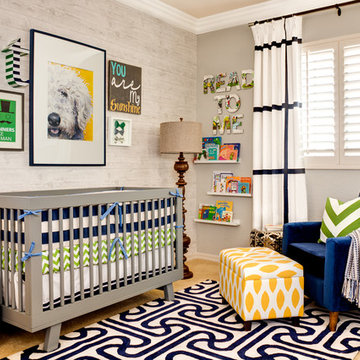
Trendy gender-neutral carpeted nursery photo in Phoenix with gray walls
Trendy gender-neutral carpeted nursery photo in Phoenix with gray walls
4