
Search results for "Determination" in Home Design Ideas

 TKS Design Group
Free ebook, Creating the Ideal Kitchen. DOWNLOAD NOW
The clients thought that they did not want the sink on the island, however, Klimala convinced them that locating it there would provide them with a more comfortable work triangle and allow breathing room for the design.
A new arched opening to the dining room provides for more of an open space for ease of daily use and practical entertaining.
The large island workspace seats three comfortably and provides a view to the backyard in two directions while cozying up to the existing fireplace which is a lovely focal point for the space.
The clients love of nature and desire for a tranquil space helped determine the beach inspired palette of sand, green and blue.
A textured off white subway tile backsplash with bands of colored glass tile give a sense of rhythm to the simple lines of the space. A farm sink and a decorative stainless hood add personality to the room.
Designed by: Susan Klimala, CKD, CBD
Photography by: Carlos Vergara
For more information on kitchen and bath design ideas go to: www.kitchenstudio-ge.com
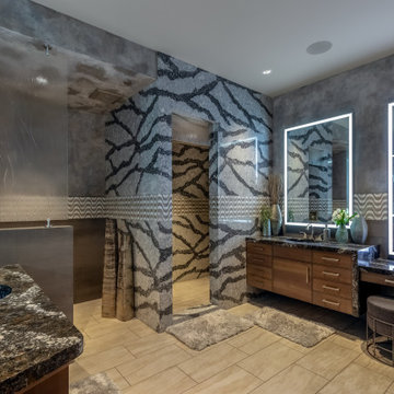
 LK Design
This project began with an entire penthouse floor of open raw space which the clients had the opportunity to section off the piece that suited them the best for their needs and desires. As the design firm on the space, LK Design was intricately involved in determining the borders of the space and the way the floor plan would be laid out. Taking advantage of the southwest corner of the floor, we were able to incorporate three large balconies, tremendous views, excellent light and a layout that was open and spacious. There is a large master suite with two large dressing rooms/closets, two additional bedrooms, one and a half additional bathrooms, an office space, hearth room and media room, as well as the large kitchen with oversized island, butler's pantry and large open living room. The clients are not traditional in their taste at all, but going completely modern with simple finishes and furnishings was not their style either. What was produced is a very contemporary space with a lot of visual excitement. Every room has its own distinct aura and yet the whole space flows seamlessly. From the arched cloud structure that floats over the dining room table to the cathedral type ceiling box over the kitchen island to the barrel ceiling in the master bedroom, LK Design created many features that are unique and help define each space. At the same time, the open living space is tied together with stone columns and built-in cabinetry which are repeated throughout that space. Comfort, luxury and beauty were the key factors in selecting furnishings for the clients. The goal was to provide furniture that complimented the space without fighting it.
 TKS Design Group
Free ebook, Creating the Ideal Kitchen. DOWNLOAD NOW
This young family of four came in right after closing on their house and with a new baby on the way. Our goal was to complete the project prior to baby’s arrival so this project went on the expedite track. The beautiful 1920’s era brick home sits on a hill in a very picturesque neighborhood, so we were eager to give it the kitchen it deserves. The clients’ dream kitchen included pro-style appliances, a large island with seating for five and a kitchen that feels appropriate to the home’s era but that also is fresh and modern. They explicitly stated they did not want a “cookie cutter” design, so we took that to heart.
The key challenge was to fit in all of the items on their wish given the room’s constraints. We eliminated an existing breakfast area and bay window and incorporated that area into the kitchen. The bay window was bricked in, and to compensate for the loss of seating, we widened the opening between the kitchen and formal dining room for more of an open concept plan.
The ceiling in the original kitchen is about a foot lower than the rest of the house, and once it was determined that it was to hide pipes and other mechanicals, we reframed a large tray over the island and left the rest of the ceiling as is. Clad in walnut planks, the tray provides an interesting feature and ties in with the custom walnut and plaster hood.
The space feels modern yet appropriate to its Tudor roots. The room boasts large family friendly appliances, including a beverage center and cooktop/double oven combination. Soft white inset cabinets paired with a slate gray island provide a gentle backdrop to the multi-toned island top, a color echoed in the backsplash tile. The handmade subway tile has a textured pattern at the cooktop, and large pendant lights add more than a bit of drama to the room.
Designed by: Susan Klimala, CKD, CBD
Photography by: Mike Kaskel
For more information on kitchen and bath design ideas go to: www.kitchenstudio-ge.com
Find the right local pro for your project

 Flooret
Part of the Modin Vinyl Plank Collection, Available Exclusively From www.Flooret.com
$3.49 / sq ft, 22.08 sq ft per box
50% WIDER. 25% LONGER. TWICE AS DURABLE
Luxury Vinyl Plank, 5 mm x 9" x 60" (1.0 mm / 40 mil wear-layer)
Lifetime Residential Warranty, 20 year Commercial Warranty
Classic Oak Elegance. Arden provides a timeless template with which to define your space. We designed the grain pattern to have just a hint of rustic, but it is still clean enough that you can convincingly use it in a modern setting.
REDEFINING DURABILITY
The most important specification for determining the durability of vinyl flooring is the thickness of the wear-layer. The best wear-layers are made of thick, clear virgin PVC, which covers the paper print-film that gives the floor its unique appearance. Once the wear-layer wears through, the paper is damaged and the floor will need replacement.
Most vinyl floors come with a 8-12 mil wear-layer (0.2-3 mm). The top commercial specs in the industry are higher, at 20-22 mil (0.5 mm). A select few manufacturers offer a "super" commercial spec of 28 mil (0.7 mm).
For Modin, we decided to set a new standard: 40 mil (1.0 mm) of premium virgin PVC. This allows us to offer an industry-leading 20 year Commercial Warranty (Lifetime Residential), compared to nearly all other commercial vinyl floors' 10 year Commercial Warranty.
Beyond our superior wear-layer, we also use a patented click mechanism for superior hold, and a ceramic-bead coating.
SIZE MATTERS
Wider and longer planks create a sense of space and luxury. Most vinyl floors come in 6" or 7" widths, and 36" or 48" lengths.
For Modin, we designed our planks to be 9" wide, and 60" long. This extra large size allows our gorgeous designs to be fully expressed.
DETAILS THAT COUNT
We made sure to get all the details right. Real texture, to create the feel of wire-brushed wood. Low sheen level, to ensure a natural look that wears well over time. 4-sided bevels, to more accurately emulate the look of real planks. When added together they help create the unique look that is Modin.
DESIGNS THAT INSPIRE
We spent nearly a year just focusing on our designs, to ensure they provide the right mix of color and depth. Focusing on timeless wire-brush and European Oak styles, as well as more contemporary modern washes, our collection offers truly beautiful design that is both functional and inspiring.


 Connecticut Stone
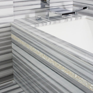
The owners wanted a unique bathroom that would complement their beautiful, one of a kind, modern residence. Olympic Grey marble from Turkey was selected. This was a renovation so we were particularly careful in handling and installation.
There were many challenges to the project. First, the material is quite specific in its veining so we needed to make a mock up to determine how to cut the slabs in a way that would allow the vein to follow around the room (in and out of niches). We were working with a finite amount of material, 14 slabs, so we needed to design and engineer the project accordingly. In addition, the client wanted to maximize efficiency for cost control so we designed the seam placement to fall strategically (behind the toilet, for example) so that he would not need to purchase additional material. The bathroom is actually quite small so there were significant constraints in trying to fit and maneuver the large panels in tight spaces.
The vanity countertop was made in Pental Quartz Thassos Polished 1-1/4”. We carved channels in the vanity top to insert Troca Mother of Pearl Flat Liners. We followed this same detail at the Tub Apron.
Identification & Stone Information
Stone Supplier: Connecticut Stone/ Tyra Dellacroce
Stone Fabricator: Connecticut Stone/ Tyra Dellacroce
Stone Installer: Martany Tile/ Anthony Collins
General Contractor: DPD Builders/ Dan Divitto
Designer: Juan Montoya Design
Material: Olympic Grey Polished
Thickness: ¾”
Finish: Polished
Quantity: Approx. 250 SF
Stone Dimensions: Custom cut to size panels
Neil Landino

 Kathleen Jennison
An Arts & Crafts Bungalow is one of my favorite styles of homes. We have quite a few of them in our Stockton Mid-Town area. And when C&L called us to help them remodel their 1923 American Bungalow, I was beyond thrilled.
As per usual, when we get a new inquiry, we quickly Google the project location while we are talking to you on the phone. My excitement escalated when I saw the Google Earth Image of the sweet Sage Green bungalow in Mid-Town Stockton. "Yes, we would be interested in working with you," I said trying to keep my cool.
But what made it even better was meeting C&L and touring their home, because they are the nicest young couple, eager to make their home period perfect. Unfortunately, it had been slightly molested by some bad house-flippers, and we needed to bring the bathroom back to it "roots."
We knew we had to banish the hideous brown tile and cheap vanity quickly. But C&L complained about the condensation problems and the constant fight with mold. This immediately told me that improper remodeling had occurred and we needed to remedy that right away.
The Before: Frustrations with a Botched Remodel
The bathroom needed to be brought back to period appropriate design with all the functionality of a modern bathroom. We thought of things like marble countertop, white mosaic floor tiles, white subway tile, board and batten molding, and of course a fabulous wallpaper.
This small (and only) bathroom on a tight budget required a little bit of design sleuthing to figure out how we could get the proper look and feel. Our goal was to determine where to splurge and where to economize and how to complete the remodel as quickly as possible because C&L would have to move out while construction was going on.
The Process: Hard Work to Remedy Design and Function
During our initial design study, (which included 2 hours in the owners’ home), we noticed framed images of William Morris Arts and Crafts textile patterns and knew this would be our design inspiration. We presented C&L with three options and they quickly selected the Pimpernel Design Concept.
We had originally selected the Black and Olive colors with a black vanity, mirror, and black and white floor tile. C&L liked it but weren’t quite sure about the black, We went back to the drawing board and decided the William & Co Pimpernel Wallpaper in Bayleaf and Manilla color with a softer gray painted vanity and mirror and white floor tile was more to their liking.
After the Design Concept was approved, we went to work securing the building permit, procuring all the elements, and scheduling our trusted tradesmen to perform the work.
We did uncover some shoddy work by the flippers such as live electrical wires hidden behind the wall, plumbing venting cut-off and buried in the walls (hence the constant dampness), the tub barely balancing on two fence boards across the floor joist, and no insulation on the exterior wall.
All of the previous blunders were fixed and the bathroom put back to its previous glory. We could feel the house thanking us for making it pretty again.
The After Reveal: Cohesive Design Decisions
We selected a simple white subway tile for the tub/shower. This is always classic and in keeping with the style of the house.
We selected a pre-fab vanity and mirror, but they look rich with the quartz countertop. There is much more storage in this small vanity than you would think.
The Transformation: A Period Perfect Refresh
We began the remodel just as the pandemic reared and stay-in-place orders went into effect. As C&L were already moved out and living with relatives, we got the go-ahead from city officials to get the work done (after all, how can you shelter in place without a bathroom?).
All our tradesmen were scheduled to work so that only one crew was on the job site at a time. We stayed on the original schedule with only a one week delay.
The end result is the sweetest little bathroom I've ever seen (and I can't wait to start work on C&L's kitchen next).
Thank you for joining me in this project transformation. I hope this inspired you to think about being creative with your design projects, determining what works best in keeping with the architecture of your space, and carefully assessing how you can have the best life in your home.

 Jordan Design Build Group
JDBG is wrapping up work on an expansive 2-story sunroom addition that also included modifications to the existing home’s interior and significant exterior improvements as well. The original project brief was to provide a conditioned 4-season sunroom addition where the homeowners could relax and enjoy their wooded views. As we delved deeper into our client’s overall objectives, it became clear that this would be no ordinary sunroom addition. The resulting 16’x25’ sunroom is a showstopper with 10’ high ceilings and wall to wall windows offering expansive views of the surrounding landscape.
As we recommend with most addition projects, the process started with our Preliminary Design Study to determine project goals, design concepts, project feasibility and associated budget estimates. During this process, our design team worked to ensure that both interior and exterior were fully integrated. We conducted in-depth programming to identify key goals and needs which would inform the design and performed a field survey and zoning analysis to identify any constraints that could impact the plans. The next step was to develop conceptual designs that addressed the program requirements.
Using a combination of 3-D massing, interior/exterior renderings, precedent imaging and space planning, the design concept was revised and refined. At the end of the study we had an approved schematic design and comprehensive budget estimates for the 2-story addition and were ready to move into design development, construction documentation, trade coordination, and final pricing. A complex project such as this involves architectural and interior design, structural and civil engineering, landscape design and environmental considerations. Multiple trades and subs are engaged during construction, from HVAC to electrical and plumbing, framers, carpenters and masons, roofers and painters just to name a few. JDBG was there every step of the way to ensure quality construction.
Other notable features of the renovation included expanding the home’s existing dining room, incorporating a custom ‘dish room,’ and providing fully conditioned storage and his & her workrooms on the lower level. A new front portico will visually connect the old and new structures and a brand new roof, shutters and paint will further transform the exterior. Thoughtful planning was also given to the landscape, including a back deck, stone patio and walkways, plantings and exterior lighting. Stay tuned for more photos as this sunroom addition nears completion.
 Signature Designs Kitchen | Bath | Interiors
AN INVITING BASEMENT REMODEL THE WHOLE FAMILY CAN ENJOY
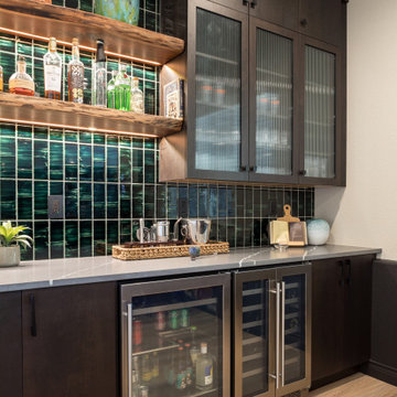
Are you tired of your basement being a dreary space used solely for storage? Well, it's time to transform it into a cozy and inviting area that the whole family can enjoy! A basement remodel is the perfect opportunity to create a comfortable and functional space that will add value to your home. And what better way to elevate your basement's entertainment potential than with a built-in wet bar? Get ready to raise a glass and say cheers to comfort as we dive into the details of designing a cozy basement remodel.
A basement remodel can add significant value to your home and give you more space to relax. On weekends, a basement bar will surely make your home the go-to spot for get togethers with friends. Before diving into your basement remodel, it's important to assess your space and determine its potential. Take a good look at the layout, lighting, and any existing features that could enhance your design. By assessing your basement space thoroughly, you'll be one step closer to creating a cozy and inviting oasis for your family.
Perhaps you can incorporate a built-in bar with a green tile backsplash or add a touch of natural beauty with a live edge wood top. The bar features warm colors, rich textures in the hand made tile and plenty of seating space for family and friends to gather around. The bar live edge countertop with Hunter green epoxy center stage in our clients basement makeover and really brings the drama.
ESSENTIAL ELEMENTS FOR A FAMILY-FRIENDLY BASEMENT
When designing a family-friendly basement, it's important to consider essential elements that will make the space comfortable and enjoyable for everyone. Incorporating a green epoxy flooring can add a vibrant and durable touch to your basement, making it easy to clean and perfect for kids' playtime. Additionally, consider adding ample storage solutions, cozy seating areas, and versatile lighting options to create a space that is functional, inviting, and perfect for family gatherings and entertainment.

 Jarrett Design
Wrestling is this family’s sport. Applying lessons from the mat, this couple won their dream kitchen. Similar to pinning one’s opponent, the remodeling process takes visualization, determination, and keeping one’s eye on the prize. These clients came to us with a clear vision of their new kitchen. They knew what they wanted it to look like and how they needed the space to function for their family. Their goal was to transform an outdated floor plan that included a dark, small kitchen into a bright, open space with counters galore, an island with seating and room for a large dining table. The couple had recently purchased this home from the husband’s parents. This was where he was raised. The family home was very special to them and now it was time to make it ‘theirs’.
Just as in focus as their vision, was their budget. They knew it was tight, but were willing to make reasonable concessions. Walls were removed, flooring changed and the new kitchen switched places with the dining area. This change allowed the sun porch to become more inviting, an unexpected bonus. Semi-custom cabinetry, in contrasting paint colors, and quartz counter tops brighten the space. The galley design with island seating makes cooking for the family and entertaining larger groups enjoyable. The entire process was smooth and the result aesthetically fabulous with all the function they desired.
This project was one of our favorites because we were thrilled to be able to help provide this dream kitchen on a budget to some of the very nicest clients, a winning result for all.
Matt Villano Photography

 Cowart Door Systems
These doors are a prominent architectural feature of the home. Their custom window design as well as their arched header make for beautiful "garden style" doors.

 Housetrends Magazine
Since moving into her Dublin home two and a half years ago, Nancy Sanford has been peeling off the decades—quite literally. Built in the 1980s, the home was “very well-maintained, but very little had been done to it” in terms of updating the finishes or style, Sanford says. Plush white carpet ran from wall-to-wall-to-wall, almond-colored laminate coated the kitchen cabinets and wallpaper ran rampant—even covering some ceilings.
Despite her efforts, Sanford knew it was going to take more than cosmetic editing to shake the ‘80s and make the home her own. Although she lives in the traditional-leaning Muirfield community, Sanford adores a minimalist, contemporary style—and admits to devouring design magazines “ad nauseam.”
To implement her thoroughly modern vision, Sanford turned to Brigid Norton, an interior designer and family friend, and Kristi Youles, a kitchen designer with The JAE Company. Working together, the trio created a carefully considered contemporary design that’s easy on the eyes, and the body.
In addition to improving the flow of the kitchen—by removing a V-shaped peninsula that angled out into the room—and adding appliances like a stainless steel refrigerator, Sanford’s short list of must-haves included clean, uncluttered lines and no wall cabinets over the countertops. “I’ve found as I’ve aged, I’ve gotten shorter and just don’t use the upper cabinets,” Sanford explains.
Easy-access, smooth-slide drawers with clean slab fronts were the answer—resulting in strong visual lines, an open, airy feel and enhanced ergonomics. Starting with a “needs assessment,” Youles and Norton designed the space quite literally around Nancy. By looking at factors such as her height and which items she uses most frequently, they were able to determine the optimum placement for everything from canned goods in the pantry to cutlery, pans and plates in the customized drawers, all of which helped to achieve the ultimate kitchen organization.
But there’s more to the kitchen cabinets smooth façade than clean-lined storage. Walnut drawer fronts—found on the oven and the base of the island—are book-matched, allowing the grain to continue from drawer to drawer. And even in spaces where drawers weren’t feasible, beneath the sink and in a desk area, the designers continued the look with cabinet doors crafted to resemble drawers.
The visual continuity of these lines might not be as impactful if it weren’t for the careful selection of contrasting finishes. The designers filled the space with pure, glossy white—using a specific type of quartz, White Cliff by Cambria, to accent the bold rectangular design of the island. Then, to break up the expanse of accompanying white painted drawers, walnut was selected to bring the contrasting warmth and grain of wood without red undertones. It is commonly found in modern furniture design, as well as current productions of mid-century designs like the iconic Eames Lounge Chair from Herman Miller, Youles says.
 Kathleen Jennison
An Arts & Crafts Bungalow is one of my favorite styles of homes. We have quite a few of them in our Stockton Mid-Town area. And when C&L called us to help them remodel their 1923 American Bungalow, I was beyond thrilled.
As per usual, when we get a new inquiry, we quickly Google the project location while we are talking to you on the phone. My excitement escalated when I saw the Google Earth Image of the sweet Sage Green bungalow in Mid-Town Stockton. "Yes, we would be interested in working with you," I said trying to keep my cool.
But what made it even better was meeting C&L and touring their home, because they are the nicest young couple, eager to make their home period perfect. Unfortunately, it had been slightly molested by some bad house-flippers, and we needed to bring the bathroom back to it "roots."
We knew we had to banish the hideous brown tile and cheap vanity quickly. But C&L complained about the condensation problems and the constant fight with mold. This immediately told me that improper remodeling had occurred and we needed to remedy that right away.
The Before: Frustrations with a Botched Remodel
The bathroom needed to be brought back to period appropriate design with all the functionality of a modern bathroom. We thought of things like marble countertop, white mosaic floor tiles, white subway tile, board and batten molding, and of course a fabulous wallpaper.
This small (and only) bathroom on a tight budget required a little bit of design sleuthing to figure out how we could get the proper look and feel. Our goal was to determine where to splurge and where to economize and how to complete the remodel as quickly as possible because C&L would have to move out while construction was going on.
The Process: Hard Work to Remedy Design and Function
During our initial design study, (which included 2 hours in the owners’ home), we noticed framed images of William Morris Arts and Crafts textile patterns and knew this would be our design inspiration. We presented C&L with three options and they quickly selected the Pimpernel Design Concept.
We had originally selected the Black and Olive colors with a black vanity, mirror, and black and white floor tile. C&L liked it but weren’t quite sure about the black, We went back to the drawing board and decided the William & Co Pimpernel Wallpaper in Bayleaf and Manilla color with a softer gray painted vanity and mirror and white floor tile was more to their liking.
After the Design Concept was approved, we went to work securing the building permit, procuring all the elements, and scheduling our trusted tradesmen to perform the work.
We did uncover some shoddy work by the flippers such as live electrical wires hidden behind the wall, plumbing venting cut-off and buried in the walls (hence the constant dampness), the tub barely balancing on two fence boards across the floor joist, and no insulation on the exterior wall.
All of the previous blunders were fixed and the bathroom put back to its previous glory. We could feel the house thanking us for making it pretty again.
The After Reveal: Cohesive Design Decisions
We selected a simple white subway tile for the tub/shower. This is always classic and in keeping with the style of the house.
We selected a pre-fab vanity and mirror, but they look rich with the quartz countertop. There is much more storage in this small vanity than you would think.
The Transformation: A Period Perfect Refresh
We began the remodel just as the pandemic reared and stay-in-place orders went into effect. As C&L were already moved out and living with relatives, we got the go-ahead from city officials to get the work done (after all, how can you shelter in place without a bathroom?).
All our tradesmen were scheduled to work so that only one crew was on the job site at a time. We stayed on the original schedule with only a one week delay.
The end result is the sweetest little bathroom I've ever seen (and I can't wait to start work on C&L's kitchen next).
Thank you for joining me in this project transformation. I hope this inspired you to think about being creative with your design projects, determining what works best in keeping with the architecture of your space, and carefully assessing how you can have the best life in your home.
 Flooret
Part of the Modin Vinyl Plank Collection, Available Exclusively From www.Flooret.com
$3.49 / sq ft, 22.08 sq ft per box
50% WIDER. 25% LONGER. TWICE AS DURABLE
Luxury Vinyl Plank, 5 mm x 9" x 60" (1.0 mm / 40 mil wear-layer)
Lifetime Residential Warranty, 20 year Commercial Warranty
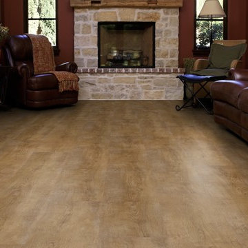
Classic Oak Elegance. Arden provides a timeless template with which to define your space. We designed the grain pattern to have just a hint of rustic, but it is still clean enough that you can convincingly use it in a modern setting.
REDEFINING DURABILITY
The most important specification for determining the durability of vinyl flooring is the thickness of the wear-layer. The best wear-layers are made of thick, clear virgin PVC, which covers the paper print-film that gives the floor its unique appearance. Once the wear-layer wears through, the paper is damaged and the floor will need replacement.
Most vinyl floors come with a 8-12 mil wear-layer (0.2-3 mm). The top commercial specs in the industry are higher, at 20-22 mil (0.5 mm). A select few manufacturers offer a ?super? commercial spec of 28 mil (0.7 mm).
For Modin, we decided to set a new standard: 40 mil (1.0 mm) of premium virgin PVC. This allows us to offer an industry-leading 20 year Commercial Warranty (Lifetime Residential), compared to nearly all other commercial vinyl floors? 10 year Commercial Warranty.
Beyond our superior wear-layer, we also use a patented click mechanism for superior hold, and a ceramic-bead coating.
SIZE MATTERS
Wider and longer planks create a sense of space and luxury. Most vinyl floors come in 6? or 7? widths, and 36? or 48? lengths.
For Modin, we designed our planks to be 9? wide, and 60? long. This extra large size allows our gorgeous designs to be fully expressed.
DETAILS THAT COUNT
We made sure to get all the details right. Real texture, to create the feel of wire-brushed wood. Low sheen level, to ensure a natural look that wears well over time. 4-sided bevels, to more accurately emulate the look of real planks. When added together they help create the unique look that is Modin.
DESIGNS THAT INSPIRE
We spent nearly a year just focusing on our designs, to ensure they provide the right mix of color and depth. Focusing on timeless wire-brush and European Oak styles, as well as more contemporary modern washes, our collection offers truly beautiful design that is both functional and inspiring.
 TKS Design Group
Free ebook, Creating the Ideal Kitchen. DOWNLOAD NOW
This young family of four came in right after closing on their house and with a new baby on the way. Our goal was to complete the project prior to baby’s arrival so this project went on the expedite track. The beautiful 1920’s era brick home sits on a hill in a very picturesque neighborhood, so we were eager to give it the kitchen it deserves. The clients’ dream kitchen included pro-style appliances, a large island with seating for five and a kitchen that feels appropriate to the home’s era but that also is fresh and modern. They explicitly stated they did not want a “cookie cutter” design, so we took that to heart.
The key challenge was to fit in all of the items on their wish given the room’s constraints. We eliminated an existing breakfast area and bay window and incorporated that area into the kitchen. The bay window was bricked in, and to compensate for the loss of seating, we widened the opening between the kitchen and formal dining room for more of an open concept plan.
The ceiling in the original kitchen is about a foot lower than the rest of the house, and once it was determined that it was to hide pipes and other mechanicals, we reframed a large tray over the island and left the rest of the ceiling as is. Clad in walnut planks, the tray provides an interesting feature and ties in with the custom walnut and plaster hood.
The space feels modern yet appropriate to its Tudor roots. The room boasts large family friendly appliances, including a beverage center and cooktop/double oven combination. Soft white inset cabinets paired with a slate gray island provide a gentle backdrop to the multi-toned island top, a color echoed in the backsplash tile. The handmade subway tile has a textured pattern at the cooktop, and large pendant lights add more than a bit of drama to the room.
Designed by: Susan Klimala, CKD, CBD
Photography by: Mike Kaskel
For more information on kitchen and bath design ideas go to: www.kitchenstudio-ge.com
 JWLaCrosse Architect
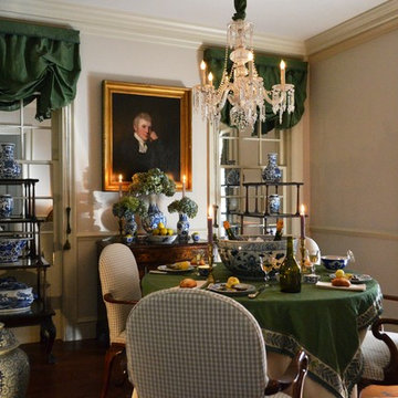
This "jewel box" of a room was photographed for the book In with the Old, classic decor from A to Z by author Jennifer Boles -founder of www.thepeakofchic.blogspot.com. The room is featured in the chapter on Candlelight
Hanging between the two mirrored windows is the portrait is of the Reverend Christopher Swainson circa 1799. Rev. Swainson was the private tutor to the second Earl of Powis, his brother Robert Clive, and their sister Charlotte Florentia Clive, the future Duchess of Northumberland -governess to Queen Victoria- The plant Clivia was named in her honor. Surprisingly the Reverend was found in a local thrift shop just outside of Atlanta. His identity was determined after deciphering faint writing on the back of the frame.
The chinoiserie chippendale styled etageres, once owned by Eleanor Stout McRae, display an assortment of blue & white porcelain. While not of any great quality they never the less give great effect to the decor. The draperies -festoon blinds or ballon shades, depending on which side of the Atlantic you reside - were fashioned in the 18th century manner. The fabric is green silk & wool moreen, it was salvaged from draperies pulled down from the former home of Virginia Carroll Crawford.
The random width american black walnut flooring was salvaged from "Boxwood" in Ansley Park, built in 1914 for Mr. & Mrs. James Swann Floyd. The flooring was originally installed in 1928 for the wedding of their daughter Frances to Emory Cocke. The Floyd's were great entertainers and held many lavish parties. If those floors could talk. Sadly Boxwood was demolished in 2014. Jonathan pulled up each board himself, chiseling out every walnut peg, and butterfly joint, behind which was a steel screw. After the screws were removed the boards. also nailed down, had to be pried up with a crowbar. It was a lengthy process, and all done in the early summer with no air conditioning. It was well worth it.
The trimwork is all new but leftover from another job.
The whole project is an example of being resourceful, some could even say being environmentally conscious.
Photo by Jonathan LaCrosse
 Signature Designs Kitchen | Bath | Interiors
AN INVITING BASEMENT REMODEL THE WHOLE FAMILY CAN ENJOY
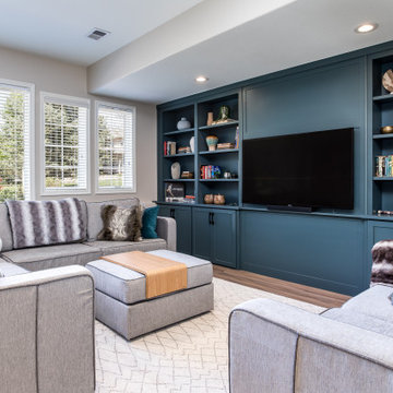
Are you tired of your basement being a dreary space used solely for storage? Well, it's time to transform it into a cozy and inviting area that the whole family can enjoy! A basement remodel is the perfect opportunity to create a comfortable and functional space that will add value to your home. And what better way to elevate your basement's entertainment potential than with a built-in wet bar? Get ready to raise a glass and say cheers to comfort as we dive into the details of designing a cozy basement remodel.
A basement remodel can add significant value to your home and give you more space to relax. On weekends, a basement bar will surely make your home the go-to spot for get togethers with friends. Before diving into your basement remodel, it's important to assess your space and determine its potential. Take a good look at the layout, lighting, and any existing features that could enhance your design. By assessing your basement space thoroughly, you'll be one step closer to creating a cozy and inviting oasis for your family.
Perhaps you can incorporate a built-in bar with a green tile backsplash or add a touch of natural beauty with a live edge wood top. The bar features warm colors, rich textures in the hand made tile and plenty of seating space for family and friends to gather around. The bar live edge countertop with Hunter green epoxy center stage in our clients basement makeover and really brings the drama.
ESSENTIAL ELEMENTS FOR A FAMILY-FRIENDLY BASEMENT
When designing a family-friendly basement, it's important to consider essential elements that will make the space comfortable and enjoyable for everyone. Incorporating a green epoxy flooring can add a vibrant and durable touch to your basement, making it easy to clean and perfect for kids' playtime. Additionally, consider adding ample storage solutions, cozy seating areas, and versatile lighting options to create a space that is functional, inviting, and perfect for family gatherings and entertainment.

 OCTOBER 5 Fine Home Builders
Sometimes, I can’t help but smile. Recently October 5 met a beautiful couple, Al and Shawn. With their two sons gone, they decided to remodel their kitchen. The house was built in 1957, with the original kitchen remaining.
When I first met Shawn, she was determined, make no mistake about it. She wanted, “. . . dark cabinets with a dark floor.” End of story! Hmmm . . . I just smiled and listened. She finally asked me what I thought. I told her, “Well, I don’t really see dark cabinets with a dark floor.”
Beautifully carved wooden beams supported the living room ceiling, along with a well design wrap-around comfortable bay-window seat. All of it painted white, which looked beautiful and enjoyed architectural significance. I guess after living in a house for 27 years, we tend to overlook its natural treasures. Shawn was having none of it. “Oh my god, white? Who’s going to keep it clean? No way? Dark, dark, dark!”
Sometimes, you just have to let an idea sit and marinate. You might guess as to who won . . . remember, I am writing this. Shawn and Al have to be one of my favorite clients of all times. We debated, argued and even kept score. Shawn won on the countertops, Arabian Nights, I have to give her credit, and the backsplash. She did not want outlets in the Carrera Marble backsplash, which surprisingly has changed my opinion, but I won everything else.
At the end of the project the score was Shawn = 2 (may be 3) and Jim = 12+ (I eventually lost count, but who’s counting anyway.)
Sometimes, I can’t help but smile. Hope you do too, when you look at the pictures below.

 By Design Interiors Inc
The custom his and hers master closet is a girl's dream closet with storage for every type of clothing and organization for all kinds of accessories!
Ashton Morgan, By Design Interiors
Photography: Daniel Angulo
Builder: Flair Builders
 Flooret
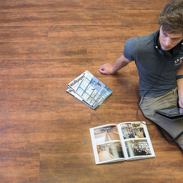
High rustic. We designed Imber to have the brown and red tones of more rustic spaces, but left out the big knots and cracks. This allows it to play nicely with a range of spaces.
The most important specification for determining the durability of vinyl flooring is the thickness of the wear-layer. The best wear-layers are made of thick, clear virgin PVC, which covers the paper print-film that gives the floor its unique appearance. Once the wear-layer wears through, the paper is damaged and the floor will need replacement.
Most vinyl floors come with a 8-12 mil wear-layer (0.2-3 mm). The top commercial specs in the industry are higher, at 20-22 mil (0.5 mm). A select few manufacturers offer a “super” commercial spec of 28 mil (0.7 mm).
For Modin, we decided to set a new standard: 40 mil (1.0 mm) of premium virgin PVC. This allows us to offer an industry-leading 20 year Commercial Warranty (Lifetime Residential), compared to nearly all other commercial vinyl floors’ 10 year Commercial Warranty.
Beyond our superior wear-layer, we also use a patented click mechanism for superior hold, and a ceramic-bead coating.
SIZE MATTERS
Wider and longer planks create a sense of space and luxury. Most vinyl floors come in 6” or 7” widths, and 36” or 48” lengths.
For Modin, we designed our planks to be 9” wide, and 60” long. This extra large size allows our gorgeous designs to be fully expressed.
DETAILS THAT COUNT
We made sure to get all the details right. Real texture, to create the feel of wire-brushed wood. Low sheen level, to ensure a natural look that wears well over time. 4-sided bevels, to more accurately emulate the look of real planks. When added together they help create the unique look that is Modin.
DESIGNS THAT INSPIRE
We spent nearly a year just focusing on our designs, to ensure they provide the right mix of color and depth. Focusing on timeless wire-brush and European Oak styles, as well as more contemporary modern washes, our collection offers truly beautiful design that is both functional and inspiring.
157