
Search results for "Determination" in Home Design Ideas

 Vintage Cellars & Saunas
This gorgeous contemporary glass front custom wine cellar in Corona Del Mar, Newport Beach, California is an eye catcher. The sleek, glass ultra modern wine room was a unique and exciting project for our team here at Vintage Cellars. The stone bar extends into the wine cellar itself, but due to mechanical, cooling, and condensation concerns, our expert custom wine cellar team knew that extra measures needed to be taken to ensure the end quality remained top notch.
The bar itself was divided into two sections, one cut section outside to make up the main seating area and the other inside the glass wine room. The stone bar, which is porous, takes up a good portion of the front facing glass panel. Had the bar simply extended into the wine cellar and been sealed off at the joints, the stone would have eventually transferred in enough heat and moisture to cause condensation. Proper wine cellar design and planning enabled this wine cellar to not only look fantastic, but function perfectly as well.
One interesting unique feature in this Corona Del Mar, Newport Beach, Orange County, California glass and metal wine cellar is an extension of floor to ceiling frames mounted to the backside of the stone bar. This feature was made to seamlessly show consistency in floor to ceiling vintageview frames throughout.
Corona Del Mar, Newport Beach, Laguna Beach, Huntington Beach, Newport Coast, Ladera Ranch, Coto De Caza, Laguna Hills, San Clemente, Dana Point, Seal Beach, Laguna Niguel still remain the areas in Orange County that we build wine cellars most often.
Contemporary wine cellars such as this are becoming more and more popular in modern design trends. Interior Design, Architecture, and Construction all play a part in ensuring that the client’s vision comes to reality. This project was no different. Working closely with David Close Homes, Vintage Cellars was able to meet with the client and team involved, determine the ultimate wine cellar wine room wine closet goals, and see them to the finish.
Upon walking into this glass and metal modern contemporary wine cellar, you become quickly surrounded with triple deep bottles from many of the world’s best wineries. On the left below the countertop is a black stained poplar wine racking system for single 750ml bottles. Above lies room for display case storage, room for large format bottles, and label forward vintageview design racking to the ceiling. On the middle wall of this wine room is room for case storage below, similarly with triple deep vintageview floor to ceiling frames dying into more case storage above. On the right side of this wall lies a vertical space for single large format case storage.
Ultra Modern wine cellars such as this are all the rage in contemporary homes in San Diego, Orange County, and Los Angeles. This glass enclosed wine cellar with a sleek modern contemporary racking system is truly a showpiece in this home in Corona Del Mar, Newport Beach, California. Wine Racking, Wine Cellar Cooling, Wine Cellar design, Wine Cellar Build out and Wine Cellar Installation is what Vintage Cellars does best. Timeless Luxury.

 TBS Construction Inc.
Los Gatos powder room in style of Art Nouveau! With the great products and creativity we get amazing projects and happy, satisfied clients.
Caesarstone Classico / Piatra Grey countertop, Crystal cabinets, fully custom, cherry wood with nutmeg stain, inset with beaded detail. Mirror by Hubbardton Forge. Sink by Kohler Devonshire in Cashmere color. Knobs by Berenson Decorative Hardware, Art Nouveau collection. Tile by Crossville porcelain field and tile, Virtue series — in Los Gatos, California.
Dean J Birinyi
 In Detail Interiors
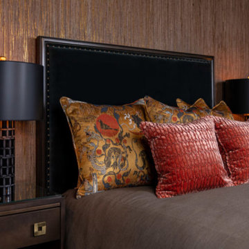
A master bedroom with rich color, texture and personality!
With a colorful master bathroom that blends the perfect matte finish, semi-primitive blast of pattern with rich, saturated jewel tones and a little calacatta gold tile – determining the best fabrics and finishes for the master bedroom felt like a HUGE challenge. How do you stand up to something so fabulously unique and still create a soft respite for someone to slumber?!
This bedroom was a small space with existing Vetrazzo floors and an entire wall dedicated to floor-to-ceiling fixed glass pane windows. Between the cracks in the plaster ceiling and the lacquered pink dresser we knew we had our work cut out.
Saturated colors create a fairy tale bedroom
Fast forward to finding the perfect, sumptuously soft evergreen mohair for the headboard and furry tuffets for the foot of the bed. Texture became the name of the game and a certain level of color variation had to tie through from selection to selection. Cladding the walls with a gilt woven cloth wall covering that also pulled a sort of skin-tone clay from detail found in the Vetrazzo flooring (OMG! so pretty!) and grounding everything with a sort of deco-inspired one-of-a-kind wool rug. The layers of unexpected style helped develop a more collected – less stylized – feeling overall.
Then it was bye-bye to the pink lacquer! A local artisan worked on a faux finish for the custom dresser that the client had already invested in and we just gave it a refresh with a deep bronze finish. Balancing this piece with the playful silk tassel pendant lights that frame a beautiful original painting of red headed queens by artist Nancy Rhodes Harper.
Exquisite lighting for a sexy master bedroom
Additionally, the swirl and swoop of the forged metal light fixture overhead play off the more structured spinal-column type pattern of the black out window treatments that truly act as their own piece of art. Each element has its place and plays with the visual and textural aesthetics that make our client (and our team) swoon.
Want more colorful and moody interior spaces? Check out another one of our recent projects here! Then call us for more information on how we can help you! Read more about our full-service interior design here!
Find the right local pro for your project

 TKS Design Group
Free ebook, Creating the Ideal Kitchen. DOWNLOAD NOW
This young family of four came in right after closing on their house and with a new baby on the way. Our goal was to complete the project prior to baby’s arrival so this project went on the expedite track. The beautiful 1920’s era brick home sits on a hill in a very picturesque neighborhood, so we were eager to give it the kitchen it deserves. The clients’ dream kitchen included pro-style appliances, a large island with seating for five and a kitchen that feels appropriate to the home’s era but that also is fresh and modern. They explicitly stated they did not want a “cookie cutter” design, so we took that to heart.
The key challenge was to fit in all of the items on their wish given the room’s constraints. We eliminated an existing breakfast area and bay window and incorporated that area into the kitchen. The bay window was bricked in, and to compensate for the loss of seating, we widened the opening between the kitchen and formal dining room for more of an open concept plan.
The ceiling in the original kitchen is about a foot lower than the rest of the house, and once it was determined that it was to hide pipes and other mechanicals, we reframed a large tray over the island and left the rest of the ceiling as is. Clad in walnut planks, the tray provides an interesting feature and ties in with the custom walnut and plaster hood.
The space feels modern yet appropriate to its Tudor roots. The room boasts large family friendly appliances, including a beverage center and cooktop/double oven combination. Soft white inset cabinets paired with a slate gray island provide a gentle backdrop to the multi-toned island top, a color echoed in the backsplash tile. The handmade subway tile has a textured pattern at the cooktop, and large pendant lights add more than a bit of drama to the room.
Designed by: Susan Klimala, CKD, CBD
Photography by: Mike Kaskel
For more information on kitchen and bath design ideas go to: www.kitchenstudio-ge.com

 Kimberley Bryan
Photo: Kimberley Bryan © 2016 Houzz
Mid-sized transitional gray two-story mixed siding exterior home photo in Seattle
Mid-sized transitional gray two-story mixed siding exterior home photo in Seattle

 E. F. San Juan
This project called for a very modern interior with minimal visible wooden millwork, save for a few focal points such as the spectacular interior doors built by E. F. San Juan. We also supplied Loewen windows and exterior doors and custom E. F. San Juan Invincia™ impact-rated wooden entry door systems.
Challenges: The interior doors were the greatest design challenge of this project. Interior designer Cindy Meador and the homeowners envisioned very modern, flush, European-style doors made of rich walnut with veneers for the bedrooms and bathrooms. The original design called for a brass inlay border to separate the horizontal panel veneers from the stiles and rails of the door; however, after some discussion, it became clear that this would not create the most stable construction to stand the test of time and use.
Solution: We worked with the team to determine that a white maple inlay would create the desired contrast and enhance the all-wood simplicity of the door design. The most challenging part of building these doors was the time-consuming process of laminating the veneers and incorporating the maple inlay. As you can see from the photos, the entries become art displays along with the other beautiful art pieces that Cindy and the owners have incorporated into the home’s interior design.
The Loewen windows and exterior doors are sleek and fit well with the home’s modern feel. These windows and
doors, along with the sizable Invincia® main entry door built by our team, are made to impact-rated standards that will fortify the home and its occupants against the Gulf Coast elements.
The completed home is a masterpiece by architect Tom Christ, interior designer Cindy Meador, and the Davis
Dunn Construction team. The team here at E. F. San Juan was honored to be a part of it and we are proud of our
artistic contribution. The residence has been featured in national publications such as VIE magazine as well as
the Alys Gazette.
Photography by Chris Luker

 Renovisions
This kitchen had not been renovated since the salt box colonial house was built in the 1960’s. The new owner felt it was time for a complete refresh with some traditional details and adding in the owner’s contemporary tastes.
At initial observation, we determined the house had good bones; including high ceilings and abundant natural light from a double-hung window and three skylights overhead recently installed by our client. Mixing the homeowners desires required the skillful eyes of Cathy and Ed from Renovisions. The original kitchen had dark stained, worn cabinets, in-adequate lighting and a non-functional coat closet off the kitchen space. In order to achieve a true transitional look, Renovisions incorporated classic details with subtle, simple and cleaner line touches. For example, the backsplash mix of honed and polished 2” x 3” stone-look subway tile is outlined in brushed stainless steel strips creating an edgy feel, especially at the niche above the range. Removing the existing wall that shared the coat closet opened up the kitchen to allow adding an island for seating and entertaining guests.
We chose natural maple, shaker style flat panel cabinetry with longer stainless steel pulls instead of knobs, keeping in line with the clients desire for a sleeker design. This kitchen had to be gutted to accommodate the new layout featuring an island with pull-out trash and recycling and deeper drawers for utensils. Spatial constraints were top of mind and incorporating a convection microwave above the slide-in range made the most sense. Our client was thrilled with the ability to bake, broil and microwave from GE’s advantium oven – how convenient! A custom pull-out cabinet was built for his extensive array of spices and oils. The sink base cabinet provides plenty of area for the large rectangular stainless steel sink, single-lever multi-sprayer faucet and matching filtered water dispenser faucet. The natural, yet sleek green soapstone countertop with distinct white veining created a dynamic visual and principal focal point for the now open space.
While oak wood flooring existed in the entire first floor, as an added element of color and interest we installed multi-color slate-look porcelain tiles in the kitchen area. We also installed a fully programmable floor heating system for those chilly New England days. Overall, out client was thrilled with his Mission Transition.

 Kathleen Jennison
An Arts & Crafts Bungalow is one of my favorite styles of homes. We have quite a few of them in our Stockton Mid-Town area. And when C&L called us to help them remodel their 1923 American Bungalow, I was beyond thrilled.
As per usual, when we get a new inquiry, we quickly Google the project location while we are talking to you on the phone. My excitement escalated when I saw the Google Earth Image of the sweet Sage Green bungalow in Mid-Town Stockton. "Yes, we would be interested in working with you," I said trying to keep my cool.
But what made it even better was meeting C&L and touring their home, because they are the nicest young couple, eager to make their home period perfect. Unfortunately, it had been slightly molested by some bad house-flippers, and we needed to bring the bathroom back to it "roots."
We knew we had to banish the hideous brown tile and cheap vanity quickly. But C&L complained about the condensation problems and the constant fight with mold. This immediately told me that improper remodeling had occurred and we needed to remedy that right away.
The Before: Frustrations with a Botched Remodel
The bathroom needed to be brought back to period appropriate design with all the functionality of a modern bathroom. We thought of things like marble countertop, white mosaic floor tiles, white subway tile, board and batten molding, and of course a fabulous wallpaper.
This small (and only) bathroom on a tight budget required a little bit of design sleuthing to figure out how we could get the proper look and feel. Our goal was to determine where to splurge and where to economize and how to complete the remodel as quickly as possible because C&L would have to move out while construction was going on.
The Process: Hard Work to Remedy Design and Function
During our initial design study, (which included 2 hours in the owners’ home), we noticed framed images of William Morris Arts and Crafts textile patterns and knew this would be our design inspiration. We presented C&L with three options and they quickly selected the Pimpernel Design Concept.
We had originally selected the Black and Olive colors with a black vanity, mirror, and black and white floor tile. C&L liked it but weren’t quite sure about the black, We went back to the drawing board and decided the William & Co Pimpernel Wallpaper in Bayleaf and Manilla color with a softer gray painted vanity and mirror and white floor tile was more to their liking.
After the Design Concept was approved, we went to work securing the building permit, procuring all the elements, and scheduling our trusted tradesmen to perform the work.
We did uncover some shoddy work by the flippers such as live electrical wires hidden behind the wall, plumbing venting cut-off and buried in the walls (hence the constant dampness), the tub barely balancing on two fence boards across the floor joist, and no insulation on the exterior wall.
All of the previous blunders were fixed and the bathroom put back to its previous glory. We could feel the house thanking us for making it pretty again.
The After Reveal: Cohesive Design Decisions
We selected a simple white subway tile for the tub/shower. This is always classic and in keeping with the style of the house.
We selected a pre-fab vanity and mirror, but they look rich with the quartz countertop. There is much more storage in this small vanity than you would think.
The Transformation: A Period Perfect Refresh
We began the remodel just as the pandemic reared and stay-in-place orders went into effect. As C&L were already moved out and living with relatives, we got the go-ahead from city officials to get the work done (after all, how can you shelter in place without a bathroom?).
All our tradesmen were scheduled to work so that only one crew was on the job site at a time. We stayed on the original schedule with only a one week delay.
The end result is the sweetest little bathroom I've ever seen (and I can't wait to start work on C&L's kitchen next).
Thank you for joining me in this project transformation. I hope this inspired you to think about being creative with your design projects, determining what works best in keeping with the architecture of your space, and carefully assessing how you can have the best life in your home.

 Matt Fajkus Architecture
The cabin typology redux came out of the owner’s desire to have a house that is warm and familiar, but also “feels like you are on vacation.” The basis of the “Hewn House” design starts with a cabin’s simple form and materiality: a gable roof, a wood-clad body, a prominent fireplace that acts as the hearth, and integrated indoor-outdoor spaces. However, rather than a rustic style, the scheme proposes a clean-lined and “hewned” form, sculpted, to best fit on its urban infill lot.
The plan and elevation geometries are responsive to the unique site conditions. Existing prominent trees determined the faceted shape of the main house, while providing shade that projecting eaves of a traditional log cabin would otherwise offer. Deferring to the trees also allows the house to more readily tuck into its leafy East Austin neighborhood, and is therefore more quiet and secluded.
Natural light and coziness are key inside the home. Both the common zone and the private quarters extend to sheltered outdoor spaces of varying scales: the front porch, the private patios, and the back porch which acts as a transition to the backyard. Similar to the front of the house, a large cedar elm was preserved in the center of the yard. Sliding glass doors open up the interior living zone to the backyard life while clerestory windows bring in additional ambient light and tree canopy views. The wood ceiling adds warmth and connection to the exterior knotted cedar tongue & groove. The iron spot bricks with an earthy, reddish tone around the fireplace cast a new material interest both inside and outside. The gable roof is clad with standing seam to reinforced the clean-lined and faceted form. Furthermore, a dark gray shade of stucco contrasts and complements the warmth of the cedar with its coolness.
A freestanding guest house both separates from and connects to the main house through a small, private patio with a tall steel planter bed.
Photo by Charles Davis Smith
 Matt Fajkus Architecture
The cabin typology redux came out of the owner’s desire to have a house that is warm and familiar, but also “feels like you are on vacation.” The basis of the “Hewn House” design starts with a cabin’s simple form and materiality: a gable roof, a wood-clad body, a prominent fireplace that acts as the hearth, and integrated indoor-outdoor spaces. However, rather than a rustic style, the scheme proposes a clean-lined and “hewned” form, sculpted, to best fit on its urban infill lot.
The plan and elevation geometries are responsive to the unique site conditions. Existing prominent trees determined the faceted shape of the main house, while providing shade that projecting eaves of a traditional log cabin would otherwise offer. Deferring to the trees also allows the house to more readily tuck into its leafy East Austin neighborhood, and is therefore more quiet and secluded.
Natural light and coziness are key inside the home. Both the common zone and the private quarters extend to sheltered outdoor spaces of varying scales: the front porch, the private patios, and the back porch which acts as a transition to the backyard. Similar to the front of the house, a large cedar elm was preserved in the center of the yard. Sliding glass doors open up the interior living zone to the backyard life while clerestory windows bring in additional ambient light and tree canopy views. The wood ceiling adds warmth and connection to the exterior knotted cedar tongue & groove. The iron spot bricks with an earthy, reddish tone around the fireplace cast a new material interest both inside and outside. The gable roof is clad with standing seam to reinforced the clean-lined and faceted form. Furthermore, a dark gray shade of stucco contrasts and complements the warmth of the cedar with its coolness.
A freestanding guest house both separates from and connects to the main house through a small, private patio with a tall steel planter bed.
Photo by Charles Davis Smith

 Jordan Design Build Group
JDBG is wrapping up work on an expansive 2-story sunroom addition that also included modifications to the existing home’s interior and significant exterior improvements as well. The original project brief was to provide a conditioned 4-season sunroom addition where the homeowners could relax and enjoy their wooded views. As we delved deeper into our client’s overall objectives, it became clear that this would be no ordinary sunroom addition. The resulting 16’x25’ sunroom is a showstopper with 10’ high ceilings and wall to wall windows offering expansive views of the surrounding landscape.
As we recommend with most addition projects, the process started with our Preliminary Design Study to determine project goals, design concepts, project feasibility and associated budget estimates. During this process, our design team worked to ensure that both interior and exterior were fully integrated. We conducted in-depth programming to identify key goals and needs which would inform the design and performed a field survey and zoning analysis to identify any constraints that could impact the plans. The next step was to develop conceptual designs that addressed the program requirements.
Using a combination of 3-D massing, interior/exterior renderings, precedent imaging and space planning, the design concept was revised and refined. At the end of the study we had an approved schematic design and comprehensive budget estimates for the 2-story addition and were ready to move into design development, construction documentation, trade coordination, and final pricing. A complex project such as this involves architectural and interior design, structural and civil engineering, landscape design and environmental considerations. Multiple trades and subs are engaged during construction, from HVAC to electrical and plumbing, framers, carpenters and masons, roofers and painters just to name a few. JDBG was there every step of the way to ensure quality construction.
Other notable features of the renovation included expanding the home’s existing dining room, incorporating a custom ‘dish room,’ and providing fully conditioned storage and his & her workrooms on the lower level. A new front portico will visually connect the old and new structures and a brand new roof, shutters and paint will further transform the exterior. Thoughtful planning was also given to the landscape, including a back deck, stone patio and walkways, plantings and exterior lighting. Stay tuned for more photos as this sunroom addition nears completion.

 Advance Design Studio, Ltd.
After living in this home for a decade, Crystal Lake residents Ken & Bonnie needed an update to their tired original kitchen to meet the needs of their busy family. Together with the expertise of designer Scott Christensen at Advance Design Studio they planned to completely reconfigure the entire space. They began by removing the restrictive peninsula and replaced it with a generous island designed to house an expansive farmhouse sink, convenient pull out trash receptacles, and a hidden dishwasher. Now there was ample room to add island seating to accommodate family gatherings, or for just “hanging out” with teenagers.
A dramatic new focal point was created with the design of an elegant range area featuring a beautiful custom wood mantle hood detailed with crushed glass handmade tile. Hidden storage houses every spice imaginable right at the cook’s fingertips. Double-stacked glass cabinetry emphasizes the impressive height of the room that was a wonderful architectural element that previously went unnoticed in the original kitchen.
The entire kitchen and breakfast nook was opened up to the 2 story family room by integrating enlarged arched openings. An outdated desk area was transformed into a beautiful breakfront bar with beverage refrigeration, glass display cabinets and plenty of new storage for entertainment pieces. An espresso nook was tucked neatly between tall cabinetry, and an old fashioned closet with shelves was converted into an efficient chef’s dream of organized custom pull out pantries.
“I am the leader of the Scott Christensen fan club,” says Bonnie. “With my busy family and a full time career, Scott made the process of designing this space so easy for me. He didn’t overwhelm me, but carefully determined what I liked and offered me two thoughtful solutions for just about everything - complete with his expert opinion that I really respected.”
Bright white Jay Rambo custom made maple cabinets are accented by Cambria quartz counter tops and simple subway tiles. Original hardwood floors were refinished and stained a darker shade, and stair risers and balusters were painted white to coordinate with the smart wainscot details throughout the first floor. The end effect is a cohesive first floor that flows together with grace and a level of elegance perfectly suitable for this stately Crystal Lake home.
Designer: Scott Christensen
Photographer: Joe Nowak
 TKS Design Group
Download our free ebook, Creating the Ideal Kitchen. DOWNLOAD NOW
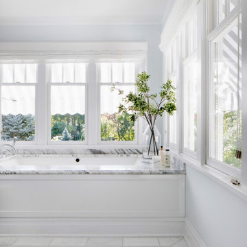
Bathrooms come in all shapes and sizes and each project has its unique challenges. This master bath remodel was no different. The room had been remodeled about 20 years ago as part of a large addition and consists of three separate zones – 1) tub zone, 2) vanity/storage zone and 3) shower and water closet zone. The room layout and zones had to remain the same, but the goal was to make each area more functional. In addition, having comfortable access to the tub and seating in the tub area was also high on the list, as the tub serves as an important part of the daily routine for the homeowners and their special needs son.
We started out in the tub room and determined that an undermount tub and flush deck would be much more functional and comfortable for entering and exiting the tub than the existing drop in tub with its protruding lip. A redundant radiator was eliminated from this room allowing room for a large comfortable chair that can be used as part of the daily bathing routine.
In the vanity and storage zone, the existing vanities size neither optimized the space nor provided much real storage. A few tweaks netted a much better storage solution that now includes cabinets, drawers, pull outs and a large custom built-in hutch that houses towels and other bathroom necessities. A framed custom mirror opens the space and bounces light around the room from the large existing bank of windows.
We transformed the shower and water closet room into a large walk in shower with a trench drain, making for both ease of access and a seamless look. Next, we added a niche for shampoo storage to the back wall, and updated shower fixtures to give the space new life.
The star of the bathroom is the custom marble mosaic floor tile. All the other materials take a simpler approach giving permission to the beautiful circular pattern of the mosaic to shine. White shaker cabinetry is topped with elegant Calacatta marble countertops, which also lines the shower walls. Polished nickel fixtures and sophisticated crystal lighting are simple yet sophisticated, allowing the beauty of the materials shines through.
Designed by: Susan Klimala, CKD, CBD
For more information on kitchen and bath design ideas go to: www.kitchenstudio-ge.com
 System Pavers
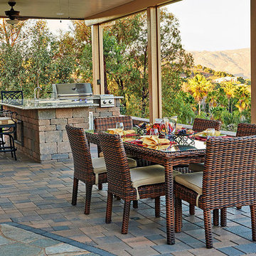
This project consists of a full backyard remodel in the San Diego CA region. New outdoor living elements designed and installed by System Pavers include: Over sized pergola with built in lighting, paver sitting wall extending the entire length of backyard, paver patio and courtyard, full built in kitchen equipped with large grill, over sized bar top, double side burners, refrigerator, and outdoor sink, built in fireplace, artificial turf and a paver driveway, outdoor living room and dining area

 LaMantia Design and Remodeling
To fully enjoy the winter holidays, with all the snow and cold, was the basis for our client’s decision to maintain their Chicago home when they were transferred to the warm and sunny west coast. A trusted caretaker was put in place to oversee and maintain their property; however, even excellent planning sometimes runs off-track.
In the midst of winter the caretaker left on a well-planned vacation. The homeowner’s were apprised of dates and, without a worry, everyone went on about their daily routines. That is, until the caretaker returned and found the home in such utter devastation, he could not believe what had happened in such a short amount of time.
The ill-timed vacation, planned during what became an extremely cold timeframe, was the home’s undoing. With the heat in the home turned slightly lower, to accommodate the emptiness, paired with the below zero temperatures, the hot water pipe in the main floor Sunroom froze and burst. The gushing, steaming water, unchecked, moved in so many directions, it is difficult to comprehend.
As the water soaked through the Sunroom flooring to the walk-out Lower Level Area below, ice blocks were freezing before the water reached the ground; Ice blocks so thick only time and warmer temperatures were able to thaw. Since the heating systems were unaffected, the heat, paired with the steaming moisture, raised the humidity levels in the entire home; what wasn’t wet ultimately became mold covered.
The humidity in the home was raised to such a level that window and door seals were compromised and condensation clouded most of the interior glass panes. The Kitchen wood flooring, saturated with water, buckled, causing the cabinets to lift and the granite to crack.
The ceiling in the lower level Bar Area fell as the water flooded both the Bar and the adjoining Billiards Room, wreaking havoc on cabinetry, carpet, artwork, etc.
After the insurance estimation determined the home was salvageable, the design phase began in earnest headed by LaMantia’s James Campbell, CKD and aided by Katie Suva, CKD, CBD as the guides. After a very long march towards recovery, the home is now back to the pristine beauty it once was.
 In Detail Interiors
A master bedroom with rich color, texture and personality!
With a colorful master bathroom that blends the perfect matte finish, semi-primitive blast of pattern with rich, saturated jewel tones and a little calacatta gold tile – determining the best fabrics and finishes for the master bedroom felt like a HUGE challenge. How do you stand up to something so fabulously unique and still create a soft respite for someone to slumber?!
This bedroom was a small space with existing Vetrazzo floors and an entire wall dedicated to floor-to-ceiling fixed glass pane windows. Between the cracks in the plaster ceiling and the lacquered pink dresser we knew we had our work cut out.
Saturated colors create a fairy tale bedroom
Fast forward to finding the perfect, sumptuously soft evergreen mohair for the headboard and furry tuffets for the foot of the bed. Texture became the name of the game and a certain level of color variation had to tie through from selection to selection. Cladding the walls with a gilt woven cloth wall covering that also pulled a sort of skin-tone clay from detail found in the Vetrazzo flooring (OMG! so pretty!) and grounding everything with a sort of deco-inspired one-of-a-kind wool rug. The layers of unexpected style helped develop a more collected – less stylized – feeling overall.
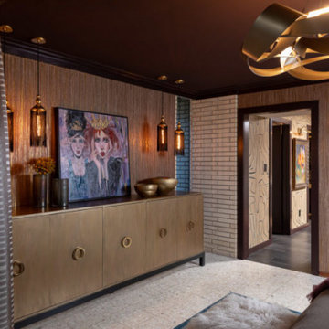
Then it was bye-bye to the pink lacquer! A local artisan worked on a faux finish for the custom dresser that the client had already invested in and we just gave it a refresh with a deep bronze finish. Balancing this piece with the playful silk tassel pendant lights that frame a beautiful original painting of red headed queens by artist Nancy Rhodes Harper.
Exquisite lighting for a sexy master bedroom
Additionally, the swirl and swoop of the forged metal light fixture overhead play off the more structured spinal-column type pattern of the black out window treatments that truly act as their own piece of art. Each element has its place and plays with the visual and textural aesthetics that make our client (and our team) swoon.
Want more colorful and moody interior spaces? Check out another one of our recent projects here! Then call us for more information on how we can help you! Read more about our full-service interior design here!

 Black + Vernooy Architects
Inspired by the owners' travels in the Mediterranean region yet rooted firmly in Texas soil, this single family residence is designed to provide a secluded, comfortable environment for observing nature, relaxing, entertaining, living, and working. The oddly shaped site determined a house that is removed from the street, resulting in a long drive through a wooded area that leads to the gently sloping house site. The house is designed around a large, central public living area. The basic "H" shaped plan reaches out to define the entry court as well as the rear yard area. The building can only be seen in small vignettes as one moves around and through it, and is finally understood from inside the main room. The public space is central to the plan, where rooms overlay and flow through and into one another. Private rooms are tucked away in more remote parts of the site. The guest bedrooms are located at a slightly lower level, and a remote study, reached by a ship's ladder, overlooks the main living area and enjoys its own roof terrace. The central part of the house is designed as a solid, strong, "original" building to which other wings are added as if built over time. The client desired that the house appear to be of no discernible style or period, and seem older rather than newer.
Built By: Dalgleish Construction Co.
Photography By: Paul Bardagjy
 Flooret
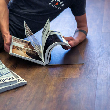
High rustic. We designed Imber to have the brown and red tones of more rustic spaces, but left out the big knots and cracks. This allows it to play nicely with a range of spaces.
The most important specification for determining the durability of vinyl flooring is the thickness of the wear-layer. The best wear-layers are made of thick, clear virgin PVC, which covers the paper print-film that gives the floor its unique appearance. Once the wear-layer wears through, the paper is damaged and the floor will need replacement.
Most vinyl floors come with a 8-12 mil wear-layer (0.2-3 mm). The top commercial specs in the industry are higher, at 20-22 mil (0.5 mm). A select few manufacturers offer a “super” commercial spec of 28 mil (0.7 mm).
For Modin, we decided to set a new standard: 40 mil (1.0 mm) of premium virgin PVC. This allows us to offer an industry-leading 20 year Commercial Warranty (Lifetime Residential), compared to nearly all other commercial vinyl floors’ 10 year Commercial Warranty.
Beyond our superior wear-layer, we also use a patented click mechanism for superior hold, and a ceramic-bead coating.
SIZE MATTERS
Wider and longer planks create a sense of space and luxury. Most vinyl floors come in 6” or 7” widths, and 36” or 48” lengths.
For Modin, we designed our planks to be 9” wide, and 60” long. This extra large size allows our gorgeous designs to be fully expressed.
DETAILS THAT COUNT
We made sure to get all the details right. Real texture, to create the feel of wire-brushed wood. Low sheen level, to ensure a natural look that wears well over time. 4-sided bevels, to more accurately emulate the look of real planks. When added together they help create the unique look that is Modin.
DESIGNS THAT INSPIRE
We spent nearly a year just focusing on our designs, to ensure they provide the right mix of color and depth. Focusing on timeless wire-brush and European Oak styles, as well as more contemporary modern washes, our collection offers truly beautiful design that is both functional and inspiring.
 Black + Vernooy Architects
Inspired by the owners' travels in the Mediterranean region yet rooted firmly in Texas soil, this single family residence is designed to provide a secluded, comfortable environment for observing nature, relaxing, entertaining, living, and working. The oddly shaped site determined a house that is removed from the street, resulting in a long drive through a wooded area that leads to the gently sloping house site. The house is designed around a large, central public living area. The basic "H" shaped plan reaches out to define the entry court as well as the rear yard area. The building can only be seen in small vignettes as one moves around and through it, and is finally understood from inside the main room. The public space is central to the plan, where rooms overlay and flow through and into one another. Private rooms are tucked away in more remote parts of the site. The guest bedrooms are located at a slightly lower level, and a remote study, reached by a ship's ladder, overlooks the main living area and enjoys its own roof terrace. The central part of the house is designed as a solid, strong, "original" building to which other wings are added as if built over time. The client desired that the house appear to be of no discernible style or period, and seem older rather than newer.
Built By: Dalgleish Construction Co.
Photography By: Paul Bardagjy

 California Closets Connecticut
BROOKLYN OFFICE
Inserts Options
• Inserts provide stylish or colorful accents to your storage system, creating a highly personalized design feature to suit you and your home.
• Choose from a wide range of options like leather, glass, acrylic, and more.
• Accents of color provide a high-end look and make your storage system unique to your home.
• Inserts are durable and easy to maintain.
• Inserts provide an opportunity to add texture and depth to a design palette.
Our Products
At California Closets, we constantly pursue opportunities to provide our clients with environmentally sustainable options, and our products reflect this commitment.
All of our board is compliant with the California Air Resources Board (CARB), which consists of some of the most rigorous regulations for emission standards, and is available in a variety of substrates, including low-emitting formaldehyde. This certification applies to our three finishes - Classic, Lago®, and TesoroTM - which come in a wide range of beautiful colors and textures.
All of our composite wood doors and drawers are made from recycled or reclaimed wood fiber and can contribute toward achieving credit in both the LEED® 2009 and LEED v4 standards. LEED, Leadership in Energy and Environmental Design, is a nationally recognized system for green building that is administered by the U.S. Green Building Council.
We offer a selection of translucent accents door/drawer inserts, back panels and countertops, designed with solid finishes or organic material that contain between 38 - 40 percent recycled content and can be reclaimed at their end-of-life stage through the supplier. They are also certified by GREENGUARD, an environmental institute that seeks to improve indoor air quality and reduce human exposure to chemicals and other pollutants.
As an industry leader, California Closets continually seeks to increase our environmental commitment. Your design consultant can provide more details to determine which products best suit your sustainability needs. Revisit us as we continue to source new products with sustainable features.
161