
Search results for "Determination" in Home Design Ideas
 Flooret
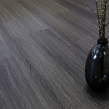
Sleek and chic. In terms of high-impact, going with a dark wire-brush pattern is a sure way to quickly define a space. Never boring, this modern pattern will set the mood immediately.
The most important specification for determining the durability of vinyl flooring is the thickness of the wear-layer. The best wear-layers are made of thick, clear virgin PVC, which covers the paper print-film that gives the floor its unique appearance. Once the wear-layer wears through, the paper is damaged and the floor will need replacement.
Most vinyl floors come with a 8-12 mil wear-layer (0.2-3 mm). The top commercial specs in the industry are higher, at 20-22 mil (0.5 mm). A select few manufacturers offer a “super” commercial spec of 28 mil (0.7 mm).
For Modin, we decided to set a new standard: 40 mil (1.0 mm) of premium virgin PVC. This allows us to offer an industry-leading 20 year Commercial Warranty (Lifetime Residential), compared to nearly all other commercial vinyl floors’ 10 year Commercial Warranty.
Beyond our superior wear-layer, we also use a patented click mechanism for superior hold, and a ceramic-bead coating.
SIZE MATTERS
Wider and longer planks create a sense of space and luxury. Most vinyl floors come in 6” or 7” widths, and 36” or 48” lengths.
For Modin, we designed our planks to be 9” wide, and 60” long. This extra large size allows our gorgeous designs to be fully expressed.
DETAILS THAT COUNT
We made sure to get all the details right. Real texture, to create the feel of wire-brushed wood. Low sheen level, to ensure a natural look that wears well over time. 4-sided bevels, to more accurately emulate the look of real planks. When added together they help create the unique look that is Modin.
DESIGNS THAT INSPIRE
We spent nearly a year just focusing on our designs, to ensure they provide the right mix of color and depth. Focusing on timeless wire-brush and European Oak styles, as well as more contemporary modern washes, our collection offers truly beautiful design that is both functional and inspiring.

 Metropolis Drafting and Construction Inc
Master suite addition to an existing 20's Spanish home in the heart of Sherman Oaks, approx. 300+ sq. added to this 1300sq. home to provide the needed master bedroom suite. the large 14' by 14' bedroom has a 1 lite French door to the back yard and a large window allowing much needed natural light, the new hardwood floors were matched to the existing wood flooring of the house, a Spanish style arch was done at the entrance to the master bedroom to conform with the rest of the architectural style of the home.
The master bathroom on the other hand was designed with a Scandinavian style mixed with Modern wall mounted toilet to preserve space and to allow a clean look, an amazing gloss finish freestanding vanity unit boasting wall mounted faucets and a whole wall tiled with 2x10 subway tile in a herringbone pattern.
For the floor tile we used 8x8 hand painted cement tile laid in a pattern pre determined prior to installation.
The wall mounted toilet has a huge open niche above it with a marble shelf to be used for decoration.
The huge shower boasts 2x10 herringbone pattern subway tile, a side to side niche with a marble shelf, the same marble material was also used for the shower step to give a clean look and act as a trim between the 8x8 cement tiles and the bark hex tile in the shower pan.
Notice the hidden drain in the center with tile inserts and the great modern plumbing fixtures in an old work antique bronze finish.
A walk-in closet was constructed as well to allow the much needed storage space.
 Holder Parlette Architecture + Landscapes
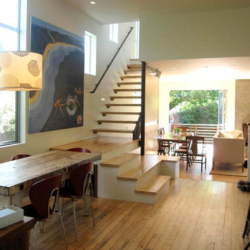
Example of a minimalist light wood floor home design design in San Francisco with white walls and a concrete fireplace
Find the right local pro for your project

 TKS Design Group
Free ebook, Creating the Ideal Kitchen. DOWNLOAD NOW
This young family of four came in right after closing on their house and with a new baby on the way. Our goal was to complete the project prior to baby’s arrival so this project went on the expedite track. The beautiful 1920’s era brick home sits on a hill in a very picturesque neighborhood, so we were eager to give it the kitchen it deserves. The clients’ dream kitchen included pro-style appliances, a large island with seating for five and a kitchen that feels appropriate to the home’s era but that also is fresh and modern. They explicitly stated they did not want a “cookie cutter” design, so we took that to heart.
The key challenge was to fit in all of the items on their wish given the room’s constraints. We eliminated an existing breakfast area and bay window and incorporated that area into the kitchen. The bay window was bricked in, and to compensate for the loss of seating, we widened the opening between the kitchen and formal dining room for more of an open concept plan.
The ceiling in the original kitchen is about a foot lower than the rest of the house, and once it was determined that it was to hide pipes and other mechanicals, we reframed a large tray over the island and left the rest of the ceiling as is. Clad in walnut planks, the tray provides an interesting feature and ties in with the custom walnut and plaster hood.
The space feels modern yet appropriate to its Tudor roots. The room boasts large family friendly appliances, including a beverage center and cooktop/double oven combination. Soft white inset cabinets paired with a slate gray island provide a gentle backdrop to the multi-toned island top, a color echoed in the backsplash tile. The handmade subway tile has a textured pattern at the cooktop, and large pendant lights add more than a bit of drama to the room.
Designed by: Susan Klimala, CKD, CBD
Photography by: Mike Kaskel
For more information on kitchen and bath design ideas go to: www.kitchenstudio-ge.com

 Kathleen Jennison
An Arts & Crafts Bungalow is one of my favorite styles of homes. We have quite a few of them in our Stockton Mid-Town area. And when C&L called us to help them remodel their 1923 American Bungalow, I was beyond thrilled.
As per usual, when we get a new inquiry, we quickly Google the project location while we are talking to you on the phone. My excitement escalated when I saw the Google Earth Image of the sweet Sage Green bungalow in Mid-Town Stockton. "Yes, we would be interested in working with you," I said trying to keep my cool.
But what made it even better was meeting C&L and touring their home, because they are the nicest young couple, eager to make their home period perfect. Unfortunately, it had been slightly molested by some bad house-flippers, and we needed to bring the bathroom back to it "roots."
We knew we had to banish the hideous brown tile and cheap vanity quickly. But C&L complained about the condensation problems and the constant fight with mold. This immediately told me that improper remodeling had occurred and we needed to remedy that right away.
The Before: Frustrations with a Botched Remodel
The bathroom needed to be brought back to period appropriate design with all the functionality of a modern bathroom. We thought of things like marble countertop, white mosaic floor tiles, white subway tile, board and batten molding, and of course a fabulous wallpaper.
This small (and only) bathroom on a tight budget required a little bit of design sleuthing to figure out how we could get the proper look and feel. Our goal was to determine where to splurge and where to economize and how to complete the remodel as quickly as possible because C&L would have to move out while construction was going on.
The Process: Hard Work to Remedy Design and Function
During our initial design study, (which included 2 hours in the owners’ home), we noticed framed images of William Morris Arts and Crafts textile patterns and knew this would be our design inspiration. We presented C&L with three options and they quickly selected the Pimpernel Design Concept.
We had originally selected the Black and Olive colors with a black vanity, mirror, and black and white floor tile. C&L liked it but weren’t quite sure about the black, We went back to the drawing board and decided the William & Co Pimpernel Wallpaper in Bayleaf and Manilla color with a softer gray painted vanity and mirror and white floor tile was more to their liking.
After the Design Concept was approved, we went to work securing the building permit, procuring all the elements, and scheduling our trusted tradesmen to perform the work.
We did uncover some shoddy work by the flippers such as live electrical wires hidden behind the wall, plumbing venting cut-off and buried in the walls (hence the constant dampness), the tub barely balancing on two fence boards across the floor joist, and no insulation on the exterior wall.
All of the previous blunders were fixed and the bathroom put back to its previous glory. We could feel the house thanking us for making it pretty again.
The After Reveal: Cohesive Design Decisions
We selected a simple white subway tile for the tub/shower. This is always classic and in keeping with the style of the house.
We selected a pre-fab vanity and mirror, but they look rich with the quartz countertop. There is much more storage in this small vanity than you would think.
The Transformation: A Period Perfect Refresh
We began the remodel just as the pandemic reared and stay-in-place orders went into effect. As C&L were already moved out and living with relatives, we got the go-ahead from city officials to get the work done (after all, how can you shelter in place without a bathroom?).
All our tradesmen were scheduled to work so that only one crew was on the job site at a time. We stayed on the original schedule with only a one week delay.
The end result is the sweetest little bathroom I've ever seen (and I can't wait to start work on C&L's kitchen next).
Thank you for joining me in this project transformation. I hope this inspired you to think about being creative with your design projects, determining what works best in keeping with the architecture of your space, and carefully assessing how you can have the best life in your home.


 Sitka Projects
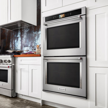
1916 Bungalow in Portland Oregon. This kitchen had been remodeled multiple times throughout the years and was in dire need of a fresh remodel. The home owners now have a time period appropriate style kitchen with modern creature comforts every cook will love.
 Williamsons Kitchens
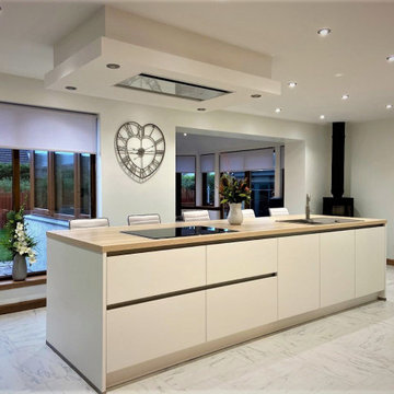
The client approached us with a clear vision in mind for their kitchen in Fraserburgh: an open-plan, modern design that would accommodate their large family. Essential to this vision was the integration of an island, complete with a secondary eating area. This space was not only to be visually appealing but also functionally efficient, as it would need to cater to family gatherings and daily activities. The desire for ample seating and a spacious table, along with additional specific storage solutions, set the stage for our design choices.
Drawing inspiration from the client's requirements, we opted for the Nolte Feel range, complemented by Silver MatrixArt handleless trims. The primary colour for the furniture was chosen as white, with a contrasting accent in Feel Lava to add a touch of modern sophistication. To further enhance the open feel, we made structural modifications: the existing kitchen window was lowered to usher in more natural light and provide an improved viewing angle. Additionally, the entrance to the sun lounge was broadened to foster a more expansive atmosphere.
A kitchen's functionality is determined largely by its worktops and appliances. For this space, we used a sturdy 40mm thick Nolte Silver Ash worktop, providing both durability and style. In terms of appliances, we decided upon NEFF's range, which included a single oven, combination microwave, induction hob, and ceiling extraction, ensuring the client's culinary needs were well catered for.
Recognising the family's unique requirements, we introduced several bespoke features. The Blanco Metra sink in Tartufo and the Quooker Fusion Square Stainless Steel instant boiling water tap combined functionality with modern aesthetics. With the client's large family in mind, we constructed a matching Nolte table and a built-in seating bench replete with storage drawers, maximising both seating and storage. Additionally, a custom-built unit for log storage was designed, mirroring the style of the kitchen, to serve their log-burning stove. The flooring, using Quickstep Arte, tied everything together, adding a touch of elegance to the room.
Experience your dream kitchen with us. Reach out today to start your bespoke kitchen journey.
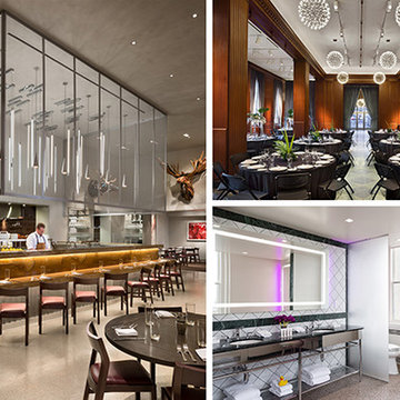
 AIA Pittsburgh
INTERIOR ARCHITECTURE: Honor Award
PROJECT: 21c Museum Hotel Durham
CLIENT: 21c Museum Hotels
ARCHITECTURE FIRM: Perfido Weiskopf Wagstaff + Goettel with Deborah Berke Partners
ENGINEERS: Coulter Jewell Thames, PA; Stewart; KLH Engineers, PSC
CONTRACTORS: Skanska USA Building
PHOTOGRAPHER: Chris Cooper Architectural Photography, Glint Studios
DESCRIPTION: 21c Museum Hotel Durham reimagines the Hill Building, designed in 1937 by Shreve, Lamb and Harmon. Art Deco details of the National Register landmark embody the glamor and modernity of their age, an inspiration for the $27 million transformation of the building into a hybrid 125-room boutique hotel, with 10,500 sf of gallery space for contemporary art open to the public free of charge 24/7, a signature restaurant, bar, and event and meeting spaces. The goal for the transformation to a museum hotel was to find an effortless relationship between the original structure and contemporary design for the building’s new program. Throughout, efforts were made to restore and incorporate the Art Deco detailing and the design team worked closely with the State Historic Preservation Office to evaluate existing conditions and determine what elements of the original fabric could be restored.
JURY COMMENTS: The jury felt this was a really wonderful building across the board. It is a very well done preservation project, with its modifications seeming to exceed even the best preservation projects. It is also a really beautifully done interior architecture project with a very high level of interior finish. Relating the project to its Landmark status and Art Deco details could have been overwhelming, but this design respects and enhances those aspects with grace and style.

 Legrand
ADSM703HW2: adorne® SensaDimmer - Auto-ON/Auto-OFF - 700W - Incandescent/Halogen - White
ARTR152W4: adorne® Tamper-Resistant Outlet - 15A - 125V - White
SensaSwitches include passive infrared (PIR) sensor technology, automatically turning lights on or off when you enter or leave a room. The design features an innovative micro-movement that allows you to also manually turn on lights with a soft touch of the finger. To determine what option is right for you, make sure the wattage of your bulbs matches the wattage of the dimmer switch by multiplying the number of bulbs by their respective wattage. For example, if you have a chandelier with 11 bulbs at 100 watts each, you would need the 1100 watt dimmer switch.
Switch supports single-pole/3-Way/4-Way
Easy "1-for-1" installation lets you simply replace your existing switch in just minutes.
Fits in your existing electrical box and does not require new wires for typical installation. Innovative assembly and snap-in system make it fast and simple to install.
Meant to combined with "AW" series of adorne wall plates.
Lamping Compatibility: Incandescent, Halogen
Maximum Wattage Compatibility: 700
UL Listed
Voltage: 120VAC
Wire Type: 3-Wire
Country: Canada
Limited Lifetime Warranty

 Fresh Start Contracting
Ken Kotch Photography
Bathroom - large modern master ceramic tile bathroom idea in Boston with flat-panel cabinets, medium tone wood cabinets, a one-piece toilet, yellow walls and marble countertops
Bathroom - large modern master ceramic tile bathroom idea in Boston with flat-panel cabinets, medium tone wood cabinets, a one-piece toilet, yellow walls and marble countertops
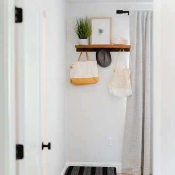
 ASR DESIGN STUDIO
This two-year remodel odyssey saw Ariel and Robert put their design and build skills to the test to transform a two bedroom/two bathroom single-story home – that had never been touched or updated! - into a three-bedroom rental property that was warm and functional.
Some of the highlights? Ariel and Robert’s parents’ laying all the flooring, Robert tiling the guest bathroom by himself, and Ariel and Robert tying the knot in the backyard in 2020.
Ariel and Robert were determined to create a home that was wholly WFH-friendly, so they designed two separate areas that made working from home a breeze.
Ariel’s workspace featured an accent wall in dark teal, wooden desks for warmth and texture, leather chairs for a contrast in material and was loaded with storage for ASR’s paint, fabric and design samples.
Meanwhile, Robert’s space was nerd-proofed and approved with room to showcase his hobbies and support his gaming.
Ariel and Robert love hosting, so their kitchen and living spaces were designed to maximize both space and style.
The kitchen was kept in the same general location, but they opened up the wall between the kitchen and living room to make it feel more inviting.
Robert built the floating shelves and integrated lighting into them while blue and glass tiles were carried all the way up to the ceiling to make the space appear larger.


 Flooret
Natural Oak. There are times and places where the simple, clean look of natural oak is all that is needed. Parkhurst captures a natural oak pattern, in what might be called a “classic grade” (not too much character, but some color variation).
REDEFINING DURABILITY
The most important specification for determining the durability of vinyl flooring is the thickness of the wear-layer. The best wear-layers are made of thick, clear virgin PVC, which covers the paper print-film that gives the floor its unique appearance. Once the wear-layer wears through, the paper is damaged and the floor will need replacement.
Most vinyl floors come with a 8-12 mil wear-layer (0.2-3 mm). The top commercial specs in the industry are higher, at 20-22 mil (0.5 mm). A select few manufacturers offer a “super” commercial spec of 28 mil (0.7 mm).
For Modin, we decided to set a new standard: 40 mil (1.0 mm) of premium virgin PVC. This allows us to offer an industry-leading 20 year Commercial Warranty (Lifetime Residential), compared to nearly all other commercial vinyl floors’ 10 year Commercial Warranty.
Beyond our superior wear-layer, we also use a patented click mechanism for superior hold, and a ceramic-bead coating.
SIZE MATTERS
Wider and longer planks create a sense of space and luxury. Most vinyl floors come in 6” or 7” widths, and 36” or 48” lengths.
For Modin, we designed our planks to be 9” wide, and 60” long. This extra large size allows our gorgeous designs to be fully expressed.
DETAILS THAT COUNT
We made sure to get all the details right. Real texture, to create the feel of wire-brushed wood. Low sheen level, to ensure a natural look that wears well over time. 4-sided bevels, to more accurately emulate the look of real planks. When added together they help create the unique look that is Modin.
DESIGNS THAT INSPIRE
We spent nearly a year just focusing on our designs, to ensure they provide the right mix of color and depth. Focusing on timeless wire-brush and European Oak styles, as well as more contemporary modern washes, our collection offers truly beautiful design that is both functional and inspiring.


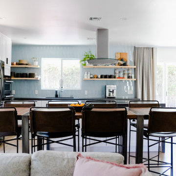 ASR DESIGN STUDIO
This two-year remodel odyssey saw Ariel and Robert put their design and build skills to the test to transform a two bedroom/two bathroom single-story home – that had never been touched or updated! - into a three-bedroom rental property that was warm and functional.
Some of the highlights? Ariel and Robert’s parents’ laying all the flooring, Robert tiling the guest bathroom by himself, and Ariel and Robert tying the knot in the backyard in 2020.
Ariel and Robert were determined to create a home that was wholly WFH-friendly, so they designed two separate areas that made working from home a breeze.
Ariel’s workspace featured an accent wall in dark teal, wooden desks for warmth and texture, leather chairs for a contrast in material and was loaded with storage for ASR’s paint, fabric and design samples.
Meanwhile, Robert’s space was nerd-proofed and approved with room to showcase his hobbies and support his gaming.
Ariel and Robert love hosting, so their kitchen and living spaces were designed to maximize both space and style.
The kitchen was kept in the same general location, but they opened up the wall between the kitchen and living room to make it feel more inviting.
Robert built the floating shelves and integrated lighting into them while blue and glass tiles were carried all the way up to the ceiling to make the space appear larger.
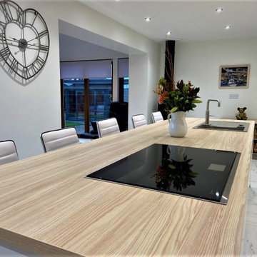 Williamsons Kitchens
The client approached us with a clear vision in mind for their kitchen in Fraserburgh: an open-plan, modern design that would accommodate their large family. Essential to this vision was the integration of an island, complete with a secondary eating area. This space was not only to be visually appealing but also functionally efficient, as it would need to cater to family gatherings and daily activities. The desire for ample seating and a spacious table, along with additional specific storage solutions, set the stage for our design choices.
Drawing inspiration from the client's requirements, we opted for the Nolte Feel range, complemented by Silver MatrixArt handleless trims. The primary colour for the furniture was chosen as white, with a contrasting accent in Feel Lava to add a touch of modern sophistication. To further enhance the open feel, we made structural modifications: the existing kitchen window was lowered to usher in more natural light and provide an improved viewing angle. Additionally, the entrance to the sun lounge was broadened to foster a more expansive atmosphere.
A kitchen's functionality is determined largely by its worktops and appliances. For this space, we used a sturdy 40mm thick Nolte Silver Ash worktop, providing both durability and style. In terms of appliances, we decided upon NEFF's range, which included a single oven, combination microwave, induction hob, and ceiling extraction, ensuring the client's culinary needs were well catered for.
Recognising the family's unique requirements, we introduced several bespoke features. The Blanco Metra sink in Tartufo and the Quooker Fusion Square Stainless Steel instant boiling water tap combined functionality with modern aesthetics. With the client's large family in mind, we constructed a matching Nolte table and a built-in seating bench replete with storage drawers, maximising both seating and storage. Additionally, a custom-built unit for log storage was designed, mirroring the style of the kitchen, to serve their log-burning stove. The flooring, using Quickstep Arte, tied everything together, adding a touch of elegance to the room.
Experience your dream kitchen with us. Reach out today to start your bespoke kitchen journey.


 Advance Design Studio, Ltd.
After living in this home for a decade, Crystal Lake residents Ken & Bonnie needed an update to their tired original kitchen to meet the needs of their busy family. Together with the expertise of designer Scott Christensen at Advance Design Studio they planned to completely reconfigure the entire space. They began by removing the restrictive peninsula and replaced it with a generous island designed to house an expansive farmhouse sink, convenient pull out trash receptacles, and a hidden dishwasher. Now there was ample room to add island seating to accommodate family gatherings, or for just “hanging out” with teenagers.
A dramatic new focal point was created with the design of an elegant range area featuring a beautiful custom wood mantle hood detailed with crushed glass handmade tile. Hidden storage houses every spice imaginable right at the cook’s fingertips. Double-stacked glass cabinetry emphasizes the impressive height of the room that was a wonderful architectural element that previously went unnoticed in the original kitchen.
The entire kitchen and breakfast nook was opened up to the 2 story family room by integrating enlarged arched openings. An outdated desk area was transformed into a beautiful breakfront bar with beverage refrigeration, glass display cabinets and plenty of new storage for entertainment pieces. An espresso nook was tucked neatly between tall cabinetry, and an old fashioned closet with shelves was converted into an efficient chef’s dream of organized custom pull out pantries.
“I am the leader of the Scott Christensen fan club,” says Bonnie. “With my busy family and a full time career, Scott made the process of designing this space so easy for me. He didn’t overwhelm me, but carefully determined what I liked and offered me two thoughtful solutions for just about everything - complete with his expert opinion that I really respected.”
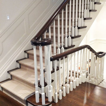
Bright white Jay Rambo custom made maple cabinets are accented by Cambria quartz counter tops and simple subway tiles. Original hardwood floors were refinished and stained a darker shade, and stair risers and balusters were painted white to coordinate with the smart wainscot details throughout the first floor. The end effect is a cohesive first floor that flows together with grace and a level of elegance perfectly suitable for this stately Crystal Lake home.
Designer: Scott Christensen
Photographer: Joe Nowak

 Renovisions
This kitchen had not been renovated since the salt box colonial house was built in the 1960’s. The new owner felt it was time for a complete refresh with some traditional details and adding in the owner’s contemporary tastes.
At initial observation, we determined the house had good bones; including high ceilings and abundant natural light from a double-hung window and three skylights overhead recently installed by our client. Mixing the homeowners desires required the skillful eyes of Cathy and Ed from Renovisions. The original kitchen had dark stained, worn cabinets, in-adequate lighting and a non-functional coat closet off the kitchen space. In order to achieve a true transitional look, Renovisions incorporated classic details with subtle, simple and cleaner line touches. For example, the backsplash mix of honed and polished 2” x 3” stone-look subway tile is outlined in brushed stainless steel strips creating an edgy feel, especially at the niche above the range. Removing the existing wall that shared the coat closet opened up the kitchen to allow adding an island for seating and entertaining guests.
We chose natural maple, shaker style flat panel cabinetry with longer stainless steel pulls instead of knobs, keeping in line with the clients desire for a sleeker design. This kitchen had to be gutted to accommodate the new layout featuring an island with pull-out trash and recycling and deeper drawers for utensils. Spatial constraints were top of mind and incorporating a convection microwave above the slide-in range made the most sense. Our client was thrilled with the ability to bake, broil and microwave from GE’s advantium oven – how convenient! A custom pull-out cabinet was built for his extensive array of spices and oils. The sink base cabinet provides plenty of area for the large rectangular stainless steel sink, single-lever multi-sprayer faucet and matching filtered water dispenser faucet. The natural, yet sleek green soapstone countertop with distinct white veining created a dynamic visual and principal focal point for the now open space.
While oak wood flooring existed in the entire first floor, as an added element of color and interest we installed multi-color slate-look porcelain tiles in the kitchen area. We also installed a fully programmable floor heating system for those chilly New England days. Overall, out client was thrilled with his Mission Transition.
158