
Search results for "Determine final" in Home Design Ideas
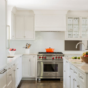
 LDa Architecture & Interiors
Architect: LDa Architecture & Interiors
Builder: Wellen Construction
Interior Design: Nina Farmer Interiors
Landscape Architect: Matthew Cunningham Landscape Design
Photographer: Michael J. Lee Photography
 Kirk Riley Design
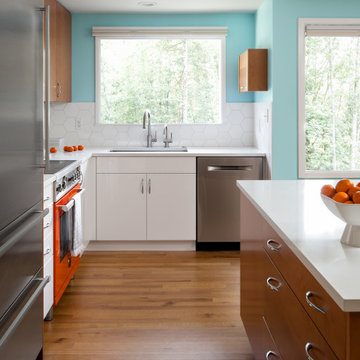
Example of a mid-sized mid-century modern l-shaped light wood floor and brown floor eat-in kitchen design in Seattle with an undermount sink, flat-panel cabinets, white cabinets, quartz countertops, white backsplash, ceramic backsplash, an island, white countertops and stainless steel appliances
 Black + Vernooy Architects
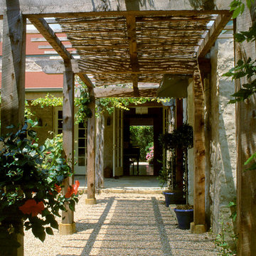
Inspired by the owners' travels in the Mediterranean region yet rooted firmly in Texas soil, this single family residence is designed to provide a secluded, comfortable environment for observing nature, relaxing, entertaining, living, and working. The oddly shaped site determined a house that is removed from the street, resulting in a long drive through a wooded area that leads to the gently sloping house site. The house is designed around a large, central public living area. The basic "H" shaped plan reaches out to define the entry court as well as the rear yard area. The building can only be seen in small vignettes as one moves around and through it, and is finally understood from inside the main room. The public space is central to the plan, where rooms overlay and flow through and into one another. Private rooms are tucked away in more remote parts of the site. The guest bedrooms are located at a slightly lower level, and a remote study, reached by a ship's ladder, overlooks the main living area and enjoys its own roof terrace. The central part of the house is designed as a solid, strong, "original" building to which other wings are added as if built over time. The client desired that the house appear to be of no discernible style or period, and seem older rather than newer.
Built By: Dalgleish Construction Co.
Photography By: Paul Bardagjy
Find the right local pro for your project

 KITCHITALIA
©ASTRA 2017
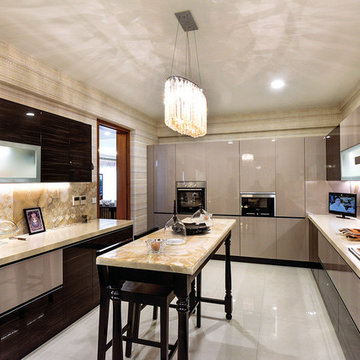
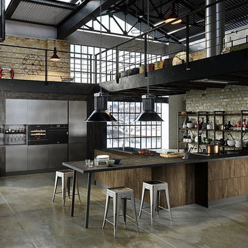
Inspiration for a large industrial concrete floor and multicolored floor eat-in kitchen remodel in Miami with an island
Inspiration for a large industrial concrete floor and multicolored floor eat-in kitchen remodel in Miami with an island
 Adrienne DeRosa
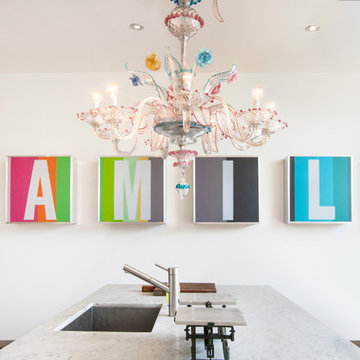
Known for their effortlessly chic eclectic style, Robert and Cortney incorporate many items from flea markets and antique stores into their designs. They found the Venetian glass chandelier in a French market and had it shipped home where it spent many years in storage. After discussing that it would be out of reach for the kids, the couple decided to put it up so that they could finally appreciate it. "It is my favorite piece", says Cortney.
Also designed by Robert and Cortney, the artwork in the kitchen speaks volumes of what this home is all about. Playing off of the chandelier, its bright colors round out the palette for the room.
Photo: Adrienne DeRosa Photography © 2014 Houzz
Design: Cortney and Robert Novogratz
 Passacantando Architects AIA
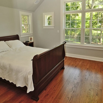
Mid-sized elegant master medium tone wood floor bedroom photo in New York with gray walls and no fireplace
 OCTOBER 5 Fine Home Builders
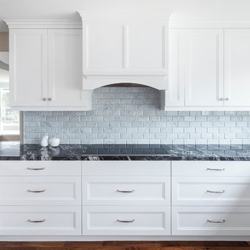
Sometimes, I can’t help but smile. Recently October 5 met a beautiful couple, Al and Shawn. With their two sons gone, they decided to remodel their kitchen. The house was built in 1957, with the original kitchen remaining.
When I first met Shawn, she was determined, make no mistake about it. She wanted, “. . . dark cabinets with a dark floor.” End of story! Hmmm . . . I just smiled and listened. She finally asked me what I thought. I told her, “Well, I don’t really see dark cabinets with a dark floor.”
Beautifully carved wooden beams supported the living room ceiling, along with a well design wrap-around comfortable bay-window seat. All of it painted white, which looked beautiful and enjoyed architectural significance. I guess after living in a house for 27 years, we tend to overlook its natural treasures. Shawn was having none of it. “Oh my god, white? Who’s going to keep it clean? No way? Dark, dark, dark!”
Sometimes, you just have to let an idea sit and marinate. You might guess as to who won . . . remember, I am writing this. Shawn and Al have to be one of my favorite clients of all times. We debated, argued and even kept score. Shawn won on the countertops, Arabian Nights, I have to give her credit, and the backsplash. She did not want outlets in the Carrera Marble backsplash, which surprisingly has changed my opinion, but I won everything else.
At the end of the project the score was Shawn = 2 (may be 3) and Jim = 12+ (I eventually lost count, but who’s counting anyway.)
Sometimes, I can’t help but smile. Hope you do too, when you look at the pictures below.
 Schwartz and Architecture
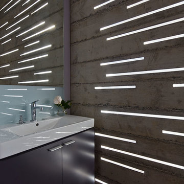
This 27 square foot powder room is by far the smallest space in this 3,200 square foot home in Nicasio CA. Where some might restrain themselves from highlighting such a utilitarian space, we elevated this tiny room to one of the most unique spaces in the home. The powder room sits behind a board-formed concrete wall adjacent to the front door of the home. In conjunction with our structural engineer and a master-mason, we developed a way to embed ¾” planks of acrylic into the South facing concrete wall. During the day, the acrylic captures the intense sun (while the concrete keeps the space temperate) creating a vibrant and entirely unexpected light show when one opens the powder room door. From the outside though, the acrylic planks appear simply as dark striations in the concrete. At night though, a timed light inside the bathroom illuminates the backside of the wall and creates a glowing nightlight at the front door.
The constraints of board-formed concrete and the sequencing of this type of construction determined a pattern that could both retain the material integrity of the concrete while pushing its limits. In addition, the requirements for the vertical members of rebar created a staggered pattern that suggests a sense of movement; a theme that is carried throughout the project. After several experimental concrete pours, the final detail turned a typical powder room into a design feature that pushes the limits of material and construction and jolts our preconceptions of what lies behind a simple bathroom door. The wall appears to transform -- from solid to penetrable, from tame to wild, from utilitarian to spectacle, from dark and stoic to light-filled and poetic.
Bruce Damonte

 MossCreek
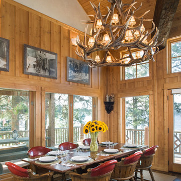
This beautiful lakefront home designed by MossCreek features a wide range of design elements that work together perfectly. From it's Arts and Craft exteriors to it's Cowboy Decor interior, this ultimate lakeside cabin is the perfect summer retreat.
Designed as a place for family and friends to enjoy lake living, the home has an open living main level with a kitchen, dining room, and two story great room all sharing lake views. The Master on the Main bedroom layout adds to the livability of this home, and there's even a bunkroom for the kids and their friends.
Expansive decks, and even an upstairs "Romeo and Juliet" balcony all provide opportunities for outdoor living, and the two-car garage located in front of the home echoes the styling of the home.
Working with a challenging narrow lakefront lot, MossCreek succeeded in creating a family vacation home that guarantees a "perfect summer at the lake!". Photos: Roger Wade
 Advance Design Studio, Ltd.
Jackie and Sean loved the Algonquin neighborhood they lived in with the peaceful neighborhood and the close proximity to work and school. What they didn’t love was how outdated their home had become. With a cramped kitchen and an unused dining room, they decided a remodel was the perfect solution to their problem. They would be able to continue to live in the area they loved, while at the same time they could have the dream home they envisioned.
After a thorough search, Jackie came across Advance Design Studio. She was impressed by all of the positive reviews she saw on the internet and saw herself identifying with all of the project stories she saw on the website. Once they met with designer Scott Christensen and owner Todd Jurs, they knew Advance Design was the right company to make their dreams a reality.
The project consisted of four main areas: the kitchen/dining/powder room, the laundry room, the master bathroom, and the kid’s bathroom. They wanted to expand the kitchen into the seldom used dining room and add a large island for hosting parties and family gatherings. They also wanted new hardwood flooring throughout the first level. The laundry room needed to be more functional, and all three bathrooms were in dire need of updating.
The closed off kitchen was opened up to create a sweeping space between the new eating area and the much larger kitchen. A handsome dry bar complete with a beverage refrigerator and lighted glass door cabinetry makes an elegant transition across from a peninsula area filled with storage. An additional decorative cabinet lighting up elegant dishware through the mullioned glass sits directly across from the drybar.
An expansive island was critical to the kitchen plans. Jackie, Sean and Scott worked closely together to create just the right details for their design. They wanted the island to be functional in addition to being the centerpiece of the room. Added storage for the kid’s school supplies was hidden behind cabinet doors so the children could do their schoolwork right at the island, and a microwave drawer glides open with the touch of a finger hidden inconspicuously within the island space. The easy to care for Cambria Britannica Quartz island top with its sweeping grey and white marble look perched atop hand-carved Craftsman corbels was absolutely what they were hoping for, blending both beauty and function perfectly.
Adding a nice contrast to the brightness of the quartz and the white cabinetry, Kodiak - Leather granite countertops were used to balance the light and dark tones of the space. Dura Supreme Classic White painted cabinets grace the perimeter, while Maple Poppy Seed stained cabinets with a beautiful soft grey woodgrain were used in the beverage center and island. The two tones compliment the large space balancing it out nicely creating interest and elegance with the simple Craftsman style full overlay doors.
A deep warm Barnwood White Oak flooring was added throughout the lower level. The new floor brings additional contrast to the bright kitchen and provides unity with the now open floorplan as it rolls in to the foyer and family room. Final details like the show-stopping lunar like duo light fixtures complete the space and intermix expertly with crisscross details of the glass door mullions, the island bar seating and even accessories in the space.
The small cluttered laundry room needed more space and more storage. With a busy family it seemed to overflow daily and did not have anywhere to hide the families “in and out stuff.” Scott designed the new space with a stackable washer and dryer and much more efficiently organized cabinetry. Doing laundry is now (almost!) a pleasure and keeping everyone’s “stuff” hidden, but readily accessible is now a snap.
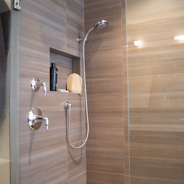
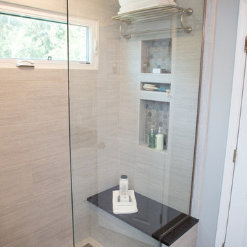
The master bath was not a place where the couple enjoyed spending time getting ready for their day. The tub almost never was used, so removing it made it possible to build an extra-large shower, replacing the small cramped cube of the previous shower they hated. Clean, horizontal lines softly draw your eye around the space with porcelain tile called Driftwood Sea spray. Full overlay cabinetry in a soft white vanity with double sinks makes getting ready for the day much more convenient for the busy couple.
Long floor planks made of porcelain tile mimic real hardwood floors in a soft grey to compliment the shower, but with the ease and care of a tile surface. Cambrian Black Granite counters with a matte finish and under mount porcelain sinks with handsome brushed chrome hardware complete the handsome space. A real bonus in any master bath; a custom built in storage nook was tucked in the corner of the space for linens and heavenly storage.
The kid’s bath was in sad shape because it was original to the house. To keep the budget in control, the tub which was in great condition was retained, but focus was on the new large brick style porcelain charcoal tile on the floor, crisp white new Craftsman style cabinetry with pretty furniture details on the corner base, a striking granite top with white under mount porcelain sinks and fresh hardware and faucets. Some beautiful soft grey wood mirrors to match mom and dads were custom sized and placed under new lighting, and 4 hooks were smartly arranged down the wall for kids’ towels.
This couple was determined not to move, and made their house their dream home. Not only does their home function greatly now, but Jackie says, “When the neighbors come to visit, they’re asking if they can “steal” the design”! The added functionality, elegance, and open floor plan were exactly what this family needed in order to stay.
Advance Design Studio, Joe Nowak
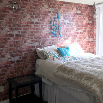
 New Generation Wallcovering Inc.
The client was looking to transform her bedroom into a loft, and she found this great rustic brick pattern by York Wallcoverings. With a more weathered and old paint look, this pattern adds a lot of texture as well.
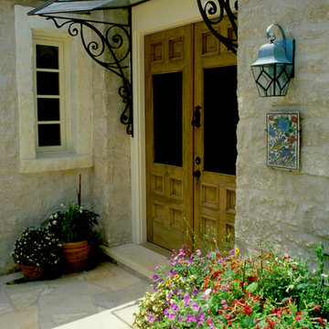 Black + Vernooy Architects
Inspired by the owners' travels in the Mediterranean region yet rooted firmly in Texas soil, this single family residence is designed to provide a secluded, comfortable environment for observing nature, relaxing, entertaining, living, and working. The oddly shaped site determined a house that is removed from the street, resulting in a long drive through a wooded area that leads to the gently sloping house site. The house is designed around a large, central public living area. The basic "H" shaped plan reaches out to define the entry court as well as the rear yard area. The building can only be seen in small vignettes as one moves around and through it, and is finally understood from inside the main room. The public space is central to the plan, where rooms overlay and flow through and into one another. Private rooms are tucked away in more remote parts of the site. The guest bedrooms are located at a slightly lower level, and a remote study, reached by a ship's ladder, overlooks the main living area and enjoys its own roof terrace. The central part of the house is designed as a solid, strong, "original" building to which other wings are added as if built over time. The client desired that the house appear to be of no discernible style or period, and seem older rather than newer.
Built By: Dalgleish Construction Co.
Photography By: Paul Bardagjy
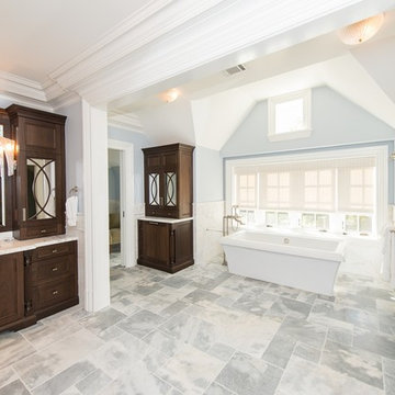 Passacantando Architects AIA
Photographer: Kevin Colquhoun
Huge elegant master white tile bathroom photo in New York with an undermount sink, recessed-panel cabinets, dark wood cabinets, granite countertops, a one-piece toilet and blue walls
Huge elegant master white tile bathroom photo in New York with an undermount sink, recessed-panel cabinets, dark wood cabinets, granite countertops, a one-piece toilet and blue walls
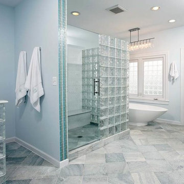
 Michael Nash Design, Build & Homes
2012 NARI CAPITAL COTY, MERIT AWARD WINNER, RESIDENTIAL BATH $30,000 to $60,000
The owners of this contemporary home in Centreville, Virginia, had a dated master bathroom suite that didn’t meet their modern tastes or their needs.
To make the changes they wanted, the design team at Michael Nash Design, Build & Homes determined that the room would need to be gutted. All the partition walls had to go, as did the old whirlpool tub. And all of the plumbing and fixtures had to be relocated to new positions to meet the new design’s criteria.
The clients previously replaced the bathroom windows with glass blocks. Thus, contemporary glass blocks were used instead of partition walls to add openness to this new bathroom layout.
Large polished limestone tiles were used on the bathroom floors and walls, and stylish glass tiles were used as an accent. A free-standing oval tub adds to the room’s contemporary look and saves a lot of space as well. A two-person shower stall with a modern body spray shower system was also installed.
Custom built high level cabinetry and vanities, and modern lighting—both recessed and hanging fixtures— contribute greatly to the success of the final project.
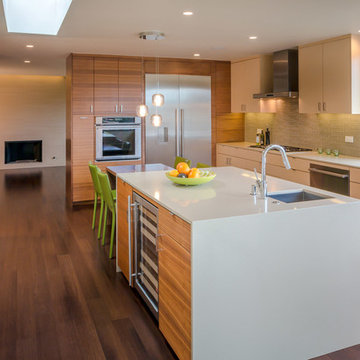
Inspiration for a contemporary dark wood floor eat-in kitchen remodel in San Francisco with an undermount sink, medium tone wood cabinets, quartz countertops, green backsplash, matchstick tile backsplash, stainless steel appliances and an island
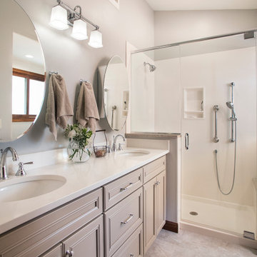
 Roeser Home Remodeling
This Mid-Century home had been updated except for the kitchen and master bath. After a few years of being empty nesters, and with the neighborhood turning over drastically to infill property in the millions, this couple decided the time was right to update the last remaining rooms.
Starting in the Kitchen
Taking a dark, u-shaped kitchen out of the past and updating it for the future, was a dream come true for this family. They knew what they wanted in order to entertain their large extended family, which included their three kids; plus, his family, consisting of nine children, spouses, and now grandchildren. Requirements of an open space to hang out and help out, a banquet for food presentation without obstruction, bright and clean, easy storage, a place for her mother’s china decanters, and an instant hot for tea were all part of the “must haves” for this kitchen. We also needed to work around the homeowners’ existing appliances since many of them were practically new.
Vaulted ceilings, lots of high windows, and large openings to other spaces in the house, were challenges that only a galley style kitchen could address. Blending and lacing the hardwood floor with new flooring required both the new and existing to be sanded down and refinished. This provided a coherent look to the entire first floor of this home. Matching casings, baseboards and base shoe helped to make the updates look fresh, but original to the house.
In the kitchen, choosing the sandstone slate finish on our Wellborn Maple select series cabinets kept the space soft; but really opened it, making the space lighter and brighter. The Harmony style door choice blended with the décor in the rest of the house, while also giving straight clean lines the homeowner desired. Grounding the row of cabinets with their refrigerator and a pantry cabinet, gave symmetry to this side of the kitchen.
On the opposite side, a built-in pantry cabinet mirrors the refrigerator. A row of drawer cabinets expanded the storage and banquet space, to lay out food for entertaining. Also added were some much-needed wall cabinets with glass inserts to mirror the windows and keep the space open. This also allowed the taller canister to be displayed and admired. A few smaller shelves were added above the window space, to house the smaller canisters so loved by the homeowner.
An artist by trade, this homeowner added two narrow cabinets to the side of the pantry and the side of the refrigerator panel to house and create easy access to the various spices her husband loves to use while cooking. She painted them to blend with Wellborn’s Sandstone finish. The Caesarstone countertop with a 3cm eased edge in London Gray has a small pattern that is subtle and interesting. Cutting down the Caesarstone to 2 cm and carrying the same London Gray pattern up the backsplash area, lended to the clean lines and easy cleaning this homeowner requested.
Choosing chrome plumbing fixtures from Moen’s Brantford line is timeless choice. Chrome is always popular and yet in today’s market, also very trendy. The Brantford faucet has a pull-down spray and one side handle, leaving space for the all-important request of a Transcape hot water dispenser, also in chrome.
Scraping away the past included smoothing out the popcorn ceiling. Adding LED slope cans to the vaulted ceilings provided the necessary task lighting to elevate these homeowners’ joy of cooking. Removing the dated “popcorn look” enhanced the clean and spacious feel created by the architecture of the ceiling. Adding Top Knob chrome hardware was the final element that tied the kitchen all together.
Master Bathroom
The original dated Master Bathroom had dark cabinets, a huge Jacuzzi tub and a small shower stall that provided barely enough room for even a child to shower. Removing the Jacuzzi tub that was never used, opened this floor plan to a grand shower that is comfortable and spacious. For easy cleaning, these homeowners opted for a panel system in their shower. Onyx shower walls with a shower seat and recess wide shower caddy were installed in place of the old Jacuzzi style tub.
The large panels were quite a challenge for our team, with an eight foot door and vaulted ceilings; but they were determined not to have a seam. These seamless panels are beautiful and very easy to clean. Keeping with the original floor plan, a double sink vanity from Wellborn’s select line with the Harmony door style in a pebble finish was installed. New Kohler Caxton under mount sinks were installed, along with the Moen Kinsley 8” wide spread faucets in chrome. Matching Kingsley 18” grab bars were added to the shower area, along with the Kohler Brantford fixed shower head and handheld slide bar.
The countertop was a beautiful Caesarstone in Frosty Carrina with an eased edge and 4” back and side splash. Matching Kinsley towel hooks were added, along with mirrors the homeowner purchased and we installed for her. Top Knobs chrome cabinet hardware finished the look along with a beautiful tile floor AO Mira 1224-S Silver Maple laid in a broken joint pattern. Matching marble sills were added on top of the knee walls and threshold in the doorway. A 3/8” frameless custom shower door with fixed panels surrounded the shower creating an open airy feel to the space.
Not shown: Kohler’s Wellworth highline toilet with a slow-close seat replaces the original toilet. The original shower stall became a space used to house a stackable washer and dryer, a top a safety pan and drain to slop sink in the basement. There was even enough room for small shelving to provide storage for laundry essentials. Adding a louver door keeps the laundry area behind the scene and opens the master area to multiple tasks needed.
Master Bedroom Fireplace
This homeowner really missed a bedroom fireplace they had in a previous home. Since we were going to be working on their master bathroom anyway; was there a way to create a fireplace without making it feel too odd in their large bedroom area? They had purchased a ventless gas fireplace and they had their original television as well.
Challenged by windows, a vaulted ceiling and the natural light streaming from the back window; this divided wall was created, keeping the lighting from the other side of the room and providing a dressing area opposite the fireplace. This was a perfect idea since the closets are now in the dressing area and the creative wall houses the fireplace and TV for cold winter nights of snuggling to a movie. Better yet, the fireplace and TV are all on remote control!
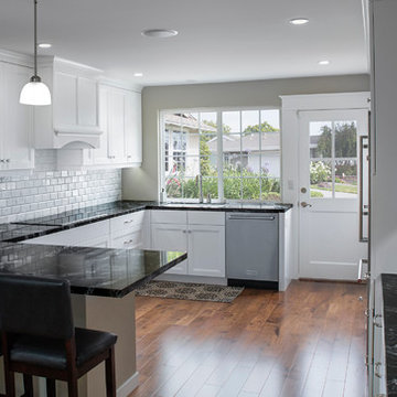 OCTOBER 5 Fine Home Builders
Sometimes, I can’t help but smile. Recently October 5 met a beautiful couple, Al and Shawn. With their two sons gone, they decided to remodel their kitchen. The house was built in 1957, with the original kitchen remaining.
When I first met Shawn, she was determined, make no mistake about it. She wanted, “. . . dark cabinets with a dark floor.” End of story! Hmmm . . . I just smiled and listened. She finally asked me what I thought. I told her, “Well, I don’t really see dark cabinets with a dark floor.”
Beautifully carved wooden beams supported the living room ceiling, along with a well design wrap-around comfortable bay-window seat. All of it painted white, which looked beautiful and enjoyed architectural significance. I guess after living in a house for 27 years, we tend to overlook its natural treasures. Shawn was having none of it. “Oh my god, white? Who’s going to keep it clean? No way? Dark, dark, dark!”
Sometimes, you just have to let an idea sit and marinate. You might guess as to who won . . . remember, I am writing this. Shawn and Al have to be one of my favorite clients of all times. We debated, argued and even kept score. Shawn won on the countertops, Arabian Nights, I have to give her credit, and the backsplash. She did not want outlets in the Carrera Marble backsplash, which surprisingly has changed my opinion, but I won everything else.
At the end of the project the score was Shawn = 2 (may be 3) and Jim = 12+ (I eventually lost count, but who’s counting anyway.)
Sometimes, I can’t help but smile. Hope you do too, when you look at the pictures below.
 Advance Design Studio, Ltd.
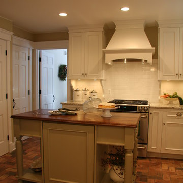
Located on a partially wooded lot in Elburn, Illinois, this home needed an eye-catching interior redo to match the unique period exterior. The residence was originally designed by Bow House, a company that reproduces the look of 300-year old bow roof Cape-Cod style homes. Since typical kitchens in old Cape Cod-style homes tend to run a bit small- or as some would like to say, cozy – this kitchen was in need of plenty of efficient storage to house a modern day family of three.
Advance Design Studio, Ltd. was able to evaluate the kitchen’s adjacent spaces and determine that there were several walls that could be relocated to allow for more usable space in the kitchen. The refrigerator was moved to the newly excavated space and incorporated into a handsome dinette, an intimate banquette, and a new coffee bar area. This allowed for more countertop and prep space in the primary area of the kitchen. It now became possible to incorporate a ball and claw foot tub and a larger vanity in the elegant new full bath that was once just an adjacent guest powder room.
Reclaimed vintage Chicago brick paver flooring was carefully installed in a herringbone pattern to give the space a truly unique touch and feel. And to top off this revamped redo, a handsome custom green-toned island with a distressed black walnut counter top graces the center of the room, the perfect final touch in this charming little kitchen.
5