
Search results for "Determine final" in Home Design Ideas

 Black + Vernooy Architects
Inspired by the owners' travels in the Mediterranean region yet rooted firmly in Texas soil, this single family residence is designed to provide a secluded, comfortable environment for observing nature, relaxing, entertaining, living, and working. The oddly shaped site determined a house that is removed from the street, resulting in a long drive through a wooded area that leads to the gently sloping house site. The house is designed around a large, central public living area. The basic "H" shaped plan reaches out to define the entry court as well as the rear yard area. The building can only be seen in small vignettes as one moves around and through it, and is finally understood from inside the main room. The public space is central to the plan, where rooms overlay and flow through and into one another. Private rooms are tucked away in more remote parts of the site. The guest bedrooms are located at a slightly lower level, and a remote study, reached by a ship's ladder, overlooks the main living area and enjoys its own roof terrace. The central part of the house is designed as a solid, strong, "original" building to which other wings are added as if built over time. The client desired that the house appear to be of no discernible style or period, and seem older rather than newer.
Built By: Dalgleish Construction Co.
Photography By: Paul Bardagjy
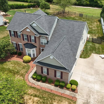
 Triumph Roofing
Shingles Roof Repairs in Charlotte
Eternity Matters, a nonprofit organization based in Charlotte, contacted Triumph Roofing with concerns about their roof. Years of wear and tear had caused multiple shingles to crack, curl, and detach, leading to water seepage in certain areas. They needed a reliable roofing solution to protect their building and ensure it remained a safe space for their community activities.
After a thorough inspection, we determined that a comprehensive Shingles Roof Repairs project would address the damage. The estimated cost of $6,500 fit their budget, providing a cost-effective yet high-quality solution. Our team quickly developed a plan to repair the damaged areas and restore the integrity of the roof.
The Repair Process
On the scheduled repair day, our team arrived early to begin the work. First, we carefully removed the damaged shingles, ensuring no debris was left behind. Next, we replaced the underlayment to provide added protection and prevent future leaks. Finally, we installed new, high-quality shingles to match the existing roof, restoring its uniform appearance.
Throughout the process, we kept Eternity Matters informed of each step, answering their questions and ensuring they felt confident in the project’s progress. By the end of the day, their roof was fully repaired, durable, and ready to withstand future weather challenges.
Client Feedback
The team at Eternity Matters shared their gratitude: "Triumph Roofing went above and beyond! They worked efficiently, stayed within our budget, and left our roof looking as good as new. We highly recommend their Shingles Roof Repairs services!"
This project highlights our commitment to delivering reliable and affordable roofing solutions. Whether it's repairing damaged shingles or providing full roof replacements, Triumph Roofing stands ready to protect your property with expert care.

 Home Expressions Interiors by Laura Bloom Inc.
This client came to us wanting to enhance their existing space by using some creative finishes for walls. They hoped to make the home feel more modern with an urban rustic vibe as opposed to the traditional architectural style of the structure but did not know how to accomplish this transition. Upon our arrival it was noted that all walls had been painted white which was determined too harsh and did not achieve the modern feel the homeowner had hoped to evoke. The space was softened by using a subtle and fresh color palette with one accent color for impact. Teal was the color selected to create a continuous thread of pop in varying degrees in each room which included the Entry Hall, Dining Room and Living Room. Touches of black were injected into each space due to the client’s previous purchases of a drum fixture for the living room and black dining table; both gave direction on scale and style.
The Entry Hall was given powerful impact as someone enters the home by taking its cue from the abstract art selected for the Dining Room. A faux concrete wall was created with the use of artistically combined colors. In the Dining Room, the use of classic chairs are successfully made modern by upholstering in teal leather which added both continuity and unexpected interest next to the velvet Greek Key pattern found on host chairs. In the Living Room custom upholstered sofa and chairs are grounded by a rug that brings all colors together. A unique copper rivet finish was applied in the niches that flank the fireplace as a contrast to whimsical amber crystal mini chandeliers hung over modern consoles that display simple yet exciting teal bowls. The final furnishings, art and accessories ultimately brought the entire home together in a rustic, modern way that is warm and inviting reflecting the unique personality of the people who live there.
Find the right local pro for your project
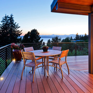
 Feeney Inc.
Will Austin Photography.
Dave Pelletier Architect
Gary Perreault, steel fabricator.
Home design - contemporary home design idea in Seattle
Home design - contemporary home design idea in Seattle

 Advance Design Studio, Ltd.
Jennifer and Dan have lived in their Deer Park Illinois home for 15 years, slowly making minor fixes like painting and decorating; but they had a new plan for their kitchen the entire time. An awkwardly placed garage door, and an island cooktop with a terrible downdraft made a full-scale kitchen remodel an absolute must. Jennifer had many ideas in mind and wanted to work with a company that could provide high-end work, while partnering with a designer that would tailor the kitchen to her ideas.
She was intrigued by the phrase “Common Sense Remodeling” in Advance Design’s feature she discovered while perusing an issue of the community’s Quintessential Barrington Magazine. Doing further research on the company’s website, as she looked through project profiles and read about Advance Design’s “Common Sense Remodeling” philosophy, she promptly scheduled an appointment to see if the people and ideas she read about were truly who they said they were. The more she read, the more she knew that the “Common Sense” approach to remodeling they described was exactly the type of company she was looking for.
The partnership was sealed after an initial consultation with Owner Todd Jurs and Project Designer Michelle Lecinski. They displayed a combination of friendliness, professionalism and respect that was unmatched by any of the other companies Jennifer talked to. She knew that with Advance Design, she would be able to retain the vision that she had in mind with high-quality craftsmanship.
“I reached out to Advance Design because of the ‘Common Sense Remodeling’ tagline,” Jennifer said. “That’s what lingered for me”. “Advance Design was the most respectful- of the house and of my design ideas, and the most professional of the handful of companies that looked at my project”.
Soon after the meeting Jennifer began working with Michelle on the project design. They quickly developed chemistry. Jennifer loved how Michelle researched and located every detail that Jennifer wanted for the kitchen. Between the two of them, every concept and idea was worked through and perfected. “Jennifer had definite ideas about what she wanted the new kitchen to look like, she just didn’t know how to bring it all together. We worked together really well to make her ideas into the practical reality necessary for a well-functioning kitchen, with the look and feel that she had envisioned”, says Michelle.
“Michelle was wonderful in using the CAD system she would show me new drawings every time we changed the layout while working through the design,” Jennifer said. “She was a really wonderful partner in execution, she made sure everything happened quickly and easily.”
The finished design drew out elements of Jennifer’s style and personality. The pair call the look “sophisticated farmhouse” to describe the kitchen renovation to family and friends. The result was a beautifully crafted, authentic-feeling space that satisfied Jennifer’s dreams 15 years in the making. The whole project consisted of a kitchen remodel, mudroom upgrade with powder room, and garage entry relocation. “The projects I personally like the best, are the ones that put the client’s dreams on display,” Project Designer Michelle said. “And this is one of those projects.”
The main focal point of the kitchen is custom zinc and brass ventilation hood with a vintage sheen, which was hand made to order by a small company in Indiana named Vogler Metalworking. “It’s like sculpture, a true work of art”, says Jennifer. Your eye is immediately drawn towards this elegant yet practical hood that eliminated the home’s downdraft problem and added a striking conversation piece at the same time. The carpenters had to use special gloves when transporting and installing it, so they didn’t smudge it with fingerprints. The beautiful hood centers proudly over the stunning black enamel and brass LaCornue Range. “I had a friend who had a LaCornue range and after learning how easy it was to cook perfect meals, I was convinced I wanted to have one”, says Jennifer. This unique, breathtaking combination anchors the entire kitchen and is apparent immediately as you walk into the great room the surrounds the space.
DuraSupreme Crestwood cabinets with a Kendall Panel add function and sophistication. A custom gray paint color paired with a storm blue was developed so that the new kitchen looked like it belonged to the existing space. Unlacquered brass faucets and hardware were important to Jennifer because she wanted the living finishes to age over time. Remarkable brass diamond mesh cabinet door inserts imported from the UK continue to add this one-of-a-kind kitchen renovation; giving it a “you won’t see this everywhere” quality. The use of old railcar flooring for the coffee bar countertop and reclaimed oak for the open shelving gives an authenticity to the space uncommon in kitchens today.
Jennifer and Michelle fell in love with the Limestone Grey Stone while they were investigating unique island countertop ideas. They liked the fact that the limestone as a living finish will age and change over time. Calcutta Miel Quartz countertops made for an excellent pairing around the perimeter, as it’s durable and perfect for cooking preparations. A textured white subway tile backsplash that runs to the ceiling keeps your eye moving towards the open shelving, and to the main focal point of the stunning range hood combination.
“The kitchen functions beautifully, and it’s gorgeous,” beams Jennifer as she gestures with both hands while smiling ear to ear. “The most important thing was I wanted a kitchen that had a wonderful flow, cooked beautiful meals and was a great gathering place for family and friends, and this space does that perfectly! Beauty wise, it turned out exactly how I had envisioned. I felt the function part was the hardest part, and that was nailed”!
Relocating the garage entry to the new mudroom was a huge priority and has finally separated the family’s arriving home functions from their kitchen. Now coats and shoes and bags have their own area for dropping once members arrive home. Matching gray DuraSupreme cabinetry helped create gorgeous, purposeful lockers for the family. A reclaimed vintage sink and custom wall paper were added to the tiny powder room to beautify the once previously only functional space. Advance Design was even able to create a custom space for their dog to sleep while the family is away.
“It was unbelievable that a project of this size was completed in such a short time, and I think that’s because of the large amount of planning and preparation that went into it,” Jennifer marveled, “When we started, we were ready, and everything was prepared”.
When it came to execution, Project Manager Justin Davis and his crew were quick, accessible, and organized. Projects like this kitchen are typically completed in as little as 8-10 weeks. Jennifer’s kitchen however despite the relocation of some challenging HVAC in a soffit and moving of an exterior door was completed remarkably fast in part because the team was working with an existing tile floor that ran throughout the first floor that the client really loved.
“You get to know these people really well because they’re living in your house while you’re living in your house. They were so fast and really good, it didn’t take as long as even planned” reported Jennifer. “I would text Justin and he always responded almost immediately. I got to know all the guys who were working in our house and they were all wonderful people”.
Details in a customized kitchen like this one require skill and care from the people who install it. “All the guys on the job were skilled at what the did. I wanted small details like little feet to look like furniture, that is where their carpentry skill came in to make these all perfect”, said Jennifer. “The tile guys were wonderful. They even let me determine how I wanted the texture with the grout to appear for a salt and pepper look; now that is a very skilled trade person making it custom”.
In Jennifer’s interview, she continued to reference Advance Design’s “Common Sense Remodeling”, so I took a minute to ask her exactly what that phrase meant to her and how it played out in her experience with her project and the Advance Design team. Here is what she said: “I was intrigued about Common Sense Remodeling and in my head that there would be clear costs and prices, great communication between the design team, the execution team and me”, said Jennifer. They did deliver on that, it was so clear about the cost breakdown, what I could expect from everyone who came to my house, and everything that we had ordered. That to me is the Common Sense”!
It’s great to see a client take literally our assertion that a well-planned remodeling project is simply “Common Sense”! She anticipated each step of the way would be clear, concise, and predictable, all the while protecting the outcome due to the careful upfront planning. “Advance Design delivered on their ‘Common Sense Remodeling’ promise,” Jennifer said. “From the design team, to the execution team - everything was straight forward like I imagined. The project turned out exactly how I envisioned, I enjoyed this process and absolutely would recommend Advance Design Studio to anyone.”
 Black + Vernooy Architects
Inspired by the owners' travels in the Mediterranean region yet rooted firmly in Texas soil, this single family residence is designed to provide a secluded, comfortable environment for observing nature, relaxing, entertaining, living, and working. The oddly shaped site determined a house that is removed from the street, resulting in a long drive through a wooded area that leads to the gently sloping house site. The house is designed around a large, central public living area. The basic "H" shaped plan reaches out to define the entry court as well as the rear yard area. The building can only be seen in small vignettes as one moves around and through it, and is finally understood from inside the main room. The public space is central to the plan, where rooms overlay and flow through and into one another. Private rooms are tucked away in more remote parts of the site. The guest bedrooms are located at a slightly lower level, and a remote study, reached by a ship's ladder, overlooks the main living area and enjoys its own roof terrace. The central part of the house is designed as a solid, strong, "original" building to which other wings are added as if built over time. The client desired that the house appear to be of no discernible style or period, and seem older rather than newer.
Built By: Dalgleish Construction Co.
Photography By: Paul Bardagjy

 Jordan Design Build Group
JDBG is wrapping up work on an expansive 2-story sunroom addition that also included modifications to the existing home’s interior and significant exterior improvements as well. The original project brief was to provide a conditioned 4-season sunroom addition where the homeowners could relax and enjoy their wooded views. As we delved deeper into our client’s overall objectives, it became clear that this would be no ordinary sunroom addition. The resulting 16’x25’ sunroom is a showstopper with 10’ high ceilings and wall to wall windows offering expansive views of the surrounding landscape.
As we recommend with most addition projects, the process started with our Preliminary Design Study to determine project goals, design concepts, project feasibility and associated budget estimates. During this process, our design team worked to ensure that both interior and exterior were fully integrated. We conducted in-depth programming to identify key goals and needs which would inform the design and performed a field survey and zoning analysis to identify any constraints that could impact the plans. The next step was to develop conceptual designs that addressed the program requirements.
Using a combination of 3-D massing, interior/exterior renderings, precedent imaging and space planning, the design concept was revised and refined. At the end of the study we had an approved schematic design and comprehensive budget estimates for the 2-story addition and were ready to move into design development, construction documentation, trade coordination, and final pricing. A complex project such as this involves architectural and interior design, structural and civil engineering, landscape design and environmental considerations. Multiple trades and subs are engaged during construction, from HVAC to electrical and plumbing, framers, carpenters and masons, roofers and painters just to name a few. JDBG was there every step of the way to ensure quality construction.
Other notable features of the renovation included expanding the home’s existing dining room, incorporating a custom ‘dish room,’ and providing fully conditioned storage and his & her workrooms on the lower level. A new front portico will visually connect the old and new structures and a brand new roof, shutters and paint will further transform the exterior. Thoughtful planning was also given to the landscape, including a back deck, stone patio and walkways, plantings and exterior lighting. Stay tuned for more photos as this sunroom addition nears completion.
 Black + Vernooy Architects
Inspired by the owners' travels in the Mediterranean region yet rooted firmly in Texas soil, this single family residence is designed to provide a secluded, comfortable environment for observing nature, relaxing, entertaining, living, and working. The oddly shaped site determined a house that is removed from the street, resulting in a long drive through a wooded area that leads to the gently sloping house site. The house is designed around a large, central public living area. The basic "H" shaped plan reaches out to define the entry court as well as the rear yard area. The building can only be seen in small vignettes as one moves around and through it, and is finally understood from inside the main room. The public space is central to the plan, where rooms overlay and flow through and into one another. Private rooms are tucked away in more remote parts of the site. The guest bedrooms are located at a slightly lower level, and a remote study, reached by a ship's ladder, overlooks the main living area and enjoys its own roof terrace. The central part of the house is designed as a solid, strong, "original" building to which other wings are added as if built over time. The client desired that the house appear to be of no discernible style or period, and seem older rather than newer.
Built By: Dalgleish Construction Co.
Photography By: Paul Bardagjy
 Black + Vernooy Architects
Inspired by the owners' travels in the Mediterranean region yet rooted firmly in Texas soil, this single family residence is designed to provide a secluded, comfortable environment for observing nature, relaxing, entertaining, living, and working. The oddly shaped site determined a house that is removed from the street, resulting in a long drive through a wooded area that leads to the gently sloping house site. The house is designed around a large, central public living area. The basic "H" shaped plan reaches out to define the entry court as well as the rear yard area. The building can only be seen in small vignettes as one moves around and through it, and is finally understood from inside the main room. The public space is central to the plan, where rooms overlay and flow through and into one another. Private rooms are tucked away in more remote parts of the site. The guest bedrooms are located at a slightly lower level, and a remote study, reached by a ship's ladder, overlooks the main living area and enjoys its own roof terrace. The central part of the house is designed as a solid, strong, "original" building to which other wings are added as if built over time. The client desired that the house appear to be of no discernible style or period, and seem older rather than newer.
Built By: Dalgleish Construction Co.
Photography By: Paul Bardagjy

 Inspiration Kitchen and Bath
Example of a small classic galley ceramic tile and beige floor enclosed kitchen design in Philadelphia with an undermount sink, recessed-panel cabinets, medium tone wood cabinets, granite countertops, beige backsplash, black appliances, porcelain backsplash and beige countertops
 Black + Vernooy Architects
Inspired by the owners' travels in the Mediterranean region yet rooted firmly in Texas soil, this single family residence is designed to provide a secluded, comfortable environment for observing nature, relaxing, entertaining, living, and working. The oddly shaped site determined a house that is removed from the street, resulting in a long drive through a wooded area that leads to the gently sloping house site. The house is designed around a large, central public living area. The basic "H" shaped plan reaches out to define the entry court as well as the rear yard area. The building can only be seen in small vignettes as one moves around and through it, and is finally understood from inside the main room. The public space is central to the plan, where rooms overlay and flow through and into one another. Private rooms are tucked away in more remote parts of the site. The guest bedrooms are located at a slightly lower level, and a remote study, reached by a ship's ladder, overlooks the main living area and enjoys its own roof terrace. The central part of the house is designed as a solid, strong, "original" building to which other wings are added as if built over time. The client desired that the house appear to be of no discernible style or period, and seem older rather than newer.
Built By: Dalgleish Construction Co.
Photography By: Paul Bardagjy
 Home Expressions Interiors by Laura Bloom Inc.
This client came to us wanting to enhance their existing space by using some creative finishes for walls. They hoped to make the home feel more modern with an urban rustic vibe as opposed to the traditional architectural style of the structure but did not know how to accomplish this transition. Upon our arrival it was noted that all walls had been painted white which was determined too harsh and did not achieve the modern feel the homeowner had hoped to evoke. The space was softened by using a subtle and fresh color palette with one accent color for impact. Teal was the color selected to create a continuous thread of pop in varying degrees in each room which included the Entry Hall, Dining Room and Living Room. Touches of black were injected into each space due to the client’s previous purchases of a drum fixture for the living room and black dining table; both gave direction on scale and style.
The Entry Hall was given powerful impact as someone enters the home by taking its cue from the abstract art selected for the Dining Room. A faux concrete wall was created with the use of artistically combined colors. In the Dining Room, the use of classic chairs are successfully made modern by upholstering in teal leather which added both continuity and unexpected interest next to the velvet Greek Key pattern found on host chairs. In the Living Room custom upholstered sofa and chairs are grounded by a rug that brings all colors together. A unique copper rivet finish was applied in the niches that flank the fireplace as a contrast to whimsical amber crystal mini chandeliers hung over modern consoles that display simple yet exciting teal bowls. The final furnishings, art and accessories ultimately brought the entire home together in a rustic, modern way that is warm and inviting reflecting the unique personality of the people who live there.
 Jordan Design Build Group
JDBG is wrapping up work on an expansive 2-story sunroom addition that also included modifications to the existing home’s interior and significant exterior improvements as well. The original project brief was to provide a conditioned 4-season sunroom addition where the homeowners could relax and enjoy their wooded views. As we delved deeper into our client’s overall objectives, it became clear that this would be no ordinary sunroom addition. The resulting 16’x25’ sunroom is a showstopper with 10’ high ceilings and wall to wall windows offering expansive views of the surrounding landscape.
As we recommend with most addition projects, the process started with our Preliminary Design Study to determine project goals, design concepts, project feasibility and associated budget estimates. During this process, our design team worked to ensure that both interior and exterior were fully integrated. We conducted in-depth programming to identify key goals and needs which would inform the design and performed a field survey and zoning analysis to identify any constraints that could impact the plans. The next step was to develop conceptual designs that addressed the program requirements.
Using a combination of 3-D massing, interior/exterior renderings, precedent imaging and space planning, the design concept was revised and refined. At the end of the study we had an approved schematic design and comprehensive budget estimates for the 2-story addition and were ready to move into design development, construction documentation, trade coordination, and final pricing. A complex project such as this involves architectural and interior design, structural and civil engineering, landscape design and environmental considerations. Multiple trades and subs are engaged during construction, from HVAC to electrical and plumbing, framers, carpenters and masons, roofers and painters just to name a few. JDBG was there every step of the way to ensure quality construction.
Other notable features of the renovation included expanding the home’s existing dining room, incorporating a custom ‘dish room,’ and providing fully conditioned storage and his & her workrooms on the lower level. A new front portico will visually connect the old and new structures and a brand new roof, shutters and paint will further transform the exterior. Thoughtful planning was also given to the landscape, including a back deck, stone patio and walkways, plantings and exterior lighting. Stay tuned for more photos as this sunroom addition nears completion.
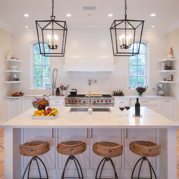
 Gayler Design Build
Gayler’s design team and construction crew worked closely with the aquarium experts. Several meetings were held to discuss and review every aspect of the 250-gallon saltwater fish tank. Among those details it was determined that the cabinet needed to be built with a steel frame in order to support the weight of the 3,000-pound tank. A chase cooling system was also installed below the tank in order to keep the water at a required, cooler temperature.
New cabinetry had to be measured with extreme care to cover the original cabinet footprint. Since the existing kitchen tile flooring would be difficult to find, Gayler also took special care during construction to protect the tile. The dated cabinetry in the kitchen and butler’s pantry was replaced with all new semi-custom inset maple cabinets painted in a Swiss Coffee finish.
A full overlay, custom-built kitchen hood, also in painted maple, anchors the kitchen’s large size and is complimented by a full ceiling-height backsplash in a herringbone pattern. Since the tile was custom-made, it had variations. Gayler Design Build took meticulous care to select and lay the tile to preserve the beautiful pattern.
The kitchen counters, the island, and the butler's pantry are finished in a marble-inspired Sereno Bianco Quartz.
To the delight of our client, they selected all new high-end appliances. Their appliance package included a SubZero 36” Integrated column refrigerator and freezer, a Wolf 60” dual fuel, 6 burner with a double griddle, a Thermador oven and microwave, a Thermador warming drawer, a Cove 24” dishwasher, a SubZero 15” Ice Maker and a SubZero 24” undercounter wine refrigerator.
Finally, pendant lighting, open and glass shelving, and dual sinks make a dramatic statement to this fantastic kitchen and butler's pantry transformation.
 Advance Design Studio, Ltd.
Jackie and Sean loved the Algonquin neighborhood they lived in with the peaceful neighborhood and the close proximity to work and school. What they didn’t love was how outdated their home had become. With a cramped kitchen and an unused dining room, they decided a remodel was the perfect solution to their problem. They would be able to continue to live in the area they loved, while at the same time they could have the dream home they envisioned.
After a thorough search, Jackie came across Advance Design Studio. She was impressed by all of the positive reviews she saw on the internet and saw herself identifying with all of the project stories she saw on the website. Once they met with designer Scott Christensen and owner Todd Jurs, they knew Advance Design was the right company to make their dreams a reality.
The project consisted of four main areas: the kitchen/dining/powder room, the laundry room, the master bathroom, and the kid’s bathroom. They wanted to expand the kitchen into the seldom used dining room and add a large island for hosting parties and family gatherings. They also wanted new hardwood flooring throughout the first level. The laundry room needed to be more functional, and all three bathrooms were in dire need of updating.
The closed off kitchen was opened up to create a sweeping space between the new eating area and the much larger kitchen. A handsome dry bar complete with a beverage refrigerator and lighted glass door cabinetry makes an elegant transition across from a peninsula area filled with storage. An additional decorative cabinet lighting up elegant dishware through the mullioned glass sits directly across from the drybar.
An expansive island was critical to the kitchen plans. Jackie, Sean and Scott worked closely together to create just the right details for their design. They wanted the island to be functional in addition to being the centerpiece of the room. Added storage for the kid’s school supplies was hidden behind cabinet doors so the children could do their schoolwork right at the island, and a microwave drawer glides open with the touch of a finger hidden inconspicuously within the island space. The easy to care for Cambria Britannica Quartz island top with its sweeping grey and white marble look perched atop hand-carved Craftsman corbels was absolutely what they were hoping for, blending both beauty and function perfectly.
Adding a nice contrast to the brightness of the quartz and the white cabinetry, Kodiak - Leather granite countertops were used to balance the light and dark tones of the space. Dura Supreme Classic White painted cabinets grace the perimeter, while Maple Poppy Seed stained cabinets with a beautiful soft grey woodgrain were used in the beverage center and island. The two tones compliment the large space balancing it out nicely creating interest and elegance with the simple Craftsman style full overlay doors.
A deep warm Barnwood White Oak flooring was added throughout the lower level. The new floor brings additional contrast to the bright kitchen and provides unity with the now open floorplan as it rolls in to the foyer and family room. Final details like the show-stopping lunar like duo light fixtures complete the space and intermix expertly with crisscross details of the glass door mullions, the island bar seating and even accessories in the space.
The small cluttered laundry room needed more space and more storage. With a busy family it seemed to overflow daily and did not have anywhere to hide the families “in and out stuff.” Scott designed the new space with a stackable washer and dryer and much more efficiently organized cabinetry. Doing laundry is now (almost!) a pleasure and keeping everyone’s “stuff” hidden, but readily accessible is now a snap.
The master bath was not a place where the couple enjoyed spending time getting ready for their day. The tub almost never was used, so removing it made it possible to build an extra-large shower, replacing the small cramped cube of the previous shower they hated. Clean, horizontal lines softly draw your eye around the space with porcelain tile called Driftwood Sea spray. Full overlay cabinetry in a soft white vanity with double sinks makes getting ready for the day much more convenient for the busy couple.
Long floor planks made of porcelain tile mimic real hardwood floors in a soft grey to compliment the shower, but with the ease and care of a tile surface. Cambrian Black Granite counters with a matte finish and under mount porcelain sinks with handsome brushed chrome hardware complete the handsome space. A real bonus in any master bath; a custom built in storage nook was tucked in the corner of the space for linens and heavenly storage.
The kid’s bath was in sad shape because it was original to the house. To keep the budget in control, the tub which was in great condition was retained, but focus was on the new large brick style porcelain charcoal tile on the floor, crisp white new Craftsman style cabinetry with pretty furniture details on the corner base, a striking granite top with white under mount porcelain sinks and fresh hardware and faucets. Some beautiful soft grey wood mirrors to match mom and dads were custom sized and placed under new lighting, and 4 hooks were smartly arranged down the wall for kids’ towels.
This couple was determined not to move, and made their house their dream home. Not only does their home function greatly now, but Jackie says, “When the neighbors come to visit, they’re asking if they can “steal” the design”! The added functionality, elegance, and open floor plan were exactly what this family needed in order to stay.
Advance Design Studio, Joe Nowak
 Black + Vernooy Architects
Inspired by the owners' travels in the Mediterranean region yet rooted firmly in Texas soil, this single family residence is designed to provide a secluded, comfortable environment for observing nature, relaxing, entertaining, living, and working. The oddly shaped site determined a house that is removed from the street, resulting in a long drive through a wooded area that leads to the gently sloping house site. The house is designed around a large, central public living area. The basic "H" shaped plan reaches out to define the entry court as well as the rear yard area. The building can only be seen in small vignettes as one moves around and through it, and is finally understood from inside the main room. The public space is central to the plan, where rooms overlay and flow through and into one another. Private rooms are tucked away in more remote parts of the site. The guest bedrooms are located at a slightly lower level, and a remote study, reached by a ship's ladder, overlooks the main living area and enjoys its own roof terrace. The central part of the house is designed as a solid, strong, "original" building to which other wings are added as if built over time. The client desired that the house appear to be of no discernible style or period, and seem older rather than newer.
Built By: Dalgleish Construction Co.
Photography By: Paul Bardagjy
 Home Expressions Interiors by Laura Bloom Inc.
This client came to us wanting to enhance their existing space by using some creative finishes for walls. They hoped to make the home feel more urban, rustic and modern as opposed to the traditional architectural style of the structure but did not know how to accomplish this transition. Upon our arrival it was noted that all walls had been painted white which was determined too harsh and did not achieve the modern feel the homeowner had hoped to evoke. The space was softened by using a subtle and fresh color palette with one accent color for impact. Teal was the color selected to create a continuous thread of pop in varying degrees in each room which included the Entry Hall, Dining Room and Living Room. Touches of black were injected into each space due to the client’s previous purchases of a drum fixture for the living room and black dining table; both gave direction on scale and style.
The Entry Hall was made powerfully impactful as someone enters the home by taking its cue from the abstract art selected for the Dining Room. A faux concrete wall was created with the use of artistically combined colors. In the Dining Room, the use of classic chairs are successfully made modern by upholstering in teal leather which added both continuity and unexpected interest next to the velvet Greek Key pattern found on host chairs. In the Living Room custom upholstered sofa and chairs are grounded by a rug that brings all colors together. A unique copper rivet finish was applied in the niches that flank the fireplace as a contrast to whimsical amber crystal mini chandeliers hung over modern consoles that display simple yet exciting teal bowls. The final furnishings, art and accessories ultimately brought the entire home together in a rustic, modern way that is warm and inviting reflecting the unique personality of the people who live there.
 Home Expressions Interiors by Laura Bloom Inc.
This client came to us wanting to enhance their existing space by using some creative finishes for walls. They hoped to make the home feel more urban, rustic and modern as opposed to the traditional architectural style of the structure but did not know how to accomplish this transition. Upon our arrival it was noted that all walls had been painted white which was determined too harsh and did not achieve the modern feel the homeowner had hoped to evoke. The space was softened by using a subtle and fresh color palette with one accent color for impact. Teal was the color selected to create a continuous thread of pop in varying degrees in each room which included the Entry Hall, Dining Room and Living Room. Touches of black were injected into each space due to the client’s previous purchases of a drum fixture for the living room and black dining table; both gave direction on scale and style.
The Entry Hall was made powerfully impactful as someone enters the home by taking its cue from the abstract art selected for the Dining Room. A faux concrete wall was created with the use of artistically combined colors. In the Dining Room, the use of classic chairs are successfully made modern by upholstering in teal leather which added both continuity and unexpected interest next to the velvet Greek Key pattern found on host chairs. In the Living Room custom upholstered sofa and chairs are grounded by a rug that brings all colors together. A unique copper rivet finish was applied in the niches that flank the fireplace as a contrast to whimsical amber crystal mini chandeliers hung over modern consoles that display simple yet exciting teal bowls. The final furnishings, art and accessories ultimately brought the entire home together in a rustic, modern way that is warm and inviting reflecting the unique personality of the people who live there.
 Home Expressions Interiors by Laura Bloom Inc.
This client came to us wanting to enhance their existing space by using some creative finishes for walls. They hoped to make the home feel more modern with an urban rustic vibe as opposed to the traditional architectural style of the structure but did not know how to accomplish this transition. Upon our arrival it was noted that all walls had been painted white which was determined too harsh and did not achieve the modern feel the homeowner had hoped to evoke. The space was softened by using a subtle and fresh color palette with one accent color for impact. Teal was the color selected to create a continuous thread of pop in varying degrees in each room which included the Entry Hall, Dining Room and Living Room. Touches of black were injected into each space due to the client’s previous purchases of a drum fixture for the living room and black dining table; both gave direction on scale and style.
The Entry Hall was given powerful impact as someone enters the home by taking its cue from the abstract art selected for the Dining Room. A faux concrete wall was created with the use of artistically combined colors. In the Dining Room, the use of classic chairs are successfully made modern by upholstering in teal leather which added both continuity and unexpected interest next to the velvet Greek Key pattern found on host chairs. In the Living Room custom upholstered sofa and chairs are grounded by a rug that brings all colors together. A unique copper rivet finish was applied in the niches that flank the fireplace as a contrast to whimsical amber crystal mini chandeliers hung over modern consoles that display simple yet exciting teal bowls. The final furnishings, art and accessories ultimately brought the entire home together in a rustic, modern way that is warm and inviting reflecting the unique personality of the people who live there.
 Black + Vernooy Architects
Inspired by the owners' travels in the Mediterranean region yet rooted firmly in Texas soil, this single family residence is designed to provide a secluded, comfortable environment for observing nature, relaxing, entertaining, living, and working. The oddly shaped site determined a house that is removed from the street, resulting in a long drive through a wooded area that leads to the gently sloping house site. The house is designed around a large, central public living area. The basic "H" shaped plan reaches out to define the entry court as well as the rear yard area. The building can only be seen in small vignettes as one moves around and through it, and is finally understood from inside the main room. The public space is central to the plan, where rooms overlay and flow through and into one another. Private rooms are tucked away in more remote parts of the site. The guest bedrooms are located at a slightly lower level, and a remote study, reached by a ship's ladder, overlooks the main living area and enjoys its own roof terrace. The central part of the house is designed as a solid, strong, "original" building to which other wings are added as if built over time. The client desired that the house appear to be of no discernible style or period, and seem older rather than newer.
Built By: Dalgleish Construction Co.
Photography By: Paul Bardagjy
7