
Search results for "Didn offer" in Home Design Ideas
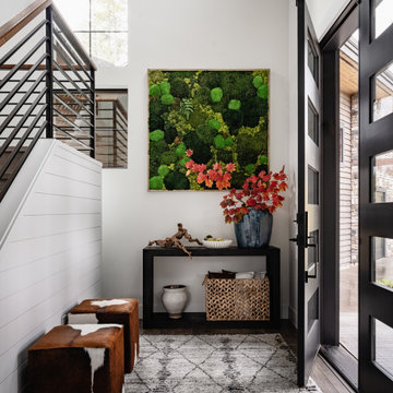
 Emily LaMarque Design Studio
Transitional dark wood floor and brown floor entryway photo in Seattle with white walls and a black front door
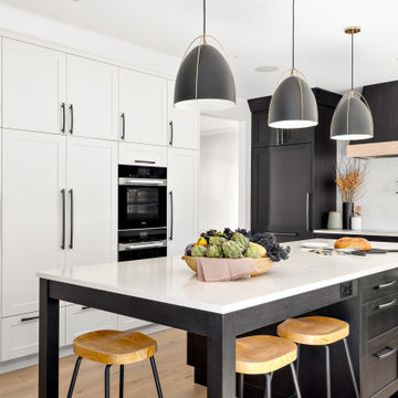
 Simply Home Decorating
This beautiful North Vancouver home belongs to a nature-loving and health-conscious couple, Emma and Vince (names changed), their two young children, and their dog, Jasper. When they contacted us about renovating and furnishing their kitchen and family room, we walked in and saw a world of potential waiting to be uncovered.
Before: Larkhall Crescent Home:
Like many original North Vancouver homes, the interior was definitely dated. We encountered late ‘80s finishes in powder pink and teal green, old carpet, and a kitchen that wasn’t maximized to suit this family’s modern-day lifestyle. However, the size of the rooms offered us a ton of space with which to get creative.
Knowing our clients’ love of cooking, need for work spaces (Emma and Vince both work remotely), and growing family, we developed a design concept that would increase usable space, optimize storage, and create intimacy in this large area. As for the style, we were inspired by their European roots, inventing a new and modern take on “Belgian Farmhouse” style. Now, the home is truly one-of-a-kind.
After: Warm & Cozy Family Room:
Fresh, bright, and comfortable, this living area has been transformed! We started with the fireplace as a focal point, selecting aged brick tiles for added texture and a crisp wood mantle. The taupe-coloured sectional infuses the room with visual warmth and serves the added purpose of separating the family room from the kitchen.
Emma and Vince were also keen on using non-toxic materials in their home, and we were happy to oblige. To meet their needs, we sourced natural wood elements and sought out Canadian-made products - that adhere to high health standards - whenever possible.
Look closer at the elements of this space, and you will find this stunning, honeycomb-patterned rug in earthy gold, beige, and charcoal tones. It’s plush to the touch and full of visual texture that brings this room’s colour palette together. We sourced these two-tone chairs with caning, petrified wood side table, black sconces, and botanical prints in greyscale from local artist, Heather Johnston.
We topped off the space with this dark wood and rattan console that offers storage facing the kitchen and presents an opportunity to display cherished items. The result is a cozy lounging space brimming with comfort and functionality. It’s perfect for enjoying quality family time, or Emma can simply slide the coffee table away to make room for her morning yoga practice.
Now, let’s turn around and give some attention to the kitchen. Do you remember what the original kitchen looked like? If not, scroll back up, because the transformation is shocking…
Moody & Welcoming Kitchen for Healthy Living:
This kitchen looks very different from how it started, right? Though we didn’t touch any walls, the kitchen has almost doubled in usable space! We created a long, extended island with storage, an outlet for small appliances, and seating for comfortable prep, after-school snacking, or mingling among friends.
On the other side of the island, the family has even more storage and an integrated dishwasher within easy reach of the sink, perfect for quick clean-up. From this angle, you can also see the expansive custom Shaker cabinetry in white and the integrated double ovens. These facilitate their cooking experience and gave us the opportunity to add an additional surprise…
A coffee garage station and more hidden storage! Keeping these items located along the perimeter allows them to be accessed by the family or their guests without someone getting under the cook’s feet. These are the little details that make everyday life easier and more enjoyable.
Moving deeper into the kitchen, the seamless induction cooktop topped with a freestanding concealed hood fan commands attention in a soft yet prominent way. The natural wood accent mirrors the fireplace mantle, and the choice of off-black wood-grain cabinets not only continues our black-and-white colour palette but adds a sense of depth and contrast. The corner sink is located to the right and perfectly positioned with a view of their thriving backyard.
To invite more of this family’s character into the space, we mixed metals for interest — matte black, dark pewter, and warm brass — and created open shelves in white oak for their plants and decor. You can also glimpse the tumbled edge of the backsplash tile, which echoes the rustic brick of the fireplace. It adds that farmhouse charm while still feeling timeless and sophisticated.
Last but not least, we designed this dining banquette in the bay window (with integrated bench storage, of course), where the family can share a meal together, the kids can do homework, or Emma and Vince can work and enjoy a change of scenery from their offices. Like the other spaces in the home, it was designed to be beautiful, multi-functional, and long-lasting.
Praise from Our Clients:
It is clear that we love this home, but what did our clients have to say?
“Lori is a visionary and masters execution to the finest detail all at the same time. When she first met us to know more about who we are and how we live, she could right away envision how we could use the space in our kitchen and living room…The results exceeded our expectations.
Lori and her team were also a delight to work with — coordination with all the trades, fast problem-solving, regular updates, professional and friendly attitude of her entire team — made it the dream team. Thank you SHD for making our space so beautiful!”
In turn, we are so grateful for this family’s trust, their open communication, and for being wonderful people with whom to work. (So, thank you!)
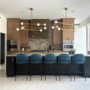
 Cecilie Lindsay Interior Design
Inspiration for a large mid-century modern marble floor and white floor kitchen remodel in DC Metro with shaker cabinets, medium tone wood cabinets, quartzite countertops, stainless steel appliances, two islands and gray countertops
Find the right local pro for your project
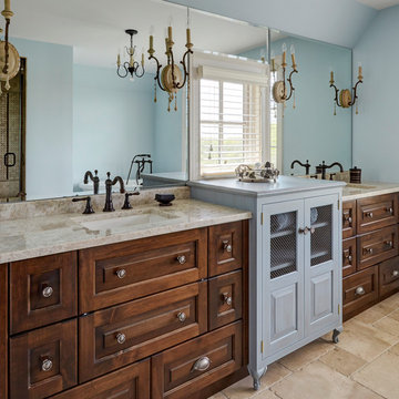
 Orren Pickell Building Group
Custom-designed cabinetry makes this space completely individual. The linen cabinet, with its vintage Deep Sky painted finish, wire mesh inserts and cabriole feet, feels as if it could have come from Provence, yet provides modern functionality. The vanities are custom designed to look like chests of drawers, although some of the fronts are actually doors. In spite of its old-world warmth, the bath features the most modern amenities, including a freestanding tub with advanced massage jets and a heated backrest, a spa style shower and more.
The architectural plans didn't specify a linen closet, but the client needed storage. What's more, the closet had to be designed around a window that had been place in the center of the two vanities. The window dictated the height of this custom piece. In spite of this, the custom Deep Sky cabinet designed to store towels and other products became a centerpiece of the space. In addition, the vanities were thoughtfully designed with shelves and drawers of varying heights to accommodate the client's specific toiletries and cosmetics. Because these are positioned on an exterior wall, it was also necessary to plan for cutouts, so the plumbing could come up through the floor.
Photo by Mike Kaskel
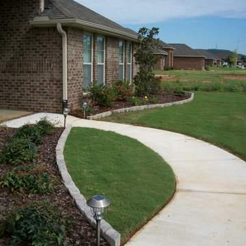
 Indoors & Out Designs, Debbie Truesdale, Owner
The new homeowners didn't like the small sidewalk that didn't offer any elegance to the front entry. We took the old sidewalk completely out and laid a curved walkway that was appropriately 4' wide. The curved beds flow in and out of the walkway
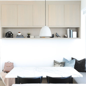
 AK Design
As a growing city we need to embrace densification and with that, we need to embrace more efficient tighter spaces. This stunning penthouse though super bright and luxurious, didn't offer a lot of space for a dining room. We designed in a cosy nook, with storage, display and seating - and it's a fabulous space. Plus, if offers another bench seat for reading which is always a favourite feature I love to add to a home.
Photo Credit: Tracey Ayton
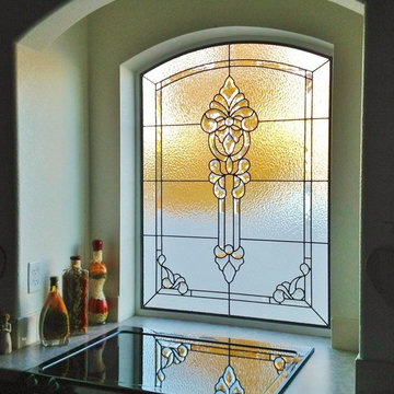
 Stained Glass Austin
We Dawson's were looking for a way to add some privacy to their kitchen window. They tried blinds but they seemed to wear out quickly and didn't offer much elegance. We custom designed a stained glass window that looked amazing in their kitchen, let in natural light, and offered privacy. The Dawson's couldn't be happier with their new kitchen window.
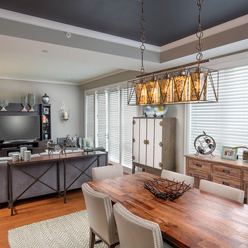

 Synergy Design & Construction
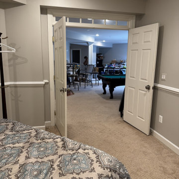
Before: The guest room suffered from the same tired finishes as the rest of the basement. It also didn’t have a closet and thus didn’t offer the comfort visitors expect.

 Woodland Builders
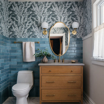
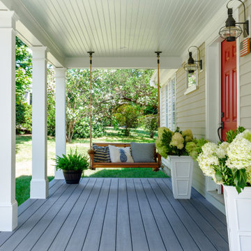
This remodeling project in Scituate, MA began with a unique challenge: the original architectural plans didn’t fully align with the family’s vision for their forever home. Woodland Builders stepped in to redesign the layout, creating a more compact and cost-effective plan that perfectly suited the family’s lifestyle and long-term needs.
The homeowners, who loved their neighborhood and planned to stay for the next 30 years, sought additional space, a functional kitchen, and a new bathroom. To achieve these goals, they moved into temporary housing, enabling Woodland to work efficiently and meet their aggressive timeline.
The remodel encompassed several key areas of the home, each thoughtfully reimagined to enhance functionality, style, and comfort.

 Mottram Architecture
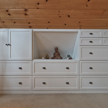
Timber frame homes offer unique challenges during a remodel. What often makes them beautiful and attractive to most homeowners, also makes them challenging for space requirements.
Context: The lovely couple that owned this home were struggling with some interesting floor plan challenges that just didn't work for their family. The loved the beautiful timbers and woodwork of their home, but the dramatically sloping ceilings on the second floor, particularly in the bathroom, just didn't work for this 1 1/2 bath home. Needing to use the skylight to approach the toilet was a less then ideal scenario. Although the bathroom footprint was more then adequate, the sloped ceiling only made half of the space useable. Check out the Before/After post on our blog to see the photos of the house pre-renovation. As much as they loved all the wood features in their home, another challenge they had was light. The wood ceiling made everything inside the house darker, even with a fantastic array of south facing windows, there were spaces in the home that felt dark and small. When they contacted us they wanted to know how could they make their brighter and more inviting, were there solutions to the 2nd floor sloped ceiling issues, and if they were going to do all of this work, how could they make their home more comfortable and efficient. A nagging water leak in the upstairs bathroom spurred them into action and here is how we solved their dilemma.
Conclusion: First, we added a little dormer to the rear of the house so we could get full headroom in nearly all of the upstairs bathroom! Then we decided to extend that dormer one more timber bay over to create a walk in closet with natural light and plenty of space. Since we were contemplating energy efficiency, we resolved a nagging issue that is present in a lot of timber frame construction, air tightness. Commonly found in timber frame construction, fiberglass insulation is installed in the rafter bays and board ceilings are installed over top. Unfortunately, board ceilings are anything but air tight, and fiberglass insulation needs to be in an airtight cavity for maximum effectiveness. So we were able to solve two issues at the same time for this homeowner. We removed the board ceiling and fiberglass insulation, we dense packed the rafter bays with cellulose insulation, and installed sheetrock in place of the boards. The boards were salvaged for re-use by the homeowner, and the space and light quality was dramatically improved. Some may think that losing the board ceiling took something away from the space, but what you'll see in the pictures is that it highly accentuates the heavy timbers and really makes them stand out in a beautiful way. Now with this added airtightness, better insulation, and brighter space, the homeowner hardly runs their wood stove, and it's so quiet in the space, an added bonus from changing the insulation. It became necessary to also add a sheetrock ceiling to the living room to hide the plumbing from the new bathroom layout above. Changing this ceiling gave the homeowner some real quality lighting that was lacking in the living room before. The brighter ceiling and new lighting layout completely transforms the living room into a space you want to hang out, even though the layout didn't change at all. When the homeowner saw the finished spaces she said "I can't believe this is my house, I want to live in this house"
Energy Efficiency: I touched a little on the efficiency above, but like all projects done with Mottram Architecture, we always want to leave you with a little extra. Timber frame construction with board ceilings and fiberglass insulation are notoriously leaky! If you want to know what we think about fiberglass insulation, check our our blog post on Why Fiberglass Insulation Sucks. By installing cellulose insulation and covering it with sheetrock we were able to greatly reduce the heat flowing out of this home. It not only improves cashflow it improves the comfort level in the space. Who wants to sit in their living room and feel a draft? Let us remind you, we are not saying cellulose insulation is an air barrier, we use the sheetrock to help with that, but it does significantly reduce the air flow over fiberglass insulation. And when we reduce the airflow, we reduce the heat flow. And when we reduce the heat flow, we reduce the need to re-heat that drafty air from outside. When it comes to energy efficiency the first and best place to start is air infiltration. We greatly reduced the air infiltration with the new insulation, but we also added a hat and warm boots. What I mean by that is, we improved the insulation in the roof, and we installed insulation in the basement. Maybe it's a silly analogy, but when you think about keeping warm, we always start with the hat and boots! With sustainability in mind, the next project will be to add a deck to the front of this house with rain catchment barrels from the metal roof. They are planning to plant a garden in the spring and the rain catchment system will help to irrigate the new garden.
Builder: East Shore Builders
Photographer: Michael Eric Berube
 Gallery KBNY
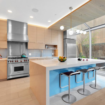
For our full gut renovation of this Manhattan loft penthouse, we partnered with architecture firm Todd Zwigard Architects. Many of our clients know us as experts in the full design-build approach, where we handle every aspect of the project. But in this case, architectural plans were already drawn, the full schedule was finished, and our clients needed a partner to execute on the architectural plans – enter Gallery. Construction management is as vital to a project as the design phase, so we’re happy to offer our expertise in this type of scenario.
A DIFFERENT APPROACH
Construction and design are often the face of most renovations, but the planning and follow-through are naturally just as necessary to make it all come together. The project itself was a fairly straightforward gut renovation of the loft. Everything was included: new floors, a new kitchen, new bathrooms, new lighting. Our task was to manage every aspect of the construction, ensuring that the planning work of Todd Zwigard Architects was executed to the exact vision imagined for this Manhattan loft renovation.
CONTEMPORARY GOES ECLECTIC
Although we didn’t contribute to the aesthetic of the interior design in this project, we did carry out the plans that brought it life. The tone was very modern, with some eclectic touches. The kitchen, featuring an island with a baby blue lacquered finish, blends contemporary clean lines into an industrial-tinged, almost futuristic aesthetic. Reclaimed wooden doors and art pieces collected throughout the years are an ode to the client's travels, an artistic touch from Todd Zwigard Architects.
LET’S TALK
Quality of work is of course important, but there are several components of construction management that are equally vital: communication; processes that make sure you're able to adhere to schedules; protocols with both safety and communication. You might say this is the nerding out of the construction process. It’s not often the face of a project, but it’s absolutely massive in terms of carrying out a successful renovation, whether it’s a penthouse loft in Manhattan, a condo in Prospect Heights, or a kitchen in a Brooklyn brownstone. Quality construction management is probably one of the biggest ways to separate professional contractors from those who aren’t.
ART FROM CHAOS
This was such a large project, so our ability to procure and source all the finishes and fixtures was hugely important to our clients. The sheer number of floors, tiles, and plumbing fixtures alone that need to be ordered, in addition to everything else, plus figuring out lead times, shipments, deliveries, and inspections. It can quickly become chaotic, but there’s an art to the planning and organization, and we’ve mastered it.
The larger a project is, the more likely that havoc will rear its head. The antidote is not only really proper planning and construction management, as we achieved in this Manhattan loft penthouse renovation, but also a great working relationship with everyone else involved in the project: contractors, architect, and clients alike.
GET IN TOUCH
Is a loft renovation in New York in your future? We’re experts in renovating New York homes, from apartment combinations in managed buildings to kitchens and bathrooms in co-ops and condos to gut renovations of historic spaces and landmark renovations.
Contact us to learn more about our approach as a design-and-build firm, where all aspects of your project are handled under the same roof. In addition to construction management, you’ll get our in-house architect in-house and the added renovation benefits of experts in design, material selection, and paperwork.


 Schrader & Companies
Example of a classic freestanding desk medium tone wood floor and brown floor home office design in Minneapolis with beige walls
 Studio Dearborn
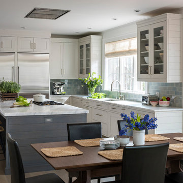
A young family moving from NYC tackled a lightning fast makeover of their new colonial revival home before the arrival of their second child. The kitchen area was quite spacious but needed a facelift and new layout. Painted cabinetry matched to Benjamin Moore’s Light Pewter is balanced by grey glazed rift oak cabinetry on the island. Shiplap paneling on the island and cabinet lend a slightly contemporary edge. White bronze hardware by Schaub & Co. in a contemporary bar shape offer clean lines with some texture in a warm metallic tone.
White Marble countertops in “Alpine Mist” create a harmonious color palette while the pale blue/grey Waterworks backsplash adds a touch of color. Kitchen design and custom cabinetry by Studio Dearborn. Countertops by Rye Marble. Refrigerator, freezer and wine refrigerator--Subzero; Ovens--Wolf. Cooktop--Gaggenau. Ventilation—Best Cirrus Series CC34IQSB. Hardware--Schaub & Company. Sink--Kohler Strive. Sink faucet--Rohl. Tile--Waterworks Architectonics 3x6 in the dust pressed line, Icewater color. Stools--Palacek. Flooring—Sota Floors. Window treatments: www.horizonshades.com in “Northbrook Birch.” Photography Adam Kane Macchia.
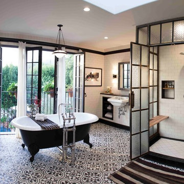


Sponsored
Columbus, OH
Free consultation for landscape design!

Peabody Landscape Group
Columbus' Reliable Landscape Design & Contracting
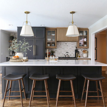

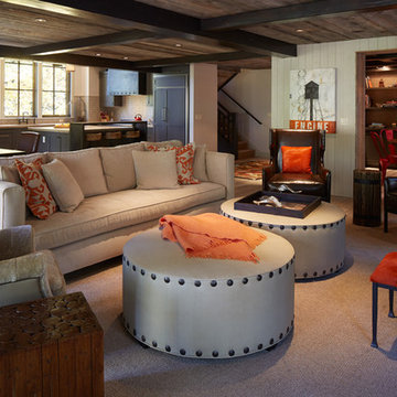

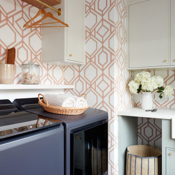
 Agnieszka Jakubowicz PHOTOGRAPHY
Design: KBG Design / Build: Silva Custom Construction / Photography: Agnieszka Jakubowicz
Laundry room - transitional laundry room idea in San Francisco
Laundry room - transitional laundry room idea in San Francisco
12