
Search results for "Difficult" in Home Design Ideas
 Cross Points Landscaping
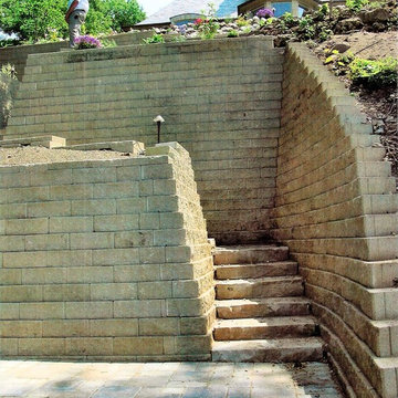
Inspiration for a large traditional full sun hillside brick retaining wall landscape in Indianapolis for summer.
 Imbue Design
Imbue Design
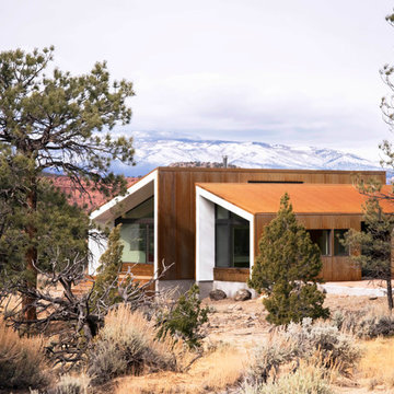
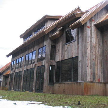
Small trendy one-story metal exterior home photo in Salt Lake City with a shed roof
Small trendy one-story metal exterior home photo in Salt Lake City with a shed roof
 Vegas Interior Design Pte Ltd
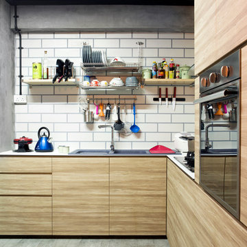
Inspiration for an industrial l-shaped kitchen remodel in Singapore with flat-panel cabinets, light wood cabinets, no island, a double-bowl sink, white backsplash and subway tile backsplash
Find the right local pro for your project
 Adrienne DeRosa
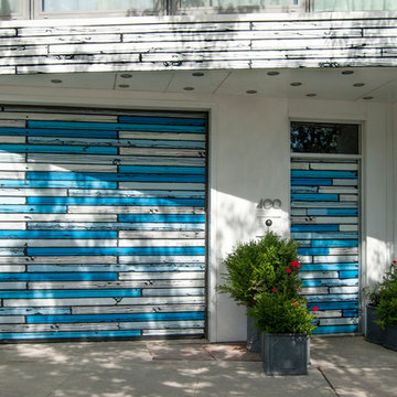
A big advantage to the property is its one-car garage, something that is notoriously hard to come by in Manhattan. "The motorcycle shop already had the makings of a garage, and we could use that for our cars", Novogratz explains. Taking up the entire ground floor, the garage and entrance raise the home well off of street level, which affords the family privacy and isolation from the sounds of the roadway outside.
The couple commissioned British Pop artist Richard Woods to create an installation on the home's facade. The faux bois panels lend visual interest to the exterior, as well as a good dose of humor.
Photo: Adrienne DeRosa Photography © 2014 Houzz
Design: Cortney and Robert Novogratz
 Thompson Construction
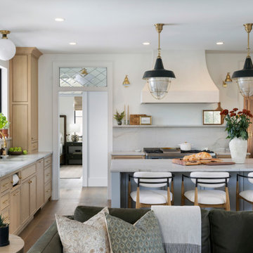
Example of a mid-sized transitional u-shaped medium tone wood floor and brown floor kitchen design in Minneapolis with an undermount sink, beaded inset cabinets, light wood cabinets, quartzite countertops, gray backsplash, stone slab backsplash, paneled appliances and gray countertops
 Erdmann Exterior Designs
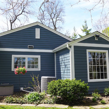
Beechworth Fiberglass/Wood Windows, James Hardie Siding in Evening Blue, James Hardie Trim in Arctic White
Small elegant blue one-story mixed siding gable roof photo in Chicago
Small elegant blue one-story mixed siding gable roof photo in Chicago
 Waterlily Interiors
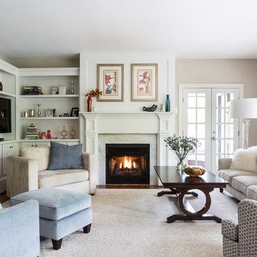
Inspiration for a timeless family room remodel in DC Metro with beige walls, a standard fireplace and a media wall
 KJM Interiors
photo: Keeney + Law
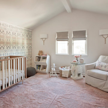
Inspiration for a transitional girl dark wood floor nursery remodel in San Francisco with pink walls
Inspiration for a transitional girl dark wood floor nursery remodel in San Francisco with pink walls
 David Lund Design
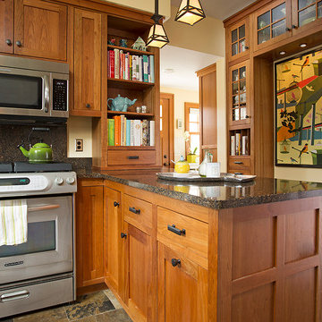
Adjacent to the main kitchen is a low profile home office and display cabinet. Perfect for a lap top, paper management, and kids' artwork, it allows for organization of activities and items that often spill over into the working kitchen.
Eric & Chelsea Eul Photography


 Lobalzo Design Associates, Ltd
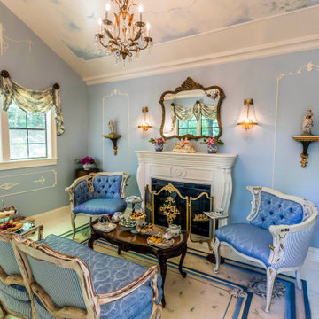
The "Petite Maison" has become a retreat for the owner and her friends. Serving afternoon tea or a bit of sherry.
French country home design photo in Cleveland
French country home design photo in Cleveland
 Masterworks Window Fashions & Design, LLC
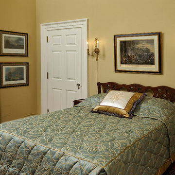
This award-winning guest bedroom project tells the story of Pennsylvania's role in the Revolutionary War. The quilted bedspread is in a Thibaut fabric, and has a reverse sham, sometimes called a French flap. Banding at the hem of the custom quilted bedspread, and on the leading edge of the draperies were inspired by the leather collar of the portrait opposite. A contrast welting defines the edge of the mattress and of the reverse sham. Two naval battles with a Pennsylvania connection were custom framed, and are shown to the right of the window, while an engraving of William Penn signing a treaty with the Indians, from the Anderson House museum collection, is above the bed. An embroidered pillow shows the seal of the Society of the Cincinnati. The small tables used as nightstands are from Maitland Smith, while the headboard and bed frame were found in a Pennsylvania antique store. The new wall color adds warmth and contrast to the linen white trim color. Bob Narod, Photographer, LLC
 RAJ Kitchen and Bath, LLC
**Check out the video of this transformation on our website**
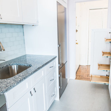
This small kitchen was way too small for this 2 bedrooms, 2 bathrooms apartment. Not only was it a very small kitchen, but the physical location of it made it very difficult to make it any bigger. There wasn't much that could have been done without incurring astronomical cost, which would get little or no return on the investment. The client wanted a kitchen that can be optimized in its current location to add a ton of value for resale.
This was difficult to do, because there was no moving of any mechanical around in the kitchen and even if we wanted to, the management of the building would not allow. For those of you who live in condos, co-ops or apartment building, you know how difficult it is to rework these foot prints. When we showed up, we saw the problems, but we also saw a huge opportunity where we can achieve those goals in the small space. This was accomplished by making some key changes and to incorporate some new things that was not possible when this kitchen was built years ago.
The crucial part of the design that would drive the entire new layout, was selecting the only appliance; that was the Refrigerator. Once we nailed down that refrigerator, we then proceeded to design the kitchen around it. We moved it to the other side of the wall where the sink was so that we can tap into the water line from the sink plumbing. It was crucial that it stays exactly 24" deep, not an inch more because we had to keep the entry as open as possible. Also, it was going to be directly in front of another big storage unit - The pantry. It is not ideal in most cases, but we needed the rest of the space to ramp up the design and open feel towards the side where all of the activities would take place, which happend to be the dining room and the view.
Once all that was figured out, we re-positioned the sink, dishwasher and the range and proceeded to wrap the cabinets around the columns to integrate them into the space. Thirty- six inches cabinets height was used so that they can be installed higher towards the ceiling height to give more room rather than the standard 18" required height between the counter tops. This was done to make the room feel a lot bigger than it really was. Not to mention, we also didn't want the faucet to be buried under the cabinets so that was also a necessary design detail for the space.
We then lowered both knee walls so that the counter top can sit on top of them, by removing that stop point that would have otherwise defined the kitchen area. This allowed us to pick up that extra footprint into the room for added prep space and enabled us to create the illusion of a kitchen that is looking longer than it really is. Every inch mattered when designing this kitchen and we made a conscious decision to use every one of that inch.
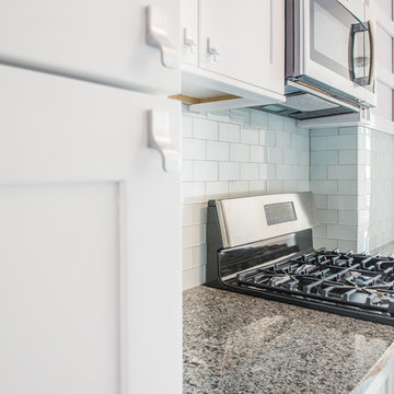
White cabinets were selected to do just what white cabinets are design to do; make a small or dark room appear bigger, brighter and more open. In this kitchen, this was amplified the more because of the kitchen location. It was perfect! We knew we did justice to the space because while we were there taking some photos, a few potential buyers walked in and went straight for the kitchen! They said its design just to fit the apartment.
Pantry roll out shelving, Double recycle bin, fancy handles, LED lighting, Quartz counter top, beautiful backslash tiles and grey linen floors finished off the kitchen which looked over a beautiful view of the George Washington Bridge from the top of this lovely 4th floor apartment.
Credit to Masterpiece Tile and Marble (Annmarie on the selection of Tiles and countertop and Val on the Construction to complete this project).
Davor Kokic Photography


 RAJ Kitchen and Bath, LLC
**Check out the video of this transformation on our website**
This small kitchen was way too small for this 2 bedrooms, 2 bathrooms apartment. Not only was it a very small kitchen, but the physical location of it made it very difficult to make it any bigger. There wasn't much that could have been done without incurring astronomical cost, which would get little or no return on the investment. The client wanted a kitchen that can be optimized in its current location to add a ton of value for resale.
This was difficult to do, because there was no moving of any mechanical around in the kitchen and even if we wanted to, the management of the building would not allow. For those of you who live in condos, co-ops or apartment building, you know how difficult it is to rework these foot prints. When we showed up, we saw the problems, but we also saw a huge opportunity where we can achieve those goals in the small space. This was accomplished by making some key changes and to incorporate some new things that was not possible when this kitchen was built years ago.
The crucial part of the design that would drive the entire new layout, was selecting the only appliance; that was the Refrigerator. Once we nailed down that refrigerator, we then proceeded to design the kitchen around it. We moved it to the other side of the wall where the sink was so that we can tap into the water line from the sink plumbing. It was crucial that it stays exactly 24" deep, not an inch more because we had to keep the entry as open as possible. Also, it was going to be directly in front of another big storage unit - The pantry. It is not ideal in most cases, but we needed the rest of the space to ramp up the design and open feel towards the side where all of the activities would take place, which happend to be the dining room and the view.
Once all that was figured out, we re-positioned the sink, dishwasher and the range and proceeded to wrap the cabinets around the columns to integrate them into the space. Thirty- six inches cabinets height was used so that they can be installed higher towards the ceiling height to give more room rather than the standard 18" required height between the counter tops. This was done to make the room feel a lot bigger than it really was. Not to mention, we also didn't want the faucet to be buried under the cabinets so that was also a necessary design detail for the space.
We then lowered both knee walls so that the counter top can sit on top of them, by removing that stop point that would have otherwise defined the kitchen area. This allowed us to pick up that extra footprint into the room for added prep space and enabled us to create the illusion of a kitchen that is looking longer than it really is. Every inch mattered when designing this kitchen and we made a conscious decision to use every one of that inch.
White cabinets were selected to do just what white cabinets are design to do; make a small or dark room appear bigger, brighter and more open. In this kitchen, this was amplified the more because of the kitchen location. It was perfect! We knew we did justice to the space because while we were there taking some photos, a few potential buyers walked in and went straight for the kitchen! They said its design just to fit the apartment.
Pantry roll out shelving, Double recycle bin, fancy handles, LED lighting, Quartz counter top, beautiful backslash tiles and grey linen floors finished off the kitchen which looked over a beautiful view of the George Washington Bridge from the top of this lovely 4th floor apartment.
Credit to Masterpiece Tile and Marble (Annmarie on the selection of Tiles and countertop and Val on the Construction to complete this project).
Davor Kokic Photography
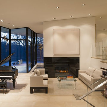
 Commonwealth Building & Design
Architect: Robert M. Gurney, FAIA
Photo: Maxwell Mackenzie
Minimalist family room photo in DC Metro
Minimalist family room photo in DC Metro
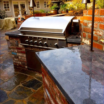
 Garden Lights Landscape and Pool Development Inc.
Steve Lambert
Example of a mid-sized classic backyard brick patio design in San Francisco
Example of a mid-sized classic backyard brick patio design in San Francisco
10