
Search results for "Direct result" in Home Design Ideas
 Klopf Architecture
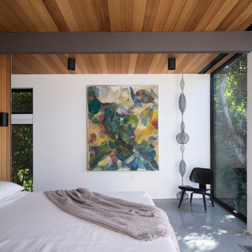
Malibu Glass Box House by Klopf Architecture
Following the devastating Woolsey Fire of 2018, the site in Malibu offered a unique opportunity to rebuild not just a home, but a new architectural composition that highlighted the property’s potential while navigating strict fire-rebuild codes in the area. Designed by Klopf Architecture, this project embraced a set of limitations and translated them into an architectural asset.
The city’s fire-rebuild process required the new structure to remain close to the original footprint, size and bulk, a constraint that ultimately clarified the architectural direction. Perched near the front of a long, narrow lot, the new home frames and overlooks a private, park-like rear expanse, an uncommon luxury especially in this part of Malibu .
Without a fixed program, the design process allowed for a different kind of creative focus allowing Klopf Architecture the opportunity to explore how a modernist home could best respond to this site. The team approached the project not with a list of requirements, but with a question: How might a modernist live here? What spatial qualities would inspire calm, connection, and a sense of wonder in this setting? The process became less about problem-solving and more about architectural storytelling—letting the site, the light, and the principles of modern design guide the form and flow of the home.
The response emerged in the form of a glass-box pavilion, an open, Mid-Century Modern inspired living, dining, and kitchen space that floats at the edge of the property’s natural descent. Connected to the more enclosed, private areas of the home by a glass-walled hallway, the living pavilion becomes a distinct centerpiece of the design. It opens on all four sides to the landscape with decks and patios on the flanks, an internal garden and water feature to the north, and a dramatic unguarded view of the expansive backyard and ocean horizon to the south.
Because of the mandated footprint, careful planning was required to ensure every space could still engage with light, landscape, or both. Strategic voids in the form of atriums and courtyards allow daylight to filter deep into the home’s core, while offering moments of surprise and retreat. These design gestures allow natural light to filter deep into the interior, creating a sense of brightness and openness throughout the day. At the same time, they expand the perceptual boundaries between inside and out, making the home feel more expansive while anchoring its connection to the surrounding landscape.
The siting of the house is what gives it its unique character. Rather than receding into the backyard like the neighboring homes, the house holds a slight prominence. From the central living pavilion, stepping down into the landscape feels more like entering a secluded park where a separate existing accessory structure, trail, and recreational areas await. The home’s modest street presence gives way to this unfolding drama of space, view, and nature.
Fire-resilient materials and assemblies are integrated seamlessly throughout including triple-pane glazing, under-slab and roof insulation, and locally sourced fire-rated cladding ensure the house not only meets Calfornia’s rigorous wildland-urban interface (WUI) standards, but feels effortlessly aligned with them. While technical decisions like fire-hardening and mechanical systems presented some construction challenges, particularly around the cantilevered glass box, the team found a functional compromise that preserved the integrity of the design.
Inside, a restrained palette and exposed post and beam design celebrate the ethos of mid-century modernism. A central circulation spine extends from the entry to the rear glass wall, offering a continuous visual link from street to ocean. Spaces such as the library and office, though more intimate in scale, are never cut off from nature as each opens to its own unique courtyard or garden view.
Though born out of a strict regulatory framework and developed without a specific client, the rebuild design unfolded with remarkable clarity. Grounded in site logic, refined by limitations and an emphasis on timeless spatial relationships – light, proportion, and a strong connection to nature, the resulting design feels both effortless and uplifting. The home lives lightly on the land, opens generously to its surroundings, and strikes a careful balance between privacy, openness, and calm. For Klopf Architecture, it stands as a compelling case study in how site, code, and circumstantial constraints can inspire enduring, modernist architecture. With years of experience reimagining mid-century modern design for how people live today, the firm took the project’s limitations as an opportunity. The result is a home shaped by open, flowing spaces, strong indoor-outdoor connections, and a calm, clear sense of structure. It’s a good reminder that even with strict constraints, there’s still room for architecture to breathe—and for modernism to keep moving forward.
Klopf Architecture project team: Geoff Campen, John Klopf, AIA, and Sherry Tan
Structural Engineer: ZFA
Contractor: Maison D’Artiste
Photography: ©2025 Mariko Reed
Year Completed: 2023
 Studio Couture
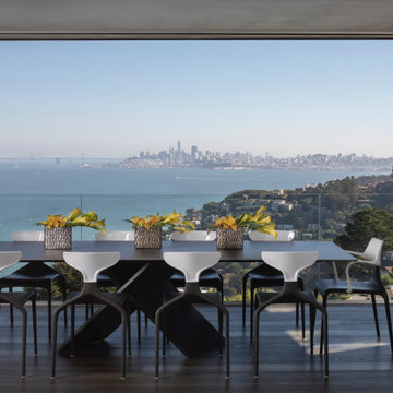
A modern dining space positioned directly against floor-to-ceiling glass, framing uninterrupted views of San Francisco Bay and the city skyline beyond. The long dining table is aligned with the landscape, reinforcing a strong visual connection between interior and exterior. Minimal furnishings, dark wood flooring, and restrained detailing keep the focus on light, horizon, and spatial clarity. The result is a calm, view-driven dining environment that feels open, balanced, and directly connected to its hillside setting.
 Klopf Architecture
Set in a quiet neighborhood and framed by mature trees, this residence presented a unique opportunity: to thoughtfully evolve a custom mid-century modern home into a space that supports the everyday rhythms of a growing family. With a deep respect for the home’s original architecture, Klopf Architecture reimagined the house to better meet the needs of its owners—introducing functional improvements while preserving the spirit and character of its mid-century roots.
The clients approached Klopf Architecture with a clear vision: refresh their home while seamlessly integrating new programmatic elements. Key goals included clarifying and enhancing the entry sequence; connecting the detached garage to the main house with a practical yet architecturally intentional intervention; adding functional spaces such as a mudroom and laundry room; expanding and remodeling the primary suite’s bathroom and closet; and creating a more engaging outdoor space that capitalized on the site’s impressive views, featuring a fire pit and outdoor kitchen.
As a couple with distinct yet complementary perspectives—one focused on modern functionality and technology, and the other dedicated to preserving the home’s architectural integrity—their collaboration with Klopf Architecture resulted in a solution that harmonized both ideals. Their shared commitment to improving the livability of their home led to a design dialogue rooted in balance. This dynamic partnership shaped the direction of the renovation, ensuring that every decision honored the spirit of the original home while aligning with the practical needs of their growing family.
Designing within the constraints of the sloped site posed one of the project’s central challenges. The detached garage sat at a higher elevation than the main house, requiring a solution that ensured architectural and geometric compatibility between the two structures. Rather than create a purely utilitarian link, Klopf Architecture introduced an intentional connection that contributes to the overall architectural language. A notable pinch point in the plan—where differing geometries converged—was treated as a hinge point, turning a potentially awkward juncture into an architectural feature. This area now functions as both a transition and a moment of design interest that unifies the overall plan.
The design also addressed the underutilized outdoor area, which was located in a shadowed portion of the site with geometrical limitations. A new connection to the rear deck was created in this same area, making the outdoor space more useful and inviting. Klopf Architecture introduced carefully positioned openings and spatial improvements that forged a strong visual and functional connection between indoor and outdoor spaces. The outdoor area now reads as a deliberate extension of the home, embracing natural light and emphasizing the dramatic views.
Working through multiple design iterations, Klopf Architecture crafted a solution that preserved the architectural language of the original home while supporting the functional needs of modern life. The garage-to-house connection became more than a passage—it evolved into an architectural moment of transition. A new mudroom and laundry space enhanced convenience without compromising the clean lines of the design. The primary suite was expanded to create a private, serene retreat. The reimagined backyard, complete with fire pit and kitchen, now plays a vital role in the family’s daily routine and social life.
Outcomes and Lasting Impact
The result is a home that balances heritage with contemporary design, technical precision with design sensibility. The redesign not only met the clients’ initial goals but also exceeded expectations in its ability to seamlessly blend past and present, function and beauty, making the outdoor kitchen a favorite gathering place.
Beyond aesthetics, the renovation has significantly improved daily life for the family. The newly integrated garage connection has streamlined routines, providing a seamless transition between arriving home, storing belongings, and entering the main living spaces. The expanded primary suite offers a retreat-like atmosphere, creating a private space to unwind at the end of the day. The redesigned outdoor areas have also become an extension of their lifestyle—whether it's casual family dinners around the fire pit, entertaining friends in the outdoor kitchen, or simply enjoying the view from the reimagined backyard.
Through a thoughtful and strategic approach, the house has been successfully evolved into a home that remains true to its mid-century modern roots while enhancing livability, functionality, and the overall quality of life for the modern-day owners.
Klopf Architecture Team: Geoffrey Campen, Fernanda Bernardes
Architectural Interior Design: Klopf Architecture
Structural Engineer: Base Design Inc.
Contractor: Golden Snail Builders
Photography: Mariko Reed
Year Completed:2022
Find the right local pro for your project
 ZeroEnergy Design
This LEED Platinum certified house reflects the homeowner's desire for an exceptionally healthy and comfortable living environment, within a traditional neighborhood.
INFILL SITE. The family, who moved from another area of Wellesley, sought out this property to be within walking distance of the high school and downtown area. An existing structure on the tight lot was removed to make way for the new home. 84% of the construction waste, from both the previous structure and the new home, was diverted from a landfill. ZED designed to preserve the existing mature trees on the perimeter of the property to minimize site impacts, and to maintain the character of the neighborhood as well as privacy on the site.
EXTERIOR EXPRESSION. The street facade of the home relates to the local New England vernacular. The rear uses contemporary language, a nod to the family’s Californian roots, to incorporate a roof deck, solar panels, outdoor living space, and the backyard swimming pool. ZED’s careful planning avoided to the need to face the garage doors towards the street, a common syndrome of a narrow lot.
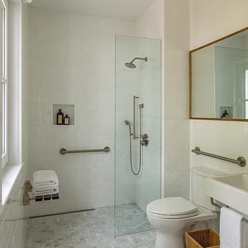
THOUGHTFUL SPACE. Homes with dual entries can often result in duplicate and unused spaces. In this home, the everyday and formal entry areas are one and the same; the front and garage doors share the entry program of coat closets, mudroom storage with bench for removing your shoes, and a laundry room with generous closets for the children's sporting equipment. The entry area leads directly to the living space, encompassing the kitchen, dining and sitting area areas in an L-shaped open plan arrangement. The kitchen is placed at the south-west corner of the space to allow for a strong connection to the dining, sitting and outdoor living spaces. A fire pit on the deck satisfies the family’s desire for an open flame while a sealed gas fireplace is used indoors - ZED’s preference after omitting gas burning appliances completely from an airtight home. A small study, with a window seat, is conveniently located just off of the living space. A first floor guest bedroom includes an accessible bathroom for aging visitors and can be used as a master suite to accommodate aging in place.
HEALTHY LIVING. The client requested a home that was easy to clean and would provide a respite from seasonal allergies and common contaminants that are found in many indoor spaces. ZED selected easy to clean solid surface flooring throughout, provided ample space for cleaning supplies on each floor, and designed a mechanical system with ventilation that provides a constant supply of fresh outdoor air. ZED selected durable materials, finishes, cabinetry, and casework with low or no volatile organic compounds (VOCs) and no added urea formaldehyde.
YEAR-ROUND COMFORT. The home is super insulated and air-tight, paired with high performance triple-paned windows, to ensure it is draft-free throughout the winter (even when in front of the large windows and doors). ZED designed a right-sized heating and cooling system to pair with the thermally improved building enclosure to ensure year-round comfort. The glazing on the home maximizes passive solar gains, and facilitates cross ventilation and daylighting.
ENERGY EFFICIENT. As one of the most energy efficient houses built to date in Wellesley, the home highlights a practical solution for Massachusetts. First, the building enclosure reduces the largest energy requirement for typical houses (heating). Super-insulation, exceptional air sealing, a thermally broken wall assembly, triple pane windows, and passive solar gain combine for a sizable heating load reduction. Second, within the house only efficient systems consume energy. These include an air source heat pump for heating & cooling, a heat pump hot water heater, LED lighting, energy recovery ventilation, and high efficiency appliances. Lastly, photovoltaics provide renewable energy help offset energy consumption. The result is an 89% reduction in energy use compared to a similar brand new home built to code requirements.
RESILIENT. The home will fare well in extreme weather events. During a winter power outage, heat loss will be very slow due to the super-insulated and airtight envelope– taking multiple days to drop to 60 degrees even with no heat source. An engineered drainage system, paired with careful the detailing of the foundation, will help to keep the finished basement dry. A generator will provide full operation of the all-electric house during a power outage.
OVERALL. The home is a reflection of the family goals and an expression of their values, beautifully enabling health, comfort, safety, resilience, and utility, all while respecting the planet.
ZED - Architect & Mechanical Designer
Bevilacqua Builders Inc - Contractor
Creative Land & Water Engineering - Civil Engineering
Barbara Peterson Landscape - Landscape Design
Nest & Company - Interior Furnishings
Eric Roth Photography - Photography
 ZeroEnergy Design
This LEED Platinum certified house reflects the homeowner's desire for an exceptionally healthy and comfortable living environment, within a traditional neighborhood.
INFILL SITE. The family, who moved from another area of Wellesley, sought out this property to be within walking distance of the high school and downtown area. An existing structure on the tight lot was removed to make way for the new home. 84% of the construction waste, from both the previous structure and the new home, was diverted from a landfill. ZED designed to preserve the existing mature trees on the perimeter of the property to minimize site impacts, and to maintain the character of the neighborhood as well as privacy on the site.
EXTERIOR EXPRESSION. The street facade of the home relates to the local New England vernacular. The rear uses contemporary language, a nod to the family’s Californian roots, to incorporate a roof deck, solar panels, outdoor living space, and the backyard swimming pool. ZED’s careful planning avoided to the need to face the garage doors towards the street, a common syndrome of a narrow lot.
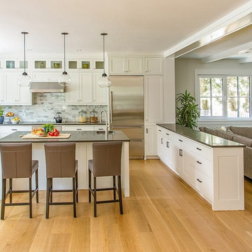
THOUGHTFUL SPACE. Homes with dual entries can often result in duplicate and unused spaces. In this home, the everyday and formal entry areas are one and the same; the front and garage doors share the entry program of coat closets, mudroom storage with bench for removing your shoes, and a laundry room with generous closets for the children's sporting equipment. The entry area leads directly to the living space, encompassing the kitchen, dining and sitting area areas in an L-shaped open plan arrangement. The kitchen is placed at the south-west corner of the space to allow for a strong connection to the dining, sitting and outdoor living spaces. A fire pit on the deck satisfies the family’s desire for an open flame while a sealed gas fireplace is used indoors - ZED’s preference after omitting gas burning appliances completely from an airtight home. A small study, with a window seat, is conveniently located just off of the living space. A first floor guest bedroom includes an accessible bathroom for aging visitors and can be used as a master suite to accommodate aging in place.
HEALTHY LIVING. The client requested a home that was easy to clean and would provide a respite from seasonal allergies and common contaminants that are found in many indoor spaces. ZED selected easy to clean solid surface flooring throughout, provided ample space for cleaning supplies on each floor, and designed a mechanical system with ventilation that provides a constant supply of fresh outdoor air. ZED selected durable materials, finishes, cabinetry, and casework with low or no volatile organic compounds (VOCs) and no added urea formaldehyde.
YEAR-ROUND COMFORT. The home is super insulated and air-tight, paired with high performance triple-paned windows, to ensure it is draft-free throughout the winter (even when in front of the large windows and doors). ZED designed a right-sized heating and cooling system to pair with the thermally improved building enclosure to ensure year-round comfort. The glazing on the home maximizes passive solar gains, and facilitates cross ventilation and daylighting.
ENERGY EFFICIENT. As one of the most energy efficient houses built to date in Wellesley, the home highlights a practical solution for Massachusetts. First, the building enclosure reduces the largest energy requirement for typical houses (heating). Super-insulation, exceptional air sealing, a thermally broken wall assembly, triple pane windows, and passive solar gain combine for a sizable heating load reduction. Second, within the house only efficient systems consume energy. These include an air source heat pump for heating & cooling, a heat pump hot water heater, LED lighting, energy recovery ventilation, and high efficiency appliances. Lastly, photovoltaics provide renewable energy help offset energy consumption. The result is an 89% reduction in energy use compared to a similar brand new home built to code requirements.
RESILIENT. The home will fare well in extreme weather events. During a winter power outage, heat loss will be very slow due to the super-insulated and airtight envelope– taking multiple days to drop to 60 degrees even with no heat source. An engineered drainage system, paired with careful the detailing of the foundation, will help to keep the finished basement dry. A generator will provide full operation of the all-electric house during a power outage.
OVERALL. The home is a reflection of the family goals and an expression of their values, beautifully enabling health, comfort, safety, resilience, and utility, all while respecting the planet.
ZED - Architect & Mechanical Designer
Bevilacqua Builders Inc - Contractor
Creative Land & Water Engineering - Civil Engineering
Barbara Peterson Landscape - Landscape Design
Nest & Company - Interior Furnishings
Eric Roth Photography - Photography
 Advance Design Studio, Ltd.
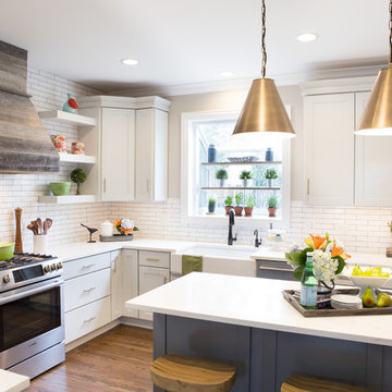
After six years of living in their Huntley IL home, Chris and Meghan were tired of their dark, dingy, outdated kitchen and it was finally time for a long-anticipated change. “The kitchen is the place where we live, it’s where we do everything,” Meghan said. “It was important that it be a space where we wanted to be.” Meghan loves cooking and enjoys including their girls in healthy meal prepping, this led them to want a brighter, more enjoyable kitchen with increased functionality and improved storage.
For Chris especially, the laundry room was an entirely dysfunctional eyesore. “We had a washer and a dryer, but it was all kind-of cobbled together!” Chris said. “There were always laundry piles everywhere, we weren’t really sure what we wanted to do in there, but it was time for us to make a change.” The mess of the space was stressful every time they walked in the door from the garage each day. Kids’ backpacks and shoes piled up haphazardly in the makeshift boot-bench closet left the family feeling disorganized and stressed. They needed space for folding clothes and locker cubbies to help keep the family organized.
Having known Christine and Todd in the Huntley community for years, Chris and Meghan were familiar with their work. “We already trusted them personally and having seen their projects for years we knew they did top notch work. After we reviewed the initial round of designs, we knew that hiring them was definitely the right choice,” Meghan and Chris said. Although Chris had done a lot of work in their home himself, the kitchen and laundry room renovation was such a large undertaking that he didn’t want to steal time away from his family to spend what would surely be many long weekends doing the job himself. “That would not have been a wise choice for us,” Chris laughed.
“Our designer, Michelle was very, very, easy to work with; anything we wanted to see or weren’t sure about, she went above and beyond to make this easy for us. She was easy to get hold of and always quick to respond,” the couple said. Michelle pulled ideas that mirrored the couple’s taste and style and was adept at directing the couple to limited choices that didn’t overwhelm them and kept the process moving. “I have a hard time making decisions. Michelle made the decision-making process so easy. I loved how she listened to what I liked and then presented three great options for me to choose from,” Meghan said.
The main objectives for the kitchen were better storage solutions, they wanted the space to reflect their lifestyle and taste, and they wanted it to last for years with low maintenance. One of the first steps in creating a more functional kitchen was relocating the refrigerator, creating an improved workflow for the busy family.
“We didn’t know that we could even move the refrigerator to a new location where it is now, that was something that we never would have thought of,” Chris said. “The new refrigerator location makes the kitchen feel so much bigger. We didn’t add any space, but our whole kitchen with the new design just seems like it’s so much larger than before!” Meghan said.
The perimeter mist colored cabinets helped warm and brighten the entire room, while the graphite colored cabinets on the island added contrast. Using this fresh, clean color palette satisfied the couple’s desire for a bright space that was the exact opposite of what they had before. Organization accessories were also added to the cabinets such as a spice drawer tray and roll outs to create hidden convenience.
“I absolutely love the hidden spices – it makes cooking so much more enjoyable!” Chris said. “And all the pull outs, and the double trash bin, who would think you could get so excited about organization!” the couple said in unison.
One thing they hated in their original kitchen was how dark the space felt. Added lighting on the ceiling with the new light fixtures combined with the lighter cabinetry colors throughout solved this problem. “Our new kitchen has this warm, almost cozy feeling that our old kitchen never had, it’s just a space that I love spending my time in now,” Meghan said. The light airy feeling was accentuated with the use of floating white shelves on either side of the decorative range hood. “We have so much cabinetry space, the new design is amazing we actually have more storage space than we will ever need,” Meghan said.
The island was extended to create more work surface and added space for stool seating. “The new island changes how we live. Now the kids can be in the kitchen with us, doing homework, eating breakfast, and the three of us have special dinners there when Chris is working late,” Meghan said.
The Carrara Marmi Quartz countertops were chosen because they are, not only beautiful, but are made from hard-working material that doesn’t require maintenance. The white subway tile backsplash that wraps to the ceiling behind the focal point cooktop range/hood compliments the crisp white countertops perfectly, while brushed brass hardware and light fixtures keep the design fresh and new.
The couple had a few fears at the beginning of the project, as most homeowners do. Their biggest fear was being out of their kitchen and laundry room for an extended time. The crew made it very easy for the family to work in a limited space keeping the washer and dryer hooked up the majority of the time, and also getting appliances working with minimal downtime.
“They above and beyond accommodated us to get us through the process,” Meghan said. “They did a great job making sure we were as comfortable as possible throughout the process,” Chris added.
“Our project manager DJ did a great job. He was very good at updating us on schedule changes, getting guys in as quickly as possible. Everyone that stepped in the house was nice and did great work,” said Chris. They thought Advance’s carpenter was phenomenal and were impressed when he took a conceptual idea from a photograph and worked with designer Michelle to create a one of a kind range/hood that has become the topic of conversation with friends and family who visit the new kitchen. “He was in our house literally every day for several weeks. He was easy to work with and good at what he did,” Meghan and Chris said.
The focal point of the kitchen; a hand-crafted, custom-built ventilation hood was clad with handpicked reclaimed barnwood. Advance Design’s carpenter built the framework and the cladding to create a one-of-a-kind design element that the couple loves.
“I think it was especially fun for him to create something unique from scratch, showcasing his talent in this area,” Meghan said. “I love that my kitchen is not like everyone else’s. I got to pick out the wood on my hood and watch it being built and was able to choose what pieces of wood went where on it. It’s totally unique.”
Red Oak flooring was toothed-in throughout the kitchen and the rest of the first floor anywhere changes were made. Then the whole floor was refinished to tone down the orange undertones in the existing floor stain, ultimately changing the color complexion of the entire first floor. The result is a completely new feeling to the entire home.
Renovating the laundry room was extremely important to Meghan and Chris, but they had trouble visualizing what the possibilities were for the seemingly small space. Michelle produced beautiful 3D illustrations that helped them envision the space in a whole new way.
“I must have told Michelle 100 times that I am a visual person, seeing the designs in 3D made it so easy to make decisions and see what we could really do with our space,” Meghan said.
A dividing wall and doorway were removed between the existing laundry room and hallway formerly containing a coat closet, providing space to design specialized graphite colored cabinetry matching the kitchen island to house custom storage cubbies for each family member. Adding the tall utility cabinetry in the new laundry area helped solve the storage issue, tucking away cleaning supplies, household items, and even the cat got its own cubby.
“I love how everything is now hidden in its own space. I can’t tell you how much I hated coming home and seeing everything sitting around on counters,” Chris said.
Electrical outlets were planned for the inside of utility cabinets, so devices could charge in hidden locations. Stacking the washer and dryer allowed for wider countertop space to provide a folding area and a special space for clothes to hang. “The way I do laundry has been completely transformed! I can actually fold clothes and hang them now right out of the washer and dryer,” Meghan said.
“The end result in the kitchen and the laundry/mud room was an updated light and bright space, with a smarter work flow that better meets the needs of this family,” Michelle said.
“I would totally recommend Advance Design,” Meghan said. “Sometimes I sit and just look at my kitchen and laundry room and think ‘Wow, I can’t believe I get to live here!’ It’s an understatement to say we love our new space.”
 O’Hara Interiors
Martha O'Hara Interiors, Interior Design & Photo Styling | Troy Thies, Photography | Hendel Homes
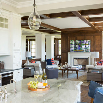
Example of a transitional living room design in Minneapolis
Example of a transitional living room design in Minneapolis
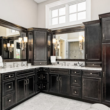
Sponsored
Sunbury, OH

J.Holderby - Renovations
Franklin County's Leading General Contractors - 2X Best of Houzz!
 O’Hara Interiors
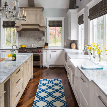
Martha O'Hara Interiors, Interior Design & Photo Styling | TC Homebuilders | Troy Thies, Photography
Please Note: All “related,” “similar,” and “sponsored” products tagged or listed by Houzz are not actual products pictured. They have not been approved by Martha O’Hara Interiors nor any of the professionals credited. For information about our work, please contact design@oharainteriors.com.
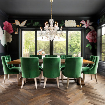
 City Homes, LLC
Example of a trendy medium tone wood floor, brown floor, wainscoting and wallpaper enclosed dining room design in Minneapolis with multicolored walls
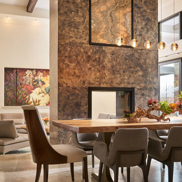

 Kitchen Design Concepts
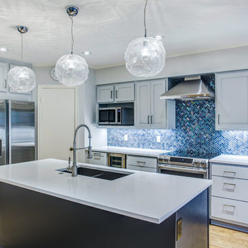
We must admit, we’ve got yet another show-stopping transformation! With keeping the cabinetry boxes (though few had to be replaced), swapping out drawer and drawer fronts with new ones, and updating all the finishes – we managed to give this space a renovation that could be confused for a full remodel! The combination of a vibrant new backsplash, a light painted cabinetry finish, and new fixtures, these cosmetic changes really made the kitchen become “brand new”. Want to learn more about this space and see how we went from “drab” to “fab” then keep reading!
Cabinetry
The cabinets boxes that needed to be replaced are from WW Woods Shiloh, Homestead door style, in maple wood. These cabinets were unfinished, as we finished the entire kitchen on-site with the rest of the new drawer and drawer fronts for a seamless look. The cabinet fronts that were replaced were from Woodmont cabinetry, in a paint grade maple, and a recessed panel profile door-style. As a result, the perimeter cabinets were painted in Sherwin Williams Tinsmith, the island in Sherwin Williams Sea Serpent, and a few interiors of the cabinets were painted in a Sherwin Williams Tinsmith.
Countertop
The countertops feature a 3 cm Caesarstone Vivid White quartz
Backsplash
The backsplash installed from countertops to the bottom of the furrdown are from Glazzio in the Oceania Herringbone Series, in Cobalt Sea, and are a 1×2 size. We love how vibrant it is!
Fixtures and Fittings
From Blanco, we have a Meridian semi-professional faucet in Satin Nickel, and a granite composite Precis 1-3/4 bowl sink in a finish of Cinder. The floating shelves are from Danver and are a stainless steel finish.
Flooring
The flooring is a cork material from Harris Cork in the Napa Collection, in a Fawn finish.
 Brandon Oriental Rugs
Sunday, September 14, 2014
Is Your Interior Design Depressing You?
By Joseph Pubillones
(DailyHerald.com http://www.dailyherald.com/article/20140913/entlife/140919600)
From time to time, someone will corner me and confess to me that they are depressed; they whisper that they believe their decorating is making them sick. They tell me that their interiors are not to their liking because of choices made by their spouse, their designer, or because of their own misguided attempts at decorating.
Is it possible for their environment to make them feel sick? Yes (as I think about it), it is possible for design to alter moods.
In the mid-1950s, Norbett Mintz, a researcher at Brandeis University, and his mentor, the renowned psychologist Abraham Maslow, decided to conduct research about the effects of "beauty" on behavior. Mintz had already conducted experiments about the effects of color on human behavior and concluded that color selection has a palpable effect on personal behavior.
A room's design can have an impact on your mood. Mismatched colors or an
overstuffed room can affect your ability to relax and feel comfortable.
In their experiment about beauty, they designed three rooms. The first was "the ugly room", replete with clashing colors and patterns, disorganization and too much furniture for the size of the space. The second was "the average room", arranged with a monochromatic scheme, basic furniture pieces and subtly colored nondescript art. The third was "the beautiful room", decorated with quality case-goods, and fashionable fabrics and colors. Overwhelmingly, the test group rejected "the ugly room". "The average room" and "the beautiful room" were tied as the preferred room. When asked to describe the rooms, the test group was best able to describe "the beautiful room".
As a designer, this is not news to me. There are rooms, especially those that I like, that I can describe with remarkable detail. Although our notion of what is beautiful varies from person to person, it can be said that beautiful design is more memorable. We can deduce that each person prefers the beautiful.
From the time we are born, there are foods that are preferred -- some love sweets; others prefer more savory flavors. Over time, our taste buds evolve, and what was once a favorite food can become insipid or nauseating. The same is true for interior design. Over time, everyone develops preferences about what makes us feel comfortable and at home.
When I hear that someone's home is depressing, I am concerned. I suggest immediate action to change what is most bothersome. If it is wall color: a painting party is overdue. If it is furniture: I ask them to consider new upholstery; a new furniture arrangement; or substituting new pieces for those that offend. And for those too timid or dismayed to tackle their problems head-on and alone, I suggest hiring a professional interior designer.
( Joseph Pubillones is the owner of Joseph Pubillones Interiors, an award-winning interior design firm based in Palm Beach, Fla. © 2014 Creators.com)
[Comment by Brandon Oriental Rugs: Good quality is evident in the words we use when we appreciate its presence: beauty, harmony, integrity, excellence. These are appealing impressions it makes upon our minds and spirits. It can't be faked. Attempts to put a stamp of "quality" -- as in "good quality" -- upon things which possess or convey "bad quality" doesn't fool anyone who appreciates quality and the benefits it inherently brings.]
Related articles
Is your interior design depressing you?
Why Our Brains Love Colorful Interiors
A Little Spent on a Well Chosen Oriental Rug Can Save You a Lot on the Remaining Furnishings for Your Home
How Can Interior Design Inspire Fashion Design? | L' Essenziale Home Designs
Interior Design Pet Peeves
Hand-Knotted Oriental Rugs Are Best Friends With Leather Furniture And Arts & Crafts (especially Stickley (tm)) Furnishings of Every Kind
Homeowners Select Persian Kashan Rug from Bucks County Oriental Rug Store Brandon Oriental Rugs (www.BrandonRugs.com) for Family Room of Their Upper Montgomery County Farmhouse
There Is Nothing New Under The Sun - Opposites Attract - The Truth Does Not Change - Quality IS Forever Manifesting Itself - REAL Is Now
ShareThisFacebookTweetLinkedInPinterestEmail
Posted by brandon rugs at 6:06 PM No comments: Links to this post
Email This
BlogThis!
Share to Twitter
Share to Facebook
Share to Pinterest
Labels: Brandon, Brandonrugs.com, Bucks County oriental rugs, colorful rugs, designing for mood, environment, interior design, personal expression, rug store Bucks County, rugs and design
Saturday, September 13, 2014
Bucks County Rug Store Helps Bethlehem, PA Homeowners Select Rugs to Complete Newly Furnished Living Room and Dining Room
Our customers purchased new living room and dining room furniture from Hendrixson's Fine Furnishings in Shimersville, PA.
With most of both rooms finished, they asked Brandon Oriental Rugs to help them find two fine quality oriental rugs that would coordinate with each other, and serve as the last puzzle pieces to complete their decorating.
Both rugs are finely detailed, hand-knotted, antique reproduction Persian Tabriz design oriental rugs made in India. The living room rug has a golden-maize color background with an antique gold border that subtly complements the fabrics and floor color in the room. The small scale motifs add color and interest while not defeating the supporting role the rug plays in the room to the customer's collection of fine original artworks.
The dining room rug is an unusual "Hasht-guli" design with berry-red background and golden-maize border that complements the living room rug, the rich mahogany wood-tones of the dining room suite, and the fabrics used in the custom window treatments designed and installed by Hendrixson's.
The wonderful result wrought by our customers expressing their good taste in an unswerving commitment to quality is proof that a modestly sized home can look and feel as elegant and luxurious as any palace.
Related articles
Lehigh Valley: Bucks County Oriental Rug Store, Brandon Oriental Rugs - www.BrandonRugs.com - Finds and Delivers Rugs for Lehigh Valley Home in Bethlehem, PA
New Homeowners in Doylestown, PA (Bucks County) Find Handmade Oriental Rug That Complements Everything in the Entry Hall to Their Home with Help from Brandon Oriental Rugs (www.BrandonRugs.com)
Brandon Oriental Rugs in Bucks County, PA helps Lehigh Valley Homeowner ( Bethlehem, PA ) Find a Fine Quality Oriental Rug to Complete Family Room
Aesthetic pieces
RUG SALE REALITY -- What Kind of Rug Sale Are You Looking For: "Biggest Discount" or "Best Quality at the Best Price"? Bucks County Oriental Rug Store - Brandon Oriental Rugs (BrandonRugs.com) - Helps You Understand the Difference
Brandon Oriental Rugs Helps Newtown, PA Homeowner Prepare for Holiday Entertaining with new Hand-knotted Oriental Rugs for the Living Room and Dining Room
Is That Really an Antique Rug? Antique Rugs Might Not Always Be As Old As You Think.
ShareThisFacebookTweetLinkedInPinterestEmail
Posted by brandon rugs at 2:47 PM No comments: Links to this post
Email This
BlogThis!
Share to Twitter
Share to Facebook
Share to Pinterest
Labels: Bethlehem, Brandon, choosing an area rug, Doylestown, interior design, Lehigh Valley home furnishings, oriental rugs bucks county
Tuesday, September 9, 2014
Oriental Rugs: What More Can You Say?
(BrandonRugs.com) Sometimes when there's a lot to be said, saying it quietly commands more attention.
You almost want to invite the oriental rugs to speak up, but they are always content playing a supporting role.
Related articles
New Homeowners in Doylestown, PA (Bucks County) Find Handmade Oriental Rug That Complements Everything in the Entry Hall to Their Home with Help from Brandon Oriental Rugs (www.BrandonRugs.com)
Bucks County Rug Store and Rug Search Service (Brandon Oriental Rugs - www.BrandonRugs.com) Helps Upper Bucks County Homeowner to Select Living Room Rugs for Old Farmhouse Renovation
A Little Spent on a Well Chosen Oriental Rug Can Save You a Lot on the Remaining Furnishings for Your Home
5 Things That Take a Room from Good to Great
RUG SALE REALITY -- What Kind of Rug Sale Are You Looking For: "Biggest Discount" or "Best Quality at the Best Price"? Bucks County Oriental Rug Store - Brandon Oriental Rugs (BrandonRugs.com) - Helps You Understand the Difference
Rug Shopping in Princeton - Hopewell - Skillman New Jersey Region Made Easier with Help From Bucks County Oriental Rug Store Brandon Oriental Rugs - www.BrandonRugs.com - as Proven by Customer's Experience
Video: All About Persian Rugs from Their Source ( with commentary from Bucks County Oriental Rug Store Brandon Oriental Rugs - www.BrandonRugs.com )
Advice For Maintaining Oriental Rugs
ShareThisFacebookTweetLinkedInPinterestEmail
Posted by brandon rugs at 4:07 PM No comments: Links to this post
Email This
BlogThis!
Share to Twitter
Share to Facebook
Share to Pinterest
Labels: Brandon, Bucks County oriental rugs, choose an oriental rug, Doylestown, Huntingdon Valley, layered rugs, New Hope, Newtown, oriental rug store Bucks County, Pinterest, rug sale, rug size, rugs and decor
Rug Placement Helps Determine Room Function and Where Rooms Begin and End
(BrandonRugs.com) If feel that your decorating is neither here nor there; the appropriate use of handmade oriental rugs will definitely help you to figure out where here is.
http://www.pinterest.com/pin/133348838942090547/
Related articles
New Homeowners in Doylestown, PA (Bucks County) Find Handmade Oriental Rug That Complements Everything in the Entry Hall to Their Home with Help from Brandon Oriental Rugs (www.BrandonRugs.com)
Bucks County Rug Store and Rug Search Service (Brandon Oriental Rugs - www.BrandonRugs.com) Helps Upper Bucks County Homeowner to Select Living Room Rugs for Old Farmhouse Renovation
Homeowners Select Persian Kashan Rug from Bucks County Oriental Rug Store Brandon Oriental Rugs (www.BrandonRugs.com) for Family Room of Their Upper Montgomery County Farmhouse
Oriental Rugs and Rugged Individualism: The World at Your Feet Is An Expression of You
Rug Shopping in Princeton - Hopewell - Skillman New Jersey Region Made Easier with Help From Bucks County Oriental Rug Store Brandon Oriental Rugs - www.BrandonRugs.com - as Proven by Customer's Experience
One-of-a-Kind Oriental Rugs Are Something Special for Those Blazing a Trail of Exquisite Taste That Can Be Admired But Not Duplicated
ShareThisFacebookTweetLinkedInPinterestEmail
Posted by brandon rugs at 3:22 PM No comments: Links to this post
Email This
BlogThis!
Share to Twitter
Share to Facebook
Share to Pinterest
Labels: Brandon, Bucks County oriental rugs, choose an oriental rug, Doylestown, Huntingdon Valley, layered rugs, New Hope, Newtown, oriental rug store Bucks County, Pinterest, rug sale, rug size, rugs and decor
Saturday, September 6, 2014
Why You Should Hire a Professional Interior Designer
by Cindy Beyer — August 27, 2014 at 1:00 pm
( http://www.restonnow.com/2014/08/27/why-you-should-hire-a-professional-interior-designer)
The interior of your home says a lot about you. Your home is your castle. Many of my clients have said they couldn’t imagine the results after their project was completed. They say it was the WOW factor. I say, that is why you hired a professional designer.
There are many situations that warrant the hiring a professional interior designer. This includes something as simple as choosing paint and window covering to full scale renovation work such as a new kitchen, bath or lower level. In addition to achieving that WOW factor, a professional interior designer will save their clients’ money in many ways, most importantly the avoidance of costly mistakes.
Not only will a professional designer understand the context of the project, they will have access to many resources and their trained eye can make a world of difference in the final result. And those final results also will improve the value of your home.
Professional interior designers are able to work closely with architects and contractors and are comfortable with drawing floor plans, as well as understanding the implications of how interiors will be used as it relates to structural and available floor space.
Beyond floor plans, program management, installation and understanding how structural design will be used in a practical setting, a professional interior designer will also be knowledgeable in color and fabric design, space planning, window coverings, furniture design, architecture and much more. So when you see the initials ASID and NCIDQ next to an interior designer’s name, know they have been through significant amount of formal certification.
When hiring a professional interior designer, it is important to have an understanding of the scope of the work to be done. Before my initial meeting with a new client, I ask them to spend some time making a list of their needs as well as any pictures they saved of items or rooms they like. Upon our first meeting, I take photos and measurements. Together,we then develop a detailed itemized list covering all areas of concern. The next step is to draw up and present a floor plan. Depending on the type of project this could include floor plans and furniture placement as well as construction and lighting if needed.
Once the plan is approved appropriate furnishings and finishes are selected. This can be fun - and exhausting as well. I often present my clients with many samples from which to choose. After the furniture choices, I develop a comprehensive budget itemizing all purchases.
I also may call on several of the contractors I work with such as electricians, plumbers, cabinet wholesalers and cabinet makers, painters, as well as drapery workrooms and installers. It has taken many years to compile trusted associates, which is an important part of being a good designer.
Lead times for good furniture and furnishings can take from 6-12 weeks depending on availability. This extra time gives sufficient time to finish the required preparatory work, and allows clients time to dispose of old furniture.
Related articles
Interior Design Pet Peeves
A Little Spent on a Well Chosen Oriental Rug Can Save You a Lot on the Remaining Furnishings for Your Home
Analysis of Initial Reaction to the New Furniture Exhibition 1901 - an 'exceedingly vulgar show' - (Curated by The Victoria and Albert Museum) with Lessons for Today (extending to the use of handmade area rugs) Regarding Evolution of Tastes and Styles
Hand-Knotted Oriental Rugs Are Best Friends With Leather Furniture And Arts & Crafts (especially Stickley (tm)) Furnishings of Every Kind
How Can Interior Design Inspire Fashion Design? | L' Essenziale Home Designs
Brandon Oriental Rugs Helps Homeowner in Doylestown, PA (Bucks County) Find Rug to Complete Newly Furnished Study
Fine Quality Area Rugs - Naturally Including Oriental Rugs - Are A Step In the Right Direction As Designers and Homeowners Plan Improvements: What's Under Foot for 2014? | ASID Icon
Bucks County Interior Designer Able to Find Oriental Rug for Her Project Through Brandon Oriental Rugs (www.BrandonRugs.com)
ShareThisFacebookTweetLinkedInPinterestEmail
Posted by brandon rugs at 11:28 PM No comments: Links to this post
Email This
BlogThis!
Share to Twitter
Share to Facebook
Share to Pinterest
Labels: Brandon, Bucks County oriental rugs, floorplan, home fashion, interior design, lifestyle, oriental rugs, rug store Bucks County
Thursday, September 4, 2014
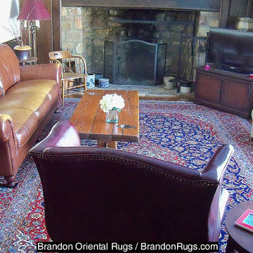
Homeowners Select Persian Kashan Rug from Bucks County Oriental Rug Store Brandon Oriental Rugs (www.BrandonRugs.com) for Family Room of Their Upper Montgomery County Farmhouse - See more at: http://brandonrugs.blogspot.com/#sthash.QMFruxxC.dpuf (Pamela Ward/ Brandon Oriental Rugs)


 Klopf Architecture
Built for the Bluff, A Sea Ranch Home is Remade from the Inside Out
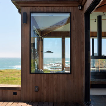
The house had always been grounded, on an ocean bluff at The Sea Ranch. It sits unencumbered, adjacent to one of the most dramatic stretches of the Sonoma coast with protected commons meadow to the east, uninterrupted Pacific views to the west, and a bluff trail running alongside. What it lacked was the feeling of home, one that could hold up its own against the natural landscape.
The owners are entrepreneurs with deep involvement across tech, real estate, and development and they know how things are built. The Sea Ranch house had been in their lives for years, a second residence and a place for family to gather. Built for a different time, it felt more compromising than comfortable. Sitting in a closed off nook, the kitchen fit one cook at a time and turned its back on the rest of the house. The entry was dim and compressed, divided by a structural column that presented itself at exactly the wrong moment. The primary suite was small relative to the view outside it. A large rear bedroom sat behind a lowered ceiling with a bathroom that had never been added. The house was certainly worth the trouble of doing it right.
What followed was not one project but four, each with its own design challenge, each addressed over a period of time.
Where the House Meets the Ocean
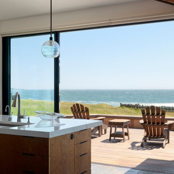
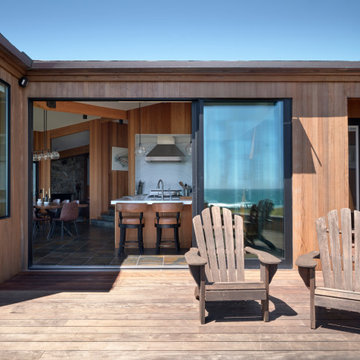
The most complex piece of the project, in both structural and spatial terms, was the kitchen expansion. The existing room was a single-person galley squeezed in as an afterthought with no meaningful connection to the dining room, the living space, or the deck outside. To make it useful for a family that cooks and gathers, it needed to grow outward into an existing patio and flow into the rooms around it.
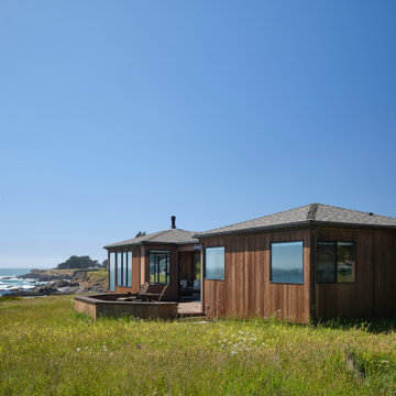
A big challenge was the roofline. Several planes at different pitches and angles converged directly where additional volume was needed. A new form had to join that geometry without reading as a correction. The solution found the simplest possible connection between the existing angles, a roofline that from outside the structure, appears entirely original. From the bluff trail where the addition is visible, there is no discernible seam.
Inside, the kitchen is now open to the living and dining rooms without interruption. A large sliding glass door connects the space onto the rear deck. The deck itself was expanded and oriented so that the body of the house shields it from the coastal wind which is a common consideration that determines whether outdoor space at The Sea Ranch actually gets used. The result is a room that works for large family gatherings where no one feels cutoff, and one that makes the boundary between being inside and outside easy to ignore.
Welcoming Light
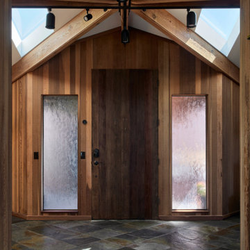
A structural column stood at the convergence of eight distinct roof planes in the entry. It was load-bearing, but it was also the reason the entry had always felt like a hallway rather than a welcoming arrival.
With the structural engineer, a custom steel connector was designed to receive beams from six separate directions, redistributing the load through a single new continuous beam. The column was surgically removed. Three triangular skylights were then cut into the roof above, their shapes drawn from the
existing geometry of the planes around them. The entry is now bright and open. The skylights feel native to the structure because they follow the logic already present in the roof.
Two Suites, Two Views
At opposite ends of the house, the two bedroom suites were each reconfigured, and each found a different way to introduce more of the landscape into the room.
An addition to the primary suite extended the structure outward to create a wraparound plan with a loop from the bedroom through bath and closet that had not been possible before. The expansion opened a slot view from the tub and shower toward the ocean. The view is precise and private. The ocean view is present and deliberate.
The rear bedroom absorbed an adjacent storage room to transform it into a full second suite with a vaulted ceiling, a large bathroom with a tub, a shower, and a sauna. A private fenced garden courtyard sits just beyond the glass bringing the outdoors inside. The tub was placed so that, looking past the courtyard and through the bedroom beyond, the ocean is visible at the far end. It is a long view and it makes the room feel larger and more settled than its footprint would suggest.
Glass on Four Sides, Fire at the Center
The main living and gathering room had always been caught between two competing facts: glass on four sides meant exceptional views but at The Sea Ranch, it also meant a cold room. A 360-degree cylindrical fireplace was added at the center on a raised stone base, providing radiant heat in every direction and giving the room a focal point around which a group naturally orients itself, whether that means two people at the end of the day or the whole family after dinner.
Owners Who Picked Up the Tools
The owner was not a passive client. they came with construction knowledge, specific ideas, and the desire to be an active part of the process, a dynamic that other architects may had found difficult, which Klopf Architecture accepted as an asset. They took it upon themselves to complete some of the work during construction, including the installation of a new radiant heating system beneath the floors.
The radiant system added to the older and less-desirable forced-air setup. At The Sea Ranch, that change matters as the house sits close enough to the ocean and moving air competes with the sound of it, where radiant heat does not. Solar panels were added to the roof as part of the new system. Insulation was upgraded throughout the walls, roof, and crawl space. The house that had always had the right setting now holds warmth the way a house on the bluff should.
They were also deeply involved in the design and selections throughout, and the finished house reflects both of them in ways that are specific rather than generic. The process took longer and moved through more iterations than a more arms-length relationship might have allowed. The result is more defined and personal because of it.
The Landscape Holds Priority
Every exterior decision was shaped by The Sea Ranch Design Standards, which require that buildings defer to the landscape around them rather than compete with it. Because this house sits on the bluff and is visible from the public trail, the additions faced a close review. Existing materials were matched. Geometries were resolved. The additions had to become indistinguishable from the original building.
From the trail, the house reads exactly as it always has — low, cedar-clad, secondary to the meadow and the water. The setting holds priority. Inside, the house has been remade.
Klopf Architecture Project Team: Geoff Campen and Trenton Jewett
Contractor: Shawn Bettega Construction
Photography: ©2025 Mariko Reed
Year Completed: 2023
Location: The Sea Ranch, CA
 Klopf Architecture
Built for the Bluff, A Sea Ranch Home is Remade from the Inside Out
The house had always been grounded, on an ocean bluff at The Sea Ranch. It sits unencumbered, adjacent to one of the most dramatic stretches of the Sonoma coast with protected commons meadow to the east, uninterrupted Pacific views to the west, and a bluff trail running alongside. What it lacked was the feeling of home, one that could hold up its own against the natural landscape.
The owners are entrepreneurs with deep involvement across tech, real estate, and development and they know how things are built. The Sea Ranch house had been in their lives for years, a second residence and a place for family to gather. Built for a different time, it felt more compromising than comfortable. Sitting in a closed off nook, the kitchen fit one cook at a time and turned its back on the rest of the house. The entry was dim and compressed, divided by a structural column that presented itself at exactly the wrong moment. The primary suite was small relative to the view outside it. A large rear bedroom sat behind a lowered ceiling with a bathroom that had never been added. The house was certainly worth the trouble of doing it right.
What followed was not one project but four, each with its own design challenge, each addressed over a period of time.
Where the House Meets the Ocean
The most complex piece of the project, in both structural and spatial terms, was the kitchen expansion. The existing room was a single-person galley squeezed in as an afterthought with no meaningful connection to the dining room, the living space, or the deck outside. To make it useful for a family that cooks and gathers, it needed to grow outward into an existing patio and flow into the rooms around it.
A big challenge was the roofline. Several planes at different pitches and angles converged directly where additional volume was needed. A new form had to join that geometry without reading as a correction. The solution found the simplest possible connection between the existing angles, a roofline that from outside the structure, appears entirely original. From the bluff trail where the addition is visible, there is no discernible seam.
Inside, the kitchen is now open to the living and dining rooms without interruption. A large sliding glass door connects the space onto the rear deck. The deck itself was expanded and oriented so that the body of the house shields it from the coastal wind which is a common consideration that determines whether outdoor space at The Sea Ranch actually gets used. The result is a room that works for large family gatherings where no one feels cutoff, and one that makes the boundary between being inside and outside easy to ignore.
Welcoming Light
A structural column stood at the convergence of eight distinct roof planes in the entry. It was load-bearing, but it was also the reason the entry had always felt like a hallway rather than a welcoming arrival.
With the structural engineer, a custom steel connector was designed to receive beams from six separate directions, redistributing the load through a single new continuous beam. The column was surgically removed. Three triangular skylights were then cut into the roof above, their shapes drawn from the
existing geometry of the planes around them. The entry is now bright and open. The skylights feel native to the structure because they follow the logic already present in the roof.
Two Suites, Two Views
At opposite ends of the house, the two bedroom suites were each reconfigured, and each found a different way to introduce more of the landscape into the room.
An addition to the primary suite extended the structure outward to create a wraparound plan with a loop from the bedroom through bath and closet that had not been possible before. The expansion opened a slot view from the tub and shower toward the ocean. The view is precise and private. The ocean view is present and deliberate.
The rear bedroom absorbed an adjacent storage room to transform it into a full second suite with a vaulted ceiling, a large bathroom with a tub, a shower, and a sauna. A private fenced garden courtyard sits just beyond the glass bringing the outdoors inside. The tub was placed so that, looking past the courtyard and through the bedroom beyond, the ocean is visible at the far end. It is a long view and it makes the room feel larger and more settled than its footprint would suggest.
Glass on Four Sides, Fire at the Center
The main living and gathering room had always been caught between two competing facts: glass on four sides meant exceptional views but at The Sea Ranch, it also meant a cold room. A 360-degree cylindrical fireplace was added at the center on a raised stone base, providing radiant heat in every direction and giving the room a focal point around which a group naturally orients itself, whether that means two people at the end of the day or the whole family after dinner.
Owners Who Picked Up the Tools
The owner was not a passive client. they came with construction knowledge, specific ideas, and the desire to be an active part of the process, a dynamic that other architects may had found difficult, which Klopf Architecture accepted as an asset. They took it upon themselves to complete some of the work during construction, including the installation of a new radiant heating system beneath the floors.
The radiant system added to the older and less-desirable forced-air setup. At The Sea Ranch, that change matters as the house sits close enough to the ocean and moving air competes with the sound of it, where radiant heat does not. Solar panels were added to the roof as part of the new system. Insulation was upgraded throughout the walls, roof, and crawl space. The house that had always had the right setting now holds warmth the way a house on the bluff should.
They were also deeply involved in the design and selections throughout, and the finished house reflects both of them in ways that are specific rather than generic. The process took longer and moved through more iterations than a more arms-length relationship might have allowed. The result is more defined and personal because of it.
The Landscape Holds Priority
Every exterior decision was shaped by The Sea Ranch Design Standards, which require that buildings defer to the landscape around them rather than compete with it. Because this house sits on the bluff and is visible from the public trail, the additions faced a close review. Existing materials were matched. Geometries were resolved. The additions had to become indistinguishable from the original building.
From the trail, the house reads exactly as it always has — low, cedar-clad, secondary to the meadow and the water. The setting holds priority. Inside, the house has been remade.
Klopf Architecture Project Team: Geoff Campen and Trenton Jewett
Contractor: Shawn Bettega Construction
Photography: ©2025 Mariko Reed
Year Completed: 2023
Location: The Sea Ranch, CA
 Klopf Architecture
Built for the Bluff, A Sea Ranch Home is Remade from the Inside Out
The house had always been grounded, on an ocean bluff at The Sea Ranch. It sits unencumbered, adjacent to one of the most dramatic stretches of the Sonoma coast with protected commons meadow to the east, uninterrupted Pacific views to the west, and a bluff trail running alongside. What it lacked was the feeling of home, one that could hold up its own against the natural landscape.
The owners are entrepreneurs with deep involvement across tech, real estate, and development and they know how things are built. The Sea Ranch house had been in their lives for years, a second residence and a place for family to gather. Built for a different time, it felt more compromising than comfortable. Sitting in a closed off nook, the kitchen fit one cook at a time and turned its back on the rest of the house. The entry was dim and compressed, divided by a structural column that presented itself at exactly the wrong moment. The primary suite was small relative to the view outside it. A large rear bedroom sat behind a lowered ceiling with a bathroom that had never been added. The house was certainly worth the trouble of doing it right.
What followed was not one project but four, each with its own design challenge, each addressed over a period of time.
Where the House Meets the Ocean
The most complex piece of the project, in both structural and spatial terms, was the kitchen expansion. The existing room was a single-person galley squeezed in as an afterthought with no meaningful connection to the dining room, the living space, or the deck outside. To make it useful for a family that cooks and gathers, it needed to grow outward into an existing patio and flow into the rooms around it.
A big challenge was the roofline. Several planes at different pitches and angles converged directly where additional volume was needed. A new form had to join that geometry without reading as a correction. The solution found the simplest possible connection between the existing angles, a roofline that from outside the structure, appears entirely original. From the bluff trail where the addition is visible, there is no discernible seam.
Inside, the kitchen is now open to the living and dining rooms without interruption. A large sliding glass door connects the space onto the rear deck. The deck itself was expanded and oriented so that the body of the house shields it from the coastal wind which is a common consideration that determines whether outdoor space at The Sea Ranch actually gets used. The result is a room that works for large family gatherings where no one feels cutoff, and one that makes the boundary between being inside and outside easy to ignore.
Welcoming Light
A structural column stood at the convergence of eight distinct roof planes in the entry. It was load-bearing, but it was also the reason the entry had always felt like a hallway rather than a welcoming arrival.
With the structural engineer, a custom steel connector was designed to receive beams from six separate directions, redistributing the load through a single new continuous beam. The column was surgically removed. Three triangular skylights were then cut into the roof above, their shapes drawn from the
existing geometry of the planes around them. The entry is now bright and open. The skylights feel native to the structure because they follow the logic already present in the roof.
Two Suites, Two Views
At opposite ends of the house, the two bedroom suites were each reconfigured, and each found a different way to introduce more of the landscape into the room.
An addition to the primary suite extended the structure outward to create a wraparound plan with a loop from the bedroom through bath and closet that had not been possible before. The expansion opened a slot view from the tub and shower toward the ocean. The view is precise and private. The ocean view is present and deliberate.
The rear bedroom absorbed an adjacent storage room to transform it into a full second suite with a vaulted ceiling, a large bathroom with a tub, a shower, and a sauna. A private fenced garden courtyard sits just beyond the glass bringing the outdoors inside. The tub was placed so that, looking past the courtyard and through the bedroom beyond, the ocean is visible at the far end. It is a long view and it makes the room feel larger and more settled than its footprint would suggest.
Glass on Four Sides, Fire at the Center
The main living and gathering room had always been caught between two competing facts: glass on four sides meant exceptional views but at The Sea Ranch, it also meant a cold room. A 360-degree cylindrical fireplace was added at the center on a raised stone base, providing radiant heat in every direction and giving the room a focal point around which a group naturally orients itself, whether that means two people at the end of the day or the whole family after dinner.
Owners Who Picked Up the Tools
The owner was not a passive client. they came with construction knowledge, specific ideas, and the desire to be an active part of the process, a dynamic that other architects may had found difficult, which Klopf Architecture accepted as an asset. They took it upon themselves to complete some of the work during construction, including the installation of a new radiant heating system beneath the floors.
The radiant system added to the older and less-desirable forced-air setup. At The Sea Ranch, that change matters as the house sits close enough to the ocean and moving air competes with the sound of it, where radiant heat does not. Solar panels were added to the roof as part of the new system. Insulation was upgraded throughout the walls, roof, and crawl space. The house that had always had the right setting now holds warmth the way a house on the bluff should.
They were also deeply involved in the design and selections throughout, and the finished house reflects both of them in ways that are specific rather than generic. The process took longer and moved through more iterations than a more arms-length relationship might have allowed. The result is more defined and personal because of it.
The Landscape Holds Priority
Every exterior decision was shaped by The Sea Ranch Design Standards, which require that buildings defer to the landscape around them rather than compete with it. Because this house sits on the bluff and is visible from the public trail, the additions faced a close review. Existing materials were matched. Geometries were resolved. The additions had to become indistinguishable from the original building.
From the trail, the house reads exactly as it always has — low, cedar-clad, secondary to the meadow and the water. The setting holds priority. Inside, the house has been remade.
Klopf Architecture Project Team: Geoff Campen and Trenton Jewett
Contractor: Shawn Bettega Construction
Photography: ©2025 Mariko Reed
Year Completed: 2023
Location: The Sea Ranch, CA
 Klopf Architecture
Built for the Bluff, A Sea Ranch Home is Remade from the Inside Out
The house had always been grounded, on an ocean bluff at The Sea Ranch. It sits unencumbered, adjacent to one of the most dramatic stretches of the Sonoma coast with protected commons meadow to the east, uninterrupted Pacific views to the west, and a bluff trail running alongside. What it lacked was the feeling of home, one that could hold up its own against the natural landscape.
The owners are entrepreneurs with deep involvement across tech, real estate, and development and they know how things are built. The Sea Ranch house had been in their lives for years, a second residence and a place for family to gather. Built for a different time, it felt more compromising than comfortable. Sitting in a closed off nook, the kitchen fit one cook at a time and turned its back on the rest of the house. The entry was dim and compressed, divided by a structural column that presented itself at exactly the wrong moment. The primary suite was small relative to the view outside it. A large rear bedroom sat behind a lowered ceiling with a bathroom that had never been added. The house was certainly worth the trouble of doing it right.
What followed was not one project but four, each with its own design challenge, each addressed over a period of time.
Where the House Meets the Ocean
The most complex piece of the project, in both structural and spatial terms, was the kitchen expansion. The existing room was a single-person galley squeezed in as an afterthought with no meaningful connection to the dining room, the living space, or the deck outside. To make it useful for a family that cooks and gathers, it needed to grow outward into an existing patio and flow into the rooms around it.
A big challenge was the roofline. Several planes at different pitches and angles converged directly where additional volume was needed. A new form had to join that geometry without reading as a correction. The solution found the simplest possible connection between the existing angles, a roofline that from outside the structure, appears entirely original. From the bluff trail where the addition is visible, there is no discernible seam.
Inside, the kitchen is now open to the living and dining rooms without interruption. A large sliding glass door connects the space onto the rear deck. The deck itself was expanded and oriented so that the body of the house shields it from the coastal wind which is a common consideration that determines whether outdoor space at The Sea Ranch actually gets used. The result is a room that works for large family gatherings where no one feels cutoff, and one that makes the boundary between being inside and outside easy to ignore.
Welcoming Light
A structural column stood at the convergence of eight distinct roof planes in the entry. It was load-bearing, but it was also the reason the entry had always felt like a hallway rather than a welcoming arrival.
With the structural engineer, a custom steel connector was designed to receive beams from six separate directions, redistributing the load through a single new continuous beam. The column was surgically removed. Three triangular skylights were then cut into the roof above, their shapes drawn from the
existing geometry of the planes around them. The entry is now bright and open. The skylights feel native to the structure because they follow the logic already present in the roof.
Two Suites, Two Views
At opposite ends of the house, the two bedroom suites were each reconfigured, and each found a different way to introduce more of the landscape into the room.
An addition to the primary suite extended the structure outward to create a wraparound plan with a loop from the bedroom through bath and closet that had not been possible before. The expansion opened a slot view from the tub and shower toward the ocean. The view is precise and private. The ocean view is present and deliberate.
The rear bedroom absorbed an adjacent storage room to transform it into a full second suite with a vaulted ceiling, a large bathroom with a tub, a shower, and a sauna. A private fenced garden courtyard sits just beyond the glass bringing the outdoors inside. The tub was placed so that, looking past the courtyard and through the bedroom beyond, the ocean is visible at the far end. It is a long view and it makes the room feel larger and more settled than its footprint would suggest.
Glass on Four Sides, Fire at the Center
The main living and gathering room had always been caught between two competing facts: glass on four sides meant exceptional views but at The Sea Ranch, it also meant a cold room. A 360-degree cylindrical fireplace was added at the center on a raised stone base, providing radiant heat in every direction and giving the room a focal point around which a group naturally orients itself, whether that means two people at the end of the day or the whole family after dinner.
Owners Who Picked Up the Tools
The owner was not a passive client. they came with construction knowledge, specific ideas, and the desire to be an active part of the process, a dynamic that other architects may had found difficult, which Klopf Architecture accepted as an asset. They took it upon themselves to complete some of the work during construction, including the installation of a new radiant heating system beneath the floors.
The radiant system added to the older and less-desirable forced-air setup. At The Sea Ranch, that change matters as the house sits close enough to the ocean and moving air competes with the sound of it, where radiant heat does not. Solar panels were added to the roof as part of the new system. Insulation was upgraded throughout the walls, roof, and crawl space. The house that had always had the right setting now holds warmth the way a house on the bluff should.
They were also deeply involved in the design and selections throughout, and the finished house reflects both of them in ways that are specific rather than generic. The process took longer and moved through more iterations than a more arms-length relationship might have allowed. The result is more defined and personal because of it.
The Landscape Holds Priority
Every exterior decision was shaped by The Sea Ranch Design Standards, which require that buildings defer to the landscape around them rather than compete with it. Because this house sits on the bluff and is visible from the public trail, the additions faced a close review. Existing materials were matched. Geometries were resolved. The additions had to become indistinguishable from the original building.
From the trail, the house reads exactly as it always has — low, cedar-clad, secondary to the meadow and the water. The setting holds priority. Inside, the house has been remade.
Klopf Architecture Project Team: Geoff Campen and Trenton Jewett
Contractor: Shawn Bettega Construction
Photography: ©2025 Mariko Reed
Year Completed: 2023
Location: The Sea Ranch, CA

 Klopf Architecture
Built for the Bluff, A Sea Ranch Home is Remade from the Inside Out
The house had always been grounded, on an ocean bluff at The Sea Ranch. It sits unencumbered, adjacent to one of the most dramatic stretches of the Sonoma coast with protected commons meadow to the east, uninterrupted Pacific views to the west, and a bluff trail running alongside. What it lacked was the feeling of home, one that could hold up its own against the natural landscape.
The owners are entrepreneurs with deep involvement across tech, real estate, and development and they know how things are built. The Sea Ranch house had been in their lives for years, a second residence and a place for family to gather. Built for a different time, it felt more compromising than comfortable. Sitting in a closed off nook, the kitchen fit one cook at a time and turned its back on the rest of the house. The entry was dim and compressed, divided by a structural column that presented itself at exactly the wrong moment. The primary suite was small relative to the view outside it. A large rear bedroom sat behind a lowered ceiling with a bathroom that had never been added. The house was certainly worth the trouble of doing it right.
What followed was not one project but four, each with its own design challenge, each addressed over a period of time.
Where the House Meets the Ocean
The most complex piece of the project, in both structural and spatial terms, was the kitchen expansion. The existing room was a single-person galley squeezed in as an afterthought with no meaningful connection to the dining room, the living space, or the deck outside. To make it useful for a family that cooks and gathers, it needed to grow outward into an existing patio and flow into the rooms around it.
A big challenge was the roofline. Several planes at different pitches and angles converged directly where additional volume was needed. A new form had to join that geometry without reading as a correction. The solution found the simplest possible connection between the existing angles, a roofline that from outside the structure, appears entirely original. From the bluff trail where the addition is visible, there is no discernible seam.
Inside, the kitchen is now open to the living and dining rooms without interruption. A large sliding glass door connects the space onto the rear deck. The deck itself was expanded and oriented so that the body of the house shields it from the coastal wind which is a common consideration that determines whether outdoor space at The Sea Ranch actually gets used. The result is a room that works for large family gatherings where no one feels cutoff, and one that makes the boundary between being inside and outside easy to ignore.
Welcoming Light
A structural column stood at the convergence of eight distinct roof planes in the entry. It was load-bearing, but it was also the reason the entry had always felt like a hallway rather than a welcoming arrival.
With the structural engineer, a custom steel connector was designed to receive beams from six separate directions, redistributing the load through a single new continuous beam. The column was surgically removed. Three triangular skylights were then cut into the roof above, their shapes drawn from the
existing geometry of the planes around them. The entry is now bright and open. The skylights feel native to the structure because they follow the logic already present in the roof.
Two Suites, Two Views
At opposite ends of the house, the two bedroom suites were each reconfigured, and each found a different way to introduce more of the landscape into the room.
An addition to the primary suite extended the structure outward to create a wraparound plan with a loop from the bedroom through bath and closet that had not been possible before. The expansion opened a slot view from the tub and shower toward the ocean. The view is precise and private. The ocean view is present and deliberate.
The rear bedroom absorbed an adjacent storage room to transform it into a full second suite with a vaulted ceiling, a large bathroom with a tub, a shower, and a sauna. A private fenced garden courtyard sits just beyond the glass bringing the outdoors inside. The tub was placed so that, looking past the courtyard and through the bedroom beyond, the ocean is visible at the far end. It is a long view and it makes the room feel larger and more settled than its footprint would suggest.
Glass on Four Sides, Fire at the Center
The main living and gathering room had always been caught between two competing facts: glass on four sides meant exceptional views but at The Sea Ranch, it also meant a cold room. A 360-degree cylindrical fireplace was added at the center on a raised stone base, providing radiant heat in every direction and giving the room a focal point around which a group naturally orients itself, whether that means two people at the end of the day or the whole family after dinner.
Owners Who Picked Up the Tools
The owner was not a passive client. they came with construction knowledge, specific ideas, and the desire to be an active part of the process, a dynamic that other architects may had found difficult, which Klopf Architecture accepted as an asset. They took it upon themselves to complete some of the work during construction, including the installation of a new radiant heating system beneath the floors.
The radiant system added to the older and less-desirable forced-air setup. At The Sea Ranch, that change matters as the house sits close enough to the ocean and moving air competes with the sound of it, where radiant heat does not. Solar panels were added to the roof as part of the new system. Insulation was upgraded throughout the walls, roof, and crawl space. The house that had always had the right setting now holds warmth the way a house on the bluff should.
They were also deeply involved in the design and selections throughout, and the finished house reflects both of them in ways that are specific rather than generic. The process took longer and moved through more iterations than a more arms-length relationship might have allowed. The result is more defined and personal because of it.
The Landscape Holds Priority
Every exterior decision was shaped by The Sea Ranch Design Standards, which require that buildings defer to the landscape around them rather than compete with it. Because this house sits on the bluff and is visible from the public trail, the additions faced a close review. Existing materials were matched. Geometries were resolved. The additions had to become indistinguishable from the original building.
From the trail, the house reads exactly as it always has — low, cedar-clad, secondary to the meadow and the water. The setting holds priority. Inside, the house has been remade.
Klopf Architecture Project Team: Geoff Campen and Trenton Jewett
Contractor: Shawn Bettega Construction
Photography: ©2025 Mariko Reed
Year Completed: 2023
Location: The Sea Ranch, CA
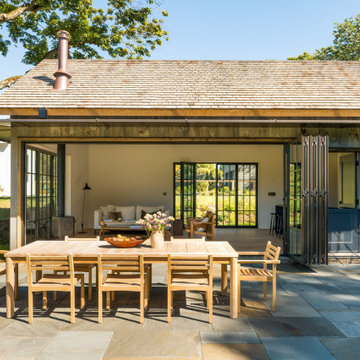
 NanaWall
Nestled in the lush landscape, a modern reinterpretation of a once-fallen barn now features a charming guest cottage with stylish details and contemporary amenities. Situated along a narrow lot in Germantown, New York, the cottage completes a cluster of existing buildings, forming an intimate courtyard on one side. Steel effect folding patio doors fully open the living areas to the expansive fields and the Catskill Mountains beyond.
The homeowners, a young family with parents living abroad, envisioned a cozy yet modern ADU for extended stays. Designed by Lauren Cawse, AIA, architect and partner at The Art of Building, the year-round retreat draws inspiration from traditional local barns while embracing a seamless indoor-outdoor connection.
Captivating Guest Cottage Design Enhances the Senses with Steel Effect Folding Patio Doors
The modern ADU design started with the site itself. Positioned between residential and commercial neighbors, the elongated property required a careful balance of privacy and openness. Architect Lauren Cawse approached the layout by redefining the existing house and garage as the east and west sides of an outdoor room, with the new cottage forming its southern boundary. This arrangement created a clear courtyard near the main residence while directing the 800-square-foot guest house toward the open meadow and the distant Catskill Mountains.
“The unique character of the site and its history inspired the architectural direction,” says Cawse. “The intent was to create a secondary structure in the compound in clear contrast to the modern farmhouse style of the house and garage.”
A Barn-Inspired Exterior Adds Visual Flair
The exterior envelope evokes a traditional barn with a simple gable shape, weathered wood siding, cedar shingles, and a foundation veneer made of local fieldstone. A large sliding barn door adds a complementary feature to the courtyard-facing side, creating a dynamic opening that maintains uninterrupted views through the cottage to the meadow beyond.
Steel effect folding patio doors surrounding the structure add a modern touch of transparency, and simulated divided lites allow the contemporary glass wall systems to harmonize with the traditional elements of the modern ADU design.
“The goal was to fully open the living areas to the outdoors, framing views to the meadows and mountains,” says Cawse. “The positioning of the NanaWall systems frames the views and, when open, dissolves the boundary between inside and out.”
Interior Design That Mirrors Nature’s Tranquility
Inside, the design program features a simple layout with one bedroom, a full bath, a kitchenette, and a living area with a wood-burning stove. The interior, a collaboration between The Art of Building and the homeowners, is defined by an understated palette and tactile materials that reflect the natural setting. Color is introduced through the framed glass views on all sides of the structure. Reclaimed timber collar ties span the ceiling overhead, while stone surfaces and naturally patinated metal accents add quiet texture throughout.
Custom hand-painted Delft tiles along the kitchen backsplash add personal detail, and terra cotta flooring in the bathroom brings warmth and old-world charm. Soaring ceilings and abundant daylight create a peaceful play of light and shadow, shifting subtly with the seasons and emphasizing the cottage’s connection to the natural landscape outside.
Sleek Steel Effect Folding Patio Doors Elevate the Modern ADU Design Aesthetic
Three customized steel effect folding patio doors define the living space, each aligned to respond to a different edge of the site. The largest, spanning nearly 20 feet wide and just under eight feet tall, opens directly onto the stone patio, allowing the main gathering area to extend fully into the landscape. Along the side of the living room, a smaller 10-foot-wide system introduces more light and ventilation, nearly creating an open corner condition if not for the structural post that supports the façade and roofline.
At the rear, a fourth ten-foot-wide system features a French door swing panel configuration that opens toward the courtyard, strengthening the design connection to the main residence. All steel effect folding patio doors were specified with a low-maintenance, water-rated Performance Sill to safeguard against inclement weather while providing a seamless, barrier-free transition to the outdoor patio.
Unique Customizations for Visual Appeal and a Steel Effect
Each folding patio door system is configured to open outward, maximizing usable floor space in the compact interior and allowing furniture placement to remain uninterrupted. By stacking outward, the steel effect folding patio doors, specified in a SE Classic Bronze powder coat, ensure every inch of the cottage is optimized. Simulated divided lites create a consistent rhythm across windows and doors, maintaining alignment with the traditional barn-inspired exterior.
In the bedroom, a three-panel, 10-foot-wide system mirrors these customizations, matching the steel effect divided-lite pattern and outward-opening configuration, extending the indoor-outdoor connection while preserving visual continuity throughout the ADU.
“The divided lites were crucial to the architectural vision, and while budget prohibited a steel and glass system, NanaWall Systems’ thin frames provide the open and airy feeling we hoped to attain,” says Cawse. “Simulated divided lites transition the thoroughly modern element of the glass walls to remain in harmony with the otherwise traditional palette.”
Matching Windows and Doors: Create a Cohesive Design Program
Alongside the larger openings in the living areas and bedroom, a smaller 3-foot-tall NanaWall tilt turn window was added to the bathroom. This window-sized NanaWall system perfectly matches the divided lite panels and sleek frames of the steel effect folding patio doors, creating a cohesive modern ADU design throughout. The compact opening provides ventilation and natural light, enhancing the spa-like atmosphere along with natural stone flooring. The matching glass lines and sleek profiles of the NanaWall Generation 4 comprehensive product line further unify visual consistency, allowing each system to fit into the architectural style seamlessly.
“This project had three bifold glass walls, a pair of double French doors with sidelites, and a single tilt turn window,” says architect Lauren Cawse. “Being able to work with a single manufacturer provided aesthetic cohesiveness and simplified coordination.”
Sustainability Where It Matters Most
New York weather can vary from hot 85-degree summers to cold 26-degree winters. Creating an efficient living space was a primary goal. To achieve this, the design included Timber HP-insulated walls and floors with a heat pump system for effective heating and cooling. Additionally, the steel effect folding patio doors and windows were specified with double-glazed panels to ensure a tight building envelope.
Indoor-Outdoor Living Spaces for Relaxing and Entertaining
In-house landscape designer Liz Pulver worked closely with the team to conceive open-air spaces that enhanced the connection between inside and outside. To the south end of the lot, the landscape transitions into an “enhanced meadow,” allowing the cottage to feel embedded within the surrounding fields rather than set apart from them. A circular pool was designed to mimic a natural pond with a modest footprint. Around it, a minimalist fence and sunken stone ha-ha wall offer discreet safety for young children.
Limited space due to existing infrastructure and zoning setbacks left only a small footprint for the swimming pool, prompting the designer to propose a circular form that maximized the usable swimming area. “We felt that the perfect way to integrate a pool into the property and to honor the landscape would be to treat the pool as a piece of art itself,” says Pulver. “The result is a beautiful round pool that serves as both a functional retreat and a sculptural moment.”
Final Thoughts: A Barn-Inspired Design for Contemporary Living
This modern ADU design skillfully combines modern features with the enduring charm of traditional barns. The outcome is a welcoming living space that stands out amid a stunning landscape. Natural materials that mimic the beauty of the outdoors, expansive steel effect folding patio doors that fill the space with fresh air and natural light, and a restrained interior design work together to create an inviting retreat for everyday living, throughout the seasons.
“When entering the site, the cottage feels as though it was always there,” says Cawse. “It achieves its two opposing goals by creating a feeling of intimacy and enclosure near the house while also functioning as a threshold to the expansive fields and views beyond.”
Explore how NanaWall folding patio doors elevate other ADU spaces in our inspiring project photo gallery!
Frequently Asked Questions (FAQs)
What is Slimline Steel Effect?
Steel Effect is a folding patio door design option that replicates the appearance of traditional steel-framed glass doors. It combines the look of steel with the performance benefits of aluminum, including energy efficiency, low maintenance, greater design flexibility, and lower cost.
How does a NanaWall Steel Effect aluminum system compare to traditional steel-framed glass doors?
NanaWall Slimline Steel Effect folding patio doors replicate the narrow frames of traditional steel doors with improved weather and thermal performance and easier operation. They are lighter, more corrosion-resistant, and feature a thermally broken design for better energy efficiency and lower long-term maintenance.
What are the benefits of Steel Effect folding glass walls?
Steel Effect folding glass walls deliver the narrow sightlines and grid patterns of traditional steel, combined with the performance and low maintenance of aluminum. The slimline steel effect option offers all the benefits of our Generation 4 product line, including the FourFold / SixFold floating panel set option and smooth operation with Gothic arch stainless steel rollers on a stainless steel track.
Can Slimline Steel Effect glass walls be customized?
Yes, these systems offer a high level of customization to suit different architectural styles, including simulated divided lites specified in various patterns, popular SE colors for a true steel effect look, and a contemporary glass stop option for a refined look. Contact your local NanaWall representative for additional options here.
How energy-efficient and weather-resistant are Slimline Steel Effect folding patio doors?
Steel effect folding systems are engineered for strong thermal and weather performance. Thermally broken frames and high-performance glazing help improve energy efficiency. Each NanaWall system has been independently tested for air, water, structural integrity, and forced entry with excellent results.
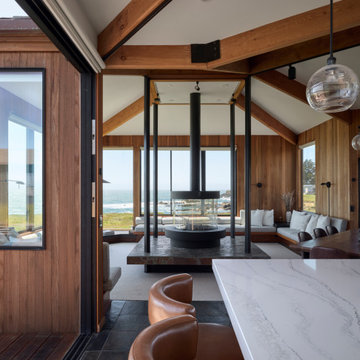 Klopf Architecture
Built for the Bluff, A Sea Ranch Home is Remade from the Inside Out
The house had always been grounded, on an ocean bluff at The Sea Ranch. It sits unencumbered, adjacent to one of the most dramatic stretches of the Sonoma coast with protected commons meadow to the east, uninterrupted Pacific views to the west, and a bluff trail running alongside. What it lacked was the feeling of home, one that could hold up its own against the natural landscape.
The owners are entrepreneurs with deep involvement across tech, real estate, and development and they know how things are built. The Sea Ranch house had been in their lives for years, a second residence and a place for family to gather. Built for a different time, it felt more compromising than comfortable. Sitting in a closed off nook, the kitchen fit one cook at a time and turned its back on the rest of the house. The entry was dim and compressed, divided by a structural column that presented itself at exactly the wrong moment. The primary suite was small relative to the view outside it. A large rear bedroom sat behind a lowered ceiling with a bathroom that had never been added. The house was certainly worth the trouble of doing it right.
What followed was not one project but four, each with its own design challenge, each addressed over a period of time.
Where the House Meets the Ocean
The most complex piece of the project, in both structural and spatial terms, was the kitchen expansion. The existing room was a single-person galley squeezed in as an afterthought with no meaningful connection to the dining room, the living space, or the deck outside. To make it useful for a family that cooks and gathers, it needed to grow outward into an existing patio and flow into the rooms around it.
A big challenge was the roofline. Several planes at different pitches and angles converged directly where additional volume was needed. A new form had to join that geometry without reading as a correction. The solution found the simplest possible connection between the existing angles, a roofline that from outside the structure, appears entirely original. From the bluff trail where the addition is visible, there is no discernible seam.
Inside, the kitchen is now open to the living and dining rooms without interruption. A large sliding glass door connects the space onto the rear deck. The deck itself was expanded and oriented so that the body of the house shields it from the coastal wind which is a common consideration that determines whether outdoor space at The Sea Ranch actually gets used. The result is a room that works for large family gatherings where no one feels cutoff, and one that makes the boundary between being inside and outside easy to ignore.
Welcoming Light
A structural column stood at the convergence of eight distinct roof planes in the entry. It was load-bearing, but it was also the reason the entry had always felt like a hallway rather than a welcoming arrival.
With the structural engineer, a custom steel connector was designed to receive beams from six separate directions, redistributing the load through a single new continuous beam. The column was surgically removed. Three triangular skylights were then cut into the roof above, their shapes drawn from the
existing geometry of the planes around them. The entry is now bright and open. The skylights feel native to the structure because they follow the logic already present in the roof.
Two Suites, Two Views
At opposite ends of the house, the two bedroom suites were each reconfigured, and each found a different way to introduce more of the landscape into the room.
An addition to the primary suite extended the structure outward to create a wraparound plan with a loop from the bedroom through bath and closet that had not been possible before. The expansion opened a slot view from the tub and shower toward the ocean. The view is precise and private. The ocean view is present and deliberate.
The rear bedroom absorbed an adjacent storage room to transform it into a full second suite with a vaulted ceiling, a large bathroom with a tub, a shower, and a sauna. A private fenced garden courtyard sits just beyond the glass bringing the outdoors inside. The tub was placed so that, looking past the courtyard and through the bedroom beyond, the ocean is visible at the far end. It is a long view and it makes the room feel larger and more settled than its footprint would suggest.
Glass on Four Sides, Fire at the Center
The main living and gathering room had always been caught between two competing facts: glass on four sides meant exceptional views but at The Sea Ranch, it also meant a cold room. A 360-degree cylindrical fireplace was added at the center on a raised stone base, providing radiant heat in every direction and giving the room a focal point around which a group naturally orients itself, whether that means two people at the end of the day or the whole family after dinner.
Owners Who Picked Up the Tools
The owner was not a passive client. they came with construction knowledge, specific ideas, and the desire to be an active part of the process, a dynamic that other architects may had found difficult, which Klopf Architecture accepted as an asset. They took it upon themselves to complete some of the work during construction, including the installation of a new radiant heating system beneath the floors.
The radiant system added to the older and less-desirable forced-air setup. At The Sea Ranch, that change matters as the house sits close enough to the ocean and moving air competes with the sound of it, where radiant heat does not. Solar panels were added to the roof as part of the new system. Insulation was upgraded throughout the walls, roof, and crawl space. The house that had always had the right setting now holds warmth the way a house on the bluff should.
They were also deeply involved in the design and selections throughout, and the finished house reflects both of them in ways that are specific rather than generic. The process took longer and moved through more iterations than a more arms-length relationship might have allowed. The result is more defined and personal because of it.
The Landscape Holds Priority
Every exterior decision was shaped by The Sea Ranch Design Standards, which require that buildings defer to the landscape around them rather than compete with it. Because this house sits on the bluff and is visible from the public trail, the additions faced a close review. Existing materials were matched. Geometries were resolved. The additions had to become indistinguishable from the original building.
From the trail, the house reads exactly as it always has — low, cedar-clad, secondary to the meadow and the water. The setting holds priority. Inside, the house has been remade.
Klopf Architecture Project Team: Geoff Campen and Trenton Jewett
Contractor: Shawn Bettega Construction
Photography: ©2025 Mariko Reed
Year Completed: 2023
Location: The Sea Ranch, CA
17