
Search results for "Doesnt tone" in Home Design Ideas
 TKS Design Group
Download our free ebook, Creating the Ideal Kitchen. DOWNLOAD NOW
Alice and Dave are on their 2nd home with TKS Design Group, having completed the remodel of a kitchen, primary bath and laundry/mudroom in their previous home. This new home is a bit different in that it is new construction. The house has beautiful space and light but they needed help making it feel like a home.
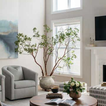
In the living room, Alice and Dave plan to host family at their home often and wanted a space that had plenty of comfy seating for conversation, but also an area to play games. So, our vision started with a search for luxurious but durable fabric along with multiple types of seating to bring the entire space together. Our light-filled living room is now warm and inviting to accommodate Alice and Dave’s weekend visitors.
The multiple types of seating chosen include a large sofa, two chairs, along with two occasional ottomans in both solids and patterns and all in easy to care for performance fabrics. Underneath, we layered a soft wool rug with cool tones that complimented both the warm tones of the wood floor and the cool tones of the fabric seating. A beautiful occasional table and a large cocktail table round out the space.
We took advantage of this room’s height by placing oversized artwork on the largest wall to create a place for your eyes to rest and to take advantage of the room’s scale. The TV was relocated to its current location over the fireplace, and a new light fixture scaled appropriately to the room’s ceiling height gives the space a more comfortable, approachable feel. Lastly, carefully chosen accessories including books, plants, and bowls complete this family’s new living space.
Photography by @MargaretRajic
Do you have a new home that has great bones but just doesn’t feel comfortable and you can’t quite figure out why? Contact us here to see how we can help!
 TKS Design Group
Download our free ebook, Creating the Ideal Kitchen. DOWNLOAD NOW
Alice and Dave are on their 2nd home with TKS Design Group, having completed the remodel of a kitchen, primary bath and laundry/mudroom in their previous home. This new home is a bit different in that it is new construction. The house has beautiful space and light but they needed help making it feel like a home.
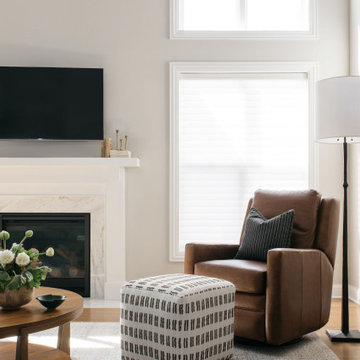
In the living room, Alice and Dave plan to host family at their home often and wanted a space that had plenty of comfy seating for conversation, but also an area to play games. So, our vision started with a search for luxurious but durable fabric along with multiple types of seating to bring the entire space together. Our light-filled living room is now warm and inviting to accommodate Alice and Dave’s weekend visitors.
The multiple types of seating chosen include a large sofa, two chairs, along with two occasional ottomans in both solids and patterns and all in easy to care for performance fabrics. Underneath, we layered a soft wool rug with cool tones that complimented both the warm tones of the wood floor and the cool tones of the fabric seating. A beautiful occasional table and a large cocktail table round out the space.
We took advantage of this room’s height by placing oversized artwork on the largest wall to create a place for your eyes to rest and to take advantage of the room’s scale. The TV was relocated to its current location over the fireplace, and a new light fixture scaled appropriately to the room’s ceiling height gives the space a more comfortable, approachable feel. Lastly, carefully chosen accessories including books, plants, and bowls complete this family’s new living space.
Photography by @MargaretRajic
Do you have a new home that has great bones but just doesn’t feel comfortable and you can’t quite figure out why? Contact us here to see how we can help!
 Housetrends Magazine
When you open the back doors of the home of Nancy and Jeremy Campbell in Granville, you don’t just step out onto a patio. You enter an extension of a modern living space that just happens to be outdoors. Their patio’s unique design and setting provides the comfort and style of indoors while enjoying the natural beauty and fresh air of outdoors.
It all started with a rather desolate back yard. “It was completely blank, there was nothing back there,” Nancy remembers of the patio space of this 1972 split-level house they bought five years ago. With a blank slate to work with, the Campbells knew the key elements of what they wanted for their new outdoor space when they sat down with Travis Ketron of Ketron Custom Builders to design it. “We knew we wanted something covered so we could use it in the rain, and in the winter, and we knew we wanted a stone fireplace,” Nancy recalls.
Travis translated the Campbells’ vision into a design to satisfy outdoor entertaining and relaxing desires in all seasons. The new outdoor space is reminiscent of a vast, rustic great room complete with a stone fireplace, a vaulted ceiling, skylights, and ceiling fans, yet no walls. The space is completely open to the elements without any glass or doors on any of the sides, except from the house. Furnished like a great room, with a built-in music system as well, it’s truly an extension of indoor living and entertaining space, and one that is unaffected by rain. Jeremy comments, “We haven’t had to cover the furniture yet. It would have to be a pretty strong wind to get wet.” Just outside the covered patio is a quartet of outdoor chairs adorned with plush cushions and colorful pillows, positioned perfectly for users to bask in the sun.
In the design process, the fireplace emerged as the anchor of the space and set the stage for the outdoor space both aesthetically and functionally. “We didn’t want it to block the view. Then designing the space with Travis, the fireplace became the center,” remembers Jeremy. Placed directly across from the two sets of French doors leading out from the house, a Rumford fireplace and extended hearth of stone in neutral earth tones is the focal point of this outdoor living room. Seating for entertaining and lounging falls easily into place around it providing optimal viewing of the private, wooded back yard. When temperatures cool off, the fireplace provides ample warmth and a cozy setting to experience the change of seasons. “It’s a great fireplace for the space,” Jeremy says of the unique design of a Rumford style fireplace. “The way you stack the wood in the fireplace is different so as to get more heat. It has a shallower box, burns hotter and puts off more heat. Wood is placed in it vertically, not stacked.” Just in case the fireplace doesn’t provide enough light for late-night soirees, there is additional outdoor lighting mounted from the ceiling to make sure the party always goes on.
Travis brought the idea of the Rumford outdoor fireplace to the Campbells. “I learned about it a few years back from some masons, and I was intrigued by the idea then,” he says. “We like to do stuff that’s out of the norm, and this fireplace fits the space and function very well.” Travis adds, “People want unique things that are designed for them. That’s our style to do that for them.”
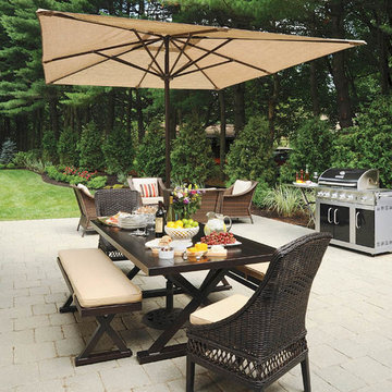
The patio also extends out to an uncovered area set up with patio tables for grilling and dining. Gray pavers flow throughout from the covered space to the open-air area. Their continuous flow mimics the feel of flooring that extends from a living room into a dining room inside a home. Also, the earth tone colors throughout the space on the pavers, fireplace and furnishings help the entire space mesh nicely with its natural surroundings.
A little ways off from both the covered and uncovered patio area is a stone fire pit ring. Removed by just the right distance, it provides a separate place for young adults to gather and enjoy the night.
Adirondack chairs and matching tables surround the outdoor fire pit, offering seating for anyone who doesn’t wish to stand and a place to set down ingredients for yummy fireside treats like s’mores.
Padded chairs outside the reach of the pavilion and the nearby umbrella the perfect place to kick back and relax in the sun. The colorful throw pillows and outdoor furniture cushions add some needed color and a touch of personality.
Enjoying the comforts of indoors while being outdoors is exactly what the Campbells are doing now, particularly when lounging on the comfortable wicker furniture that dominate most of the area. “My favorite part of the whole thing is the fireplace,” Nancy says.
Jeremy concludes, “There is no television, it would destroy the ambiance out there. We just enjoy listening to music and watching the fire.”
Find the right local pro for your project
 Storie Collective
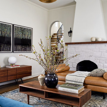
Boho meets Portuguese design in a stunning transformation of this Van Ness tudor in the upper northwest neighborhood of Washington, DC. Our team’s primary objectives were to fill space with natural light, period architectural details, and cohesive selections throughout the main level and primary suite. At the entry, new archways are created to maximize light and flow throughout the main level while ensuring the space feels intimate. A new kitchen layout along with a peninsula grounds the chef’s kitchen while securing its part in the everyday living space. Well-appointed dining and living rooms infuse dimension and texture into the home, and a pop of personality in the powder room round out the main level. Strong raw wood elements, rich tones, hand-formed elements, and contemporary nods make an appearance throughout the newly renovated main level and primary suite of the home.
 Factor Design Build
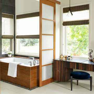
Example of a trendy beige floor bathroom design in Denver with flat-panel cabinets, dark wood cabinets, an undermount tub, beige walls and black countertops
 Kitchen Design Concepts
We introduce to you one of our newer services we are providing here at Kitchen Design Concepts: spaces that just need a little reviving! As of recent, we are taking on projects that are in need of minimal updating, as in, spaces that don’t need a full-on remodel. Yes, you heard right! If your space has good bones, you like the layout of your kitchen, and you just need a few cosmetic changes, then today’s feature is for you! Recently, we updated a space where we did just this! The kitchen was in need of a little love, some fresh paint, and new finishes. And if we’re being honest here, the result looks almost as if the kitchen had a full-on remodel! To learn more about this space and how we did our magic, continue reading below:
The Before and After
First, see what an impact new finishes can make! The “before” image shows a kitchen with outdated finishes such as the tile countertops, backsplash, and cabinetry finish. The “after” image, is a kitchen that looks almost as if its brand new, the image speaks for itself!
Cabinetry
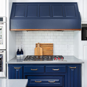
With the wooden cabinetry in this kitchen already having great bones, all we needed to do was our refinishing process that involved removing door and drawer fronts, sanding, priming, and painting. The main color of the cabinetry is white (Sherwin Williams Pure White 7005) and as an accent, we applied a deep navy blue that really pops in this space (Sherwin Willaims Naval 6244). As a special design element, we incorporated a natural wooden band across the hood which is subtle but adds an element of surprise.
Countertops
The original countertops in this space were a 12×12 tile with cracks and discolored grout from all the wear and tear. To replace the countertops, we installed a clean and crisp quartz that is not only durable but easy to maintain (no grout here!). The 3cm countertops are a Cambria quartz in a grey-tone color (Carrick).
Backsplash
Keeping things simple, yet classic, we installed a 3×6 subway tile from Interceramic. The crisp white pairs well with all the other finishes of the space and really brighten the space up! To spice things up, we paired the white tile with a contrasting grout color (Cape Grey) that matches the countertop. This is a simple method to add interest to your white backsplash!
Fixtures and Fittings
For the fixtures and fittings of the kitchen, we wanted pieces that made a statement. That’s why we selected this industrial style faucet from Brizo! The faucet is a Brizo LITZE™ PULL-DOWN FAUCET WITH ARC SPOUT AND INDUSTRIAL HANDLE (63044LF-BLGL). The matte black paired with the luxe gold elements really make a statement! To match the gold elements of the faucet, we installed cabinetry hardware from Topknobs in the same gold finish. The hardware is a Channing pull TK743HB. Lastly, the large single bowl sink (who doesn’t want a large sink?!) is a great functional touch to the kitchen. The sink is a Blanco Precision 16″ R10 super single with 16″ Drainer in stainless steel (516216).

Sponsored
Columbus, OH

Hope Restoration & General Contracting
Columbus Design-Build, Kitchen & Bath Remodeling, Historic Renovations
 Katie Hutchison Studio
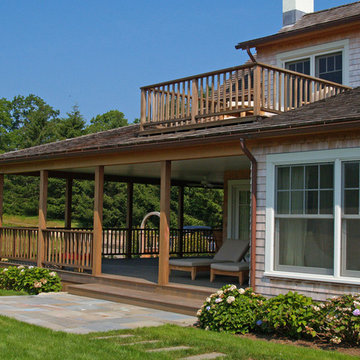
This larger home, constructed on Martha’s Vineyard, is a collection of informal, dormered gable components and grounding one-story, shed-roof elements that reduce its overall scale.
Designed to take advantage of a gently sloping up-Island property, this 5500 sq. ft. (not including finished basement) six-bedroom home includes staggered floor levels that climb from the front of the site to the rear. Generous, open living space on the entry level -- anchored on the west end by a fireplace and on the east end by the kitchen -- borders a dining area that’s nestled under a roof which also shelters the adjacent wrap-around porch. A deck off the rear of the dining space extends around the kitchen and is easily accessible from the nearby family room, too. Bedrooms occupy the other above-grade levels, including, at the upper-most level, the master suite comprised of a study, roof deck, master bath, walk-in closets and the master bedroom.
A clean-lined interior of warm neutrals sets a soothing tone in which the Island landscape is welcomed through expansive windows, porches and decks. Clad in white cedar shingles with a red cedar roof, the West Tisbury House will softly weather in-tune with its meadow site.
Katie Hutchison Studio collaborated with Geoffrey Koper Architect of Yarmouth Port, Mass. on the West Tisbury House. Kitchen fit-out and interior finishes, fixtures, and furnishings by others.
This larger home, constructed on Martha’s Vineyard, is a collection of informal, dormered gable components and grounding one-story, shed-roof elements that reduce its overall scale.
Designed to take advantage of a gently sloping up-Island property, this 5500 sq. ft. (not including finished basement) six-bedroom home includes staggered floor levels that climb from the front of the site to the rear. Generous, open living space on the entry level -- anchored on the west end by a fireplace and on the east end by the kitchen -- borders a dining area that’s nestled under a roof which also shelters the adjacent wrap-around porch. A deck off the rear of the dining space extends around the kitchen and is easily accessible from the nearby family room, too. Bedrooms occupy the other above-grade levels, including, at the upper-most level, the master suite comprised of a study, roof deck, master bath, walk-in closets and the master bedroom.
A clean-lined interior of warm neutrals sets a soothing tone in which the Island landscape is welcomed through expansive windows, porches and decks. Clad in white cedar shingles with a red cedar roof, the West Tisbury House will softly weather in-tune with its meadow site.
Katie Hutchison Studio collaborated with Geoffrey Koper Architect of Yarmouth Port, Mass. on the West Tisbury House. Kitchen fit-out and interior finishes, fixtures, and furnishings by others.
photo by Katie Hutchison
 Bella Home Design
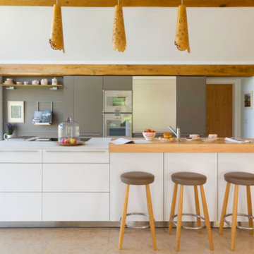
Open concept kitchen - mid-sized scandinavian galley beige floor and porcelain tile open concept kitchen idea in DC Metro with flat-panel cabinets, gray cabinets, quartz countertops, stainless steel appliances, an island, an undermount sink and white countertops
 Juxtapose Designs
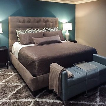
Large transitional master carpeted and gray floor bedroom photo in Other with multicolored walls and no fireplace
 INSPIRED KITCHEN DESIGN
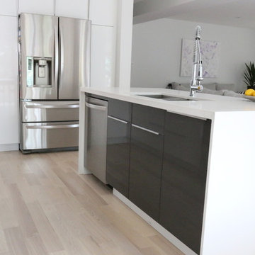
Italian-style kitchens reduce the screaming to a mere whisper by concealing large appliances. IKEA Europe has always had more options for doing so. Both the previous line FAKTUM and the new one METOD have options for concealing the dishwasher and the refrigerator.
IKEA USA only has an option for concealing the dishwasher. Justyna chose not to do this, but it doesn’t seem necessary when the dishwasher faces inward.
 Cambria
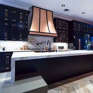
Brittanicca Gold pairs with rich black cabinetry, copper accents, chevron wood flooring, and pops of gray in this glam high-contrast kitchen. A Brittanicca Gold backsplash showcases flowing organic gold and greige veining beneath a statement copper range hood. A double waterfall-edge kitchen island showcases the beauty of Cambria Brittanicca Gold.
 Designtheory Inc.
Valerie Wilcox
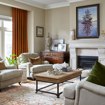
Example of a mid-sized classic formal living room design in Toronto with beige walls, a standard fireplace and no tv
Example of a mid-sized classic formal living room design in Toronto with beige walls, a standard fireplace and no tv

 David Johnston Architects
Hufker Photo
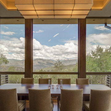
Inspiration for a contemporary dining room remodel in Denver with beige walls
Inspiration for a contemporary dining room remodel in Denver with beige walls
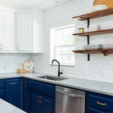 Kitchen Design Concepts
We introduce to you one of our newer services we are providing here at Kitchen Design Concepts: spaces that just need a little reviving! As of recent, we are taking on projects that are in need of minimal updating, as in, spaces that don’t need a full-on remodel. Yes, you heard right! If your space has good bones, you like the layout of your kitchen, and you just need a few cosmetic changes, then today’s feature is for you! Recently, we updated a space where we did just this! The kitchen was in need of a little love, some fresh paint, and new finishes. And if we’re being honest here, the result looks almost as if the kitchen had a full-on remodel! To learn more about this space and how we did our magic, continue reading below:
The Before and After
First, see what an impact new finishes can make! The “before” image shows a kitchen with outdated finishes such as the tile countertops, backsplash, and cabinetry finish. The “after” image, is a kitchen that looks almost as if its brand new, the image speaks for itself!
Cabinetry
With the wooden cabinetry in this kitchen already having great bones, all we needed to do was our refinishing process that involved removing door and drawer fronts, sanding, priming, and painting. The main color of the cabinetry is white (Sherwin Williams Pure White 7005) and as an accent, we applied a deep navy blue that really pops in this space (Sherwin Willaims Naval 6244). As a special design element, we incorporated a natural wooden band across the hood which is subtle but adds an element of surprise.
Countertops
The original countertops in this space were a 12×12 tile with cracks and discolored grout from all the wear and tear. To replace the countertops, we installed a clean and crisp quartz that is not only durable but easy to maintain (no grout here!). The 3cm countertops are a Cambria quartz in a grey-tone color (Carrick).
Backsplash
Keeping things simple, yet classic, we installed a 3×6 subway tile from Interceramic. The crisp white pairs well with all the other finishes of the space and really brighten the space up! To spice things up, we paired the white tile with a contrasting grout color (Cape Grey) that matches the countertop. This is a simple method to add interest to your white backsplash!
Fixtures and Fittings
For the fixtures and fittings of the kitchen, we wanted pieces that made a statement. That’s why we selected this industrial style faucet from Brizo! The faucet is a Brizo LITZE™ PULL-DOWN FAUCET WITH ARC SPOUT AND INDUSTRIAL HANDLE (63044LF-BLGL). The matte black paired with the luxe gold elements really make a statement! To match the gold elements of the faucet, we installed cabinetry hardware from Topknobs in the same gold finish. The hardware is a Channing pull TK743HB. Lastly, the large single bowl sink (who doesn’t want a large sink?!) is a great functional touch to the kitchen. The sink is a Blanco Precision 16″ R10 super single with 16″ Drainer in stainless steel (516216).
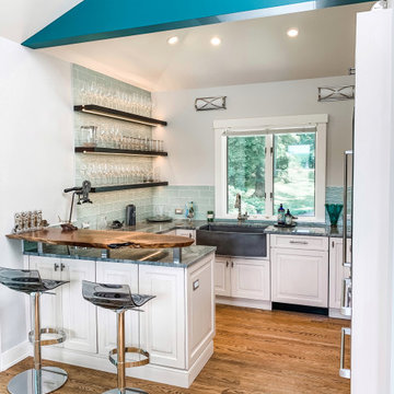
 Melissa Sakell, CKBD
This project was an especially fun one for me and was the first of many with these amazing clients. The original space did not make sense with the homes style and definitely not with the homeowners personalities. So the goal was to brighten it up, make it into an entertaining kitchen as the main kitchen is in another of the house and make it feel like it was always supposed to be there. The space was slightly expanded giving a little more working space and allowing some room for the gorgeous Walnut bar top by Grothouse Lumber, which if you look closely resembles a shark,t he homeowner is an avid diver so this was fate. We continued with water tones in the wavy glass subway tile backsplash and fusion granite countertops, kept the custom WoodMode cabinet white with a slight distressing for some character and grounded the space a little with some darker elements found in the floating shelving and slate farmhouse sink. We also remodeled a pantry in the same style cabinetry and created a whole different feel by switching up the backsplash to a deeper blue. Being just off the main kitchen and close to outdoor entertaining it also needed to be functional and beautiful, wine storage and an ice maker were added to make entertaining a dream. Along with tons of storage to keep everything in its place. The before and afters are amazing and the new spaces fit perfectly within the home and with the homeowners.


Sponsored
Sunbury, OH

J.Holderby - Renovations
Franklin County's Leading General Contractors - 2X Best of Houzz!
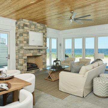
 Sytsma Building
Inspiration for a coastal open concept gray floor living room remodel in Grand Rapids with white walls and a standard fireplace
 Square Deal Construction Company, LLC
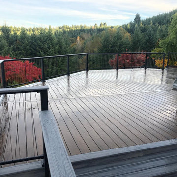
Huge minimalist backyard second story metal railing deck photo in Portland with no cover
 City Cabinet Center
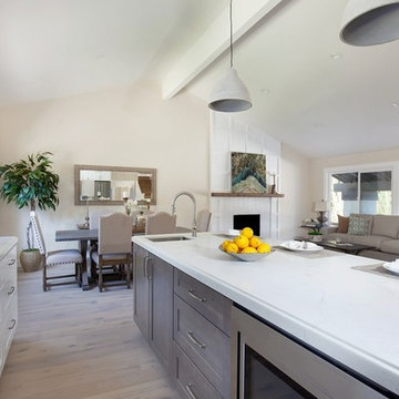
This kitchen is a great example of how you can mix and match across our cabinetry lines. The kitchen island base is from Schrock while the painted white cabinets are from our Lotus in-stock line.
32