
Search results for "Eliminating" in Home Design Ideas
 Pruett & Co.
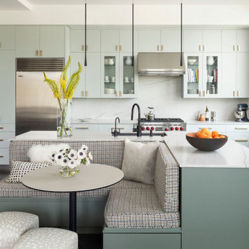
In this remodel we painted the existing perimeter cabinets a soft sea salt color and built a new island that included a cozy banquette that faces the gorgeous view of the Flatirons.
 User
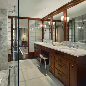
UserThe original master bathroom was tiny and outdated, with a single sink. The new design maximizes space and light while making the space feel luxurious. Eliminating the wall between the bedroom and bath and replacing it with sliding cherry and glass shoji screens brought more light into each room.
A custom double vanity with makeup area was added.
 Ward Jewell Architect AIA
San Marino based clients were interested in developing a property that had been in their family for generations. This was an exciting proposition as it was one of the last surviving bayside double lots on the scenic Coronado peninsula in San Diego. They desired a holiday home that would be a gathering place for their large, close- knit family.
San Marino based clients were interested in developing a property that had been in their family for generations. This was an exciting proposition as it was one of the last surviving bayside double lots on the scenic Coronado peninsula in San Diego. They desired a holiday home that would be a gathering place for their large, close-knit family. Facing the Back Bay, overlooking downtown and the Bay Bridge, this property presented us with a unique opportunity to design a vacation home with a dual personality. One side faces a bustling harbor with a constant parade of yachts, cargo vessels and military ships while the other opens onto a deep, quiet contemplative garden. The home’s shingle-style influence carries on the historical Coronado tradition of clapboard and Craftsman bungalows built in the shadow of the great Hotel Del Coronado which was erected at the turn of the last century. In order to create an informal feel to the residence, we devised a concept that eliminated the need for a “front door”. Instead, one walks through the garden and enters the “Great Hall” through either one of two French doors flanking a walk-in stone fireplace. Both two-story bedroom wings bookend this central wood beam vaulted room which serves as the “heart of the home”, and opens to both views. Three sets of stairs are discretely tucked away inside the bedroom wings.
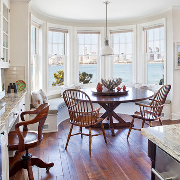
In lieu of a formal dining room, the family convenes and dines around a beautiful table and banquette set into a circular window bay off the kitchen which overlooks the lights of the city beyond the harbor. Working with noted interior designer Betty Ann Marshall, we designed a unique kitchen that was inspired by the colors and textures of a fossil the couple found on a honeymoon trip to the quarries of Montana. We set that ancient fossil into a matte glass backsplash behind the professional cook’s stove. A warm library with walnut paneling and a bayed window seat affords a refuge for the family to read or play board games. The couple’s fine craft and folk art collection is on prominent display throughout the house and helps to set an intimate and whimsical tone.
Another architectural feature devoted to family is the play room lit by a dramatic cupola which beacons the older grandchildren and their friends. Below the play room is a four car garage that allows the patriarch space to refurbish an antique fire truck, a mahogany launch boat and several vintage cars. Their jet skis and kayaks are housed in another garage designed for that purpose. Lattice covered skylights that allow dappled sunlight to bathe the loggia affords a comfortable refuge to watch the kids swim and gaze out upon the rushing water, the Coronado Bay Bridge and the romantic downtown San Diego skyline.
Architect: Ward Jewell Architect, AIA
Interior Design: Betty Ann Marshall
Construction: Bill Lyons
Photographer: Laura Hull
Styling: Zale Design Studio
Find the right local pro for your project

 H3K Design
Patrick Ketchum Photography
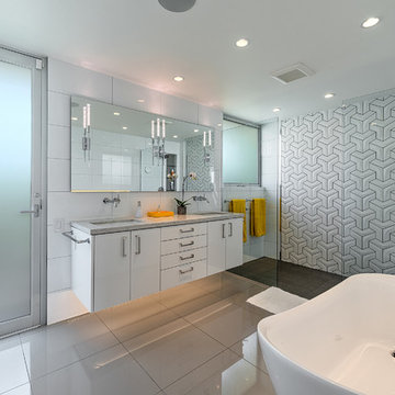
Inspiration for a contemporary master white tile porcelain tile freestanding bathtub remodel in Los Angeles with an undermount sink, flat-panel cabinets, white cabinets and quartzite countertops
Inspiration for a contemporary master white tile porcelain tile freestanding bathtub remodel in Los Angeles with an undermount sink, flat-panel cabinets, white cabinets and quartzite countertops
 Manou Design Group
Jeremy Fukunaga
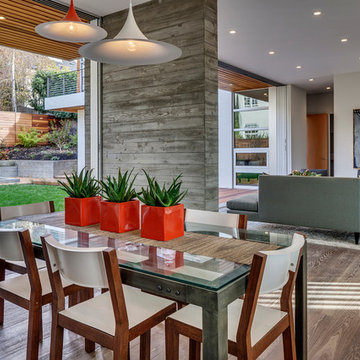
Great room - contemporary medium tone wood floor great room idea in San Francisco
Great room - contemporary medium tone wood floor great room idea in San Francisco
 Jacobsen Architecture, LLC
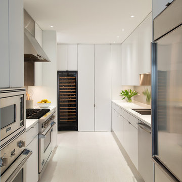
Example of a trendy galley kitchen design in DC Metro with flat-panel cabinets, white cabinets, stainless steel appliances and no island
 Kate Roos Design LLC
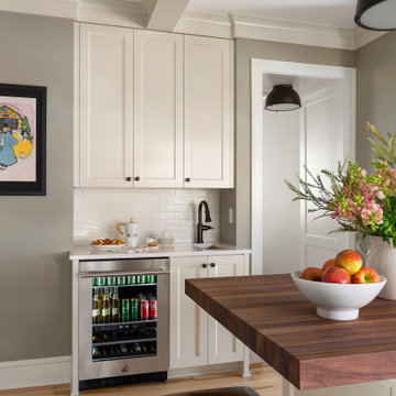
The refrigerator and pantry were relocated making way for a beverage bar complete with refrigeration and a bar sink. Located out of the way of the kitchen work triangle, this dedicated space supports everything from morning coffee to cocktail prep for the adjoining dining room.
 TKS Design Group
Download our free ebook, Creating the Ideal Kitchen. DOWNLOAD NOW
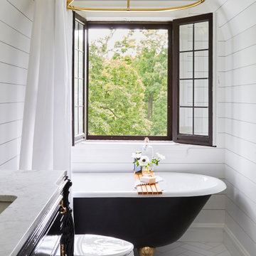
This charming little attic bath was an infrequently used guest bath located on the 3rd floor right above the master bath that we were also remodeling. The beautiful original leaded glass windows open to a view of the park and small lake across the street. A vintage claw foot tub sat directly below the window. This is where the charm ended though as everything was sorely in need of updating. From the pieced-together wall cladding to the exposed electrical wiring and old galvanized plumbing, it was in definite need of a gut job. Plus the hardwood flooring leaked into the bathroom below which was priority one to fix. Once we gutted the space, we got to rebuilding the room. We wanted to keep the cottage-y charm, so we started with simple white herringbone marble tile on the floor and clad all the walls with soft white shiplap paneling. A new clawfoot tub/shower under the original window was added. Next, to allow for a larger vanity with more storage, we moved the toilet over and eliminated a mish mash of storage pieces. We discovered that with separate hot/cold supplies that were the only thing available for a claw foot tub with a shower kit, building codes require a pressure balance valve to prevent scalding, so we had to install a remote valve. We learn something new on every job! There is a view to the park across the street through the home’s original custom shuttered windows. Can’t you just smell the fresh air? We found a vintage dresser and had it lacquered in high gloss black and converted it into a vanity. The clawfoot tub was also painted black. Brass lighting, plumbing and hardware details add warmth to the room, which feels right at home in the attic of this traditional home. We love how the combination of traditional and charming come together in this sweet attic guest bath. Truly a room with a view!
Designed by: Susan Klimala, CKD, CBD
Photography by: Michael Kaskel
For more information on kitchen and bath design ideas go to: www.kitchenstudio-ge.com
 Annette English & Associates
Photography by Jon Coolidge.
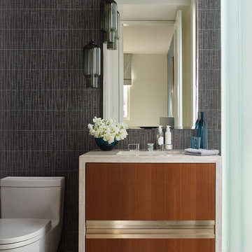
Powder room - contemporary powder room idea in Los Angeles with flat-panel cabinets, a one-piece toilet, an undermount sink, gray walls and dark wood cabinets
Powder room - contemporary powder room idea in Los Angeles with flat-panel cabinets, a one-piece toilet, an undermount sink, gray walls and dark wood cabinets
 Old Country Ceramic Tile
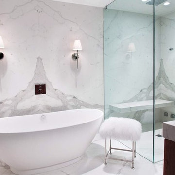
Fiandre Maximum Marmi - A new and exciting porcelain technology. Exceptional sizes, minimal thickness 1/4" thick. Can be used for tub / shower, walls , floors, countertops . Minimal grout lines, easy to clean, requires no special care or maintenance unlike marble slabs. Exceptional pricing compared to marble . Available in honed and polished finishes. Can be installed over most existing ceramic tile finishes which eliminates messy tear outs.

 Atelier Noël, Inc.
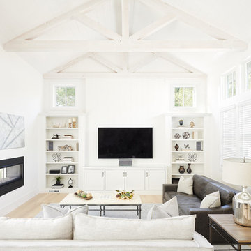
Example of a country open concept light wood floor and beige floor living room design in San Francisco with white walls, a two-sided fireplace and a wall-mounted tv
 Kipnis Architecture + Planning
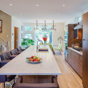
Given the efficient size of the home, the first floor is wide open. The traditional living room was eliminated leaving a dining room at the front, kitchen literally in the center of the space, and family room at the rear.
Natural daylight floods in from the large front and back windows, along with light from the skylight atop of the centrally located stairwell.
The kitchen cabinets, made from reclaimed wood, have naturalistic grooves align with adjacent cabinet fronts. http://www.kipnisarch.com
Cable Photo/Wayne Cable http://selfmadephoto.com
 Lee Meier Interiors
Designer: Barbara Stowe, Allied ASID
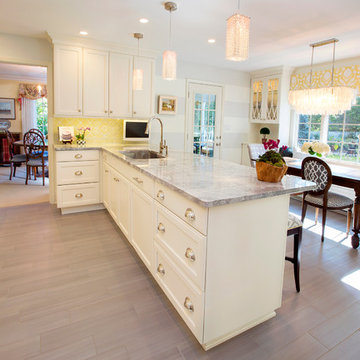
The clients were looking for a complete update of their original 1960's kitchen. They requested a clean and fresh look that would withstand the test of time. Although the footprint remained the same, eliminating soffits allowed for full height cabinets and made the space look larger. Brookhaven by Wood-Mode cabinetry, a narrow pull-out pantry cabinet and custom built-in plate rack provide plenty of storage and the dual-fuel Wolf range and Sub-Zero refrigerator are welcome upgrades.
Classic colors of gray and yellow are repeated in the handmade ceramic tile back splash, the granite counter tops, porcelain plank tile flooring, decorative valance and the numerous fabrics.
Antique chairs upholstered with new fabrics and a farmhouse table made from old doors add warmth, while polished nickel hardware and Schonbek crystal pendants add a bit of bling.
The result is a kitchen that is wonderful to cook in as well as being a lovely gathering place for family and friends.
 TKS Design Group
Download our free ebook, Creating the Ideal Kitchen. DOWNLOAD NOW
Lakefront property in the northwest suburbs of Chicago is hard to come by, so when we were hired by this young family with exactly that, we were immediately inspired by not just the unusually large footprint of this 1950’s colonial revival but also the lovely views of the manmade lake it was sited on. The large 5-bedroom home was solidly stuck in the 1980’s, but we saw tons of potential. We started out by updating the existing staircase with a fresh coat of paint and adding new herringbone slate to the entry hall.
The powder room off the entryway also got a refresh - new flooring, new cabinets and fixtures. We ran the new slate right through into this space for some consistency. A fun wallpaper and shiplap trim add a welcoming feel and set the tone for the home.
Next, we tackled the kitchen. Located away from the rest of the first floor, the kitchen felt a little isolated, so we immediately began planning for how to better connect it to the rest of the first floor. We landed on removing the wall between the kitchen and dining room and designed a modified galley style space with separate cooking and clean up zones. The cooking zone consists of the refrigerator, prep sink and cooktop, along with a nice long run of prep space at the island. The cleanup side of the kitchen consists of the main sink and dishwasher. Both areas are situated so that the user can view the lake during prep work and cleanup!
One of the home’s main puzzles was how to incorporate the mudroom and area in front of the patio doors at the back of the house. We already had a breakfast table area, so the space by the patio doors was a bit of a no man’s land. We decided to separate the kitchen proper from what became the new mudroom with a large set of barn doors. That way you can quickly hide any mudroom messes but have easy access to the light coming in through the patio doors as well as the outdoor grilling station. We also love the impact the barn doors add to the overall space.
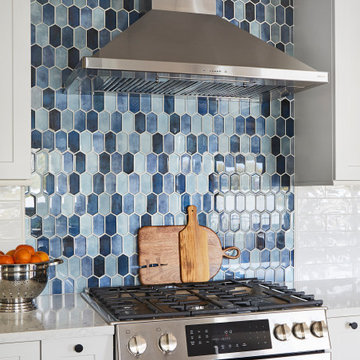
The homeowners’ first words to us were “it’s time to ditch the brown,” so we did! We chose a lovely blue pallet that reflects the home’s location on the lake which is also vibrant yet easy on the eye. Countertops are white quartz, and the natural oak floor works well with the other honey accents. The breakfast table was given a refresh with new chairs, chandelier and window treatments that frame the gorgeous views of the lake out the back.
We coordinated the slate mudroom flooring with that used in the home’s main entrance for a consistent feel. The storage area consists of open and closed storage to allow for some clutter control as needed.
Next on our “to do” list was revamping the dated brown bar area in the neighboring dining room. We eliminated the clutter by adding some closed cabinets and did some easy updates to help the space feel more current. One snag we ran into here was the discovery of a beam above the existing open shelving that had to be modified with a smaller structural beam to allow for our new design to work. This was an unexpected surprise, but in the end we think it was well worth it!
We kept the colors here a bit more muted to blend with the homeowner’s existing furnishings. Open shelving and polished nickel hardware add some simple detail to the new entertainment zone which also looks out onto the lake!
Next we tackled the upstairs starting with the homeowner’s son’s bath. The bath originally had both a tub shower and a separate shower, so we decided to swap out the shower for a new laundry area. This freed up some space downstairs in what used to be the mudroom/laundry room and is much more convenient for daily laundry needs.
We continued the blue palette here with navy cabinetry and the navy tile in the shower. Porcelain floor tile and chrome fixtures keep maintenance to a minimum while matte black mirrors and lighting add some depth the design. A low maintenance runner adds some warmth underfoot and ties the whole space together.
We added a pocket door to the bathroom to minimize interference with the door swings. The left door of the laundry closet is on a 180 degree hinge to allow for easy full access to the machines. Next we tackled the master bath which is an en suite arrangement. The original was typical of the 1980’s with the vanity outside of the bathroom, situated near the master closet. And the brown theme continued here with multiple shades of brown.
Our first move was to segment off the bath and the closet from the master bedroom. We created a short hall from the bedroom to the bathroom with his and hers walk-in closets on the left and right as well as a separate toilet closet outside of the main bathroom for privacy and flexibility.
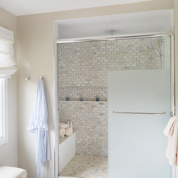
The original bathroom had a giant soaking tub with steps (dangerous!) as well as a small shower that did not work well for our homeowner who is 6’3”. With other bathtubs in the home, they decided to eliminate the tub and create an oversized shower which takes up the space where the old tub was located. The double vanity is on the opposite wall and a bench is located under the window for morning conversations and a place to set a couple of towels.
The pallet in here is light and airy with a mix of blond wood, creamy porcelain and marble tile, and brass accents. A simple roman shade adds some texture and it’s top-down mechanism allows for light and privacy.
This large whole house remodel gave our homeowners not only the ability to maximize the potential of their home but also created a lovely new frame from which to view their fabulous lake views.
Designed by: Susan Klimala, CKD, CBD
Photography by: Michael Kaskel
For more information on kitchen and bath design ideas go to: www.kitchenstudio-ge.com
 TKS Design Group
Download our free ebook, Creating the Ideal Kitchen. DOWNLOAD NOW
Lakefront property in the northwest suburbs of Chicago is hard to come by, so when we were hired by this young family with exactly that, we were immediately inspired by not just the unusually large footprint of this 1950’s colonial revival but also the lovely views of the manmade lake it was sited on. The large 5-bedroom home was solidly stuck in the 1980’s, but we saw tons of potential. We started out by updating the existing staircase with a fresh coat of paint and adding new herringbone slate to the entry hall.
The powder room off the entryway also got a refresh - new flooring, new cabinets and fixtures. We ran the new slate right through into this space for some consistency. A fun wallpaper and shiplap trim add a welcoming feel and set the tone for the home.
Next, we tackled the kitchen. Located away from the rest of the first floor, the kitchen felt a little isolated, so we immediately began planning for how to better connect it to the rest of the first floor. We landed on removing the wall between the kitchen and dining room and designed a modified galley style space with separate cooking and clean up zones. The cooking zone consists of the refrigerator, prep sink and cooktop, along with a nice long run of prep space at the island. The cleanup side of the kitchen consists of the main sink and dishwasher. Both areas are situated so that the user can view the lake during prep work and cleanup!
One of the home’s main puzzles was how to incorporate the mudroom and area in front of the patio doors at the back of the house. We already had a breakfast table area, so the space by the patio doors was a bit of a no man’s land. We decided to separate the kitchen proper from what became the new mudroom with a large set of barn doors. That way you can quickly hide any mudroom messes but have easy access to the light coming in through the patio doors as well as the outdoor grilling station. We also love the impact the barn doors add to the overall space.
The homeowners’ first words to us were “it’s time to ditch the brown,” so we did! We chose a lovely blue pallet that reflects the home’s location on the lake which is also vibrant yet easy on the eye. Countertops are white quartz, and the natural oak floor works well with the other honey accents. The breakfast table was given a refresh with new chairs, chandelier and window treatments that frame the gorgeous views of the lake out the back.
We coordinated the slate mudroom flooring with that used in the home’s main entrance for a consistent feel. The storage area consists of open and closed storage to allow for some clutter control as needed.
Next on our “to do” list was revamping the dated brown bar area in the neighboring dining room. We eliminated the clutter by adding some closed cabinets and did some easy updates to help the space feel more current. One snag we ran into here was the discovery of a beam above the existing open shelving that had to be modified with a smaller structural beam to allow for our new design to work. This was an unexpected surprise, but in the end we think it was well worth it!
We kept the colors here a bit more muted to blend with the homeowner’s existing furnishings. Open shelving and polished nickel hardware add some simple detail to the new entertainment zone which also looks out onto the lake!
Next we tackled the upstairs starting with the homeowner’s son’s bath. The bath originally had both a tub shower and a separate shower, so we decided to swap out the shower for a new laundry area. This freed up some space downstairs in what used to be the mudroom/laundry room and is much more convenient for daily laundry needs.
We continued the blue palette here with navy cabinetry and the navy tile in the shower. Porcelain floor tile and chrome fixtures keep maintenance to a minimum while matte black mirrors and lighting add some depth the design. A low maintenance runner adds some warmth underfoot and ties the whole space together.
We added a pocket door to the bathroom to minimize interference with the door swings. The left door of the laundry closet is on a 180 degree hinge to allow for easy full access to the machines. Next we tackled the master bath which is an en suite arrangement. The original was typical of the 1980’s with the vanity outside of the bathroom, situated near the master closet. And the brown theme continued here with multiple shades of brown.
Our first move was to segment off the bath and the closet from the master bedroom. We created a short hall from the bedroom to the bathroom with his and hers walk-in closets on the left and right as well as a separate toilet closet outside of the main bathroom for privacy and flexibility.
The original bathroom had a giant soaking tub with steps (dangerous!) as well as a small shower that did not work well for our homeowner who is 6’3”. With other bathtubs in the home, they decided to eliminate the tub and create an oversized shower which takes up the space where the old tub was located. The double vanity is on the opposite wall and a bench is located under the window for morning conversations and a place to set a couple of towels.
The pallet in here is light and airy with a mix of blond wood, creamy porcelain and marble tile, and brass accents. A simple roman shade adds some texture and it’s top-down mechanism allows for light and privacy.
This large whole house remodel gave our homeowners not only the ability to maximize the potential of their home but also created a lovely new frame from which to view their fabulous lake views.
Designed by: Susan Klimala, CKD, CBD
Photography by: Michael Kaskel
For more information on kitchen and bath design ideas go to: www.kitchenstudio-ge.com
 Fox Interiors
This narrow galley style primary bathroom was opened up by eliminating a wall between the toilet and vanity zones, enlarging the vanity counter space, and expanding the shower into dead space between the existing shower and the exterior wall.
Now the space is the relaxing haven they'd hoped for for years.
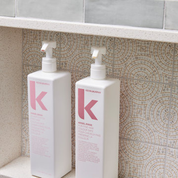
The warm, modern palette features soft green cabinetry, sage green ceramic tile with a high variation glaze and a fun accent tile with gold and silver tones in the shower niche that ties together the brass and brushed nickel fixtures and accessories, and a herringbone wood-look tile flooring that anchors the space with warmth.
Wood accents are repeated in the softly curved mirror frame, the unique ash wood grab bars, and the bench in the shower.
Quartz counters and shower elements are easy to mantain and provide a neutral break in the palette.
The sliding shower door system allows for easy access without a door swing bumping into the toilet seat.
The closet across from the vanity was updated with a pocket door, eliminating the previous space stealing small swinging doors.
Storage features include a pull out hamper for quick sorting of dirty laundry and a tall cabinet on the counter that provides storage at an easy to grab height.

23