
Search results for "Embraced" in Home Design Ideas
 NanaWall
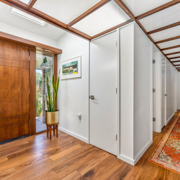
Vision for Renewal: Embracing Modernity While Honoring History
Built in the heart of a community renowned for its dedication to Mid-Century Modern architecture, this home has stood the test of time. Its original design, characterized by open spaces, flat planes, and vast use of single-paned glass, aimed to merge indoor and outdoor living. However, decades had taken their toll. The home featured inefficient materials and outdated layouts that no longer met the needs of modern homeownership. The renovation aimed to preserve the home’s unique architectural features but update its functionality for modern living. The homeowner, Stacy Kosis of Nook Design Collective, is a seasoned designer with over 19 years in the industry. She deeply appreciates Mid-Century Modern aesthetics and served as Director of Design with a Colorado custom home builder before branching out on her own two years ago. Kosis embarked on this ambitious project to breathe new life into a structure many saw beyond repair. The complete gut renovation was done in 8 months which is a huge testament to the Kosis’ skill and knowledge in design and construction. Her background experience and knowledge of NanaWall systems reliability and performance in previous projects were instrumental in her approach.
 In Detail Interiors
Colorful and rich style
When a repeat client shows up on your doorstep with his third home to furnish and wants to start from scratch and go really bold, you just embrace him, scoot him right up to the resource room, and don’t ask questions! I mean, who does not love a client that embraces velvet, leather, silk and wallcoverings?
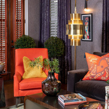
This lush, vibrant lounge space was all created from the want to really deep dive into something different, eclectic and more traveled. The original small, narrow, dimly lit room totally delivered on helping accomplish that mood. Mixing a little of that Ming dynasty-inspired strawberry red with a deep chocolate mohair on the sectional and cladding the room in a soft, amethyst woven wallcovering. We loved the interplay and “non-matchiness” that this space embraced.
Lighting and art were both about telling a story in this room – accenting conversational opportunities and an almost gallery-esque feel. Designating a more dynamic and unusual, sculptural feel – from the harder lines of the statement floor lamp in the living room across to the sprawling, slightly modern bloom of the dining area fixture.
Jewel of a space
The area rug had to ground the already bold furniture and lend itself to the darker wood floors, and a dusky green wool proved the ticket. We loved the almost pixelated pattern the hand-knotted wool lent to the overall design. A little hint of oxblood, chocolate and blue picked up in accents elsewhere, but the tone of almost jade really caught us about this piece.
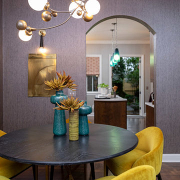
Not enough can be said about the accent of a dining space either (which in terms of space planning was the only way to balance this long, narrow “hallway” of a room off the kitchen). Citron velvet on the low-profile chairs left the space feeling open, but fun for games and cocktail parties. Plus, the cerused wood dining table was a great complement – offering depth without a conflict to the existing flooring or nearby sectional.
Being able to view this space as a whole was very important to us! From the selection of sconces carried throughout (that wonky placement was existing and with so little opportunity to add cans we had to play up the new fixtures in a way that make them feel purposeful and desirable.), to the balance of color and temperature in each furniture grouping. Sometimes working floor to ceiling in an existing space can pose a lot of unique challenges when it comes to furnishing projects. However, we loved that the client embraced our drive to really punch up the visual feel of this living/dining combo. Also, we know the enjoyment he gets from the finished product is a testament to hunting for the right pieces, designing with unusual and luxe fabric combinations, and managing the inclusion of budget-friendly surprises that always balance a job well done.
What the client says
“From the moment that Cheryl arrived, I felt that she was definitely the designer that I needed to help facilitate & execute my vision for the space. I’m not the “cookie cutter” type, and I immediately realized that Cheryl had a knack for envisioning ideas that were unique, yet tasteful, timeless, and sophisticated.”
From its beginnings as a plain Jane envelope, this combination living/dining space becomes a study in texture and color!
 In Detail Interiors
Colorful and rich style
When a repeat client shows up on your doorstep with his third home to furnish and wants to start from scratch and go really bold, you just embrace him, scoot him right up to the resource room, and don’t ask questions! I mean, who does not love a client that embraces velvet, leather, silk and wallcoverings?
This lush, vibrant lounge space was all created from the want to really deep dive into something different, eclectic and more traveled. The original small, narrow, dimly lit room totally delivered on helping accomplish that mood. Mixing a little of that Ming dynasty-inspired strawberry red with a deep chocolate mohair on the sectional and cladding the room in a soft, amethyst woven wallcovering. We loved the interplay and “non-matchiness” that this space embraced.
Lighting and art were both about telling a story in this room – accenting conversational opportunities and an almost gallery-esque feel. Designating a more dynamic and unusual, sculptural feel – from the harder lines of the statement floor lamp in the living room across to the sprawling, slightly modern bloom of the dining area fixture.
Jewel of a space
The area rug had to ground the already bold furniture and lend itself to the darker wood floors, and a dusky green wool proved the ticket. We loved the almost pixelated pattern the hand-knotted wool lent to the overall design. A little hint of oxblood, chocolate and blue picked up in accents elsewhere, but the tone of almost jade really caught us about this piece.
Not enough can be said about the accent of a dining space either (which in terms of space planning was the only way to balance this long, narrow “hallway” of a room off the kitchen). Citron velvet on the low-profile chairs left the space feeling open, but fun for games and cocktail parties. Plus, the cerused wood dining table was a great complement – offering depth without a conflict to the existing flooring or nearby sectional.
Being able to view this space as a whole was very important to us! From the selection of sconces carried throughout (that wonky placement was existing and with so little opportunity to add cans we had to play up the new fixtures in a way that make them feel purposeful and desirable.), to the balance of color and temperature in each furniture grouping. Sometimes working floor to ceiling in an existing space can pose a lot of unique challenges when it comes to furnishing projects. However, we loved that the client embraced our drive to really punch up the visual feel of this living/dining combo. Also, we know the enjoyment he gets from the finished product is a testament to hunting for the right pieces, designing with unusual and luxe fabric combinations, and managing the inclusion of budget-friendly surprises that always balance a job well done.
What the client says
“From the moment that Cheryl arrived, I felt that she was definitely the designer that I needed to help facilitate & execute my vision for the space. I’m not the “cookie cutter” type, and I immediately realized that Cheryl had a knack for envisioning ideas that were unique, yet tasteful, timeless, and sophisticated.”
From its beginnings as a plain Jane envelope, this combination living/dining space becomes a study in texture and color!
Find the right local pro for your project
 Muratore Construction + Design
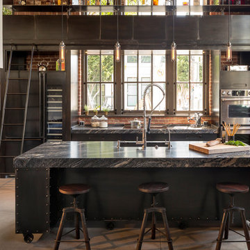
Interior Design: Muratore Corp Designer, Cindy Bayon | Construction + Millwork: Muratore Corp | Photography: Scott Hargis
Eat-in kitchen - mid-sized industrial galley concrete floor eat-in kitchen idea in San Francisco with an island, flat-panel cabinets, stainless steel cabinets, marble countertops, stainless steel appliances and an undermount sink
Eat-in kitchen - mid-sized industrial galley concrete floor eat-in kitchen idea in San Francisco with an island, flat-panel cabinets, stainless steel cabinets, marble countertops, stainless steel appliances and an undermount sink
 Jessica Cain
Photo: Jessica Cain © 2017 Houzz
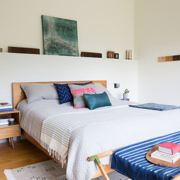
Large trendy medium tone wood floor and brown floor bedroom photo in Kansas City with white walls
Large trendy medium tone wood floor and brown floor bedroom photo in Kansas City with white walls

 Mindful Designs, Inc.
Gibeon Photography
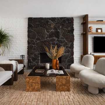
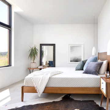
Example of a large danish master concrete floor and gray floor bedroom design in Other with white walls and no fireplace
Example of a large danish master concrete floor and gray floor bedroom design in Other with white walls and no fireplace
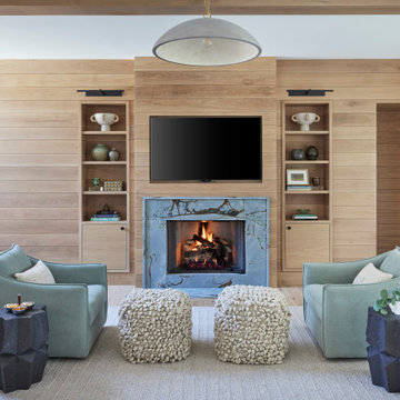

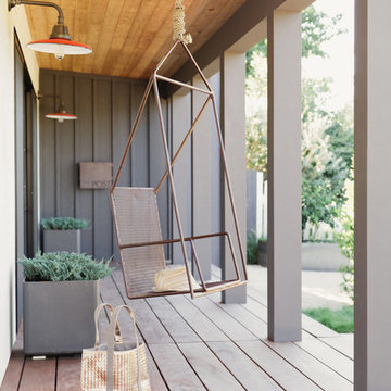
 Katharine Webster Inc.
This is an example of a transitional porch design in San Francisco with decking and a roof extension.
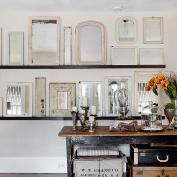

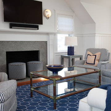
 Carolyn Thayer interiors
Cary Hazlegrove
Inspiration for a coastal medium tone wood floor living room remodel in Boston with white walls, a standard fireplace, a stone fireplace and a wall-mounted tv
Inspiration for a coastal medium tone wood floor living room remodel in Boston with white walls, a standard fireplace, a stone fireplace and a wall-mounted tv
 Wettling Architects
photo credit: Theo Morrison Photography
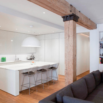
Example of a trendy kitchen design in New York with flat-panel cabinets and an island
Example of a trendy kitchen design in New York with flat-panel cabinets and an island
 T+E Arkitekter
Zoltan Gavai
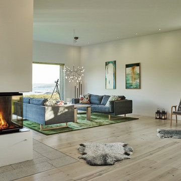
Danish enclosed light wood floor and beige floor living room photo in Gothenburg with white walls and no tv
Danish enclosed light wood floor and beige floor living room photo in Gothenburg with white walls and no tv
 Embrace Your Space Organizing & Design
Photo courtesy of Embrace Your Space LLC
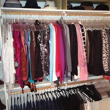
Closet - closet idea in Portland
Closet - closet idea in Portland
 In Detail Interiors
Colorful and rich style
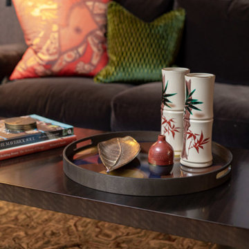
When a repeat client shows up on your doorstep with his third home to furnish and wants to start from scratch and go really bold, you just embrace him, scoot him right up to the resource room, and don’t ask questions! I mean, who does not love a client that embraces velvet, leather, silk and wallcoverings?
This lush, vibrant lounge space was all created from the want to really deep dive into something different, eclectic and more traveled. The original small, narrow, dimly lit room totally delivered on helping accomplish that mood. Mixing a little of that Ming dynasty-inspired strawberry red with a deep chocolate mohair on the sectional and cladding the room in a soft, amethyst woven wallcovering. We loved the interplay and “non-matchiness” that this space embraced.
Lighting and art were both about telling a story in this room – accenting conversational opportunities and an almost gallery-esque feel. Designating a more dynamic and unusual, sculptural feel – from the harder lines of the statement floor lamp in the living room across to the sprawling, slightly modern bloom of the dining area fixture.
Jewel of a space
The area rug had to ground the already bold furniture and lend itself to the darker wood floors, and a dusky green wool proved the ticket. We loved the almost pixelated pattern the hand-knotted wool lent to the overall design. A little hint of oxblood, chocolate and blue picked up in accents elsewhere, but the tone of almost jade really caught us about this piece.
Not enough can be said about the accent of a dining space either (which in terms of space planning was the only way to balance this long, narrow “hallway” of a room off the kitchen). Citron velvet on the low-profile chairs left the space feeling open, but fun for games and cocktail parties. Plus, the cerused wood dining table was a great complement – offering depth without a conflict to the existing flooring or nearby sectional.
Being able to view this space as a whole was very important to us! From the selection of sconces carried throughout (that wonky placement was existing and with so little opportunity to add cans we had to play up the new fixtures in a way that make them feel purposeful and desirable.), to the balance of color and temperature in each furniture grouping. Sometimes working floor to ceiling in an existing space can pose a lot of unique challenges when it comes to furnishing projects. However, we loved that the client embraced our drive to really punch up the visual feel of this living/dining combo. Also, we know the enjoyment he gets from the finished product is a testament to hunting for the right pieces, designing with unusual and luxe fabric combinations, and managing the inclusion of budget-friendly surprises that always balance a job well done.
What the client says
“From the moment that Cheryl arrived, I felt that she was definitely the designer that I needed to help facilitate & execute my vision for the space. I’m not the “cookie cutter” type, and I immediately realized that Cheryl had a knack for envisioning ideas that were unique, yet tasteful, timeless, and sophisticated.”
From its beginnings as a plain Jane envelope, this combination living/dining space becomes a study in texture and color!

 JAMES DIXON ARCHITECT PC
With designer Carolina George http://www.carolinageorge.com
Photo: Michael Stavaridis
 PI Photography Wall Art & Fine Art
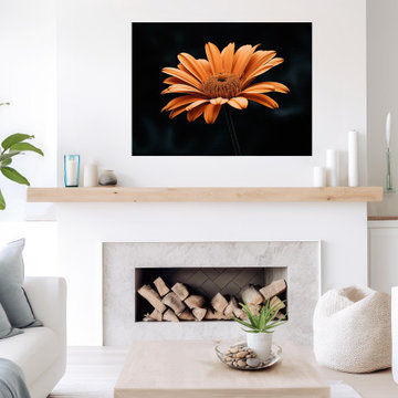
 https://pipafineart.com/pages/amber-embrace-floral-photorealistic-digital-art-prints-and-backgrounds. This striking digitally created photorealistic artwork, aptly titled "Amber Embrace," presents a singular, vibrant orange daisy in an incredibly detailed close-up, emerging with dramatic elegance from a deep, velvety black background. The flower itself is a masterpiece of digital rendering, with each petal showcasing a rich spectrum of amber and copper hues, highlighted by subtle variations in light and shadow that lend it a remarkable, almost luminous three-dimensional quality. The intricate texture of the daisy's center is meticulously captured, adding depth and drawing the eye into its heart. The overall effect is one of bold beauty and profound serenity, emphasizing the delicate complexity of nature against a backdrop of compelling darkness. The photorealistic precision makes this artwork feel as if it were a high-definition photograph, yet it possesses the controlled artistic vision unique to digital creation.
Amber Embrace Realism Painting Orange Color Floral Photorealistic Digital Artwork Canvas Print in Living Room Setting
"Amber Embrace" is exceptionally versatile and can dramatically enhance a variety of interior spaces and decorating styles. In a modern or contemporary living room, its vivid orange against the deep black would serve as a powerful focal point, injecting a sophisticated burst of color and organic form that beautifully contrasts with minimalist furniture and clean lines. It offers a warmth that can prevent a modern space from feeling too stark. For a transitional design, which expertly blends classic comfort with contemporary elements, this artwork seamlessly integrates, providing both timeless floral appeal and a fresh, updated aesthetic. It could elegantly tie together varied textures and furniture styles. In a maximalist setting, where rich layers and bold statements are embraced, "Amber Embrace" would contribute a luxurious, jewel-toned element, perhaps complementing deep wall colors or ornate metallic accents.
8