
Search results for "Engaging visuals" in Home Design Ideas
 Trace Ventures
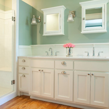
When the owners of this classic 1910 Foursquare engaged us to design and build a remodel, they were close to selling and moving on. Undeterred, our design-build team came up with a thoughtful plan that offered the modern livability they craved while respecting historical character of Nashville's West End area.
We built a rear addition for a first-floor master suite, powder room and kitchen with a walk-out basement. Its hipped roof mirrors the main house’s and fits right under a second-story window. We also built a new screen porch and large deck and opened the kitchen to the remodeled family room.
Custom-built columns and casework conceal a structural beam. Shaker-style cabinets in both master bath and kitchen are topped with Cambria quartz countertops. The latter’s two-toned treatment adds visual interest and texture.
 The Brooklyn Studio
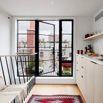
This residence was a complete gut renovation of a 4-story row house in Park Slope, and included a new rear extension and penthouse addition. The owners wished to create a warm, family home using a modern language that would act as a clean canvas to feature rich textiles and items from their world travels. As with most Brooklyn row houses, the existing house suffered from a lack of natural light and connection to exterior spaces, an issue that Principal Brendan Coburn is acutely aware of from his experience re-imagining historic structures in the New York area. The resulting architecture is designed around moments featuring natural light and views to the exterior, of both the private garden and the sky, throughout the house, and a stripped-down language of detailing and finishes allows for the concept of the modern-natural to shine.
Upon entering the home, the kitchen and dining space draw you in with views beyond through the large glazed opening at the rear of the house. An extension was built to allow for a large sunken living room that provides a family gathering space connected to the kitchen and dining room, but remains distinctly separate, with a strong visual connection to the rear garden. The open sculptural stair tower was designed to function like that of a traditional row house stair, but with a smaller footprint. By extending it up past the original roof level into the new penthouse, the stair becomes an atmospheric shaft for the spaces surrounding the core. All types of weather – sunshine, rain, lightning, can be sensed throughout the home through this unifying vertical environment. The stair space also strives to foster family communication, making open living spaces visible between floors. At the upper-most level, a free-form bench sits suspended over the stair, just by the new roof deck, which provides at-ease entertaining. Oak was used throughout the home as a unifying material element. As one travels upwards within the house, the oak finishes are bleached to further degrees as a nod to how light enters the home.
The owners worked with CWB to add their own personality to the project. The meter of a white oak and blackened steel stair screen was designed by the family to read “I love you” in Morse Code, and tile was selected throughout to reference places that hold special significance to the family. To support the owners’ comfort, the architectural design engages passive house technologies to reduce energy use, while increasing air quality within the home – a strategy which aims to respect the environment while providing a refuge from the harsh elements of urban living.
This project was published by Wendy Goodman as her Space of the Week, part of New York Magazine’s Design Hunting on The Cut.
Photography by Kevin Kunstadt
 Advance Design Studio, Ltd.
Curtis and Peggy had been thinking of a kitchen remodel for quite some time, but they knew their house would have a unique set of challenges. Their older Victorian house was built in 1891. The kitchen cabinetry was original, and they wanted to keep the authenticity of their period home while adding modern comforts that would improve their quality of life.
A friend recommended Advance Design Studio for their exceptional experience and quality of work. After meeting with designer Michelle Lecinski at Advance Design, they were confident they could partner with Advance to accomplish the unique kitchen renovation they’d been talking about for years. “We wanted to do the kitchen for a long, long time,” Curtis said. “(We asked ourselves) what are we actually going to do? How are we going to do this? And who are we going to find to do exactly what we want?”
The goal for the project was to keep the home renovation and new kitchen feeling authentic to the time in which it was built. They desperately wanted the modern comforts that come with a larger refrigerator and the dishwasher that they never had! The old home was also a bit drafty so adding a fireplace, wall insulation and new windows became a priority. They very much wanted to create a comfortable hearth room adjacent to the kitchen, complete with old world brick.
The original cabinetry had to go to make way for beautiful new kitchen cabinetry that appears as if it was a hundred years old, but with all the benefits of cutting-edge storage, self-closing drawers, and a brand-new look. “We just wanted to keep it old looking, but with some modern updates,” Peggy said.
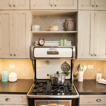
Dura Supreme Highland Cabinets with a Heritage Old World Painted Finish replaced the original 1891 cabinets. The hand-applied careful rubbed-off detailing makes these exquisite cabinets look as if they came from a far-gone era. Despite the small size of the kitchen, Peggy, Curtis and Michelle utilized every inch with custom cabinet sizes to increase storage capacity. The custom cabinets allowed for the addition of a 24” Fisher Paykel dishwasher with a concealing Dura Supreme door panel. Michelle was also able to work into the new design a larger 30” Fisher Paykel French refrigerator. “We made every ¼ inch count in this small space,” designer Michelle said. “Having the ability to custom size the cabinetry was the only way to achieve this.”
“The kitchen essentially was designed around the Heartland Vintage range and oven,” says Michelle. A classic appliance that combines nostalgic beauty and craftsmanship for modern cooking, with nickel plated trim and elegantly shaped handles and legs; the not to miss range is a striking focal point of the entire room and an engaging conversation piece.
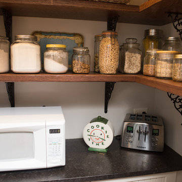
Granite countertops in Kodiak Satin with subtle veining kept with the old-world style. The delicate porcelain La Vie Crackle Sonoma tile kitchen backsplash compliments the home’s style perfectly. A handcrafted passthrough designed to show off Peggy’s fine china was custom built by project carpenters Justin Davis and Jeff Dallain to physically and visually open the space. Additional storage was created in the custom panty room with Latte Edinburg cabinets, hand-made weathered wood shelving with authentic black iron brackets, and an intricate tin copper ceiling.
Peggy and Curtis loved the idea of adding a Vermont stove to make the hearth-room not only functional, but a truly beckoning place to be. A stunning Bordeaux red Vermont Castings Stove with crisp black ventilation was chosen and combined with the authentic reclaimed Chicago brick wall. Advance’s talented carpenters custom-built elegant weathered shelves to house family memorabilia, installed carefully chosen barn sconces, and made the hearth room an inviting place to relax with a cup of coffee and a good book.
“Peggy and Curtis’ project was so much fun to work on. Creating a space that looks and feels like it always belonged in this beautiful old Victorian home is a designer’s dream. To see the delight in their faces when they saw the design details coming together truly made it worth the time and effort that went into making the very compact kitchen space work”, said Michelle. “The result is an amazing custom kitchen, packed with functionality in every inch, nook and cranny!” exclaims Michelle.
The renovation didn’t end with the kitchen. New Pella windows were added to help lessen the drafts. The removal of the original windows and trim necessitated the re-creation of hand-made corbels and trim details no longer available today. The talented carpenter team came to the rescue, crafting new pieces and masterfully finishing them as if they were always there. New custom gutters were formed and installed with a front entry rework necessary to accommodate the changes.
The whole house functions better, but it still feels like the original 1891 home. “From start to finish it’s just a much better space than we used to have,” Peggy said. “Jeff and Justin were amazing.” Curtis added; “We were lucky to find Advance Design, because they really came through for us. I loved that they had everything in house, anything you needed to have done, they could do it”.
Find the right local pro for your project
 Rendering Space
Explore 3D Virtual Tour at www.1911Highlands.com
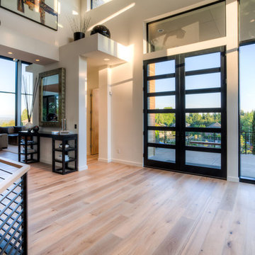
Produced by www.RenderingSpace.com. Rendering Space provides high-end Real Estate and Property Marketing in the Pacific Northwest. We combine art with technology to provide the most visually engaging marketing available.
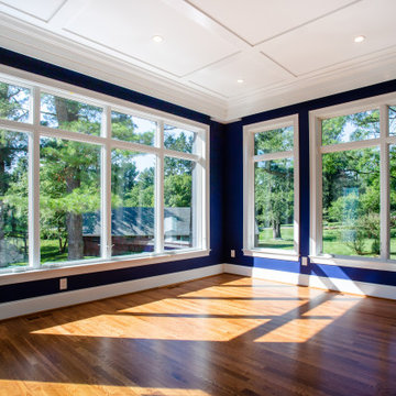
 Jordan Design Build Group
JDBG is wrapping up work on an expansive 2-story sunroom addition that also included modifications to the existing home’s interior and significant exterior improvements as well. The original project brief was to provide a conditioned 4-season sunroom addition where the homeowners could relax and enjoy their wooded views. As we delved deeper into our client’s overall objectives, it became clear that this would be no ordinary sunroom addition. The resulting 16’x25’ sunroom is a showstopper with 10’ high ceilings and wall to wall windows offering expansive views of the surrounding landscape.
As we recommend with most addition projects, the process started with our Preliminary Design Study to determine project goals, design concepts, project feasibility and associated budget estimates. During this process, our design team worked to ensure that both interior and exterior were fully integrated. We conducted in-depth programming to identify key goals and needs which would inform the design and performed a field survey and zoning analysis to identify any constraints that could impact the plans. The next step was to develop conceptual designs that addressed the program requirements.
Using a combination of 3-D massing, interior/exterior renderings, precedent imaging and space planning, the design concept was revised and refined. At the end of the study we had an approved schematic design and comprehensive budget estimates for the 2-story addition and were ready to move into design development, construction documentation, trade coordination, and final pricing. A complex project such as this involves architectural and interior design, structural and civil engineering, landscape design and environmental considerations. Multiple trades and subs are engaged during construction, from HVAC to electrical and plumbing, framers, carpenters and masons, roofers and painters just to name a few. JDBG was there every step of the way to ensure quality construction.
Other notable features of the renovation included expanding the home’s existing dining room, incorporating a custom ‘dish room,’ and providing fully conditioned storage and his & her workrooms on the lower level. A new front portico will visually connect the old and new structures and a brand new roof, shutters and paint will further transform the exterior. Thoughtful planning was also given to the landscape, including a back deck, stone patio and walkways, plantings and exterior lighting. Stay tuned for more photos as this sunroom addition nears completion.
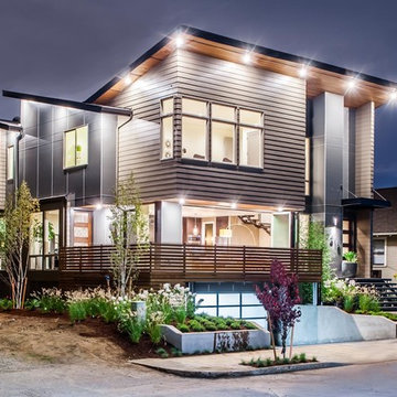 Rendering Space
www.RenderingSpace.com
Rendering Space provides high-end Real Estate and Property Marketing in the Pacific Northwest. We combine art with technology to provide the most visually engaging marketing available. Homes by Brent Keys homesbybrentkeys.com
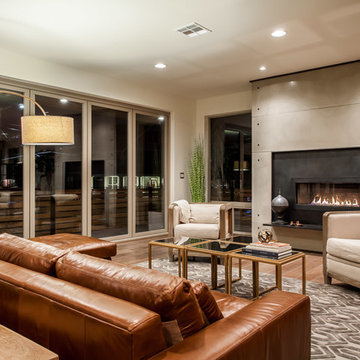 Rendering Space
www.RenderingSpace.com
Rendering Space provides high-end Real Estate and Property Marketing in the Pacific Northwest. We combine art with technology to provide the most visually engaging marketing available. Homes by Brent Keys homesbybrentkeys.com


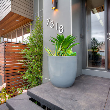 Rendering Space
www.RenderingSpace.com
Rendering Space provides high-end Real Estate and Property Marketing in the Pacific Northwest. We combine art with technology to provide the most visually engaging marketing available. Homes by Brent Keys homesbybrentkeys.com
 Advance Design Studio, Ltd.
Curtis and Peggy had been thinking of a kitchen remodel for quite some time, but they knew their house would have a unique set of challenges. Their older Victorian house was built in 1891. The kitchen cabinetry was original, and they wanted to keep the authenticity of their period home while adding modern comforts that would improve their quality of life.
A friend recommended Advance Design Studio for their exceptional experience and quality of work. After meeting with designer Michelle Lecinski at Advance Design, they were confident they could partner with Advance to accomplish the unique kitchen renovation they’d been talking about for years. “We wanted to do the kitchen for a long, long time,” Curtis said. “(We asked ourselves) what are we actually going to do? How are we going to do this? And who are we going to find to do exactly what we want?”
The goal for the project was to keep the home renovation and new kitchen feeling authentic to the time in which it was built. They desperately wanted the modern comforts that come with a larger refrigerator and the dishwasher that they never had! The old home was also a bit drafty so adding a fireplace, wall insulation and new windows became a priority. They very much wanted to create a comfortable hearth room adjacent to the kitchen, complete with old world brick.
The original cabinetry had to go to make way for beautiful new kitchen cabinetry that appears as if it was a hundred years old, but with all the benefits of cutting-edge storage, self-closing drawers, and a brand-new look. “We just wanted to keep it old looking, but with some modern updates,” Peggy said.
Dura Supreme Highland Cabinets with a Heritage Old World Painted Finish replaced the original 1891 cabinets. The hand-applied careful rubbed-off detailing makes these exquisite cabinets look as if they came from a far-gone era. Despite the small size of the kitchen, Peggy, Curtis and Michelle utilized every inch with custom cabinet sizes to increase storage capacity. The custom cabinets allowed for the addition of a 24” Fisher Paykel dishwasher with a concealing Dura Supreme door panel. Michelle was also able to work into the new design a larger 30” Fisher Paykel French refrigerator. “We made every ¼ inch count in this small space,” designer Michelle said. “Having the ability to custom size the cabinetry was the only way to achieve this.”
“The kitchen essentially was designed around the Heartland Vintage range and oven,” says Michelle. A classic appliance that combines nostalgic beauty and craftsmanship for modern cooking, with nickel plated trim and elegantly shaped handles and legs; the not to miss range is a striking focal point of the entire room and an engaging conversation piece.
Granite countertops in Kodiak Satin with subtle veining kept with the old-world style. The delicate porcelain La Vie Crackle Sonoma tile kitchen backsplash compliments the home’s style perfectly. A handcrafted passthrough designed to show off Peggy’s fine china was custom built by project carpenters Justin Davis and Jeff Dallain to physically and visually open the space. Additional storage was created in the custom panty room with Latte Edinburg cabinets, hand-made weathered wood shelving with authentic black iron brackets, and an intricate tin copper ceiling.
Peggy and Curtis loved the idea of adding a Vermont stove to make the hearth-room not only functional, but a truly beckoning place to be. A stunning Bordeaux red Vermont Castings Stove with crisp black ventilation was chosen and combined with the authentic reclaimed Chicago brick wall. Advance’s talented carpenters custom-built elegant weathered shelves to house family memorabilia, installed carefully chosen barn sconces, and made the hearth room an inviting place to relax with a cup of coffee and a good book.
“Peggy and Curtis’ project was so much fun to work on. Creating a space that looks and feels like it always belonged in this beautiful old Victorian home is a designer’s dream. To see the delight in their faces when they saw the design details coming together truly made it worth the time and effort that went into making the very compact kitchen space work”, said Michelle. “The result is an amazing custom kitchen, packed with functionality in every inch, nook and cranny!” exclaims Michelle.
The renovation didn’t end with the kitchen. New Pella windows were added to help lessen the drafts. The removal of the original windows and trim necessitated the re-creation of hand-made corbels and trim details no longer available today. The talented carpenter team came to the rescue, crafting new pieces and masterfully finishing them as if they were always there. New custom gutters were formed and installed with a front entry rework necessary to accommodate the changes.
The whole house functions better, but it still feels like the original 1891 home. “From start to finish it’s just a much better space than we used to have,” Peggy said. “Jeff and Justin were amazing.” Curtis added; “We were lucky to find Advance Design, because they really came through for us. I loved that they had everything in house, anything you needed to have done, they could do it”.
 Klopf Architecture
Malibu Glass Box House by Klopf Architecture
Following the devastating Woolsey Fire of 2018, the site in Malibu offered a unique opportunity to rebuild not just a home, but a new architectural composition that highlighted the property’s potential while navigating strict fire-rebuild codes in the area. Designed by Klopf Architecture, this project embraced a set of limitations and translated them into an architectural asset.
The city’s fire-rebuild process required the new structure to remain close to the original footprint, size and bulk, a constraint that ultimately clarified the architectural direction. Perched near the front of a long, narrow lot, the new home frames and overlooks a private, park-like rear expanse, an uncommon luxury especially in this part of Malibu .
Without a fixed program, the design process allowed for a different kind of creative focus allowing Klopf Architecture the opportunity to explore how a modernist home could best respond to this site. The team approached the project not with a list of requirements, but with a question: How might a modernist live here? What spatial qualities would inspire calm, connection, and a sense of wonder in this setting? The process became less about problem-solving and more about architectural storytelling—letting the site, the light, and the principles of modern design guide the form and flow of the home.
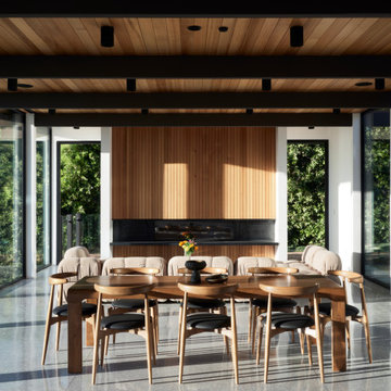
The response emerged in the form of a glass-box pavilion, an open, Mid-Century Modern inspired living, dining, and kitchen space that floats at the edge of the property’s natural descent. Connected to the more enclosed, private areas of the home by a glass-walled hallway, the living pavilion becomes a distinct centerpiece of the design. It opens on all four sides to the landscape with decks and patios on the flanks, an internal garden and water feature to the north, and a dramatic unguarded view of the expansive backyard and ocean horizon to the south.
Because of the mandated footprint, careful planning was required to ensure every space could still engage with light, landscape, or both. Strategic voids in the form of atriums and courtyards allow daylight to filter deep into the home’s core, while offering moments of surprise and retreat. These design gestures allow natural light to filter deep into the interior, creating a sense of brightness and openness throughout the day. At the same time, they expand the perceptual boundaries between inside and out, making the home feel more expansive while anchoring its connection to the surrounding landscape.
The siting of the house is what gives it its unique character. Rather than receding into the backyard like the neighboring homes, the house holds a slight prominence. From the central living pavilion, stepping down into the landscape feels more like entering a secluded park where a separate existing accessory structure, trail, and recreational areas await. The home’s modest street presence gives way to this unfolding drama of space, view, and nature.
Fire-resilient materials and assemblies are integrated seamlessly throughout including triple-pane glazing, under-slab and roof insulation, and locally sourced fire-rated cladding ensure the house not only meets Calfornia’s rigorous wildland-urban interface (WUI) standards, but feels effortlessly aligned with them. While technical decisions like fire-hardening and mechanical systems presented some construction challenges, particularly around the cantilevered glass box, the team found a functional compromise that preserved the integrity of the design.
Inside, a restrained palette and exposed post and beam design celebrate the ethos of mid-century modernism. A central circulation spine extends from the entry to the rear glass wall, offering a continuous visual link from street to ocean. Spaces such as the library and office, though more intimate in scale, are never cut off from nature as each opens to its own unique courtyard or garden view.
Though born out of a strict regulatory framework and developed without a specific client, the rebuild design unfolded with remarkable clarity. Grounded in site logic, refined by limitations and an emphasis on timeless spatial relationships – light, proportion, and a strong connection to nature, the resulting design feels both effortless and uplifting. The home lives lightly on the land, opens generously to its surroundings, and strikes a careful balance between privacy, openness, and calm. For Klopf Architecture, it stands as a compelling case study in how site, code, and circumstantial constraints can inspire enduring, modernist architecture. With years of experience reimagining mid-century modern design for how people live today, the firm took the project’s limitations as an opportunity. The result is a home shaped by open, flowing spaces, strong indoor-outdoor connections, and a calm, clear sense of structure. It’s a good reminder that even with strict constraints, there’s still room for architecture to breathe—and for modernism to keep moving forward.
Klopf Architecture project team: Geoff Campen, John Klopf, AIA, and Sherry Tan
Structural Engineer: ZFA
Contractor: Maison D’Artiste
Photography: ©2025 Mariko Reed
Year Completed: 2023
 Zume Builders
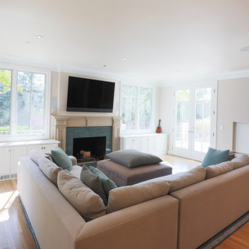
The family room boasts an abundance of natural light, thanks to large windows. During the day, the room is bathed in warm sunlight, creating a cheerful and inviting ambiance.
Whether it's hosting lively family gatherings, engaging in friendly conversations, or simply enjoying quiet moments, this family room is designed to accommodate all needs. Its combination of a TV mounted above the fireplace, built-in cabinets for storage, and well-thought-out lighting ensures that this space is as functional as it is visually appealing.
 Rendering Space
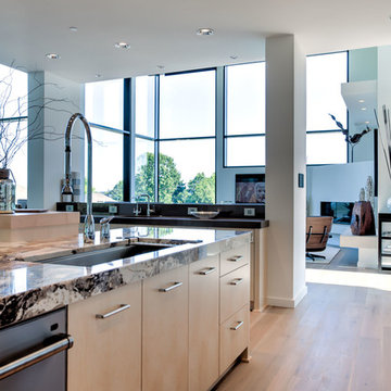
Explore 3D Virtual Tour at www.1911Highlands.com
Produced by www.RenderingSpace.com. Rendering Space provides high-end Real Estate and Property Marketing in the Pacific Northwest. We combine art with technology to provide the most visually engaging marketing available.
 Huber Interiors, LLC
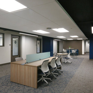
The CSU Foundation Office Remodel at Colorado State University in Fort Collins, CO, revitalizes a dated university space into a dynamic, modern workplace. This interior design project features a flexible, open floor plan to promote collaboration and functionality, incorporating a welcoming reception area, various open work zones, 15 private offices, a small conference room, and a break room, all tailored to the needs of employees and clients. Inspired by the Foundation’s existing office, designed in 2018, the remodel showcases a bold aesthetic with vibrant pops of color integrated through meticulously designed custom furniture. Our team crafted bespoke furniture pieces, carefully selecting fabrics and finishes to align with the Foundation’s signature color palette, ensuring a cohesive and striking visual identity. A creative exposed ceiling, painted dark to enhance the sense of height in the low-ceiling space, is complemented by modern light fixtures, creating an inviting and dynamic atmosphere. In addition to design, our team played a pivotal role in managing the construction process, conducting regular site visits and thorough submittal reviews to ensure seamless execution and adherence to the project vision. This design reflects the CSU Foundation’s vibrant personality and passion, delivering an engaging and inspiring environment that enhances productivity and leaves a lasting impression on visitors.


 Klopf Architecture
Malibu Glass Box House by Klopf Architecture
Following the devastating Woolsey Fire of 2018, the site in Malibu offered a unique opportunity to rebuild not just a home, but a new architectural composition that highlighted the property’s potential while navigating strict fire-rebuild codes in the area. Designed by Klopf Architecture, this project embraced a set of limitations and translated them into an architectural asset.
The city’s fire-rebuild process required the new structure to remain close to the original footprint, size and bulk, a constraint that ultimately clarified the architectural direction. Perched near the front of a long, narrow lot, the new home frames and overlooks a private, park-like rear expanse, an uncommon luxury especially in this part of Malibu .
Without a fixed program, the design process allowed for a different kind of creative focus allowing Klopf Architecture the opportunity to explore how a modernist home could best respond to this site. The team approached the project not with a list of requirements, but with a question: How might a modernist live here? What spatial qualities would inspire calm, connection, and a sense of wonder in this setting? The process became less about problem-solving and more about architectural storytelling—letting the site, the light, and the principles of modern design guide the form and flow of the home.
The response emerged in the form of a glass-box pavilion, an open, Mid-Century Modern inspired living, dining, and kitchen space that floats at the edge of the property’s natural descent. Connected to the more enclosed, private areas of the home by a glass-walled hallway, the living pavilion becomes a distinct centerpiece of the design. It opens on all four sides to the landscape with decks and patios on the flanks, an internal garden and water feature to the north, and a dramatic unguarded view of the expansive backyard and ocean horizon to the south.
Because of the mandated footprint, careful planning was required to ensure every space could still engage with light, landscape, or both. Strategic voids in the form of atriums and courtyards allow daylight to filter deep into the home’s core, while offering moments of surprise and retreat. These design gestures allow natural light to filter deep into the interior, creating a sense of brightness and openness throughout the day. At the same time, they expand the perceptual boundaries between inside and out, making the home feel more expansive while anchoring its connection to the surrounding landscape.
The siting of the house is what gives it its unique character. Rather than receding into the backyard like the neighboring homes, the house holds a slight prominence. From the central living pavilion, stepping down into the landscape feels more like entering a secluded park where a separate existing accessory structure, trail, and recreational areas await. The home’s modest street presence gives way to this unfolding drama of space, view, and nature.
Fire-resilient materials and assemblies are integrated seamlessly throughout including triple-pane glazing, under-slab and roof insulation, and locally sourced fire-rated cladding ensure the house not only meets Calfornia’s rigorous wildland-urban interface (WUI) standards, but feels effortlessly aligned with them. While technical decisions like fire-hardening and mechanical systems presented some construction challenges, particularly around the cantilevered glass box, the team found a functional compromise that preserved the integrity of the design.
Inside, a restrained palette and exposed post and beam design celebrate the ethos of mid-century modernism. A central circulation spine extends from the entry to the rear glass wall, offering a continuous visual link from street to ocean. Spaces such as the library and office, though more intimate in scale, are never cut off from nature as each opens to its own unique courtyard or garden view.
Though born out of a strict regulatory framework and developed without a specific client, the rebuild design unfolded with remarkable clarity. Grounded in site logic, refined by limitations and an emphasis on timeless spatial relationships – light, proportion, and a strong connection to nature, the resulting design feels both effortless and uplifting. The home lives lightly on the land, opens generously to its surroundings, and strikes a careful balance between privacy, openness, and calm. For Klopf Architecture, it stands as a compelling case study in how site, code, and circumstantial constraints can inspire enduring, modernist architecture. With years of experience reimagining mid-century modern design for how people live today, the firm took the project’s limitations as an opportunity. The result is a home shaped by open, flowing spaces, strong indoor-outdoor connections, and a calm, clear sense of structure. It’s a good reminder that even with strict constraints, there’s still room for architecture to breathe—and for modernism to keep moving forward.
Klopf Architecture project team: Geoff Campen, John Klopf, AIA, and Sherry Tan
Structural Engineer: ZFA
Contractor: Maison D’Artiste
Photography: ©2025 Mariko Reed
Year Completed: 2023
 Rendering Space
www.RenderingSpace.com
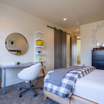
Rendering Space provides high-end Real Estate and Property Marketing in the Pacific Northwest. We combine art with technology to provide the most visually engaging marketing available. Homes by Brent Keys homesbybrentkeys.com
 Lexy Design
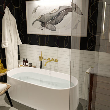
This space is inspired by my eclectic tastes and my love of mid-century esthetic. 3D photo visualizations help me test lighting, textures, and create a presentation that really engages us to explore every detail. All assets are modeled from real life materials and hardware and can be easily be purchased.
 Alliance Designs LLC
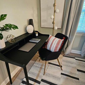
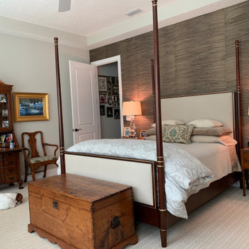
The vibrant and lively condo interior is characterized by a rich mixture of patterns and prints that create a visually dynamic and engaging space. The strategic use of wallpaper and terrazzo tile not only adds depth and texture but also infuses the environment with a sense of playfulness and creativity, making it an inviting and enjoyable area for both residents and guests.
Sponsored
Columbus, OH

Snider & Metcalf Interior Design, LTD
Leading Interior Designers in Columbus, Ohio & Ponte Vedra, Florida
 RMG Space Designs
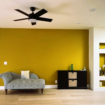
The play of niches adds depth to the room, allowing for a creative use of colour to enhance the overall aesthetic. Additionally, the recessed wall adds visual interest, creating depth and dimension rather than flatness. This combination ensures that the space feels dynamic and engaging
 Luxe Custom Homes
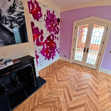
This luxury bedroom combines refined craftsmanship with artistic design to create a calm yet visually engaging space. The room features custom herringbone flooring, soft lavender walls, and bold floral accent art that adds personality and depth. Natural light pours through large French doors and geometric windows, highlighting the room’s elegant architectural details.
The black marble fireplace and custom millwork provide warmth and texture, creating a balance between sophistication and comfort. Every element was thoughtfully designed to reflect a modern yet timeless aesthetic that enhances both relaxation and style.
Our team specializes in custom homes and luxury interiors across Middle Tennessee, bringing distinctive design and exceptional quality to every project.
 Rendering Space
Explore 3D Virtual Tour at www.1911Highlands.com
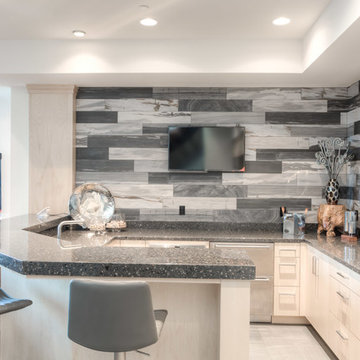
Produced by www.RenderingSpace.com. Rendering Space provides high-end Real Estate and Property Marketing in the Pacific Northwest. We combine art with technology to provide the most visually engaging marketing available.
12