
Search results for "Enhances problem solving" in Home Design Ideas
 Schulte Design Build
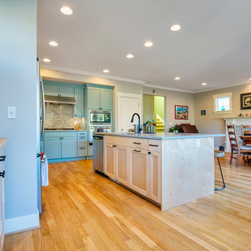
This kitchen project is in a newer build home (2007). The family liked everything about the space except for the island layout and location. Both ends of it were pinch points which made it cumbersome for multiple people to be in the space at a time. They liked the granite countertops but the one on the island was damaged and needed to be replaced to accommodate the new island configuration. Due to this, it made sense to replace all the countertops with quartz. The perimeter cabinets were in good shape but were a dark color which made the space dark and uninviting. We solved this by painting them a bright green/blue color with a two-part water-based paint. We added a couple of other cabinets in the adjacent spaces to provide them with more needed storage which did not impact the kitchen space. We relocated the existing 3 recessed lights over the island which saved them from the landfill. We replaced the old under cabinet fluorescent light fixtures with new energy efficient LED channel fixtures that provide much better counter task lighting. We painted both the ceiling and walls to freshen up the space. As you can see, we were able to solve this family’s kitchen problems in both an environmentally and budget conscious way with creative solutions.
 Drury Design
THE SETUP
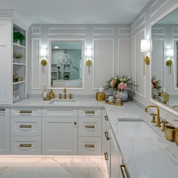
The original primary bathroom was characterized by a disjointed and segmented layout. The shower featured a bulky glass-block enclosure that overwhelmed the space visually. There was a considerable amount of open, unused space, and despite having a his and hers vanity, the arrangement lacked personal space for each user, as they shared the conjoined space between the sinks. The toilet was inconveniently located right by the door, with a half-wall partition meant to provide privacy but instead contributing to a cramped and unbalanced feel. Overall, the bathroom’s layout and design were fragmented, failing to make the most of the available space and lacking adequate storage solutions.
Design objectives:
- Reconfigure the layout to enhance functionality and flow.
- Create an elegant, upscale aesthetic that is light and bright.
- Incorporate specialized storage solutions for female hair care needs.
- Increase overall storage capacity.
- Develop a spa-like shower experience.
- Provide a significant wow factor to the space.
THE REMODEL
Design challenges to be solved:
- Repositioning the toilet to a more suitable location.
- Designing hair care storage solutions without cluttering the elegant space.
- Balancing an upscale, elegant design with a feminine touch in the color palette.
- Increasing the brightness of the room without adding windows.
- Completely replacing the existing shower to create a spa-like experience.
- Planning new storage solutions without adding bulkiness or clutter to the cabinetry.
THE RENEWED SPACE
Design solutions:
Toilet Relocation: Moved the toilet by the window, creating a better overall layout that also opened up two full walls for cabinetry and storage solutions.
Specialized Vanity Storage: The left side of the left vanity is the wife’s. Open shelves facing across the vanity can be used for decorative or daily needs items. Pull-out docking drawers with power outlets and metal basins handle hot hair appliances.
Bright and Elegant Color Scheme: White cabinets, countertops, floors, and shower walls keep the space bright. The just-off-white wall color with a hint of pink adds a feminine touch. Thin wainscoting with white trim offers traditional-leaning elegance.
Layered Lighting Strategy: Ceiling can lights, sconces, lighted mirrors, and toe-kick lighting were installed. Natural light-rated bulbs keep the space bright and natural-feeling.
Spa-Like Shower: An extra-large shower was created using the same floor tile materials for continuity. Equipped with a Kohler Anthem system with a shower head, hand-held, and four body sprays. His and Hers niches for separate body care product storage.
Enhanced Storage Solutions: Added a linen cabinet within the vanity area for efficient storage of towels and bathroom essentials.
This elegant bathroom feels incredibly spacious now. The color palette and lights keep the room bright and cheery. Gold fixtures, the herringbone pattern on the floor, and exquisite trim work add an elegant touch. With the husband and wife having their own vanity wall sections joined at the corner, each user truly has their own space within the space. The clients are very happy with the final result.
 Roof-Tastic & Beyond Exteriors
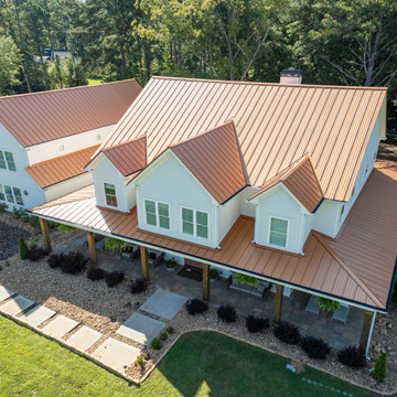
Mr. B has had constant issues with his 3 year old roof. He had the builder come look at the issues countless times and has had no success in solving the problem. When Jake came out from Roof-Tastic and did a thorough attic inspection, he found multiple leaking areas around the home and was able to show Mr. B exactly how these issues started. Mr. B said he was tired of trying to solve the issue through the builder and decided to move forward with a leak free metal roof.
Find the right local pro for your project

 Eleanora Robinson
Start with Custom College Term Papers
Being in college means having same assignments you had in high school, only of the higher level of complexity. This can cause certain problems. If you need to turn in a term paper, but do not clearly understand how a more complex term paper should look like, you should think of ordering a custom college term paper on https://writemypaperbro.com/
The Benefits of a Custom College Term Paper
Remember, how easy it was in school dealing with term papers. College makes it more difficult. A custom college term paper will help you solve many problems. First of all, a custom college term paper will help you step aside from school requirements and painlessly move to a new level. After all, there is nothing wrong about ordering a custom college term paper if you know you are no Shakespeare in writing.
All custom college term papers are written by experienced writers. Depending on the subject, a custom college term paper will be completed by a specialist in the sphere, and this gives your custom college term paper extra benefits. You have a chance to buy cheap term paper of high quality.
This does not mean you will have to order custom college term papers all the time. One custom college term paper can serve as a perfect example of what a college assignment should look like. Such a term paper example includes the content, paper format, parts of the assignment, and the final goal. Think how you are saving. By ordering a custom college term paper, you get rid of the necessity to look for pattern for your next assignments, because you already have a perfect example. It is only up to you how to use your custom college term paper. However, if you like what you get from the writing service, you can always come back for more.
 Drury Design
THE SETUP
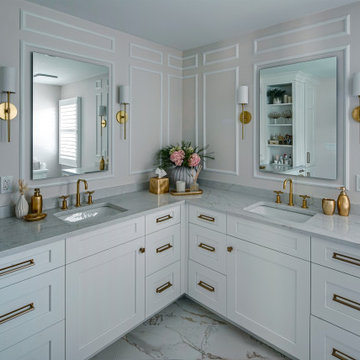
The original primary bathroom was characterized by a disjointed and segmented layout. The shower featured a bulky glass-block enclosure that overwhelmed the space visually. There was a considerable amount of open, unused space, and despite having a his and hers vanity, the arrangement lacked personal space for each user, as they shared the conjoined space between the sinks. The toilet was inconveniently located right by the door, with a half-wall partition meant to provide privacy but instead contributing to a cramped and unbalanced feel. Overall, the bathroom’s layout and design were fragmented, failing to make the most of the available space and lacking adequate storage solutions.
Design objectives:
- Reconfigure the layout to enhance functionality and flow.
- Create an elegant, upscale aesthetic that is light and bright.
- Incorporate specialized storage solutions for female hair care needs.
- Increase overall storage capacity.
- Develop a spa-like shower experience.
- Provide a significant wow factor to the space.
THE REMODEL
Design challenges to be solved:
- Repositioning the toilet to a more suitable location.
- Designing hair care storage solutions without cluttering the elegant space.
- Balancing an upscale, elegant design with a feminine touch in the color palette.
- Increasing the brightness of the room without adding windows.
- Completely replacing the existing shower to create a spa-like experience.
- Planning new storage solutions without adding bulkiness or clutter to the cabinetry.
THE RENEWED SPACE
Design solutions:
Toilet Relocation: Moved the toilet by the window, creating a better overall layout that also opened up two full walls for cabinetry and storage solutions.
Specialized Vanity Storage: The left side of the left vanity is the wife’s. Open shelves facing across the vanity can be used for decorative or daily needs items. Pull-out docking drawers with power outlets and metal basins handle hot hair appliances.
Bright and Elegant Color Scheme: White cabinets, countertops, floors, and shower walls keep the space bright. The just-off-white wall color with a hint of pink adds a feminine touch. Thin wainscoting with white trim offers traditional-leaning elegance.
Layered Lighting Strategy: Ceiling can lights, sconces, lighted mirrors, and toe-kick lighting were installed. Natural light-rated bulbs keep the space bright and natural-feeling.
Spa-Like Shower: An extra-large shower was created using the same floor tile materials for continuity. Equipped with a Kohler Anthem system with a shower head, hand-held, and four body sprays. His and Hers niches for separate body care product storage.
Enhanced Storage Solutions: Added a linen cabinet within the vanity area for efficient storage of towels and bathroom essentials.
This elegant bathroom feels incredibly spacious now. The color palette and lights keep the room bright and cheery. Gold fixtures, the herringbone pattern on the floor, and exquisite trim work add an elegant touch. With the husband and wife having their own vanity wall sections joined at the corner, each user truly has their own space within the space. The clients are very happy with the final result.
 Land2c Landscape Architecture
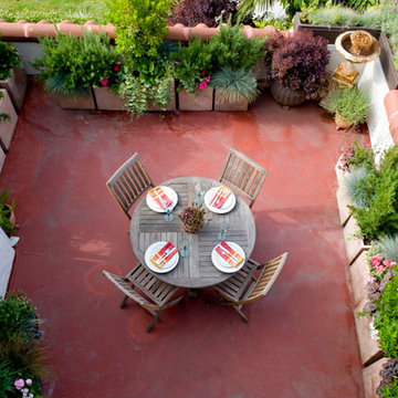
This expansive condominium terrace needed privacy from an apartment building across the street to the right and the adjacent neighbor to the left. Light-weight fiber pots filled with varied heights of plants solved that problem. The area is now more private and welcoming with colorful Mediterranean-type plants. The tallest shrubs are compact Strawberry Trees (Arbutus unedo 'Compacta'.
 Natural Path Landscaping
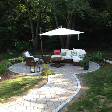
The owners wanted a restful patio with some shade. The raised patio solved the sloping yard problem and allowed better utilization of their property.
Inspiration for a large contemporary concrete paver patio remodel in Boston
Inspiration for a large contemporary concrete paver patio remodel in Boston
 Betz Pools Limited
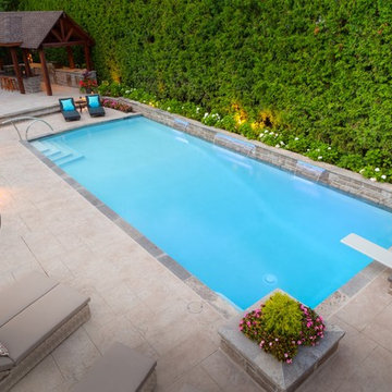
The dazzling focal point of this Thornhill backyard is a dry Gunite pool with premium PebbleTec white glass bead interior and Wiarton flagstone coping. The backyard had a drainage problem which was solved with a sloping raised upper patio in architecturally stamped concrete to re-direct the runoff away from the house. (18 x 42 custom rectangular)
 N Sabella Inc
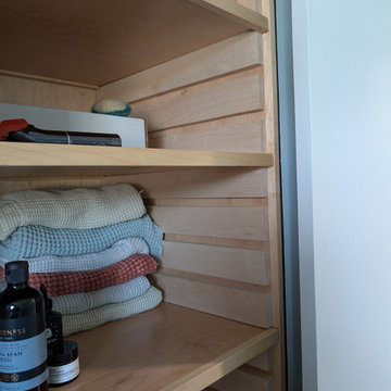
This bathroom converted from a small bedroom in a ranch-style home on a concrete slab, is now a beautiful, light-filled retreat. One of the biggest challenges in this transformation was the plumbing. With the home built on a slab, running new lines required creative problem-solving. But the result was worth it: a custom walk-in shower with frameless glass that keeps the space feeling airy and expansive.
The client gravitated toward natural finishes, so we balanced modern simplicity with warm wood tones. Custom-built open shelving features sliding pull-out shelves for easy access and a clean, tailored look. The vanity’s natural woodgrain adds warmth, while brushed nickel fixtures maintain a streamlined, modern aesthetic.
 User
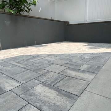
UserOpen Graded crushed stone base with proper drainage grid was installed to effectively address water accumulation. Quality Permeable Concrete Paver Patio was installed to successfully absorb any rain water AND re-route raising ground water to the new drainage system. Another water problem solved, and Owners gained a beautiful hard surface patio to enjoy.
 Bullseye Wood Specialties, L.L.C
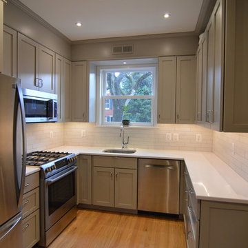
This compact DC kitchen was in dire need of space saving tricks and we used several. The kitchen features two tip-on toe kick drawers, sink tilt out, lazy susan, blind corner cabinet and custom vertical wood dividers over the frig. The original kitchen layout was L shaped because space did not allow for full depth base cabinets on the right wall. Problem solved -- we simply built cabinets that were 18" deep which still provide loads of storage as well as much needed counter top space.
 Rhodes Architecture + Light
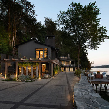
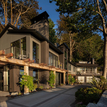
The renovation of an extensive linear residence and site facing Port Orchard waterway embraces water, greenspace and forested hillside. The home, completed this fall, serves as an artist’s studio, galleries, family space, game room, outdoor living areas and peaceful retreat.
New interiors and exterior spaces and finishes, cabinetry, lighting, paving, landscape and courtyards become settings for the owner’s art + collections, three-generations of family and the wonderful colors and textures of the land + water.
Inside, a monumental central stair and tapered two-story tall red cedar and steel column was designed as the residence’s entry focal point and internal landmarks, guiding the visitor’s eye to the main atrium…. and upward. Heavy wide-flange steel moment frames support the house and enable whole walls of glass. Rough, mill-finished steel contrasts refined cabinetry, stone, wood structure and defining dropped ceilings, reflecting the opener’s love of the tension between highly polished and detailed + rough, found art.
Outside, A new southern “dining room” was designed for warm summer evening gatherings under a heavy-timber trellis. The focus, opposite water and island views, is a metal perforated screen. The final screen is composed of the lyrics from a Joe Cocker song of great meaning to the owners, cut from ½” marine bronze, set into dark-fired brick. “Oh My Darling, Be Home Soon….”
Natural daylight and high-efficiency lighting are central players as in any gallery. From a high clerestory and extensive southern and eastern window-walls to carefully selected up-lighting, pendants, and accent fixtures, Rhodes Architecture + Light worked closely with the owner to ensure that their dark existing house would become one filled with light…. night and day.
The owners, Ken and Jane, allowed us to interview them about their experience working with Rhodes Architecture + Light, and how they are feeling about living with the architecture today.
What was your experience like, working with Rhodes Architecture + Light?
“They worked with us because it was a remodel, an existing thing, and we had to try to make it work for all of our interests and how our family operated. They listened, and we listened, and it was a great communication back and forth.”–Jane
How has the renovation changed the way you live and enjoy your home?
“I remember saying to them that I want the whole floor heated because it gets so chilly down here. And we had the wood burning stove, but it was over there and now we just turn the floor heat on and we can come down. It’s cozy and nice. So we’re looking forward to winter now.”–Ken
“We have 5 kids together and now a bunch of grandchildren. I wanted a marble countertop, but there’s just no way. I didn’t want it to be a place where I had to say, ‘No, no, no. Wipe up your drink, do this, do that.’ I wanted it to be a place where everybody can come with all the kids, and we make a big mess, and I can clean it up. And we can enjoy ourselves here, because that room upstairs, we almost never went in. And now we’re in there eating pizza and watching the game.” –Jane
As an artist, Jane enjoyed the collaborative process.
“I can’t believe it was as positive as it was. I went into it thinking it would be a great, creative, fun, collaborative thing, and I have to say, with our architects, it was. I like that creative process. I always say when I am doing a painting, it’s a series of problem solving so it wasn’t unusual for me. I am completely blown away by them and had fun with that part of it.” –Jane
Architect: Tim James Rhodes RA AIA, Rhodes Architecture + Light
Builder: Fairbank Construction Company
Structural: Swensen Say Faget
 Klopf Architecture
Malibu Glass Box House by Klopf Architecture
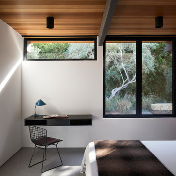
Following the devastating Woolsey Fire of 2018, the site in Malibu offered a unique opportunity to rebuild not just a home, but a new architectural composition that highlighted the property’s potential while navigating strict fire-rebuild codes in the area. Designed by Klopf Architecture, this project embraced a set of limitations and translated them into an architectural asset.
The city’s fire-rebuild process required the new structure to remain close to the original footprint, size and bulk, a constraint that ultimately clarified the architectural direction. Perched near the front of a long, narrow lot, the new home frames and overlooks a private, park-like rear expanse, an uncommon luxury especially in this part of Malibu .
Without a fixed program, the design process allowed for a different kind of creative focus allowing Klopf Architecture the opportunity to explore how a modernist home could best respond to this site. The team approached the project not with a list of requirements, but with a question: How might a modernist live here? What spatial qualities would inspire calm, connection, and a sense of wonder in this setting? The process became less about problem-solving and more about architectural storytelling—letting the site, the light, and the principles of modern design guide the form and flow of the home.
The response emerged in the form of a glass-box pavilion, an open, Mid-Century Modern inspired living, dining, and kitchen space that floats at the edge of the property’s natural descent. Connected to the more enclosed, private areas of the home by a glass-walled hallway, the living pavilion becomes a distinct centerpiece of the design. It opens on all four sides to the landscape with decks and patios on the flanks, an internal garden and water feature to the north, and a dramatic unguarded view of the expansive backyard and ocean horizon to the south.
Because of the mandated footprint, careful planning was required to ensure every space could still engage with light, landscape, or both. Strategic voids in the form of atriums and courtyards allow daylight to filter deep into the home’s core, while offering moments of surprise and retreat. These design gestures allow natural light to filter deep into the interior, creating a sense of brightness and openness throughout the day. At the same time, they expand the perceptual boundaries between inside and out, making the home feel more expansive while anchoring its connection to the surrounding landscape.
The siting of the house is what gives it its unique character. Rather than receding into the backyard like the neighboring homes, the house holds a slight prominence. From the central living pavilion, stepping down into the landscape feels more like entering a secluded park where a separate existing accessory structure, trail, and recreational areas await. The home’s modest street presence gives way to this unfolding drama of space, view, and nature.
Fire-resilient materials and assemblies are integrated seamlessly throughout including triple-pane glazing, under-slab and roof insulation, and locally sourced fire-rated cladding ensure the house not only meets Calfornia’s rigorous wildland-urban interface (WUI) standards, but feels effortlessly aligned with them. While technical decisions like fire-hardening and mechanical systems presented some construction challenges, particularly around the cantilevered glass box, the team found a functional compromise that preserved the integrity of the design.
Inside, a restrained palette and exposed post and beam design celebrate the ethos of mid-century modernism. A central circulation spine extends from the entry to the rear glass wall, offering a continuous visual link from street to ocean. Spaces such as the library and office, though more intimate in scale, are never cut off from nature as each opens to its own unique courtyard or garden view.
Though born out of a strict regulatory framework and developed without a specific client, the rebuild design unfolded with remarkable clarity. Grounded in site logic, refined by limitations and an emphasis on timeless spatial relationships – light, proportion, and a strong connection to nature, the resulting design feels both effortless and uplifting. The home lives lightly on the land, opens generously to its surroundings, and strikes a careful balance between privacy, openness, and calm. For Klopf Architecture, it stands as a compelling case study in how site, code, and circumstantial constraints can inspire enduring, modernist architecture. With years of experience reimagining mid-century modern design for how people live today, the firm took the project’s limitations as an opportunity. The result is a home shaped by open, flowing spaces, strong indoor-outdoor connections, and a calm, clear sense of structure. It’s a good reminder that even with strict constraints, there’s still room for architecture to breathe—and for modernism to keep moving forward.
Klopf Architecture project team: Geoff Campen, John Klopf, AIA, and Sherry Tan
Structural Engineer: ZFA
Contractor: Maison D’Artiste
Photography: ©2025 Mariko Reed
Year Completed: 2023
 Rhodes Architecture + Light
The renovation of an extensive linear residence and site facing Port Orchard waterway embraces water, greenspace and forested hillside. The home, completed this fall, serves as an artist’s studio, galleries, family space, game room, outdoor living areas and peaceful retreat.
New interiors and exterior spaces and finishes, cabinetry, lighting, paving, landscape and courtyards become settings for the owner’s art + collections, three-generations of family and the wonderful colors and textures of the land + water.
Inside, a monumental central stair and tapered two-story tall red cedar and steel column was designed as the residence’s entry focal point and internal landmarks, guiding the visitor’s eye to the main atrium…. and upward. Heavy wide-flange steel moment frames support the house and enable whole walls of glass. Rough, mill-finished steel contrasts refined cabinetry, stone, wood structure and defining dropped ceilings, reflecting the opener’s love of the tension between highly polished and detailed + rough, found art.
Outside, A new southern “dining room” was designed for warm summer evening gatherings under a heavy-timber trellis. The focus, opposite water and island views, is a metal perforated screen. The final screen is composed of the lyrics from a Joe Cocker song of great meaning to the owners, cut from ½” marine bronze, set into dark-fired brick. “Oh My Darling, Be Home Soon….”
Natural daylight and high-efficiency lighting are central players as in any gallery. From a high clerestory and extensive southern and eastern window-walls to carefully selected up-lighting, pendants, and accent fixtures, Rhodes Architecture + Light worked closely with the owner to ensure that their dark existing house would become one filled with light…. night and day.
The owners, Ken and Jane, allowed us to interview them about their experience working with Rhodes Architecture + Light, and how they are feeling about living with the architecture today.
What was your experience like, working with Rhodes Architecture + Light?
“They worked with us because it was a remodel, an existing thing, and we had to try to make it work for all of our interests and how our family operated. They listened, and we listened, and it was a great communication back and forth.”–Jane
How has the renovation changed the way you live and enjoy your home?
“I remember saying to them that I want the whole floor heated because it gets so chilly down here. And we had the wood burning stove, but it was over there and now we just turn the floor heat on and we can come down. It’s cozy and nice. So we’re looking forward to winter now.”–Ken
“We have 5 kids together and now a bunch of grandchildren. I wanted a marble countertop, but there’s just no way. I didn’t want it to be a place where I had to say, ‘No, no, no. Wipe up your drink, do this, do that.’ I wanted it to be a place where everybody can come with all the kids, and we make a big mess, and I can clean it up. And we can enjoy ourselves here, because that room upstairs, we almost never went in. And now we’re in there eating pizza and watching the game.” –Jane
As an artist, Jane enjoyed the collaborative process.
“I can’t believe it was as positive as it was. I went into it thinking it would be a great, creative, fun, collaborative thing, and I have to say, with our architects, it was. I like that creative process. I always say when I am doing a painting, it’s a series of problem solving so it wasn’t unusual for me. I am completely blown away by them and had fun with that part of it.” –Jane
Architect: Tim James Rhodes RA AIA, Rhodes Architecture + Light
Builder: Fairbank Construction Company
Structural: Swensen Say Faget
 Klopf Architecture
Malibu Glass Box House by Klopf Architecture
Following the devastating Woolsey Fire of 2018, the site in Malibu offered a unique opportunity to rebuild not just a home, but a new architectural composition that highlighted the property’s potential while navigating strict fire-rebuild codes in the area. Designed by Klopf Architecture, this project embraced a set of limitations and translated them into an architectural asset.
The city’s fire-rebuild process required the new structure to remain close to the original footprint, size and bulk, a constraint that ultimately clarified the architectural direction. Perched near the front of a long, narrow lot, the new home frames and overlooks a private, park-like rear expanse, an uncommon luxury especially in this part of Malibu .
Without a fixed program, the design process allowed for a different kind of creative focus allowing Klopf Architecture the opportunity to explore how a modernist home could best respond to this site. The team approached the project not with a list of requirements, but with a question: How might a modernist live here? What spatial qualities would inspire calm, connection, and a sense of wonder in this setting? The process became less about problem-solving and more about architectural storytelling—letting the site, the light, and the principles of modern design guide the form and flow of the home.
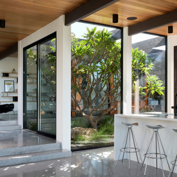
The response emerged in the form of a glass-box pavilion, an open, Mid-Century Modern inspired living, dining, and kitchen space that floats at the edge of the property’s natural descent. Connected to the more enclosed, private areas of the home by a glass-walled hallway, the living pavilion becomes a distinct centerpiece of the design. It opens on all four sides to the landscape with decks and patios on the flanks, an internal garden and water feature to the north, and a dramatic unguarded view of the expansive backyard and ocean horizon to the south.
Because of the mandated footprint, careful planning was required to ensure every space could still engage with light, landscape, or both. Strategic voids in the form of atriums and courtyards allow daylight to filter deep into the home’s core, while offering moments of surprise and retreat. These design gestures allow natural light to filter deep into the interior, creating a sense of brightness and openness throughout the day. At the same time, they expand the perceptual boundaries between inside and out, making the home feel more expansive while anchoring its connection to the surrounding landscape.
The siting of the house is what gives it its unique character. Rather than receding into the backyard like the neighboring homes, the house holds a slight prominence. From the central living pavilion, stepping down into the landscape feels more like entering a secluded park where a separate existing accessory structure, trail, and recreational areas await. The home’s modest street presence gives way to this unfolding drama of space, view, and nature.
Fire-resilient materials and assemblies are integrated seamlessly throughout including triple-pane glazing, under-slab and roof insulation, and locally sourced fire-rated cladding ensure the house not only meets Calfornia’s rigorous wildland-urban interface (WUI) standards, but feels effortlessly aligned with them. While technical decisions like fire-hardening and mechanical systems presented some construction challenges, particularly around the cantilevered glass box, the team found a functional compromise that preserved the integrity of the design.
Inside, a restrained palette and exposed post and beam design celebrate the ethos of mid-century modernism. A central circulation spine extends from the entry to the rear glass wall, offering a continuous visual link from street to ocean. Spaces such as the library and office, though more intimate in scale, are never cut off from nature as each opens to its own unique courtyard or garden view.
Though born out of a strict regulatory framework and developed without a specific client, the rebuild design unfolded with remarkable clarity. Grounded in site logic, refined by limitations and an emphasis on timeless spatial relationships – light, proportion, and a strong connection to nature, the resulting design feels both effortless and uplifting. The home lives lightly on the land, opens generously to its surroundings, and strikes a careful balance between privacy, openness, and calm. For Klopf Architecture, it stands as a compelling case study in how site, code, and circumstantial constraints can inspire enduring, modernist architecture. With years of experience reimagining mid-century modern design for how people live today, the firm took the project’s limitations as an opportunity. The result is a home shaped by open, flowing spaces, strong indoor-outdoor connections, and a calm, clear sense of structure. It’s a good reminder that even with strict constraints, there’s still room for architecture to breathe—and for modernism to keep moving forward.
Klopf Architecture project team: Geoff Campen, John Klopf, AIA, and Sherry Tan
Structural Engineer: ZFA
Contractor: Maison D’Artiste
Photography: ©2025 Mariko Reed
Year Completed: 2023
 unique creations
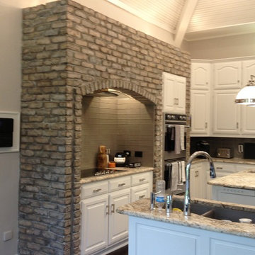
A tear out of old brick is not necessary. Thanks to Faux Effects International products, this brick has a brand new contemporary look. This kitchen is now complete and beautiful!
 Kaestner Designs - Kitchens, Baths & Interiors
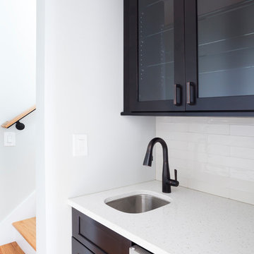
I was asked to design a compact wet bar for the space under the stairs that led to the roof deck. Problem solved! This design features glass-door upper cabinets with a sink base and panels for the lower portion that were designed around a compact beverage center and a bar sink. Quartz counters and oil rubbed bronze faucet highlight this project. Sleek subway tiles in white provide the perfect backdrop for this small but useful space!
 Rhodes Architecture + Light
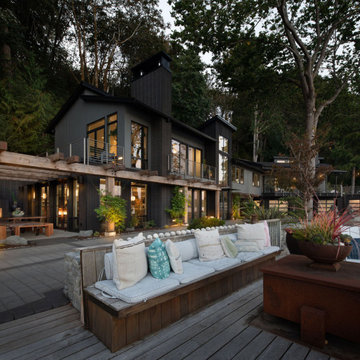
The renovation of an extensive linear residence and site facing Port Orchard waterway embraces water, greenspace and forested hillside. The home, completed this fall, serves as an artist’s studio, galleries, family space, game room, outdoor living areas and peaceful retreat.
New interiors and exterior spaces and finishes, cabinetry, lighting, paving, landscape and courtyards become settings for the owner’s art + collections, three-generations of family and the wonderful colors and textures of the land + water.
Inside, a monumental central stair and tapered two-story tall red cedar and steel column was designed as the residence’s entry focal point and internal landmarks, guiding the visitor’s eye to the main atrium…. and upward. Heavy wide-flange steel moment frames support the house and enable whole walls of glass. Rough, mill-finished steel contrasts refined cabinetry, stone, wood structure and defining dropped ceilings, reflecting the opener’s love of the tension between highly polished and detailed + rough, found art.
Outside, A new southern “dining room” was designed for warm summer evening gatherings under a heavy-timber trellis. The focus, opposite water and island views, is a metal perforated screen. The final screen is composed of the lyrics from a Joe Cocker song of great meaning to the owners, cut from ½” marine bronze, set into dark-fired brick. “Oh My Darling, Be Home Soon….”
Natural daylight and high-efficiency lighting are central players as in any gallery. From a high clerestory and extensive southern and eastern window-walls to carefully selected up-lighting, pendants, and accent fixtures, Rhodes Architecture + Light worked closely with the owner to ensure that their dark existing house would become one filled with light…. night and day.
The owners, Ken and Jane, allowed us to interview them about their experience working with Rhodes Architecture + Light, and how they are feeling about living with the architecture today.
What was your experience like, working with Rhodes Architecture + Light?
“They worked with us because it was a remodel, an existing thing, and we had to try to make it work for all of our interests and how our family operated. They listened, and we listened, and it was a great communication back and forth.”–Jane
How has the renovation changed the way you live and enjoy your home?
“I remember saying to them that I want the whole floor heated because it gets so chilly down here. And we had the wood burning stove, but it was over there and now we just turn the floor heat on and we can come down. It’s cozy and nice. So we’re looking forward to winter now.”–Ken
“We have 5 kids together and now a bunch of grandchildren. I wanted a marble countertop, but there’s just no way. I didn’t want it to be a place where I had to say, ‘No, no, no. Wipe up your drink, do this, do that.’ I wanted it to be a place where everybody can come with all the kids, and we make a big mess, and I can clean it up. And we can enjoy ourselves here, because that room upstairs, we almost never went in. And now we’re in there eating pizza and watching the game.” –Jane
As an artist, Jane enjoyed the collaborative process.
“I can’t believe it was as positive as it was. I went into it thinking it would be a great, creative, fun, collaborative thing, and I have to say, with our architects, it was. I like that creative process. I always say when I am doing a painting, it’s a series of problem solving so it wasn’t unusual for me. I am completely blown away by them and had fun with that part of it.” –Jane
Architect: Tim James Rhodes RA AIA, Rhodes Architecture + Light
Builder: Fairbank Construction Company
Structural: Swensen Say Faget
 AIA Pittsburgh
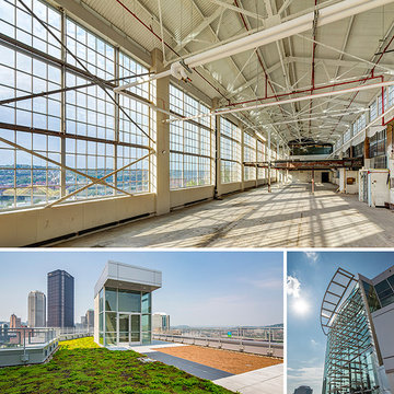
SUSTAINABLE DESIGN: Award of Excellence
PROJECT: Energy Innovation Center
CLIENT: Pittsburgh Gateways, Inc.
ARCHITECTURE FIRM: DLA+ Architecture & Interior Design
ENGINEERS: Atlantic Engineering Services; CJL Engineering; The Gateway Engineers, Inc.
CONTRACTORS: Mascaro Construction Company, L.P.
PHOTOGRAPHER: Jim Schafer Location Photography
DESCRIPTION: Originally built in 1930 as the Clifford B. Connelley Trade School, the facility was an educational landmark and nationwide model for vocational training. With a vision for revitalization, the Energy Innovation Center (EIC) renews the region’s tradition in workforce development during today’s age of advancing technology. The 6.6 acre complex will promote energy-sector research and innovation and create direct and deliberate bridges to job creation, entrepreneurship, and urban economic revitalization. The mechanical, electrical, and plumbing design provide a state-of-the-art, historically sensitive, energy efficient design that provides superior indoor air quality and maximizes the use of rentable floor space.
JURY COMMENTS: The project demonstrates an intense pallet of sustainable technology while respecting the original building’s forms. The use of the old swimming pool volume for the large equipment is an excellent example of creative problem solving. The goal of fostering knowledge by opening the project to the public through the large glass atrium addition is admirable.
 Lynda Bittner Home Interiors, LLC
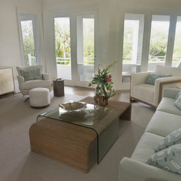
Although large, this open floor plan provided many unique challenges. With only one wall in a room with many angles and traffic pathways to seven other areas our work was cut out for us. Problems solved! In the end a beautiful, casual, comfortable conversational space was delivered with a coastal contemporary sophistication.
32