
Search results for "Enhances problem solving" in Home Design Ideas
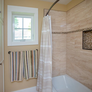
 Edgewater Design Group
As written in Northern Home & Cottage by Elizabeth Edwards
For years, Jeff and Ellen Miller spent their vacations sailing in Northern Michigan—so they had plenty of time to check out which small harbor town they might like to retire to someday. When that time arrived several years ago, they looked at properties up and down the coast and along inland lakes. When they discovered a sweet piece on the outskirts of Boyne City that included waterfront and a buildable lot, with a garage on it, across the street, they knew they’d found home. The couple figured they could find plans for their dream lake cottage online. After all, they weren’t looking to build anything grandiose. Just a small-to-medium sized contemporary Craftsman. But after an unfruitful online search they gave up, frustrated. Every plan they found had the back of the house facing the water—they needed a blueprint for a home that fronted on the water. The Millers first met the woman, Stephanie Baldwin, Owner & President of Edgewater Design Group, who solved that issue and a number of others on the 2015
Northern Home & Cottage Petoskey Area Home Tour. Baldwin’s home that year was a smart, 2000-square cottage on Crooked Lake with simple lines and a Craftsman sensibility. That home proved to the couple that Edgewater Design Group is as proficient at small homes as the larger ones they are often known for. Edgewater Design Group did indeed come up with the perfect plan for the Millers. At 2400 square feet, the simple Craftsman with its 3 bedrooms, vaulted ceiling in the great room and upstairs deck is everything the Millers wanted—including the fact that construction stayed within their budget. An extra courtesy of working with the talented design team is a screened in porch facing the lake (“She told us, of course you have to have a screened in porch,” Ellen says. “And we love it!’) Edgewater’s other touches are more subtle. The Millers wanted to keep the garage, but the home needed to be sited on a small knoll some feet away in order to capture the views of Lake Charlevoix across the street. The solution is a covered walkway and steps that are so artful they enhance the home. Another favor Baldwin did for them was to connect them with Legacy Construction, a firm known for its craftsmanship and attention to detail. The Miller home, outfitted with touches including custom molding, cherry cabinetry, a stunning custom range hood, built in shelving and custom vanities. A warm hickory floor and lovely earth-toned Craftsman-style color palette pull it all together, while a fireplace mantel hewn from a tree taken on the property rounds out this gracious lake cottage.
 Daniels Design & Remodeling
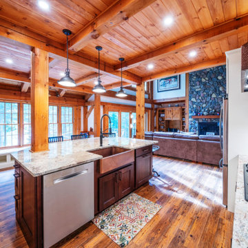
Our homeowners wanted to improve their kitchen layout at their lake house and wanted an open, functional flow with increased storage, lighting and trending styles. We removed a non-bearing wall between kitchen and great room and created an area for a large island. These changes brought in their thirst for abundant, natural light and solved the bottleneck that occurred in the old space when the refrigerator was in use. The new layout provides ample storage space and open stations for friends and family to gather while entertaining. Updating the kitchen and living space enhances the function of the home.We converted existing outdated materials to be more attractive and functional: lighting, cabinetry, flooring, and tiled surfaces. We found ways to provide innovative materials for our homeowners’ selections by maintaining the use of the existing knotty pine beams, ceiling and posts and working with the existing ‘cottage feel’ while updating fixtures, finishes and flow through the space. Warm design elements are evident through use of copper accents like the hood, faucets, sink and cabinet pulls.
 Clement Walsh Landscape Architect, Inc.
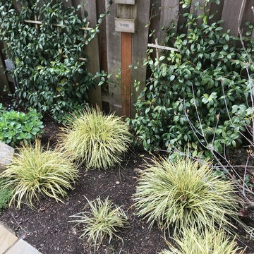
Plants in this photo include the following evergreen plants: Evergold Sedges, Star Jasmine climbers, Creeping Thyme and Autumn Joy Sedum. The Sedums will have large pink flower heads in the fall that the bees love.
Find the right local pro for your project
 Drury Design
THE SETUP
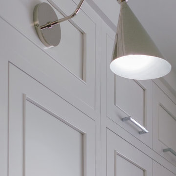
Sam’s client had lived in her downtown townhome home for less than a year when she decided to remodel the spacious second level. This open area consisted of three sections: a TV and fireplace zone, a sparsely furnished dining area, and a dominant central kitchen. The kitchen featured a long back wall with three segmented sections and a massive island housing the cooktop. She found the kitchen’s functionality lacking and its presence overwhelming – it dominated the entire floor, regardless of where you stood.
Design objectives:
- Reconfigure key kitchen elements (sink, cooktop, oven) while minimizing the kitchen’s visual impact
- Optimize the kitchen’s back wall, eliminating existing dead space
- Create a purposeful, well-defined dining area
- Establish a distinct, comfortable living area
- Reuse existing appliances and flooring
- Maintain an overall modern design aesthetic
THE REMODEL
Design challenges to be solved:
- Redesign the island to reduce its overwhelming presence
- Create a comfortable, dedicated living room within the available space
- Establish a distinct, inviting dining area within spatial constraints
- Enhance kitchen functionality and style without dominating the entire floor
THE RENEWED SPACE
Design solutions:
- Sam created raised end caps for the island. This separated the kitchen from adjacent living and dining areas while focusing the kitchen’s functionality. The new sink location offers ample workspace, allowing the cook to interact with guests seated at the island. The redesigned island also provides additional storage.
- For the living area, Sam opted for a functional-yet-minimalist approach. Large-format tile creates a natural stone look for the fireplace and TV wall. The recessed TV and extended fireplace shelf maintain a sleek profile. - Artistic wallpaper adds depth and texture, while the intentional lack of extensive shelving keeps the space open and distinct.
- Sam transformed the dining area’s blank wall into a feature, adding a unique dry bar with counter space, open shelves, cabinet storage and a beverage fridge. - - - Wallpaper behind and above the bar contributes to the area’s personality. A mirror adds depth while pendant lights add style and visual interest.
Relocating the cooktop to the back wall facilitates hidden ventilation, reducing visual clutter. Sam balanced transitional and modern elements for a contemporary yet comfortable feel. The digital control panel on the convection cooktop maintains a sleek look, while the wall oven is now at an easy-to-use height. ----- Mirrored base cabinet fronts and a paneled fridge prevent cabinetry monotony.
The redesign has delighted Sam’s client, achieving her main goal of creating a more inviting and visually appealing space. Each section now has its own visual personality and functionality while harmonizing within a monochromatic palette. The entire floor offers wow-factor pop upon first glance, with each area maintaining its distinct character while contributing to a cohesive, modern aesthetic.
 Springer Environmental Services
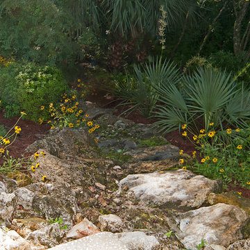
A stone feature solves an erosion problem where runoff was washing away soil. Natural limestone forms a dry creekbed that channels water into a lower area. Moss and wildflowers decorate the stones, while ferns and shade-loving plants transition the area into the edge of a wood.
 KURV Architecture DPC (Alex Hughes Architects)
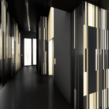
Located in the heart of Manhattan’s Lower East Side, the building was erected on a shallow commercial lot between two 120 year old masonry buildings and a new residential rental building. 330 Grand Street is a mix of 725 SF 1BRs and 1050 SF 2BR apartments. It also contains a 1100 SF two story duplex as well as private and public rooftop space, large private balconies for most units and two large private terraces for the ground floor units.
330 Grand Street was originally designed and approved at the NYC DOB as a prefabricated modular building. During the pandemic, as shipping costs skyrocketed putting the project at risk, we suggested redesigning the building as a reinforced cast-in-place concrete structure. Concrete was readily available and prices had not been affected by the demand increase that many other materials suffered in the pandemic. We took this opportunity to raise floor to ceiling heights, enlarge high performance windows and redistribute the buildings MEPFS and Structural Systems to create very open floor plans.
The challenge was to create a luxurious sensorial living experience with very limited means. In a city with very high construction costs, low cost residential buildings in the area are usually devoid of good quality, design and character. Our approach was to aim high for the end user, prioritizing natural light, open space with long visual perspectives, high ceilings and as always, rejecting the use of predefined building templates.
Our biggest challenge was to ensure that the small spaces feel as clean cut, large and bright as possible. Several unique design decisions were made to ensure low cost and high quality;
Floor plans were laid out so that spaces were wide open and free of clutter from mechanical or structural interruptions. Therefore all infrastructure was placed in lateral demising walls, which in turn act as the unit’s storage and kitchen. The apartments feel wide open, are super quiet and have more storage space than any other comparable apartment in the city.
To solve the problem of the site’s shallow commercial lot which is typically prone to dark interior spaces we focused our attention on the building’s envelope. Instead of the usual small punched window openings, oversized high performance windows were designed to ensure that light penetrated as far as possible into the units. In the smaller 1BR units, the full 50’ depth of the lot is perceived by partitioning spaces with sliding pocket doors that can be retracted to allow deep visual perspectives, making the sight lines in the space feel longer, larger, more ample than normal. In addition to the full height glazing, each unit above the 2nd floor receives a 7 foot covered balcony, adding 120 to 240 sf to each apartment, something unusual in New York City buildings. The space is large enough for a full size dining table, when the weather permits being outside.
We also worked hard to ensure modularity. For example, all kitchen units are all identical throughout the building. The idea of modularity and the economy of the repetitive unit is exercised to the maximum through the building.
Hardware, appliances, flooring, wall coverings and material finishes are all carefully selected to feel bespoke, high quality and unique.
It was important to KURV that the result of this work manifest into something that would deeply connect with the end user and sustain relationships with the consumers of this space.
All images by KURV Architecture ©
 Regal Plastics - San Antonio
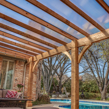
This homeowner was tired of Texas heat and thunderstorms pushing them indoors. They solved the problem by adding a Polygal covered pergola.
Example of a large backyard patio design in Austin with a pergola
Example of a large backyard patio design in Austin with a pergola
 Drury Design
THE SETUP
Sam’s client had lived in her downtown townhome home for less than a year when she decided to remodel the spacious second level. This open area consisted of three sections: a TV and fireplace zone, a sparsely furnished dining area, and a dominant central kitchen. The kitchen featured a long back wall with three segmented sections and a massive island housing the cooktop. She found the kitchen’s functionality lacking and its presence overwhelming – it dominated the entire floor, regardless of where you stood.
Design objectives:
- Reconfigure key kitchen elements (sink, cooktop, oven) while minimizing the kitchen’s visual impact
- Optimize the kitchen’s back wall, eliminating existing dead space
- Create a purposeful, well-defined dining area
- Establish a distinct, comfortable living area
- Reuse existing appliances and flooring
- Maintain an overall modern design aesthetic
THE REMODEL
Design challenges to be solved:
- Redesign the island to reduce its overwhelming presence
- Create a comfortable, dedicated living room within the available space
- Establish a distinct, inviting dining area within spatial constraints
- Enhance kitchen functionality and style without dominating the entire floor
THE RENEWED SPACE
Design solutions:
- Sam created raised end caps for the island. This separated the kitchen from adjacent living and dining areas while focusing the kitchen’s functionality. The new sink location offers ample workspace, allowing the cook to interact with guests seated at the island. The redesigned island also provides additional storage.
- For the living area, Sam opted for a functional-yet-minimalist approach. Large-format tile creates a natural stone look for the fireplace and TV wall. The recessed TV and extended fireplace shelf maintain a sleek profile. - Artistic wallpaper adds depth and texture, while the intentional lack of extensive shelving keeps the space open and distinct.
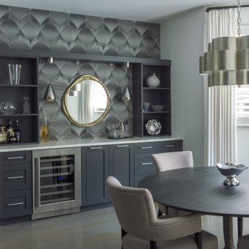
- Sam transformed the dining area’s blank wall into a feature, adding a unique dry bar with counter space, open shelves, cabinet storage and a beverage fridge. - - - Wallpaper behind and above the bar contributes to the area’s personality. A mirror adds depth while pendant lights add style and visual interest.
Relocating the cooktop to the back wall facilitates hidden ventilation, reducing visual clutter. Sam balanced transitional and modern elements for a contemporary yet comfortable feel. The digital control panel on the convection cooktop maintains a sleek look, while the wall oven is now at an easy-to-use height. ----- Mirrored base cabinet fronts and a paneled fridge prevent cabinetry monotony.
The redesign has delighted Sam’s client, achieving her main goal of creating a more inviting and visually appealing space. Each section now has its own visual personality and functionality while harmonizing within a monochromatic palette. The entire floor offers wow-factor pop upon first glance, with each area maintaining its distinct character while contributing to a cohesive, modern aesthetic.
 Ven Studio Architects
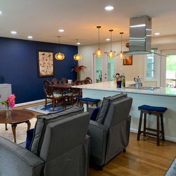
The kitchen, while spacious, was completely enclosed from the living and dining room spaces and did not utilize the space efficiently. Traffic flow between the indoors and outdoors was disjointed, and the new kitchen layout solves those problems. The new design eliminates the walls in the kitchen to create an open space for entertaining, and an exterior door was added off the kitchen to facilitate a better traffic flow to the outdoor entertaining space. New cabinets, countertops, flooring, appliances, light fixtures, and finishes help to brighten and modernize the space.
 Bridgewater
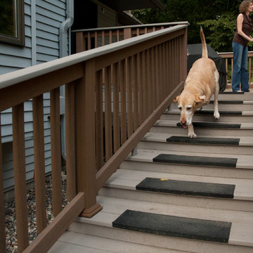
Craig Weber of Bridgewater Construction solved the problem by designing a unique custom staircase. He used the same building materials for both staircase and deck. But the stairs were both longer and wider than usual, making it easy for two or even three dogs to chase the same Frisbee at the same time. An unusual design objective, but it worked.
 Manchester Design Group
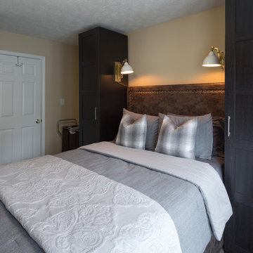
And then there was storage. A friendly trip to IKEA solved the problem. Of course I had to embellish the storage cabinet with lighting and strong sleek handles. We went from a tossed space to a sleek stay-cation.
 Reico Kitchen & Bath
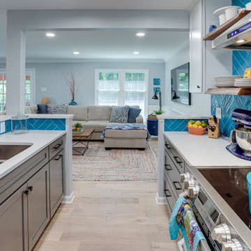
Designed by Akram Aljahmi of Reico Kitchen & Bath in King of Prussia, PA in collaboration with Property Remodeling Group, this transitional inspired kitchen design features white and grey finishes complemented by a bold splash of blue tile.
The kitchen design features Merillat Classic kitchen cabinets in Portrait door style with 5 piece drawer head in 2 finishes. The wall cabinets features a painted white Cotton finish and the base cabinets feature a painted grey Graphite finish. Kitchen countertops are engineered quartz in the color Carrera Marmi from Q by MSI. The kitchen also features a stunning blue herringbone tile back splash with 3x10 tiles.
According to the client, "Akram solved a fundamental function problem that I could not see a solution for. His re-imagining of how the main floor of our home could function was a dramatic shift that I can't wait to experience as part of day-to-day life. Really appreciate his space plan and layout, as well as his support selecting finishes. Akram and team were great to work with!".
Photos courtesy of BTW Images LLC.
 Rodwin Architecture & Skycastle Construction
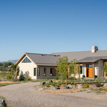
Wild View Farm includes a new “Forever home” (we deconstructed an existing house with a 90% landfill diversion rate), and enhancements to several working barns. The 80 acre site was an original homestead farm from the 1890’s. Both its buildings and soil had become severely degraded. The owners are working to holistically restore this property and make it a model of modern regenerative farming. They are planting hundreds of trees, re-introducing livestock and working with Dryland Agroecology Research and High Plains Permaculture to restore the soil.
The -51 HERS rated home is not just energy-efficient - it’s a model of “Regenerative design”. The deep green house design included multiple challenges – foremost was how to create a Passive Solar design that also took full advantage of the massive views to the West. We solved it with an L shaped building that optimized passive and active solar strategies on the south face, then actively protected the western facade with a giant covered porch and tuned glazing. The home’s leading-edge energy package includes a Ground source heat pump, a large roof-mounted solar PV array, battery back-up, EV chargers, and Energy Recovery Ventilator (ERV), Energy Star Appliances and windows, a robust foam insulation shell and LED lighting.
We also endeavored to craft a modern day interpretation of the farmhouse typology, with a low-slung simple gable-roofed form that would feel like it’s always been there. The exterior material palette of limestone, cementitious stucco and heavy timber gives it a rich Colorado Modern Farmhouse feel. The home is full of custom details like walls of vaulted glass to capture the sweeping mountain views, an AI Smart Home control system, a sleeping loft for kids and guests, a hard-working Butler’s Pantry, a gourmet outdoor kitchen, a pool & spa, a cozy office nook for reading, and a lovely built-in bench for morning coffee. Phase 2 of this project will include a Farmworker ADU and a full renovation of the existing historic barn.
Built by Skycastle Construction. Interior Design by Kimball Modern and Rodwin Architecture. Landscaping by EDI. Photography by Dane Cronin Photo
 Jacob Lilley Architects
Jacob Lilley Architects
Location: Lexington, MA, USA
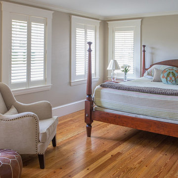
A new garage, kids play room above and a mudroom met the need for more space. A renovated kitchen, bedroom and other living spaces created a refreshed sense of home.
The strategic location of the mudroom as an intermediary connector solved problems with this 19th-century home siting seven feet above the ground with limited access to the rear yard.
The connector between the garage and existing house is a stair that unifies the various levels and develops a strong connection to the yard.
Photographed by: Eric Roth
 Rodwin Architecture & Skycastle Construction
Wild View Farm includes a new “Forever home” (we deconstructed an existing house with a 90% landfill diversion rate), and enhancements to several working barns. The 80 acre site was an original homestead farm from the 1890’s. Both its buildings and soil had become severely degraded. The owners are working to holistically restore this property and make it a model of modern regenerative farming. They are planting hundreds of trees, re-introducing livestock and working with Dryland Agroecology Research and High Plains Permaculture to restore the soil.
The -51 HERS rated home is not just energy-efficient - it’s a model of “Regenerative design”. The deep green house design included multiple challenges – foremost was how to create a Passive Solar design that also took full advantage of the massive views to the West. We solved it with an L shaped building that optimized passive and active solar strategies on the south face, then actively protected the western facade with a giant covered porch and tuned glazing. The home’s leading-edge energy package includes a Ground source heat pump, a large roof-mounted solar PV array, battery back-up, EV chargers, and Energy Recovery Ventilator (ERV), Energy Star Appliances and windows, a robust foam insulation shell and LED lighting.
We also endeavored to craft a modern day interpretation of the farmhouse typology, with a low-slung simple gable-roofed form that would feel like it’s always been there. The exterior material palette of limestone, cementitious stucco and heavy timber gives it a rich Colorado Modern Farmhouse feel. The home is full of custom details like walls of vaulted glass to capture the sweeping mountain views, an AI Smart Home control system, a sleeping loft for kids and guests, a hard-working Butler’s Pantry, a gourmet outdoor kitchen, a pool & spa, a cozy office nook for reading, and a lovely built-in bench for morning coffee. Phase 2 of this project will include a Farmworker ADU and a full renovation of the existing historic barn.
Built by Skycastle Construction. Interior Design by Kimball Modern and Rodwin Architecture. Landscaping by EDI. Photography by Dane Cronin Photo
 Bluestar Landscape Designers
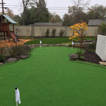
This putting green completely changes the side yard into a space just for play. The dry stream bed solves drainage problems.
This is an example of a contemporary side yard landscaping in Sacramento.
This is an example of a contemporary side yard landscaping in Sacramento.
 Lagois Design Build Renovate
New windows, floors, powder room and basement:
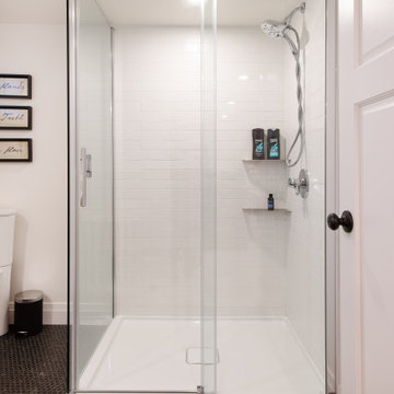
We gave the home new windows, new hardwood floors, and paint throughout. We created a new main floor powder room and a new finished basement containing a living area, three-piece bathroom and new bedroom with egress (tilt and turn) windows.
Flipped around and redesigned kitchen:
We created a new kitchen. The footprint of the kitchen stayed the same, but we flipped it around and redesigned it. Now it has a walk-in pantry area and more floorspace going in and out, which optimized the flow of traffic. We replaced the old non-functioning mudroom with a new one.
Disappearing balcony and drafty door:
To create a new space using a balcony in a bedroom, we extended the second storey out to line up with the first floor, and this increased the square footage. In that room we turned a drafty door into a window.
We reinstated the rear deck, using as many of the original pieces as we could:
There was a leaking roof problem because the original roof pitches were causing ice damming. We designed a new roof to prevent that in the future.
New windows, stucco, and the challenge of asbestos:
Another challenge was installing new windows in the original stucco finish, which contained asbestos. We waterproofed those properly, future proofing them from leaks.
We solved the situation by installing a 5-inch trim around the perimeter of the window. Specialists cut the asbestos back (we had to set up a containment perimeter around each window), and then we placed windows that are five inches wider than the window frames. We used special flashing tapes and sealed them all up behind the stucco.
 The Designers
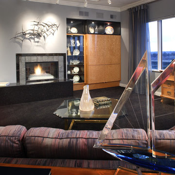
In this view, we see the fireplace, which was renovated to display a higher hearth. The original was too close to the floor for easy viewing. Moving the hearth higher creates a focal point for the room. This treatment required an extremely creative fireplace technician to solve the problem. The niche to the right of the fireplace houses the television and stereo.
 RG Cowan Design Build
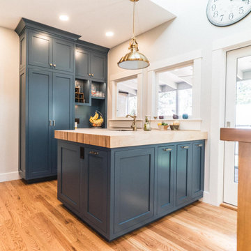
The History Modernized project was designed to solve the problem of a complicated and confined kitchen space in a beautiful turn of the century home. Our clients need for functionality, maximum use of space, and beauty led us to an amazing split kitchen design that allowed for two usable, overlapping work zones in an odd and elongated space.
Within this design we were able to open the kitchen to the existing dining area and create bar seating on the dining room side of the kitchen while modernizing the openness of the plan. Personally, we think function and Beauty tied on this one!
 KURV Architecture DPC (Alex Hughes Architects)
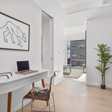
Located in the heart of Manhattan’s Lower East Side, the building was erected on a shallow commercial lot between two 120 year old masonry buildings and a new residential rental building. 330 Grand Street is a mix of 725 SF 1BRs and 1050 SF 2BR apartments. It also contains a 1100 SF two story duplex as well as private and public rooftop space, large private balconies for most units and two large private terraces for the ground floor units.
330 Grand Street was originally designed and approved at the NYC DOB as a prefabricated modular building. During the pandemic, as shipping costs skyrocketed putting the project at risk, we suggested redesigning the building as a reinforced cast-in-place concrete structure. Concrete was readily available and prices had not been affected by the demand increase that many other materials suffered in the pandemic. We took this opportunity to raise floor to ceiling heights, enlarge high performance windows and redistribute the buildings MEPFS and Structural Systems to create very open floor plans.
The challenge was to create a luxurious sensorial living experience with very limited means. In a city with very high construction costs, low cost residential buildings in the area are usually devoid of good quality, design and character. Our approach was to aim high for the end user, prioritizing natural light, open space with long visual perspectives, high ceilings and as always, rejecting the use of predefined building templates.
Our biggest challenge was to ensure that the small spaces feel as clean cut, large and bright as possible. Several unique design decisions were made to ensure low cost and high quality;
Floor plans were laid out so that spaces were wide open and free of clutter from mechanical or structural interruptions. Therefore all infrastructure was placed in lateral demising walls, which in turn act as the unit’s storage and kitchen. The apartments feel wide open, are super quiet and have more storage space than any other comparable apartment in the city.
To solve the problem of the site’s shallow commercial lot which is typically prone to dark interior spaces we focused our attention on the building’s envelope. Instead of the usual small punched window openings, oversized high performance windows were designed to ensure that light penetrated as far as possible into the units. In the smaller 1BR units, the full 50’ depth of the lot is perceived by partitioning spaces with sliding pocket doors that can be retracted to allow deep visual perspectives, making the sight lines in the space feel longer, larger, more ample than normal. In addition to the full height glazing, each unit above the 2nd floor receives a 7 foot covered balcony, adding 120 to 240 sf to each apartment, something unusual in New York City buildings. The space is large enough for a full size dining table, when the weather permits being outside.
We also worked hard to ensure modularity. For example, all kitchen units are all identical throughout the building. The idea of modularity and the economy of the repetitive unit is exercised to the maximum through the building.
Hardware, appliances, flooring, wall coverings and material finishes are all carefully selected to feel bespoke, high quality and unique.
It was important to KURV that the result of this work manifest into something that would deeply connect with the end user and sustain relationships with the consumers of this space.
All images by KURV Architecture ©
57