
Search results for "Ensured" in Home Design Ideas
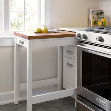
 Mari Kushino Design
Classic Shaker Kitchen In A Small Space.
Design by Mari Kushino Design,
Cabinets by South Shore Cabinetry,
Photography by Tony Colangelo Photography.
 Claire Esparros for Homepolish
Photo: Claire Esparros for Homepolish
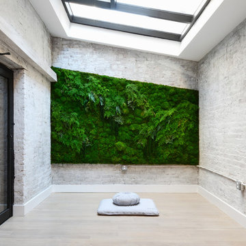
Home yoga studio - home yoga studio idea in New York
Home yoga studio - home yoga studio idea in New York
 Twelve Stones Designs, LLC
C.L. Fry Photography
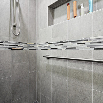
Example of a small transitional gray tile and porcelain tile porcelain tile corner shower design in Austin with gray walls
Example of a small transitional gray tile and porcelain tile porcelain tile corner shower design in Austin with gray walls
Find the right local pro for your project
 Sawhill Kitchens
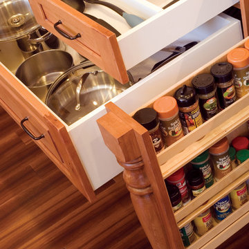
Kitchen with Universal Design features by Sawhill Custom Kitchens & Design in Minneapolis. VIsit www.sawhillkitchens.com to see more examples of our work.
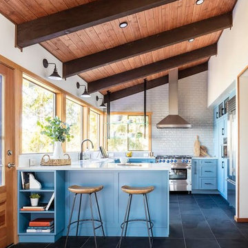
 Interiors by Popov
When we drove out to Mukilteo for our initial consultation, we immediately fell in love with this house. With its tall ceilings, eclectic mix of wood, glass and steel, and gorgeous view of the Puget Sound, we quickly nicknamed this project "The Mukilteo Gem". Our client, a cook and baker, did not like her existing kitchen. The main points of issue were short runs of available counter tops, lack of storage and shortage of light. So, we were called in to implement some big, bold ideas into a small footprint kitchen with big potential. We completely changed the layout of the room by creating a tall, built-in storage wall and a continuous u-shape counter top. Early in the project, we took inventory of every item our clients wanted to store in the kitchen and ensured that every spoon, gadget, or bowl would have a dedicated "home" in their new kitchen. The finishes were meticulously selected to ensure continuity throughout the house. We also played with the color scheme to achieve a bold yet natural feel.This kitchen is a prime example of how color can be used to both make a statement and project peace and balance simultaneously. While busy at work on our client's kitchen improvement, we also updated the entry and gave the homeowner a modern laundry room with triple the storage space they originally had.
End result: ecstatic clients and a very happy design team. That's what we call a big success!
John Granen.
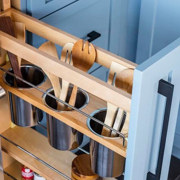 Interiors by Popov
When we drove out to Mukilteo for our initial consultation, we immediately fell in love with this house. With its tall ceilings, eclectic mix of wood, glass and steel, and gorgeous view of the Puget Sound, we quickly nicknamed this project "The Mukilteo Gem". Our client, a cook and baker, did not like her existing kitchen. The main points of issue were short runs of available counter tops, lack of storage and shortage of light. So, we were called in to implement some big, bold ideas into a small footprint kitchen with big potential. We completely changed the layout of the room by creating a tall, built-in storage wall and a continuous u-shape counter top. Early in the project, we took inventory of every item our clients wanted to store in the kitchen and ensured that every spoon, gadget, or bowl would have a dedicated "home" in their new kitchen. The finishes were meticulously selected to ensure continuity throughout the house. We also played with the color scheme to achieve a bold yet natural feel.This kitchen is a prime example of how color can be used to both make a statement and project peace and balance simultaneously. While busy at work on our client's kitchen improvement, we also updated the entry and gave the homeowner a modern laundry room with triple the storage space they originally had.
End result: ecstatic clients and a very happy design team. That's what we call a big success!
ohn Granen.
 Clifton Leung Design Workshop - CLDW.com.hk
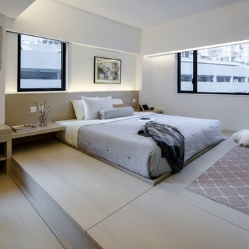
With a thoughtful use of lighting and carefully curated furniture, this 1,000 sq ft Mid-Levels apartment with unsightly columns and beams is transformed into a cosy Scandinavian home with a Japanese touch.
When you think of designing a home, one does not usually put Japanese and Nordic together. But Clifton was inspired by the compatibility of the two cultures, which both emphasise minimalism, to bring out this eye-catching fusion project.
Earth tones reminiscent of Scandinavian design are used throughout the apartment, allowing it to look more spacious and comfortable.
Upon entering the apartment, one is quickly greeted by the Japanese style living room, which oozes Zen with a faux fur carpet and flatter furniture pieces including a Fritz Hansen sofa in pink, side table from Habitat, dining table from HAY and pendent lamps from Louis Poulsen.
The apartment is blessed with a high ceiling, but nonetheless, its columns and beams originally made it appear smaller. But with a clever use of lighting, such as indirect lighting on top of the beams and strategic placement of lamps on the columns, the flaws are concealed and the unit appears taller, bigger and more comfortable.
Similarly, the kitchen is transformed into an open one with an island, so the owners, both social butterflies, can invite their friends over for gatherings.
Besides catering to the two adult owners, Clifton did not forget about their fur friend Buddy, a Bichon Frise. To ensure that Buddy does not feel left out at night, while ensuring the couple can have some privacy in their bedroom, a small square hole was made in the door for him to freely move in and out.
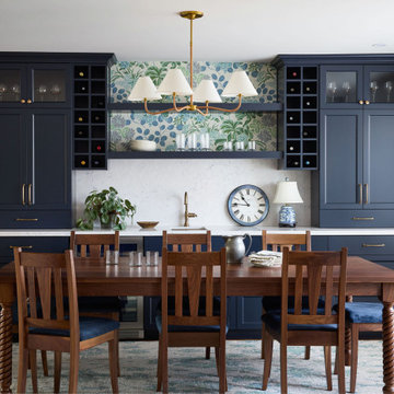
 Beyond the Box Design Collective
This thoughtfully curated residence blends coastal charm with playful sophistication, where every room tells a story. From imaginative wallpapers and sculptural lighting to rich textures and bold tilework, the home celebrates creativity and comfort in equal measure. A seamless fusion of elegance and eccentricity, it invites both wonder and ease at every turn.
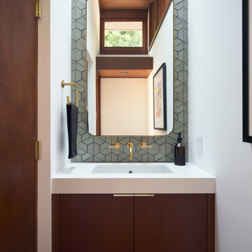
 Klopf Architecture
Nestled in the hills of Orinda, California, this 1951 residence is one of only seven extant homes, now known as “The Magnificent Seven”, designed by architect Olof Dahlstrand, a protégé of Frank Lloyd Wright. With its low-slung rooflines, natural materials, and deep integration with the sloping landscape, the home is a pristine example of mid-century modern design inspired by Wright’s organic principles. Over the years, prior homeowners have emphasized preservation, ensuring that the house remained relatively untouched. Each owner has respected the original architecture and stayed true to Dahlstrand’s intent. When a family of five—two college-aged sons and a middle school-aged daughter—acquired the property, they were captivated by its history, legacy of care, and architectural significance. While they appreciated Dahlstrand’s original vision, they also recognized the need to adapt the home for contemporary living while preserving its design integrity.
The remodel was conceived as a thoughtful response to the past—an effort to bring the house into the 21st century without compromising its soul. The primary mandate was to maintain architectural continuity while improving the functionality, comfort, and livability for a modern family. The design team—architects and contractor alike—worked with a shared reverence for the original architecture, allowing that mindset to guide even the most technical or pragmatic decisions.
A key objective was to increase natural light in the kitchen—a departure from Wrightian principles of enclosed, intimate cooking spaces—while maintaining the home’s architectural language. The kitchen was reconfigured to foster a stronger connection to adjacent living spaces while retaining the underlying concept of spatial separation. One of the most transformative architectural changes was the removal of a ridge beam that was originally planned to remain visible through the kitchen. During construction, the team collaborated on a better solution: a wide-flanged steel beam concealed within the roof envelope. This subtle move preserved the clean lines and ceiling continuity, a modern update carried out with utmost respect for the existing framework.
The home’s original powder room, previously accessible only through the kitchen, was relocated for better flow and privacy. A new powder room was carved out of former kitchen cabinetry—a narrow, interior space that could have felt dark and enclosed. To avoid this, the design extended the line of original transom windows into the new powder room and added a skylight above the vanity. The result is a bright and airy space that feels consistent with the rest of the home. Other updates included the installation of new solid-core interior doors with veneers carefully matched to the original mahogany, enhancing the continuity of the interiors. Even smaller decisions, such as placing the door knobs at 42 inches high, mirrored the original proportions. Every choice reflected a shared belief between the architect, contractor, and client: that new work should serve the integrity of the old.
The home’s extensive interior redwood millwork and paneling was meticulously restored. Where new materials were introduced—such as the replacement redwood soffit paneling—the contractor took pains to find finish nails that matched the original, rather than using modern equivalents. This level of craftsmanship and collaboration defined the project. It extended even to the detailing of a blind door to the new powder room, which had to disappear into the existing redwood board-and-batten wall. It was a team effort: the owner found a suitable handle, the architects devised the custom in-swing mechanism, and the contractor executed it so the door aligned precisely with the battens. Throughout, the homeowners were deeply engaged in the design process. One, a meticulous design enthusiast, focused on aesthetic integrity and historic detail. The other brought a practical and function-driven perspective, ensuring that new fixtures and materials would be durable and require minimal maintenance.
While the home’s location posed no major site challenges, sustainability was a key concern. The team upgraded the roof insulation, installed solar panels with battery storage, and added ductless mini-split cooling systems. Lighting was another area where modern technology was woven into a historic framework: new square LED fixtures echo the original custom perimeter soffit lights, maintaining the design language while offering advanced performance.
A planned expansion of a bedroom into suite with a bathroom had to be shelved due to budget constraints and the high cost of below-grade foundation work. Still, the team focused their efforts on making the most of the existing footprint, resolving constraints through design ingenuity rather than adding square footage. This renovation represents a collaborative achievement in preserving and evolving a historically significant home. Every decision was shaped by a shared ethos among clients, architects, and contractor: to maintain the home’s architectural soul while updating it for contemporary life. The result is a timeless modernist residence that continues Olof Dahlstrand’s legacy, remaining grounded in nature, craftsmanship, and human-scale design.
Klopf Architecture Team: John Klopf, AIA, Klara Kevane, Fernanda Bernardes
Interior Architectural Design: Klopf Architecture
Structural Engineer: Daniel Bastiao
Contractor: Don Larwood, Larwood Construction
Photography: Mariko Reed
Year Completed: 2022
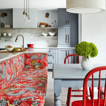
 Square Footage Inc.
Photos by Valerie Wilcox
Eat-in kitchen - large contemporary l-shaped medium tone wood floor eat-in kitchen idea in Toronto with a double-bowl sink, shaker cabinets, blue cabinets, quartz countertops, multicolored backsplash, porcelain backsplash, stainless steel appliances and an island
Eat-in kitchen - large contemporary l-shaped medium tone wood floor eat-in kitchen idea in Toronto with a double-bowl sink, shaker cabinets, blue cabinets, quartz countertops, multicolored backsplash, porcelain backsplash, stainless steel appliances and an island
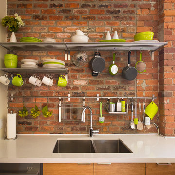
 Affecting Spaces Design Studio
This modern kitchen maintains it's industrial feel by having the exposed brick as its backdrop. The warm honey tones of the white oak, mixed with the stainless steel appliances and white quartz creates a perfect space to showcase the original charm of this space. The accessory rails allow for storage, without covering up the amazing brick wall.
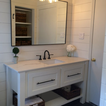
 Moore Design Works
Inspiration for a mid-sized scandinavian 3/4 white tile and subway tile slate floor and black floor bathroom remodel in Houston with furniture-like cabinets, white cabinets, a two-piece toilet, white walls, an undermount sink and marble countertops

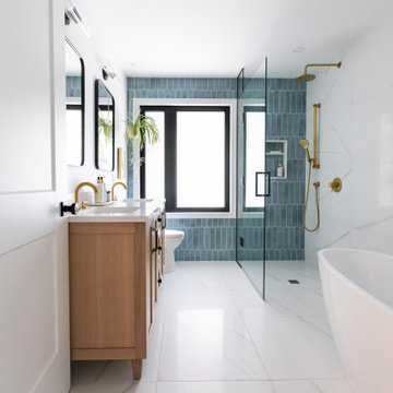

 Route Design : Ashley Winn
Kate Osborne
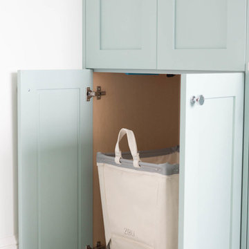
Laundry room - transitional laundry room idea in Salt Lake City
Laundry room - transitional laundry room idea in Salt Lake City
 Interiors by Popov
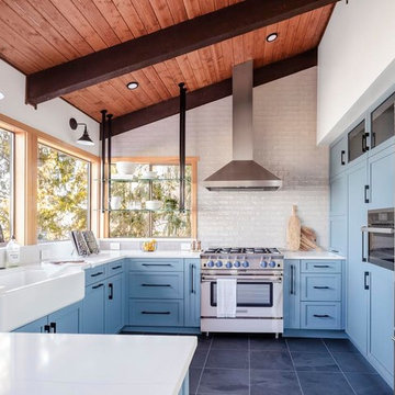
When we drove out to Mukilteo for our initial consultation, we immediately fell in love with this house. With its tall ceilings, eclectic mix of wood, glass and steel, and gorgeous view of the Puget Sound, we quickly nicknamed this project "The Mukilteo Gem". Our client, a cook and baker, did not like her existing kitchen. The main points of issue were short runs of available counter tops, lack of storage and shortage of light. So, we were called in to implement some big, bold ideas into a small footprint kitchen with big potential. We completely changed the layout of the room by creating a tall, built-in storage wall and a continuous u-shape counter top. Early in the project, we took inventory of every item our clients wanted to store in the kitchen and ensured that every spoon, gadget, or bowl would have a dedicated "home" in their new kitchen. The finishes were meticulously selected to ensure continuity throughout the house. We also played with the color scheme to achieve a bold yet natural feel.This kitchen is a prime example of how color can be used to both make a statement and project peace and balance simultaneously. While busy at work on our client's kitchen improvement, we also updated the entry and gave the homeowner a modern laundry room with triple the storage space they originally had.
End result: ecstatic clients and a very happy design team. That's what we call a big success!
John Granen.

 MasterBrand Cabinets
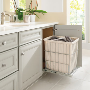
Elegant ceramic tile and white floor bathroom photo in Other with recessed-panel cabinets, gray cabinets, beige walls and white countertops


31