
Search results for "Everyday purchases" in Home Design Ideas
 JF Interiors, Inc.
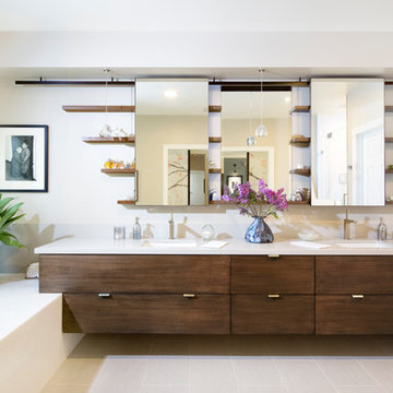
The walnut shelves in the master bath are not only an architectural element, they also display accessories while hiding everyday essentials behind the sliding mirrors. The vanity top is a Caesarstone while the tub deck & surround are both marble.
Photo credit: Fran Kuhn Photography
 Cameo Kitchens, Inc.
Kelly Keul Duer
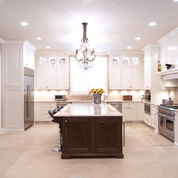
Example of a huge classic u-shaped kitchen design in DC Metro with beaded inset cabinets, white cabinets, quartz countertops, beige backsplash, stainless steel appliances and an island
Example of a huge classic u-shaped kitchen design in DC Metro with beaded inset cabinets, white cabinets, quartz countertops, beige backsplash, stainless steel appliances and an island
 embrio design studio
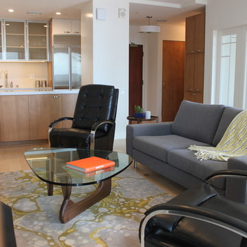
Have you ever dreamt about your pie in the sky home? Well I have! That is, our wonderful client’s dream home. It includes a place with 72-degree weather everyday, a wondrous view of a harbor, a walkable city & with clean, modern accommodations. And voilà… a penthouse flat in downtown San Diego by the bay. We stripped away the cheap 80’s rental finishes, opened things up to bring in the sunshine, added new flooring, kitchen, bathrooms, a fireplace refresh and modern furniture for a little slice of heaven and comfort. Don't tell anyone, but there’s even a Lazy Boy chair in there!
Find the right local pro for your project
 Cameo Kitchens, Inc.
Kelly Keul Duer, Merima Hopkins
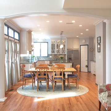
Inspiration for a contemporary light wood floor eat-in kitchen remodel in DC Metro with white cabinets, granite countertops, multicolored backsplash, stainless steel appliances and brown walls
Inspiration for a contemporary light wood floor eat-in kitchen remodel in DC Metro with white cabinets, granite countertops, multicolored backsplash, stainless steel appliances and brown walls
 Bilotta Kitchen & Home
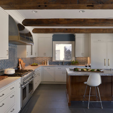
This transitional kitchen featuring Bilotta Custom Cabinetry is a favorite project of Paulette Gambacorta’s, senior designer at Bilotta Kitchens. The client lives in Manhattan and purchased this classic Victorian house as their weekend escape from the hustle and bustle of the city. The renovation planned to provide plenty of storage space and appliances while still having backyard views of the Hudson, perfect for entertaining and holidays. However, kitchen plans changed when the homeowners decided to have a child and their intended weekend getaway home became the city dwellers’ permanent residence. Having the home be their main residence, meant the kitchen had to function for everyday living as well as for entertaining and large family and friend gatherings. The perimeter cabinetry is a white dove paint and the island and pantry are quarter-sawn white oak with a stain. The pantry has tapered legs for a free-standing furniture look. The countertop is Calcutta Super White Quartzite with a Blue Ceramic Waterworks backsplash. The 48” Thermador range has a custom-made wall hood in Antiqued Brass and Antiqued steel by Amore Design LLC. The refrigerator, freezer, and wine unit are Subzero with the wine fridge outside the cooking area for easy access. Sinks are from Kohler and stainless steel faucets are by Artesso Collection by Brizo. Designer: Paulette Gambacorta Photo Credit: Peter Krupenye
 Bilotta Kitchen & Home
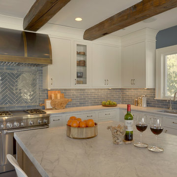
This transitional kitchen featuring Bilotta Custom Cabinetry is a favorite project of Paulette Gambacorta’s, senior designer at Bilotta Kitchens. The client lives in Manhattan and purchased this classic Victorian house as their weekend escape from the hustle and bustle of the city. The renovation planned to provide plenty of storage space and appliances while still having backyard views of the Hudson, perfect for entertaining and holidays. However, kitchen plans changed when the homeowners decided to have a child and their intended weekend getaway home became the city dwellers’ permanent residence. Having the home be their main residence, meant the kitchen had to function for everyday living as well as for entertaining and large family and friend gatherings. The perimeter cabinetry is a white dove paint and the island and pantry are quarter-sawn white oak with a stain. The pantry has tapered legs for a free-standing furniture look. The countertop is Calcutta Super White Quartzite with a Blue Ceramic Waterworks backsplash. The 48” Thermador range has a custom-made wall hood in Antiqued Brass and Antiqued steel by Amore Design LLC. The refrigerator, freezer, and wine unit are Subzero with the wine fridge outside the cooking area for easy access. Sinks are from Kohler and stainless steel faucets are by Artesso Collection by Brizo. Designer: Paulette Gambacorta Photo Credit: Peter Krupenye

 Byggmeister Inc
Photo by Jim Raycroft
Our client for this project, an amateur pianist, wanted to create a music room for a nice new piano he was planning to purchase. The project scope would also include a new kitchen, bathroom, bedroom and living space, but the new piano was the priority.
LIFTING THE CEILING
The client was moving into a row house, and hoped to accommodate occasional gatherings of musician friends for informal recitals. Because acoustics were important we asked sound engineers from Acentech to visit the site. They noted that the ideal space would have higher ceilings and would be more like a cube than the “half a cube” we were dealing with. “How can we raise the ceiling and make the space a cube?” our client asked.
Designer Josy Raycroft started to explore the possibility of combining the second and third floor units by removing the front half of second floor ceiling, thereby opening up a 2-story music space in the shape of a nearly perfect cube. Thus, the project turned from a straightforward floor plan modification into a complete reimagining of the whole row house, with the client’s new Steinway D as the focal point. Josy and the client started with the piano and created the space around it.
ADDRESSING EVERYDAY NEEDS
For the client’s more mundane needs, Josy switched the location of the bathroom and kitchen—moving the bathroom towards the middle of the second floor where it would be convenient to the rest of the spaces, and placing the kitchen towards the back. The remainder of the third floor was transformed into bedroom and office space open to the music room below.
Products and finishes coordinator Karin Mahdavi worked with the client to select understated finishes for the living spaces so that they would support the piano room without competing with it. As a result the living spaces flow seamlessly into the piano space, creating a coherent whole out of the different parts, kind of like a Schubert piano sonata.

Sponsored
Delaware, OH

Buckeye Basements, Inc.
Central Ohio's Basement Finishing ExpertsBest Of Houzz '13-'21
 Valentini Kids Furniture Brooklyn NY
Classic Wall Unit Prestige Liberty 102 by Spar
Made in Italy
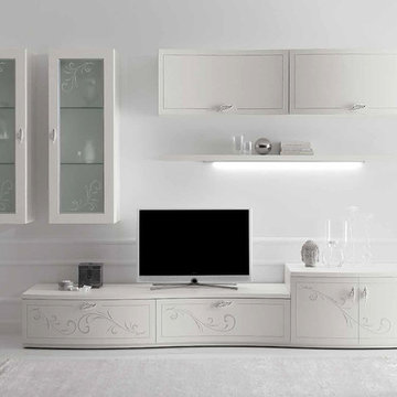
Spar Arreda gets into contemporary homes with collections for everyday living. Prestige Liberty by Spar is an italian modular wall unit line featuring modern styles, lines and shapes that harmoniously develop a concept of freshness and innovation, that tune in to the essential and pure luxury and that reflect the most advanced and innovative needs. This italian entertainment center will complement your living room, not only as an aesthetic, but also as a functional addition, featuring an abundance of storage space, both hidden and exposed. White Ash finishing, concave and convex fronts, cabinets refined with a floral decoration in relief and printed with bright silver glitter - all these details will definitely make your living room elegant, unique and charming.
MATERIAL/CONSTRUCTION:
Curved front: 19 mm thick, made of plywood covered with laminate and edged with white lacquered Ash. Finished with a floral design in relief with frosted silver glitter brilliant
Shaped tops: 30 mm thickness made of particle board panels E1 class melamine laminate pore white ash, abs edge 1 mm thick rounded wood effect
Internal Structure: 18 mm thick, made of particle board panels E1 class ennobled and lined with melamine coating
Drawers: banks 12 mm thick panels made of wood particles in E1 class with PVC coating finish gray fabric - Provisions drawer sp. 6 mm wood fiber medium density '(MDF) coated with melamine coating with the same finish of the banks. Slides in galvanized steel with invisible self-closing closure automatic suspension with height adjustment
Front glass: 19 mm thick, frame made of medium-density fiberboard '(MDF) covered with white laminate pore ash, 4mm thick tempered frosted glass with decoration beaded floral printed with bright silver glitter
The starting price is for the Prestige Wall Unit Composition Liberty 102 as shown in the main picture. The Light Kit is not included in the price and can be purchased separately.
Dimensions:
Wall Unit Composition: W124" x D22" x H78"
 TaylorPro Design and Remodeling, Inc.
"From the very beginning, it was obvious that Kerry Taylor is a creative, calm, solution oriented person who deals with challenges extremely well. His professionalism, knowledge, and work ethic are exemplary and his crew mirrors every one of those qualities. From structural problems that required immediate resolution to working around other contractors (flooring, windows), to everyday cleanup and protection of our surroundings, they did it all. Kerry designed and built special structures to support the cabinet crown moldings that we had purchased and which turned out not to be as we expected. We hadn't decided on everything ahead of time and the necessary resulting change orders were very decently priced and well documented in his invoices and receipts. He came in absolutely on budget and on time because he knows how to efficiently manage a project so that the workflow is smooth. We will absolutely call on him for future projects."
~ Avis D, Client
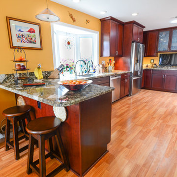
Single bowl sink, double faucets, under cabinet led lighting, TV center, key cabinet, spice rack pull out, toe kick drawer, rollouts, stainless steel hood, pendant, solar tube, appliance garage.
Photo by: Kerry W. Taylor
 Amy Carman Design
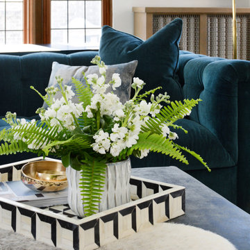
This beautifully-appointed Tudor home is laden with architectural detail. Beautifully-formed plaster moldings, an original stone fireplace, and 1930s-era woodwork were just a few of the features that drew this young family to purchase the home, however the formal interior felt dark and compartmentalized. The owners enlisted Amy Carman Design to lighten the spaces and bring a modern sensibility to their everyday living experience. Modern furnishings, artwork and a carefully hidden TV in the dinette picture wall bring a sense of fresh, on-trend style and comfort to the home. To provide contrast, the ACD team chose a juxtaposition of traditional and modern items, creating a layered space that knits the client's modern lifestyle together the historic architecture of the home.
 Byggmeister Inc
Photo by Jim Raycroft
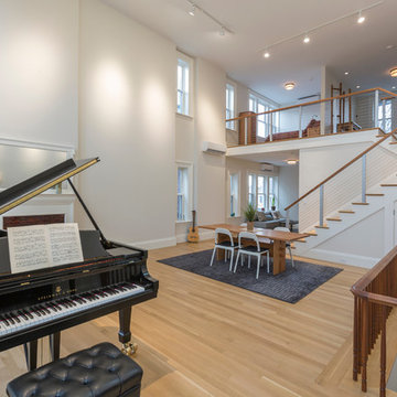
Our client for this project, an amateur pianist, wanted to create a music room for a nice new piano he was planning to purchase. The project scope would also include a new kitchen, bathroom, bedroom and living space, but the new piano was the priority.
LIFTING THE CEILING
The client was moving into a row house, and hoped to accommodate occasional gatherings of musician friends for informal recitals. Because acoustics were important we asked sound engineers from Acentech to visit the site. They noted that the ideal space would have higher ceilings and would be more like a cube than the “half a cube” we were dealing with. “How can we raise the ceiling and make the space a cube?” our client asked.
Designer Josy Raycroft started to explore the possibility of combining the second and third floor units by removing the front half of second floor ceiling, thereby opening up a 2-story music space in the shape of a nearly perfect cube. Thus, the project turned from a straightforward floor plan modification into a complete reimagining of the whole row house, with the client’s new Steinway D as the focal point. Josy and the client started with the piano and created the space around it.
ADDRESSING EVERYDAY NEEDS
For the client’s more mundane needs, Josy switched the location of the bathroom and kitchen—moving the bathroom towards the middle of the second floor where it would be convenient to the rest of the spaces, and placing the kitchen towards the back. The remainder of the third floor was transformed into bedroom and office space open to the music room below.
Products and finishes coordinator Karin Mahdavi worked with the client to select understated finishes for the living spaces so that they would support the piano room without competing with it. As a result the living spaces flow seamlessly into the piano space, creating a coherent whole out of the different parts, kind of like a Schubert piano sonata.
 Byggmeister Inc
Photo by Jim Raycroft
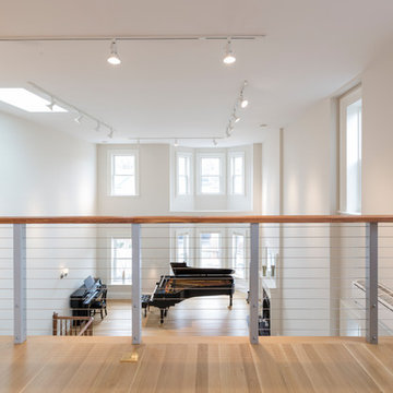
Our client for this project, an amateur pianist, wanted to create a music room for a nice new piano he was planning to purchase. The project scope would also include a new kitchen, bathroom, bedroom and living space, but the new piano was the priority.
LIFTING THE CEILING
The client was moving into a row house, and hoped to accommodate occasional gatherings of musician friends for informal recitals. Because acoustics were important we asked sound engineers from Acentech to visit the site. They noted that the ideal space would have higher ceilings and would be more like a cube than the “half a cube” we were dealing with. “How can we raise the ceiling and make the space a cube?” our client asked.
Designer Josy Raycroft started to explore the possibility of combining the second and third floor units by removing the front half of second floor ceiling, thereby opening up a 2-story music space in the shape of a nearly perfect cube. Thus, the project turned from a straightforward floor plan modification into a complete reimagining of the whole row house, with the client’s new Steinway D as the focal point. Josy and the client started with the piano and created the space around it.
ADDRESSING EVERYDAY NEEDS
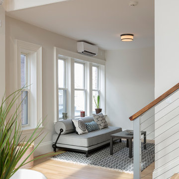
For the client’s more mundane needs, Josy switched the location of the bathroom and kitchen—moving the bathroom towards the middle of the second floor where it would be convenient to the rest of the spaces, and placing the kitchen towards the back. The remainder of the third floor was transformed into bedroom and office space open to the music room below.
Products and finishes coordinator Karin Mahdavi worked with the client to select understated finishes for the living spaces so that they would support the piano room without competing with it. As a result the living spaces flow seamlessly into the piano space, creating a coherent whole out of the different parts, kind of like a Schubert piano sonata.
 Byggmeister Inc
Photo by Jim Raycroft
Our client for this project, an amateur pianist, wanted to create a music room for a nice new piano he was planning to purchase. The project scope would also include a new kitchen, bathroom, bedroom and living space, but the new piano was the priority.
LIFTING THE CEILING
The client was moving into a row house, and hoped to accommodate occasional gatherings of musician friends for informal recitals. Because acoustics were important we asked sound engineers from Acentech to visit the site. They noted that the ideal space would have higher ceilings and would be more like a cube than the “half a cube” we were dealing with. “How can we raise the ceiling and make the space a cube?” our client asked.
Designer Josy Raycroft started to explore the possibility of combining the second and third floor units by removing the front half of second floor ceiling, thereby opening up a 2-story music space in the shape of a nearly perfect cube. Thus, the project turned from a straightforward floor plan modification into a complete reimagining of the whole row house, with the client’s new Steinway D as the focal point. Josy and the client started with the piano and created the space around it.
ADDRESSING EVERYDAY NEEDS
For the client’s more mundane needs, Josy switched the location of the bathroom and kitchen—moving the bathroom towards the middle of the second floor where it would be convenient to the rest of the spaces, and placing the kitchen towards the back. The remainder of the third floor was transformed into bedroom and office space open to the music room below.
Products and finishes coordinator Karin Mahdavi worked with the client to select understated finishes for the living spaces so that they would support the piano room without competing with it. As a result the living spaces flow seamlessly into the piano space, creating a coherent whole out of the different parts, kind of like a Schubert piano sonata.

Sponsored
Sunbury, OH

J.Holderby - Renovations
Franklin County's Leading General Contractors - 2X Best of Houzz!
 Ava Homes
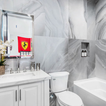
 Our objective in this home remodeling project was to transform our clients’ newly purchased Studio City cape cod style house into an aesthetically beautiful yet functional residence, that they could use for everyday living as well as entertaining friends and family. Our clients loved the original exterior design but wanted an almost entirely changed interior and backyard. We worked with them through the initial stages of design and material selection to ensure that we understand their vision. We integrated elements of contemporary and farmhouse designs throughout the interior. We created an open floor plan with a lot of natural light making a spacious, bright and connected space. We did this through some structural changes and the addition of glass sliding doors and windows. The open floor plan combined with the fully remodeled kitchen and bathrooms, new flooring, plenty of recessed lighting, and many other details managed to literally amaze our clients. We also created a master suite by expanding the master bathroom and constructing a walk-in closet. A new bathroom addition as well as a new pool house along with a new pool and spa were the other parts of this home remodeling project. The new pool and pool house along with a simple yet beautiful landscaping gave the backyard a whole new look. The roof, the HVAC system as well as all doors and windows were replaced. The garage was remodeled and the door replaced. This was a truly beautiful home remodeling at its best by Ava Homes.
 Pro Dunk Hoops
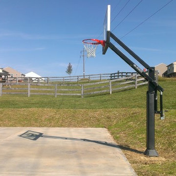
William's photos of his Pro Dunk Gold Basketball System were taken in Burlington, Kentucky. He installed the system on his backyard court. The dimensions of his playing area are 35' x 25'. He loves the system and uses it almost everyday. This is a Pro Dunk Gold Basketball System that was purchased in June of 2013. It was installed on a 35 ft wide by a 25 ft deep playing area in Burlington, KY. Browse all of William G's photos navigate to: http://www.produnkhoops.com/photos/albums/william-35x25-pro-dunk-gold-basketball-system-475/
 Byggmeister Inc
Photo by Jim Raycroft
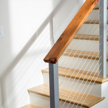
Our client for this project, an amateur pianist, wanted to create a music room for a nice new piano he was planning to purchase. The project scope would also include a new kitchen, bathroom, bedroom and living space, but the new piano was the priority.
LIFTING THE CEILING
The client was moving into a row house, and hoped to accommodate occasional gatherings of musician friends for informal recitals. Because acoustics were important we asked sound engineers from Acentech to visit the site. They noted that the ideal space would have higher ceilings and would be more like a cube than the “half a cube” we were dealing with. “How can we raise the ceiling and make the space a cube?” our client asked.
Designer Josy Raycroft started to explore the possibility of combining the second and third floor units by removing the front half of second floor ceiling, thereby opening up a 2-story music space in the shape of a nearly perfect cube. Thus, the project turned from a straightforward floor plan modification into a complete reimagining of the whole row house, with the client’s new Steinway D as the focal point. Josy and the client started with the piano and created the space around it.
ADDRESSING EVERYDAY NEEDS
For the client’s more mundane needs, Josy switched the location of the bathroom and kitchen—moving the bathroom towards the middle of the second floor where it would be convenient to the rest of the spaces, and placing the kitchen towards the back. The remainder of the third floor was transformed into bedroom and office space open to the music room below.
Products and finishes coordinator Karin Mahdavi worked with the client to select understated finishes for the living spaces so that they would support the piano room without competing with it. As a result the living spaces flow seamlessly into the piano space, creating a coherent whole out of the different parts, kind of like a Schubert piano sonata.
 Pro Dunk Hoops
William's photos of his Pro Dunk Gold Basketball System were taken in Burlington, Kentucky. He installed the system on his backyard court. The dimensions of his playing area are 35' x 25'. He loves the system and uses it almost everyday. This is a Pro Dunk Gold Basketball System that was purchased in June of 2013. It was installed on a 35 ft wide by a 25 ft deep playing area in Burlington, KY. Browse all of William G's photos navigate to: http://www.produnkhoops.com/photos/albums/william-35x25-pro-dunk-gold-basketball-system-475/


 Magnolia Outdoors
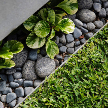
When our long-term clients purchased this home in Sherman Oaks, we helped them turn the backyard into a space they could actually use with a backyard upgrade and pool remodel. We rebuilt the pool and added a custom deck area with built-in bench seating for everyday use and small gatherings. We also designed and installed an outdoor BBQ kitchen with a durable basalt countertop that complements the interior. To break up the space, we added paving, stepping stones, and low-maintenance groundcover planting for texture and easier upkeep. We finished it off with wood elements and neutral tones to bring everything together into a practical and inviting backyard.
Backyard Remodel and Pool Renovation with Outdoor Kitchen in Sherman Oaks, CA - https://www.magnoliaoutdoors.net/backyard-transformation/
 Byggmeister Inc
Photo by Jim Raycroft
Our client for this project, an amateur pianist, wanted to create a music room for a nice new piano he was planning to purchase. The project scope would also include a new kitchen, bathroom, bedroom and living space, but the new piano was the priority.
LIFTING THE CEILING
The client was moving into a row house, and hoped to accommodate occasional gatherings of musician friends for informal recitals. Because acoustics were important we asked sound engineers from Acentech to visit the site. They noted that the ideal space would have higher ceilings and would be more like a cube than the “half a cube” we were dealing with. “How can we raise the ceiling and make the space a cube?” our client asked.
Designer Josy Raycroft started to explore the possibility of combining the second and third floor units by removing the front half of second floor ceiling, thereby opening up a 2-story music space in the shape of a nearly perfect cube. Thus, the project turned from a straightforward floor plan modification into a complete reimagining of the whole row house, with the client’s new Steinway D as the focal point. Josy and the client started with the piano and created the space around it.
ADDRESSING EVERYDAY NEEDS
For the client’s more mundane needs, Josy switched the location of the bathroom and kitchen—moving the bathroom towards the middle of the second floor where it would be convenient to the rest of the spaces, and placing the kitchen towards the back. The remainder of the third floor was transformed into bedroom and office space open to the music room below.
Products and finishes coordinator Karin Mahdavi worked with the client to select understated finishes for the living spaces so that they would support the piano room without competing with it. As a result the living spaces flow seamlessly into the piano space, creating a coherent whole out of the different parts, kind of like a Schubert piano sonata.
 Byggmeister Inc
Photo by Jim Raycroft
Our client for this project, an amateur pianist, wanted to create a music room for a nice new piano he was planning to purchase. The project scope would also include a new kitchen, bathroom, bedroom and living space, but the new piano was the priority.
LIFTING THE CEILING
The client was moving into a row house, and hoped to accommodate occasional gatherings of musician friends for informal recitals. Because acoustics were important we asked sound engineers from Acentech to visit the site. They noted that the ideal space would have higher ceilings and would be more like a cube than the “half a cube” we were dealing with. “How can we raise the ceiling and make the space a cube?” our client asked.
Designer Josy Raycroft started to explore the possibility of combining the second and third floor units by removing the front half of second floor ceiling, thereby opening up a 2-story music space in the shape of a nearly perfect cube. Thus, the project turned from a straightforward floor plan modification into a complete reimagining of the whole row house, with the client’s new Steinway D as the focal point. Josy and the client started with the piano and created the space around it.
ADDRESSING EVERYDAY NEEDS
For the client’s more mundane needs, Josy switched the location of the bathroom and kitchen—moving the bathroom towards the middle of the second floor where it would be convenient to the rest of the spaces, and placing the kitchen towards the back. The remainder of the third floor was transformed into bedroom and office space open to the music room below.
Products and finishes coordinator Karin Mahdavi worked with the client to select understated finishes for the living spaces so that they would support the piano room without competing with it. As a result the living spaces flow seamlessly into the piano space, creating a coherent whole out of the different parts, kind of like a Schubert piano sonata.
19