
Search results for "Exaggeration" in Home Design Ideas

 dRemodeling Design-Build
Working with an otherwise flush wall, the cabinetry frames and allows for the wall to have a relief to it. This relief is then further exaggerated by the inset mirrors. Taking advantage of the inset, the cabinets feature recessed lighting for the vanity space, a unique option compared to wall sconce lighting.

 K V Designs
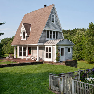
Mid-sized cottage beige one-story concrete fiberboard gable roof idea in Bridgeport with a shingle roof

 Stephen Allen Photography
Stephen Allen
Trendy living room photo in Orlando with white walls and a standard fireplace
Trendy living room photo in Orlando with white walls and a standard fireplace
Find the right local pro for your project


 McCall Design & Planning
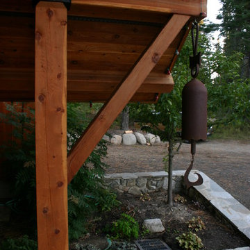
The clients for this project wanted a home with a traditional feel that fit the local aesthetic, but with a contemporary flare. The gabled forms and materials call back, while the exaggerated knee-braces and large banks of windows lend a little modernity. With a northerly exposure towards the lake the design opens up to the view without having concerns about excessive solar gain. A personal touch was added by the client fabricating the brackets for the post and beam connections.
 McCall Design & Planning
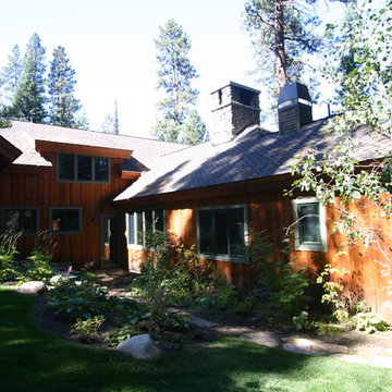
The clients for this project wanted a home with a traditional feel that fit the local aesthetic, but with a contemporary flare. The gabled forms and materials call back, while the exaggerated knee-braces and large banks of windows lend a little modernity. With a northerly exposure towards the lake the design opens up to the view without having concerns about excessive solar gain. A personal touch was added by the client fabricating the brackets for the post and beam connections.

 Kohn Shnier architects
The house sits on a relatively conventional site in a well-established neighborhood. The design of the house seeks to find the ‘sweet spot’ between formal innovations that break with conventional boundaries of its neighbours yet respects the essential qualities of its context. The exaggerated horizontal coursing and subtle pleating of the limestone masonry ensures that this house, though smaller than most of its neighbours, is distinct without being abstentious or trendy.
Photo by Doublespace Photography
 McCall Design & Planning
The clients for this project wanted a home with a traditional feel that fit the local aesthetic, but with a contemporary flare. The gabled forms and materials call back, while the exaggerated knee-braces and large banks of windows lend a little modernity. With a northerly exposure towards the lake the design opens up to the view without having concerns about excessive solar gain. A personal touch was added by the client fabricating the brackets for the post and beam connections.

 Douglas Peters>architect
Inspiration for a large modern gray two-story mixed siding flat roof remodel in Los Angeles
 McCall Design & Planning
The clients for this project wanted a home with a traditional feel that fit the local aesthetic, but with a contemporary flare. The gabled forms and materials call back, while the exaggerated knee-braces and large banks of windows lend a little modernity. With a northerly exposure towards the lake the design opens up to the view without having concerns about excessive solar gain. A personal touch was added by the client fabricating the brackets for the post and beam connections.

 GlobalElementsAZ.com
The perfect entertaining space. Four swivel wood back "martini" chairs surround a round travertine table. The custom made wetbar is just steps away.
Living room - modern travertine floor living room idea in Phoenix with white walls
Living room - modern travertine floor living room idea in Phoenix with white walls

 Cara McBroom, Licensed Interior Designer
The long layout of this room called for a second seating area–one that enjoys the fireplace, and promotes conversation. The modern gray leather club chairs are centered around a round, Century Furniture mother of pearl table. The floor lamp has an exaggerated arch that allows the light to be centered over the arrangement, while not taking away from the view, or the lines of the room.
 Young & Borlik Architects, inc.
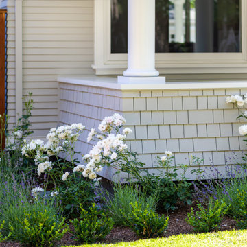
Detail showing horizontal wood siding and shingles at a front porch wall. White columns and a low seat wall welcome visitors. A softly exaggerated flared-base detail is used at the front and rear porches, and is repeated in exterior molding around the home.
 Kohn Shnier architects
The house sits on a relatively conventional site in a well-established neighborhood. The design of the house seeks to find the ‘sweet spot’ between formal innovations that break with conventional boundaries of its neighbours yet respects the essential qualities of its context. The exaggerated horizontal coursing and subtle pleating of the limestone masonry ensures that this house, though smaller than most of its neighbours, is distinct without being abstentious or trendy.
Photo by Doublespace Photography
 McCall Design & Planning
The clients for this project wanted a home with a traditional feel that fit the local aesthetic, but with a contemporary flare. The gabled forms and materials call back, while the exaggerated knee-braces and large banks of windows lend a little modernity. With a northerly exposure towards the lake the design opens up to the view without having concerns about excessive solar gain. A personal touch was added by the client fabricating the brackets for the post and beam connections.


 ODS Architecture
Originally a nearly three-story tall 1920’s European-styled home was turned into a modern villa for work and home. A series of low concrete retaining wall planters and steps gradually takes you up to the second level entry, grounding or anchoring the house into the site, as does a new wrap around veranda and trellis. Large eave overhangs on the upper roof were designed to give the home presence and were accented with a Mid-century orange color. The new master bedroom addition white box creates a better sense of entry and opens to the wrap around veranda at the opposite side. Inside the owners live on the lower floor and work on the upper floor with the garage basement for storage, archives and a ceramics studio. New windows and open spaces were created for the graphic designer owners; displaying their mid-century modern furnishings collection.
A lot of effort went into attempting to lower the house visually by bringing the ground plane higher with the concrete retaining wall planters, steps, wrap around veranda and trellis, and the prominent roof with exaggerated overhangs. That the eaves were painted orange is a cool reflection of the owner’s Dutch heritage. Budget was a driver for the project and it was determined that the footprint of the home should have minimal extensions and that the new windows remain in the same relative locations as the old ones. Wall removal was utilized versus moving and building new walls where possible.
Photo Credit: John Sutton Photography.
 ODS Architecture
Originally a nearly three-story tall 1920’s European-styled home was turned into a modern villa for work and home. A series of low concrete retaining wall planters and steps gradually takes you up to the second level entry, grounding or anchoring the house into the site, as does a new wrap around veranda and trellis. Large eave overhangs on the upper roof were designed to give the home presence and were accented with a Mid-century orange color. The new master bedroom addition white box creates a better sense of entry and opens to the wrap around veranda at the opposite side. Inside the owners live on the lower floor and work on the upper floor with the garage basement for storage, archives and a ceramics studio. New windows and open spaces were created for the graphic designer owners; displaying their mid-century modern furnishings collection.
A lot of effort went into attempting to lower the house visually by bringing the ground plane higher with the concrete retaining wall planters, steps, wrap around veranda and trellis, and the prominent roof with exaggerated overhangs. That the eaves were painted orange is a cool reflection of the owner’s Dutch heritage. Budget was a driver for the project and it was determined that the footprint of the home should have minimal extensions and that the new windows remain in the same relative locations as the old ones. Wall removal was utilized versus moving and building new walls where possible.
Photo Credit: John Sutton Photography.
 ODS Architecture
Originally a nearly three-story tall 1920’s European-styled home was turned into a modern villa for work and home. A series of low concrete retaining wall planters and steps gradually takes you up to the second level entry, grounding or anchoring the house into the site, as does a new wrap around veranda and trellis. Large eave overhangs on the upper roof were designed to give the home presence and were accented with a Mid-century orange color. The new master bedroom addition white box creates a better sense of entry and opens to the wrap around veranda at the opposite side. Inside the owners live on the lower floor and work on the upper floor with the garage basement for storage, archives and a ceramics studio. New windows and open spaces were created for the graphic designer owners; displaying their mid-century modern furnishings collection.
A lot of effort went into attempting to lower the house visually by bringing the ground plane higher with the concrete retaining wall planters, steps, wrap around veranda and trellis, and the prominent roof with exaggerated overhangs. That the eaves were painted orange is a cool reflection of the owner’s Dutch heritage. Budget was a driver for the project and it was determined that the footprint of the home should have minimal extensions and that the new windows remain in the same relative locations as the old ones. Wall removal was utilized versus moving and building new walls where possible.
Photo Credit: John Sutton Photography.
11