
Search results for "Exciting element" in Home Design Ideas
 Studio McGee
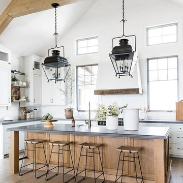
Large cottage u-shaped dark wood floor and brown floor kitchen photo in Salt Lake City with white cabinets, white backsplash, black appliances, an island, gray countertops and shaker cabinets
 TVL Creative Ltd.
[Our Clients]
We were so excited to help these new homeowners re-envision their split-level diamond in the rough. There was so much potential in those walls, and we couldn’t wait to delve in and start transforming spaces. Our primary goal was to re-imagine the main level of the home and create an open flow between the space. So, we started by converting the existing single car garage into their living room (complete with a new fireplace) and opening up the kitchen to the rest of the level.
[Kitchen]
The original kitchen had been on the small side and cut-off from the rest of the home, but after we removed the coat closet, this kitchen opened up beautifully. Our plan was to create an open and light filled kitchen with a design that translated well to the other spaces in this home, and a layout that offered plenty of space for multiple cooks. We utilized clean white cabinets around the perimeter of the kitchen and popped the island with a spunky shade of blue. To add a real element of fun, we jazzed it up with the colorful escher tile at the backsplash and brought in accents of brass in the hardware and light fixtures to tie it all together. Through out this home we brought in warm wood accents and the kitchen was no exception, with its custom floating shelves and graceful waterfall butcher block counter at the island.
[Dining Room]
The dining room had once been the home’s living room, but we had other plans in mind. With its dramatic vaulted ceiling and new custom steel railing, this room was just screaming for a dramatic light fixture and a large table to welcome one-and-all.
[Living Room]
We converted the original garage into a lovely little living room with a cozy fireplace. There is plenty of new storage in this space (that ties in with the kitchen finishes), but the real gem is the reading nook with two of the most comfortable armchairs you’ve ever sat in.
[Master Suite]
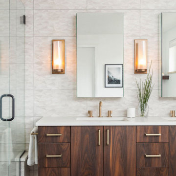
This home didn’t originally have a master suite, so we decided to convert one of the bedrooms and create a charming suite that you’d never want to leave. The master bathroom aesthetic quickly became all about the textures. With a sultry black hex on the floor and a dimensional geometric tile on the walls we set the stage for a calm space. The warm walnut vanity and touches of brass cozy up the space and relate with the feel of the rest of the home. We continued the warm wood touches into the master bedroom, but went for a rich accent wall that elevated the sophistication level and sets this space apart.
[Hall Bathroom]
The floor tile in this bathroom still makes our hearts skip a beat. We designed the rest of the space to be a clean and bright white, and really let the lovely blue of the floor tile pop. The walnut vanity cabinet (complete with hairpin legs) adds a lovely level of warmth to this bathroom, and the black and brass accents add the sophisticated touch we were looking for.
[Office]
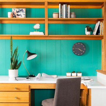
We loved the original built-ins in this space, and knew they needed to always be a part of this house, but these 60-year-old beauties definitely needed a little help. We cleaned up the cabinets and brass hardware, switched out the formica counter for a new quartz top, and painted wall a cheery accent color to liven it up a bit. And voila! We have an office that is the envy of the neighborhood.
 KrimsonHAUS
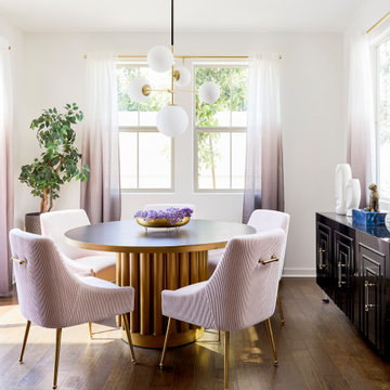
This blushful dining area was created to compliment the homeowner’s sense of person style. We kept the space light and airy by flanking the windows with ombre sheer panels. To help ground the space we also paired the lighter pieces with dark buffet and dining table.
Find the right local pro for your project
 Amy Maguire
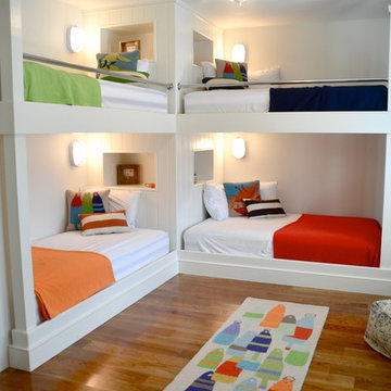
Example of a beach style gender-neutral medium tone wood floor kids' room design in Boston with white walls
 Laney LA, Inc.
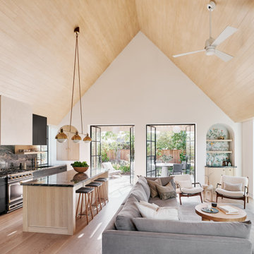
Rather than starting with an outcome in mind, this 1,400 square foot residence began from a polemic place - exploring shared conviction regarding the concentrated power of living with a smaller footprint. From the gabled silhouette to passive ventilation, the home captures the nostalgia for the past with the sustainable practices of the future.
While the exterior materials contrast a calm, minimal palette with the sleek lines of the gabled silhouette, the interior spaces embody a playful, artistic spirit. From the hand painted De Gournay wallpaper in the master bath to the rugged texture of the over-grouted limestone and Portuguese cobblestones, the home is an experience that encapsulates the unexpected and the timeless.

 Ward Jewell Architect AIA
San Marino based clients were interested in developing a property that had been in their family for generations. This was an exciting proposition as it was one of the last surviving bayside double lots on the scenic Coronado peninsula in San Diego. They desired a holiday home that would be a gathering place for their large, close- knit family.
San Marino based clients were interested in developing a property that had been in their family for generations. This was an exciting proposition as it was one of the last surviving bayside double lots on the scenic Coronado peninsula in San Diego. They desired a holiday home that would be a gathering place for their large, close-knit family. Facing the Back Bay, overlooking downtown and the Bay Bridge, this property presented us with a unique opportunity to design a vacation home with a dual personality. One side faces a bustling harbor with a constant parade of yachts, cargo vessels and military ships while the other opens onto a deep, quiet contemplative garden. The home’s shingle-style influence carries on the historical Coronado tradition of clapboard and Craftsman bungalows built in the shadow of the great Hotel Del Coronado which was erected at the turn of the last century. In order to create an informal feel to the residence, we devised a concept that eliminated the need for a “front door”. Instead, one walks through the garden and enters the “Great Hall” through either one of two French doors flanking a walk-in stone fireplace. Both two-story bedroom wings bookend this central wood beam vaulted room which serves as the “heart of the home”, and opens to both views. Three sets of stairs are discretely tucked away inside the bedroom wings.
In lieu of a formal dining room, the family convenes and dines around a beautiful table and banquette set into a circular window bay off the kitchen which overlooks the lights of the city beyond the harbor. Working with noted interior designer Betty Ann Marshall, we designed a unique kitchen that was inspired by the colors and textures of a fossil the couple found on a honeymoon trip to the quarries of Montana. We set that ancient fossil into a matte glass backsplash behind the professional cook’s stove. A warm library with walnut paneling and a bayed window seat affords a refuge for the family to read or play board games. The couple’s fine craft and folk art collection is on prominent display throughout the house and helps to set an intimate and whimsical tone.
Another architectural feature devoted to family is the play room lit by a dramatic cupola which beacons the older grandchildren and their friends. Below the play room is a four car garage that allows the patriarch space to refurbish an antique fire truck, a mahogany launch boat and several vintage cars. Their jet skis and kayaks are housed in another garage designed for that purpose. Lattice covered skylights that allow dappled sunlight to bathe the loggia affords a comfortable refuge to watch the kids swim and gaze out upon the rushing water, the Coronado Bay Bridge and the romantic downtown San Diego skyline.
Architect: Ward Jewell Architect, AIA
Interior Design: Betty Ann Marshall
Construction: Bill Lyons
Photographer: Laura Hull
Styling: Zale Design Studio
 Weatherill Interiors
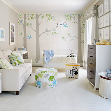
Example of a mid-sized transitional gender-neutral carpeted and beige floor nursery design in San Francisco with multicolored walls

Sponsored
Columbus, OH

Wannemacher Interiors
Customized Award-Winning Interior Design Solutions in Franklin Cnty OH

 Amy Troute Inspired Interior Design
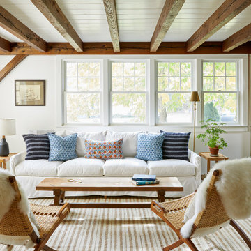
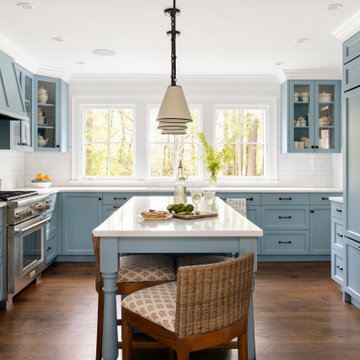
ATIID collaborated with these homeowners to curate new furnishings throughout the home while their down-to-the studs, raise-the-roof renovation, designed by Chambers Design, was underway. Pattern and color were everything to the owners, and classic “Americana” colors with a modern twist appear in the formal dining room, great room with gorgeous new screen porch, and the primary bedroom. Custom bedding that marries not-so-traditional checks and florals invites guests into each sumptuously layered bed. Vintage and contemporary area rugs in wool and jute provide color and warmth, grounding each space. Bold wallpapers were introduced in the powder and guest bathrooms, and custom draperies layered with natural fiber roman shades ala Cindy’s Window Fashions inspire the palettes and draw the eye out to the natural beauty beyond. Luxury abounds in each bathroom with gleaming chrome fixtures and classic finishes. A magnetic shade of blue paint envelops the gourmet kitchen and a buttery yellow creates a happy basement laundry room. No detail was overlooked in this stately home - down to the mudroom’s delightful dutch door and hard-wearing brick floor.
Photography by Meagan Larsen Photography
 Tamara Eaton Design
Jeffrey Kilmer
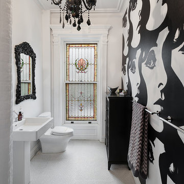
Inspiration for an eclectic mosaic tile floor bathroom remodel in New York with multicolored walls
Inspiration for an eclectic mosaic tile floor bathroom remodel in New York with multicolored walls
 Nicole Arnold Interiors
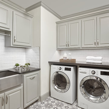
We transformed a Georgian brick two-story built in 1998 into an elegant, yet comfortable home for an active family that includes children and dogs. Although this Dallas home’s traditional bones were intact, the interior dark stained molding, paint, and distressed cabinetry, along with dated bathrooms and kitchen were in desperate need of an overhaul. We honored the client’s European background by using time-tested marble mosaics, slabs and countertops, and vintage style plumbing fixtures throughout the kitchen and bathrooms. We balanced these traditional elements with metallic and unique patterned wallpapers, transitional light fixtures and clean-lined furniture frames to give the home excitement while maintaining a graceful and inviting presence. We used nickel lighting and plumbing finishes throughout the home to give regal punctuation to each room. The intentional, detailed styling in this home is evident in that each room boasts its own character while remaining cohesive overall.

 Liz Schupanitz Designs
Cooking for Two
Location: Plymouth, MN, United States
When this couple’s last child graduated from college they began the process of looking for a new home. After a lengthy search they decided to stay with the neighborhood they loved, saving money by remodeling rather than starting over.
The top priorities on their wish list were adding character to their 1990’s era home with a classic white kitchen and a larger island while keeping within the existing footprint. With the intention of honing their cooking skills, they were also considering better appliances and two ovens.
Challenges and Solutions
Design a larger island with seating for at least two. The existing island was small and the area behind the seating was less than recommended clearances.
To solve this challenge, the seating area of the island was extended out into the open area of the kitchen. This created a larger island with seating for three, extra storage and a bookshelf across from the range.
The original kitchen had a range with microwave above, so adding another oven was a challenge with limited wall space.
Because the adjoining dining room is used infrequently, the homeowner was open to placing the second oven and microwave in the walkway. This made room for the small buffet between the built in refrigerator and ovens, creating one of her favorite areas.
The client requested a white painted kitchen but wanted to make sure it had warmth and character. To achieve this the following elements were chosen:
1) Cabinets painted with Benjamin Moore Capitol White, a luminous and warm shade of white.
2) The Range hood was painted with warm metallic shades to reflect the bronze of the Ashley Norton hardware.
3) Black Aqua Grantique granite was chosen for countertops because it looks like soapstone and adds contrast.
4) Walker Zanger Café tile in Latte was chosen for it’s handmade look with uneven edges.
5) The to-the-counter-cabinet with glass door shows off serving dishes and lends sophisticated charm.
The result is a welcoming classic kitchen, where this couple enjoys cooking more often and sharpening their skills with gourmet appliances.
Liz Schupanitz Designs
Photographed by: Andrea Rugg Photography
 Bonaventura Architect
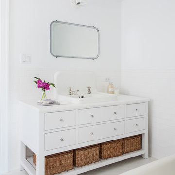
Please see this Award Winning project in the October 2014 issue of New York Cottages & Gardens Magazine: NYC&G
http://www.cottages-gardens.com/New-York-Cottages-Gardens/October-2014/NYCG-Innovation-in-Design-Winners-Kitchen-Design/
It was also featured in a Houzz Tour:
Houzz Tour: Loving the Old and New in an 1880s Brooklyn Row House
http://www.houzz.com/ideabooks/29691278/list/houzz-tour-loving-the-old-and-new-in-an-1880s-brooklyn-row-house
Photo Credit: Hulya Kolabas
Sponsored
Columbus, OH

Trish Takacs Design
Award Winning & Highly Skilled Kitchen & Bath Designer in Columbus

 Katie Rosenfeld Design
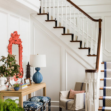
This ocean-front shingled Gambrel style house is home to a young family with little kids who lead an active, outdoor lifestyle. My goal was to create a bespoke, colorful and eclectic interior that looked sophisticated and fresh, but that was tough enough to withstand salt, sand and wet kids galore. The palette of coral and blue is an obvious choice, but we tried to translate it into a less expected, slightly updated way, hence the front door! Liberal use of indoor-outdoor fabrics created a seamless appearance while preserving the utility needed for this full time seaside residence.
photo: Michael J Lee Photography
 Paintzen, Inc.
When we imagine the homes of our favorite actors, we often think of picturesque kitchens, artwork hanging on the walls, luxurious furniture, and pristine conditions 24/7. But for celebrities with children, sometimes that last one isn’t always accurate! Kids will be kids – which means there may be messy bedrooms, toys strewn across their play area, and maybe even some crayon marks or finger-paints on walls or floors.
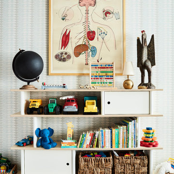
Lucy Liu recently partnered with One Kings Lane and Paintzen to redesign her son Rockwell’s playroom in their Manhattan apartment for that reason. Previously, Lucy had decided not to focus too much on the layout or color of the space – it was simply a room to hold all of Rockwell’s toys. There wasn’t much of a design element to it and very little storage.
Lucy was ready to change that – and transform the room into something more sophisticated and tranquil for both Rockwell and for guests (especially those with kids!). And to really bring that transformation to life, one of the things that needed to change was the lack of color and texture on the walls.
When selecting the color palette, Lucy and One Kings Lane designer Nicole Fisher decided on a more neutral, contemporary style. They chose to avoid the primary colors, which are too often utilized in children’s rooms and playrooms.
Instead, they chose to have Paintzen paint the walls in a cozy gray with warm beige undertones. (Try PPG ‘Slate Pebble’ for a similar look!) It created a perfect backdrop for the decor selected for the room, which included a tepee for Rockwell, some Tribal-inspired artwork, Moroccan woven baskets, and some framed artwork.
To add texture to the space, Paintzen also installed wallpaper on two of the walls. The wallpaper pattern involved muted blues and grays to add subtle color and a slight contrast to the rest of the walls. Take a closer look at this smartly designed space, featuring a beautiful neutral color palette and lots of exciting textures!
 Klopf Architecture
Mariko Reed
Inspiration for a mid-sized 1960s porcelain tile and beige floor great room remodel in San Francisco with black walls
Inspiration for a mid-sized 1960s porcelain tile and beige floor great room remodel in San Francisco with black walls
 TVL Creative Ltd.
[Our Clients]
We were so excited to help these new homeowners re-envision their split-level diamond in the rough. There was so much potential in those walls, and we couldn’t wait to delve in and start transforming spaces. Our primary goal was to re-imagine the main level of the home and create an open flow between the space. So, we started by converting the existing single car garage into their living room (complete with a new fireplace) and opening up the kitchen to the rest of the level.
[Kitchen]
The original kitchen had been on the small side and cut-off from the rest of the home, but after we removed the coat closet, this kitchen opened up beautifully. Our plan was to create an open and light filled kitchen with a design that translated well to the other spaces in this home, and a layout that offered plenty of space for multiple cooks. We utilized clean white cabinets around the perimeter of the kitchen and popped the island with a spunky shade of blue. To add a real element of fun, we jazzed it up with the colorful escher tile at the backsplash and brought in accents of brass in the hardware and light fixtures to tie it all together. Through out this home we brought in warm wood accents and the kitchen was no exception, with its custom floating shelves and graceful waterfall butcher block counter at the island.
[Dining Room]
The dining room had once been the home’s living room, but we had other plans in mind. With its dramatic vaulted ceiling and new custom steel railing, this room was just screaming for a dramatic light fixture and a large table to welcome one-and-all.
[Living Room]
We converted the original garage into a lovely little living room with a cozy fireplace. There is plenty of new storage in this space (that ties in with the kitchen finishes), but the real gem is the reading nook with two of the most comfortable armchairs you’ve ever sat in.
[Master Suite]
This home didn’t originally have a master suite, so we decided to convert one of the bedrooms and create a charming suite that you’d never want to leave. The master bathroom aesthetic quickly became all about the textures. With a sultry black hex on the floor and a dimensional geometric tile on the walls we set the stage for a calm space. The warm walnut vanity and touches of brass cozy up the space and relate with the feel of the rest of the home. We continued the warm wood touches into the master bedroom, but went for a rich accent wall that elevated the sophistication level and sets this space apart.
[Hall Bathroom]
The floor tile in this bathroom still makes our hearts skip a beat. We designed the rest of the space to be a clean and bright white, and really let the lovely blue of the floor tile pop. The walnut vanity cabinet (complete with hairpin legs) adds a lovely level of warmth to this bathroom, and the black and brass accents add the sophisticated touch we were looking for.
[Office]
We loved the original built-ins in this space, and knew they needed to always be a part of this house, but these 60-year-old beauties definitely needed a little help. We cleaned up the cabinets and brass hardware, switched out the formica counter for a new quartz top, and painted wall a cheery accent color to liven it up a bit. And voila! We have an office that is the envy of the neighborhood.


2