
Search results for "Existed" in Home Design Ideas
 Twelve Stones Designs, LLC
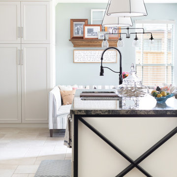
The owners of this kitchen had spent the money to upgrade the finishes in their kitchen upon building the home 12 years ago, but after living in the space for several years they realized how nonfunctional the layout really was. The (then) two preschool aged children had grown into busy, hungry teenagers with many friends who also liked to hang out at the house. So the family needed a more functional kitchen with better traffic flow, space for daily activities revolving around the kitchen at different times of day, and a kitchen that could accommodate cooking for and serving large groups. Furthermore, the dark, traditional finishes no longer reflected the homeowners’ style. They requested a brighter, more relaxed, coastal style that reflected their love of the seaside cities they like to visit.
Originally, the kitchen was U-shaped with a narrow island in the middle. The island created narrow aisles that bottle-necked at the dishwasher, refrigerator, and cooktop areas. There was a pass-through from the foyer into the kitchen, but the owners never liked that the pass-through was also located so close to the powder room. The awkward proximity was unappealing and made guests feel uncomfortable.
The kitchen’s storage was made up of lots of narrow cabinets, apothecary drawers, clipped corner units, and very few drawers. It lacked useful storage for the larger items the family used on a daily basis. And the kitchen’s only pantry was small closet that had only builder-grade, narrow shelving with no illumination to be able to see the contents inside.
Overall, the kitchen’s lighting plan was poorly executed. Only six recessed cans illuminated the entire kitchen and nook areas. The under cabinet lighting was not evenly distributed either. In fact, the builder had mis-placed the under cabinet lighting around the decorative pilasters which made for choppy, dark cubbies. Further, the builder didn’t include any lighting over the sink or the bar area, which meant whoever was doing the dishes was always in their own shadow. That, coupled with the steep overhang of the game room above made the bar area feel like a dim, cavernous space that wasn’t inviting or task oriented. The kitchen looked out into the main living space, but the raised bar and a narrow wall (which held the only large cabinet in the kitchen) created more of a barrier than a relationship to the living room or breakfast nook. In fact, one couldn’t even see the breakfast nook from the cooktop or sink areas due to its orientation. The raised bar top was too narrow to comfortably sit to either dine at or chat from due to the lack of knee space. The the homeowners confided that the kitchen felt more like a dark, dirty prison than place where the family, or their guests, wanted to gather and commune.
The clients' needs and desires were:
➢ to create a kitchen that would be a space the family loved to be in; to relate to the adjacent spaces all around, and to have better flow for entertaining large groups
➢ to remove the walls between the breakfast nook and living area and to be able to utilize the natural light from the windows in both those areas
➢ to incorporate a functional chopping block for prepping fresh food for home cooked meals, an island with a large sink and drain board, 2 pull out trash cans, and seating for at least the 2 teens to eat or do homework
➢ to design a kitchen and breakfast nook with an airy, coastal, relaxed vibe that blended with the rest of the house's coastal theme
➢ to integrate a layered lighting plan which would include ample general illumination, specific task lighting, decorative lighting, and lots of illuminated storage
➢ to design a kitchen with not only more storage for all the husband’s kitchen gadgets and collection of oils and spices, but smart storage, including a coffee/breakfast bar and a place to store and conceal the toaster oven and microwave
➢ to find a way to utilize the large open space between the kitchen, pantry area, and breakfast nook
Twelve Stones Designs achieved the owner's goals by:
➢ removing the walls between the kitchen and living room to allow the natural light to filter in from the adjacent rooms and to create a connection between the kitchen, nook, and living spaces for a sense of unity and communion
➢ removing the existing pantry and designing 3 large pantry style cabinets with LED tape lights and rollout drawers to house lots of kitchen appliances, gadgets, and tons of groceries. We also took the cabinets all the way up to the 9’ ceiling for additional storage for seasonal items and bulk storage.
➢ designing 2 islands - 1 with a gorgeous black walnut chopping block that houses a drawer for chopping and carving knives and a custom double pull out trash unit for point of use utilization - and 1 that houses the dishwasher, a large Blanco Gourmet sink with integrated drain board, woven baskets for fresh root vegetables and kitchen towels, plenty of drawer storage for kitchen items, and bar seating for up to 4 diners.
➢ closing off the space between the kitchen and the powder room to create a beautiful new private alcove for the powder room as well as adding some decorative storage. This also gave us space to include more tall storage near the new range for precision placement of the husband’s extensive oil and spice collection as well as a location for a combo-steam oven the wife wanted for baking and cooking healthy meals.
The project is enhanced functionally by:
➢ incorporated USB and standard receptacles for the kids’ laptops and phone charging in the large island
➢ designing the small island to include additional open shelving for items used on a daily basis such as a variety of bowls, plates, and colanders. This set up also works well for the husband who prefers to “plate” his dinners in restaurant-style fashion before presenting them to the table.
➢ the integration of specific storage units, such as double stacked cutlery drawers, a custom spice pull-out, a Kuerig coffee and tea pod drawer, and custom double stacked utensil drawers
➢ moving the refrigerator to the old oven location - this eliminated the bottle neck as well as created a better relationship to the eating table. It also utilizes the floor space between the pantry, nook, and kitchen
➢ creating a banquet style breakfast nook - this banquette seating not only doubles the amount of seating for large gatherings but it better utilizes the odd space between the kitchen and the previous nook area. It also helps to create a distinct pathway from the mudroom room through the pantry area, kitchen, nook, and living room.
➢ the coffee/breakfast bar area which includes the perfect location for the concealed microwave and toaster oven, convenient storage for the coffee pods and tea accoutrements. Roll-out drawers below also house the smoothie maker, hot water kettle, and a plethora of smoothie-making ingredients such as protein powders, smoothie additives, etc. Furthermore, the drawers below the Keurig house measuring utensil, cutlery, baking supplies and tupperware storage.
➢ incorporating lots of wide drawers and pullouts to accommodate large cookware.
➢ utilizing as much vertical space as possible by building storage to the ceiling which accommodates the family’s abundant amount of serving platters, baking sheets, bakeware, casserole dishes, and additional cutting boards.
The project is enhanced aesthetically by:
➢ new 5-piece Versailles pattern porcelain tile that now seamlessly joins the entire down stairs area together creating a bright, cohesiveness feeling instead of choppy separated spaces - it also adds a coastal feeling
➢ designing a cabinet to conceal the microwave and toaster oven
➢ the coastal influenced light fixtures over the nook table and island
➢ the sandy colors of the Langdon Cambria countertops. The swirling pattern and sparkling quartz pieces remind the homeowner of black-and-tan sandy beaches
➢ the striped banquet seating whose creamy white background and blue-green stripes were the inspiration for the cabinet and wall colors.
➢ All the interior doors were painted black to coordinate with the blacks and grays in the backsplash tile and countertop. This also adds a hint of tailored formality to an otherwise casual space.
➢ the use of WAC's Oculux small aperture LED units for the overhead lighting complimented with Diode LED strips for task lighting under the cabinets and inside the pantry and glass wall cabinets. All of the lighting applications are on separate dimmer switches.
Innovative uses of materials or construction methods by Realty Restoration LLC:
➢ Each 1-1/2” x 3” block of reclaimed end-grain black walnut that makes up the center island chopping block was hand milled and built in the shop. It was designed to look substantial and proportional to the surrounding elements, executed by creating the 4 inch tall top with a solid wood chamfered edge band.
➢ The metal doors on either side of the vent hood were also custom designed for this project and built in the Realty Restoration LLC shop. They are made 1x2, 11-gauge mild steel with ribbed glass. Weighing 60 lbs a piece, heavy duty cabinet hinges were added to support the weight of the door and keep them from sagging.
➢ Under-cabinet receptacles were added along the range wall in order to have a clean, uninterrupted backsplash.
Design obstacles to overcome:
➢ Because we were removing the demising walls between the kitchen and living room, we had to find a way to plumb and vent the new island. We did this by tunneling through the slab (the slab had post tension cables which prevented us from just trenching) to run a new wet vent through a nearby structural wall. We pulled the existing hot and cold lines between upper floor joists and ran them down the structural wall as well and up through a conduit in the tunnel.
➢ Since we were converting from wall overs to a gas range it allowed us to utilize the 220 feed for the wall ovens to provide a new sub panel for all the new kitchen circuits
➢ Due to framing deficiencies inherited from the original build there was a 1-1/2” differential in the floor-to-ceiling height over a 20 foot span; by utilizing the process of cutting and furring coupled with the crown moulding details on the cabinet elevations we were able to mask the problem and provide seamless transitions between the cabinet components.
Evidence of superior craftsmanship:
➢ uniquely designed, one-of-a-kind metal “X” end panels on the large island. The end panels were custom made in the Realty Restoration LLC shop and fitted to the exact dimensions of the island. The welding seams are completely indistinguishable - the posts look like they are cut from a single sheet of metal
➢ square metal posts on the small island were also custom made and designed to compliment and carry through the metal element s throughout the kitchen
➢ the beautiful, oversized end panels on the pantry cabinets which give the breakfast nook a tailored look
➢ integrating a large format 5 piece Versailles tile pattern to seamlessly flow from the existing spaces into the new kitchen space
➢ By constructing a custom cabinet that jogged around a corner we could not remodel (housing the entry way coat closet) we were able to camouflage the adjacent wall offset within the upper and lower cabinets. By designing around the existing jog in the structural walls we accomplished a few things: we were able to find the space to house, and hide, the microwave and toaster oven yet still have a clean cohesive appearance from the kitchen side. Additionally, the owners were able to keep their much needed coat closet and we didn’t have to increase the budget with unnecessary structural work.
 TKS Design Group
Download our free ebook, Creating the Ideal Kitchen. DOWNLOAD NOW
Lakefront property in the northwest suburbs of Chicago is hard to come by, so when we were hired by this young family with exactly that, we were immediately inspired by not just the unusually large footprint of this 1950’s colonial revival but also the lovely views of the manmade lake it was sited on. The large 5-bedroom home was solidly stuck in the 1980’s, but we saw tons of potential. We started out by updating the existing staircase with a fresh coat of paint and adding new herringbone slate to the entry hall.
The powder room off the entryway also got a refresh - new flooring, new cabinets and fixtures. We ran the new slate right through into this space for some consistency. A fun wallpaper and shiplap trim add a welcoming feel and set the tone for the home.
Next, we tackled the kitchen. Located away from the rest of the first floor, the kitchen felt a little isolated, so we immediately began planning for how to better connect it to the rest of the first floor. We landed on removing the wall between the kitchen and dining room and designed a modified galley style space with separate cooking and clean up zones. The cooking zone consists of the refrigerator, prep sink and cooktop, along with a nice long run of prep space at the island. The cleanup side of the kitchen consists of the main sink and dishwasher. Both areas are situated so that the user can view the lake during prep work and cleanup!
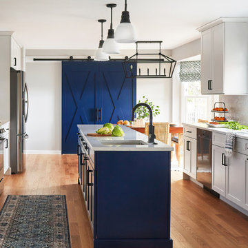
One of the home’s main puzzles was how to incorporate the mudroom and area in front of the patio doors at the back of the house. We already had a breakfast table area, so the space by the patio doors was a bit of a no man’s land. We decided to separate the kitchen proper from what became the new mudroom with a large set of barn doors. That way you can quickly hide any mudroom messes but have easy access to the light coming in through the patio doors as well as the outdoor grilling station. We also love the impact the barn doors add to the overall space.
The homeowners’ first words to us were “it’s time to ditch the brown,” so we did! We chose a lovely blue pallet that reflects the home’s location on the lake which is also vibrant yet easy on the eye. Countertops are white quartz, and the natural oak floor works well with the other honey accents. The breakfast table was given a refresh with new chairs, chandelier and window treatments that frame the gorgeous views of the lake out the back.
We coordinated the slate mudroom flooring with that used in the home’s main entrance for a consistent feel. The storage area consists of open and closed storage to allow for some clutter control as needed.
Next on our “to do” list was revamping the dated brown bar area in the neighboring dining room. We eliminated the clutter by adding some closed cabinets and did some easy updates to help the space feel more current. One snag we ran into here was the discovery of a beam above the existing open shelving that had to be modified with a smaller structural beam to allow for our new design to work. This was an unexpected surprise, but in the end we think it was well worth it!
We kept the colors here a bit more muted to blend with the homeowner’s existing furnishings. Open shelving and polished nickel hardware add some simple detail to the new entertainment zone which also looks out onto the lake!
Next we tackled the upstairs starting with the homeowner’s son’s bath. The bath originally had both a tub shower and a separate shower, so we decided to swap out the shower for a new laundry area. This freed up some space downstairs in what used to be the mudroom/laundry room and is much more convenient for daily laundry needs.
We continued the blue palette here with navy cabinetry and the navy tile in the shower. Porcelain floor tile and chrome fixtures keep maintenance to a minimum while matte black mirrors and lighting add some depth the design. A low maintenance runner adds some warmth underfoot and ties the whole space together.
We added a pocket door to the bathroom to minimize interference with the door swings. The left door of the laundry closet is on a 180 degree hinge to allow for easy full access to the machines. Next we tackled the master bath which is an en suite arrangement. The original was typical of the 1980’s with the vanity outside of the bathroom, situated near the master closet. And the brown theme continued here with multiple shades of brown.
Our first move was to segment off the bath and the closet from the master bedroom. We created a short hall from the bedroom to the bathroom with his and hers walk-in closets on the left and right as well as a separate toilet closet outside of the main bathroom for privacy and flexibility.
The original bathroom had a giant soaking tub with steps (dangerous!) as well as a small shower that did not work well for our homeowner who is 6’3”. With other bathtubs in the home, they decided to eliminate the tub and create an oversized shower which takes up the space where the old tub was located. The double vanity is on the opposite wall and a bench is located under the window for morning conversations and a place to set a couple of towels.
The pallet in here is light and airy with a mix of blond wood, creamy porcelain and marble tile, and brass accents. A simple roman shade adds some texture and it’s top-down mechanism allows for light and privacy.
This large whole house remodel gave our homeowners not only the ability to maximize the potential of their home but also created a lovely new frame from which to view their fabulous lake views.
Designed by: Susan Klimala, CKD, CBD
Photography by: Michael Kaskel
For more information on kitchen and bath design ideas go to: www.kitchenstudio-ge.com
 EW Architecture Inc.
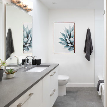
At roughly 1,600 sq.ft. of existing living space, this modest 1971 split level home was too small for the family living there and in need of updating. Modifications to the existing roof line, adding a half 2nd level, and adding a new entry effected an overall change in building form. New finishes inside and out complete the alterations, creating a fresh new look. The sloping site drops away to the east, resulting in incredible views from all levels. From the clean, crisp interior spaces expansive glazing frames the VISTA.
Find the right local pro for your project
 Matt Fajkus Architecture
Situated within a one-acre lot in Austin’s Tarry Trail neighborhood, the backyard of this existing 1933- vintage historical house was underutilized. The owners felt that the main drawbacks of the existing backyard were a general disconnection between each outdoor area and a general lack of relationship to the house proper. Therefore, the primary goal of the redesign was a scheme that would promote the use of the outdoor zones, with the pool as a centerpiece.
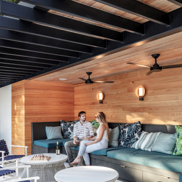
The first major design move was to frame the pool with a new structure as a backdrop. This cabana is perpendicular to the main house and creates a clear “bookend” to the upper level deck while housing indoor and outdoor activities. Under the cabana’s overhang, an integrated seating space offers a balance of sunlight and shade while an outdoor grill and bar area facilitate the family’s outdoor lifestyle. The only enclosed program exists as a naturally lit perch within the canopy of the trees, providing a serene environment to exercise within the comfort of a climate-controlled space.
A corollary focus was to create sectional variation within the volume of the pool to encourage dynamic use at both ends while relating to the interior program of the home. A shallow beach zone for children to play is located near the family room and the access to the play space in the yard below. At the opposite end of the pool, outside the formal living room, another shallow space is made to be a splash-free sunbathing area perfect for enjoying an adult beverage.
The functional separation set up by the pool creates a subtle and natural division between the energetic family spaces for playing, lounging, and grilling, and the composed, entertaining and dining spaces. The pool also enhances the formal program of the house by acting as a reflecting pool within a composed view from the front entry that draws visitors to an outdoor dining area under a majestic oak tree.
By acting as a connector between the house and the yard, the elongated pool bridges the day-to-day activities within the house and the lush, sprawling backyard. Planter beds and low walls provide loose constraints to organize the overall outdoor living area, while allowing the space to spill out into the yard. Terraces navigate the sectional change in the landscape, offering a passage to the lower yard where children can play on the grass as the parents lounge by the outdoor fireplace.
 Advance Design Studio, Ltd.
Mike and Michelle of Lake Barrington knew they needed extra space. Their home was becoming too crowded for their family with blossoming teenagers, so a basement renovation offered the perfect solution for more space for the kids and more room to entertain for the adults.
“Our project consisted of expanding our laundry room, putting in a first floor wet bar so we had adult space upstairs, while also renovating our basement for a family-friendly and teen-functional area as well,” Michelle says.
They found Advance Design Studio through a neighbor who gave a glowing recommendation, giving Michelle and Mike the confidence they needed to move forward with a major home renovation. They felt like they knew Advance Design before they even worked together. When they met with the owner Todd Jurs and designer Nicole Ryan, Mike and Michelle knew they were getting a trustworthy, dependable team that could create the project they had been dreaming about for 7 years.
Having virtually no natural light to work with, one of the biggest design challenges was creating a basement that did not feel dark and depressing. The Advance team got to work creating architectural archways and custom detailed dry-stack stone columns artfully designed into the space, adding a dramatic element that made the space feel less like a basement or more like a relaxing family room. Color 3D renderings were created to portray what the space would look like so Mike and Michelle could visualize the space in advance.
Detailed trim and crown moldings grace the built in buffet and wet bar making for an amazingly functional space that lacks nothing in style and visual interest. Cherry wood cabinetry by Dura Supreme is featured in the space with a “Cocoa Brown” finish and includes beautiful mirrored glass doors embellished with unique elliptical mullion details. A built-in microwave, dishwasher and mini fridge add practicality to the ample entertainment mecca. An under mounted sink finishes the space joined with a intricate mosaic tile backsplash and “Ventisca Polished” quartz countertops.
The basement is absolutely perfect for hosting friends and family with expertly designed key areas such as a game space for the kids, a movie area for the family, an ample workout room with luxurious full bath, and even built in wine storage. The family absolutely loves the new basement living space, and has already enjoyed numerous family movie nights and sleep-overs with friends.
While custom cabinets made by Dura Supreme were used to create unique spaces that lived up to Mike and Michelle’s expectations., heated flooring under the 16”x16” “Mongolian Spring” tile was installed giving all tiled areas of the basement a much cozier feel, eliminating that cold hard surface most of us hate in our basements!
The new basement must-have requirement list included a new bath space, which was incorporated adjacent to the work out room. The sleek shower door and cabinets in the new bathroom make guests and family feel like they are in an elegant hotel. The new guest bath features 4”x36” “Silver Screen” honed marble tile in a brick pattern on the shower walls and 2”x2” “Chenille” limestone tile in a hexagon mosaic pattern on the shower floor.
“I came in with very specific requirements for our three project areas,” Michelle says. “There was not one time that I felt like I was asking for something that was not going to turn out how I anticipated.”
Tying in multiple rooms during a renovation if you have can do it makes a lot of sense and saves money in the long run. A fully functional laundry room as well was a must on this family’s wish list. Michelle wanted to add space to the existing cramped and awkward laundry room, and Mike wanted to make sure they could still park a car in the garage. Reconfiguring interior walls required borrowing unused space cleverly from the garage in order to enlarge the laundry room space.
Drawers under the stairs added beautiful hidden storage created almost magically out of dead space. White painted Dura Supreme cabinets bring additional light into the small space; while the 16”x16” cleft slate tile flooring provides excellent contrast and the naturally earthy feel Michelle wanted. Quartz countertops with a 3”x12” “Debut Dew” subway tile backsplash add elegance to the now upliftingly bright laundry room.
The extra space makes doing laundry much more pleasurable and the added storage is a great for all those little things like winter hats and gloves, umbrellas and the like. “The Advance Design project team was phenomenal to work with,” Michelle says. “They came in, shared the plans with us and walked us through the expectations. We always knew what was coming next.”
Converting an existing closet space, the wet bar upstairs was challenging because they wanted a functional area that didn’t look or feel like cabinets just sticking out of a closet. So the Advance team transformed this ordinary closet space into a stunning wet bar that architecturally appears as if it’s always been there. Traditional, elegant hand carved custom molding matching the adjacent fireplace ties the new entertainment bar area in nicely with the existing family room and kitchen area.
Featuring a built in wine refrigerator, Dura Supreme cabinetry in deep cherry wood elegantly displays wine bottles and etched glass mullion doors that fill with soft light in the evening hours. Cambria “Windermere” quartz countertops with a sophisticated hammered copper sink and a glimmering backsplash round out the stunning wet bar. Hosting parties and family functions has become much more enjoyable now that they have a dedicated beverage serving area large enough to include hors devours.
All three projects were designed and constructed together at the same time, making for a cohesive project that was administered smoothly and easily both for the design team and for the family. Disruption to the home was minimal as each phase was completed in each project conclusively, and design and meeting time for the homeowner was efficient and organized making for an enjoyable process.
“Advance Design was great to work with,” Michelle says. “I would highly recommend them to anyone considering a home improvement project. They took the time at the beginning to understand our needs, our budget, and our vision for our home. The field team was great, attentive, on time, cleaned up each day and made the overall experience very positive. We couldn't be happier with the finished product.”
With the help of our talented, award winning design team you can create the basement, laundry room, or any other home renovation that you have been dreaming of. With our “Common Sense Remodeling” approach, the process of renovating you home has never been easier. Contact us today at 847-836-2600 or schedule an appointment to talk with us about that kitchen remodeling project.
Joe Nowak
 Closetopia
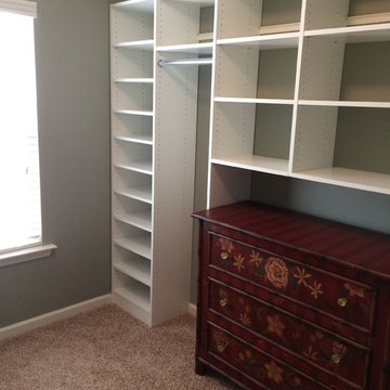
This dresser was special to the client so we incorporated space into the design in order for it to remain in the plan.
Walk-in closet - mid-sized traditional gender-neutral carpeted and beige floor walk-in closet idea in Atlanta with open cabinets and white cabinets
Walk-in closet - mid-sized traditional gender-neutral carpeted and beige floor walk-in closet idea in Atlanta with open cabinets and white cabinets
 Costa Bella Builders
Aptos Addition and Major Remodel. Our goal on this project was to provide the owners with the larger kitchen and additional bedrooms they needed for their growing family of five. The existing house was small, but they had a good sized lot in the Cliff Drive neighborhood along the ocean bluffs in Rio Del Mar which we were able to utilize.. Our team designed an extension of the existing house into the rear yard area, allowing for a new master suite and creating separate bedrooms for the children. The old kitchen was expanded and reconceived to create an inviting and open family room area with commercial appliances to support the client’s passion for great Italian cooking. Her decorating concept combining Modern Farmhouse themes with contemporary fixtures and finishes resulted in the beautiful, light, and comfortable home you see in these photographs.

Sponsored
Columbus, OH

Hope Restoration & General Contracting
Columbus Design-Build, Kitchen & Bath Remodeling, Historic Renovations

 Gilmans Kitchens and Baths
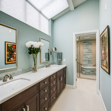
The client's purchased an 80's condo unit of the 4th floor.
The main goal(s): To create a space suitable for aging-in-place and to successfully incorporate pre-existing furniture and decor from the client's previous home.
The challenges:
- To be able to fully incorporate existing furniture into a smaller space, as the client's had down-sized by moving into a condo unit.
- Creating and providing a wide range of accessibility and universal design to accommodate certain health issues of one of the clients.
Inspiration: Existing arches throughout the home.
Treve Johnson Photography
 CG&S Design-Build
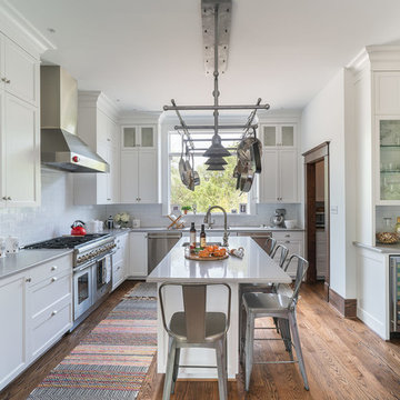
We couldn’t save the original floor in the kitchen due to existing structural problems that needed to be corrected, which triggered building a subfloor under the new floor and adding insulation to bring the home up to code. And that in turn required reflowing new floors throughout the first level of the home. But the new Douglas fir floor, stained to stately rich dark brown, blends perfectly with the new moulding, baseboards, and casements specially cut to match the existing detailing. We installed a custom-made pot rack by Two Hills Studio in the renovated kitchen, providing an interesting—almost steam-punk—stylistic counterpoint amidst the white and grey paint and grey Silestone surfaces.
Photography by Ryan Davis | CG&S Design-Build
 Mike Farley Pool Designer, SWD, ASLA
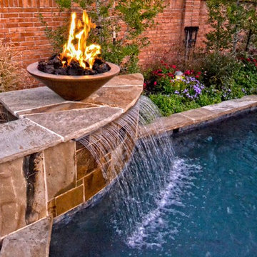
Soft lines were desired in a limited space surrounded by easements, building and pool setbacks. Simple architectural curves complemented the architecture of the home. This allowed the client to have a walk around the pool and provide maximum pool surface area. The spa side dry steps allowed access to the pool steps 18" lower than the patio. The spa provides a strong visual from the family room and balancing the project the fire bowl and rainfall provides a strong visual from the arbor, grill counter, bar and master bedroom. We added a door from the master bedroom to allow access directly to the fire pit on that cold winter night. The fire bow wall provides a screen for the utility transformer and location for the rainfall. Landscaping softens the lines of the hardscape fence, and house walls. The firelight along with the low voltage lighting accent the space at night. The step lights allow for safe travel over the changes in elevation to the pool. The stone veneers match the existing grill and bar counter and the flagstone coping step treads and wall caps match existing stone kitchen patio. The concrete paving pattern was selected to match the pattern of the existing stone kitchen patio as well. The trip to the city zoning board was well worth the reward of providing everything the client wanted in a limited space. Project designed by Mike Farley. Check out Mike's reference site for more info and videos at www.FarleyPoolDesigns.com.
 Closetopia
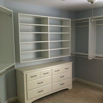
This bedroom-turned closet has plenty of space for hanging and storing items. Incorporating the dresser that was already on hand saved the client a few $$ and provides storage for hard-to-fold items.
 Constantine Design Group, Inc.
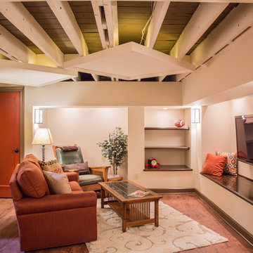
This early 20th century Indianapolis, IN basement remodel was in desperate need of help. The original and still operating hydronic radiant heating system had its plumbing configured without regard to any other use of the space. Fearful of harming the aged system and the high cost of doing so, these Clients were adamant that the existing system remain intact. Architect Lee Constantine developed a design that maintained the existing heating system while creating "niches" around the perimeter that would conceal the unsightly plumbing. Additionally, by removing free-standing structural supporting posts, amore flexible and inviting space was achieved. Because of an already low ceiling condition, the floor-ceiling structure above was kept exposed, painted and highlighted with indirect lighting to avoid further reducing the ceiling height. Constantine incorporated "clouds" on this ceiling to conceal certain existing components that either were cost prohibitive to relocate or couldn't be relocated. These "clouds"become a "visual element" through their geometry and hidden "indirect" light source rather than an undesirable complication. Now this family entertains frequently in the basement and reports "it doesn't feel like we're in a basement anymore"
Sponsored
Columbus, OH
Hope Restoration & General Contracting
Columbus Design-Build, Kitchen & Bath Remodeling, Historic Renovations
 PLANT Architect Inc.
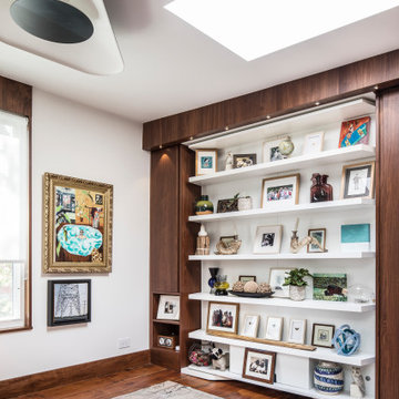
This closet-lined third-floor room is typically used as a dressing room. When guests stay over, the owners clear off the shelves and fold down the Murphy bed that is concealed behind them.
 Vintage Cellars - Luxury Custom Wine Cellars LA
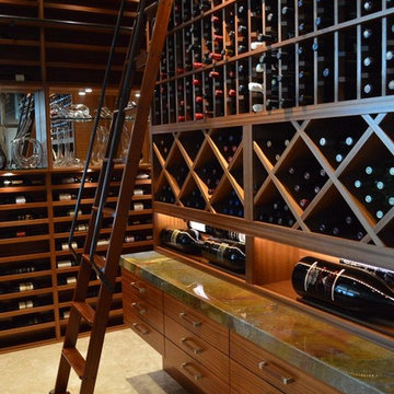
An existing wine cellar in a La Jolla, San Diego home was expanded to accommodate the growing collection of the owner.
We worked on this project twice. The first installation was completed in 2008. After about 5 years, the client requested us to double the capacity of their wine room, but maintain the contemporary design.
We added new sections to the existing racking to provide additional space for more wines. Stunning Wine Cellar for a Contemporary Home
We completed a wine cellar installation project in La Jolla, an affluent city of San Diego, California, where we had to match the contemporary design of the home. The beautiful residential space was originally built with glass and wood.
All the woodworking was constructed from Sapele Mahogany, which is common in many parts of the house. The cabinetry and furniture had to be the same tone and material.
We have worked on this project twice. The first time was in 2008 and the second one was in 2013. We needed to expand and double the size of the custom wine cellar.
A very integral part of this homeowner’s life is their wine and the collecting of wine. Our main goal was to create a racking design that consists of various orientations to allow the owner to store different sizes of bottles.
Racking Features of the La Jolla Custom Wine Cellar
The original room was constructed when the home was built. The architect, designing team, and contractor gave us a palette to match the existing cabinetry.
The owners didn’t know what their needs were going to be. When they buy cases of wine, for example, they just put some of the bottles in the diamond bins and some in individual bottle spaces.
In 2013, we tried to make the racking as universal as possible. The original capacity of the wine room was 1,100 bottles. It increased to 1,624 after the expansion of the space and adding more wine racks.
Elevation 1
The first area of the room consists of racking for individual storage at the top section, with a VC-style cover for concealing the evaporator. There are diamond bins in the middle that can store nine bottles in each opening.
We added many slots for large format bottles below the diamond bins because the owners stored bigger bottles in the first room, as big as 9 liters. What we did was to open up a couple of spaces to create a wider wine storage area.
The whole racking in this area has a solid end panel. We took out the vertical supports and put the beam supports across to bear the load.
We incorporated a coved tray feature to allow the owners to get a feel for the beautiful bottles in their collection. The large format bottles are stored in various heights, resulting in a cascading wine display. This style of racking allows for easy visibility of the wine labels. We installed LED lighting above this area to illuminate the space dramatically without emitting too much heat.
Elevation 2
The next racking is labeled Elevation 2, which is the left wall that you will pass by before you go into the other storage area. It consists of horizontal display racks that can store both standard and larger bottles. These display racks, which are 8 ¼” deep, were installed with lighting and mirror at the back.
The middle section has two glass shelves that provide an area for the client’s wine cellar accessories and mini car collection.
Elevation 3
On the 3rd Elevation, the top racking includes slots with twelve coved trays and six solid backs. We added new individual column wine racks, and custom cabinets with scalloped neck supports to the existing cabinetry. Now, the total capacity of the individual bottle racking is 384, and the custom cabinets can accommodate 34 bottles.
There is a double deep Sapele Mahogany tabletop where we installed very large steel supports under it. This will provide structural stability for bearing the weight of this big case storage area. The homeowner buys a lot of wine, so he wanted to have an area where he could stack all the boxes.
He didn’t want the boxes to occupy the area at the front. With this feature, he could just bring the wines directly to this storage area, without affecting the aesthetic appeal of the front entrance of his La Jolla custom wine cellar.
Elevations 4 and 5
The next wall is Elevation 4, which consists of wine racks for 98 magnum bottles. The top most section has a VC-style evaporator cover.
Elevation 5 (in front of elevation 3), had twelve coved trays, 16-bottle custom cabinets with scalloped neck supports, and one hundred eighty individual storage slots.
After adding new sections, we ended up having sixteen coved trays, 26-bottle custom cabinets, and 288 individual bottle racking.
Rolling Ladder for Easy Access of Wines
Another factor that we consider when designing a wine room is the convenience in accessing the bottles. Since the ceiling of this La Jolla custom wine cellar was tall (about 124” height), we added a hook rolling ladder.
A hook ladder has fixtures that allow it to slide along the rail and can be lifted off the rail if you want to transfer it to another section of the racking on a different wall.
Vintage Cellars has built gorgeous custom wine cellars and wine storage rooms across the United States and World for over 25 years. We are your go-to business for anything wine cellar and wine storage related! Whether you're interested in a wine closet, wine racking, custom wine racks, a custom wine cellar door, or a cooling system for your existing space, Vintage Cellars has you covered!
We carry all kinds of wine cellar cooling and refrigeration systems, incuding: Breezaire, CellarCool, WhisperKool, Wine Guardian, CellarPro and Commercial systems.
We also carry many types of Wine Refrigerators, Wine Cabinets, and wine racking types, including La Cache, Marvel, N'Finity, Transtherm, Vinotheque, Vintage Series, Credenza, Walk in wine rooms, Climadiff, Riedel, Fontenay, and VintageView.
Vintage Cellars also does work in many styles, including Contemporary and Modern, Rustic, Farmhouse, Traditional, Craftsman, Industrial, Mediterranean, Mid-Century, Industrial and Eclectic.
Some locations we cover often include: San Diego, Rancho Santa Fe, Corona Del Mar, Del Mar, La Jolla, Newport Beach, Newport Coast, Huntington Beach, Del Mar, Solana Beach, Carlsbad, Orange County, Beverly Hills, Malibu, Pacific Palisades, Santa Monica, Bel Air, Los Angeles, Encinitas, Cardiff, Coronado, Manhattan Beach, Palos Verdes, San Marino, Ladera Heights, Santa Monica, Brentwood, Westwood, Hancock Park, Laguna Beach, Crystal Cove, Laguna Niguel, Torrey Pines, Thousand Oaks, Coto De Caza, Coronado Island, San Francisco, Danville, Walnut Creek, Marin, Tiburon, Hillsborough, Berkeley, Oakland, Napa, Sonoma, Agoura Hills, Hollywood Hills, Laurel Canyon, Sausalito, Mill Valley, San Rafael, Piedmont, Paso Robles, Carmel, Pebble Beach
Contact Vintage Cellars today with any of your Wine Cellar needs!
(800) 876-8789
Vintage Cellars
904 Rancheros Drive
San Marcos, California 92069
(800) 876-8789
 Randy Angell Designs
The subtle changes begin as soon as you walk out the back door of the house. The existing decking had a lot of what we call "tweeners"; areas that are overly generous walkways, yet not large enough to house furniture. The awkwardly small bluestone patio was expanded to accommodate a generous seating area. This was done by pushing the step-down closer to the pool.
Our talented stone mason carefully married the new bluestone into the existing portion of the patio, resulting in an imperceptible difference between the two.
As you descend the new bluestone steps to the pool level, your bare feet will be thankful for the new smooth-finished, limestone-colored concrete, with a hand cut pattern carefully etched into it's surface.
The old red brick decking was so hot that the owners could not walk around the pool with their bare feet. The brick coping was also replaced with an eased edge, Pennsylvania Premier Stone which matches the new step treads throughout the project.
Between the house and the pool, a large raised planter was reconfigured, giving additional space to the pool deck for a shaded lounge chair area. Across the pool, a bank of rather tall painted brick retaining walls were cut down, shortened and moved. This lessened the visual impact of the walls (which were overwhelming in the space) and also opened up a new seating area, nestled under the arms of the massive Pecan tree at the back of the property.
Rather than continuing solid decking around the entire pool, the area near these walls has been transformed to large stone stepper pads set in a sea of beautiful St. Augustine lawn. This creates a visually softened area that is still suited to setting tables and chairs when the guest list calls for additional seating.
The spa area is possibly the most dramatic change on this project. Yet more raised planter walls divided this area into awkward spaces, unsuited for proper furniture placement. The planters were removed, new stone decks added, and once again expertly married into the existing decks, opening the area to house a large dining table and a newly built-in BBQ area.
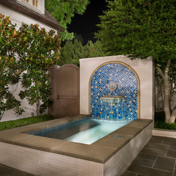
The spa itself was re-imagined with the bluestone coping and painted brick veneer. The most impressive addition though is the new handmade glazed tiles that surround the existing cast stone water feature. This water feature was almost unnoticeable against the painted brick wall, but now the dramatic arch and pop of color draw the eye to this quaint little corner of the property.
Originally designed by one of the most notable landscape architects in town, this once impressive project had faltered in recent years. The pool and spa still functioned well, and the client wanted to keep it intact. In addition, they wanted to keep as much of the existing landscape as possible. But, the surrounding decks, walls and steps were fair game.
At first glance, one might think that our changes were simple material changes. However, upon closer inspection, one can see the subtle-yet-transformative changes that came together to update this classic pool in a tasteful, timeless manner, as well as to improve the flow and usability of the deck areas, while softening the feel of this massive hardscape.
 AquaTerra Outdoors
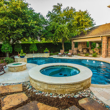
AquaTerra was hired to transform this dated pool and landscaping to a new outdoor environment more suited to the current home owners. We demolished everything down to the pool shell and started over. Working with an existing shell forced us to be creative with what was existing; we added the tanning ledge and the raised water feature wall all on the existing structure.
Features of this renovation that add aesthetic appeal include: New tanning ledge with bubblers, new raised water feature wall, all new pool tile, coping, plaster and led lights, new pool equipment, new travertine decks, new fire pit, new artificial turf putting green and all new landscaping.
The finished project gave the clients more than could have imagined!
Photography:Daniel Driensky

Sponsored
Columbus, OH
Hope Restoration & General Contracting
Columbus Design-Build, Kitchen & Bath Remodeling, Historic Renovations


 Noelle Johnson Landscape Consulting
A photo taken of totem pole cactus
Inspiration for a southwestern landscaping in Phoenix.
Inspiration for a southwestern landscaping in Phoenix.
 Jarrett Design
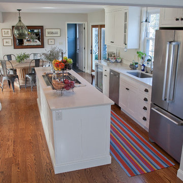
This remodel was a dated 1980s Cape Cod style home that desperately needed updating with the kitchen starting as the foundation for the rest of the home. The owners purchased the property in 2013 with the intent of replacing the existing kitchen installed in 2000, as well as updating most surfaces throughout the home. The space while moderately sized, felt cramped due to the L-shaped design and eat-in island that disrupted traffic flow from the mudroom, dining room and sliding doors to the patio. The owners knew they wanted to bring the light from the southern facing front of the home to the dark cave-like feeling of the kitchen. This was remedied by knocking down the wall between the existing dining room (now a lounge area), widening the entrance to the family room and creating a pathway to the existing formal living room (now the dining room). Also to create better traffic flow into the kitchen, the existing mudroom door was moved to the opposite side of the wall.
A large work island with cooktop, oven and convection/microwave was designed for efficiency and maintaining clean site lines. The work triangle allows for quick and easy meal prep and clean-up for the busy family. Space at the end of the kitchen was perfectly suited for a large kitchen table with views of the back yard, easy conversation with the cook at the island or those hanging in the newly appointed lounge area. The new doorway between the kitchen and dining room showcases the 10ft floor to ceiling bay window, allows more light to flood into the space and creates easy access between the two rooms for family gatherings. Given the home owners relocated to the area for job reasons and are not sure how long they will be in this home, we helped them achieve a balance of a design and finishes that they not only love, but would be appealing to many if another move was in their near future.
Matt Villano Photography
55