
Search results for "Extended" in Home Design Ideas
 Maria Killam
Tracey Ayton Photography
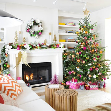
Inspiration for a mid-sized transitional enclosed light wood floor family room remodel in Vancouver with white walls and a standard fireplace
Inspiration for a mid-sized transitional enclosed light wood floor family room remodel in Vancouver with white walls and a standard fireplace
 White Birch Design
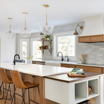
Eagan, MN kitchen remodel by White Birch Design, serving the Minneapolis and St. Paul area. To learn more about us and see more examples of our work, visit our website at www.whitebirchdesignllc.com
 CRx Construction
custom builder, custom home, luxury home,
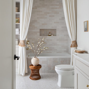
Transitional beige tile and subway tile mosaic tile floor bathroom photo in Other with recessed-panel cabinets, beige cabinets, gray walls, white countertops, a niche and a built-in vanity
Transitional beige tile and subway tile mosaic tile floor bathroom photo in Other with recessed-panel cabinets, beige cabinets, gray walls, white countertops, a niche and a built-in vanity
Find the right local pro for your project
 KD Landscape
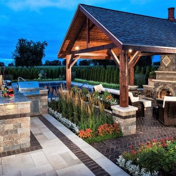
Best of Houzz Design Award Winner. The pavilion not only provides a shady respite during the summer months but also a great place to relax by the fire during spring and fall. The pavilion is convenient to the home, the pool and the outdoor kitchen. Landscape design by John Algozzini.
Landscape design by John Algozzini. The complete landscape can be seen in our projects, listed as Fun By The Farm.
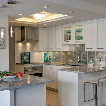
 Drury Design
Like most high rises in the city, this kitchen was lacking in square footage. To give the illusion of more space, super white cabinetry from Grabill Cabinet Company and Arabascato quartzite countertops were installed. Perfect for entertaining, dual peninsulas comfortably provide seating for four people.
The multi-tiered ceiling provides both general task lighting & ambient cove lighting accentuating the architectural details in this kitchen. The Wolf induction cooktop and single oven, along with the Broan ventilation system, fit perfectly on limited available wall space.
Neutral arabesque glass backsplash tile was used on the wall behind the hood to create an eye-catching focal point.
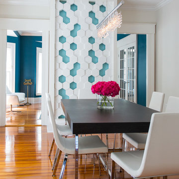
 Hammond Design
In the dining room we installed 3-D wall tiles that mimic the shapes found on the tracery ceiling in the adjacent family room. We used a lighter shade of blue from the music room so as not to overpower the deep tone in the music room beyond. A crystal light fixture adds that sparkle the clients love.
Photo: Eric Roth
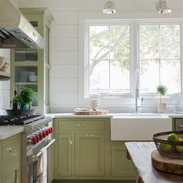
 La Pietra Tile & Stone
Jaine Beiles
Inspiration for a small country u-shaped light wood floor eat-in kitchen remodel in New York with a farmhouse sink, recessed-panel cabinets, green cabinets, marble countertops, white backsplash, stainless steel appliances and no island
Inspiration for a small country u-shaped light wood floor eat-in kitchen remodel in New York with a farmhouse sink, recessed-panel cabinets, green cabinets, marble countertops, white backsplash, stainless steel appliances and no island


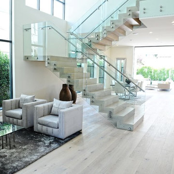
 ADM Flooring
ADM is a manufacturer and distributor of high quality wood flooring for all forms of applications. Our flooring is produced eco-friendly and with bio materials. Our products are factory direct; this gives us the competitive edge in pricing. We promise you the best service, anytime. Our support team is available for all types of requests.
 Amy McFadden Interior Design
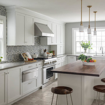
Inspiration for a timeless gray floor kitchen remodel in Boston with a farmhouse sink, shaker cabinets, white cabinets, multicolored backsplash, stainless steel appliances and an island

 John R. Schroeder, AIA
Photo by Jody Dole
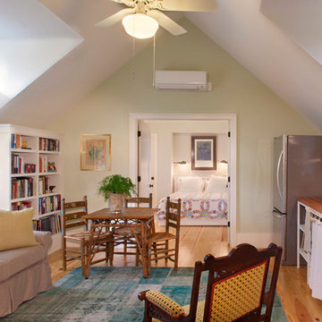
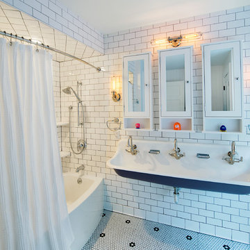
This was a fast-track design-build project which began design in July and ended construction before Christmas. The scope included additions and first and second floor renovations. The house is an early 1900’s gambrel style with painted wood shingle siding and mission style detailing. On the first and second floor we removed previously constructed awkward additions and extended the gambrel style roof to make room for a large kitchen on the first floor and a master bathroom and bedroom on the second floor. We also added two new dormers to match the existing dormers to bring light into the master shower and new bedroom. We refinished the wood floors, repainted all of the walls and trim, added new vintage style light fixtures, and created a new half and kid’s bath. We also added new millwork features to continue the existing level of detail and texture within the house. A wrap-around covered porch with a corner trellis was also added, which provides a perfect opportunity to enjoy the back-yard. A wonderful project!
 House of L
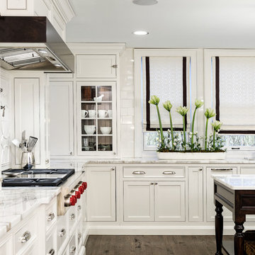
A 1927 colonial home in Shaker Heights, Ohio, received a breathtaking renovation that required extensive work, transforming it from a tucked away, utilitarian space, to an all-purpose gathering room, a role that most kitchens embrace in a home today. The scope of work changed over the course of the project, starting more minimalistically and then quickly becoming the main focus of the house's remodeling, resulting in a staircase being relocated and walls being torn down to create an inviting focal point to the home where family and friends could connect. The focus of the functionality was to allow for multiple prep areas with the inclusion of two islands and sinks, two eating areas (one for impromptu snacking and small meals of younger family members and friends on island no. two and a built-in bench seat for everyday meals in the immediate family). The kitchen was equipped with all Subzero and Wolf appliances, including a 48" range top with a 12" griddle, two double ovens, a 42" built-in side by side refrigerator and freezer, a microwave drawer on island no. one and a beverage center and icemaker in island no. two. The aesthetic feeling embraces the architectural feel of the home while adding a modern sensibility with the revamped layout and graphic elements that tie the color palette of whites, chocolate and charcoal. The cabinets were custom made and outfitted with beaded inset doors with a Shaker panel frame and finished in Benjamin Moore's OC-17 White Dove, a soft white that allowed for the kitchen to feel warm while still maintaining its brightness. Accents of walnut were added to create a sense of warmth, including a custom premium grade walnut countertop on island no. one from Brooks Custom and a TV cabinet with a doggie feeding station beneath. Bringing the cabinet line to the 8'6" ceiling height helps the room feel taller and bold light fixtures at the islands and eating area add detail to an otherwise simpler ceiling detail. The 1 1/4" countertops feature Calacatta Gold Marble with an ogee edge detail. Special touches on the interiors include secret storage panels, an appliance garage, breadbox, pull-out drawers behind the cabinet doors and all soft-close hinges and drawer glides. A kneading area was made as a part of island no. one for the homeowners' love of baking, complete with a stone top allowing for dough to stay cool. Baskets beneath store kitchen essentials that need air circulation. The room adjacent to the kitchen was converted to a hearth room (from a formal dining room) to extend the kitchen's living space and allow for a natural spillover for family and guests to spill into.
Jason Miller, Pixelate
 Carpenter & MacNeille
Michael J. Lee Photography
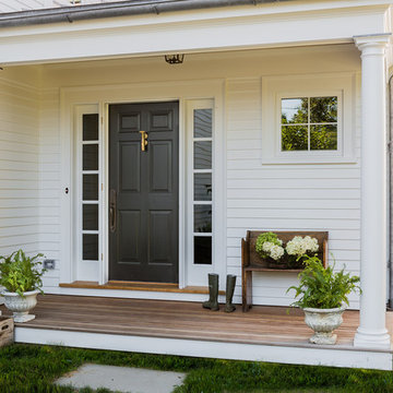
Entryway - traditional medium tone wood floor entryway idea in Boston with white walls and a black front door
Entryway - traditional medium tone wood floor entryway idea in Boston with white walls and a black front door

 Advance Design Studio, Ltd.
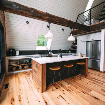
After six years of living in their Huntley IL home, Chris and Meghan were tired of their dark, dingy, outdated kitchen and it was finally time for a long-anticipated change. “The kitchen is the place where we live, it’s where we do everything,” Meghan said. “It was important that it be a space where we wanted to be.” Meghan loves cooking and enjoys including their girls in healthy meal prepping, this led them to want a brighter, more enjoyable kitchen with increased functionality and improved storage.
For Chris especially, the laundry room was an entirely dysfunctional eyesore. “We had a washer and a dryer, but it was all kind-of cobbled together!” Chris said. “There were always laundry piles everywhere, we weren’t really sure what we wanted to do in there, but it was time for us to make a change.” The mess of the space was stressful every time they walked in the door from the garage each day. Kids’ backpacks and shoes piled up haphazardly in the makeshift boot-bench closet left the family feeling disorganized and stressed. They needed space for folding clothes and locker cubbies to help keep the family organized.
Having known Christine and Todd in the Huntley community for years, Chris and Meghan were familiar with their work. “We already trusted them personally and having seen their projects for years we knew they did top notch work. After we reviewed the initial round of designs, we knew that hiring them was definitely the right choice,” Meghan and Chris said. Although Chris had done a lot of work in their home himself, the kitchen and laundry room renovation was such a large undertaking that he didn’t want to steal time away from his family to spend what would surely be many long weekends doing the job himself. “That would not have been a wise choice for us,” Chris laughed.
“Our designer, Michelle was very, very, easy to work with; anything we wanted to see or weren’t sure about, she went above and beyond to make this easy for us. She was easy to get hold of and always quick to respond,” the couple said. Michelle pulled ideas that mirrored the couple’s taste and style and was adept at directing the couple to limited choices that didn’t overwhelm them and kept the process moving. “I have a hard time making decisions. Michelle made the decision-making process so easy. I loved how she listened to what I liked and then presented three great options for me to choose from,” Meghan said.
The main objectives for the kitchen were better storage solutions, they wanted the space to reflect their lifestyle and taste, and they wanted it to last for years with low maintenance. One of the first steps in creating a more functional kitchen was relocating the refrigerator, creating an improved workflow for the busy family.
“We didn’t know that we could even move the refrigerator to a new location where it is now, that was something that we never would have thought of,” Chris said. “The new refrigerator location makes the kitchen feel so much bigger. We didn’t add any space, but our whole kitchen with the new design just seems like it’s so much larger than before!” Meghan said.
The perimeter mist colored cabinets helped warm and brighten the entire room, while the graphite colored cabinets on the island added contrast. Using this fresh, clean color palette satisfied the couple’s desire for a bright space that was the exact opposite of what they had before. Organization accessories were also added to the cabinets such as a spice drawer tray and roll outs to create hidden convenience.
“I absolutely love the hidden spices – it makes cooking so much more enjoyable!” Chris said. “And all the pull outs, and the double trash bin, who would think you could get so excited about organization!” the couple said in unison.
One thing they hated in their original kitchen was how dark the space felt. Added lighting on the ceiling with the new light fixtures combined with the lighter cabinetry colors throughout solved this problem. “Our new kitchen has this warm, almost cozy feeling that our old kitchen never had, it’s just a space that I love spending my time in now,” Meghan said. The light airy feeling was accentuated with the use of floating white shelves on either side of the decorative range hood. “We have so much cabinetry space, the new design is amazing we actually have more storage space than we will ever need,” Meghan said.
The island was extended to create more work surface and added space for stool seating. “The new island changes how we live. Now the kids can be in the kitchen with us, doing homework, eating breakfast, and the three of us have special dinners there when Chris is working late,” Meghan said.
The Carrara Marmi Quartz countertops were chosen because they are, not only beautiful, but are made from hard-working material that doesn’t require maintenance. The white subway tile backsplash that wraps to the ceiling behind the focal point cooktop range/hood compliments the crisp white countertops perfectly, while brushed brass hardware and light fixtures keep the design fresh and new.
The couple had a few fears at the beginning of the project, as most homeowners do. Their biggest fear was being out of their kitchen and laundry room for an extended time. The crew made it very easy for the family to work in a limited space keeping the washer and dryer hooked up the majority of the time, and also getting appliances working with minimal downtime.
“They above and beyond accommodated us to get us through the process,” Meghan said. “They did a great job making sure we were as comfortable as possible throughout the process,” Chris added.
“Our project manager DJ did a great job. He was very good at updating us on schedule changes, getting guys in as quickly as possible. Everyone that stepped in the house was nice and did great work,” said Chris. They thought Advance’s carpenter was phenomenal and were impressed when he took a conceptual idea from a photograph and worked with designer Michelle to create a one of a kind range/hood that has become the topic of conversation with friends and family who visit the new kitchen. “He was in our house literally every day for several weeks. He was easy to work with and good at what he did,” Meghan and Chris said.
The focal point of the kitchen; a hand-crafted, custom-built ventilation hood was clad with handpicked reclaimed barnwood. Advance Design’s carpenter built the framework and the cladding to create a one-of-a-kind design element that the couple loves.
“I think it was especially fun for him to create something unique from scratch, showcasing his talent in this area,” Meghan said. “I love that my kitchen is not like everyone else’s. I got to pick out the wood on my hood and watch it being built and was able to choose what pieces of wood went where on it. It’s totally unique.”
Red Oak flooring was toothed-in throughout the kitchen and the rest of the first floor anywhere changes were made. Then the whole floor was refinished to tone down the orange undertones in the existing floor stain, ultimately changing the color complexion of the entire first floor. The result is a completely new feeling to the entire home.
Renovating the laundry room was extremely important to Meghan and Chris, but they had trouble visualizing what the possibilities were for the seemingly small space. Michelle produced beautiful 3D illustrations that helped them envision the space in a whole new way.
“I must have told Michelle 100 times that I am a visual person, seeing the designs in 3D made it so easy to make decisions and see what we could really do with our space,” Meghan said.
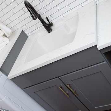
A dividing wall and doorway were removed between the existing laundry room and hallway formerly containing a coat closet, providing space to design specialized graphite colored cabinetry matching the kitchen island to house custom storage cubbies for each family member. Adding the tall utility cabinetry in the new laundry area helped solve the storage issue, tucking away cleaning supplies, household items, and even the cat got its own cubby.
“I love how everything is now hidden in its own space. I can’t tell you how much I hated coming home and seeing everything sitting around on counters,” Chris said.
Electrical outlets were planned for the inside of utility cabinets, so devices could charge in hidden locations. Stacking the washer and dryer allowed for wider countertop space to provide a folding area and a special space for clothes to hang. “The way I do laundry has been completely transformed! I can actually fold clothes and hang them now right out of the washer and dryer,” Meghan said.
“The end result in the kitchen and the laundry/mud room was an updated light and bright space, with a smarter work flow that better meets the needs of this family,” Michelle said.
“I would totally recommend Advance Design,” Meghan said. “Sometimes I sit and just look at my kitchen and laundry room and think ‘Wow, I can’t believe I get to live here!’ It’s an understatement to say we love our new space.”
 collaborative interiors
Photographer: Mike Penney
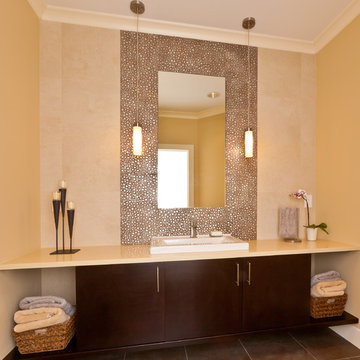
Powder room - contemporary brown tile powder room idea in Seattle with a drop-in sink, flat-panel cabinets, dark wood cabinets, solid surface countertops, beige walls and beige countertops
Powder room - contemporary brown tile powder room idea in Seattle with a drop-in sink, flat-panel cabinets, dark wood cabinets, solid surface countertops, beige walls and beige countertops
 Lincorp / Borchert
by Brian Walters
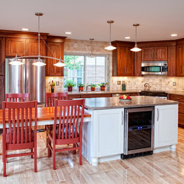
Example of a mid-sized classic l-shaped light wood floor and beige floor eat-in kitchen design in Detroit with shaker cabinets, medium tone wood cabinets, beige backsplash, stainless steel appliances, an undermount sink, granite countertops, stone tile backsplash and an island
Example of a mid-sized classic l-shaped light wood floor and beige floor eat-in kitchen design in Detroit with shaker cabinets, medium tone wood cabinets, beige backsplash, stainless steel appliances, an undermount sink, granite countertops, stone tile backsplash and an island
 AND Interior Design Studio
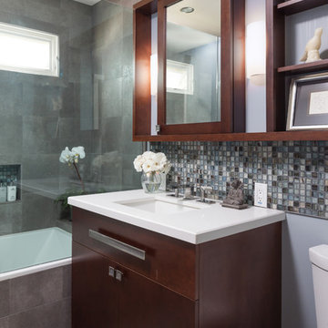
Inspiration for a small contemporary mosaic tile and gray tile porcelain tile bathroom remodel in San Francisco with an undermount sink, flat-panel cabinets, gray walls, dark wood cabinets and a two-piece toilet
 Klopf Architecture
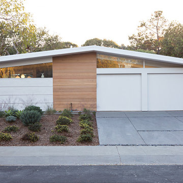
Klopf Architecture, Arterra Landscape Architects, and Flegels Construction updated a classic Eichler open, indoor-outdoor home. Expanding on the original walls of glass and connection to nature that is common in mid-century modern homes. The completely openable walls allow the homeowners to truly open up the living space of the house, transforming it into an open air pavilion, extending the living area outdoors to the private side yards, and taking maximum advantage of indoor-outdoor living opportunities. Taking the concept of borrowed landscape from traditional Japanese architecture, the fountain, concrete bench wall, and natural landscaping bound the indoor-outdoor space. The Truly Open Eichler is a remodeled single-family house in Palo Alto. This 1,712 square foot, 3 bedroom, 2.5 bathroom is located in the heart of the Silicon Valley.
Klopf Architecture Project Team: John Klopf, AIA, Geoff Campen, and Angela Todorova
Landscape Architect: Arterra Landscape Architects
Structural Engineer: Brian Dotson Consulting Engineers
Contractor: Flegels Construction
Photography ©2014 Mariko Reed
Location: Palo Alto, CA
Year completed: 2014
 River Valley Landscapes
The property is one of the original farm houses located on the main street of a small town. It has been in the family for many years and our client just inherited the property. They were trying to have balance of preserving the old while realizing modern day living has its benefits too. The house had a large addition added using mostly old style materials, but designed with function and modern day luxuries. Our goal was to carry that theme to the outside.
Our first problem we had to address was how to transition between the first floor elevation changes. The lower room was the husband’s office. He stated in the future he may have clients over and it would be nice to have an area to sit outside. The wife’s main concern was to renew the four corner garden. She also felt it was very important to be able to see it from the kitchen area. Finally there was an old wishing well stuck right outside the kitchen. They both felt it would be neat to be able to incorporate this in some how. They wanted a patio area with a built in grill to accommodate there family and friends. They also wanted to keep a large play area for the kids.
We were able to pull this off successfully. We addressed the first issue by having a small lower level flagstone area. This area is large enough for 1 to 2 people to sit comfortably. It also provides a transition from his office to the larger patio area. We installed a simple small gravel sitting area opposite of the main patio. This provides our client a secluded place to relax or do business. Mrs.... told me she is amazed how much her and her husband enjoys this area. It is so peaceful looking at the small creek over a glass of wine.
We built a natural limestone retaining wall to create the patio terrace. The stone was chosen to extend the houses architectural elements into the landscape. Irregular broken flagstone was used to give it a more casual feel. We installed three Serviceberries into the patio terrace to replace some trees that were taken down during the remodeling. She was very concern that they would block the view of the four corner garden. We new they were crucial to nestle in the terrace, so we placed them for a couple days for her to decide. Fortunately she agreed they not only kept the view open, but helped frame the garden.
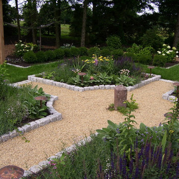
The four corner garden was designed to be viewed from afar and experienced up close. We wanted the space to have some formal structure while keeping with the casual farm house feel. Another natural limestone retaining wall was created. This leveled the garden terrace and helped associate it with the rest of the property. The four corner garden is nestled into the existing woods edge. This provides three distinct experiences to entering the garden; a more formal from the driveway, an open feel from the lower lawn, and a more natural / casual experience from the wooded area. The Plymouth brown gravel was used for the center of the garden. This helped highlight the stone post that was found during construction. The gravel also brings the sense of sound into the garden space. Lamb’s ear was chosen as a fun way to get kids interest in horticulture.
The balance of using the new to create the old feel is what makes this project a success. The property has already hosted a local historical society event and won an award for its preservation efforts. When Mrs.... can’t find her husband, she knows he is either reading the newspaper by the grill or resting in the hammock along the wood’s path.
160