
Search results for "Extremely comfortable" in Home Design Ideas
 TVL Creative Ltd.
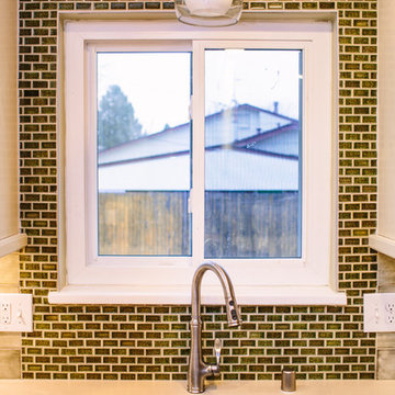
This remodel took an extremely dark & dated kitchen and transformed it into a bright and airy happy place for our client. The existing conditions created a dark, hall-like kitchen that greatly lacked in function and did little to optimize storage. Realizing the potential of this truly massive space, we created a design that utilizes every inch of the kitchen and creates functional cooking and prep space as well as pantry storage and work nooks. Our first order of business was to demo out the blocky corner that separated the kitchen from the living room. This involved removing an existing fireplace, re-structuring a wall, and having an entirely new furnace installed in the basement to eliminate a duct running right through the corner we hoped to eliminate. After opening up the space, we focused on highlighting and brightening the room. New NuCore flooring was installed to give the kitchen a fresh look while offering optimal function and cleanability. Two-toned cabinets in a honey maple and painted silk were used to create a warm and comfortable balance throughout the space. New quartz countertops in MSI's canvas were installed, and butcher block was installed on the two desk areas to offer a warm visual relief and casual work surface. The color palette for the kitchen is reminiscent of a cozy apothecary; we utilized fresh greens with Sherwin Williams paint on the walls and Treviso Gray Sage glazed subway tiles on the backsplash. Over the sink, we designed a playful highlight with counter-to-ceiling mini brick mosaic in a dark crackle green. We introduced additional lighting throughout including new recessed lights, over-sink light, and under-cabinet lights. New appliances were introduced to the space as well, and we complimented the stainless steel of these fixtures to the transitional nickel hardware on the cabinets. This space now feels open and inviting, and is visible from the second you enter the front door! We are so proud of this result and so happy that our clients can enjoy this gorgeous kitchen for years to come.
 TVL Creative Ltd.
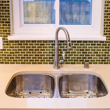
This remodel took an extremely dark & dated kitchen and transformed it into a bright and airy happy place for our client. The existing conditions created a dark, hall-like kitchen that greatly lacked in function and did little to optimize storage. Realizing the potential of this truly massive space, we created a design that utilizes every inch of the kitchen and creates functional cooking and prep space as well as pantry storage and work nooks. Our first order of business was to demo out the blocky corner that separated the kitchen from the living room. This involved removing an existing fireplace, re-structuring a wall, and having an entirely new furnace installed in the basement to eliminate a duct running right through the corner we hoped to eliminate. After opening up the space, we focused on highlighting and brightening the room. New NuCore flooring was installed to give the kitchen a fresh look while offering optimal function and cleanability. Two-toned cabinets in a honey maple and painted silk were used to create a warm and comfortable balance throughout the space. New quartz countertops in MSI's canvas were installed, and butcher block was installed on the two desk areas to offer a warm visual relief and casual work surface. The color palette for the kitchen is reminiscent of a cozy apothecary; we utilized fresh greens with Sherwin Williams paint on the walls and Treviso Gray Sage glazed subway tiles on the backsplash. Over the sink, we designed a playful highlight with counter-to-ceiling mini brick mosaic in a dark crackle green. We introduced additional lighting throughout including new recessed lights, over-sink light, and under-cabinet lights. New appliances were introduced to the space as well, and we complimented the stainless steel of these fixtures to the transitional nickel hardware on the cabinets. This space now feels open and inviting, and is visible from the second you enter the front door! We are so proud of this result and so happy that our clients can enjoy this gorgeous kitchen for years to come.
 Classic Sofa
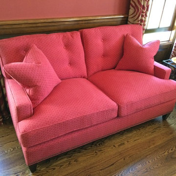
This is a smaller version of our Hunter Sofa, with all of the same details and construction but designed to comfortably seat two people instead of three, yielding around 50’’ of seating space between the arms.
Find the right local pro for your project
 TVL Creative Ltd.
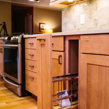
This remodel took an extremely dark & dated kitchen and transformed it into a bright and airy happy place for our client. The existing conditions created a dark, hall-like kitchen that greatly lacked in function and did little to optimize storage. Realizing the potential of this truly massive space, we created a design that utilizes every inch of the kitchen and creates functional cooking and prep space as well as pantry storage and work nooks. Our first order of business was to demo out the blocky corner that separated the kitchen from the living room. This involved removing an existing fireplace, re-structuring a wall, and having an entirely new furnace installed in the basement to eliminate a duct running right through the corner we hoped to eliminate. After opening up the space, we focused on highlighting and brightening the room. New NuCore flooring was installed to give the kitchen a fresh look while offering optimal function and cleanability. Two-toned cabinets in a honey maple and painted silk were used to create a warm and comfortable balance throughout the space. New quartz countertops in MSI's canvas were installed, and butcher block was installed on the two desk areas to offer a warm visual relief and casual work surface. The color palette for the kitchen is reminiscent of a cozy apothecary; we utilized fresh greens with Sherwin Williams paint on the walls and Treviso Gray Sage glazed subway tiles on the backsplash. Over the sink, we designed a playful highlight with counter-to-ceiling mini brick mosaic in a dark crackle green. We introduced additional lighting throughout including new recessed lights, over-sink light, and under-cabinet lights. New appliances were introduced to the space as well, and we complimented the stainless steel of these fixtures to the transitional nickel hardware on the cabinets. This space now feels open and inviting, and is visible from the second you enter the front door! We are so proud of this result and so happy that our clients can enjoy this gorgeous kitchen for years to come.
 TVL Creative Ltd.
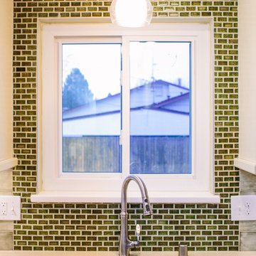
This remodel took an extremely dark & dated kitchen and transformed it into a bright and airy happy place for our client. The existing conditions created a dark, hall-like kitchen that greatly lacked in function and did little to optimize storage. Realizing the potential of this truly massive space, we created a design that utilizes every inch of the kitchen and creates functional cooking and prep space as well as pantry storage and work nooks. Our first order of business was to demo out the blocky corner that separated the kitchen from the living room. This involved removing an existing fireplace, re-structuring a wall, and having an entirely new furnace installed in the basement to eliminate a duct running right through the corner we hoped to eliminate. After opening up the space, we focused on highlighting and brightening the room. New NuCore flooring was installed to give the kitchen a fresh look while offering optimal function and cleanability. Two-toned cabinets in a honey maple and painted silk were used to create a warm and comfortable balance throughout the space. New quartz countertops in MSI's canvas were installed, and butcher block was installed on the two desk areas to offer a warm visual relief and casual work surface. The color palette for the kitchen is reminiscent of a cozy apothecary; we utilized fresh greens with Sherwin Williams paint on the walls and Treviso Gray Sage glazed subway tiles on the backsplash. Over the sink, we designed a playful highlight with counter-to-ceiling mini brick mosaic in a dark crackle green. We introduced additional lighting throughout including new recessed lights, over-sink light, and under-cabinet lights. New appliances were introduced to the space as well, and we complimented the stainless steel of these fixtures to the transitional nickel hardware on the cabinets. This space now feels open and inviting, and is visible from the second you enter the front door! We are so proud of this result and so happy that our clients can enjoy this gorgeous kitchen for years to come.
 TVL Creative Ltd.
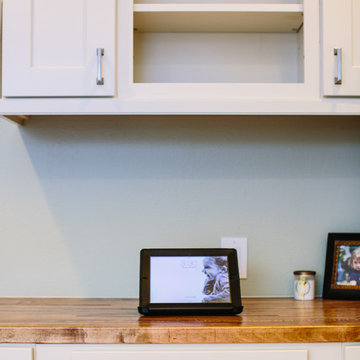
This remodel took an extremely dark & dated kitchen and transformed it into a bright and airy happy place for our client. The existing conditions created a dark, hall-like kitchen that greatly lacked in function and did little to optimize storage. Realizing the potential of this truly massive space, we created a design that utilizes every inch of the kitchen and creates functional cooking and prep space as well as pantry storage and work nooks. Our first order of business was to demo out the blocky corner that separated the kitchen from the living room. This involved removing an existing fireplace, re-structuring a wall, and having an entirely new furnace installed in the basement to eliminate a duct running right through the corner we hoped to eliminate. After opening up the space, we focused on highlighting and brightening the room. New NuCore flooring was installed to give the kitchen a fresh look while offering optimal function and cleanability. Two-toned cabinets in a honey maple and painted silk were used to create a warm and comfortable balance throughout the space. New quartz countertops in MSI's canvas were installed, and butcher block was installed on the two desk areas to offer a warm visual relief and casual work surface. The color palette for the kitchen is reminiscent of a cozy apothecary; we utilized fresh greens with Sherwin Williams paint on the walls and Treviso Gray Sage glazed subway tiles on the backsplash. Over the sink, we designed a playful highlight with counter-to-ceiling mini brick mosaic in a dark crackle green. We introduced additional lighting throughout including new recessed lights, over-sink light, and under-cabinet lights. New appliances were introduced to the space as well, and we complimented the stainless steel of these fixtures to the transitional nickel hardware on the cabinets. This space now feels open and inviting, and is visible from the second you enter the front door! We are so proud of this result and so happy that our clients can enjoy this gorgeous kitchen for years to come.
 TVL Creative Ltd.
This remodel took an extremely dark & dated kitchen and transformed it into a bright and airy happy place for our client. The existing conditions created a dark, hall-like kitchen that greatly lacked in function and did little to optimize storage. Realizing the potential of this truly massive space, we created a design that utilizes every inch of the kitchen and creates functional cooking and prep space as well as pantry storage and work nooks. Our first order of business was to demo out the blocky corner that separated the kitchen from the living room. This involved removing an existing fireplace, re-structuring a wall, and having an entirely new furnace installed in the basement to eliminate a duct running right through the corner we hoped to eliminate. After opening up the space, we focused on highlighting and brightening the room. New NuCore flooring was installed to give the kitchen a fresh look while offering optimal function and cleanability. Two-toned cabinets in a honey maple and painted silk were used to create a warm and comfortable balance throughout the space. New quartz countertops in MSI's canvas were installed, and butcher block was installed on the two desk areas to offer a warm visual relief and casual work surface. The color palette for the kitchen is reminiscent of a cozy apothecary; we utilized fresh greens with Sherwin Williams paint on the walls and Treviso Gray Sage glazed subway tiles on the backsplash. Over the sink, we designed a playful highlight with counter-to-ceiling mini brick mosaic in a dark crackle green. We introduced additional lighting throughout including new recessed lights, over-sink light, and under-cabinet lights. New appliances were introduced to the space as well, and we complimented the stainless steel of these fixtures to the transitional nickel hardware on the cabinets. This space now feels open and inviting, and is visible from the second you enter the front door! We are so proud of this result and so happy that our clients can enjoy this gorgeous kitchen for years to come.


 TVL Creative Ltd.
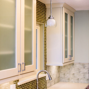
This remodel took an extremely dark & dated kitchen and transformed it into a bright and airy happy place for our client. The existing conditions created a dark, hall-like kitchen that greatly lacked in function and did little to optimize storage. Realizing the potential of this truly massive space, we created a design that utilizes every inch of the kitchen and creates functional cooking and prep space as well as pantry storage and work nooks. Our first order of business was to demo out the blocky corner that separated the kitchen from the living room. This involved removing an existing fireplace, re-structuring a wall, and having an entirely new furnace installed in the basement to eliminate a duct running right through the corner we hoped to eliminate. After opening up the space, we focused on highlighting and brightening the room. New NuCore flooring was installed to give the kitchen a fresh look while offering optimal function and cleanability. Two-toned cabinets in a honey maple and painted silk were used to create a warm and comfortable balance throughout the space. New quartz countertops in MSI's canvas were installed, and butcher block was installed on the two desk areas to offer a warm visual relief and casual work surface. The color palette for the kitchen is reminiscent of a cozy apothecary; we utilized fresh greens with Sherwin Williams paint on the walls and Treviso Gray Sage glazed subway tiles on the backsplash. Over the sink, we designed a playful highlight with counter-to-ceiling mini brick mosaic in a dark crackle green. We introduced additional lighting throughout including new recessed lights, over-sink light, and under-cabinet lights. New appliances were introduced to the space as well, and we complimented the stainless steel of these fixtures to the transitional nickel hardware on the cabinets. This space now feels open and inviting, and is visible from the second you enter the front door! We are so proud of this result and so happy that our clients can enjoy this gorgeous kitchen for years to come.
 TVL Creative Ltd.
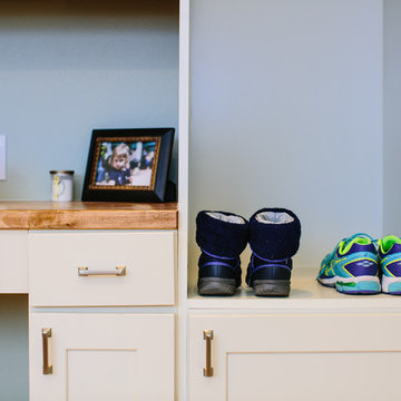
This remodel took an extremely dark & dated kitchen and transformed it into a bright and airy happy place for our client. The existing conditions created a dark, hall-like kitchen that greatly lacked in function and did little to optimize storage. Realizing the potential of this truly massive space, we created a design that utilizes every inch of the kitchen and creates functional cooking and prep space as well as pantry storage and work nooks. Our first order of business was to demo out the blocky corner that separated the kitchen from the living room. This involved removing an existing fireplace, re-structuring a wall, and having an entirely new furnace installed in the basement to eliminate a duct running right through the corner we hoped to eliminate. After opening up the space, we focused on highlighting and brightening the room. New NuCore flooring was installed to give the kitchen a fresh look while offering optimal function and cleanability. Two-toned cabinets in a honey maple and painted silk were used to create a warm and comfortable balance throughout the space. New quartz countertops in MSI's canvas were installed, and butcher block was installed on the two desk areas to offer a warm visual relief and casual work surface. The color palette for the kitchen is reminiscent of a cozy apothecary; we utilized fresh greens with Sherwin Williams paint on the walls and Treviso Gray Sage glazed subway tiles on the backsplash. Over the sink, we designed a playful highlight with counter-to-ceiling mini brick mosaic in a dark crackle green. We introduced additional lighting throughout including new recessed lights, over-sink light, and under-cabinet lights. New appliances were introduced to the space as well, and we complimented the stainless steel of these fixtures to the transitional nickel hardware on the cabinets. This space now feels open and inviting, and is visible from the second you enter the front door! We are so proud of this result and so happy that our clients can enjoy this gorgeous kitchen for years to come.
 TVL Creative Ltd.
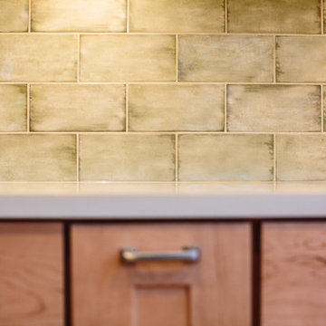
This remodel took an extremely dark & dated kitchen and transformed it into a bright and airy happy place for our client. The existing conditions created a dark, hall-like kitchen that greatly lacked in function and did little to optimize storage. Realizing the potential of this truly massive space, we created a design that utilizes every inch of the kitchen and creates functional cooking and prep space as well as pantry storage and work nooks. Our first order of business was to demo out the blocky corner that separated the kitchen from the living room. This involved removing an existing fireplace, re-structuring a wall, and having an entirely new furnace installed in the basement to eliminate a duct running right through the corner we hoped to eliminate. After opening up the space, we focused on highlighting and brightening the room. New NuCore flooring was installed to give the kitchen a fresh look while offering optimal function and cleanability. Two-toned cabinets in a honey maple and painted silk were used to create a warm and comfortable balance throughout the space. New quartz countertops in MSI's canvas were installed, and butcher block was installed on the two desk areas to offer a warm visual relief and casual work surface. The color palette for the kitchen is reminiscent of a cozy apothecary; we utilized fresh greens with Sherwin Williams paint on the walls and Treviso Gray Sage glazed subway tiles on the backsplash. Over the sink, we designed a playful highlight with counter-to-ceiling mini brick mosaic in a dark crackle green. We introduced additional lighting throughout including new recessed lights, over-sink light, and under-cabinet lights. New appliances were introduced to the space as well, and we complimented the stainless steel of these fixtures to the transitional nickel hardware on the cabinets. This space now feels open and inviting, and is visible from the second you enter the front door! We are so proud of this result and so happy that our clients can enjoy this gorgeous kitchen for years to come.
 TVL Creative Ltd.
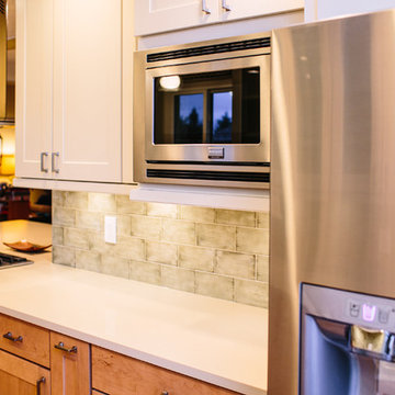
This remodel took an extremely dark & dated kitchen and transformed it into a bright and airy happy place for our client. The existing conditions created a dark, hall-like kitchen that greatly lacked in function and did little to optimize storage. Realizing the potential of this truly massive space, we created a design that utilizes every inch of the kitchen and creates functional cooking and prep space as well as pantry storage and work nooks. Our first order of business was to demo out the blocky corner that separated the kitchen from the living room. This involved removing an existing fireplace, re-structuring a wall, and having an entirely new furnace installed in the basement to eliminate a duct running right through the corner we hoped to eliminate. After opening up the space, we focused on highlighting and brightening the room. New NuCore flooring was installed to give the kitchen a fresh look while offering optimal function and cleanability. Two-toned cabinets in a honey maple and painted silk were used to create a warm and comfortable balance throughout the space. New quartz countertops in MSI's canvas were installed, and butcher block was installed on the two desk areas to offer a warm visual relief and casual work surface. The color palette for the kitchen is reminiscent of a cozy apothecary; we utilized fresh greens with Sherwin Williams paint on the walls and Treviso Gray Sage glazed subway tiles on the backsplash. Over the sink, we designed a playful highlight with counter-to-ceiling mini brick mosaic in a dark crackle green. We introduced additional lighting throughout including new recessed lights, over-sink light, and under-cabinet lights. New appliances were introduced to the space as well, and we complimented the stainless steel of these fixtures to the transitional nickel hardware on the cabinets. This space now feels open and inviting, and is visible from the second you enter the front door! We are so proud of this result and so happy that our clients can enjoy this gorgeous kitchen for years to come.
 TVL Creative Ltd.
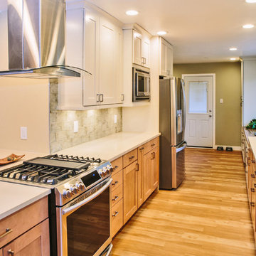
This remodel took an extremely dark & dated kitchen and transformed it into a bright and airy happy place for our client. The existing conditions created a dark, hall-like kitchen that greatly lacked in function and did little to optimize storage. Realizing the potential of this truly massive space, we created a design that utilizes every inch of the kitchen and creates functional cooking and prep space as well as pantry storage and work nooks. Our first order of business was to demo out the blocky corner that separated the kitchen from the living room. This involved removing an existing fireplace, re-structuring a wall, and having an entirely new furnace installed in the basement to eliminate a duct running right through the corner we hoped to eliminate. After opening up the space, we focused on highlighting and brightening the room. New NuCore flooring was installed to give the kitchen a fresh look while offering optimal function and cleanability. Two-toned cabinets in a honey maple and painted silk were used to create a warm and comfortable balance throughout the space. New quartz countertops in MSI's canvas were installed, and butcher block was installed on the two desk areas to offer a warm visual relief and casual work surface. The color palette for the kitchen is reminiscent of a cozy apothecary; we utilized fresh greens with Sherwin Williams paint on the walls and Treviso Gray Sage glazed subway tiles on the backsplash. Over the sink, we designed a playful highlight with counter-to-ceiling mini brick mosaic in a dark crackle green. We introduced additional lighting throughout including new recessed lights, over-sink light, and under-cabinet lights. New appliances were introduced to the space as well, and we complimented the stainless steel of these fixtures to the transitional nickel hardware on the cabinets. This space now feels open and inviting, and is visible from the second you enter the front door! We are so proud of this result and so happy that our clients can enjoy this gorgeous kitchen for years to come.
 Advance Design Studio, Ltd.
After six years of living in their Huntley IL home, Chris and Meghan were tired of their dark, dingy, outdated kitchen and it was finally time for a long-anticipated change. “The kitchen is the place where we live, it’s where we do everything,” Meghan said. “It was important that it be a space where we wanted to be.” Meghan loves cooking and enjoys including their girls in healthy meal prepping, this led them to want a brighter, more enjoyable kitchen with increased functionality and improved storage.
For Chris especially, the laundry room was an entirely dysfunctional eyesore. “We had a washer and a dryer, but it was all kind-of cobbled together!” Chris said. “There were always laundry piles everywhere, we weren’t really sure what we wanted to do in there, but it was time for us to make a change.” The mess of the space was stressful every time they walked in the door from the garage each day. Kids’ backpacks and shoes piled up haphazardly in the makeshift boot-bench closet left the family feeling disorganized and stressed. They needed space for folding clothes and locker cubbies to help keep the family organized.
Having known Christine and Todd in the Huntley community for years, Chris and Meghan were familiar with their work. “We already trusted them personally and having seen their projects for years we knew they did top notch work. After we reviewed the initial round of designs, we knew that hiring them was definitely the right choice,” Meghan and Chris said. Although Chris had done a lot of work in their home himself, the kitchen and laundry room renovation was such a large undertaking that he didn’t want to steal time away from his family to spend what would surely be many long weekends doing the job himself. “That would not have been a wise choice for us,” Chris laughed.
“Our designer, Michelle was very, very, easy to work with; anything we wanted to see or weren’t sure about, she went above and beyond to make this easy for us. She was easy to get hold of and always quick to respond,” the couple said. Michelle pulled ideas that mirrored the couple’s taste and style and was adept at directing the couple to limited choices that didn’t overwhelm them and kept the process moving. “I have a hard time making decisions. Michelle made the decision-making process so easy. I loved how she listened to what I liked and then presented three great options for me to choose from,” Meghan said.
The main objectives for the kitchen were better storage solutions, they wanted the space to reflect their lifestyle and taste, and they wanted it to last for years with low maintenance. One of the first steps in creating a more functional kitchen was relocating the refrigerator, creating an improved workflow for the busy family.
“We didn’t know that we could even move the refrigerator to a new location where it is now, that was something that we never would have thought of,” Chris said. “The new refrigerator location makes the kitchen feel so much bigger. We didn’t add any space, but our whole kitchen with the new design just seems like it’s so much larger than before!” Meghan said.
The perimeter mist colored cabinets helped warm and brighten the entire room, while the graphite colored cabinets on the island added contrast. Using this fresh, clean color palette satisfied the couple’s desire for a bright space that was the exact opposite of what they had before. Organization accessories were also added to the cabinets such as a spice drawer tray and roll outs to create hidden convenience.
“I absolutely love the hidden spices – it makes cooking so much more enjoyable!” Chris said. “And all the pull outs, and the double trash bin, who would think you could get so excited about organization!” the couple said in unison.
One thing they hated in their original kitchen was how dark the space felt. Added lighting on the ceiling with the new light fixtures combined with the lighter cabinetry colors throughout solved this problem. “Our new kitchen has this warm, almost cozy feeling that our old kitchen never had, it’s just a space that I love spending my time in now,” Meghan said. The light airy feeling was accentuated with the use of floating white shelves on either side of the decorative range hood. “We have so much cabinetry space, the new design is amazing we actually have more storage space than we will ever need,” Meghan said.
The island was extended to create more work surface and added space for stool seating. “The new island changes how we live. Now the kids can be in the kitchen with us, doing homework, eating breakfast, and the three of us have special dinners there when Chris is working late,” Meghan said.
The Carrara Marmi Quartz countertops were chosen because they are, not only beautiful, but are made from hard-working material that doesn’t require maintenance. The white subway tile backsplash that wraps to the ceiling behind the focal point cooktop range/hood compliments the crisp white countertops perfectly, while brushed brass hardware and light fixtures keep the design fresh and new.
The couple had a few fears at the beginning of the project, as most homeowners do. Their biggest fear was being out of their kitchen and laundry room for an extended time. The crew made it very easy for the family to work in a limited space keeping the washer and dryer hooked up the majority of the time, and also getting appliances working with minimal downtime.
“They above and beyond accommodated us to get us through the process,” Meghan said. “They did a great job making sure we were as comfortable as possible throughout the process,” Chris added.
“Our project manager DJ did a great job. He was very good at updating us on schedule changes, getting guys in as quickly as possible. Everyone that stepped in the house was nice and did great work,” said Chris. They thought Advance’s carpenter was phenomenal and were impressed when he took a conceptual idea from a photograph and worked with designer Michelle to create a one of a kind range/hood that has become the topic of conversation with friends and family who visit the new kitchen. “He was in our house literally every day for several weeks. He was easy to work with and good at what he did,” Meghan and Chris said.
The focal point of the kitchen; a hand-crafted, custom-built ventilation hood was clad with handpicked reclaimed barnwood. Advance Design’s carpenter built the framework and the cladding to create a one-of-a-kind design element that the couple loves.
“I think it was especially fun for him to create something unique from scratch, showcasing his talent in this area,” Meghan said. “I love that my kitchen is not like everyone else’s. I got to pick out the wood on my hood and watch it being built and was able to choose what pieces of wood went where on it. It’s totally unique.”
Red Oak flooring was toothed-in throughout the kitchen and the rest of the first floor anywhere changes were made. Then the whole floor was refinished to tone down the orange undertones in the existing floor stain, ultimately changing the color complexion of the entire first floor. The result is a completely new feeling to the entire home.
Renovating the laundry room was extremely important to Meghan and Chris, but they had trouble visualizing what the possibilities were for the seemingly small space. Michelle produced beautiful 3D illustrations that helped them envision the space in a whole new way.
“I must have told Michelle 100 times that I am a visual person, seeing the designs in 3D made it so easy to make decisions and see what we could really do with our space,” Meghan said.
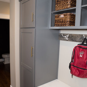
A dividing wall and doorway were removed between the existing laundry room and hallway formerly containing a coat closet, providing space to design specialized graphite colored cabinetry matching the kitchen island to house custom storage cubbies for each family member. Adding the tall utility cabinetry in the new laundry area helped solve the storage issue, tucking away cleaning supplies, household items, and even the cat got its own cubby.
“I love how everything is now hidden in its own space. I can’t tell you how much I hated coming home and seeing everything sitting around on counters,” Chris said.
Electrical outlets were planned for the inside of utility cabinets, so devices could charge in hidden locations. Stacking the washer and dryer allowed for wider countertop space to provide a folding area and a special space for clothes to hang. “The way I do laundry has been completely transformed! I can actually fold clothes and hang them now right out of the washer and dryer,” Meghan said.
“The end result in the kitchen and the laundry/mud room was an updated light and bright space, with a smarter work flow that better meets the needs of this family,” Michelle said.
“I would totally recommend Advance Design,” Meghan said. “Sometimes I sit and just look at my kitchen and laundry room and think ‘Wow, I can’t believe I get to live here!’ It’s an understatement to say we love our new space.”

Sponsored
Columbus, OH

Snider & Metcalf Interior Design, LTD
Leading Interior Designers in Columbus, Ohio & Ponte Vedra, Florida

 IQnewswire
The End of the Ultra-Slim Wedding Suit
For several years, men’s formalwear was dominated by narrow lapels, short jackets and trousers cut close to the leg. The style created a sharp outline, but it often left little room for sitting, dancing or eating comfortably. Current tailoring is moving towards a more balanced shape, with cleaner shoulders, a defined waist and trousers that follow the leg without gripping it.This change does not mean that wedding suits have become oversized. The newer approach sits between skinny and loose. It keeps the structure expected of formal clothing while allowing the cloth to hang properly. For grooms, that balance is useful during a day that may involve a ceremony, photographs, dinner and several hours on the dance floor.
Look For Shape Rather Than Tightness
A well-fitted suit should create a clear outline without relying on tension. Collections of Marc Darcy suits include tailored three-piece designs, checks and textured fabrics that suit the current preference for visible structure and considered proportions.
The jacket should sit close enough to define the waist, but the front button should fasten without pulling the cloth into an X-shaped crease. At the shoulders, the seam should finish close to the natural shoulder point. Extra width can make the jacket look borrowed, while a shoulder that is too narrow may cause the upper sleeve to collapse.
Fit should be assessed while moving as well as standing. Reach forward, sit down and raise both arms. A tailored jacket will never feel like casual sportswear, but it should allow the groom to carry out ordinary movements without sharp restriction across the back or chest.
Give The Jacket Enough Length
Very short suit jackets became common alongside skinny trousers, but they can disrupt the proportions of a three-piece outfit. If the jacket finishes too high, the waistcoat may appear longer than the outer layer and the trousers may look as though they begin too low.
A more traditional jacket length usually covers most of the seat and divides the body more evenly. This can make the legs appear longer without shortening the jacket excessively. The correct length depends on height and body proportions, so two men wearing the same chest size may still need different jacket lengths.
View the suit from the back and side rather than relying on a front-facing mirror. The vents should lie flat, and the hem should not lift away from the body. A side photograph can reveal an unbalanced jacket more clearly than the changing-room mirror.
Choose Trousers That Fall Cleanly
The move away from very tight tailoring is most noticeable in suit trousers. A modern tailored leg can still be neat at the ankle, but it should provide enough room through the seat and thigh for the fabric to fall without horizontal lines.
Trouser pockets offer a useful fit check. If they pull open while standing, the waist or hips may be too tight. The fly should lie flat, and the waistband should remain in place without depending on an overtightened belt. Higher-rise trousers can work particularly well with a waistcoat because they reduce the chance of shirt fabric appearing between the two pieces.
The hem should make gentle contact with the shoe rather than gathering heavily around it. A short hem can work with narrow trousers but taking it too far may make the suit look dated once the current cropped style moves on. A slight break is easier to wear with different formal shoes and tends to look balanced in full-length wedding photographs.
Let The Waistcoat Support the Silhouette
A waistcoat adds structure through the centre of the outfit, but only when it fits correctly. It should lie flat against the shirt and cover the trouser waistband. Tightening the back strap cannot correct a waistcoat that is the wrong size or too short.
Current three-piece styling often places greater emphasis on the waistcoat. Double-breasted designs, contrasting fabrics and wider openings can distinguish the groom without requiring a brightly coloured jacket. When the groom removes the jacket later, the waistcoat keeps the outfit looking complete.
Allow room for a full meal and several hours of wear. A waistcoat that feels acceptably close during a brief fitting may become uncomfortable at dinner. Sit down with every button fastened and check whether the lower edge presses into the waist or causes the front to bow.
Use Stronger Lapels Carefully
Wider notch and peak lapels are returning after years of extremely narrow designs. A broader lapel can frame the shirt and tie, balance the shoulders and give the jacket a more formal character. Peak lapels create a particularly strong line on double-breasted jackets and evening suits.
The lapel width should still suit the wearer. A very broad lapel can overwhelm a smaller frame, while an extremely narrow one may look out of proportion on a broad chest. The shirt collar, tie width and lapel should relate to one another without matching exactly.
A wider lapel also leaves less need for decorative extras. A simple buttonhole flower or plain pocket square may be enough. Large lapel pins can crowd the upper part of the jacket, especially when the cloth already contains a check.
Avoid Buying According to the Size Label Alone
The same labelled size can fit differently across designs because cut, fabric and construction affect the garment. Begin with accurate chest, waist, inside-leg and approximate jacket-length measurements. Compare those figures with the retailer’s size information rather than ordering the size worn in another brand without checking.
If the jacket fits at the shoulders but needs slight shaping through the waist, a tailor can often make the adjustment. Sleeves and trouser hems are also commonly altered. Major changes to the shoulder line or jacket length are more difficult and may not be economical.
Do not choose the smallest size that can be fastened. A suit that looks tight in the fitting room is unlikely to become more comfortable during a long wedding day. Cloth should skim the body and return to a clean position after movement.
Balance a checked suit with simple styling
Texture and checks remain popular in wedding tailoring, particularly for country houses, converted barns and traditional venues. These fabrics already add depth to the outfit, so the cut should remain controlled and the accessories relatively quiet.
A plain white, pale blue or cream shirt gives a checked suit a clear foundation. Choose a tie from one of the secondary colours in the cloth rather than introducing another strong pattern. A white pocket square works when the suit contains several shades and does not need further decoration.
Shoes should support the proportions of the trousers. A very slim shoe may appear too small beneath a fuller hem, while a heavy casual sole can pull attention away from the tailoring. Oxfords, Derbies and refined brogues usually provide enough visual weight without looking bulky.
Coordinate the wedding party without forcing one fit
Matching groomsmen suits can become difficult when every member of the party has a different build. Insisting on an identical close fit may leave some men comfortable and others visibly restricted. A better approach is to keep the cloth, colour and main design consistent while adjusting jacket and trouser sizes for each person.
The groom can stand apart through a waistcoat, lapel shape or accessory rather than wearing a suit cut much tighter than everyone else. This creates a connection across the group without treating one silhouette as suitable for every body.
Arrange fittings early enough to identify size and alteration issues. Group orders should be checked well before the wedding, particularly when trousers need hemming or jackets require sleeve adjustments. Each person should try the complete outfit with the intended shirt and shoes.
Judge the suit by the whole day
A wedding fitting often lasts less than half an hour, while the suit may be worn for twelve hours or more. Comfort should therefore be tested under realistic conditions. Sit for several minutes, walk upstairs and check the waistband after moving around.
Pay attention to the parts that cannot be seen clearly in a mirror. The collar should remain close to the shirt at the back of the neck. Jacket vents should not pull apart, and the trouser seat should follow the body without sagging or strain.
The current move towards balanced tailoring gives grooms more room to choose clothes that look formal without feeling restrictive. Clean shoulders, a shaped jacket and trousers with a natural fall will outlast extreme proportions. A suit that allows the groom to stand, sit and celebrate comfortably is also more likely to look composed in photographs taken throughout the day.
 Cantoni Irvine
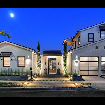
When Irvine designer, Richard Bustos’ client decided to remodel his Orange County 4,900 square foot home into a contemporary space, he immediately thought of Cantoni. His main concern though was based on the assumption that our luxurious modern furnishings came with an equally luxurious price tag. It was only after a visit to our Irvine store, where the client and Richard connected that the client realized our extensive collection of furniture and accessories was well within his reach.
“Richard was very thorough and straight forward as far as pricing,” says the client. "I became very intrigued that he was able to offer high quality products that I was looking for within my budget.”
The next phases of the project involved looking over floor plans and discussing the client’s vision as far as design. The goal was to create a comfortable, yet stylish and modern layout for the client, his wife, and their three kids. In addition to creating a cozy and contemporary space, the client wanted his home to exude a tranquil atmosphere. Drawing most of his inspiration from Houzz, (the leading online platform for home remodeling and design) the client incorporated a Zen-like ambiance through the distressed greyish brown flooring, organic bamboo wall art, and with Richard’s help, earthy wall coverings, found in both the master bedroom and bathroom.
Over the span of approximately two years, Richard helped his client accomplish his vision by selecting pieces of modern furniture that possessed the right colors, earthy tones, and textures so as to complement the home’s pre-existing features.
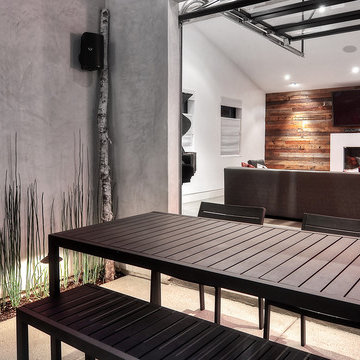
The first room the duo tackled was the great room, and later continued furnishing the kitchen and master bedroom. Living up to its billing, the great room not only opened up to a breathtaking view of the Newport coast, it also was one great space. Richard decided that the best option to maximize the space would be to break the room into two separate yet distinct areas for living and dining.
While exploring our online collections, the client discovered the Jasper Shag rug in a bold and vibrant green. The grassy green rug paired with the sleek Italian made Montecarlo glass dining table added just the right amount of color and texture to compliment the natural beauty of the bamboo sculpture. The client happily adds, “I’m always receiving complements on the green rug!”
Once the duo had completed the dining area, they worked on furnishing the living area, and later added pieces like the classic Renoir bed to the master bedroom and Crescent Console to the kitchen, which adds both balance and sophistication. The living room, also known as the family room was the central area where Richard’s client and his family would spend quality time. As a fellow family man, Richard understood that that meant creating an inviting space with comfortable and durable pieces of furniture that still possessed a modern flare. The client loved the look and design of the Mercer sectional. With Cantoni’s ability to customize furniture, Richard was able to special order the sectional in a fabric that was both durable and aesthetically pleasing.
Selecting the color scheme for the living room was also greatly influenced by the client’s pre-existing artwork as well as unique distressed floors. Richard recommended adding dark pieces of furniture as seen in the Mercer sectional along with the Viera area rug. He explains, “The darker colors and contrast of the rug’s material worked really well with the distressed wood floor.” Furthermore, the comfortable American Leather Recliner, which was customized in red leather not only maximized the space, but also tied in the client’s picturesque artwork beautifully. The client adds gratefully, “Richard was extremely helpful with color; He was great at seeing if I was taking it too far or not enough.”
It is apparent that Richard and his client made a great team. With the client’s passion for great design and Richard’s design expertise, together they transformed the home into a modern sanctuary. Working with this particular client was a very rewarding experience for Richard. He adds, “My client and his family were so easy and fun to work with. Their enthusiasm, focus, and involvement are what helped me bring their ideas to life. I think we created a unique environment that their entire family can enjoy for many years to come.”
https://www.cantoni.com/project/a-contemporary-sanctuary
 Cantoni Irvine
When Irvine designer, Richard Bustos’ client decided to remodel his Orange County 4,900 square foot home into a contemporary space, he immediately thought of Cantoni. His main concern though was based on the assumption that our luxurious modern furnishings came with an equally luxurious price tag. It was only after a visit to our Irvine store, where the client and Richard connected that the client realized our extensive collection of furniture and accessories was well within his reach.
“Richard was very thorough and straight forward as far as pricing,” says the client. "I became very intrigued that he was able to offer high quality products that I was looking for within my budget.”
The next phases of the project involved looking over floor plans and discussing the client’s vision as far as design. The goal was to create a comfortable, yet stylish and modern layout for the client, his wife, and their three kids. In addition to creating a cozy and contemporary space, the client wanted his home to exude a tranquil atmosphere. Drawing most of his inspiration from Houzz, (the leading online platform for home remodeling and design) the client incorporated a Zen-like ambiance through the distressed greyish brown flooring, organic bamboo wall art, and with Richard’s help, earthy wall coverings, found in both the master bedroom and bathroom.
Over the span of approximately two years, Richard helped his client accomplish his vision by selecting pieces of modern furniture that possessed the right colors, earthy tones, and textures so as to complement the home’s pre-existing features.
The first room the duo tackled was the great room, and later continued furnishing the kitchen and master bedroom. Living up to its billing, the great room not only opened up to a breathtaking view of the Newport coast, it also was one great space. Richard decided that the best option to maximize the space would be to break the room into two separate yet distinct areas for living and dining.
While exploring our online collections, the client discovered the Jasper Shag rug in a bold and vibrant green. The grassy green rug paired with the sleek Italian made Montecarlo glass dining table added just the right amount of color and texture to compliment the natural beauty of the bamboo sculpture. The client happily adds, “I’m always receiving complements on the green rug!”
Once the duo had completed the dining area, they worked on furnishing the living area, and later added pieces like the classic Renoir bed to the master bedroom and Crescent Console to the kitchen, which adds both balance and sophistication. The living room, also known as the family room was the central area where Richard’s client and his family would spend quality time. As a fellow family man, Richard understood that that meant creating an inviting space with comfortable and durable pieces of furniture that still possessed a modern flare. The client loved the look and design of the Mercer sectional. With Cantoni’s ability to customize furniture, Richard was able to special order the sectional in a fabric that was both durable and aesthetically pleasing.
Selecting the color scheme for the living room was also greatly influenced by the client’s pre-existing artwork as well as unique distressed floors. Richard recommended adding dark pieces of furniture as seen in the Mercer sectional along with the Viera area rug. He explains, “The darker colors and contrast of the rug’s material worked really well with the distressed wood floor.” Furthermore, the comfortable American Leather Recliner, which was customized in red leather not only maximized the space, but also tied in the client’s picturesque artwork beautifully. The client adds gratefully, “Richard was extremely helpful with color; He was great at seeing if I was taking it too far or not enough.”
It is apparent that Richard and his client made a great team. With the client’s passion for great design and Richard’s design expertise, together they transformed the home into a modern sanctuary. Working with this particular client was a very rewarding experience for Richard. He adds, “My client and his family were so easy and fun to work with. Their enthusiasm, focus, and involvement are what helped me bring their ideas to life. I think we created a unique environment that their entire family can enjoy for many years to come.”
https://www.cantoni.com/project/a-contemporary-sanctuary
 Melanie Rekola Landscape Design
Landscape design and photography by Melanie Rekola
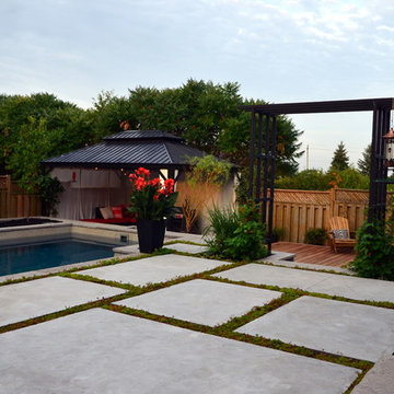
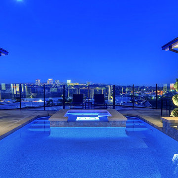
This lovely landscape sports a poured in place concrete slab patio with drought tolerant sedum plants between the slabs. This sedum mix is sold in sheets then cut to fit but it’s actually grown for green-roof application. It works perfectly in this hot environment too as it is extremely drought tolerant and can go a month without water. Because the water runoff is absorbed between the slabs the patio drainage works perfectly and there are no need for drains.The swimming pool is of the fiberglass variety. Though the initial investment is greater than that of vinyl pools the ROI is greater over a 10 year period. Fiberglass pools retains more heat as the pool shell is all one piece and they don’t ever require a new liner.. This fiberglass pool has cool built-in benching and steps. And there is even a swim jet built into one side great for those cardio blasting swims. The pool interior colour is grey though it shows a soft blue/grey when water is added due to the reflection of the sky and other surroundings. The pool coping is natural stone with rock face edge. The steel arbour was custom made. Metal (steel) was chosen for it’s slim strength as wood placed here would have been too chunky. The best rooms (indoors or our) have a subtle layering of textural elements. To me this landscape needed a structure here to define the “rooms” It will look even better in a few years when the vines reach the top and the Miscanthus on either side reaches its 7′ height!The 12′ x 16′ pavilion is also made of steel and houses an alfresco dining table and sofa set. The pavilions built in cupola makes the warm breezes comfortably pass through with no need for a fan. It’s also sunken 2′ from the pool/patio height and nestled nicely in the corner. I must also mention the large slim planters with “Red Shades” Canna lily within. They are the perfect boldness/balance!Step through the arbor and a linear pond with “floating” natural stone step is revealed! Two smooth flow scuppers are responsible for the quiet waterfalls either side. A wood deck overhangs the pond adding softness to the setting. A modern retaining wall with natural stone cap runs the full width of the pond and pool adding interest and dimension. In the covered outdoor living area this wall is the perfect seat wall - adding lots of extra party seating!

Sponsored
Columbus, OH
Snider & Metcalf Interior Design, LTD
Leading Interior Designers in Columbus, Ohio & Ponte Vedra, Florida


 Cantoni Irvine
When Irvine designer, Richard Bustos’ client decided to remodel his Orange County 4,900 square foot home into a contemporary space, he immediately thought of Cantoni. His main concern though was based on the assumption that our luxurious modern furnishings came with an equally luxurious price tag. It was only after a visit to our Irvine store, where the client and Richard connected that the client realized our extensive collection of furniture and accessories was well within his reach.
“Richard was very thorough and straight forward as far as pricing,” says the client. "I became very intrigued that he was able to offer high quality products that I was looking for within my budget.”
The next phases of the project involved looking over floor plans and discussing the client’s vision as far as design. The goal was to create a comfortable, yet stylish and modern layout for the client, his wife, and their three kids. In addition to creating a cozy and contemporary space, the client wanted his home to exude a tranquil atmosphere. Drawing most of his inspiration from Houzz, (the leading online platform for home remodeling and design) the client incorporated a Zen-like ambiance through the distressed greyish brown flooring, organic bamboo wall art, and with Richard’s help, earthy wall coverings, found in both the master bedroom and bathroom.
Over the span of approximately two years, Richard helped his client accomplish his vision by selecting pieces of modern furniture that possessed the right colors, earthy tones, and textures so as to complement the home’s pre-existing features.
The first room the duo tackled was the great room, and later continued furnishing the kitchen and master bedroom. Living up to its billing, the great room not only opened up to a breathtaking view of the Newport coast, it also was one great space. Richard decided that the best option to maximize the space would be to break the room into two separate yet distinct areas for living and dining.
While exploring our online collections, the client discovered the Jasper Shag rug in a bold and vibrant green. The grassy green rug paired with the sleek Italian made Montecarlo glass dining table added just the right amount of color and texture to compliment the natural beauty of the bamboo sculpture. The client happily adds, “I’m always receiving complements on the green rug!”
Once the duo had completed the dining area, they worked on furnishing the living area, and later added pieces like the classic Renoir bed to the master bedroom and Crescent Console to the kitchen, which adds both balance and sophistication. The living room, also known as the family room was the central area where Richard’s client and his family would spend quality time. As a fellow family man, Richard understood that that meant creating an inviting space with comfortable and durable pieces of furniture that still possessed a modern flare. The client loved the look and design of the Mercer sectional. With Cantoni’s ability to customize furniture, Richard was able to special order the sectional in a fabric that was both durable and aesthetically pleasing.
Selecting the color scheme for the living room was also greatly influenced by the client’s pre-existing artwork as well as unique distressed floors. Richard recommended adding dark pieces of furniture as seen in the Mercer sectional along with the Viera area rug. He explains, “The darker colors and contrast of the rug’s material worked really well with the distressed wood floor.” Furthermore, the comfortable American Leather Recliner, which was customized in red leather not only maximized the space, but also tied in the client’s picturesque artwork beautifully. The client adds gratefully, “Richard was extremely helpful with color; He was great at seeing if I was taking it too far or not enough.”
It is apparent that Richard and his client made a great team. With the client’s passion for great design and Richard’s design expertise, together they transformed the home into a modern sanctuary. Working with this particular client was a very rewarding experience for Richard. He adds, “My client and his family were so easy and fun to work with. Their enthusiasm, focus, and involvement are what helped me bring their ideas to life. I think we created a unique environment that their entire family can enjoy for many years to come.”
https://www.cantoni.com/project/a-contemporary-sanctuary
61