
Search results for "Extremely difficult" in Home Design Ideas
 Christian Rice Architects, Inc.
Brady Architectural Photography
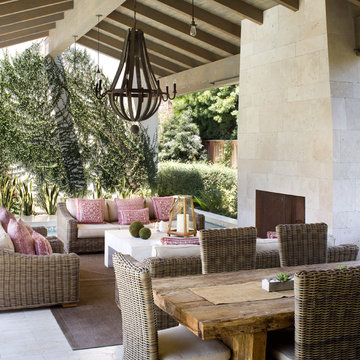
Example of a large tuscan backyard tile patio design in San Diego with a roof extension and a fire pit
Example of a large tuscan backyard tile patio design in San Diego with a roof extension and a fire pit
 Oregon Tile & Marble
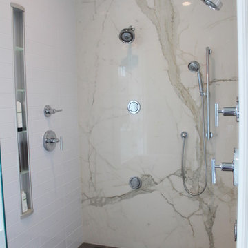
Measuring 118” x 59” x 6mm, Calacatta ThinSlab Porcelain marble-look slabs are ideal for residential and commercial installations – kitchen counters, vanity tops, shower surrounds and floor & wall applications. Unlike natural marble, ThinSlab Porcelain does not require sealing and will retain its polished or honed finish under all types of high-use conditions.
 Molidor Custom Builders, Inc.
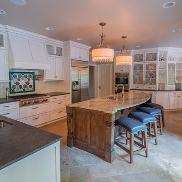
This Kitchen located in a traditional Tudor-style home in Lake Forest, IL needed a drastic change to reflect the sophisticated style and personality of the young, modern family with its executive yet family-oriented lifestyle. Our clients presented us with multiple design and functionality challenges including, but not limited to their kitchen feeling dark and enclosed even with their wonderful 9’ ceilings. There was a true lack of connection between their family room and kitchen, which made it difficult for them to enjoy their time together as a young family. The kitchen lacked storage, included a small desk area used for storing china, and a broken working triangle between appliances and prep areas.
From the client’s lackluster kitchen we set out to provide them with functional and attractive solutions to maximize their storage, space and provide quality that would stand the test of time.
We started by changing the orientation of the kitchen in turn opening up the exterior wall with beautiful French sliding patio doors that originally housed an under-sized window where under perched the kitchen sink. Instantly ample light poured into the space connecting the wooded lot to the kitchen as well as large deck for entertaining. We also opened the adjoining wall to the family room, which allotted open passage and a clear view to join the family space together. A bar height countertop was added for entertaining yet allowed for some visual separation between the spaces. We added spice drawers, towel pull outs at the sink and a wall of display and china cabinetry that mimic the cabinetry designed in the family room with beautiful, serpentine curved mullions by a floating banquette in the breakfast nook.
The exterior runs of the kitchen cabinetry are custom-made and hand finished with a beautiful warm white paint and café latte glaze. With espresso brown marble counters. The center ten-foot island is a rustic alder furniture-grade beauty with hand-turned legs and beautiful shaker panel doors and green marble top that brings in the tones of the teals, creams and browns running through the space. All of this sets on top of a beautiful twelve by twenty-four stone tile laid in an angled herringbone pattern. The kitchen backsplash is a custom tone crackle subway tile with a custom colored hand-cut Ann Sacks glass mosaic representing escargot over the professional-grade oven, surrounded by a hand-poured teal glass border.
The great room appeared extremely dark despite having large windows that reached towards the vaulted ceilings. The client felt attention was not drawn to the outside. The solution we drafted included pulling the mullions out of the windows and painting the trim work white. The fireplace was on one wall and the television on another. With the current furniture arrangements the back would have been to the fireplace. We changed the orientation of the room by placing the television over the fireplace in a recessed niche trimmed with stone and faced the upper portion in silk and the lower in large-format travertine. In creating a more intriguing fireplace façade we provided a focus for the furniture grouping to sit within. An oversized section with extra deep seating allows for a comfortable place to perch and spend family time while watching movies. The lighting in the space prior was not adequate so we created the addition of a small chandelier over the game table near the windows and added volume to the ceiling by including a larger chandelier central within the room with more candles. These changes helped update the formerly outdated dark and dreary space.
With the bones of the room uplifted we drew our attention to adding detail in furnishings and window treatments. We accented the room with subtle patterning on top of bold color choices. The chairs offer depth and dimension with the green citron accented seats and peacock-patterned back fabric that help tone the colors down. To lighting the space we added an oversized cocktail ottoman that floats beautifully within the space and brings in the blue accents with button tufts as a peek-a-boo effect within. The sliding tray works perfectly to function as both a cocktail table and place to rest one’s feet. The game table in the rear of the room has an inlaid cross-cut branch marquis within the top and is surrounded by clean-lined chairs and a curved banquette perfect for a family to play games at and spend their quality time. Beautiful bounding window treatments drape the two-story window wall with an over-sized medallion patterned top treatment cascading into solid blue striated fabric trimmed with beaded shell trim for an appropriately dynamic finishing touch to the space.
The kitchen and family room meld beautifully together and offer a crisp yet welcoming feel to the home in keeping with the Tudor styling and modern family needs. It’s a space truly to be enjoyed by all who visit.
Katherine Elizabeth Designs
Find the right local pro for your project

 Splash Pools & Construction
Located at the Toll Brothers Model Homes the Enclave at Yorba Linda. Toll Brothers envisioned a raised overflow pool with glass walls, allowing guests to see underwater from the outside. Extensive care was taken during the difficult design and build process to ensure that excellence was achieved and Toll Brothers was completely enamored with the results.
This pool features a very modern look with straight, clean lines, square columns and LED lights accenting the acrylic pool walls. The bar area touts an acrylic wall and in-pool bar stools, while the tile inside the pool matches the house, bringing continuity to the entire space.
An extreme amount of coordination was required for the 2.5 inch thick pieces of acrylic to fit perfectly within the slots on the columns while still maintaining the structural integrity of the pool. We were in continual communication with the structural engineer and acrylic manufacturer, ensuring that each piece fit perfectly. The completed acrylic walls were then craned over the house due to their weight.
With a vanishing edge on the front three sections and a negative edge along the back, it was absolutely imperative that the pool was perfectly level and that the water filtration system operated perfectly so that the flow was even over each wall. The water cascading over the front walls collects in a trough that ties into to the rear negative edge basin, where it recirculates back into the pool.
The rear negative edge was designed so as not to distract from the breathtaking view of the valley below, while the lounging deck overhangs the pool with a freestanding cover ensuring that the view is completely unobstructed.
An elegant piece of artwork frames the back of the pool, completing the look for this intriguing swimming pool.




 Gayler Design Build
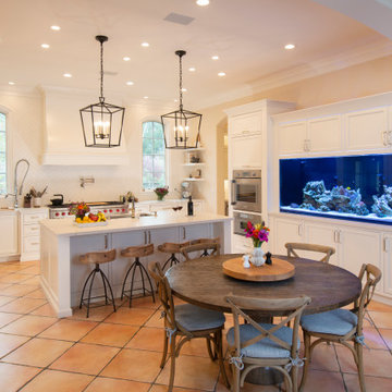
Gayler’s design team and construction crew worked closely with the aquarium experts. Several meetings were held to discuss and review every aspect of the 250-gallon saltwater fish tank. Among those details it was determined that the cabinet needed to be built with a steel frame in order to support the weight of the 3,000-pound tank. A chase cooling system was also installed below the tank in order to keep the water at a required, cooler temperature.
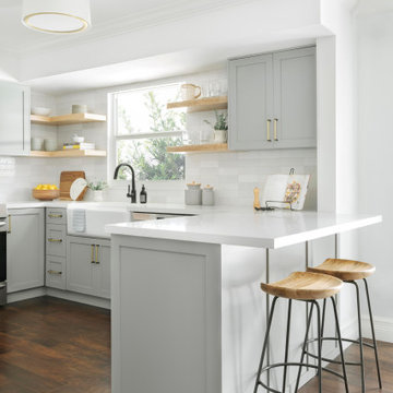
New cabinetry had to be measured with extreme care to cover the original cabinet footprint. Since the existing kitchen tile flooring would be difficult to find, Gayler also took special care during construction to protect the tile. The dated cabinetry in the kitchen and butler’s pantry was replaced with all new semi-custom inset maple cabinets painted in a Swiss Coffee finish.
A full overlay, custom-built kitchen hood, also in painted maple, anchors the kitchen’s large size and is complimented by a full ceiling-height backsplash in a herringbone pattern. Since the tile was custom-made, it had variations. Gayler Design Build took meticulous care to select and lay the tile to preserve the beautiful pattern.
The kitchen counters, the island, and the butler's pantry are finished in a marble-inspired Sereno Bianco Quartz.
To the delight of our client, they selected all new high-end appliances. Their appliance package included a SubZero 36” Integrated column refrigerator and freezer, a Wolf 60” dual fuel, 6 burner with a double griddle, a Thermador oven and microwave, a Thermador warming drawer, a Cove 24” dishwasher, a SubZero 15” Ice Maker and a SubZero 24” undercounter wine refrigerator.
Finally, pendant lighting, open and glass shelving, and dual sinks make a dramatic statement to this fantastic kitchen and butler's pantry transformation.
 Fiorito Interior Design
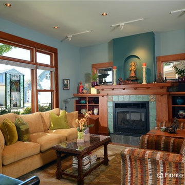
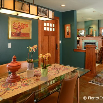
After a decade of being bi-coastal, my clients decided to retire from the east coast to the west. But the task of packing up a whole lifetime in a home was quite daunting so they hired me to comb through their furniture and accessories to see what could fit, what should be left behind, and what should make the move. The job proved difficult since my clients have a wealth of absolutely gorgeous objects and furnishings collected from trips to exotic, far-flung locales like Nepal, or inherited from relatives in England. It was tough to pare down, but after hours of diligent measuring, I mapped out what would migrate west and where it would be placed once here, and I filled in some blank spaces with new pieces.
They bought their recent Craftsman-style home from the contractor who had designed and built it for his family. The only architectural work we did was to transform the den at the rear of the house into a television/garden room. My clients did not want the television to be on display, and sticking a TV in an armoire just doesn’t cut it anymore. I recommended installing a hidden, mirror TV with accompanying invisible in-wall speakers. To do this, we removed an unnecessary small door in the corner of the room to free up the entire wall. Now, at the touch of a remote, what looks like a beautiful wall mirror mounted over a Japanese tansu console comes to life, and sound magically floats out from the wall around it! We also replaced a bank of windows with French doors to allow easy access to the garden.
While the house is extremely well made, the interiors were bland. The warm woodwork was lost in a sea of beige, so I chose a deep aqua color palette for the front rooms of the house which makes the woodwork sing. And we discovered a wonderful art niche over the fireplace that the previous owners had covered with a framed print. Conversely, a warm color palette in the TV room contrasts nicely with the greenery from the garden seen through the new French doors.
Photo by Bernardo Grijalva
 Castle Building & Remodeling
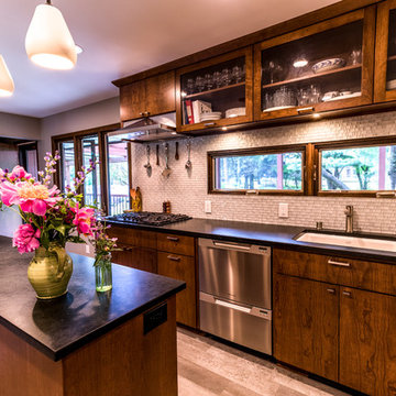
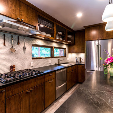
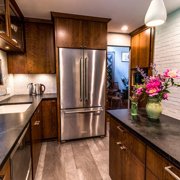
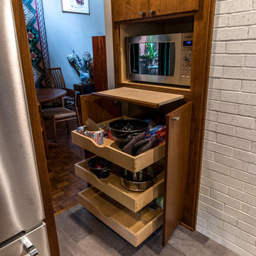
This beautiful St. Anthony, MN mid-century home needed some major updates to the kitchen and main bathroom. The original 1972 kitchen and bathroom were extremely dark and quirky – an old bidet in the bathroom and cooktop shoved into the corner of the kitchen made it difficult for the homeowners to cook and clean efficiently in both spaces. The remodel gave them the opportunity to create a new layout in each of the rooms – the kitchen was opened to the eat-in area, the cooktop was relocated for a better work triangle, and more counter space was added through a small island. Custom bench seats were added to the eat-in area for added storage and character to the kitchen. The bathroom was reconfigured to eliminate the old 70’s bidet, and a useless storage cabinet, which allowed us to add a large, walk in shower with bench and a separate soaking tub. The same cabinetry and earthy color palette was used in the bathroom to create cohesion and to emphasize the mid-century character of the home. What was created is much brighter, more functional and is a timeless yet new space for the homeowners to enjoy as they age in the home.
 Fiorito Interior Design
After a decade of being bi-coastal, my clients decided to retire from the east coast to the west. But the task of packing up a whole lifetime in a home was quite daunting so they hired me to comb through their furniture and accessories to see what could fit, what should be left behind, and what should make the move. The job proved difficult since my clients have a wealth of absolutely gorgeous objects and furnishings collected from trips to exotic, far-flung locales like Nepal, or inherited from relatives in England. It was tough to pare down, but after hours of diligent measuring, I mapped out what would migrate west and where it would be placed once here, and I filled in some blank spaces with new pieces.
They bought their recent Craftsman-style home from the contractor who had designed and built it for his family. The only architectural work we did was to transform the den at the rear of the house into a television/garden room. My clients did not want the television to be on display, and sticking a TV in an armoire just doesn’t cut it anymore. I recommended installing a hidden, mirror TV with accompanying invisible in-wall speakers. To do this, we removed an unnecessary small door in the corner of the room to free up the entire wall. Now, at the touch of a remote, what looks like a beautiful wall mirror mounted over a Japanese tansu console comes to life, and sound magically floats out from the wall around it! We also replaced a bank of windows with French doors to allow easy access to the garden.
While the house is extremely well made, the interiors were bland. The warm woodwork was lost in a sea of beige, so I chose a deep aqua color palette for the front rooms of the house which makes the woodwork sing. And we discovered a wonderful art niche over the fireplace that the previous owners had covered with a framed print. Conversely, a warm color palette in the TV room contrasts nicely with the greenery from the garden seen through the new French doors.
Photo by Bernardo Grijalva
 Castle Building & Remodeling
This beautiful St. Anthony, MN mid-century home needed some major updates to the kitchen and main bathroom. The original 1972 kitchen and bathroom were extremely dark and quirky – an old bidet in the bathroom and cooktop shoved into the corner of the kitchen made it difficult for the homeowners to cook and clean efficiently in both spaces. The remodel gave them the opportunity to create a new layout in each of the rooms – the kitchen was opened to the eat-in area, the cooktop was relocated for a better work triangle, and more counter space was added through a small island. Custom bench seats were added to the eat-in area for added storage and character to the kitchen. The bathroom was reconfigured to eliminate the old 70’s bidet, and a useless storage cabinet, which allowed us to add a large, walk in shower with bench and a separate soaking tub. The same cabinetry and earthy color palette was used in the bathroom to create cohesion and to emphasize the mid-century character of the home. What was created is much brighter, more functional and is a timeless yet new space for the homeowners to enjoy as they age in the home.
 LaMantia Design and Remodeling
To fully enjoy the winter holidays, with all the snow and cold, was the basis for our client’s decision to maintain their Chicago home when they were transferred to the warm and sunny west coast. A trusted caretaker was put in place to oversee and maintain their property; however, even excellent planning sometimes runs off-track.
In the midst of winter the caretaker left on a well-planned vacation. The homeowner’s were apprised of dates and, without a worry, everyone went on about their daily routines. That is, until the caretaker returned and found the home in such utter devastation, he could not believe what had happened in such a short amount of time.
The ill-timed vacation, planned during what became an extremely cold timeframe, was the home’s undoing. With the heat in the home turned slightly lower, to accommodate the emptiness, paired with the below zero temperatures, the hot water pipe in the main floor Sunroom froze and burst. The gushing, steaming water, unchecked, moved in so many directions, it is difficult to comprehend.
As the water soaked through the Sunroom flooring to the walk-out Lower Level Area below, ice blocks were freezing before the water reached the ground; Ice blocks so thick only time and warmer temperatures were able to thaw. Since the heating systems were unaffected, the heat, paired with the steaming moisture, raised the humidity levels in the entire home; what wasn’t wet ultimately became mold covered.
The humidity in the home was raised to such a level that window and door seals were compromised and condensation clouded most of the interior glass panes. The Kitchen wood flooring, saturated with water, buckled, causing the cabinets to lift and the granite to crack.
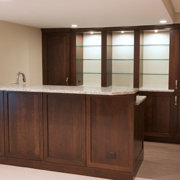
The ceiling in the lower level Bar Area fell as the water flooded both the Bar and the adjoining Billiards Room, wreaking havoc on cabinetry, carpet, artwork, etc.
After the insurance estimation determined the home was salvageable, the design phase began in earnest headed by LaMantia’s James Campbell, CKD and aided by Katie Suva, CKD, CBD as the guides. After a very long march towards recovery, the home is now back to the pristine beauty it once was.
 Castle Building & Remodeling
This beautiful St. Anthony, MN mid-century home needed some major updates to the kitchen and main bathroom. The original 1972 kitchen and bathroom were extremely dark and quirky – an old bidet in the bathroom and cooktop shoved into the corner of the kitchen made it difficult for the homeowners to cook and clean efficiently in both spaces. The remodel gave them the opportunity to create a new layout in each of the rooms – the kitchen was opened to the eat-in area, the cooktop was relocated for a better work triangle, and more counter space was added through a small island. Custom bench seats were added to the eat-in area for added storage and character to the kitchen. The bathroom was reconfigured to eliminate the old 70’s bidet, and a useless storage cabinet, which allowed us to add a large, walk in shower with bench and a separate soaking tub. The same cabinetry and earthy color palette was used in the bathroom to create cohesion and to emphasize the mid-century character of the home. What was created is much brighter, more functional and is a timeless yet new space for the homeowners to enjoy as they age in the home.
 Castle Building & Remodeling
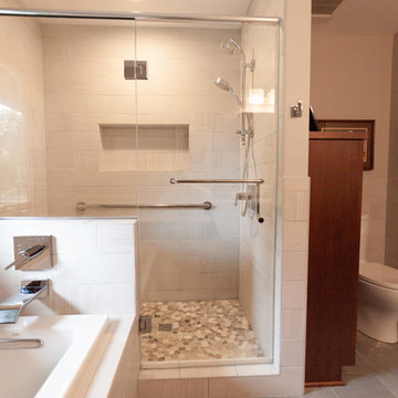
This beautiful St. Anthony, MN mid-century home needed some major updates to the kitchen and main bathroom. The original 1972 kitchen and bathroom were extremely dark and quirky – an old bidet in the bathroom and cooktop shoved into the corner of the kitchen made it difficult for the homeowners to cook and clean efficiently in both spaces. The remodel gave them the opportunity to create a new layout in each of the rooms – the kitchen was opened to the eat-in area, the cooktop was relocated for a better work triangle, and more counter space was added through a small island. Custom bench seats were added to the eat-in area for added storage and character to the kitchen. The bathroom was reconfigured to eliminate the old 70’s bidet, and a useless storage cabinet, which allowed us to add a large, walk in shower with bench and a separate soaking tub. The same cabinetry and earthy color palette was used in the bathroom to create cohesion and to emphasize the mid-century character of the home. What was created is much brighter, more functional and is a timeless yet new space for the homeowners to enjoy as they age in the home.
 Castle Building & Remodeling
This beautiful St. Anthony mid-century home needed some major updates to the kitchen and main bathroom. The original 1972 kitchen and bathroom were extremely dark and quirky – an old bidet in the bathroom and cooktop shoved into the corner of the kitchen made it difficult for the homeowners to cook and clean efficiently in both spaces.
The remodel gave them the opportunity to create a new layout in each of the rooms – the kitchen was opened to the eat-in area, the cooktop was relocated for a better work triangle, and more counter space was added through a small island. Custom bench seats were added to the eat-in area for added storage and character to the kitchen.
The bathroom was reconfigured to eliminate the old 70’s bidet, and a useless storage cabinet, which allowed us to add a large, walk in shower with bench and a separate soaking tub. The same cabinetry and earthy color palette was used in the bathroom to create cohesion and to emphasize the mid-century character of the home.
What was created is much brighter, more functional and is a timeless yet new space for the homeowners to enjoy as they age in the home.

 The Dock Doctors
Custom U-shaped pile dock which is installed in an extremely deep and exposed area of Lake George. The end sections articulate (raise) for winter storage. The piles descend 25 feet into the water and are anchored with 4500 lb. concrete blocks. We specialize in difficult sites.
 ESF Home Textile LLC.
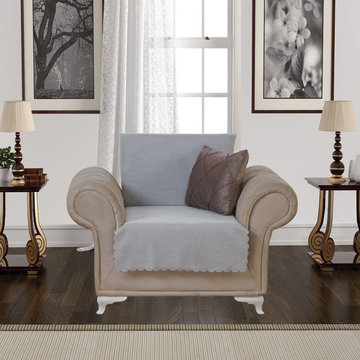
Chiara Rose Anti-slip Armless Sofa Cover Furniture Protector Chair Size Diamond
Dimensions: 29 Inch X 70 Inch
BEST SOFA PROTECTOR - This Slipcover is Extremely Sturdy, as well as an Instant, Magical Solution to Renew your Old Furniture with an Elegant Look! Ultrasonically welded seams prevent ripping apart and unraveling. The Edges are Laser-Cut to give a Chenille Trim Effect. Its Velvety Texture is Soft and also functions like a Warm Pet Bed giving a Sense of Security while your Pet is Resting. Our Covers are absolutely Pet-Friendly.
PROTECTIVE! Best Protection for ANIMAL SCRATCHES FUR SHED-HAIR DIRT FOOD SPILLS WEAR TEAR! STAIN PROOF! Perfect Guard against Cats Dogs Kids Children!
DECORATIVE! Great Stylish Coverage and Luxury Decoration in Living, Sitting Room with Full Solid Colors and Beautiful Printed, Patterned Designs, Extra Deluxe Décor, Nice Plush Texture! New Modern Look! CUSTOM-FIT! Relaxed fitted in Wing-back, Club, Rocker, Single Chair and a Half, one two three Pillow Coach, 1 2 Seaters, Box, T cushion, L, U shape Seaters! Big Large Long Wide Couches! Leather Velour Denim Twill Linen Sofas!
NON SLIDE! Slid-Resistant with PLASTIC DROP BACKING! No More Slipping Off / Sliding Over! Plastic Dots firmly Grip Upholstery! Stays in Place! No Zipper, Mat, Elastic Strap! No Pads under!
EASY CARE & WASH, DURABLE, DETERRENT! Machine Washable! Easily Removable Ready Made Furniture Throws! Cheap and Inexpensive! Heavy Duty Fabric! Stretch Enough to Cloth up Perfectly and Look Form Fit! NO ARMS! Slipcovers with Armrests DON’T properly FIT IN the Armrests and always create Fitting Problems. You know, they also have an Ugly Look. But with Chiara Rose no Need to Worry about Armrests anymore!
• PLEASE MAKE SURE TO READ DETAILED PRODUCT INFORMATION BELOW!
________________________________________
Product Description
WHY CHIARA ROSE SOFA COVERS?
Kids and Pets; We love them but we also love our furniture. Cleaning furniture is one of the most difficult chores and that’s why you need to protect it from dirt. The easiest and economical way of preserving your furniture is Chiara Rose Sofa Protector. Just put the sofa protector on your sofas (futon or couch) and stop worrying about stains and spills. It is perfect for homes with kids and pets. Pets love to scratch upholstery of the furniture. The enduring 220 gsm polyester fabric of Chiara Rose Sofa Protectors prevents tears and any kind of debris on your sofas. Its sturdy texture doesn’t let any spill and dirt penetrate the upholstery.
Besides being durable, Chiara Rose Sofa Cover is suitable to all types of decoration. To express your own personal style, you can choose from a variety of color and design options that fit perfectly to your home décor. With brilliant colors and attractive patterns, Chiara Rose Sofa Covers will give your room a completely new outlook. Unlike other covers, you don’t need to remove Chiara Rose Sofa Protector when you have guests. It will both protect your furniture and become a part of your home decoration.
WHY CHIARA ROSE SOFA PROTECTOR IS DURABLE?
The most common problem with traditional sofa covers is that after a short time of use the stitches come apart. The edges of Chiara Rose Sofa Cover are manufactured with ultrasonic laser cut technology. This technology prevents the edges from unraveling. What’s more, the 220 gsm polyester knitted fabric is the most long lasting fabric used in furniture protectors. While being durable, this fabric gives a warm sense
of touch and pleasure to sit upon.
WHY CHIARA ROSE IS THE BEST ANTI-SLIP SOFA PROTECTOR?
We always use the most contemporary technology to develop our products. That’s why we decided to use the patented plastic drop design on the back side of our covers to create the anti slip effect. These plastic drops firmly grip the upholstery of furniture so that the cover doesn’t slip off the seat easily. Even after your kids and pets jump on the sofa, Chiara Rose Sofa Cover holds on to your furniture. A quick adjustment is all it takes to get it back to look smooth. Chiara Rose Sofa Cover is the only sofa protector that uses this new technology.
WHY IT IS EASY TO USE CHIARA ROSE SOFA PROTECTORS?
No zippers, no elastic straps, no metal hooks!!! The anti-slip drops will take care of everything! , As shown on the image, just lay Chiara Rose Sofa Cover on your sofa, and tuck it between the cushion and the arms of the sofa. That’s all you need to do to put it on.
Chiara Rose Sofa Protector doesn’t allow everyday dirt, pet hair and food spills reach your sofa. The pattern of the fabric prevents accumulation of dirt on it. You can easily take off this dirt. In order to get best results, use a vacuum cleaner or shake your cover off before machine wash.
Chiara Rose Sofa Protector is easy care. It can be machine washed on max. 30°C or 85°F water temperature. Don’t use bleacher. Machine dryer can be used on low heat setting. To avoid wrinkles, use gentle cycle on washing machine and hang from a line while drying. If necessary, iron at low temperature.
 Castle Building & Remodeling
This beautiful St. Anthony mid-century home needed some major updates to the kitchen and main bathroom. The original 1972 kitchen and bathroom were extremely dark and quirky – an old bidet in the bathroom and cooktop shoved into the corner of the kitchen made it difficult for the homeowners to cook and clean efficiently in both spaces.
The remodel gave them the opportunity to create a new layout in each of the rooms – the kitchen was opened to the eat-in area, the cooktop was relocated for a better work triangle, and more counter space was added through a small island. Custom bench seats were added to the eat-in area for added storage and character to the kitchen.
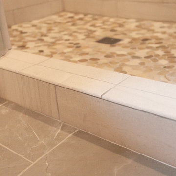
The bathroom was reconfigured to eliminate the old 70’s bidet, and a useless storage cabinet, which allowed us to add a large, walk in shower with bench and a separate soaking tub. The same cabinetry and earthy color palette was used in the bathroom to create cohesion and to emphasize the mid-century character of the home.
What was created is much brighter, more functional and is a timeless yet new space for the homeowners to enjoy as they age in the home.
 GJ Studio
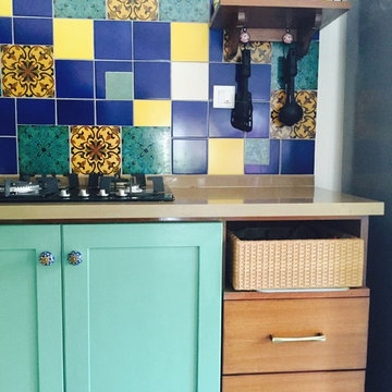
A wicker basket to store veggies that don't need refrigeration- onions, potatoes, garlic
Eclectic l-shaped limestone floor eat-in kitchen photo in Bengaluru with a single-bowl sink, recessed-panel cabinets, green cabinets, quartzite countertops, multicolored backsplash, ceramic backsplash, stainless steel appliances and an island
Eclectic l-shaped limestone floor eat-in kitchen photo in Bengaluru with a single-bowl sink, recessed-panel cabinets, green cabinets, quartzite countertops, multicolored backsplash, ceramic backsplash, stainless steel appliances and an island
8