
Search results for "Eye level" in Home Design Ideas
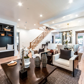

 Kasper Custom Home Remodeling
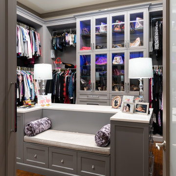
Just like the rest of this elegant master suite, her closet is fitted with high end amenities. From a large island with a bench and plenty of (lockable!) accessory storage to hydraulic lifts that bring the top row of clothing down to eye level, there is no detail left out.
 Zahn Development, Inc.
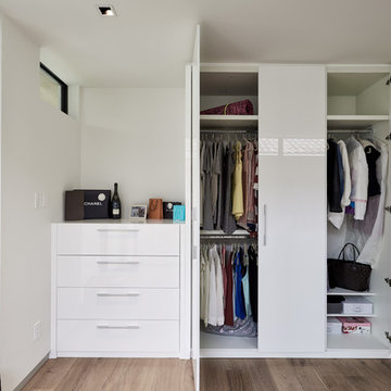
Example of a trendy reach-in closet design in Miami with flat-panel cabinets and white cabinets
Find the right local pro for your project
 New Leaf Construction
Counter Tops by Discover marble and Granite
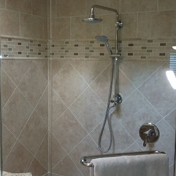
Inspiration for a mid-sized timeless master beige tile and porcelain tile porcelain tile corner shower remodel in Miami with an undermount sink, raised-panel cabinets, white cabinets and granite countertops
Inspiration for a mid-sized timeless master beige tile and porcelain tile porcelain tile corner shower remodel in Miami with an undermount sink, raised-panel cabinets, white cabinets and granite countertops
 ABK Today
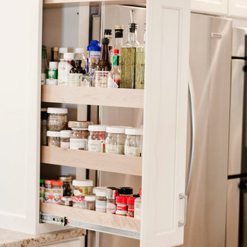
This open kitchen and living design meets the lifestyle needs of an active household and encourages guests to hang out or join in the food prep when entertaining. The bright, open transitional style strikes the perfect balance between traditional and modern design schemes.
 TJ Glidden Construction
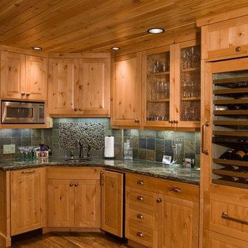
Inspiration for a large rustic l-shaped light wood floor eat-in kitchen remodel in Sacramento with a drop-in sink, shaker cabinets, light wood cabinets, granite countertops, multicolored backsplash, stone tile backsplash, stainless steel appliances and no island
 DaVinci Custom Fireplaces
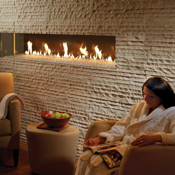
66" x 12" Left Corner, DaVinci Custom Fireplace
Example of a large trendy open concept medium tone wood floor and brown floor living room design in Seattle with brown walls, a ribbon fireplace and a tile fireplace
Example of a large trendy open concept medium tone wood floor and brown floor living room design in Seattle with brown walls, a ribbon fireplace and a tile fireplace

 The Cleary Company
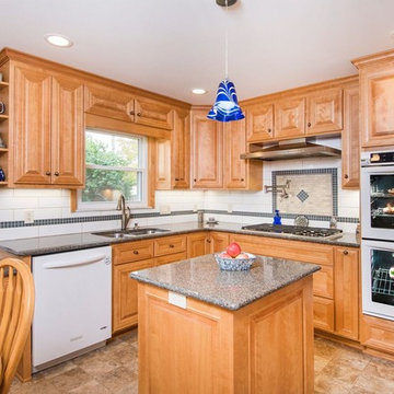
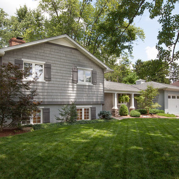
Example of a mid-sized classic gray split-level vinyl exterior home design in Columbus
 Gilmans Kitchens and Baths
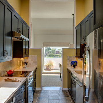
The challenge of modernizing this 1970’s kitchen was its high ceilings. A dark color pallet was selected to keep the focus at eye level. A wall was removed to create symmetry within the space. To balance the dark pallet, lights where added above and under the cabinets.
Treve Johnson Photography
 Archadeck of Nova Scotia
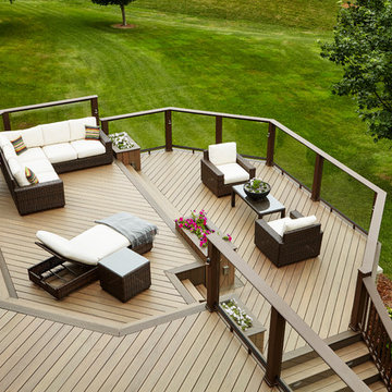
At Archadeck of Nova Scotia we love any size project big or small. But, that being said, we have a soft spot for the projects that let us show off our talents! This Halifax house was no exception. The owners wanted a space to suit their outdoor lifestyle with materials to last far into the future. The choices were quite simple: stone veneer, Timbertech composite decking and glass railing.
What better way to create that stability than with a solid foundation, concrete columns and decorative stone veneer? The posts were all wrapped with stone and match the retaining wall which was installed to help with soil retention and give the backyard more definition (it’s not too hard on the eyes either).
A set of well-lit steps will guide you up the multi-level deck. The built-in planters soften the hardness of the Timbertech composite deck and provide a little visual relief. The two-tone aesthetic of the deck and railing are a stunning feature which plays up contrasting tones.
From there it’s a game of musical chairs; we recommend the big round one on a September evening with a glass of wine and cozy blanket.
We haven’t gotten there quite yet, but this property has an amazing view (you will see soon enough!). As to not spoil the view, we installed TImbertech composite railing with glass panels. This allows you to take in the surrounding sights while relaxing and not have those pesky balusters in the way.
In any Canadian backyard, there is always the dilemma of dealing with mosquitoes and black flies! Our solution to this itchy problem is to incorporate a screen room as part of your design. This screen room in particular has space for dining and lounging around a fireplace, perfect for the colder evenings!
Ahhh…there’s the view! From the top level of the deck you can really get an appreciation for Nova Scotia. Life looks pretty good from the top of a multi-level deck. Once again, we installed a composite and glass railing on the new composite deck to capture the scenery.
What puts the cherry on top of this project is the balcony! One of the greatest benefits of composite decking and railing is that it can be curved to create beautiful soft edges. Imagine sipping your morning coffee and watching the sunrise over the water.
If you want to know more about composite decking, railing or anything else you’ve seen that sparks your interest; give us a call! We’d love to hear from you.
 Archadeck of Nova Scotia
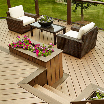
At Archadeck of Nova Scotia we love any size project big or small. But, that being said, we have a soft spot for the projects that let us show off our talents! This Halifax house was no exception. The owners wanted a space to suit their outdoor lifestyle with materials to last far into the future. The choices were quite simple: stone veneer, Timbertech composite decking and glass railing.
What better way to create that stability than with a solid foundation, concrete columns and decorative stone veneer? The posts were all wrapped with stone and match the retaining wall which was installed to help with soil retention and give the backyard more definition (it’s not too hard on the eyes either).
A set of well-lit steps will guide you up the multi-level deck. The built-in planters soften the hardness of the Timbertech composite deck and provide a little visual relief. The two-tone aesthetic of the deck and railing are a stunning feature which plays up contrasting tones.
From there it’s a game of musical chairs; we recommend the big round one on a September evening with a glass of wine and cozy blanket.
We haven’t gotten there quite yet, but this property has an amazing view (you will see soon enough!). As to not spoil the view, we installed TImbertech composite railing with glass panels. This allows you to take in the surrounding sights while relaxing and not have those pesky balusters in the way.
In any Canadian backyard, there is always the dilemma of dealing with mosquitoes and black flies! Our solution to this itchy problem is to incorporate a screen room as part of your design. This screen room in particular has space for dining and lounging around a fireplace, perfect for the colder evenings!
Ahhh…there’s the view! From the top level of the deck you can really get an appreciation for Nova Scotia. Life looks pretty good from the top of a multi-level deck. Once again, we installed a composite and glass railing on the new composite deck to capture the scenery.
What puts the cherry on top of this project is the balcony! One of the greatest benefits of composite decking and railing is that it can be curved to create beautiful soft edges. Imagine sipping your morning coffee and watching the sunrise over the water.
If you want to know more about composite decking, railing or anything else you’ve seen that sparks your interest; give us a call! We’d love to hear from you.
 The Robin Kencel Team
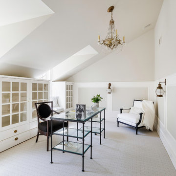
Transitional freestanding desk carpeted and gray floor study room photo in New York with gray walls


 TK Building & Design
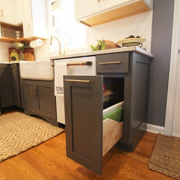
This transitional kitchen brings in clean lines, simple cabinets, warm earth tones accents, and lots of function. This kitchen has a small footprint and had very little storage space. Our clients wanted to add more space, somehow, get the most storage possible, make it feel bright and open, have a desk area, and somewhere that could function as a coffee area. By taking out the doorway into the dining room, we were able to extend the cabinetry into the dining room, giving them their desk area as well as storage and a nice area for guests! A custom appliance garage was made that allows you to have all the necessities right at your hands and gives you the ability to close it up and hide all of the appliances. Trash, spice, tray, and drawer pull outs were added for function, as well as 2 lazy susans, wine storage, and deep drawers for pots and pans.
The homeowner fell in love with the matte white GE Cafe appliances with the brushed bronze accents, and quite frankly, so did we! Once we found those, we knew we wanted to incorporate that metal throughout the kitchen.
New hardwood flooring was installed in the kitchen and finished to match the existing wood in the dining room. We brought the warmth up to eye level with open shelving stained to match.
We love creating with our clients, and this kitchen was no exception! We are thrilled with how everything came together.

 Specht Novak Architects
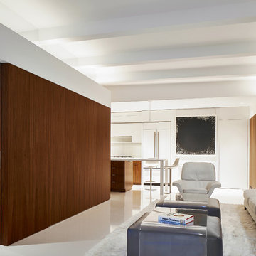
This 900 square foot NYC residence features a wealth of fold-out furniture, hidden storage, and other space-saving features. What really makes it feel expansive, though, is the use of specially-coated front-surface mirrors in strategic locations. These mirrors are placed above eye level to make the ceiling appear to extend far beyond the perimeter walls. Front-surface mirrors are also located directly adjacent to windows to multiply the views and increase the light brought into the space. It is a new take on an old idea, and one that subtly and invisibly reinforces the architecture. The loft is mainly one big open space that includes a kitchen and living room supplemented with a multi-use area that can serve as an office, guest bedroom, or 10-person dining room depending on the configuration of the retractable furniture.The bathroom and main bedroom are designed as small ͞cabinets͟ that flow from this space. White epoxy floors and gloss lacquered surfaces continue the sense of reflectivity, and contrast sharply with dark walnut cabinetry and panels at the perimeter. Dimmable concealed lighting at the perimeter combined with small point sources at art locations allow for a wide variety of moods depending on the light levels.The overall effect is minimal, yet warm and inviting. Architect: Specht Architects Contractor: TCM Photographer: Dror Baldinger

Sponsored
Columbus, OH

Hope Restoration & General Contracting
Columbus Design-Build, Kitchen & Bath Remodeling, Historic Renovations
 FRG Objects & Design / Art
_Photograph by Kim Schmidt_
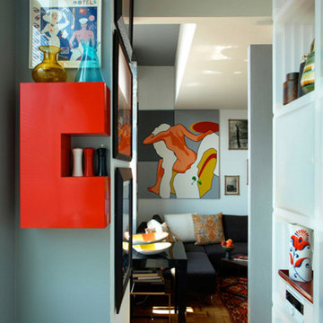
The red spice cabinet is from Ikea. It gave the kitchen a pop of color with a playful modern design.
I love to hang art to compliment the architecture of a building. The piece in the kitchen is hung high above the usual eye level to accent the high corners in such a small kitchen. This allowed your eye to travel and create an illusion of height.
 Specht Novak Architects
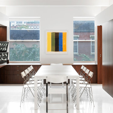
This 900 square foot NYC residence features a wealth of fold-out furniture, hidden storage, and other space-saving features. What really makes it feel expansive, though, is the use of specially-coated front-surface mirrors in strategic locations. These mirrors are placed above eye level to make the ceiling appear to extend far beyond the perimeter walls. Front-surface mirrors are also located directly adjacent to windows to multiply the views and increase the light brought into the space. It is a new take on an old idea, and one that subtly and invisibly reinforces the architecture. The loft is mainly one big open space that includes a kitchen and living room supplemented with a multi-use area that can serve as an office, guest bedroom, or 10-person dining room depending on the configuration of the retractable furniture.The bathroom and main bedroom are designed as small ͞cabinets͟ that flow from this space. White epoxy floors and gloss lacquered surfaces continue the sense of reflectivity, and contrast sharply with dark walnut cabinetry and panels at the perimeter. Dimmable concealed lighting at the perimeter combined with small point sources at art locations allow for a wide variety of moods depending on the light levels.The overall effect is minimal, yet warm and inviting. Architect: Specht Architects Contractor: TCM Photographer: Dror Baldinger
 Specht Novak Architects
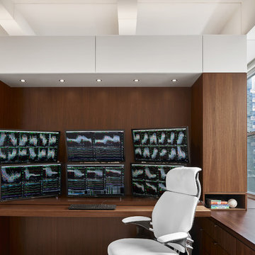
This 900 square foot NYC residence features a wealth of fold-out furniture, hidden storage, and other space-saving features. What really makes it feel expansive, though, is the use of specially-coated front-surface mirrors in strategic locations. These mirrors are placed above eye level to make the ceiling appear to extend far beyond the perimeter walls. Front-surface mirrors are also located directly adjacent to windows to multiply the views and increase the light brought into the space. It is a new take on an old idea, and one that subtly and invisibly reinforces the architecture. The loft is mainly one big open space that includes a kitchen and living room supplemented with a multi-use area that can serve as an office, guest bedroom, or 10-person dining room depending on the configuration of the retractable furniture.The bathroom and main bedroom are designed as small ͞cabinets͟ that flow from this space. White epoxy floors and gloss lacquered surfaces continue the sense of reflectivity, and contrast sharply with dark walnut cabinetry and panels at the perimeter. Dimmable concealed lighting at the perimeter combined with small point sources at art locations allow for a wide variety of moods depending on the light levels.The overall effect is minimal, yet warm and inviting. Architect: Specht Architects Contractor: TCM Photographer: Dror Baldinger
22