
Search results for "Facilitation" in Home Design Ideas
 Archadeck of Austin
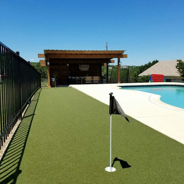
Our talented design team here at Archadeck of Austin are experts at translating the needs and desires of our clients’ into our outdoor living spaces. For this project, we designed a pergola with a metal roof. The interior of the pergola is spacious enough at 20′ x 15′ to facilitate a changing area covered in cedar slats at one end. In addition, the addition serves as the perfect spot for the homeowner’s to store pool supplies when not in use.
 Metropolis Drafting and Construction Inc
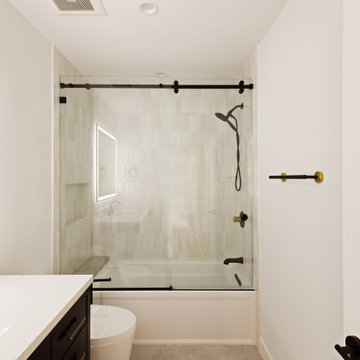
Today’s investment landscape in California features a surge in transforming single-family lots into vibrant multi-family residences, facilitated by recent SB9 and ADU laws. This project exemplifies how a modest 6,750-square-foot lot can accommodate a 1,500-square-foot primary home alongside a 2,500-square-foot duplex, seamlessly integrating design, functionality, and neighborhood aesthetics.
The primary residence underwent a meticulous interior transformation, evolving from a 3-bedroom, 1.5-bath layout into a spacious 4-bedroom, 2-bath home. Strategic reconfigurations centered around creating an expansive great room—an open-concept space adorned with vaulted ceilings—where the kitchen, dining, and living areas converge into a magnificent communal zone.
Exterior updates further distinguish the property. The front and side yards are enclosed with fencing and privacy hedges, linked by concrete pathways that enhance outdoor functionality while compensating for backyard space lost during renovations. The exterior façade was refreshed with darker tones, deliberately contrasting with the duplex to emphasize architectural separation.
Designed to preserve the suburban charm, the duplex visually mimics a single-family home from the street. Its facade creates an illusion of a two-story residence, maintaining harmony within the neighborhood fabric. The main unit, developed under SB9 guidelines, features three bedrooms and two bathrooms, with a luxurious parents’ suite situated upstairs. Downstairs, two bedrooms share a full bath, creating a balanced family-oriented layout.
The duplex’s interior boasts 9-foot ceilings throughout, elevating the sense of space and openness. The design thoughtfully places the kitchen at the front, inviting guests into the home, while stairs on the right lead to the private upstairs bedroom suite.
The ADU offers a two bedroom and two & half baths. the unit is accessible via a private side entrance with a dedicated walkway. Its layout includes a ground-floor living room, a galley kitchen, and a discreet powder room beneath the stairs, designed to contain guest traffic and maintain privacy upstairs. The upstairs bedrooms each feature luxurious bathrooms with expansive showers, adding an element of modern elegance.
Both units enjoy thoughtfully landscaped outdoor spaces—private patios, backyard areas, and gated front yards—creating welcoming environments for residents and visitors alike.
This project exemplifies innovative urban infill solutions, blending architectural elegance with legal compliance and community harmony—an inspiring blueprint for the future of residential development in California.
 Michael Nash Design, Build & Homes
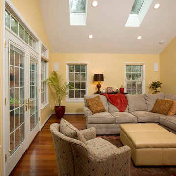
 When the homeowners purchased this traditional colonial in Vienna, Virginia, they were already planning on making some serious changes. The home’s original floor plan was boxy and closed in, making traffic flow from one room to the next virtually non-existent. Additionally, the existing décor left a lot to be desired. Their vision was to open up the layout and create a more contemporary look using lots of light, soft colors and high end materials.
They decided to add a two-story addition to the back of the home’s existing breakfast room and the small upstairs bedroom above it. The old breakfast area was too small for their daily meals and their teenage son needed more space in his bedroom. They also decided to add a sunroom/family room to the left side of their old family room. This new room offers a vaulted ceiling with four skylights and lots of windows with a better view of the side and backyard.
To create a more open floor plan, the team at Michael Nash Design, Build & Homes removed the load bearing wall between the kitchen and family room and installed a large beam to handle the second floor load. Not only did this open up the space, but it allowed for the addition of a breakfast bar.
The right side bearing wall of the old family room was also removed and replaced with structural beams. This action created a continuous flow between the new sunroom and old family room. Separated by a double-sided stone fireplace, this new sunroom is connected to a new outside sun deck built using a maintenance-free decking material. The old family room with new lighting now serves as a casual seating area. It also features an eight-foot long built-in desk.
The newly updated kitchen features granite countertops with matching tile backsplash, professional-quality appliances, a porcelain tile floor and custom cabinets, including a large pantry. The new breakfast room is more spacious and gets daylight from three different angles.
Upstairs, a new 12’ x 20’ bedroom is a great place for this teenage football fan to hang out. It provides significantly more closet space than the old room and lets in more sunlight as well.
The old laundry room was converted to a new mudroom with locker style cabinetry and a place for kids to store their bag packs. New plumbing and electrical were implemented in a new closet in an upper hallway to facilitate the new washer and dryer.
In this remodel, form and function have come together in an open concept design that meets the needs of the entire family.
Find the right local pro for your project
 Drury Design
The 100-year old home’s kitchen was old and just didn’t function well. A peninsula in the middle of the main part of the kitchen blocked the path from the back door. This forced the homeowners to mostly use an odd, U-shaped corner of the kitchen.
Design objectives:
-Add an island
-Wow-factor design
-Incorporate arts and crafts with a touch of Mid-century modern style
-Allow for a better work triangle when cooking
-Create a seamless path coming into the home from the backdoor
-Make all the countertops in the space 36” high (the old kitchen had different base cabinet heights)
Design challenges to be solved:
-Island design
-Where to place the sink and dishwasher
-The family’s main entrance into the home is a back door located within the kitchen space. Samantha needed to find a way to make an unobstructed path through the kitchen to the outside
-A large eating area connected to the kitchen felt slightly misplaced – Samantha wanted to bring the kitchen and materials more into this area
-The client does not like appliance garages/cabinets to the counter. The more countertop space, the better!
Design solutions:
-Adding the right island made all the difference! Now the family has a couple of seats within the kitchen space. -Multiple walkways facilitate traffic flow.
-Multiple pantry cabinets (both shallow and deep) are placed throughout the space. A couple of pantry cabinets were even added to the back door wall and wrap around into the breakfast nook to give the kitchen a feel of extending into the adjoining eating area.
-Upper wall cabinets with clear glass offer extra lighting and the opportunity for the client to display her beautiful vases and plates. They add and an airy feel to the space.
-The kitchen had two large existing windows that were ideal for a sink placement. The window closest to the back door made the most sense due to the fact that the other window was in the corner. Now that the sink had a place, we needed to worry about the dishwasher. Samantha didn’t want the dishwasher to be in the way of people coming in the back door – it’s now in the island right across from the sink.
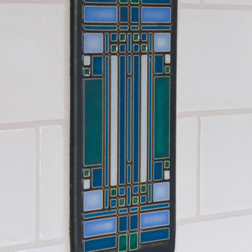
-The homeowners love Motawi Tile. Some fantastic pieces are placed within the backsplash throughout the kitchen. -Larger tiles with borders make for nice accent pieces over the rangetop and by the bar/beverage area.
-The adjacent area for eating is a gorgeous nook with massive windows. We added a built-in furniture-style banquette with additional lower storage cabinets in the same finish. It’s a great way to connect and blend the two areas into what now feels like one big space!
 Van Auken Akins Architects LLC
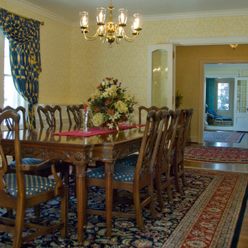
Van Auken Akins Architects LLC designed and facilitated the complete renovation of a home in Cleveland Heights, Ohio. Areas of work include the living and dining spaces on the first floor, and bedrooms and baths on the second floor with new wall coverings, oriental rug selections, furniture selections and window treatments. The third floor was renovated to create a whimsical guest bedroom, bathroom, and laundry room. The upgrades to the baths included new plumbing fixtures, new cabinetry, countertops, lighting and floor tile. The renovation of the basement created an exercise room, wine cellar, recreation room, powder room, and laundry room in once unusable space. New ceilings, soffits, and lighting were installed throughout along with wallcoverings, wood paneling, carpeting and furniture.
 Braitman Design Studio
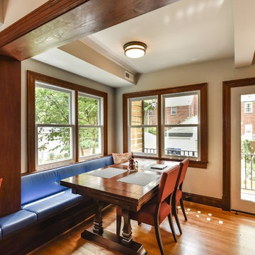
The dining area is at the back of the home overlooking the newly renovated backyard.
A custom Banquette spans the entire space from the kitchen through the dining area to the back. It facilitates both large and intimate dinner parties.
Stained wood openings help maintain the original style of the 1930's home.
 KED Interiors
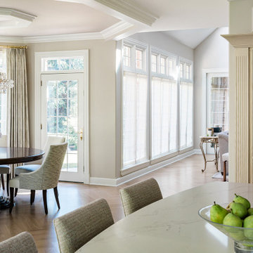
The recent redesign of the kitchen and dining nook skillfully fuses timeless French country aesthetics with modern design principles, tailored for a young couple who cherish both art and architecture. This transformation emphasizes an inviting, comfortable atmosphere without compromising on sophistication. The space uses a palette of muted colors and aged materials to achieve a subtle elegance that integrates seamlessly with the home’s intrinsic architectural charm.
Central to the kitchen are two islands, designed to facilitate both everyday living and grand entertaining. These islands not only offer extensive preparation surfaces but also serve as social hubs, making the kitchen the heart of the home. Adjacent to this area, a well-equipped scullery and a butler’s pantry enhance functionality, providing ample space for storage and meal prep without cluttering the main kitchen area.
The dining area is designed to host intimate dinners or family gatherings, while views of the stunning chandelier, sculpted ceilings and detailed millwork float above, echoing the home’s French influences. Similarly, the sitting area adjacent to the kitchen features comfortable seating and abundant natural light, creating a perfect spot for relaxation or casual conversation.
Attention to detail is evident in the decorative grates on the pantry doors, and the arched glass elements in cabinetry, all nodding to classic French design. This project masterfully balances historical reverence with modern functionality, making it an ideal setting for both lively social gatherings and serene everyday living.
 Paradise Found Construction
Jesse had inherited his townhome, and had lived there for several years. His career took him to another state, and the home was unoccupied for over a year. He decided that he would not return to Raleigh and that it was time to sell.
The 1975 home still had the original kitchen and baths, and was in need of general repair and new flooring. The HVAC system, water heater, and washer and dryer had been replaced as they aged and became non-functional, and the exterior had been maintained by the Home Owner’s Association. Jesse wanted to update the home and have it sell as quickly as possible, so we got to work determining what the best use of the budget would be to accomplish this goal.
We focused on updating the major interior design elements that would provide the most enjoyment, durability, and energy efficiency for the new homeowners.
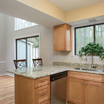
We started with completely gutting the Kitchen and reconfiguring it by moving the refrigerator into the laundry area, and stacked the washer and dryer to save space. We replaced all of the old vinyl cabinets with durable natural wood cabinetry, and added granite counter tops and a stainless steel sink. We also removed the ceiling-hung cabinets over the counter peninsula to open up the Kitchen and bring in more light and facilitate better flow and interaction, and added a floor-to-ceiling Pantry Closet to make up for the lost storage space. All of the Kitchen appliances were replaced with new energy efficient models.
We next gutted the downstairs Powder Bath and replaced the vinyl vanity with matching cabinetry with the kitchen, and replaced the toilet (as well as all other toilets in the home) with an EPA WaterSense rated low-flow toilets. We removed the wallpaper and finished the walls smooth, replaced the lighting and mirror, and removed the carpet and installed a porcelain tile floor.
The second floor 2nd Bedroom had been left open to the Great Room with a balcony and accordion door for privacy, but it left the room open to all of the noise from the Great Room and Kitchen. In order to make the room function as a private bedroom, we removed the balcony and installed a full wall in its place.
Replacing all of the flooring was also at the top of the list, as was general repair on the walls and new paint throughout. We installed natural oak flooring in the Great Room and porcelain tile in the entry foyer. The seals on several of the exterior windows and the Master Bedroom sliding door had been compromised and needed to be replaced, as well as several interior doors and repair of all the louvered closet doors. The two upstairs Baths were functionally sound and the tile was in good shape. We replaced the toilets with EPA WaterSense rated low-flow toilets, and painted the vanities with a brighter color palette.
The end result was bright, open, and comfortable updated home ready for its new occupants.
Design Features
Durable and handsome natural wood cabinetry.
Granite Kitchen and Powder countertops.
Stainless Kitchen appliances and white refrigerator.
Stainless Kitchen sink and brushed nickel faucets.
Brushed Nickel cabinetry and door hardware.
Low-flow EPA WaterSense rated toilets.
Light and bright natural hardwood flooring.
Porcelain tile and luxury vinyl flooring.
New carpet.
Private 2nd Bedroom.
Light and bright No-VOC paints and finishes.
Energy Efficient and Green Features
Energy efficient EPA Energy Star appliances.
EPA WaterSense rated low-flow toilets.
Energy efficient EPA Energy Star windows and door.
Durable No-VOC cabinetry.
Durable porcelain tile flooring.
Low-flow faucets.
Energy efficient CFL lighting throughout.
No-VOC paints and finishes.
 LAND DEVELOPMENT AND BUILDING, LLC
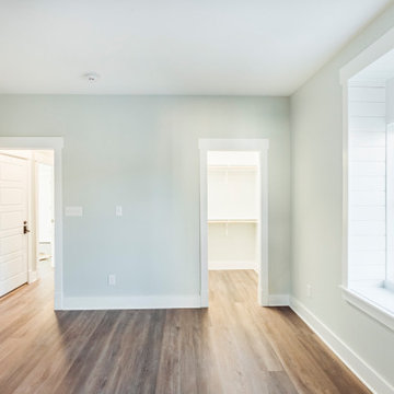
Designed by Ross Chapin and Built by Land Development & Building, the Betty at Inglenook’s Pocket Neighborhoods is an open Cottage-style Home that facilitates everyday living on a single level. High ceilings in the kitchen, family room and dining nook make this a bright and enjoyable space for your morning coffee, cooking a gourmet dinner, or entertaining guests. Whether it’s a two-bedroom Betty or a reconfigured three-bedroom Betty, the Betty plans are tailored to maximize the way we live.
 TKS Design Group
Download our free ebook, Creating the Ideal Kitchen. DOWNLOAD NOW
As with most projects, it all started with the kitchen layout. The home owners came to us wanting to upgrade their kitchen and overall aesthetic in their suburban home, with a combination of fresh paint, updated finishes, and improved flow for more ease when doing everyday activities.
A monochromatic, earth-toned palette left the kitchen feeling uninspired. It lacked the brightness they wanted from their space. An eat-in table underutilized the available square footage. The butler’s pantry was out of the way and hard to access, and the dining room felt detached from the kitchen.
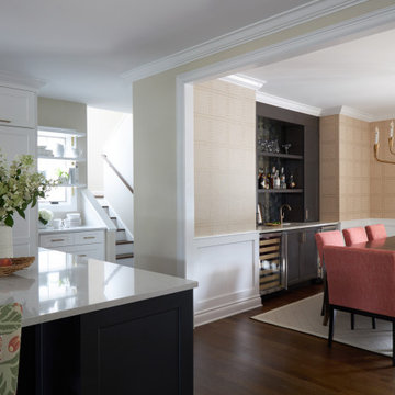
Lead Designer, Stephanie Cole, saw an improved layout for the spaces that were no longer working for this family. By eliminating an existing wall between the kitchen and dining room, and relocating the bar area to the dining room, we opened up the kitchen, providing all the space we needed to create a dreamy and functional layout. A new perimeter configuration promoted circulation while also making space for a large and functional island loaded with seating – a must for any family. Because an island that isn’t big enough for everyone (and a few more) is a recipe for disaster. The light white cabinetry is fresh and contrasts with the deeper tones in the wood flooring, creating a modern aesthetic that is elevated, yet approachable for everyday living.
With better flow as the overarching goal, we made some structural changes too. To remove a bottleneck in the entryway, we angled one of the dining room walls to create more natural separation between rooms and facilitate ease of movement throughout the large space.
At The Kitchen Studio, we believe a well-designed kitchen uses every square inch to the fullest. By starting from scratch, it was possible to rethink the entire kitchen layout and design the space according to how it is used, because the kitchen shouldn’t make it harder to feed the family. A new location for the existing range, flanked by a new column refrigerator and freezer on each side, worked to anchor the space. The very large and very spacious island (a dream island if we do say so ourselves) now houses the primary sink and provides ample space for food prep and family gathering.
The new kitchen table and coordinating banquette seating provide a cozy nook for quick breakfasts before school or work, and evening homework sessions. Elegant gold details catch the natural light, elevating the aesthetic.
The dining room was transformed into one of this client’s favorite spaces and we couldn’t agree more. We saw an opportunity to give the dining room a more distinguished identity by closing off the entrance from the foyer. The relocated wet bar enhances the sophisticated vibe of this gathering space, complete with beautiful antique mirror tiles and open shelving encased by moody built-in cabinets.
Updated furnishings add warmth. A rich walnut table is paired with custom chairs in a muted coral fabric. The large, transitional chandelier grounds the room, pairing beautifully with the gold finishes prevalent in the faucet and cabinet hardware. Linen-inspired wallpaper and cream-toned window treatments add to the glamorous feel of this entertainment space.
There is no way around it. The laundry room was cramped. The large washer and dryer blocked access to the sink and left little room for the space to serve its other essential function – as a mudroom. Because we reworked the kitchen layout to create more space overall, we could rethink the mudroom too – an essential for any busy family. The first step was moving the washer and dryer to an existing area on the second floor, where most of the family’s laundry lives (no one wants to carry laundry up and down the stairs if they don’t have to anyway). This is a more functional solution and opened up the space for all the mudroom necessities – including the existing kitchen refrigerator, loads of built-in cubbies, and a bench.
It’s hard to not fall in love with every detail of a new space, especially when it serves your day-to-day life. But that doesn’t mean the clients didn’t have their favorite features they use on the daily. This remodel was focused largely on function with a new kitchen layout. And it’s the functional features that have the biggest impact. The large island provides much needed workspace in the kitchen and is a spot where everyone gathers together – it grounds the space and the family. And the custom counter stools are the icing on the cake. The nearby mudroom has everything their previous space was lacking – ample storage, space for everyone’s essentials, and the beloved cement floor tiles that are both durable and artistic.
 Mom's Design Build
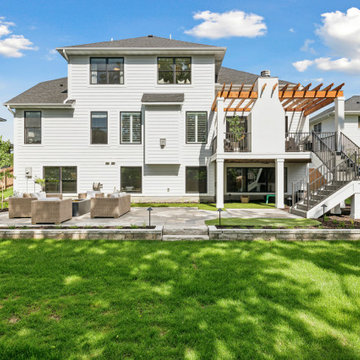
This project transformed a basic builder-grade deck and unlandscaped yard into a beautifully designed outdoor living space. The renovation included elevating the architectural finish of the deck with low-maintenance fascia, trim, and wrapped columns as well as the addition of a pergola for shade and style. A new fireplace was added to create a cozy seating arrangement, adding both privacy and visual interest.
The landscaping was enhanced with a patio and a gas fire pit seating area, perfect for relaxation and gatherings. Additionally, a dining area was incorporated to facilitate hosting and entertaining. To address the yard’s excessive slope, a retaining wall was constructed, leveling the terrain and providing a more functional and aesthetically pleasing outdoor space.
 Integrated Home Improvement
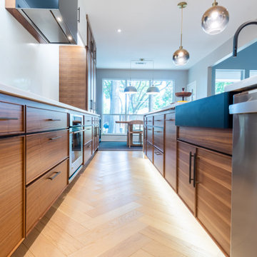
Both the design and construction teams put their heart into making sure we worked with the client to achieve this gorgeous vision. The client was sensitive to both aesthetic and functionality goals, so we set out to improve their old, dated cramped kitchen, with an open concept that facilitates cooking workflow, and dazzles the eye with its mid century modern design. One of their biggest items was their need for increased storage space. We certainly achieved that with ample cabinet space and doubling their pantry space.
The 13 foot waterfall island is the centerpiece, which is heavily utilized for cooking, eating, playing board games and hanging out. The pantry behind the walnut doors used to be the fridge space, and there's an extra pantry now to the left of the current fridge. We moved the sink from the counter to the island, which really helped workflow (we created triangle between cooktop, sink and fridge/pantry 2). To make the cabinets flow linearly at the top we moved and replaced the window. The beige paint is called alpaca from Sherwin Williams and the blue is charcoal blue from sw.
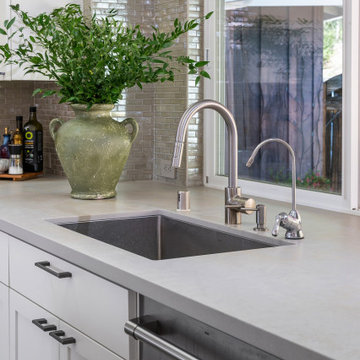
Everything was carefully selected, from the horizontal grain on the walnut cabinets, to the subtly veined white quartz from Arizona tile, to the black glass paneled luxury hood from Futuro Futuro. The pendants and chandelier are from West Elm. The flooring is from karastan; a gorgeous engineered, white oak in herringbone pattern. The recessed lights are decorative from Lumens. The pulls are antique brass from plank hardware (in London). We sourced the door handles and cooktop (Empava) from Houzz. The faucet is Rohl and the sink is Bianco.
 Fiorito Interior Design
This gorgeous, nature-inspired Great Room—comprised of the kitchen, dining area, and sitting room—was reimagined for some wonderful repeat clients, beginning with a small, treasured piece of art.
Their large 1950s ranch house nestled into a gentle hill surrounded by orchards of fragrant orange, lemon, and cherry trees initially featured a too-small kitchen adjacent to a warren of small spaces with low ceilings serving as a dining and sitting area. They dreamed of a more spacious, light-filled layout.
A complete redesign of the home not only resolved spatial constraints but also embraced the beauty of the home’s natural surroundings. By removing walls and creating an open-plan layout, we enhanced the flow and connectivity between the kitchen, dining, and sitting areas, seamlessly integrating the outdoors with the indoors.
The relocated kitchen now faces the backyard, to facilitate outdoor entertaining and features a large island, serving as a welcoming focal point for both cooking and socializing. I designed a distinctive ceiling feature above the island, crafted from planks of the adjacent vaulted ceiling, mirroring the shape of the island below. This feature adds architectural interest and visually connects the flat kitchen plane with the vaulted plank ceiling of the sitting area, creating a harmonious sense of continuity and warmth.
A beautiful, prized painting of a bird on a branch created the direction for the color and texture palette. An intriguing yellow-green-tan background in the art guided my choices for the backsplash tile (an iridescent version mimics light glinting on water) and countertops. The kitchen's soothing color palette features various shades of natural green, while the dining area introduces feather-blue tones through chair upholstery and rug. Just steps away, the inviting sitting area features a rebuilt fireplace clad in cut, polished Haisa marble tiles in a vertical pattern. The soft, generous seating creates a comfortable spot for movie nights or cozying up by the fire on a cold winter evening. The elegant, simple silhouettes of the furniture enhance the serene and calming atmosphere of the space.
After photos: Bernardo Grijalva and Fiorito Interior Design
Cabinetry: custom by Schmitz Woodwork
Countertops: Primordia and Calcatta Maximus by Caesarstone
Backsplash: Elements in Miami Sand Pearl by Lunada Bay
Island pendants: Simple Sanders by Shades of Light
Stools: Essex by Lazar in Brisa fabric by Ultrafabrics
Dining table: Emerson Wave by Saloom
Dining chairs: Essex by Lazar
Dining lighting: Triad chandelier by Kichler
Dining rug: Soho Smoke by Jaunty Inc.
Sitting area sofa and ottoman: Corvo by Lazar
Sitting area swivel chair: Noah by Lazar
Sitting area rug: Soho Stone by Jaunty Inc.
Motorized shades: Hunter Douglas
Entry console: Reed by Uttermost
Entry light: Re by Visual Comfort
Fireplace: Haisa cut and polished marble by Icontile
Wall paint: Mascarpone by Benjamin Moore
 MAKHNO studio
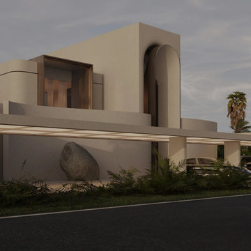
Embracing the ethos of modern architecture, the design utilizes curvilinear forms and layered horizontal lines to create a dynamic exterior. The harmonious blend of natural elements with the structure's clean, beige-toned facade accentuates its luxurious yet inviting ambience. Strategic placement of windows and openings facilitates a seamless flow of natural light, enhancing the indoor-outdoor living experience.
 Halpern Architects
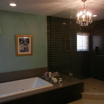
Patrice's Bathroom. I enjoyed developing the details of the tub platform extending through the frameless glass and becoming the shower seat.I had hoped that the tile in the shower would have extended out of the shower and become the backsplash, but that part of the design was not developed at Halpern Architects.
One of the challenges of doing an Extreme Makeover house is developing details that can be field assembled quickly. In this case, working with Nationwide Homes, the modular home company that built "The boxes", a range of details were developed to make things easier. The tub and surround was installed By Nationwide. To facilitate connections and service without the visual or technical complications of an access panel, access was provided from below.
Throughout the design process, I had insisted that all of the plumbing, mechanical and electrical connections occur in the crawlspace, allowing the work to continue without crowding the interior of the house.
Many of the time saving details were worked out through a great working relationship between Fusion Custom Homes, who was the general contractor, Nationwide Homes, who was the modular home manufacturer, and Halpern Architects.The crawlspace was constructed taller than usual with nearly full standing headroom and a full height access door was provided from the exterior, allowing workman to come and go at will, without having to enter the house. This also allowed multiple trades to stock the job and work at the same time.
 Pinnacle Design & Remodeling
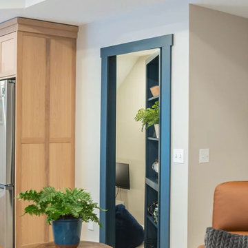
A blank slate and open minds are a perfect recipe for creative design ideas. The homeowner's brother is a custom cabinet maker who brought our ideas to life and then Landmark Remodeling installed them and facilitated the rest of our vision. We had a lot of wants and wishes, and were to successfully do them all, including a gym, fireplace, hidden kid's room, hobby closet, and designer touches.
 Leet Architecture
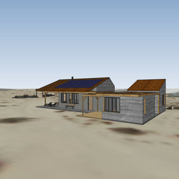
The design approach facilitates phased construction, which accommodates starting small with a cabin-like primary living space and expanding as needed. Wood trusses carry a pitched roof over the main living area to provide an infrastructure for an off-grid solar array.
 Axis Mundi | SF
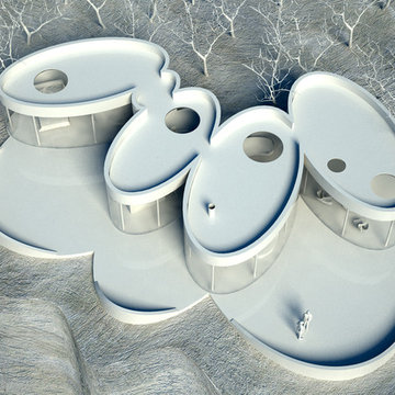
This weekend retreat, nestled in a grove of aspens in Lizard Head Pass, Colorado, embodies the words of Henri Poincaré: “Ideas rose in clouds; I felt them collide until pairs interlocked, so to speak, making a stable combination.” It directly challenges many of our ideas about home. Rather than a place offering the illusion of protection from the outside world through solid structure, its openness, light and reflectivity make it arguably more transparent than even Philip Johnson’s iconic Glass House. Featuring a floorplan that is an abstract interpretation of a cumulus cloud, the home’s five rotated, elliptically shaped glass pods approach invisibility at certain times of the year. Each pod serves a distinct programmatic function, though together they facilitate an easy and fluid flow accomplished by minimalist doors placed at the interstices where the pods meet. It functions as an ethereal meeting place between earth and sky.
Total Area: 2200 sq. ft., 600 sq. ft. exterior deck
Major Materials: Steel structure, curved architectural glass, anodized aluminum, epoxy flooring, and wood decking.
Design Team: John Beckmann, with Jacob George
Renderings: Jacob George
Diagrams and model: Jacob George and Jessica Marvin
© Axis Mundi Design LLC
 Van Auken Akins Architects LLC
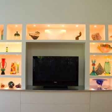
Van Auken Akins Architects LLC designed and facilitated the renovation of the master bedroom and bath of a Moreland Hills home. The master bedroom was outfitted with new wall coverings, carpeting, lighting and window treatments. In the master bath, new cabinetry, countertops, lighting and carpet were installed. A new entertainment cabinet in the living room was designed as well.
 LifeHouse Construction
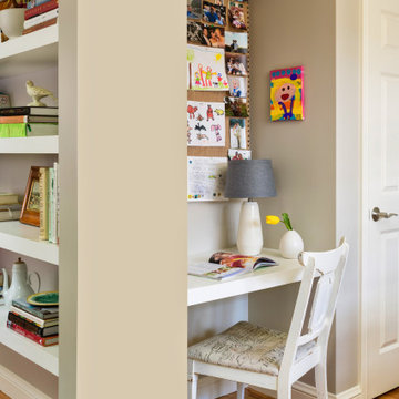
A busy family of five decided to turn their neglected living room into a more useful space to accommodate their needs by converting the space into a study, pantry, and breakfast nook. To better facilitate their passion for cooking, the kitchen now features a 72″ wide refrigerator and freezer, bar top seating, and a built-in breakfast nook.
Photos by Kimberly Gavin Photography
42