
Search results for "Feeling reduce" in Home Design Ideas
 Ginkgo Leaf Studio
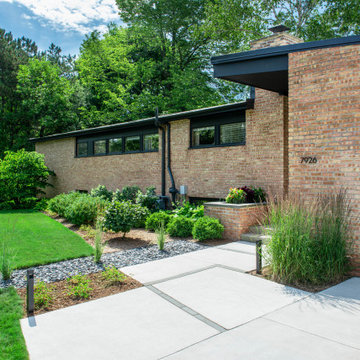
The angles of the new front walk carry through to the angled bedline across the front of the mid-century modern home.
Renn Kuhnen Photography
Inspiration for a mid-sized 1950s entryway remodel in Milwaukee
Inspiration for a mid-sized 1950s entryway remodel in Milwaukee
 Dura Supreme Cabinetry
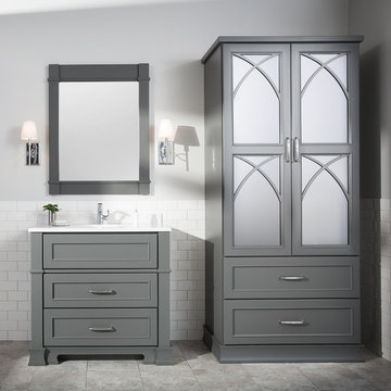
Submerse yourself in a serene bath environment and enjoy solitude as your reward. Select the most inviting and luxurious materials to create a relaxing space that rejuvenates as it soothes and calms. Coordinating bath furniture from Dura Supreme brings all the details together with your choice of beautiful styles and finishes. Mirrored doors in the linen cabinet make small spaces look expansive and add a convenient full length mirror into the bathroom.
A large linen cabinet in this bathroom adds vast amounts of storage to the small space, while adding beauty to the room. This sublime bathroom features Dura Supreme’s “Style Four” furniture series. Style Four offers 10 different configurations (for single sink vanities, double sink vanities, or offset sinks), and multiple decorative toe options to coordinate vanities and linen cabinets. A matching mirror complements the vanity design. On this example, the sculpted detail of the Cove Furniture Base creates a classic architectural detail for this bath cabinetry set.
The Storm Gray painted finish with the white subway tile, counter top and other white accents give this luxurious small space a bright yet cool feel. This look is destined to be a classic for years to come.
The bathroom has evolved from its purist utilitarian roots to a more intimate and reflective sanctuary in which to relax and reconnect. A refreshing spa-like environment offers a brisk welcome at the dawning of a new day or a soothing interlude as your day concludes.
Our busy and hectic lifestyles leave us yearning for a private place where we can truly relax and indulge. With amenities that pamper the senses and design elements inspired by luxury spas, bathroom environments are being transformed form the mundane and utilitarian to the extravagant and luxurious.
Bath cabinetry from Dura Supreme offers myriad design directions to create the personal harmony and beauty that are a hallmark of the bath sanctuary. Immerse yourself in our expansive palette of finishes and wood species to discover the look that calms your senses and soothes your soul. Your Dura Supreme designer will guide you through the selections and transform your bath into a beautiful retreat.
Request a FREE Dura Supreme Brochure Packet:
http://www.durasupreme.com/request-brochure
Find a Dura Supreme Showroom near you today:
http://www.durasupreme.com/dealer-locator
 Flooret
Part of the Modin Vinyl Plank Collection, Available Exclusively From www.Flooret.com
$3.49 / sq ft, 22.08 sq ft per box
50% WIDER. 25% LONGER. TWICE AS DURABLE
Luxury Vinyl Plank, 5 mm x 9" x 60" (1.0 mm / 40 mil wear-layer)
Lifetime Residential Warranty, 20 year Commercial Warranty
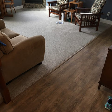
Classic Oak Elegance. Arden provides a timeless template with which to define your space. We designed the grain pattern to have just a hint of rustic, but it is still clean enough that you can convincingly use it in a modern setting.
REDEFINING DURABILITY
The most important specification for determining the durability of vinyl flooring is the thickness of the wear-layer. The best wear-layers are made of thick, clear virgin PVC, which covers the paper print-film that gives the floor its unique appearance. Once the wear-layer wears through, the paper is damaged and the floor will need replacement.
Most vinyl floors come with a 8-12 mil wear-layer (0.2-3 mm). The top commercial specs in the industry are higher, at 20-22 mil (0.5 mm). A select few manufacturers offer a "super" commercial spec of 28 mil (0.7 mm).
For Modin, we decided to set a new standard: 40 mil (1.0 mm) of premium virgin PVC. This allows us to offer an industry-leading 20 year Commercial Warranty (Lifetime Residential), compared to nearly all other commercial vinyl floors' 10 year Commercial Warranty.
Beyond our superior wear-layer, we also use a patented click mechanism for superior hold, and a ceramic-bead coating.
SIZE MATTERS
Wider and longer planks create a sense of space and luxury. Most vinyl floors come in 6" or 7" widths, and 36" or 48" lengths.
For Modin, we designed our planks to be 9" wide, and 60" long. This extra large size allows our gorgeous designs to be fully expressed.
DETAILS THAT COUNT
We made sure to get all the details right. Real texture, to create the feel of wire-brushed wood. Low sheen level, to ensure a natural look that wears well over time. 4-sided bevels, to more accurately emulate the look of real planks. When added together they help create the unique look that is Modin.
DESIGNS THAT INSPIRE
We spent nearly a year just focusing on our designs, to ensure they provide the right mix of color and depth. Focusing on timeless wire-brush and European Oak styles, as well as more contemporary modern washes, our collection offers truly beautiful design that is both functional and inspiring.
Find the right local pro for your project

 Martinson's Garden Works
Inspiration for a large traditional shade front yard mulch driveway in Jackson for summer.
 TKS Design Group
Download our free ebook, Creating the Ideal Kitchen. DOWNLOAD NOW
This family from Wheaton was ready to remodel their kitchen, dining room and powder room. The project didn’t call for any structural or space planning changes but the makeover still had a massive impact on their home. The homeowners wanted to change their dated 1990’s brown speckled granite and light maple kitchen. They liked the welcoming feeling they got from the wood and warm tones in their current kitchen, but this style clashed with their vision of a deVOL type kitchen, a London-based furniture company. Their inspiration came from the country homes of the UK that mix the warmth of traditional detail with clean lines and modern updates.
To create their vision, we started with all new framed cabinets with a modified overlay painted in beautiful, understated colors. Our clients were adamant about “no white cabinets.” Instead we used an oyster color for the perimeter and a custom color match to a specific shade of green chosen by the homeowner. The use of a simple color pallet reduces the visual noise and allows the space to feel open and welcoming. We also painted the trim above the cabinets the same color to make the cabinets look taller. The room trim was painted a bright clean white to match the ceiling.
In true English fashion our clients are not coffee drinkers, but they LOVE tea. We created a tea station for them where they can prepare and serve tea. We added plenty of glass to showcase their tea mugs and adapted the cabinetry below to accommodate storage for their tea items. Function is also key for the English kitchen and the homeowners. They requested a deep farmhouse sink and a cabinet devoted to their heavy mixer because they bake a lot. We then got rid of the stovetop on the island and wall oven and replaced both of them with a range located against the far wall. This gives them plenty of space on the island to roll out dough and prepare any number of baked goods. We then removed the bifold pantry doors and created custom built-ins with plenty of usable storage for all their cooking and baking needs.
The client wanted a big change to the dining room but still wanted to use their own furniture and rug. We installed a toile-like wallpaper on the top half of the room and supported it with white wainscot paneling. We also changed out the light fixture, showing us once again that small changes can have a big impact.
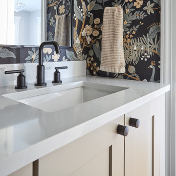
As the final touch, we also re-did the powder room to be in line with the rest of the first floor. We had the new vanity painted in the same oyster color as the kitchen cabinets and then covered the walls in a whimsical patterned wallpaper. Although the homeowners like subtle neutral colors they were willing to go a bit bold in the powder room for something unexpected. For more design inspiration go to: www.kitchenstudio-ge.com
 Joyfully Growing Blog, LLC
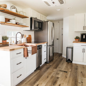
Example of a small farmhouse galley laminate floor and gray floor kitchen design in Portland with a farmhouse sink, raised-panel cabinets, white cabinets, wood countertops, white backsplash, porcelain backsplash, stainless steel appliances and no island
 Pinnacle Lighting Group
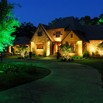
Large elegant two-story stone house exterior photo in Other with a hip roof and a shingle roof

Sponsored
Columbus, OH

Wannemacher Interiors
Customized Award-Winning Interior Design Solutions in Franklin Cnty OH
 Torrey Pines Landscape Co., Inc
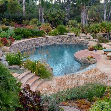
Pool design- Harry Thompson
Baja entry in quartzite, re-purposed ledge stone and masonry scraps for rustic wall behind pool, water fall spa with buckskin flagstones as path leading back to the residence, steps around both sides of pool to next level up, minimized lawn areas
Photo-Martin Mann
 Nathan Taylor for Obelisk Home
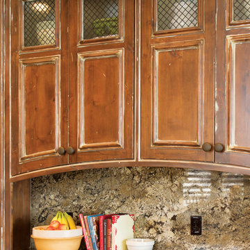
The interior of the home went from Colonial to Classic Lodge without changing the footprint of the home. Columns were removed, fur downs removed that defined space, fireplace relocated, kitchen layout and direction changed, breakfast room and sitting room flip flopped, study reduced in size, entry to master bedroom changed, master suite completely re-arranged and enlarged, custom hand railing designed to open up stairwell, hardwood added to stairs, solid knotty alder 8’ doors added, knotty alder crown moldings added, reclaimed beamed ceiling grid, tongue and groove ceiling in kitchen, knotty alder cabinetry, leather finish to granite, seeded glass insets, custom door to panty to showcase an antique stained glass window from childhood church, custom doors and handles made for study entry, shredded straw added to wall texture, custom glazing done to all walls, wood floor remnants created an antique quilt pattern for the back wall of the powder bath, custom wall treatment created by designer, and a mixture of new and antique furnishing were added, all to create a warm, yet lived in feeling for this special family.
A new central stone wall reversed with an over scaled fireplace and reclaimed flooring from the East became the anchor for this level of the home. Removing all the “divisions” of space and using a unified surface made unused rooms, part of the daily living for this family. The desire to entertain large group in a unified space, yet still feel like you are in a cozy environment was the driving force for removing divisions of space.
Photos by Randy Colwell
 Flying Dormer
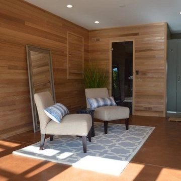
The European homeowners wanted to create a space for a new sauna and hot tub, as well as a place to relax afterwards. It needed to be light and bright, and have a warm but modern feel. We built this addition under the existing deck, and spruced up the deck at the same time to enjoy the nice territorial views.
The walls of the addition are cedar, with built-ins and deep cabinets for storage. There is a walk-in, tiled shower with built-in bench just off the sauna, and a seating area with tv for relaxing. The floor is stained concrete.
The 14-foot wall of windows (including a door to the hot tub), and the secondary window wall that includes french doors allows the maximum amount of light into the space and really creates that spa feeling.
The plans evolved during construction to include a larger sauna (thereby reducing the shower size somewhat) and a much larger hot tub than originally planned. The solution was to move the hot tub outside, which had the benefit of opening up more space inside for a yoga/ workout area. The hot tub is covered by a glass roof so it can be enjoyed year-round under the stars.
 TKS Design Group
Download our free ebook, Creating the Ideal Kitchen. DOWNLOAD NOW
This family from Wheaton was ready to remodel their kitchen, dining room and powder room. The project didn’t call for any structural or space planning changes but the makeover still had a massive impact on their home. The homeowners wanted to change their dated 1990’s brown speckled granite and light maple kitchen. They liked the welcoming feeling they got from the wood and warm tones in their current kitchen, but this style clashed with their vision of a deVOL type kitchen, a London-based furniture company. Their inspiration came from the country homes of the UK that mix the warmth of traditional detail with clean lines and modern updates.
To create their vision, we started with all new framed cabinets with a modified overlay painted in beautiful, understated colors. Our clients were adamant about “no white cabinets.” Instead we used an oyster color for the perimeter and a custom color match to a specific shade of green chosen by the homeowner. The use of a simple color pallet reduces the visual noise and allows the space to feel open and welcoming. We also painted the trim above the cabinets the same color to make the cabinets look taller. The room trim was painted a bright clean white to match the ceiling.
In true English fashion our clients are not coffee drinkers, but they LOVE tea. We created a tea station for them where they can prepare and serve tea. We added plenty of glass to showcase their tea mugs and adapted the cabinetry below to accommodate storage for their tea items. Function is also key for the English kitchen and the homeowners. They requested a deep farmhouse sink and a cabinet devoted to their heavy mixer because they bake a lot. We then got rid of the stovetop on the island and wall oven and replaced both of them with a range located against the far wall. This gives them plenty of space on the island to roll out dough and prepare any number of baked goods. We then removed the bifold pantry doors and created custom built-ins with plenty of usable storage for all their cooking and baking needs.
The client wanted a big change to the dining room but still wanted to use their own furniture and rug. We installed a toile-like wallpaper on the top half of the room and supported it with white wainscot paneling. We also changed out the light fixture, showing us once again that small changes can have a big impact.
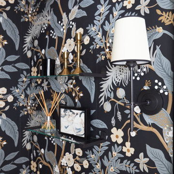
As the final touch, we also re-did the powder room to be in line with the rest of the first floor. We had the new vanity painted in the same oyster color as the kitchen cabinets and then covered the walls in a whimsical patterned wallpaper. Although the homeowners like subtle neutral colors they were willing to go a bit bold in the powder room for something unexpected. For more design inspiration go to: www.kitchenstudio-ge.com
 Torrey Pines Landscape Co., Inc
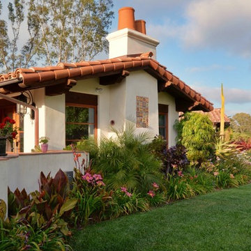
Podocarpus, Day Lily, Palms, Aeoniums, Cannas
Design- Harry Thompson, Torrey Pines Landscape Co., Inc
A San Diego Home and Garden 2014 award winner
Maintenance- Torrey Pines Landscape Co., Inc, A CLCA award winner
Photo-Martin Mann
 Eyoh Design
Louisa, San Clemente Coastal Modern Architecture
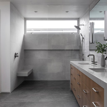
The brief for this modern coastal home was to create a place where the clients and their children and their families could gather to enjoy all the beauty of living in Southern California. Maximizing the lot was key to unlocking the potential of this property so the decision was made to excavate the entire property to allow natural light and ventilation to circulate through the lower level of the home.
A courtyard with a green wall and olive tree act as the lung for the building as the coastal breeze brings fresh air in and circulates out the old through the courtyard.
The concept for the home was to be living on a deck, so the large expanse of glass doors fold away to allow a seamless connection between the indoor and outdoors and feeling of being out on the deck is felt on the interior. A huge cantilevered beam in the roof allows for corner to completely disappear as the home looks to a beautiful ocean view and Dana Point harbor in the distance. All of the spaces throughout the home have a connection to the outdoors and this creates a light, bright and healthy environment.
Passive design principles were employed to ensure the building is as energy efficient as possible. Solar panels keep the building off the grid and and deep overhangs help in reducing the solar heat gains of the building. Ultimately this home has become a place that the families can all enjoy together as the grand kids create those memories of spending time at the beach.
Images and Video by Aandid Media.


 Core Outdoor Living
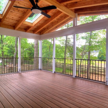
Cedar Ceiling Above Rafters, Composite Floor with Powder Coated Iron Railing
Inspiration for a large timeless screened-in back porch remodel in DC Metro with decking and a roof extension
Inspiration for a large timeless screened-in back porch remodel in DC Metro with decking and a roof extension
 User
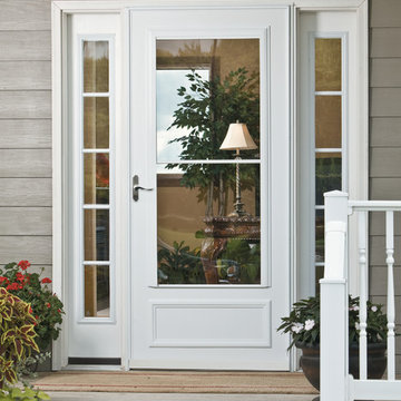
UserENJOY THE BREEZE: LARSON Screen Away Storm Doors are designed to increase ventilation, allowing more fresh air inside for greater comfort and reduced cooling costs.
We love how this white storm door matches the sidelights and the railing on this home to give it a put together look that has a timeless feel.
 Constantine Design Group, Inc.
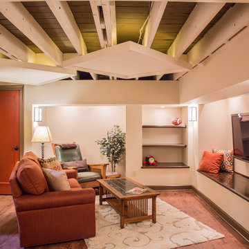
This early 20th century Indianapolis, IN basement remodel was in desperate need of help. The original and still operating hydronic radiant heating system had its plumbing configured without regard to any other use of the space. Fearful of harming the aged system and the high cost of doing so, these Clients were adamant that the existing system remain intact. Architect Lee Constantine developed a design that maintained the existing heating system while creating "niches" around the perimeter that would conceal the unsightly plumbing. Additionally, by removing free-standing structural supporting posts, amore flexible and inviting space was achieved. Because of an already low ceiling condition, the floor-ceiling structure above was kept exposed, painted and highlighted with indirect lighting to avoid further reducing the ceiling height. Constantine incorporated "clouds" on this ceiling to conceal certain existing components that either were cost prohibitive to relocate or couldn't be relocated. These "clouds"become a "visual element" through their geometry and hidden "indirect" light source rather than an undesirable complication. Now this family entertains frequently in the basement and reports "it doesn't feel like we're in a basement anymore"


 DHD Architecture and Interior Design
Union Square Loft II
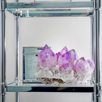
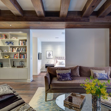
DHD Interiors worked with this couple to furnish their new recently renovated Flatiron loft. Navigating the dark wood paneling and flooring, DHD selected furniture and finishes that felt rich in color and texture while still cool and casual. Layers of grass cloth wallpapers were added to the main bedrooms to reduce the contrast of the dark wood and walls, adding brightness to the loft’s overall feel. Greys and mink-toned browns served as the foundation for a base palette, with deep burgundies and blues working as accents. This loft feels like a true downtown loft with its original brick and an industrial dining table, but stays balanced with softly upholstered furniture. Each piece, from the Dunbar chaise lounge to the organically shaped coffee table, displays a sculptural quality that contributes to a visually dynamic space.
2 Bedrooms / 2,000 Square Feet
Architecture and Photography:
Danny Forster Design Studio

 Southern Landscape
Paver path, stone staircase, and natural landscaping designed and constructed by Southern Landscape. The natural feel of the landscape accentuates the beautiful natural surroundings of the Texas Hill Country.
 Céladon Designs, Inc.
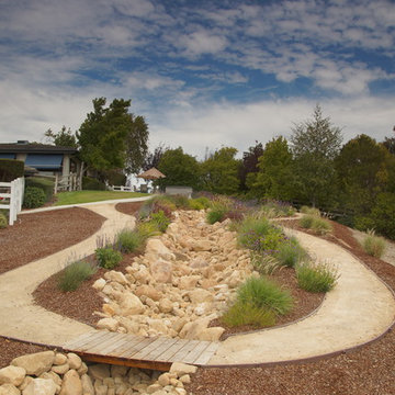
Inspiration for a large rustic drought-tolerant and full sun backyard gravel garden path in Santa Barbara for spring.
26