
Search results for "Feeling reduce" in Home Design Ideas
 Klopf Architecture
From Mid-Century Classic to the Present
An iconic design updated with comfort, function, and flow for today.
A Remodel That Balances Past and Present
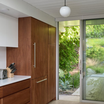
What started as a desire to update a classic Eichler soon became an exploration of how Mid-Century Modern design can successfully evolve for today. The client, a tech professional with a passion for scuba diving and underwater photography, wanted a home that would both honor its original character and feel tailored to his daily life. A lifelong technology enthusiast, he still owns the very first Mac desktop he saved up for as a teenager working at Radio Shack, a detail that underscores his appreciation for design that melds function and form.
Honoring Separation While Expanding Possibility
Unlike many contemporary remodels where walls are opened up to create expansive living spaces, this project took a more restrained approach. The client valued the defined rooms of the original plan and wanted to preserve as much wall space as possible for displaying his large-format underwater photography. The emphasis was not on dramatic spatial reinvention, but on thoughtful refinements. Klopf Architecture shaped a gallery-like backdrop while also expanding the primary suite, modernizing materials and fixtures throughout the home, and improving the functionality and layout of the kitchen. The finished home feels at once timeless and renewed, an Eichler that continues to inspire while fully supporting the lifestyle of its present-day owner.
A major turning point came mid-design. The original project brief had not included an addition, but as the reconfiguration of the primary bedroom and bath unfolded, it became clear that an expansion was the best approach to achieve the client’s vision of a more spacious suite. Fortunately, the adjustment came at a stage when revisions were still manageable and was integrated seamlessly, showing how thoughtful course corrections can strengthen a project rather than hinder it.
Navigating Challenges With Precision
The design development included multiple conceptual rounds, balancing preservation with subtle expansion. During construction, an existing post previously thought to be load-bearing turned out not to be. The structural engineer was able to pivot quickly, and both the post and the cross beam that had been intended to replace it could be omitted, allowing the original rhythm of the Eichler beam bays to be preserved.
Sustainability was not just a checklist item, but a way to align the home with the client’s values of simplicity, efficiency, and long-term functionality. R-38 roof insulation reduced energy usage, solar panels with battery storage provided independence and resilience, and passive comfort strategies eliminated the need forenergy-intensive air conditioning. An electric vehicle charger and an on-demand hot water recirculation system (with call buttons as opposed to having constant circulation) add to the home’s long-term efficiency factors. Together, these moves created a home that is quieter, more comfortable, and better equipped for the future, qualities that supported the client’s pragmatic approach to design and living lightly.
Details That Respect the Eichler DNA
The remodel carries forward the Eichler’s original spirit while introducing new layers of modern livability. Originally, the house was approached along a deep, narrow walk, with the garage on one side and the house on the other, leaving the front door tucked far back within this chasm-like space. By pulling the entry forward, the design reshaped the arrival experience, creating a clearer threshold and a natural drop-off zone for bags, shoes, and keys. This shift also made room for a custom bench at the entry that extends seamlessly through the glass sidelight. The bench and drop-off zone now work together as a single, integrated sequence that supports everyday living while offering a tactile reminder of Eichler’s philosophy of connectedness.
At the client’s request, Klopf reintroduced a classic Eichler gesture by extending the exterior siding into the entry and living room. The detail reinforces a sense of indoor/outdoor continuity while providing a subtle architectural surface that allows the client’s photography to take visual precedence.
The signature concrete masonry wall at the front was reconstructed using blocks sourced to match the originals, now strengthened with rebar for seismic resilience while maintaining a private outdoor courtyard, visually extending the kitchen outward. A decorative trellis element, a detail borrowed from a neighboring Eichler, restores a familiar mid-century modern architectural motif. At the courtyard entry door, a custom etched glass sidelight with an ocean-themed design featuring kelp and jellyfish serves as a subtle homage to the client’s passion for deep-sea diving.
Landscaping became an integral part of the overall transformation. The homeowner engaged landscape architect Randi Johnsen of Third Nature Studio to shape a series of calm, inviting outdoor rooms that read as a natural extension of the interiors. While technically outside of the core construction scope, the landscape design proved central to achieving a sense of completeness and connectedness across the property. Such whole-property considerations often emerge as design ideas take shape, underscoring the importance of flexibility in planning and budgeting, as well as close collaboration among the design team starting early in the process.
The Value of Evolving Scope
As with many custom residential projects, the scope evolved during the design process. What began as a targeted remodel grew to include a new/expanded primary suite, a rebuilt CMU patio wall for strength and longevity, and a solar panel array and battery storage for energy resilience and carbon-reduction. Each thoughtful decision represented a conscious investment in the home’s performance and character, rather than a cost overrun.
The result was a project delivered on schedule, tailored precisely to the client’s lifestyle, and positioned to add long-term value both functionally and aesthetically. By embracing scope evolution as an opportunity rather than a challenge, and relying on good design paired with transparent communication, this remodel demonstrates how Eichler homes can be adapted for contemporary living without erasing their DNA.
Klopf Architecture project team: John Klopf, AIA, and Klara Kevane, Elise Webb and Nicholas LaNasa.
Contractor: Golden Cove Construction
Landscape Design: Third Nature Studio
Structural Engineer: Daniel Bastiao Design
Photography: ©2025 Mariko Reed
Year Completed: 2024
Location: Sunnyvale, CA
 KCBR Design | Remodel
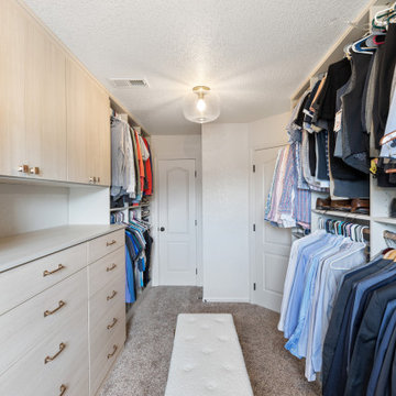
The client wanted to update their bathroom to have an elevated farmhouse feel, so we designed the vanities with a contemporary apron front countertop and used plumbing fixtures that give a nod to old fashioned water pump handles and lighting that is reminiscent of lanterns. They wanted to reduce the tub footprint, so we included a free-standing tub that is custom painted to coordinate with the shower floor tiles. They wanted to incorporate more functionality including space for laundry, jewelry organization, a coffee bar, ice maker and beverage center as well as a more organized feel overall.
 Deck and Patio Company "Outdoor Living Experts"
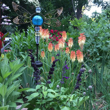
Kniphofia (Red Hot Poker):
This frequently bi-colored flower makes a dramatic statement in the garden and is an ideal plant for those who are new to gardening. In fact, this plant is so easy to grow it has been described as “tough to kill.” It is fairly drought-resistant, plus hummingbirds and butterflies love it. It is best planted in early spring or late fall.
When in bloom, the blossoms appear a bit like a hot poker or torch and for those feeling a bit of sadness saying good-bye to some of their lawn, note that these plants boast very “grass-like” leaves. This photo is of Vultaggio’s own garden and is courtesy of Sandra Vultaggio.
(Note: the dramatic dark blue/black flowers in the foreground are Salvia ‘Black and Blue’ which bloom from late spring to early autumn.)
So here's to millennials and their commitment to sustainability. If you have any questions on this topic, feel free to contact our office for more ideas.
Monarda (Bee Balm)
1. Native to North America, this beautiful flowering plant is from the mint family. It’s easy to grow, is deer resistant, and attracts pollinators like butterflies, hummingbirds, and bees.
It’s tubular flowers come in a variety of colors (pink, white, violet, red) and bloom in high summer through early fall. Bee Balm takes to full sun or light shade, and prefers a well-drained fertile soil. It needs some protection from excess moisture in winter.
Find the right local pro for your project
 KCBR Design | Remodel
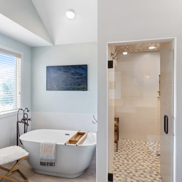
The client wanted to update their bathroom to have an elevated farmhouse feel, so we designed the vanities with a contemporary apron front countertop and used plumbing fixtures that give a nod to old fashioned water pump handles and lighting that is reminiscent of lanterns. They wanted to reduce the tub footprint, so we included a free-standing tub that is custom painted to coordinate with the shower floor tiles. They wanted to incorporate more functionality including space for laundry, jewelry organization, a coffee bar, ice maker and beverage center as well as a more organized feel overall.
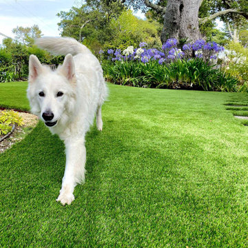
 Blue Wagon Synthetic Turf Supply (Peninsula)
EVERNATURAL PREMIUM - $3.36 / SF.
Evernatural Premium
Evernatural Premium offers the most realistic, all-in-one product on the synthetic grass market today. By engineering multiple blade types, it gives the product the benefits of all blades in one product while still offering a dense 111-ounce product with tall 2” blade height.
The blades are designed to reduce shine, reduce heat, and act as a memory foam so blades return to their original shape after bent by foot traffic. More specifically:
Double W Blade (Lime color) is designed to diffuse light, making it look more realistic with less shine. The ability to deflect light also helps keep the turf cooler. In addition, it is great for high traffic as it can withstand high wear and pressure.
Double S Blade (Field color) is designed to replicate natural grass in both appearance and function. The Double S has an uneven surface, consisting of seven sublayers. This provides effective insulation and reflection of the sunlight.
Diamond Blade (Emerald and Brown colors) is designed to make the grass look more realistic and gives it a soft touch.
The Evernatural Premium has all these benefits, all while looking and feeling like real lawn!
For more information, please contact Jesus (theturfguy)
Phone: 510-753-4773
Email: theturfguy@bwlandscapesupply.com
 TKS Design Group
Download our free ebook, Creating the Ideal Kitchen. DOWNLOAD NOW
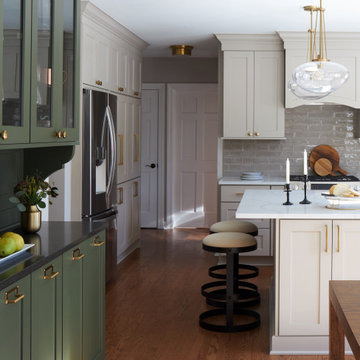
This family from Wheaton was ready to remodel their kitchen, dining room and powder room. The project didn’t call for any structural or space planning changes but the makeover still had a massive impact on their home. The homeowners wanted to change their dated 1990’s brown speckled granite and light maple kitchen. They liked the welcoming feeling they got from the wood and warm tones in their current kitchen, but this style clashed with their vision of a deVOL type kitchen, a London-based furniture company. Their inspiration came from the country homes of the UK that mix the warmth of traditional detail with clean lines and modern updates.
To create their vision, we started with all new framed cabinets with a modified overlay painted in beautiful, understated colors. Our clients were adamant about “no white cabinets.” Instead we used an oyster color for the perimeter and a custom color match to a specific shade of green chosen by the homeowner. The use of a simple color pallet reduces the visual noise and allows the space to feel open and welcoming. We also painted the trim above the cabinets the same color to make the cabinets look taller. The room trim was painted a bright clean white to match the ceiling.
In true English fashion our clients are not coffee drinkers, but they LOVE tea. We created a tea station for them where they can prepare and serve tea. We added plenty of glass to showcase their tea mugs and adapted the cabinetry below to accommodate storage for their tea items. Function is also key for the English kitchen and the homeowners. They requested a deep farmhouse sink and a cabinet devoted to their heavy mixer because they bake a lot. We then got rid of the stovetop on the island and wall oven and replaced both of them with a range located against the far wall. This gives them plenty of space on the island to roll out dough and prepare any number of baked goods. We then removed the bifold pantry doors and created custom built-ins with plenty of usable storage for all their cooking and baking needs.
The client wanted a big change to the dining room but still wanted to use their own furniture and rug. We installed a toile-like wallpaper on the top half of the room and supported it with white wainscot paneling. We also changed out the light fixture, showing us once again that small changes can have a big impact.
As the final touch, we also re-did the powder room to be in line with the rest of the first floor. We had the new vanity painted in the same oyster color as the kitchen cabinets and then covered the walls in a whimsical patterned wallpaper. Although the homeowners like subtle neutral colors they were willing to go a bit bold in the powder room for something unexpected. For more design inspiration go to: www.kitchenstudio-ge.com
 Voar Construction
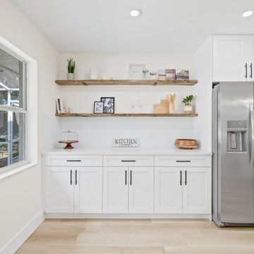
After the Remodel – Kitchen
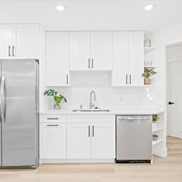
The kitchen was completely reimagined into a bright, open, and modern space. The lowered ceiling was removed and new lighting was added, creating a luminous and welcoming atmosphere. Walls were taken down to open the floor plan, and a large peninsula was introduced, adding both functionality and flow to the entire home. White cabinets that reach the ceiling maximize storage, while warm wood shelves bring a cozy touch. The quartz countertops and herringbone backsplash give a timeless elegance, perfectly complemented by modern appliances and a central range hood. Continuous wood flooring ties the kitchen seamlessly with the rest of the house, making it spacious, cohesive, and highly valuable.and no longer functional in design. Dark and unattractive tile choices made the space feel even more closed-in. Poor lighting only added to the problem, leaving the kitchen dim and unwelcoming. The space was divided into two separate sections with closed walls, eliminating the possibility of an open concept and making the area feel much smaller than it really was. The lowered ceiling further reduced the sense of space, wasting the kitchen’s true potential. Overall, it was a poorly lit, outdated kitchen lacking both style and functionality.


 Drury Design
THE SETUP
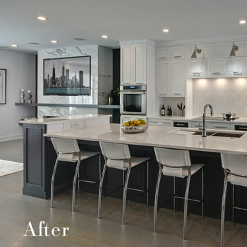
Sam’s client had lived in her downtown townhome home for less than a year when she decided to remodel the spacious second level. This open area consisted of three sections: a TV and fireplace zone, a sparsely furnished dining area, and a dominant central kitchen. The kitchen featured a long back wall with three segmented sections and a massive island housing the cooktop. She found the kitchen’s functionality lacking and its presence overwhelming – it dominated the entire floor, regardless of where you stood.
Design objectives:
- Reconfigure key kitchen elements (sink, cooktop, oven) while minimizing the kitchen’s visual impact
- Optimize the kitchen’s back wall, eliminating existing dead space
- Create a purposeful, well-defined dining area
- Establish a distinct, comfortable living area
- Reuse existing appliances and flooring
- Maintain an overall modern design aesthetic
THE REMODEL
Design challenges to be solved:
- Redesign the island to reduce its overwhelming presence
- Create a comfortable, dedicated living room within the available space
- Establish a distinct, inviting dining area within spatial constraints
- Enhance kitchen functionality and style without dominating the entire floor
THE RENEWED SPACE
Design solutions:
- Sam created raised end caps for the island. This separated the kitchen from adjacent living and dining areas while focusing the kitchen’s functionality. The new sink location offers ample workspace, allowing the cook to interact with guests seated at the island. The redesigned island also provides additional storage.
- For the living area, Sam opted for a functional-yet-minimalist approach. Large-format tile creates a natural stone look for the fireplace and TV wall. The recessed TV and extended fireplace shelf maintain a sleek profile. - Artistic wallpaper adds depth and texture, while the intentional lack of extensive shelving keeps the space open and distinct.
- Sam transformed the dining area’s blank wall into a feature, adding a unique dry bar with counter space, open shelves, cabinet storage and a beverage fridge. - - - Wallpaper behind and above the bar contributes to the area’s personality. A mirror adds depth while pendant lights add style and visual interest.
Relocating the cooktop to the back wall facilitates hidden ventilation, reducing visual clutter. Sam balanced transitional and modern elements for a contemporary yet comfortable feel. The digital control panel on the convection cooktop maintains a sleek look, while the wall oven is now at an easy-to-use height. ----- Mirrored base cabinet fronts and a paneled fridge prevent cabinetry monotony.
The redesign has delighted Sam’s client, achieving her main goal of creating a more inviting and visually appealing space. Each section now has its own visual personality and functionality while harmonizing within a monochromatic palette. The entire floor offers wow-factor pop upon first glance, with each area maintaining its distinct character while contributing to a cohesive, modern aesthetic.

 Flying Dormer
The European homeowners wanted to create a space for a new sauna and hot tub, as well as a place to relax afterwards. It needed to be light and bright, and have a warm but modern feel. We built this addition under the existing deck, and spruced up the deck at the same time to enjoy the nice territorial views.
The walls of the addition are cedar, with built-ins and deep cabinets for storage. There is a walk-in, tiled shower with built-in bench just off the sauna, and a seating area with tv for relaxing. The floor is stained concrete.
The 14-foot wall of windows (including a door to the hot tub), and the secondary window wall that includes french doors allows the maximum amount of light into the space and really creates that spa feeling.
The plans evolved during construction to include a larger sauna (thereby reducing the shower size somewhat) and a much larger hot tub than originally planned. The solution was to move the hot tub outside, which had the benefit of opening up more space inside for a yoga/ workout area. The hot tub is covered by a glass roof so it can be enjoyed year-round under the stars.
 Voar Construction
After the Remodel – Kitchen
The kitchen was completely reimagined into a bright, open, and modern space. The lowered ceiling was removed and new lighting was added, creating a luminous and welcoming atmosphere. Walls were taken down to open the floor plan, and a large peninsula was introduced, adding both functionality and flow to the entire home. White cabinets that reach the ceiling maximize storage, while warm wood shelves bring a cozy touch. The quartz countertops and herringbone backsplash give a timeless elegance, perfectly complemented by modern appliances and a central range hood. Continuous wood flooring ties the kitchen seamlessly with the rest of the house, making it spacious, cohesive, and highly valuable.and no longer functional in design. Dark and unattractive tile choices made the space feel even more closed-in. Poor lighting only added to the problem, leaving the kitchen dim and unwelcoming. The space was divided into two separate sections with closed walls, eliminating the possibility of an open concept and making the area feel much smaller than it really was. The lowered ceiling further reduced the sense of space, wasting the kitchen’s true potential. Overall, it was a poorly lit, outdated kitchen lacking both style and functionality.
 TKS Design Group
Download our free ebook, Creating the Ideal Kitchen. DOWNLOAD NOW
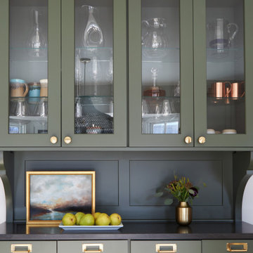
This family from Wheaton was ready to remodel their kitchen, dining room and powder room. The project didn’t call for any structural or space planning changes but the makeover still had a massive impact on their home. The homeowners wanted to change their dated 1990’s brown speckled granite and light maple kitchen. They liked the welcoming feeling they got from the wood and warm tones in their current kitchen, but this style clashed with their vision of a deVOL type kitchen, a London-based furniture company. Their inspiration came from the country homes of the UK that mix the warmth of traditional detail with clean lines and modern updates.
To create their vision, we started with all new framed cabinets with a modified overlay painted in beautiful, understated colors. Our clients were adamant about “no white cabinets.” Instead we used an oyster color for the perimeter and a custom color match to a specific shade of green chosen by the homeowner. The use of a simple color pallet reduces the visual noise and allows the space to feel open and welcoming. We also painted the trim above the cabinets the same color to make the cabinets look taller. The room trim was painted a bright clean white to match the ceiling.
In true English fashion our clients are not coffee drinkers, but they LOVE tea. We created a tea station for them where they can prepare and serve tea. We added plenty of glass to showcase their tea mugs and adapted the cabinetry below to accommodate storage for their tea items. Function is also key for the English kitchen and the homeowners. They requested a deep farmhouse sink and a cabinet devoted to their heavy mixer because they bake a lot. We then got rid of the stovetop on the island and wall oven and replaced both of them with a range located against the far wall. This gives them plenty of space on the island to roll out dough and prepare any number of baked goods. We then removed the bifold pantry doors and created custom built-ins with plenty of usable storage for all their cooking and baking needs.
The client wanted a big change to the dining room but still wanted to use their own furniture and rug. We installed a toile-like wallpaper on the top half of the room and supported it with white wainscot paneling. We also changed out the light fixture, showing us once again that small changes can have a big impact.
As the final touch, we also re-did the powder room to be in line with the rest of the first floor. We had the new vanity painted in the same oyster color as the kitchen cabinets and then covered the walls in a whimsical patterned wallpaper. Although the homeowners like subtle neutral colors they were willing to go a bit bold in the powder room for something unexpected. For more design inspiration go to: www.kitchenstudio-ge.com
 United Porte Inc
Our doors have several superior features:
- Single sheet of metal is used in construction. No welded seams are best as these can significantly weaken the structural integrity of the entranceway. Our doors are also more resilient to mechanic damage, such as sledgehammer strikes.
- The advantage of a single, non-welded door is that it reduces interior internal condensation. Over time, condensation can negatively affect the door mechanisms.
- Stiffening Ribs: These non-visible details add to our door's security.
- Quality insulation serves to reduce unwanted external noise, as well as protect against extreme heat, and severe cold.
- 3D Hinges: Hacking are often carried out at the side of a door's hinges. A better feature is utilizing hinges with ball bearings and installed anti-cuts.
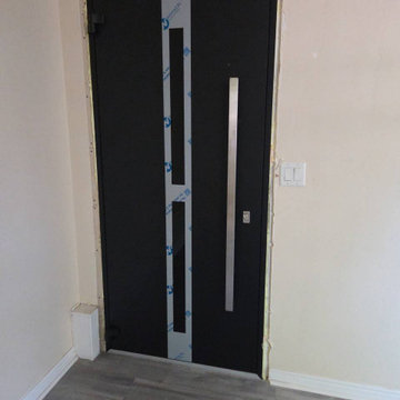
Introducing the Deux collection of modern exterior entrance doors in a sleek black enamel color. These doors are expertly crafted from a single sheet of metal with a sturdy Aluminum frame and threshold, ensuring both durability and security for your home.
The exterior design boasts a vertical insert of Stainless Steel and opaque black glass, creating a bold and modern look that will enhance the curb appeal of any home. The black enamel color provides a sophisticated and contemporary feel, perfect for those who want to make a statement with their entrance.
The interior design also features a vertical insert of Stainless Steel and opaque black glass, creating a cohesive and stylish look throughout the home.
With the Deux collection, you don't have to compromise on style or function. These modern front doors offer both, making them the perfect choice for homeowners who want to elevate the look of their home's exterior.
Plus, with our user-friendly website and easy ordering process, you can have your new modern exterior entrance door delivered right to your doorstep.
Upgrade your home's curb appeal and make a bold statement with the Deux collection of modern exterior entrance doors in black enamel. Order yours today and experience the perfect combination of style and function.
Model - 1755 Deux
Color - Black
Door thickness - 3 1/4"
Frame thickness - 4"
Exterior design - Vertical insert of the Stainless Steel and opaque black glass. Coating of the door - black enamel.
Interior design - Vertical insert of the Stainless Steel and opaque black glass. Coating of the door - black enamel.
Hardware included:
- Aluminum frame 4" thick - Dimensions of the door including frame is 74" x 82".
- Aluminum threshold.
- Plate-type, primary mortise lock for armoured type of aluminum doors, locked by 3 key turns, doors are captured in 3 places. The lock has replaceable core and 5 keys.
- Heavy-duty Cylinder.
- 3D hinges Wala
- Turnknob for lock.
- Armor plate Securemme for the lock.
- 2 Bar Handles.
 United Porte Inc
Furthermore, VDom Doors insulate your home from extreme weather conditions, as well as unwanted animals, insects, and dust from entering.
Our doors have several superior features:
- Single sheet of metal is used in construction. No welded seams are best as these can significantly weaken the structural integrity of the entranceway. Our doors are also more resilient to mechanic damage, such as sledgehammer strikes.
- The advantage of a single, non-welded door is that it reduces interior internal condensation. Over time, condensation can negatively affect the door mechanisms.
- Stiffening Ribs: These non-visible details add to our door's security.
- Quality insulation serves to reduce unwanted external noise, as well as protect against extreme heat, and severe cold.
- 3D Hinges: Hacking are often carried out at the side of a door's hinges. A better feature is utilizing hinges with ball bearings and installed anti-cuts.
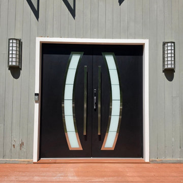
Introducing the Deux collection of modern exterior entrance doors in a sleek black enamel color. Expertly crafted from a single sheet of metal with a sturdy Aluminum frame and threshold, these doors offer both style and security for your home.
The exterior design features the horizontal strips of clear glass and frosted glass, creating a striking and contemporary look that will enhance the curb appeal of any home. The black enamel color provides a sophisticated and modern feel, perfect for those who want to make a bold statement with their entrance.
The interior design also boasts the horizontal strips of clear glass and frosted glass, creating a cohesive and stylish look throughout the home.
The Deux collection of modern front doors is ideal for homeowners who want to elevate the look of their home's exterior while also ensuring the safety and security of their property. And with our easy ordering process and user-friendly website, you can have your new door delivered right to your doorstep.
Upgrade your home's curb appeal and make a bold statement with the Deux collection of modern exterior entrance doors in black enamel. Order yours today and experience the perfect combination of style and function.
Model - 6500 Deux
Color - Black
Door thickness - 3 1/4"
Frame thickness - 4"
Exterior design - Stainless steel inserts, frosted glass. Coating of the door - black enamel.
Interior design - Stainless steel inserts, frosted glass. Coating of the door - black enamel.
Hardware included:
- Aluminum frame 4" thick - Dimensions of the door including frame is 74" x 82".
- Aluminum threshold.
- Plate-type, primary mortise lock for armoured type of aluminum doors, locked by 3 key turns, doors are captured in 3 places. The lock has replaceable core and 5 keys.
- Heavy-duty Cylinder.
- 3D hinges Wala
- Turnknob for lock.
- Armor plate Securemme for the lock.
- 2 Bar Handles.
Sponsored
Sunbury, OH

J.Holderby - Renovations
Franklin County's Leading General Contractors - 2X Best of Houzz!
 United Porte Inc
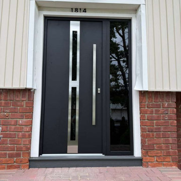
Furthermore, VDom Doors insulate your home from extreme weather conditions, as well as unwanted animals, insects, and dust from entering.
Our doors have several superior features:
- Single sheet of metal is used in construction. No welded seams are best as these can significantly weaken the structural integrity of the entranceway. Our doors are also more resilient to mechanic damage, such as sledgehammer strikes.
- The advantage of a single, non-welded door is that it reduces interior internal condensation. Over time, condensation can negatively affect the door mechanisms.
- Stiffening Ribs: These non-visible details add to our door's security.
- Quality insulation serves to reduce unwanted external noise, as well as protect against extreme heat, and severe cold.
- Italian Hinges Combi Arialdo: Hacking are often carried out at the side of a door's hinges. A better feature is utilizing hinges with ball bearings and installed anti-cuts.
Introducing the Deux collection of modern exterior entrance doors in a sleek black enamel color. These doors are expertly crafted from a single sheet of metal with a sturdy metal frame and threshold, ensuring both durability and security for your home.
The exterior design boasts a vertical insert of stainless steel and black opaque glass, creating a bold and modern look that will enhance the curb appeal of any home. The black enamel color provides a sophisticated and contemporary feel, perfect for those who want to make a statement with their entrance.
The interior design also features a vertical insert of stainless steel and black opaque glass, creating a cohesive and stylish look throughout the home.
With the Deux collection, you don't have to compromise on style or function. These modern front doors offer both, making them the perfect choice for homeowners who want to elevate the look of their home's exterior.
Plus, with our user-friendly website and easy ordering process, you can have your new modern exterior entrance door delivered right to your doorstep.
Upgrade your home's curb appeal and make a bold statement with the Deux collection of modern exterior entrance doors in black enamel. Order yours today and experience the perfect combination of style and function.
Model - 1755 Deux
Color - Black
Door thickness - 3 1/4"
Frame thickness - 4"
Exterior design - Vertical insert of the stainless steel and black opaque glass. Coating of the door - Moisture resistant MDF layer 2/3", black enamel.
Interior design - Vertical insert of the stainless steel and black opaque glass. Coating of the door - black enamel.
Hardware included:
- Metal frame 4" thick - dimensions of the door with frame is 38" x 82".
- Metal threshold.
- Plate-type, primary lock for armoured type of steel doors, locked by 3 key turns, doors are captured in 3 places. The lock has replaceable core and 5 keys.
- Cylinder K2.
- Hinges Combi Arialdo.
- Turnknob for lock.
- Armor plate for the lock.
- Stainless steel Handle
To maintain the warranty, a canopy is required over the door.
 Remodeling Contractors
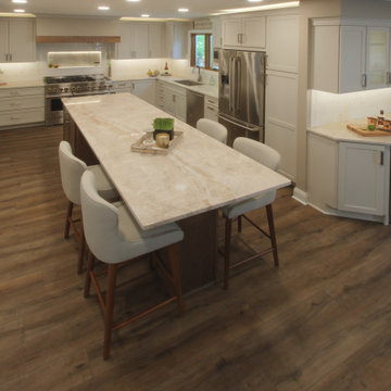
West Des Moines two story homes create challenges for homeowners with layouts including small rooms that don’t seem to flow together. The family that lives in this home found that entertaining and gathering in the kitchen was almost impossible with the current layout and asked for an addition to solve the problem. After listening to the challenges of that they faced and working with the homeowners, a new solution emerged without an addition, reducing the overall budget and allowing the whole main floor to be updated.
By removing the wall between the kitchen and dinning room, the team was able to design an island for family and friends to congregate around. Then by flanking the island with a large commercial range surrounded by a custom backsplash and custom hood a picture perfect kitchen was born. Lastly by repeating elements within the range hood, island and fireplace, the team was able to create unity throughout the space. This visually makes the space feel larger and feels like the addition was built
 Remodeling Contractors
West Des Moines two story homes create challenges for homeowners with layouts including small rooms that don’t seem to flow together. The family that lives in this home found that entertaining and gathering in the kitchen was almost impossible with the current layout and asked for an addition to solve the problem. After listening to the challenges of that they faced and working with the homeowners, a new solution emerged without an addition, reducing the overall budget and allowing the whole main floor to be updated.
By removing the wall between the kitchen and dinning room, the team was able to design an island for family and friends to congregate around. Then by flanking the island with a large commercial range surrounded by a custom backsplash and custom hood a picture perfect kitchen was born. Lastly by repeating elements within the range hood, island and fireplace, the team was able to create unity throughout the space. This visually makes the space feel larger and feels like the addition was built
 F9 Productions Inc.
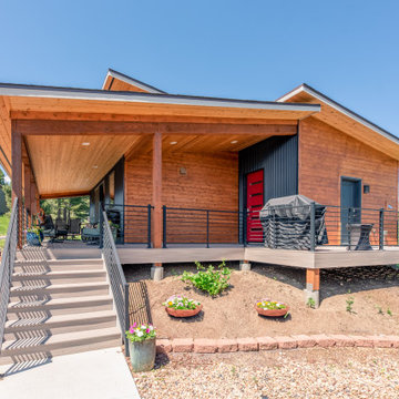
Imagine a compact backyard home in Golden that keeps family close but gives everyone space. The Golden ADU sits west of North Table Mountain, offering owners a private retreat so their kids' family can take the main house – all while framing epic Denver views.
The owners needed independence with family ties, so we created a unit that balances privacy and proximity. South-facing design captures stunning plains and city sights for daily inspiration.
Multi-generational living can feel crowded, but this ADU provides a separate, functional space without sacrificing connection. It handles site limits by maximizing views and light efficiently.
The concept mixes sloped roofs and simple boxes for a fresh, modern feel that fits the landscape. A large deck extends the living area outdoors, inviting relaxation amid the scenery.
Standard wood framing keeps it durable and budget-friendly, built strong for Colorado's elements.
South orientation and big windows bring in passive solar warmth and natural light, reducing energy needs while keeping things cozy.
Practical main floor with one bedroom, two baths, office, mudroom, and open kitchen-living – all designed for ease and flow.
Completed in 2022, the Golden ADU is a smart solution for family living. It blends privacy, views, and efficiency, creating a peaceful space that strengthens bonds and enhances life in the mountains.

 Architectural Fine Finishes dba Property Partners
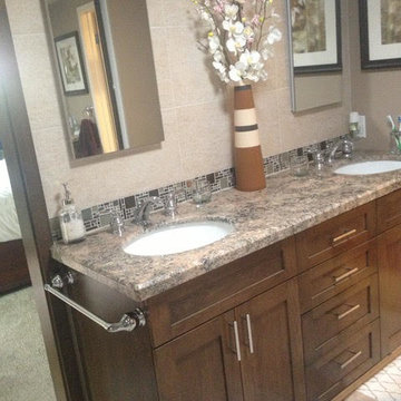
Client use to have a white sink cabinet that was delaminating. A new cherry wood sink cabinet was installed and stained to coordinate with the existing granite counters,
Tile for Master bath was chosen to coordinate with the granite being saved,
Glass tile was chosen for the new oversized niche in both showers to create the “wow” factor.
Large porcelain tiles were used on walls and floors to create an “openness” and large tiles also reduce grout lines which again adds to the feel of a larger space.
Large tiles were also used above sink cabinet to create a “spa” feel.
 Prompt 2 Design
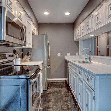
To achieve the updated kitchen, we knocked out the fur down & raised the ceiling to make it feel open & less cramped. New appliances, updated fixtures & cabinet hardware went along ways. The white quartz counter tops are a perfect fit in helping reduce eye clutter & keeping the space feeling open.
 TKS Design Group
Download our free ebook, Creating the Ideal Kitchen. DOWNLOAD NOW
This family from Wheaton was ready to remodel their kitchen, dining room and powder room. The project didn’t call for any structural or space planning changes but the makeover still had a massive impact on their home. The homeowners wanted to change their dated 1990’s brown speckled granite and light maple kitchen. They liked the welcoming feeling they got from the wood and warm tones in their current kitchen, but this style clashed with their vision of a deVOL type kitchen, a London-based furniture company. Their inspiration came from the country homes of the UK that mix the warmth of traditional detail with clean lines and modern updates.
To create their vision, we started with all new framed cabinets with a modified overlay painted in beautiful, understated colors. Our clients were adamant about “no white cabinets.” Instead we used an oyster color for the perimeter and a custom color match to a specific shade of green chosen by the homeowner. The use of a simple color pallet reduces the visual noise and allows the space to feel open and welcoming. We also painted the trim above the cabinets the same color to make the cabinets look taller. The room trim was painted a bright clean white to match the ceiling.
In true English fashion our clients are not coffee drinkers, but they LOVE tea. We created a tea station for them where they can prepare and serve tea. We added plenty of glass to showcase their tea mugs and adapted the cabinetry below to accommodate storage for their tea items. Function is also key for the English kitchen and the homeowners. They requested a deep farmhouse sink and a cabinet devoted to their heavy mixer because they bake a lot. We then got rid of the stovetop on the island and wall oven and replaced both of them with a range located against the far wall. This gives them plenty of space on the island to roll out dough and prepare any number of baked goods. We then removed the bifold pantry doors and created custom built-ins with plenty of usable storage for all their cooking and baking needs.
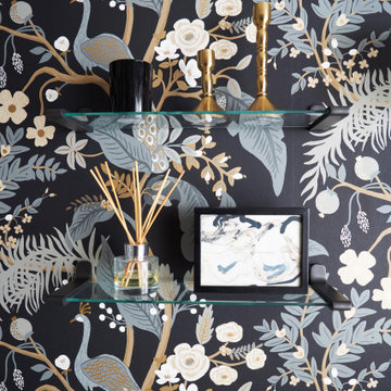
The client wanted a big change to the dining room but still wanted to use their own furniture and rug. We installed a toile-like wallpaper on the top half of the room and supported it with white wainscot paneling. We also changed out the light fixture, showing us once again that small changes can have a big impact.
As the final touch, we also re-did the powder room to be in line with the rest of the first floor. We had the new vanity painted in the same oyster color as the kitchen cabinets and then covered the walls in a whimsical patterned wallpaper. Although the homeowners like subtle neutral colors they were willing to go a bit bold in the powder room for something unexpected. For more design inspiration go to: www.kitchenstudio-ge.com
29