
Search results for "Feels softer" in Home Design Ideas
 Amazing Blinds by Armi
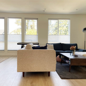
Privacy can be tricky with street-facing, side-by-side windows, especially in many Seattle-area homes. Our clients wanted a window treatments that kept their space open to natural light without feeling exposed. We recommended honeycomb shades with top-down bottom-up functionality— a practical, stylish solution that offers privacy, light control, and a softer sense of home.
 Bridget Mack
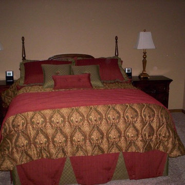
Custom bed treatment. The clients wanted a formal hotel feel. The wallpaper is gone and a new softer tan applied. The pink carpet is gone and a neutral beige frieze installed. (I know it looks grey, it's not.) The bed skirt starts the theatrical opening effect that carries through the space.
 Regan Baker Design Inc.
Well-traveled. Relaxed. Timeless.
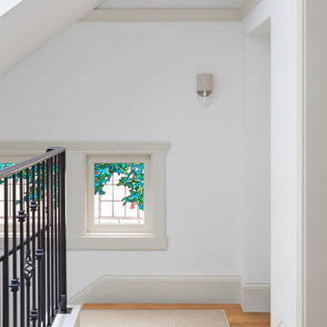
Our well-traveled clients were soon-to-be empty nesters when they approached us for help reimagining their Presidio Heights home. The expansive Spanish-Revival residence originally constructed in 1908 had been substantially renovated 8 year prior, but needed some adaptations to better suit the needs of a family with three college-bound teens. We evolved the space to be a bright, relaxed reflection of the family’s time together, revising the function and layout of the ground-floor rooms and filling them with casual, comfortable furnishings and artifacts collected abroad.
One of the key changes we made to the space plan was to eliminate the formal dining room and transform an area off the kitchen into a casual gathering spot for our clients and their children. The expandable table and coffee/wine bar means the room can handle large dinner parties and small study sessions with similar ease. The family room was relocated from a lower level to be more central part of the main floor, encouraging more quality family time, and freeing up space for a spacious home gym.
In the living room, lounge-worthy upholstery grounds the space, encouraging a relaxed and effortless West Coast vibe. Exposed wood beams recall the original Spanish-influence, but feel updated and fresh in a light wood stain. Throughout the entry and main floor, found artifacts punctate the softer textures — ceramics from New Mexico, religious sculpture from Asia and a quirky wall-mounted phone that belonged to our client’s grandmother.
Find the right local pro for your project
 lavish
This stunning primary bedroom remodel delivers a refined, masculine aesthetic that feels equal parts luxury hotel and personal sanctuary. The transformation centers around a rich, moody palette anchored by a custom periwinkle-blue wall color that shifts beautifully from cool gray to soft lavender depending on the light — creating an atmosphere that is both energizing and deeply restful.
The room's focal point is a king-sized upholstered platform bed featuring a wide, channel-tufted headboard in warm taupe velvet, dressed with layered indigo linen bedding, oversized quilted shams in dusty mauve, and a classic windowpane throw blanket. Flanking the bed are sleek black oval nightstands — each topped with a marble-column lamp, silver starburst sculptures, and carefully curated personal accessories that nod to the homeowner's passions for horology and classic automobiles.
A full wall of fluted black wood dressers provides generous storage while doubling as a dramatic display surface beneath a large-scale framed photograph of a luxury watch movement — a conversation piece that elevates the space into gallery territory. The sitting area features a channel-tufted slate leather armchair paired with a minimalist pedestal side table, positioned beside a grand bay window with an arched transom and custom woven valance.
Personal touches throughout — a vintage car model, A Man & His Car coffee table book, watch displays, and framed automotive photography — give this retreat a deeply personal character without sacrificing sophistication. A cognac leather oval bench at the foot of the bed introduces warmth and a subtle vintage nod that ties the entire palette together beautifully.
The second bedroom refreshes a guest suite with a softer, transitional sensibility: warm greige walls, a linen platform bed, crisp white bedding with charcoal velvet accent pillows, and a triptych of terracotta-framed abstract art above the headboard.
 Design Lifestyles, LLC
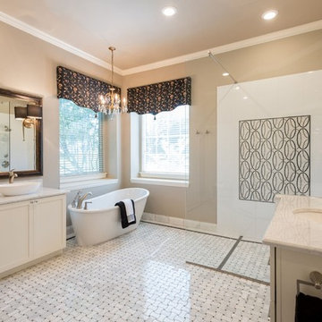
This master bathroom was once shouting with coral wallpaper, harsh gold accents and an over sized, unused tub. Our client wanted to escape to their master bathroom and feel as if they were in a spa atmosphere. We were able to show our client’s 3D concept renderings to communicate our overall master bathroom design. Using a marble curved basket weave mosaic tile on the floor with a black granite outline and Carrara baseboard, this stunning design began to take place. We selected a solid white, gloss tile for the shower walls so that our tile accent would be the shower focal point. The shower features a curbless entry, linear drain and seamless glass design for the most luxurious shower experience. Since our client had two beautiful chandeliers from her late mother’s home, we incorporated the fixtures into the lighting plan for a touch of sentimental glam. Custom designed vanity cabinets along with a vessel sink and waterfall edge countertop provided a useful yet beautiful accent to this bathroom. Stunning black sconces offer a softer lighting option that is incorporated with new can lights overhead. The finishing touch on this beautiful master bathroom is the custom designed valances above the windows that offer a sleek black accent with a subtle floral print.
This beautiful master bathroom was photographed by Michael Hunter Photography.
 Bilotta Kitchen & Home
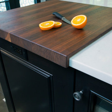
This two-toned kitchen was designed by Paula Greer, CKD of Bilotta Kitchens with Robin Zahn of Robin Prince Zahn Architecture. The u-shaped space has perimeter cabinets in Bilotta’s own line, the Bilotta Collection in a custom gray paint. The island is Wood-Mode Cabinetry in cherry with a stain. Countertops are Caesarstone’s London Grey with a built-in walnut cutting board on one corner of the island from Brooks Custom. The custom Madison Hood by Rangecraft is in a Dark Antique Steel finish and extends up accentuating the high ceiling above the cooking triangle. Two of the most interesting elements of this space are the banquette area and the coffered ceilings. By far, the most frequent installation of banquettes is tucking them into a corner of the room, regardless of how much seating is available at the island. In this kitchen, the island provides enough space for four to five stools. But because the space is separated from the rest of the house, the client wanted to ensure there was sufficient seating for their frequent entertaining. Also, the house is situated in a secluded wooded area; the new kitchen includes an abundance of unobstructed windows to fully experience the beautiful outdoor surroundings. The corner banquette (under more windows!) makes it feel like you’re dining in the trees. The bonus feature is that there’s extra storage below for table linens or seldom-used serving pieces. This really functions like a couch, complete with throw pillows and a TV, where the empty-nesters love spending time even when it isn’t mealtime. As for the ceiling, coffers don’t necessarily have to be large and intricately detailed with layers of moldings in order to be effective. This kitchen features two different ceiling heights: a small section of an addition contains a vaulted ceiling, while the larger island and eating area are tucked under a 2nd floor balcony and bedrooms. The client wanted to distinguish the lower area from the vaulted section, but in a subtle manner. The architect chose to implement shallow coffers with minimal trim for a softer result. The geometric pattern also reflects the floor tile and other lines within the room. The most interesting aspect, though, is that the vaulted area is actually concealed from view when you’re standing in the breakfast area; but as you approach the sink and window, the ceiling explodes above you for a visual surprise. And lastly, of course during this time of “work from home” the desk tucked in a nook opposite the banquette creates the perfect space for Zoom meetings, email checking and just the day-to-day activities we used to go into the office to do. The kitchen is an all-around perfect space for cooking, entertaining, relaxing or working!
Bilotta Designer: Paula Greer
Photographer: Philip Jensen-Carter
Architect: Robin Prince Zahn Architecture
 Interior Enhancement Group
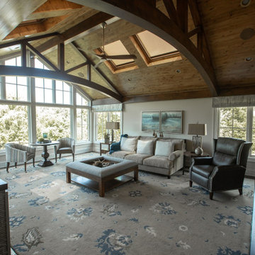
In response to the dramatic, wood-clad ceiling, our team selected a suite of understated, softer elements to make this room feel cozy, including upholstered furniture and an expansive, custom designed wool rug. Because the husband is much taller than his wife, we added a layer of extra back pillows to the sofa to give her the support she needs and allow him to remove pillows as needed. Even the cocktail table has an upholstered edge and a wood center for placing a drink or serving a snack. The two low-backed chairs in front of the windows leave the sweeping view unobstructed while the side table can double as another game table.


 Design Lifestyles, LLC
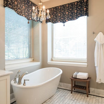
This master bathroom was once shouting with coral wallpaper, harsh gold accents and an over sized, unused tub. Our client wanted to escape to their master bathroom and feel as if they were in a spa atmosphere. We were able to show our client’s 3D concept renderings to communicate our overall master bathroom design. Using a marble curved basket weave mosaic tile on the floor with a black granite outline and Carrara baseboard, this stunning design began to take place. We selected a solid white, gloss tile for the shower walls so that our tile accent would be the shower focal point. The shower features a curbless entry, linear drain and seamless glass design for the most luxurious shower experience. Since our client had two beautiful chandeliers from her late mother’s home, we incorporated the fixtures into the lighting plan for a touch of sentimental glam. Custom designed vanity cabinets along with a vessel sink and waterfall edge countertop provided a useful yet beautiful accent to this bathroom. Stunning black sconces offer a softer lighting option that is incorporated with new can lights overhead. The finishing touch on this beautiful master bathroom is the custom designed valances above the windows that offer a sleek black accent with a subtle floral print.
This beautiful master bathroom was photographed by Michael Hunter Photography.
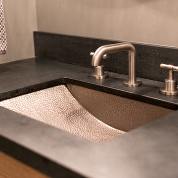
 Costa Bella Builders
This 30-year-old Aptos beachfront townhome was completely renovated. Our goal on this project was to take what had been a dark and closed in full-time residence and transform it into a lovely, open, and airy weekend beach retreat. This goal was fueled by our Silicon Valley clients’ desire for a nearby weekend escape from their busy schedules. Using their input and design ideas, we opened up the family room space structurally and lightened it aesthetically using a new electrical plan, softer interior colors, contemporary tile surfaces, new cabinetry, flooring and fixtures. The change from the old darker space to the lighter feel shown here was quite dramatic. The owners now have a beautiful and functional space in which to relax or host friends on the weekends and Holidays.
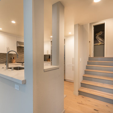 Costa Bella Builders
 This 30-year-old Aptos beachfront townhome was completely renovated. Our goal on this project was to take what had been a dark and closed in full-time residence and transform it into a lovely, open, and airy weekend beach retreat. This goal was fueled by our Silicon Valley clients’ desire for a nearby weekend escape from their busy schedules. Using their input and design ideas, we opened up the family room space structurally and lightened it aesthetically using a new electrical plan, softer interior colors, contemporary tile surfaces, new cabinetry, flooring and fixtures. The change from the old darker space to the lighter feel shown here was quite dramatic. The owners now have a beautiful and functional space in which to relax or host friends on the weekends and Holidays.
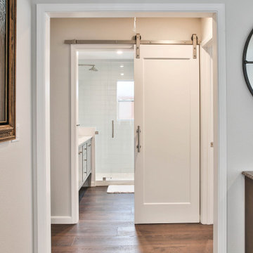
 Studio 38 Designs, Inc.
Different than the kitchen, the clients really wanted this space to feel relaxing and "spa like" so a softer cooler palate was used. With a completely new layout, the once bare bathroom now is fully equipped. The larger footprint allowed for a double vanity and ample storage inside the mirrors, vanity, linen shelving, and extra deep shower niches.
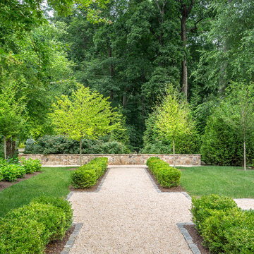
 Live Green Landscape Associates Llc
This courtyard leads visitors from the front of the house to the backyard. The formal feel of the front bleeds into the courtyard through the placement of shrubs and the linear outline of the courtyard. However, the softer and more playful nature of pea gravel and the natural irregular stone wall ahead begins to transition the space into a more relaxing area as you move to the backyard.
Photo Credit- Roger Foley
 Michelle Yorke Interior Design LLC
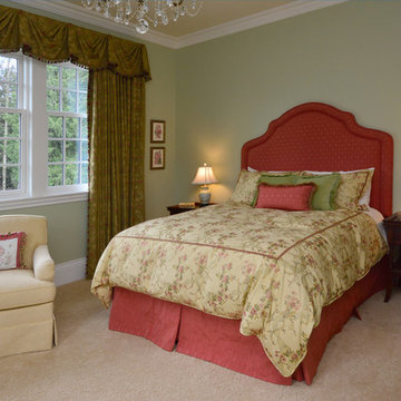
The bedrooms in this home definitely take on a more subtle style of Regency period design. We wanted the rooms to feel luxurious yet calming - but not overwhelming. We went with softer color schemes and usually one accent of pattern, either through the window treatments or bedding.

Sponsored
Columbus, OH

Wannemacher Interiors
Customized Award-Winning Interior Design Solutions in Franklin Cnty OH
 Laurie Yapp Design
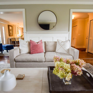
Coastal influence created this peaceful, bright living room and doubled as a family room. Used light fabric for sofa and went with a softer palette to create a peaceful feel.
 Zion Home and Building, LLC
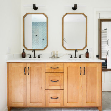
The ChallengeFor this master suite, the client wanted to trade a dated, heavy aesthetic for a space that felt like a "breath of fresh air." The goal was to create a private sanctuary that was bright and modern, yet retained the organic warmth of a lived-in home. They needed a layout that could accommodate both a spacious walk-in shower and a dedicated soaking tub without feeling crowded.The Zion Solution
We leaned into an Organic Modern palette, using custom White Oak vanities as the anchor for the room. We guided the client through the selection of a soft, aqua-toned tile set in a herringbone pattern for the shower—a design-forward choice that provides a subtle, rhythmic texture. To balance these softer elements, we introduced high-contrast Matte Black fixtures, providing a crisp, architectural edge. As your partner, we took absolute ownership of the "inch-by-inch" planning required to ensure the freestanding tub and glass shower functioned as a unified retreat.The Result
The transformation is a master-grade sanctuary that delivers daily inspiration and a sense of calm. By focusing on elite craftsmanship—from the precision of the herringbone tile alignment to the seamless quartz transitions—we created a home that inspires pride. It’s a space where the "Savvy Host" can truly recharge.
 Techo-Bloc
Let’s Talk About Aesthetics
From an aesthetic standpoint, we expect the trends to be anything but boring. Here are our landscape predictions for the coming year:
Natural Feels
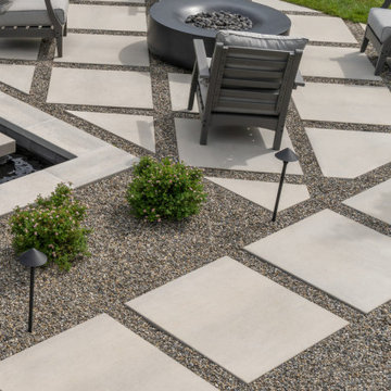
An outdoor space is already in nature, but imagine maintaining that flow of curved edges, soft textures and all-natural tones to really help connect you with your surroundings. Just like xeriscaping and bioliphic designs, choosing softer-edged products to inspire your outdoor space, including pool caps and even rounded furniture pieces, will help bring nature into even the most technical designs.
 Pizzale Design Inc.
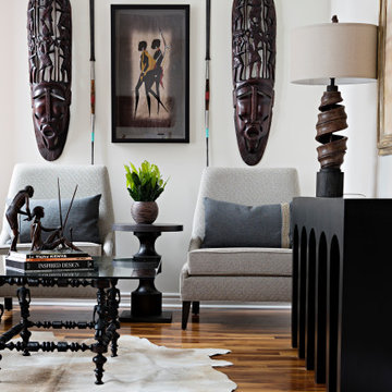
A person’s home is the place where their personality can flourish. In this client’s case, it was their love for their native homeland of Kenya, Africa. One of the main challenges with these space was to remain within the client’s budget. It was important to give this home lots of character, so hiring a faux finish artist to hand-paint the walls in an African inspired pattern for powder room to emphasizing their existing pieces was the perfect solution to staying within their budget needs. Each room was carefully planned to showcase their African heritage in each aspect of the home. The main features included deep wood tones paired with light walls, and dark finishes. A hint of gold was used throughout the house, to complement the spaces and giving the space a bit of a softer feel.
Sponsored
Sunbury, OH

J.Holderby - Renovations
Franklin County's Leading General Contractors - 2X Best of Houzz!
 Ann Lowengart Interiors
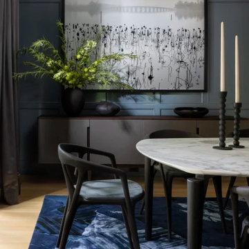
Set within a stately traditional home, this renovation strikes a bold balance between heritage and modernity. The clients wanted their contemporary aesthetic to shine through without compromising the home’s architectural integrity. The kitchen and bathrooms were completely reimagined with sleek lines and a refined palette, infusing each space with a distinctly modern sensibility. Traditional trim and millwork were thoughtfully preserved—framing the crisp, tailored interiors with timeless detail throughout. In the dining room, deep tones and sculptural lighting add drama, while the living spaces lean softer, blending comfort with clean sophistication. The result is a home that honors its classic bones yet feels entirely fresh, personal, and family-friendly—a seamless conversation between old and new.
 Spin Design Limited
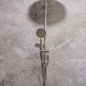
The brushed stainless finish has a subtle, refined appearance that exudes understated elegance. It doesn't have the high shine of polished finishes, which contributes to a more subdued and sophisticated look.
The brushed finish scatters light rather than reflecting it directly, creating a softer and more diffused appearance.
The brushed texture adds depth and tactile interest to the tapware. This texture contributes to a more luxurious and high-end feel, enhancing the overall sophistication of the space. Its simplicity adds a sense of modernity and sophistication to the bathroom.
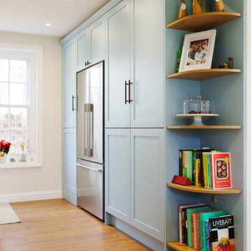
 Herbert William Limited
Designed to feel bright, calm and effortlessly welcoming, this shaker kitchen offers a fresh take on a classic design.
Finished in Salcombe Blue, the cabinetry introduces a soft wash of colour that brings character to the space without overwhelming it. A statement worktop with elegant veining draws the eye to the centre of the room, adding depth and visual interest while complementing the softer tones of the cabinetry.
The spacious island acts as the social heart of the kitchen, offering generous workspace, integrated wine storage and seating for casual dining. Extending into a curved built-in banquette, it creates a seamless connection to the adjoining dining area.
37