
Search results for "Forward thinking approach" in Home Design Ideas

 Beth Dotolo, ASID, RID, NCIDQ
A jewel box townhouse with a high/low approach gave our busy working couple a design-forward space, arousing a new sense of happiness and pride in their home. With a love for entertaining, our clients needed a space that would meet their functional needs and be a reflection of them. They brought on Pulp to create a vision that would functionally articulate their style. Our design team imagined this edgy concept with lots of unique style elements, texture, and contrast. Pulp mixed luxury items, such as the bone-inlay cocktail table and textual black croc wall covering, and offset them with more affordable whimsical touches, like individual framed feathers. Beth and Carolina pushed their tastes to the limit with unexpected touches, like the split face bookends and the teak hand chair, to add a quirky layer and graphic edge that our homeowners would come to fall in love with.

 TOC design & construction inc.
DESIGNED BY TOC design
CONSTRUCTION BY TOC design & Construction inc.
PHOTOS BY : Tania Scardellato
I was fortunate to have a young family approach me in desperate need to renovate there only 3 piece bathroom. This space was In dire need of a remodel, with old brown wall to wall tiles and a dated bulky yellow brown single sink vanity.
Storage was a must, lighting a necessity, and proper accessibility to the shower bath area.
We had a tight budget to respect, but a full gut of this bathroom was required. And a good thing too, once we started doing the demolition we noticed that mildew and rotting floors and walls had accumulated throughout the years. Doing it right the first time is no joke when dealing with water and electrical issues.
We discarded all reminisce of old and built from scratch, new walls, new plumbing, new electrical ,new insulation and a new window, a new fan that actually exhausted outside ( I say this laughing as you would be amazed at how many fans are installed but don’t exhaust outside, and you the client would never know unless you go inside the attic space.
Once all the hard stuff was done, the rest is just a matter of smart design. If you have a small bathroom here are some tips to guide you.
10 tips for making a small bathroom feel larger
Is your tiny bathroom cramping your functionality and style, leaving you longing for the enormous bathrooms gracing the pages of design magazines? Even if your bathroom is a fraction of the size, all it takes is some design savvy to make the most of the space you have. Consider these 10 smart tips that will help your bathroom look, feel and function like those larger contenders.
1-Get creative with corners
Space is at a premium in small bathrooms, so it's important to maximize every inch. Corners, for example, provide extra space for shelving, storage units and even hooks. Get creative and install unique design solutions that are not only functional, but also eye-catching. If you love the airiness of floating cabinets, add baskets or decorative boxes under for extra storage. If you are installing floating cabinets insure that they are installed securely to studs or plywood at wall.
2- Let solid colors shine
Busy patterns have a shrinking effect and make small bathrooms seem even smaller. Conversely, light natural hues make a space feel more open. If you're itching to get creative with design, experiment with textures but keep overpowering patterns to a minimum. Tone on tone is the best to achieve this.
3 - Maximize your bathtub
A bathtub takes up a significant portion of the room, but modern, compact options with curved basins, can make the tub feel larger when in use, all while conserving space.
4 - Select a smaller faucet
A faucet is jewelry for the bathroom. And just as accessories can overpower an outfit, a big bulky faucet isn't flattering in a small bath. Single-handle designs conserve counter space, while a wall-mount installation frees it up all together and can create quite the wow-factor, if the budget can accommodate the required changes to plumbing behind the wall.
5 - Make vanity storage simple
If you're in a storage war with your small bathroom, you're not alone in the battle. Toiletries and personal supplies without a place to call home only add clutter and chaos. Store smart with a space-saving vanity, the dual sink vanity shown here, looks quite simple, but in reality it has 4 sets of full extension drawers, and the vanity tower adds extra storage without overpowering the use of space.
6 - Show off the shower
Shower curtains may be pretty, but they interrupt the visual flow of a bathing space and make it feel significantly smaller. In bathrooms with small footprints, opt for a clear glass sliding shower door that doesn't require the clearance of one with a hinged design. Or as shown in this design and for fraction less expensive a half hinged panel installed on a fixed tempered glass panel. If you're embarking on a big remodel, create the illusion of more space by using same tile in the shower that's used throughout; instead of seeing them as two separate zones, the eye will read them as one.
7 - Discover the treasure of hidden storage
Work with a contractor, and you just might find some serious storage potential hidden behind your walls. Whether it's utilizing space between the studs for shallow shelving or a creating a small linen closet by annexing space from an adjacent room, even small additions can make a big difference.
8 - Focal Point
Tile is a beautiful, durable addition to any bathroom. For dainty spaces, consider installing tile at a diagonal to accentuate the focal point or as in this bathroom I used an oversized textured pattern to bring depth to the space at the window wall.
9 - Choose the right lights
Strategically install light to reflect and brighten a small bathroom to make it appear larger. Recessed lighting is an affordable solution for tiny rooms, offering ample light while taking up little space. Wall sconces alongside a mirror also reflect off the walls and make a room feel bright and airy. I always recommend going with LED lighting at 2800 to 3000K.
10 – Accessorize
This is your time to shine in your decorating skills, have fun with your towels, you can change the color scheme daily just by adding pops of color in your accessories, make sure to get items that serve a dual purpose, like baskets, boxes they can always be used as hampers, storing of towels and even a nice display for your guest.

 Gardner Architects LLC
Photo by Amy Gardner
This house, built in the 1960s, sits southfacing on a terrific wooded lot in Bethesda, Maryland.
The owners desire a whole-house renovation which would improve the general building fabric and systems, and extend the sense of living out of doors in all seasons.
The original sixties-modern character is preserved and the renovation extends the design forward into a contemporary, modern approach. Connections to and through the site are enhanced through the creation of new larger window and door openings.
Screened porches and decks perch above the sloped and wooded site. The new kitchen and bathrooms allow for opportunities to feel out-of -doors while preparing, cooking, dining, and bathing.
Smart passive strategies guide the environmental choices for this project, including envelope improvements, updated mechanical systems, and on-site stormwater management.
Find the right local pro for your project

 Period Architecture Ltd.
Angle Eye Photography
Mid-sized elegant open concept brick floor family room photo in Philadelphia with beige walls, a standard fireplace, a wood fireplace surround and a media wall
Mid-sized elegant open concept brick floor family room photo in Philadelphia with beige walls, a standard fireplace, a wood fireplace surround and a media wall

 Carolina V. Gentry, RID
A jewel-box townhouse with a high/low approach gave our busy working couple a design-forward space, arousing a new sense of happiness and pride in their home. With a love for entertaining, our clients needed a space that would meet their functional needs and be a reflection of them. They brought on Pulp to create a vision that would functionally articulate their style. Our design team imagined this edgy concept with lots of unique style elements, texture, and contrast. Pulp mixed luxury items, such as the bone-inlay cocktail table and textual black croc wall covering, and offset them with more affordable whimsical touches, like individual framed feathers. Beth and Carolina pushed their tastes to the limit with unexpected touches, like the split face bookends and the teak hand chair, to add a quirky layer and graphic edge that our homeowners would come to fall in love with.


 River Valley Landscapes
Blending contemporary forms and lush plantings, this Garden maximizes the sensory experience of the materials and planting from inside and outside the home. The garden occupies an interior courtyard framed by four interior walls. The home, designed by Architect Cliff May was built in 1948 and the following year was featured in House Beautiful Magazine. The clients list of needs and desires was brief. They wanted a space that would complement the mid century modern home and provide visual interest from inside the home. Some form of water was also requested. They had a budget of $30,000. In order to stay within their budget the clients performed the demolition of the old garden. The designer’s intent was to create a garden that would possess a clear sculptural quality and would be as visually striking from inside the home as it would be from inside the courtyard. The strategy behind the design was to use hardscape materials characterized by simple geometric forms and a planting palette that would emphasize form over color, and then to arrange the materials to achieve an interpretation of modern aesthetic.
The views from inside the homes three main living rooms present the garden as a graphic composition of space, hardscape materials and planting. Inside the courtyard the edges are defined by stone and planting. The floor is composed of rectangular slabs of Teakwood flagstone with a counterpoint of Mexican beach pebbles set within the joints and around the edges. Concrete along the edges of the Teakwood pads reduces migration of the modified stone and sand base. The contrast of the Mexican beach pebbles accentuates the pattern of the flagstone. The outside perimeter of the pebbles is contained with low profile edging. An existing catch drain was utilized for storm water runoff. A concrete block pier set on a concrete footing is covered with black stucco and provides a perch for a custom made copper bowl that circulates water into the L shaped water feature. The water features subterranean basin is constructed of pressure treated wood with a custom box liner insert. Since the Teakwood flagstone was unavailable as coping for the water feature, the designer chose Shawnee Buff stone to complement the Teakwood flagstone. The subtle sound of water spilling from the copper bowl and the reflective qualities of the water help to create an atmosphere of relaxation. The planting is composed of shades of green with white flowers in order to accentuate the graphic design. ‘Justin Brouwer’ Boxwood, ‘Sum and Substance’ Hosta, white Anemones, black bamboo and ornamental grasses contrast dramatically with the clean lines of the hardscape elements. The black bamboo is set in 30” diameter concrete containers to control the vigorous plant from spreading.
The construction of the interior courtyard space challenged the building team. They set up baffles between the front door and the door to the courtyard as well as temporary protection over the floor to allow the process to move forward without too much disturbance to the client’s lives. All of the materials were shuffled through the temporary portal.
The clients love the space and recently said that “the design is so well thought out and simple that they would never get tired of it.” The designs sculptural quality compliments the modern feel of the home and creates a sublime yet dramatic view from within the house or within the courtyard. The clients plan to purchase two black Bertoia Diamond chairs with red cushions which should perfectly integrate with the space.
Sponsored
Sunbury, OH

J.Holderby - Renovations
Franklin County's Leading General Contractors - 2X Best of Houzz!
 Gardner Architects LLC
Photography by Jim Tetro
This house, built in the 1960s, sits southfacing on a terrific wooded lot in Bethesda, Maryland.
The owners desire a whole-house renovation which would improve the general building fabric and systems, and extend the sense of living out of doors in all seasons.
The original sixties-modern character is preserved and the renovation extends the design forward into a contemporary, modern approach. Connections to and through the site are enhanced through the creation of new larger window and door openings.
Screened porches and decks perch above the sloped and wooded site. The new kitchen and bathrooms allow for opportunities to feel out-of -doors while preparing, cooking, dining, and bathing.
Smart passive strategies guide the environmental choices for this project, including envelope improvements, updated mechanical systems, and on-site stormwater management.
 Gardner Architects LLC
Photo by Amy Gardner
This house, built in the 1960s, sits southfacing on a terrific wooded lot in Bethesda, Maryland.
The owners desire a whole-house renovation which would improve the general building fabric and systems, and extend the sense of living out of doors in all seasons.
The original sixties-modern character is preserved and the renovation extends the design forward into a contemporary, modern approach. Connections to and through the site are enhanced through the creation of new larger window and door openings.
Screened porches and decks perch above the sloped and wooded site. The new kitchen and bathrooms allow for opportunities to feel out-of -doors while preparing, cooking, dining, and bathing.
Smart passive strategies guide the environmental choices for this project, including envelope improvements, updated mechanical systems, and on-site stormwater management.

 Tribe Design Group
Photo by Kate Turpin Zimmerman
Kitchen - large contemporary u-shaped concrete floor and gray floor kitchen idea in Austin with a single-bowl sink, flat-panel cabinets, light wood cabinets, marble countertops, white backsplash, stone slab backsplash, paneled appliances, an island and white countertops
Kitchen - large contemporary u-shaped concrete floor and gray floor kitchen idea in Austin with a single-bowl sink, flat-panel cabinets, light wood cabinets, marble countertops, white backsplash, stone slab backsplash, paneled appliances, an island and white countertops

 Milgard Windows & Doors
The Kiguchi family moved into their Austin, Texas home in 1994. Built in the 1980’s as part of a neighborhood development, they happily raised their family here but longed for something more contemporary. Once they became empty nesters, they decided it was time for a major remodel. After spending many years visiting Austin AIA Home Tours that highlight contemporary residential architecture, they had a lot of ideas and in 2013 were ready to interview architects and get their renovation underway.
The project turned into a major remodel due to an unstable foundation. Architects Ben Arbib and Ed Hughey, of Arbib Hughey Design were hired to solve the structural issue and look for inspiration in the bones of the house, which sat on top of a hillside and was surrounded by great views.
Unfortunately, with the old floor plan, the beautiful views were hidden by small windows that were poorly placed. In order to bring more natural light into the house the window sizes and configurations had to be addressed, all while keeping in mind the homeowners desire for a modern look and feel.
To achieve a more contemporary and sophisticated front of house, a new entry was designed that included removing a two-story bay window and porch. The entrance of the home also became more integrated with the landscape creating a template for new foliage to be planted. Older exterior materials were updated to incorporate a more muted palette of colors with a metal roof, dark grey siding in the back and white stucco in the front. Deep eaves were added over many of the new large windows for clean lines and sun protection.
“Inside it was about opening up the floor plan, expanding the views throughout the house, and updating the material palette to get a modern look that was also warm and inviting,” said Ben from Arbib Hughey Design. “Prior to the remodel, the house had the typical separation of rooms. We removed the walls between them and changed all of the windows to Milgard Thermally Improved Aluminum to connect the inside with the outside. No matter where you are you get nice views and natural light.”
The architects wanted to create some drama, which they accomplished with the window placement and opening up the interior floor plan to an open concept approach. Cabinetry was used to help delineate intimate spaces. To add warmth to an all-white living room, white-washed oak wood floors were installed and pine planks were used around the fireplace. The large windows served as artwork bringing the color of nature into the space.
An octagon shaped, elevated dining room, (named “the turret”), had a big impact on the design of the house. They architects rounded the corners and added larger window openings overlooking a new sunken garden. The great room was also softened by rounding out the corners and that circular theme continued throughout the house, being picked up in skylight wells and kitchen cabinetry. A staircase leading to a catwalk was added and the result was a two-story window wall that flooded the home with natural light.
When asked why Milgard® Thermally Improved Aluminum windows were selected, the architectural team listed many reasons:
1) Aesthetics: “We liked the slim profiles and narrow sightlines. The window frames never get in the way of the view and that was important to us. They also have a very contemporary look that went well with our design.”
2) Options: “We liked that we could get large sliding doors that matched the windows, giving us a very cohesive look and feel throughout the project.”
3) Cost Effective: “Milgard windows are affordable. You get a good product at a good price.”
4) Custom Sizes: “Milgard windows are customizable, which allowed us to get the right window for each location.”
Ready to take on your own traditional to modern home remodeling project? Arbib Hughey Design advises, “Work with a good architect. That means picking a team that is creative, communicative, listens well and is responsive. We think it’s important for an architect to listen to their clients and give them something they want, not something the architect thinks they should have. At the same time you want an architect who is willing and able to think outside the box and offer up design options that you may not have considered. Design is about a lot of back and forth, trying out ideas, getting feedback and trying again.”
The home was completely transformed into a unique, contemporary house perfectly integrated with its site. Internally the home has a natural flow for the occupants and externally it is integrated with the surroundings taking advantage of great natural light. As a side note, it was highly praised as part of the Austin AIA homes tour.

 Struttura
Inspiration for a contemporary l-shaped gray floor and vaulted ceiling kitchen remodel in Atlanta with an undermount sink, flat-panel cabinets, white cabinets, stainless steel appliances, an island and white countertops
 Carolina V. Gentry, RID
A jewel-box townhouse with a high/low approach gave our busy working couple a design-forward space, arousing a new sense of happiness and pride in their home. With a love for entertaining, our clients needed a space that would meet their functional needs and be a reflection of them. They brought on Pulp to create a vision that would functionally articulate their style. Our design team imagined this edgy concept with lots of unique style elements, texture, and contrast. Pulp mixed luxury items, such as the bone-inlay cocktail table and textual black croc wall covering, and offset them with more affordable whimsical touches, like individual framed feathers. Beth and Carolina pushed their tastes to the limit with unexpected touches, like the split face bookends and the teak hand chair, to add a quirky layer and graphic edge that our homeowners would come to fall in love with.
Sponsored
Sunbury, OH
J.Holderby - Renovations
Franklin County's Leading General Contractors - 2X Best of Houzz!

 Klopf Architecture
 and Outer space Landscape Architects designed a new warm, modern, open, indoor-outdoor home in Los Altos, California. Inspired by mid-century modern homes but looking for something completely new and custom, the owners, a couple with two children, bought an older ranch style home with the intention of replacing it.
Created on a grid, the house is designed to be at rest with differentiated spaces for activities; living, playing, cooking, dining and a piano space. The low-sloping gable roof over the great room brings a grand feeling to the space. The clerestory windows at the high sloping roof make the grand space light and airy.
Upon entering the house, an open atrium entry in the middle of the house provides light and nature to the great room. The Heath tile wall at the back of the atrium blocks direct view of the rear yard from the entry door for privacy.
The bedrooms, bathrooms, play room and the sitting room are under flat wing-like roofs that balance on either side of the low sloping gable roof of the main space. Large sliding glass panels and pocketing glass doors foster openness to the front and back yards. In the front there is a fenced-in play space connected to the play room, creating an indoor-outdoor play space that could change in use over the years. The play room can also be closed off from the great room with a large pocketing door. In the rear, everything opens up to a deck overlooking a pool where the family can come together outdoors.
Wood siding travels from exterior to interior, accentuating the indoor-outdoor nature of the house. Where the exterior siding doesn’t come inside, a palette of white oak floors, white walls, walnut cabinetry, and dark window frames ties all the spaces together to create a uniform feeling and flow throughout the house. The custom cabinetry matches the minimal joinery of the rest of the house, a trim-less, minimal appearance. Wood siding was mitered in the corners, including where siding meets the interior drywall. Wall materials were held up off the floor with a minimal reveal. This tight detailing gives a sense of cleanliness to the house.
The garage door of the house is completely flush and of the same material as the garage wall, de-emphasizing the garage door and making the street presentation of the house kinder to the neighborhood.
The house is akin to a custom, modern-day Eichler home in many ways. Inspired by mid-century modern homes with today’s materials, approaches, standards, and technologies. The goals were to create an indoor-outdoor home that was energy-efficient, light and flexible for young children to grow. This 3,000 square foot, 3 bedroom, 2.5 bathroom new house is located in Los Altos in the heart of the Silicon Valley.
Klopf Architecture Project Team: John Klopf, AIA, and Chuang-Ming Liu
Landscape Architect: Outer space Landscape Architects
Structural Engineer: ZFA Structural Engineers
Staging: Da Lusso Design
Photography ©2018 Mariko Reed
Location: Los Altos, CA
Year completed: 2017


 Carolina V. Gentry, RID
A jewel-box townhouse with a high/low approach gave our busy working couple a design-forward space, arousing a new sense of happiness and pride in their home. With a love for entertaining, our clients needed a space that would meet their functional needs and be a reflection of them. They brought on Pulp to create a vision that would functionally articulate their style. Our design team imagined this edgy concept with lots of unique style elements, texture, and contrast. Pulp mixed luxury items, such as the bone-inlay cocktail table and textual black croc wall covering, and offset them with more affordable whimsical touches, like individual framed feathers. Beth and Carolina pushed their tastes to the limit with unexpected touches, like the split face bookends and the teak hand chair, to add a quirky layer and graphic edge that our homeowners would come to fall in love with.
 Resiklo Design
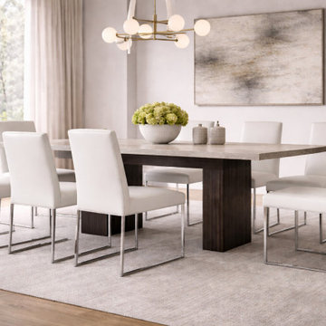
The B&B Italia Solo dining chairs, designed by Antonio Citterio, reflect a refined approach to modern Italian design. This set of eight features sleek, minimalist silhouettes upholstered in smooth neutral leather, paired with elegant chrome sled bases that lend a light, architectural presence to the dining room. Thoughtfully proportioned for comfort and visual balance, the Solo chairs are ideal for contemporary and design-forward interiors where clean lines and craftsmanship take center stage.
This piece is now available to purchase on our website.
#BBItalia #AntonioCitterio #SoloDiningChairs #ItalianDesign #DesignerDiningChairs #ModernDiningRoom #LuxuryFurniture #HighEndInteriors #MinimalistDesign #ContemporaryDining #ArchitecturalFurniture #NeutralInteriors #CollectibleDesign #DesignerFurniture

 Carolina V. Gentry, RID
A jewel-box townhouse with a high/low approach gave our busy working couple a design-forward space, arousing a new sense of happiness and pride in their home. With a love for entertaining, our clients needed a space that would meet their functional needs and be a reflection of them. They brought on Pulp to create a vision that would functionally articulate their style. Our design team imagined this edgy concept with lots of unique style elements, texture, and contrast. Pulp mixed luxury items, such as the bone-inlay cocktail table and textual black croc wall covering, and offset them with more affordable whimsical touches, like individual framed feathers. Beth and Carolina pushed their tastes to the limit with unexpected touches, like the split face bookends and the teak hand chair, to add a quirky layer and graphic edge that our homeowners would come to fall in love with.

 Bulldog Paving Inc
Pavers are very versatile products. They are used as walkways, driveways, patios, decks, swimming pool areas, outdoor kitchens and pathway coverings and look amazing regardless of the application they are used in. You can choose from different varieties of pavers and the design opportunities are plenty. When you call Bulldog Paving for Driveway Pavers, we provide you with different options and quotes. Beautiful Driveway Pavers We work well within your budget and in the timeframe that has been decided for the project. The solution that we provide for your driveway pavers requirement will be based on the kind of area that has to be covered, the architectural styling of your home, your personal choice and some other factors.

 Dominic Paul Mercadante Architecture
Douglass Fir beams, vertical grain Douglas Fir ceiling, trim. and cabinets. Custom reproduction Craftsmen lighting fixtures by John Hamm (www.hammstudios.com)
Custom Dining furniture by Phi Home Designs
Brian Vanden Brink Photographer
95