
Search results for "Framework" in Home Design Ideas

 Change Your Bathroom©
The detailed plans for this bathroom can be purchased here: https://www.changeyourbathroom.com/shop/felicitous-flora-bathroom-plans/
The original layout of this bathroom underutilized the spacious floor plan and had an entryway out into the living room as well as a poorly placed entry between the toilet and the shower into the master suite. The new floor plan offered more privacy for the water closet and cozier area for the round tub. A more spacious shower was created by shrinking the floor plan - by bringing the wall of the former living room entry into the bathroom it created a deeper shower space and the additional depth behind the wall offered deep towel storage. A living plant wall thrives and enjoys the humidity each time the shower is used. An oak wood wall gives a natural ambiance for a relaxing, nature inspired bathroom experience.
 PI Photography Wall Art & Fine Art
https://pipafineart.com/pages/ghostly-bloom-x-ray-effect-illustration-digital-floral-artwork-prints-and-backgrounds
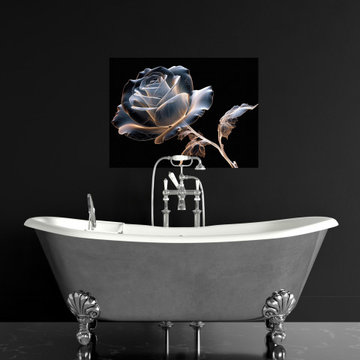
This mesmerizing digital artwork, "Ghostly Bloom," offers a truly unique and ethereal interpretation of a rose, presented with an intriguing X-ray effect. Against a stark, profound black background, the rose appears as if illuminated from within, its delicate petals and intricate structure rendered in translucent, ghostly whites and grays, highlighted by a captivating golden-orange luminescence along its edges. This glowing outline gives the impression of an internal light source, revealing the subtle veins and contours that define each petal and leaf, much like an actual X-ray would expose inner forms. The transparency allows for a captivating play of light and shadow, giving the bloom an almost holographic or spectral quality. The stem and leaves are similarly rendered, showcasing their delicate skeletal framework with an artistic blend of scientific precision and imaginative beauty. The contrast between the radiant bloom and the absolute darkness creates a powerful visual statement that is both delicate and dramatic. This piece transcends traditional floral art, offering a modern, almost futuristic perspective on natural beauty.
"Ghostly Bloom" would be an exceptional addition to several contemporary decorating styles. Its minimalist composition and high contrast make it a perfect fit for Modern and Minimalist interiors, where it can serve as a sophisticated focal point without overwhelming the space. In an Industrial setting, its raw yet refined aesthetic, combined with the glowing X-ray effect, would complement exposed elements and dark finishes. For Glam or Art Deco inspired rooms, the artwork's striking elegance and unique visual flair would add a touch of luxurious mystique and intrigue. It also resonates well with Sci-Fi or Futuristic themed spaces, bridging the gap between nature and technology. The artwork's unique approach to a classic subject allows it to stand out, sparking conversation and admiration.

 Renovisions
These South Shore of Boston homeowners desired a larger kitchen as their existing had limited space to host family events and entertain guests – they turned to Renovisions to help transform their small, outdated kitchen with separate walk-in pantry into a beautiful, open and spacious inspirational room.
Choosing the right cabinetry for the room and how to meet the needs of the client was critical to the overall success of this design. A traditional style was the framework of the home and the flat paneled doors on the white painted cabinetry support this aspect. Going vertical as possible with cabinets is a trend here to stay; keeping with that idea, we recommended the graceful tall pantry cabinet that flanks one side of the kitchen. This not only lends to an eye-appealing furniture-look, but adds significant storage space, allowing the cabinets to store items they may not use on a regular basis. In this case, the clients are amazed with the amount of storage they’ve gained and one that provides easy access to all interior items. Every inch of space was key to create this optimally functional kitchen. Must-haves such as tray dividers above the refrigerator are handy and the double pull-out trash/recycling bins on the right side of the sink were a simple and clean way to gain floor space and conceal unsightly trash.
The focal point of this kitchen is the expansive, soft-grey colored contrasting island with larger, deeper drawers for pots, pans and platters. The client was excited to switch to an induction chef-series range that featured a divided oven that can accommodate two different temperatures.
Fit and finish is important in any renovation and this certainly holds true in this kitchen project to personalize their space. The custom recessed panel columns with wainscot details add an architectural element that ties into the kitchen cabinet design and Carrera-look quartz countertops which provide a stunning classical look that ties nicely with the overall traditional style. These homeowners are excited to show off their open and spacious Renovision!
“We really enjoyed our new kitchen and it’s amazing improvement over the holidays. We got rave reviews from all of our guests!”
Steve & Mary S. (Duxbury)
Find the right local pro for your project
 Klopf Architecture
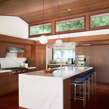
Nestled in the hills of Orinda, California, this 1951 residence is one of only seven extant homes, now known as “The Magnificent Seven”, designed by architect Olof Dahlstrand, a protégé of Frank Lloyd Wright. With its low-slung rooflines, natural materials, and deep integration with the sloping landscape, the home is a pristine example of mid-century modern design inspired by Wright’s organic principles. Over the years, prior homeowners have emphasized preservation, ensuring that the house remained relatively untouched. Each owner has respected the original architecture and stayed true to Dahlstrand’s intent. When a family of five—two college-aged sons and a middle school-aged daughter—acquired the property, they were captivated by its history, legacy of care, and architectural significance. While they appreciated Dahlstrand’s original vision, they also recognized the need to adapt the home for contemporary living while preserving its design integrity.
The remodel was conceived as a thoughtful response to the past—an effort to bring the house into the 21st century without compromising its soul. The primary mandate was to maintain architectural continuity while improving the functionality, comfort, and livability for a modern family. The design team—architects and contractor alike—worked with a shared reverence for the original architecture, allowing that mindset to guide even the most technical or pragmatic decisions.
A key objective was to increase natural light in the kitchen—a departure from Wrightian principles of enclosed, intimate cooking spaces—while maintaining the home’s architectural language. The kitchen was reconfigured to foster a stronger connection to adjacent living spaces while retaining the underlying concept of spatial separation. One of the most transformative architectural changes was the removal of a ridge beam that was originally planned to remain visible through the kitchen. During construction, the team collaborated on a better solution: a wide-flanged steel beam concealed within the roof envelope. This subtle move preserved the clean lines and ceiling continuity, a modern update carried out with utmost respect for the existing framework.
The home’s original powder room, previously accessible only through the kitchen, was relocated for better flow and privacy. A new powder room was carved out of former kitchen cabinetry—a narrow, interior space that could have felt dark and enclosed. To avoid this, the design extended the line of original transom windows into the new powder room and added a skylight above the vanity. The result is a bright and airy space that feels consistent with the rest of the home. Other updates included the installation of new solid-core interior doors with veneers carefully matched to the original mahogany, enhancing the continuity of the interiors. Even smaller decisions, such as placing the door knobs at 42 inches high, mirrored the original proportions. Every choice reflected a shared belief between the architect, contractor, and client: that new work should serve the integrity of the old.
The home’s extensive interior redwood millwork and paneling was meticulously restored. Where new materials were introduced—such as the replacement redwood soffit paneling—the contractor took pains to find finish nails that matched the original, rather than using modern equivalents. This level of craftsmanship and collaboration defined the project. It extended even to the detailing of a blind door to the new powder room, which had to disappear into the existing redwood board-and-batten wall. It was a team effort: the owner found a suitable handle, the architects devised the custom in-swing mechanism, and the contractor executed it so the door aligned precisely with the battens. Throughout, the homeowners were deeply engaged in the design process. One, a meticulous design enthusiast, focused on aesthetic integrity and historic detail. The other brought a practical and function-driven perspective, ensuring that new fixtures and materials would be durable and require minimal maintenance.
While the home’s location posed no major site challenges, sustainability was a key concern. The team upgraded the roof insulation, installed solar panels with battery storage, and added ductless mini-split cooling systems. Lighting was another area where modern technology was woven into a historic framework: new square LED fixtures echo the original custom perimeter soffit lights, maintaining the design language while offering advanced performance.
A planned expansion of a bedroom into suite with a bathroom had to be shelved due to budget constraints and the high cost of below-grade foundation work. Still, the team focused their efforts on making the most of the existing footprint, resolving constraints through design ingenuity rather than adding square footage. This renovation represents a collaborative achievement in preserving and evolving a historically significant home. Every decision was shaped by a shared ethos among clients, architects, and contractor: to maintain the home’s architectural soul while updating it for contemporary life. The result is a timeless modernist residence that continues Olof Dahlstrand’s legacy, remaining grounded in nature, craftsmanship, and human-scale design.
Klopf Architecture Team: John Klopf, AIA, Klara Kevane, Fernanda Bernardes
Interior Architectural Design: Klopf Architecture
Structural Engineer: Daniel Bastiao
Contractor: Don Larwood, Larwood Construction
Photography: Mariko Reed
Year Completed: 2022

 User
The 5,000 square foot private residence is located in the community of Horseshoe Bay, above the shores of Lake LBJ, and responds to the Texas Hill Country vernacular prescribed by the community: shallow metal roofs, regional materials, sensitive scale massing and water-wise landscaping. The house opens to the scenic north and north-west views and fractures and shifts in order to keep significant oak, mesquite, elm, cedar and persimmon trees, in the process creating lush private patios and limestone terraces.
The Owners desired an accessible residence built for flexibility as they age. This led to a single level home, and the challenge to nestle the step-less house into the sloping landscape.
Full height glazing opens the house to the very beautiful arid landscape, while porches and overhangs protect interior spaces from the harsh Texas sun. Expansive walls of industrial insulated glazing panels allow soft modulated light to penetrate the interior while providing visual privacy. An integral lap pool with adjacent low fenestration reflects dappled light deep into the house.
Chaste stained concrete floors and blackened steel focal elements contrast with islands of mesquite flooring, cherry casework and fir ceilings. Selective areas of exposed limestone walls, some incorporating salvaged timber lintels, and cor-ten steel components further the contrast within the uncomplicated framework.
The Owner’s object and art collection is incorporated into the residence’s sequence of connecting galleries creating a choreography of passage that alternates between the lucid expression of simple ranch house architecture and the rich accumulation of their heritage.
The general contractor for the project is local custom homebuilder Dauphine Homes. Structural Engineering is provided by Structures Inc. of Austin, Texas, and Landscape Architecture is provided by Prado Design LLC in conjunction with Jill Nokes, also of Austin.
Cecil Baker + Partners Photography

 Nautilus Architects
Details take this kitchen from good to great. Mortised chrome edge pulls leave the anigre drawer and door faces unblemished. These are contrasted with integral pulls carved into mahogany cabinetry. Clunky European hinges are replaced by elegant, smooth-working offset pivot hinges with invisible magnet catches embedded in the doors. Outside cabinet corners are mitered so there is no evidence of a door or drawer edge from any angle. A small reveal at wall bases, achieved using matte black plastic laminate, eliminates the need for applied baseboard, and indeed the interior is entirely “trimless.”
Cathedral ceilings and seamless cabinetry complement this home’s river view.
The low ceilings in this ’70s contemporary were a nagging issue for the 6-foot-8 homeowner. Plus, drab interiors failed to do justice to the home’s Connecticut River view. By raising ceilings and removing non-load-bearing partitions, architect Christopher Arelt was able to create a cathedral-within-a-cathedral structure in the kitchen, dining and living area. Decorative mahogany rafters open the space’s height, introduce a warmer palette and create a welcoming framework for light.
The homeowner, a Frank Lloyd Wright fan, wanted to emulate the famed architect’s use of reddish-brown concrete floors, and the result further warmed the interior. “Concrete has a connotation of cold and industrial but can be just the opposite,” explains Arelt. Clunky European hardware was replaced by hidden pivot hinges, and outside cabinet corners were mitered so there is no evidence of a drawer or door from any angle.
Photo Credit: Read McKendree

 Village Home Stores
To the left of the 4-door refrigerator is a hidden pantry front that leads to a full room of added storage and an upright freezer.
Example of a mid-sized classic l-shaped medium tone wood floor open concept kitchen design in Chicago with an undermount sink, flat-panel cabinets, medium tone wood cabinets, laminate countertops, multicolored backsplash, stainless steel appliances, beige walls and an island
Example of a mid-sized classic l-shaped medium tone wood floor open concept kitchen design in Chicago with an undermount sink, flat-panel cabinets, medium tone wood cabinets, laminate countertops, multicolored backsplash, stainless steel appliances, beige walls and an island

 Brenda Motter Interiors LTD
Roger Brooks Photography
Mid-sized arts and crafts travertine floor hallway photo in Calgary with beige walls
Mid-sized arts and crafts travertine floor hallway photo in Calgary with beige walls


 Heidi Hornaday, Architect, P.C.
This vintage beach cottage underwent an extensive interior and exterior remodel designed to enhance lake views and create outdoor living spaces for entertaining family and friends. The update included new finishes, structure, and mechanical systems within the existing building shell, as well as new terraces and landscaping on the narrow beach front property. The landscape retaining walls and permeable paver design won the 2011 Belgard World Class Awards for Best Residential Project and Best Design. The project was also nominated for Best in Class Versa-Lok product, and Best in Class for Permeable product Belgard awards.

 Advance Design Studio, Ltd.
After six years of living in their Huntley IL home, Chris and Meghan were tired of their dark, dingy, outdated kitchen and it was finally time for a long-anticipated change. “The kitchen is the place where we live, it’s where we do everything,” Meghan said. “It was important that it be a space where we wanted to be.” Meghan loves cooking and enjoys including their girls in healthy meal prepping, this led them to want a brighter, more enjoyable kitchen with increased functionality and improved storage.
For Chris especially, the laundry room was an entirely dysfunctional eyesore. “We had a washer and a dryer, but it was all kind-of cobbled together!” Chris said. “There were always laundry piles everywhere, we weren’t really sure what we wanted to do in there, but it was time for us to make a change.” The mess of the space was stressful every time they walked in the door from the garage each day. Kids’ backpacks and shoes piled up haphazardly in the makeshift boot-bench closet left the family feeling disorganized and stressed. They needed space for folding clothes and locker cubbies to help keep the family organized.
Having known Christine and Todd in the Huntley community for years, Chris and Meghan were familiar with their work. “We already trusted them personally and having seen their projects for years we knew they did top notch work. After we reviewed the initial round of designs, we knew that hiring them was definitely the right choice,” Meghan and Chris said. Although Chris had done a lot of work in their home himself, the kitchen and laundry room renovation was such a large undertaking that he didn’t want to steal time away from his family to spend what would surely be many long weekends doing the job himself. “That would not have been a wise choice for us,” Chris laughed.
“Our designer, Michelle was very, very, easy to work with; anything we wanted to see or weren’t sure about, she went above and beyond to make this easy for us. She was easy to get hold of and always quick to respond,” the couple said. Michelle pulled ideas that mirrored the couple’s taste and style and was adept at directing the couple to limited choices that didn’t overwhelm them and kept the process moving. “I have a hard time making decisions. Michelle made the decision-making process so easy. I loved how she listened to what I liked and then presented three great options for me to choose from,” Meghan said.
The main objectives for the kitchen were better storage solutions, they wanted the space to reflect their lifestyle and taste, and they wanted it to last for years with low maintenance. One of the first steps in creating a more functional kitchen was relocating the refrigerator, creating an improved workflow for the busy family.
“We didn’t know that we could even move the refrigerator to a new location where it is now, that was something that we never would have thought of,” Chris said. “The new refrigerator location makes the kitchen feel so much bigger. We didn’t add any space, but our whole kitchen with the new design just seems like it’s so much larger than before!” Meghan said.
The perimeter mist colored cabinets helped warm and brighten the entire room, while the graphite colored cabinets on the island added contrast. Using this fresh, clean color palette satisfied the couple’s desire for a bright space that was the exact opposite of what they had before. Organization accessories were also added to the cabinets such as a spice drawer tray and roll outs to create hidden convenience.
“I absolutely love the hidden spices – it makes cooking so much more enjoyable!” Chris said. “And all the pull outs, and the double trash bin, who would think you could get so excited about organization!” the couple said in unison.
One thing they hated in their original kitchen was how dark the space felt. Added lighting on the ceiling with the new light fixtures combined with the lighter cabinetry colors throughout solved this problem. “Our new kitchen has this warm, almost cozy feeling that our old kitchen never had, it’s just a space that I love spending my time in now,” Meghan said. The light airy feeling was accentuated with the use of floating white shelves on either side of the decorative range hood. “We have so much cabinetry space, the new design is amazing we actually have more storage space than we will ever need,” Meghan said.
The island was extended to create more work surface and added space for stool seating. “The new island changes how we live. Now the kids can be in the kitchen with us, doing homework, eating breakfast, and the three of us have special dinners there when Chris is working late,” Meghan said.
The Carrara Marmi Quartz countertops were chosen because they are, not only beautiful, but are made from hard-working material that doesn’t require maintenance. The white subway tile backsplash that wraps to the ceiling behind the focal point cooktop range/hood compliments the crisp white countertops perfectly, while brushed brass hardware and light fixtures keep the design fresh and new.
The couple had a few fears at the beginning of the project, as most homeowners do. Their biggest fear was being out of their kitchen and laundry room for an extended time. The crew made it very easy for the family to work in a limited space keeping the washer and dryer hooked up the majority of the time, and also getting appliances working with minimal downtime.
“They above and beyond accommodated us to get us through the process,” Meghan said. “They did a great job making sure we were as comfortable as possible throughout the process,” Chris added.
“Our project manager DJ did a great job. He was very good at updating us on schedule changes, getting guys in as quickly as possible. Everyone that stepped in the house was nice and did great work,” said Chris. They thought Advance’s carpenter was phenomenal and were impressed when he took a conceptual idea from a photograph and worked with designer Michelle to create a one of a kind range/hood that has become the topic of conversation with friends and family who visit the new kitchen. “He was in our house literally every day for several weeks. He was easy to work with and good at what he did,” Meghan and Chris said.
The focal point of the kitchen; a hand-crafted, custom-built ventilation hood was clad with handpicked reclaimed barnwood. Advance Design’s carpenter built the framework and the cladding to create a one-of-a-kind design element that the couple loves.
“I think it was especially fun for him to create something unique from scratch, showcasing his talent in this area,” Meghan said. “I love that my kitchen is not like everyone else’s. I got to pick out the wood on my hood and watch it being built and was able to choose what pieces of wood went where on it. It’s totally unique.”
Red Oak flooring was toothed-in throughout the kitchen and the rest of the first floor anywhere changes were made. Then the whole floor was refinished to tone down the orange undertones in the existing floor stain, ultimately changing the color complexion of the entire first floor. The result is a completely new feeling to the entire home.
Renovating the laundry room was extremely important to Meghan and Chris, but they had trouble visualizing what the possibilities were for the seemingly small space. Michelle produced beautiful 3D illustrations that helped them envision the space in a whole new way.
“I must have told Michelle 100 times that I am a visual person, seeing the designs in 3D made it so easy to make decisions and see what we could really do with our space,” Meghan said.
A dividing wall and doorway were removed between the existing laundry room and hallway formerly containing a coat closet, providing space to design specialized graphite colored cabinetry matching the kitchen island to house custom storage cubbies for each family member. Adding the tall utility cabinetry in the new laundry area helped solve the storage issue, tucking away cleaning supplies, household items, and even the cat got its own cubby.
“I love how everything is now hidden in its own space. I can’t tell you how much I hated coming home and seeing everything sitting around on counters,” Chris said.
Electrical outlets were planned for the inside of utility cabinets, so devices could charge in hidden locations. Stacking the washer and dryer allowed for wider countertop space to provide a folding area and a special space for clothes to hang. “The way I do laundry has been completely transformed! I can actually fold clothes and hang them now right out of the washer and dryer,” Meghan said.
“The end result in the kitchen and the laundry/mud room was an updated light and bright space, with a smarter work flow that better meets the needs of this family,” Michelle said.
“I would totally recommend Advance Design,” Meghan said. “Sometimes I sit and just look at my kitchen and laundry room and think ‘Wow, I can’t believe I get to live here!’ It’s an understatement to say we love our new space.”

 Richard P. Rauso, ASLA, Landscape Architects
Richard P. Rauso, ASLA
Photo of a mid-sized eclectic full sun backyard stone landscaping for summer.
Photo of a mid-sized eclectic full sun backyard stone landscaping for summer.

 Richmond American
Patio for outdoor living | Visit our website to see where we’re building the Dalton plan in Florida! You’ll find photos, interactive floor plans and more.
At the front of this Dalton model home, you'll find two welcoming bedrooms, a shared bath and a laundry room with a sink. Toward the back of the home is a formal dining room, a spacious great room and a gourmet kitchen with a walk-in pantry, central island and an adjacent nook. The elegant master bedroom features a tray ceiling, walk-in closet and a private bath. Upstairs is a versatile bonus room with a walk-in closet and full bath.
 Renovisions
These South Shore of Boston homeowners desired a larger kitchen as their existing had limited space to host family events and entertain guests – they turned to Renovisions to help transform their small, outdated kitchen with separate walk-in pantry into a beautiful, open and spacious inspirational room.
Choosing the right cabinetry for the room and how to meet the needs of the client was critical to the overall success of this design. A traditional style was the framework of the home and the flat paneled doors on the white painted cabinetry support this aspect. Going vertical as possible with cabinets is a trend here to stay; keeping with that idea, we recommended the graceful tall pantry cabinet that flanks one side of the kitchen. This not only lends to an eye-appealing furniture-look, but adds significant storage space, allowing the cabinets to store items they may not use on a regular basis. In this case, the clients are amazed with the amount of storage they’ve gained and one that provides easy access to all interior items. Every inch of space was key to create this optimally functional kitchen. Must-haves such as tray dividers above the refrigerator are handy and the double pull-out trash/recycling bins on the right side of the sink were a simple and clean way to gain floor space and conceal unsightly trash.
The focal point of this kitchen is the expansive, soft-grey colored contrasting island with larger, deeper drawers for pots, pans and platters. The client was excited to switch to an induction chef-series range that featured a divided oven that can accommodate two different temperatures.
Fit and finish is important in any renovation and this certainly holds true in this kitchen project to personalize their space. The custom recessed panel columns with wainscot details add an architectural element that ties into the kitchen cabinet design and Carrera-look quartz countertops which provide a stunning classical look that ties nicely with the overall traditional style. These homeowners are excited to show off their open and spacious Renovision!
“We really enjoyed our new kitchen and it’s amazing improvement over the holidays. We got rave reviews from all of our guests!”
Steve & Mary S. (Duxbury)
 Renovisions
These South Shore of Boston homeowners desired a larger kitchen as their existing had limited space to host family events and entertain guests – they turned to Renovisions to help transform their small, outdated kitchen with separate walk-in pantry into a beautiful, open and spacious inspirational room.
Choosing the right cabinetry for the room and how to meet the needs of the client was critical to the overall success of this design. A traditional style was the framework of the home and the flat paneled doors on the white painted cabinetry support this aspect. Going vertical as possible with cabinets is a trend here to stay; keeping with that idea, we recommended the graceful tall pantry cabinet that flanks one side of the kitchen. This not only lends to an eye-appealing furniture-look, but adds significant storage space, allowing the cabinets to store items they may not use on a regular basis. In this case, the clients are amazed with the amount of storage they’ve gained and one that provides easy access to all interior items. Every inch of space was key to create this optimally functional kitchen. Must-haves such as tray dividers above the refrigerator are handy and the double pull-out trash/recycling bins on the right side of the sink were a simple and clean way to gain floor space and conceal unsightly trash.
The focal point of this kitchen is the expansive, soft-grey colored contrasting island with larger, deeper drawers for pots, pans and platters. The client was excited to switch to an induction chef-series range that featured a divided oven that can accommodate two different temperatures.
Fit and finish is important in any renovation and this certainly holds true in this kitchen project to personalize their space. The custom recessed panel columns with wainscot details add an architectural element that ties into the kitchen cabinet design and Carrera-look quartz countertops which provide a stunning classical look that ties nicely with the overall traditional style. These homeowners are excited to show off their open and spacious Renovision!
“We really enjoyed our new kitchen and it’s amazing improvement over the holidays. We got rave reviews from all of our guests!”
Steve & Mary S. (Duxbury)
 Renovisions
These South Shore of Boston homeowners desired a larger kitchen as their existing had limited space to host family events and entertain guests – they turned to Renovisions to help transform their small, outdated kitchen with separate walk-in pantry into a beautiful, open and spacious inspirational room.
Choosing the right cabinetry for the room and how to meet the needs of the client was critical to the overall success of this design. A traditional style was the framework of the home and the flat paneled doors on the white painted cabinetry support this aspect. Going vertical as possible with cabinets is a trend here to stay; keeping with that idea, we recommended the graceful tall pantry cabinet that flanks one side of the kitchen. This not only lends to an eye-appealing furniture-look, but adds significant storage space, allowing the cabinets to store items they may not use on a regular basis. In this case, the clients are amazed with the amount of storage they’ve gained and one that provides easy access to all interior items. Every inch of space was key to create this optimally functional kitchen. Must-haves such as tray dividers above the refrigerator are handy and the double pull-out trash/recycling bins on the right side of the sink were a simple and clean way to gain floor space and conceal unsightly trash.
The focal point of this kitchen is the expansive, soft-grey colored contrasting island with larger, deeper drawers for pots, pans and platters. The client was excited to switch to an induction chef-series range that featured a divided oven that can accommodate two different temperatures.
Fit and finish is important in any renovation and this certainly holds true in this kitchen project to personalize their space. The custom recessed panel columns with wainscot details add an architectural element that ties into the kitchen cabinet design and Carrera-look quartz countertops which provide a stunning classical look that ties nicely with the overall traditional style. These homeowners are excited to show off their open and spacious Renovision!
“We really enjoyed our new kitchen and it’s amazing improvement over the holidays. We got rave reviews from all of our guests!”
Steve & Mary S. (Duxbury)

 Design Plus Architecture
Covered Patio with built-in benches and climbing trellis's for plants and sun control
Patio vertical garden - small craftsman backyard stone patio vertical garden idea with a gazebo
Patio vertical garden - small craftsman backyard stone patio vertical garden idea with a gazebo
 Elite Empire Construction Inc.
Master Hydrotherapy Suite: Precision Tile Artistry & Integrated Tech
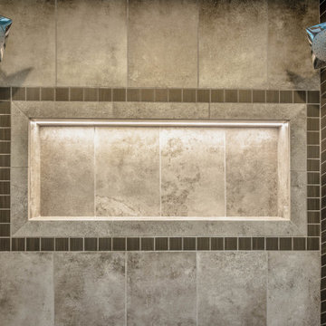
This detailed perspective reveals the intricate layers of craftsmanship required to execute a high-performance 18-head steam shower. Beyond the technical plumbing, this shot showcases the custom-designed tile transitions and integrated lighting that turn a functional space into a visual masterpiece in Hayden, Idaho.
Signature Craftsmanship Details:
18-Outlet Command Column: Visible here is the vertical array of massaging body sprayers and high-volume showerheads. This density of Kohler professional plumbing fixtures is meticulously spaced for total body coverage, all managed by the central computerized DTV system.
Integrated Polk Audio Soundscape: Flanking the showerheads are the moisture-resistant Polk Audio speakers. We’ve built these directly into the wall assembly, providing a wireless, high-fidelity audio experience that maintains the room's sleek architectural lines.
Artisan Niche & Mosaic Detail: The centerpiece of this wall is a deep-set shampoo niche, featuring a precision-installed linear LED light channel. We framed the niche with a sophisticated mosaic tile border, adding a layer of fine-scale texture that contrasts beautifully with the large-format field stone.
Decorative Vertical Transitions: To emphasize the height and scale of the suite, we installed decorative accent tiles running floor-to-ceiling on the left and right. This vertical detail frames the plumbing and audio components, adding a sense of intentional, curated design to the technical wall.
Seamless Stone Integration: The alignment of the mosaic details with the plumbing cutouts requires a high level of layout precision, ensuring that every sprayer and speaker is perfectly centered within the decorative tile framework.
 Sunspace Design, Inc.
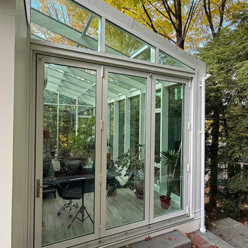
Gardening opportunities are sharply defined by the seasons in New England’s variable climate. Our team was tasked with expanding the growing season for Newtonville, Massachusetts homeowners. The clients envisioned a structure that could perform double duty by serving as both a fully functional four season greenhouse as well as a comfortable home extension. The resulting 24’ x 11’ hybrid addition stunningly captures the sun’s rays while keeping the elements at bay.
The project required careful architectural planning. Working in close collaboration with the team at Legault Design LLC of Concord, MA, Sunspace fabricated a custom aluminum framework that complements the home’s existing aesthetic. Our aluminum products have terrific strength-to-weight ratios allowing for slender profile lines that maximize glass areas without sacrificing structural integrity. Aluminum framing is also inherently resistant to the high humidity levels typical of a working greenhouse. This was doubly important given the space’s dual purpose.
Another key to this greenhouse’s performance is found in its glazing. A glass structure intended for year-round habitation demands intelligent thermal management. We outfitted the enclosure with Cardinal Low-E 366 high-performance glass. Cardinal’s 1” thick insulated units, filled with argon gas, act as a crucial thermal barrier. These units also feature a specialized coating blocking 95% of damaging UV rays, enabling them to retain heat in the winter while reflecting it during the summer. The best modern glass technology allows spaces like this one to remain temperate sanctuaries in any environmental condition.
This greenhouse’s design incorporates three expansive 42” x 60” awning windows to encourage natural airflow, and the 10′ folding glass wall system dissolves the boundary between the interior and exterior yard when fully opened. The seamless indoor-outdoor flow is perfect for summer entertaining or simply letting the space breathe. The space is instantly adaptable to the needs of the moment, whether shielding the home from harsh snows or thrown open to invite a summer breeze.

 Worth Design Build, Inc.
Studio Laguna Photography
Staircase - mid-sized modern wooden straight staircase idea in Minneapolis with wooden risers
Staircase - mid-sized modern wooden straight staircase idea in Minneapolis with wooden risers
143