
Search results for "Framework" in Home Design Ideas
 Main Line Kitchen Design
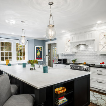
The best kitchen showroom in your area may be closer closer than you think. The four designers there are some of the most experienced award winning kitchen designers in the Delaware Valley. They design in and sell 6 national cabinet lines. And their pricing for cabinetry is slightly less than at home centers in apples to apples comparisons. Where is this kitchen showroom and how come you don’t remember seeing it when it is so close by? It’s in your own home!
Main Line Kitchen Design brings all the same samples you select from when you travel to other showrooms to your home. We make design changes on our laptops in 20-20 CAD with you present usually in the very kitchen being renovated. Understanding what designs will look like and how sample kitchen cabinets, doors, and finishes will look in your home is easy when you are standing in the very room being renovated. Design changes can be emailed to you to print out and discuss with friends and family if you choose. Best of all our design time is free since it is incorporated into the very competitive pricing of your cabinetry when you purchase a kitchen from Main Line Kitchen Design.
Finally there is a kitchen business model and design team that carries the highest quality cabinetry, is experienced, convenient, and reasonably priced. Call us today and find out why we get the best reviews on the internet or Google us and check. We look forward to working with you.
As our company tag line says:
“The world of kitchen design is changing…”
Scott Fredrick Photography
 Nar Design Group
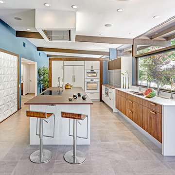
This mid-century modern kitchen was developed with the original architectural elements of its mid-century shell at the heart of its design. Throughout the space, the kitchen’s repetition of alternating dark walnut and light wood uses in the cabinetry and framework reflect the contrast of the dark wooden beams running along the white ceiling. The playful use of two tones intentionally develops unified work zones using all modern day elements and conveniences. For instance, the 5’ galley workstation stands apart with grain-matched walnut cabinetry and stone wrap detail for a furniture-like feeling. The mid-century architecture continued to be an emphasis through design details such as a flush venting system within a drywall structure that conscientiously disappears into the ceiling affording the existing post-and-beams structures and clerestory windows to stand in the forefront.
Along with celebrating the characteristic of the mid-century home the clients wanted to bring the outdoors in. We chose to emphasis the view even more by incorporating a large window centered over the galley kitchen sink. The final result produced a translucent wall that provokes a dialog between the outdoor elements and the natural color tones and materials used throughout the kitchen. While the natural light and views are visible because of the spacious windows, the contemporary kitchens clean geometric lines emphasize the newly introduced natural materials and further integrate the outdoors within the space.
The clients desired to have a designated area for hot drinks such as coffee and tea. To create a station that could house all the small appliances & accessories and was easily accessible we incorporated two aluminum tambours together with integrated power lift doors. One tambour acting as the hot drink station and the other acting as an appliance garage. Overall, this minimalistic kitchen is nothing short of functionality and mid-century character.
Photo Credit: Fred Donham of PhotographerLink
 Legacy Landscape
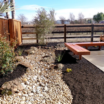
Inspiration for a contemporary drought-tolerant and full sun backyard gravel landscaping in San Francisco.
Find the right local pro for your project
 Advance Design Studio, Ltd.
After six years of living in their Huntley IL home, Chris and Meghan were tired of their dark, dingy, outdated kitchen and it was finally time for a long-anticipated change. “The kitchen is the place where we live, it’s where we do everything,” Meghan said. “It was important that it be a space where we wanted to be.” Meghan loves cooking and enjoys including their girls in healthy meal prepping, this led them to want a brighter, more enjoyable kitchen with increased functionality and improved storage.
For Chris especially, the laundry room was an entirely dysfunctional eyesore. “We had a washer and a dryer, but it was all kind-of cobbled together!” Chris said. “There were always laundry piles everywhere, we weren’t really sure what we wanted to do in there, but it was time for us to make a change.” The mess of the space was stressful every time they walked in the door from the garage each day. Kids’ backpacks and shoes piled up haphazardly in the makeshift boot-bench closet left the family feeling disorganized and stressed. They needed space for folding clothes and locker cubbies to help keep the family organized.
Having known Christine and Todd in the Huntley community for years, Chris and Meghan were familiar with their work. “We already trusted them personally and having seen their projects for years we knew they did top notch work. After we reviewed the initial round of designs, we knew that hiring them was definitely the right choice,” Meghan and Chris said. Although Chris had done a lot of work in their home himself, the kitchen and laundry room renovation was such a large undertaking that he didn’t want to steal time away from his family to spend what would surely be many long weekends doing the job himself. “That would not have been a wise choice for us,” Chris laughed.
“Our designer, Michelle was very, very, easy to work with; anything we wanted to see or weren’t sure about, she went above and beyond to make this easy for us. She was easy to get hold of and always quick to respond,” the couple said. Michelle pulled ideas that mirrored the couple’s taste and style and was adept at directing the couple to limited choices that didn’t overwhelm them and kept the process moving. “I have a hard time making decisions. Michelle made the decision-making process so easy. I loved how she listened to what I liked and then presented three great options for me to choose from,” Meghan said.
The main objectives for the kitchen were better storage solutions, they wanted the space to reflect their lifestyle and taste, and they wanted it to last for years with low maintenance. One of the first steps in creating a more functional kitchen was relocating the refrigerator, creating an improved workflow for the busy family.
“We didn’t know that we could even move the refrigerator to a new location where it is now, that was something that we never would have thought of,” Chris said. “The new refrigerator location makes the kitchen feel so much bigger. We didn’t add any space, but our whole kitchen with the new design just seems like it’s so much larger than before!” Meghan said.
The perimeter mist colored cabinets helped warm and brighten the entire room, while the graphite colored cabinets on the island added contrast. Using this fresh, clean color palette satisfied the couple’s desire for a bright space that was the exact opposite of what they had before. Organization accessories were also added to the cabinets such as a spice drawer tray and roll outs to create hidden convenience.
“I absolutely love the hidden spices – it makes cooking so much more enjoyable!” Chris said. “And all the pull outs, and the double trash bin, who would think you could get so excited about organization!” the couple said in unison.
One thing they hated in their original kitchen was how dark the space felt. Added lighting on the ceiling with the new light fixtures combined with the lighter cabinetry colors throughout solved this problem. “Our new kitchen has this warm, almost cozy feeling that our old kitchen never had, it’s just a space that I love spending my time in now,” Meghan said. The light airy feeling was accentuated with the use of floating white shelves on either side of the decorative range hood. “We have so much cabinetry space, the new design is amazing we actually have more storage space than we will ever need,” Meghan said.
The island was extended to create more work surface and added space for stool seating. “The new island changes how we live. Now the kids can be in the kitchen with us, doing homework, eating breakfast, and the three of us have special dinners there when Chris is working late,” Meghan said.
The Carrara Marmi Quartz countertops were chosen because they are, not only beautiful, but are made from hard-working material that doesn’t require maintenance. The white subway tile backsplash that wraps to the ceiling behind the focal point cooktop range/hood compliments the crisp white countertops perfectly, while brushed brass hardware and light fixtures keep the design fresh and new.
The couple had a few fears at the beginning of the project, as most homeowners do. Their biggest fear was being out of their kitchen and laundry room for an extended time. The crew made it very easy for the family to work in a limited space keeping the washer and dryer hooked up the majority of the time, and also getting appliances working with minimal downtime.
“They above and beyond accommodated us to get us through the process,” Meghan said. “They did a great job making sure we were as comfortable as possible throughout the process,” Chris added.
“Our project manager DJ did a great job. He was very good at updating us on schedule changes, getting guys in as quickly as possible. Everyone that stepped in the house was nice and did great work,” said Chris. They thought Advance’s carpenter was phenomenal and were impressed when he took a conceptual idea from a photograph and worked with designer Michelle to create a one of a kind range/hood that has become the topic of conversation with friends and family who visit the new kitchen. “He was in our house literally every day for several weeks. He was easy to work with and good at what he did,” Meghan and Chris said.
The focal point of the kitchen; a hand-crafted, custom-built ventilation hood was clad with handpicked reclaimed barnwood. Advance Design’s carpenter built the framework and the cladding to create a one-of-a-kind design element that the couple loves.
“I think it was especially fun for him to create something unique from scratch, showcasing his talent in this area,” Meghan said. “I love that my kitchen is not like everyone else’s. I got to pick out the wood on my hood and watch it being built and was able to choose what pieces of wood went where on it. It’s totally unique.”
Red Oak flooring was toothed-in throughout the kitchen and the rest of the first floor anywhere changes were made. Then the whole floor was refinished to tone down the orange undertones in the existing floor stain, ultimately changing the color complexion of the entire first floor. The result is a completely new feeling to the entire home.
Renovating the laundry room was extremely important to Meghan and Chris, but they had trouble visualizing what the possibilities were for the seemingly small space. Michelle produced beautiful 3D illustrations that helped them envision the space in a whole new way.
“I must have told Michelle 100 times that I am a visual person, seeing the designs in 3D made it so easy to make decisions and see what we could really do with our space,” Meghan said.
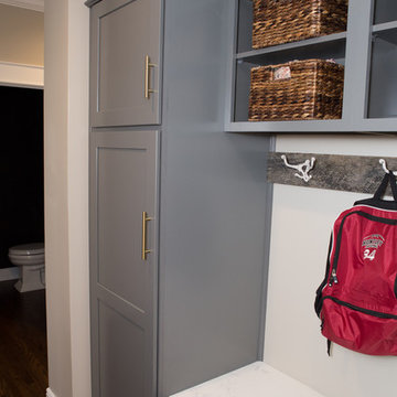
A dividing wall and doorway were removed between the existing laundry room and hallway formerly containing a coat closet, providing space to design specialized graphite colored cabinetry matching the kitchen island to house custom storage cubbies for each family member. Adding the tall utility cabinetry in the new laundry area helped solve the storage issue, tucking away cleaning supplies, household items, and even the cat got its own cubby.
“I love how everything is now hidden in its own space. I can’t tell you how much I hated coming home and seeing everything sitting around on counters,” Chris said.
Electrical outlets were planned for the inside of utility cabinets, so devices could charge in hidden locations. Stacking the washer and dryer allowed for wider countertop space to provide a folding area and a special space for clothes to hang. “The way I do laundry has been completely transformed! I can actually fold clothes and hang them now right out of the washer and dryer,” Meghan said.
“The end result in the kitchen and the laundry/mud room was an updated light and bright space, with a smarter work flow that better meets the needs of this family,” Michelle said.
“I would totally recommend Advance Design,” Meghan said. “Sometimes I sit and just look at my kitchen and laundry room and think ‘Wow, I can’t believe I get to live here!’ It’s an understatement to say we love our new space.”
 The Cultural Landscape Foundation
Saturday June 27, 10:00 to 11:30am | Brooklyn
Monroe Place by Robin Key of Robin Key Landscape Architecture
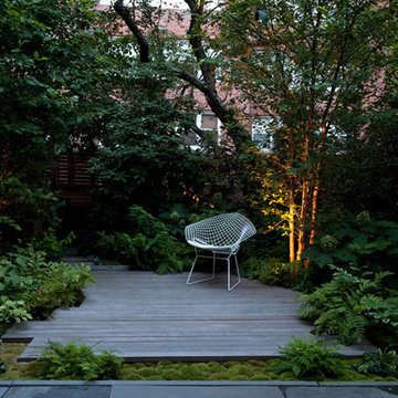
The landscape architect worked closely with the owners to design the front and rear gardens of this Brooklyn Heights townhouse. Located in a historic district, the front garden ironwork and original bluestone sidewalk were restored with the approval of the New York City Landmarks Preservation Commission. In the rear garden, materials were carefully selected to create a balance between the historic landscape and the new elements. The stone patios, laid using salvaged bluestone already existing on the site, are defined by two linear, stacked-stone fountains where water cascades gently into low pools. A raised wood deck at the back of the property is nestled within a bed of soft moss and wispy ferns, creating a peaceful seating area surrounded by woodland plantings. Here modern garden furniture and sculpture create a bold contrast. Throughout the property, the site’s existing mature trees were preserved to serve as a framework for the garden. A lower level seating area adjacent to the house provides the owners with an outdoor kitchen and area for entertaining. Photo courtesy Robin Key Landscape Architecture
 Decorative Wrought IronShamrock Doors & Gates
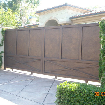
Large mediterranean beige concrete gable roof idea in Los Angeles
 Nar Design Group
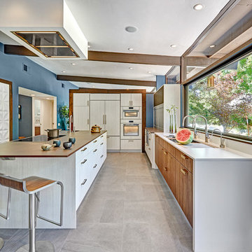
This mid-century modern kitchen was developed with the original architectural elements of its mid-century shell at the heart of its design. Throughout the space, the kitchen’s repetition of alternating dark walnut and light wood uses in the cabinetry and framework reflect the contrast of the dark wooden beams running along the white ceiling. The playful use of two tones intentionally develops unified work zones using all modern day elements and conveniences. For instance, the 5’ galley workstation stands apart with grain-matched walnut cabinetry and stone wrap detail for a furniture-like feeling. The mid-century architecture continued to be an emphasis through design details such as a flush venting system within a drywall structure that conscientiously disappears into the ceiling affording the existing post-and-beams structures and clerestory windows to stand in the forefront.
Along with celebrating the characteristic of the mid-century home the clients wanted to bring the outdoors in. We chose to emphasis the view even more by incorporating a large window centered over the galley kitchen sink. The final result produced a translucent wall that provokes a dialog between the outdoor elements and the natural color tones and materials used throughout the kitchen. While the natural light and views are visible because of the spacious windows, the contemporary kitchens clean geometric lines emphasize the newly introduced natural materials and further integrate the outdoors within the space.
The clients desired to have a designated area for hot drinks such as coffee and tea. To create a station that could house all the small appliances & accessories and was easily accessible we incorporated two aluminum tambours together with integrated power lift doors. One tambour acting as the hot drink station and the other acting as an appliance garage. Overall, this minimalistic kitchen is nothing short of functionality and mid-century character.
Photo Credit: Fred Donham of PhotographerLink
 Pacific Coast Custom Design
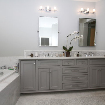
Beautiful updates to dated spaces. We updated the master bathrooms and 2 guest bathrooms with beautiful custom vanities with recessed fronts. The beautiful gray finish works wonderfully with the Carrara marble and white subway tile. We created recessed soap niches in the guest bathrooms and a deluxe recessed niche with shelves in the master bathroom. The lovely gray and white palate gives a fresh calming feeling to these spaces. Now the client has the bathrooms of their dreams.
 Brown Haven Homes
KMPICS.COM
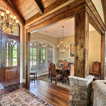
Large arts and crafts dark wood floor entryway photo in Atlanta with beige walls and a dark wood front door
Large arts and crafts dark wood floor entryway photo in Atlanta with beige walls and a dark wood front door
 Advance Design Studio, Ltd.
After six years of living in their Huntley IL home, Chris and Meghan were tired of their dark, dingy, outdated kitchen and it was finally time for a long-anticipated change. “The kitchen is the place where we live, it’s where we do everything,” Meghan said. “It was important that it be a space where we wanted to be.” Meghan loves cooking and enjoys including their girls in healthy meal prepping, this led them to want a brighter, more enjoyable kitchen with increased functionality and improved storage.
For Chris especially, the laundry room was an entirely dysfunctional eyesore. “We had a washer and a dryer, but it was all kind-of cobbled together!” Chris said. “There were always laundry piles everywhere, we weren’t really sure what we wanted to do in there, but it was time for us to make a change.” The mess of the space was stressful every time they walked in the door from the garage each day. Kids’ backpacks and shoes piled up haphazardly in the makeshift boot-bench closet left the family feeling disorganized and stressed. They needed space for folding clothes and locker cubbies to help keep the family organized.
Having known Christine and Todd in the Huntley community for years, Chris and Meghan were familiar with their work. “We already trusted them personally and having seen their projects for years we knew they did top notch work. After we reviewed the initial round of designs, we knew that hiring them was definitely the right choice,” Meghan and Chris said. Although Chris had done a lot of work in their home himself, the kitchen and laundry room renovation was such a large undertaking that he didn’t want to steal time away from his family to spend what would surely be many long weekends doing the job himself. “That would not have been a wise choice for us,” Chris laughed.
“Our designer, Michelle was very, very, easy to work with; anything we wanted to see or weren’t sure about, she went above and beyond to make this easy for us. She was easy to get hold of and always quick to respond,” the couple said. Michelle pulled ideas that mirrored the couple’s taste and style and was adept at directing the couple to limited choices that didn’t overwhelm them and kept the process moving. “I have a hard time making decisions. Michelle made the decision-making process so easy. I loved how she listened to what I liked and then presented three great options for me to choose from,” Meghan said.
The main objectives for the kitchen were better storage solutions, they wanted the space to reflect their lifestyle and taste, and they wanted it to last for years with low maintenance. One of the first steps in creating a more functional kitchen was relocating the refrigerator, creating an improved workflow for the busy family.
“We didn’t know that we could even move the refrigerator to a new location where it is now, that was something that we never would have thought of,” Chris said. “The new refrigerator location makes the kitchen feel so much bigger. We didn’t add any space, but our whole kitchen with the new design just seems like it’s so much larger than before!” Meghan said.
The perimeter mist colored cabinets helped warm and brighten the entire room, while the graphite colored cabinets on the island added contrast. Using this fresh, clean color palette satisfied the couple’s desire for a bright space that was the exact opposite of what they had before. Organization accessories were also added to the cabinets such as a spice drawer tray and roll outs to create hidden convenience.
“I absolutely love the hidden spices – it makes cooking so much more enjoyable!” Chris said. “And all the pull outs, and the double trash bin, who would think you could get so excited about organization!” the couple said in unison.
One thing they hated in their original kitchen was how dark the space felt. Added lighting on the ceiling with the new light fixtures combined with the lighter cabinetry colors throughout solved this problem. “Our new kitchen has this warm, almost cozy feeling that our old kitchen never had, it’s just a space that I love spending my time in now,” Meghan said. The light airy feeling was accentuated with the use of floating white shelves on either side of the decorative range hood. “We have so much cabinetry space, the new design is amazing we actually have more storage space than we will ever need,” Meghan said.
The island was extended to create more work surface and added space for stool seating. “The new island changes how we live. Now the kids can be in the kitchen with us, doing homework, eating breakfast, and the three of us have special dinners there when Chris is working late,” Meghan said.
The Carrara Marmi Quartz countertops were chosen because they are, not only beautiful, but are made from hard-working material that doesn’t require maintenance. The white subway tile backsplash that wraps to the ceiling behind the focal point cooktop range/hood compliments the crisp white countertops perfectly, while brushed brass hardware and light fixtures keep the design fresh and new.
The couple had a few fears at the beginning of the project, as most homeowners do. Their biggest fear was being out of their kitchen and laundry room for an extended time. The crew made it very easy for the family to work in a limited space keeping the washer and dryer hooked up the majority of the time, and also getting appliances working with minimal downtime.
“They above and beyond accommodated us to get us through the process,” Meghan said. “They did a great job making sure we were as comfortable as possible throughout the process,” Chris added.
“Our project manager DJ did a great job. He was very good at updating us on schedule changes, getting guys in as quickly as possible. Everyone that stepped in the house was nice and did great work,” said Chris. They thought Advance’s carpenter was phenomenal and were impressed when he took a conceptual idea from a photograph and worked with designer Michelle to create a one of a kind range/hood that has become the topic of conversation with friends and family who visit the new kitchen. “He was in our house literally every day for several weeks. He was easy to work with and good at what he did,” Meghan and Chris said.
The focal point of the kitchen; a hand-crafted, custom-built ventilation hood was clad with handpicked reclaimed barnwood. Advance Design’s carpenter built the framework and the cladding to create a one-of-a-kind design element that the couple loves.
“I think it was especially fun for him to create something unique from scratch, showcasing his talent in this area,” Meghan said. “I love that my kitchen is not like everyone else’s. I got to pick out the wood on my hood and watch it being built and was able to choose what pieces of wood went where on it. It’s totally unique.”
Red Oak flooring was toothed-in throughout the kitchen and the rest of the first floor anywhere changes were made. Then the whole floor was refinished to tone down the orange undertones in the existing floor stain, ultimately changing the color complexion of the entire first floor. The result is a completely new feeling to the entire home.
Renovating the laundry room was extremely important to Meghan and Chris, but they had trouble visualizing what the possibilities were for the seemingly small space. Michelle produced beautiful 3D illustrations that helped them envision the space in a whole new way.
“I must have told Michelle 100 times that I am a visual person, seeing the designs in 3D made it so easy to make decisions and see what we could really do with our space,” Meghan said.
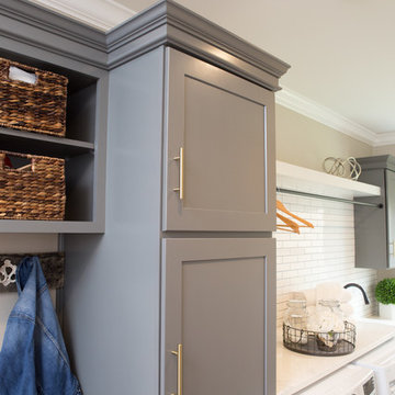
A dividing wall and doorway were removed between the existing laundry room and hallway formerly containing a coat closet, providing space to design specialized graphite colored cabinetry matching the kitchen island to house custom storage cubbies for each family member. Adding the tall utility cabinetry in the new laundry area helped solve the storage issue, tucking away cleaning supplies, household items, and even the cat got its own cubby.
“I love how everything is now hidden in its own space. I can’t tell you how much I hated coming home and seeing everything sitting around on counters,” Chris said.
Electrical outlets were planned for the inside of utility cabinets, so devices could charge in hidden locations. Stacking the washer and dryer allowed for wider countertop space to provide a folding area and a special space for clothes to hang. “The way I do laundry has been completely transformed! I can actually fold clothes and hang them now right out of the washer and dryer,” Meghan said.
“The end result in the kitchen and the laundry/mud room was an updated light and bright space, with a smarter work flow that better meets the needs of this family,” Michelle said.
“I would totally recommend Advance Design,” Meghan said. “Sometimes I sit and just look at my kitchen and laundry room and think ‘Wow, I can’t believe I get to live here!’ It’s an understatement to say we love our new space.”

 Klopf Architecture
Klopf Architecture and Outer space Landscape Architects designed a new warm, modern, open, indoor-outdoor home in Los Altos, California. Inspired by mid-century modern homes but looking for something completely new and custom, the owners, a couple with two children, bought an older ranch style home with the intention of replacing it.
Created on a grid, the house is designed to be at rest with differentiated spaces for activities; living, playing, cooking, dining and a piano space. The low-sloping gable roof over the great room brings a grand feeling to the space. The clerestory windows at the high sloping roof make the grand space light and airy.
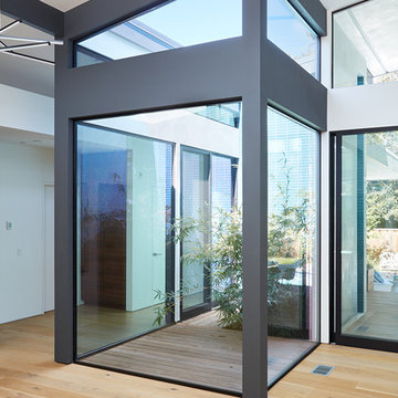
Upon entering the house, an open atrium entry in the middle of the house provides light and nature to the great room. The Heath tile wall at the back of the atrium blocks direct view of the rear yard from the entry door for privacy.
The bedrooms, bathrooms, play room and the sitting room are under flat wing-like roofs that balance on either side of the low sloping gable roof of the main space. Large sliding glass panels and pocketing glass doors foster openness to the front and back yards. In the front there is a fenced-in play space connected to the play room, creating an indoor-outdoor play space that could change in use over the years. The play room can also be closed off from the great room with a large pocketing door. In the rear, everything opens up to a deck overlooking a pool where the family can come together outdoors.
Wood siding travels from exterior to interior, accentuating the indoor-outdoor nature of the house. Where the exterior siding doesn’t come inside, a palette of white oak floors, white walls, walnut cabinetry, and dark window frames ties all the spaces together to create a uniform feeling and flow throughout the house. The custom cabinetry matches the minimal joinery of the rest of the house, a trim-less, minimal appearance. Wood siding was mitered in the corners, including where siding meets the interior drywall. Wall materials were held up off the floor with a minimal reveal. This tight detailing gives a sense of cleanliness to the house.
The garage door of the house is completely flush and of the same material as the garage wall, de-emphasizing the garage door and making the street presentation of the house kinder to the neighborhood.
The house is akin to a custom, modern-day Eichler home in many ways. Inspired by mid-century modern homes with today’s materials, approaches, standards, and technologies. The goals were to create an indoor-outdoor home that was energy-efficient, light and flexible for young children to grow. This 3,000 square foot, 3 bedroom, 2.5 bathroom new house is located in Los Altos in the heart of the Silicon Valley.
Klopf Architecture Project Team: John Klopf, AIA, and Chuang-Ming Liu
Landscape Architect: Outer space Landscape Architects
Structural Engineer: ZFA Structural Engineers
Staging: Da Lusso Design
Photography ©2018 Mariko Reed
Location: Los Altos, CA
Year completed: 2017
 Performance Kitchens & Home
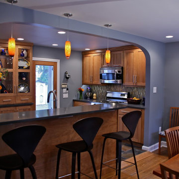
Small trendy galley slate floor enclosed kitchen photo in Philadelphia with an undermount sink, shaker cabinets, light wood cabinets, solid surface countertops, multicolored backsplash, glass tile backsplash, stainless steel appliances and an island
 Webber Coleman Woodworks
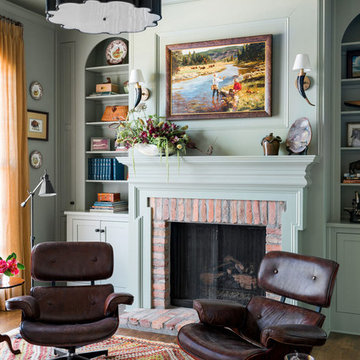
Large transitional enclosed medium tone wood floor and brown floor family room photo in Atlanta with a standard fireplace and a brick fireplace
 Charles P. Rogers Beds & Mattresses
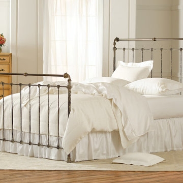
Our original Iron and Brass Sleigh Bed. Decorative accents are cast by hand directly onto the iron framework in the traditional manner. The crest rail and decorative turning are pure, solid brass in our exclusive antique vintage white finish. Available as a bed or headboard only.
 BLDG Workshop Inc.
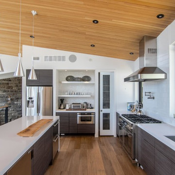
The owner of this Devil’s Glen Ski Resort chalet was determined to honour the original structure built by his father.
At the same time, a growing family created the need for an amplified space. The design for the enlarged chalet attempts to incorporate proportions and angles from the original craftsman styled structure while simultaneously taking cues from the challenging mountain site.
Stonework and timber beams create a framework for expansive glazing that affords sweeping views to the mountain, snow and sky. As a result, a new generation of skiers is engaged with the mountain and it’s community in the same way the owner’s father provided him.
 Beardsley Architects + Engineers
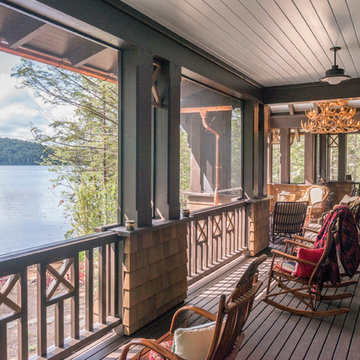
Mid-sized mountain style side porch photo in New York with decking and a roof extension
 User
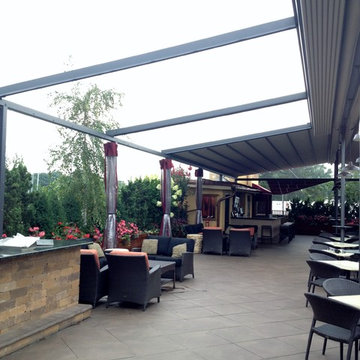
UserThis penthouse awning installation near New York City shows 2,000+ square feet of dining area that is now completely protected by a waterproof retractable enclosure.
The desire was for a penthouse awning that provided protection from the sun, but was also heavy-duty enough to handle inclement weather. The owner wanted to preserve the Al-fresco outdoor dining feel of the rooftop patio, but wanted to be able to hit a button for on-demand protection when needed. This restaurant can now book additional functions, generating more revenue from the penthouse than before the awning was installed - guaranteeing their patrons a protected space.
The Gennius is a retractable pergola awning SPECIFICALLY designed to handle inclement weather. Rainwater is routed downward with the slope of the fabric, and captured within a gutter integrated within the awning's supporting framework. Rainwater then escapes the gutter through the support posts and is diverted away from the entertaining area.
For more information on the Gennius, please visit http://www.pergola-awning.com/Gennius.html
 Elton R Construction
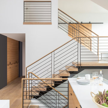
The floating stairs work amazingly in the space, and the dark accents are continued with the handrails. This view shows off just how open this design really is!
 Harwell Fencing and Gates Inc
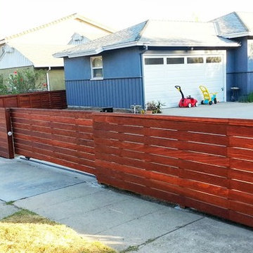
This fence was built using, Clear redwood and solid redwood framework. It's in the front yard in this beautiful neighborhood so it need to be 42" tall. After completion, this fence was beautifully sanded, it has 2 coats of Jarah Brown Cabot Stain and all of the nail holes are filled to give the ultimate clean finish.
42