
Search results for "Gathers bits" in Home Design Ideas
 ALISONDAMONTE
Photo © Bruce Damonte
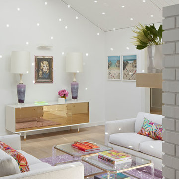
Living room - mid-century modern formal medium tone wood floor living room idea in San Francisco with white walls
Living room - mid-century modern formal medium tone wood floor living room idea in San Francisco with white walls
 Blue Heron Signature Homes
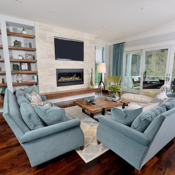
Designed and built by Terramor Homes in Raleigh, NC. This open design concept was an exciting challenge. Kitchen, Family Room and Large Eat in Kitchen are entirely open to each other for family enjoyment. When we enjoy a large family gathering, we envisioned it to be while enjoying the view of the woods, greenway and river seen from the back of the home. Since most of our gatherings extend past single table seating spaces, we wanted to plan properly for spill over onto the huge screened porch that adjoins all of the rooms for extended seating that remains all-inclusive. The screened porch is accessible from the dining area, but more impressively, by a 16 foot wide sliding glass door across the back wall of the Family Room. When fully opened, an 8 foot wide opening is created- making a complete extension of our living and eating areas fully integrated.
M. Eric Honeycutt
 FineLine Kitchens, Inc.
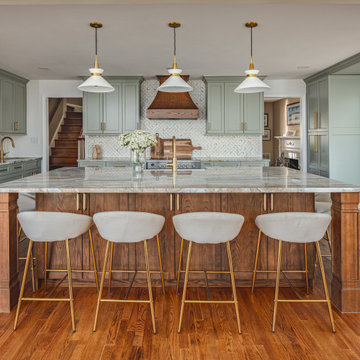
Hi everyone, I'm Sarah and Ogun we are here with fine line kitchens. So we are a couple working together. I do the interior design and remodeling of the space material selection meeting with the clients. And I handled operations outside, you know meaning all the construction work that is taking place the inside. The houses that we work in. I handle all the aspects of the construction, so today's project is very special. We're in Vienna and the client had a very big family. It's a family of seven that lives here. So we had a few aspects that we needed to keep in mind while designing this one. Having everybody be able to sit on the island. So we wanted plenty of seating all the way around. We didn't want anybody standing or anything like that. So what we did is we maximize the space. The center island is the biggest part of the kitchen. We use a natural stone to kind of give it a beautiful texture versus quartz. It's kind of standard white or kind of fabricated, so I wanted something very natural. We did this because I took my inspiration from the outside, so the inspiration if you look at the view right in front of me is there are so many greens there's a lot of brass accents and I wanted to bring this. Into this kitchen while designing it for my clients. She is very warm very. She wanted a very homey, comfy kind of look for the kitchen. So that's what we did today. As you can see, the cabinets are sage green, very light, so I still think it's a neutral, but it's a lighter color that again brings the outside in and we combine that with the oak right behind me so it's a slightly warm oak. It's not very dark. It's not very light. It's a medium brown and the same color went on the island. To kind of tie these two in and the backsplash, my favorite part is where you can see a little bit of design. It is, in my opinion still classic, but includes a pattern so the outside part is as we said in the beginning, is handled by my husband. I'd like him to speak a little bit about that. Thanks, Sarah, I want to talk to you guys a little bit about the construction part of this project. Originally this kitchen was located mostly in this area. They had their stove there sing. It was more of a peninsula layout in Sarah's and the customer vision they wanted. They wanted to get rid of the peninsula and they want to be able to have a huge island that can at least sit seven people because they're familiar with seven. So we wanted to make sure that we can achieve this design and bring it to life so that they can be happy with this layout. Some of the challenges we had, the house, the home being, you know, old home. There were a lot of you know the older electrical and plumbing that had to be replaced. We had to relocate the stove from here to this area. Over here we had put a nice foot fan that we had to relocate all the ductwork and the plumbing. Was being on the peninsula area. We had to relocate it to the center islands. So we achieved all this and kind of like bring it to bring in this kitchen up to date it looks beautiful. That's true, so yes, the old layout did not function for my clients because everything was kind of gathered on one side of the kitchen. So there was like a peninsula right there. So the end of this island kind of continued straight. And that was just the L shape. Kind of where everything was and there used to be another big table here, so they were using only kind of half of the space. So like I said at the beginning, our vision was to kind of feed everybody at the island, create some symmetry. 'cause I love that. So as you can see behind me, this is kind of the focal point symmetrical. Everything is kind of even we wanted to also panel the fridge here so it mimics the pantry and another size. So when you're looking at it, it is bringing again that symmetry back again. I hope you enjoyed this kitchen and this video and I'll see you soon. So how do you think this project turned out? It's nice. I like the color. I think it turned out nice. It's kind of like a little bit different color than what we always do. So I realize. Are you giving me a little bit of credit here that I did something different? Are you proud? I'm so proud of you. Other than that I like it. That they have kind of like a two sink. So if this was our kitchen, if we ever like you can have your own. I can have mine if we ever get into a fight then this can be like my own kitchen. Why are we gonna bring in a fight right now? So I'm cooking anyway. You're grilling most of the time, So what are you even talking about? My kitchen? That's my kitchen. You can just take the small sink. That's fine. It's always good to have your own space right there, so anyways. Thank you guys for watching. We hope to see you soon and if you have any questions please click the link below. It'll lead you to our website, house, YouTube and all of the social media is so nice to have you guys. We'll see you soon. Thanks bye bye-bye.
Find the right local pro for your project

 Nar Design Group
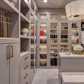
The master bathroom was designed for clients who have a true appreciation for clean lines, symmetry, and simple beauty. They desired a space that checked the box on each of these aesthetic details while maximizing function and storage within each area of this space. This was achieved by providing separate his and hers vanities, a designated makeup station, ample tall storage, and a feature wall to backdrop the bathtub. If standing in the center of this bathroom, one would find that both sides of this bathroom are a mirror image of one another. The makeup vanity is centered on the front wall and is captured by identical floor to ceiling linen storage cabinets with a combination of drawer and door storage. Tall narrow columns were set on the sides of these linen cabinets, which each have a hidden frameless flush inset touch latch door concealing medicine cabinet storage. These columns are finished in a dark textured laminate with vertical grain to emphasize the ceiling height and give a clean contrast to the light linen cabinet finish throughout the rest of the space. Back-to-back are the his and hers vanities that provide quite a bit more storage. Bringing in the element of aged brass cabinet hardware and decorative light fixtures added the perfect amount of soft glam to complete this elegant bathroom.
 Carl Mattison Design
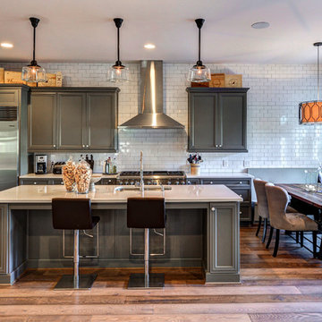
The open kitchen is the family gathering space. The banquette fits perfect by the rear facing windows. Flooring is reclaimed and paired with the gray cabinetry and walls to give a soft modern approach alongside the vintage appeal of the subway tiled wall and school house lights.

 TKS Design Group
Download our free ebook, Creating the Ideal Kitchen. DOWNLOAD NOW
For many, extra time at home during COVID left them wanting more from their homes. Whether you realized the shortcomings of your space or simply wanted to combat boredom, a well-designed and functional home was no longer a want, it became a need. Tina found herself wanting more from her Old Irving Park home and reached out to The Kitchen Studio about adding function to her kitchen to make the most of the available real estate.
At the end of the day, there is nothing better than returning home to a bright and happy space you love. And this kitchen wasn’t that for Tina. Dark and dated, with a palette from the past and features that didn’t make the most of the available square footage, this remodel required vision and a fresh approach to the space. Lead designer, Stephanie Cole’s main design goal was better flow, while adding greater functionality with organized storage, accessible open shelving, and an overall sense of cohesion with the adjoining family room.
The original kitchen featured a large pizza oven, which was rarely used, yet its footprint limited storage space. The nearby pantry had become a catch-all, lacking the organization needed in the home. The initial plan was to keep the pizza oven, but eventually Tina realized she preferred the design possibilities that came from removing this cumbersome feature, with the goal of adding function throughout the upgraded and elevated space. Eliminating the pantry added square footage and length to the kitchen for greater function and more storage. This redesigned space reflects how she lives and uses her home, as well as her love for entertaining.
The kitchen features a classic, clean, and timeless palette. White cabinetry, with brass and bronze finishes, contrasts with rich wood flooring, and lets the large, deep blue island in Woodland’s custom color Harbor – a neutral, yet statement color – draw your eye.
The kitchen was the main priority. In addition to updating and elevating this space, Tina wanted to maximize what her home had to offer. From moving the location of the patio door and eliminating a window to removing an existing closet in the mudroom and the cluttered pantry, the kitchen footprint grew. Once the floorplan was set, it was time to bring cohesion to her home, creating connection between the kitchen and surrounding spaces.
The color palette carries into the mudroom, where we added beautiful new cabinetry, practical bench seating, and accessible hooks, perfect for guests and everyday living. The nearby bar continues the aesthetic, with stunning Carrara marble subway tile, hints of brass and bronze, and a design that further captures the vibe of the kitchen.
Every home has its unique design challenges. But with a fresh perspective and a bit of creativity, there is always a way to give the client exactly what they want [and need]. In this particular kitchen, the existing soffits and high slanted ceilings added a layer of complexity to the lighting layout and upper perimeter cabinets.
While a space needs to look good, it also needs to function well. This meant making the most of the height of the room and accounting for the varied ceiling features, while also giving Tina everything she wanted and more. Pendants and task lighting paired with an abundance of natural light amplify the bright aesthetic. The cabinetry layout and design compliments the soffits with subtle profile details that bring everything together. The tile selections add visual interest, drawing the eye to the focal area above the range. Glass-doored cabinets further customize the space and give the illusion of even more height within the room.
While her family may be grown and out of the house, Tina was focused on adding function without sacrificing a stunning aesthetic and dreamy finishes that make the kitchen the gathering place of any home. It was time to love her kitchen again, and if you’re wondering what she loves most, it’s the niche with glass door cabinetry and open shelving for display paired with the marble mosaic backsplash over the range and complimenting hood. Each of these features is a stunning point of interest within the kitchen – both brag-worthy additions to a perimeter layout that previously felt limited and lacking.
Whether your remodel is the result of special needs in your home or simply the excitement of focusing your energy on creating a fun new aesthetic, we are here for it. We love a good challenge because there is always a way to make a space better – adding function and beauty simultaneously.

 FineLine Kitchens, Inc.
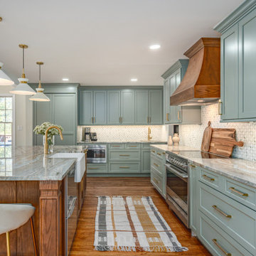
Hi everyone, I'm Sarah and Ogun we are here with fine line kitchens. So we are a couple working together. I do the interior design and remodeling of the space material selection meeting with the clients. And I handled operations outside, you know meaning all the construction work that is taking place the inside. The houses that we work in. I handle all the aspects of the construction, so today's project is very special. We're in Vienna and the client had a very big family. It's a family of seven that lives here. So we had a few aspects that we needed to keep in mind while designing this one. Having everybody be able to sit on the island. So we wanted plenty of seating all the way around. We didn't want anybody standing or anything like that. So what we did is we maximize the space. The center island is the biggest part of the kitchen. We use a natural stone to kind of give it a beautiful texture versus quartz. It's kind of standard white or kind of fabricated, so I wanted something very natural. We did this because I took my inspiration from the outside, so the inspiration if you look at the view right in front of me is there are so many greens there's a lot of brass accents and I wanted to bring this. Into this kitchen while designing it for my clients. She is very warm very. She wanted a very homey, comfy kind of look for the kitchen. So that's what we did today. As you can see, the cabinets are sage green, very light, so I still think it's a neutral, but it's a lighter color that again brings the outside in and we combine that with the oak right behind me so it's a slightly warm oak. It's not very dark. It's not very light. It's a medium brown and the same color went on the island. To kind of tie these two in and the backsplash, my favorite part is where you can see a little bit of design. It is, in my opinion still classic, but includes a pattern so the outside part is as we said in the beginning, is handled by my husband. I'd like him to speak a little bit about that. Thanks, Sarah, I want to talk to you guys a little bit about the construction part of this project. Originally this kitchen was located mostly in this area. They had their stove there sing. It was more of a peninsula layout in Sarah's and the customer vision they wanted. They wanted to get rid of the peninsula and they want to be able to have a huge island that can at least sit seven people because they're familiar with seven. So we wanted to make sure that we can achieve this design and bring it to life so that they can be happy with this layout. Some of the challenges we had, the house, the home being, you know, old home. There were a lot of you know the older electrical and plumbing that had to be replaced. We had to relocate the stove from here to this area. Over here we had put a nice foot fan that we had to relocate all the ductwork and the plumbing. Was being on the peninsula area. We had to relocate it to the center islands. So we achieved all this and kind of like bring it to bring in this kitchen up to date it looks beautiful. That's true, so yes, the old layout did not function for my clients because everything was kind of gathered on one side of the kitchen. So there was like a peninsula right there. So the end of this island kind of continued straight. And that was just the L shape. Kind of where everything was and there used to be another big table here, so they were using only kind of half of the space. So like I said at the beginning, our vision was to kind of feed everybody at the island, create some symmetry. 'cause I love that. So as you can see behind me, this is kind of the focal point symmetrical. Everything is kind of even we wanted to also panel the fridge here so it mimics the pantry and another size. So when you're looking at it, it is bringing again that symmetry back again. I hope you enjoyed this kitchen and this video and I'll see you soon. So how do you think this project turned out? It's nice. I like the color. I think it turned out nice. It's kind of like a little bit different color than what we always do. So I realize. Are you giving me a little bit of credit here that I did something different? Are you proud? I'm so proud of you. Other than that I like it. That they have kind of like a two sink. So if this was our kitchen, if we ever like you can have your own. I can have mine if we ever get into a fight then this can be like my own kitchen. Why are we gonna bring in a fight right now? So I'm cooking anyway. You're grilling most of the time, So what are you even talking about? My kitchen? That's my kitchen. You can just take the small sink. That's fine. It's always good to have your own space right there, so anyways. Thank you guys for watching. We hope to see you soon and if you have any questions please click the link below. It'll lead you to our website, house, YouTube and all of the social media is so nice to have you guys. We'll see you soon. Thanks bye bye-bye.
 Melissa Hill Home Design
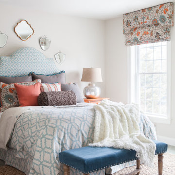
This client was so much fun to design for. Their project was all about color, texture and creating a master bedroom and guest bedroom that compliments their passion for traveling and eclectic style. We created a seating area in the master bedroom where the family can gather at night to read and spend time quality time. Their desire for deep color and bold pattern allowed us to create a casual space that is both warm and inviting at the end of a long day. Guests often visit and stay for a bit. They wanted to give their family and friends the same cozy feel in their guest bedroom. We were able to use a combination of patterns, textures and colors with our custom-made bedding and pillows. We also love to repurpose where we can and painted furniture is a great place to start. The depth of color used here is a true reflection of our clients' warm and friendly personality that says "welcome to our home."
Custom designed by Hartley and Hill Design
All materials and furnishings in this space are available through Hartley and Hill Design. www.hartleyandhilldesign.com
888-639-0639
Neil Landino Photography

 Everything Home
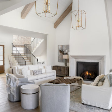
A neutral color palette punctuated by warm wood tones and large windows create a comfortable, natural environment that combines casual southern living with European coastal elegance. The 10-foot tall pocket doors leading to a covered porch were designed in collaboration with the architect for seamless indoor-outdoor living. Decorative house accents including stunning wallpapers, vintage tumbled bricks, and colorful walls create visual interest throughout the space. Beautiful fireplaces, luxury furnishings, statement lighting, comfortable furniture, and a fabulous basement entertainment area make this home a welcome place for relaxed, fun gatherings.
---
Project completed by Wendy Langston's Everything Home interior design firm, which serves Carmel, Zionsville, Fishers, Westfield, Noblesville, and Indianapolis.
For more about Everything Home, click here: https://everythinghomedesigns.com/
To learn more about this project, click here:
https://everythinghomedesigns.com/portfolio/aberdeen-living-bargersville-indiana/
 Kaplan Thompson Architects
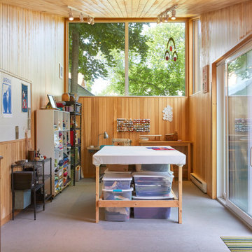
Designed to maximize function with minimal impact, the studio serves up adaptable square footage in a wrapping almost healthy enough to eat.
The open interior space organically transitions from personal to communal with the guidance of an angled roof plane. Beneath the tallest elevation, a sunny workspace awaits creative endeavors. The high ceiling provides room for big ideas in a small space, while a cluster of windows offers a glimpse of the structure’s soaring eave. Solid walls hugging the workspace add both privacy and anchors for wall-mounted storage. Towards the studio’s southern end, the ceiling plane slopes downward into a more intimate gathering space with playfully angled lines.
The building is as sustainable as it is versatile. Its all-wood construction includes interior paneling sourced locally from the Wood Mill of Maine. Lengths of eastern white pine span up to 16 feet to reach from floor to ceiling, creating visual warmth from a material that doubles as a natural insulator. Non-toxic wood fiber insulation, made from sawdust and wax, partners with triple-glazed windows to further insulate against extreme weather. During the winter, the interior temperature is able to reach 70 degrees without any heat on.
As it neared completion, the studio became a family project with Jesse, Betsy, and their kids working together to add the finishing touches. “Our whole life is a bit of an architectural experiment”, says Jesse, “but this has become an incredibly useful space.”


 Davina Designs
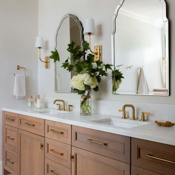
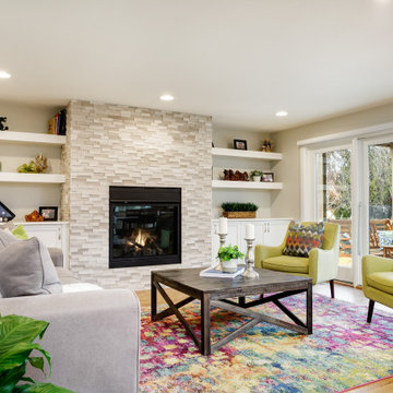
The owners wanted this cozy family room to be a space to gather and play games or visit with guests without the distraction of a tv. The cool and serene stacked marble of the fireplace gave us plenty of opportunity to play with color on the furniture and in the rug. The floating shelves lightened up the feel of the built-in cabinets, thus keeping the wall feeling light and airy.
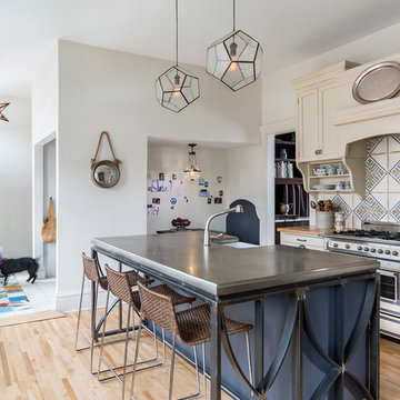
Eat-in kitchen - cottage galley light wood floor eat-in kitchen idea in Minneapolis with a farmhouse sink, recessed-panel cabinets, beige cabinets, wood countertops, multicolored backsplash, ceramic backsplash, paneled appliances and an island
 Lee Meier Interiors
Designer: Barbara Stowe, Allied ASID
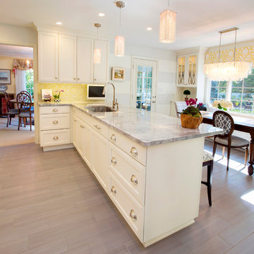
The clients were looking for a complete update of their original 1960's kitchen. They requested a clean and fresh look that would withstand the test of time. Although the footprint remained the same, eliminating soffits allowed for full height cabinets and made the space look larger. Brookhaven by Wood-Mode cabinetry, a narrow pull-out pantry cabinet and custom built-in plate rack provide plenty of storage and the dual-fuel Wolf range and Sub-Zero refrigerator are welcome upgrades.
Classic colors of gray and yellow are repeated in the handmade ceramic tile back splash, the granite counter tops, porcelain plank tile flooring, decorative valance and the numerous fabrics.
Antique chairs upholstered with new fabrics and a farmhouse table made from old doors add warmth, while polished nickel hardware and Schonbek crystal pendants add a bit of bling.
The result is a kitchen that is wonderful to cook in as well as being a lovely gathering place for family and friends.

Sponsored
Fredericksburg, OH

High Point Cabinets
Columbus' Experienced Custom Cabinet Builder | 4x Best of Houzz Winner
 Marlene Oliphant Designs LLC
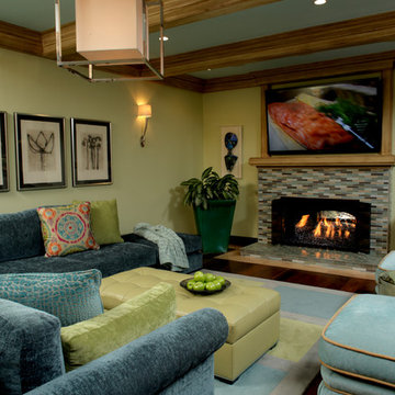
This redesigned family room was relieved of cumbersome tv cabinetry in favor of a flatscreen over the fireplace. The fireplace was tiled in pastel strip tiles Firecrystals replaced the old logs. This is a favorite gathering place for both family and friends. Photos by Harry Chamberlain.
 USI Design & Remodeling
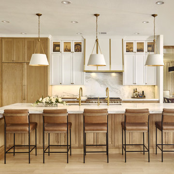
Located in Argyle, Texas, this comprehensive whole-home renovation was conceived by USI Design & Remodeling who reimagined the home's interior architecture, transforming a collection of compartmentalized rooms into a cohesive environment designed for modern living, entertaining, and daily comfort. The project encompassed the kitchen, family room, dining room, lounge, office, primary bathroom, and supporting circulation spaces, creating a unified experience that feels both expansive and intentional. Throughout the home, refined materials, custom millwork, and carefully curated finishes establish a sense of understated luxury while maintaining warmth and livability.
At the heart of the renovation is a completely reconfigured kitchen and gathering space designed around functionality, hospitality, and visual connection. Architectural barriers were removed to improve sightlines and circulation, allowing the kitchen, dining, and family spaces to function as a single integrated living environment. A dramatic five-foot workstation sink anchors the kitchen, while custom cabinetry and furniture-inspired details elevate the space beyond conventional residential design. Adjacent to the kitchen, the former pantry, laundry, and service corridor were reimagined as a hybrid scullery and utility suite, creating a highly functional support space that discreetly accommodates food preparation, storage, organization, and household operations without compromising the elegance of the primary living areas.
The renovation extends beyond aesthetics to create a home tailored to the family's evolving needs. The primary bathroom was transformed into a spa-inspired retreat, while the lounge, office, and dining spaces were redesigned to support both everyday living and entertaining. Consistent architectural detailing, layered textures, and thoughtful proportions establish continuity throughout the residence, allowing each room to feel connected to the larger design narrative. The result is a sophisticated yet approachable home that balances practical performance with timeless design, delivering a renewed living experience that is both highly functional and distinctly luxurious.
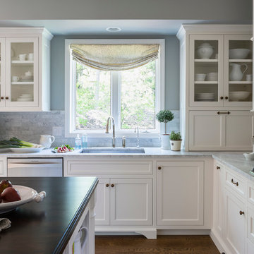
 Liz Schupanitz Designs
A PLACE TO GATHER
Location: Eagan, MN, USA
This family of five wanted an inviting space to gather with family and friends. Mom, the primary cook, wanted a large island with more organized storage – everything in its place – and a crisp white kitchen with the character of an older home.
Challenges:
Design an island that could accommodate this family of five for casual weeknight dinners.
Create more usable storage within the existing kitchen footprint.
Design a better transition between the upper cabinets on the 8-foot sink wall and the adjoining 9-foot cooktop wall.
Make room for more counter space around the cooktop. It was poorly lit, cluttered with small appliances and confined by the tall oven cabinet.
Solutions:
A large island, that seats 5 comfortably, replaced the small island and kitchen table. This allowed for more storage including cookbook shelves, a heavy-duty roll out shelf for the mixer, a 2-bin recycling center and a bread drawer.
Tall pantries with decorative grilles were placed between the kitchen and family room. These created ample storage and helped define each room, making each one feel larger, yet more intimate.
A space intentionally separates the upper cabinets on the sink wall from those on the cooktop wall. This created symmetry on the sink wall and made room for an appliance garage, which keeps the countertops uncluttered.
Moving the double ovens to the former pantry location made way for more usable counter space around the cooktop and a dramatic focal point with the hood, cabinets and marble backsplash.
Special Features:
Custom designed corbels and island legs lend character.
Gilt open lanterns, antiqued nickel grilles on the pantries, and the soft linen shade at the kitchen sink add personality and charm.
The unique bronze hardware with a living finish creates the patina of an older home.
A walnut island countertop adds the warmth and feel of a kitchen table.
This homeowner truly understood the idea of living with the patina of marble. Her grandmother’s marble-topped antique table inspired the Carrara countertops.
The result is a highly organized kitchen with a light, open feel that invites you to stay a while.
Liz Schupanitz Designs
Photographed by: Andrea Rugg
6