
Search results for "Hawaiian room design" in Home Design Ideas
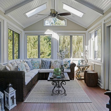
 ROAM Architecture
This one-room sunroom addition is connected to both an existing wood deck, as well as the dining room inside. As part of the project, the homeowners replaced the deck flooring material with composite decking, which gave us the opportunity to run that material into the addition as well, giving the room a seamless indoor / outdoor transition. We also designed the space to be surrounded with windows on three sides, as well as glass doors and skylights, flooding the interior with natural light and giving the homeowners the visual connection to the outside which they so desired. The addition, 12'-0" wide x 21'-6" long, has enabled the family to enjoy the outdoors both in the early spring, as well as into the fall, and has become a wonderful gathering space for the family and their guests.
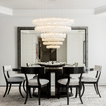
 Shakuff
Crystal Shell Custom Blown Glass Chandelier. Sea inspired glass shells glisten from their crackle-like texture. Available as individual pendants or multi-pendant chandeliers. Multiple sizes and colors are available.
Modern Custom Glass Lighting perfect for your entryway / foyer, stairwell, living room, dining room, kitchen, and any room in your home. Dramatic lighting that is fully customizable and tailored to fit your space perfectly. No two pieces are the same.
Visit our website: www.shakuff.com for more details.
Tel. 212.675.0383
info@shakuff.com
Photo Credit: Sean Litchenfield Photography
Interior Design By: MacWright Interiors LLC
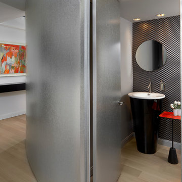
 Mitchell Channon Design
Winner, 2014 ASID Design Excellence Award in Residential Design.
Behind a curved silver leaf wall, a powder room adds an element of surprise and delight. The cone-shaped pedestal sink and table base sit perfectly against a geometric wall-covering.
Photography: Tony Soluri
Find the right local pro for your project
 Advance Design Studio, Ltd.
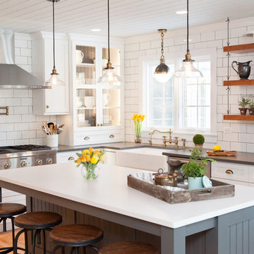
When this suburban family decided to renovate their kitchen, they knew that they wanted a little more space. Advance Design worked together with the homeowner to design a kitchen that would work for a large family who loved to gather regularly and always ended up in the kitchen! So the project began with extending out an exterior wall to accommodate a larger island and more moving-around space between the island and the perimeter cabinetry.
Style was important to the cook, who began collecting accessories and photos of the look she loved for months prior to the project design. She was drawn to the brightness of whites and grays, and the design accentuated this color palette brilliantly with the incorporation of a warm shade of brown woods that originated from a dining room table that was a family favorite. Classic gray and white cabinetry from Dura Supreme hits the mark creating a perfect balance between bright and subdued. Hints of gray appear in the bead board detail peeking just behind glass doors, and in the application of the handsome floating wood shelves between cabinets. White subway tile is made extra interesting with the application of dark gray grout lines causing it to be a subtle but noticeable detail worthy of attention.
Suede quartz Silestone graces the countertops with a soft matte hint of color that contrasts nicely with the presence of white painted cabinetry finished smartly with the brightness of a milky white farm sink. Old melds nicely with new, as antique bronze accents are sprinkled throughout hardware and fixtures, and work together unassumingly with the sleekness of stainless steel appliances.
The grace and timelessness of this sparkling new kitchen maintains the charm and character of a space that has seen generations past. And now this family will enjoy this new space for many more generations to come in the future with the help of the team at Advance Design Studio.
Photographer: Joe Nowak
Dura Supreme Cabinetry
 Nar Design Group
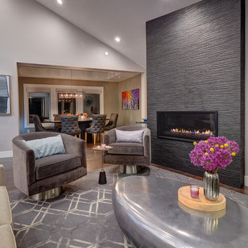
This home remodel is a celebration of curves and light. Starting from humble beginnings as a basic builder ranch style house, the design challenge was maximizing natural light throughout and providing the unique contemporary style the client’s craved.
The Entry offers a spectacular first impression and sets the tone with a large skylight and an illuminated curved wall covered in a wavy pattern Porcelanosa tile.
The chic entertaining kitchen was designed to celebrate a public lifestyle and plenty of entertaining. Celebrating height with a robust amount of interior architectural details, this dynamic kitchen still gives one that cozy feeling of home sweet home. The large “L” shaped island accommodates 7 for seating. Large pendants over the kitchen table and sink provide additional task lighting and whimsy. The Dekton “puzzle” countertop connection was designed to aid the transition between the two color countertops and is one of the homeowner’s favorite details. The built-in bistro table provides additional seating and flows easily into the Living Room.
A curved wall in the Living Room showcases a contemporary linear fireplace and tv which is tucked away in a niche. Placing the fireplace and furniture arrangement at an angle allowed for more natural walkway areas that communicated with the exterior doors and the kitchen working areas.
The dining room’s open plan is perfect for small groups and expands easily for larger events. Raising the ceiling created visual interest and bringing the pop of teal from the Kitchen cabinets ties the space together. A built-in buffet provides ample storage and display.
The Sitting Room (also called the Piano room for its previous life as such) is adjacent to the Kitchen and allows for easy conversation between chef and guests. It captures the homeowner’s chic sense of style and joie de vivre.
 L Marie Interior Design
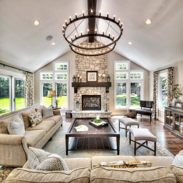
Clients' first home and there forever home with a family of four and in laws close, this home needed to be able to grow with the family. This most recent growth included a few home additions including the kids bathrooms (on suite) added on to the East end, the two original bathrooms were converted into one larger hall bath, the kitchen wall was blown out, entrying into a complete 22'x22' great room addition with a mudroom and half bath leading to the garage and the final addition a third car garage. This space is transitional and classic to last the test of time.
 Thyme & Place Design LLC
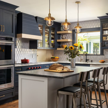
The client requested a kitchen that would not only provide a great space to cook and enjoy family meals but one that would fit in with her unique design sense. An avid collector of contemporary art, she wanted something unexpected in her 100-year-old home in both color and finishes but still providing a great layout with improved lighting, storage, and superior cooking abilities. The existing kitchen was in a closed off space trapped between the family room and the living. If you were in the kitchen, you were isolated from the rest of the house. Making the kitchen an integrated part of the home was a paramount request.
Step one, remove the wall separating the kitchen from the other rooms in the home which allowed the new kitchen to become an integrated space instead of an isolation room for the cook. Next, we relocated the pantry access which was in the family room to the kitchen integrating a poorly used recess which had become a catch all area which did not provide any usable space for storage or working area. To add valuable function in the kitchen we began by capturing unused "cubbies", adding a walk-in pantry from the kitchen, increasing the storage lost to un-needed drop ceilings and bring light and design to the space with a new large awning window, improved lighting, and combining interesting finishes and colors to reflect the artistic attitude of the client.
A bathroom located above the kitchen had been leaking into the plaster ceiling for several years. That along with knob and tube wiring, rotted beams and a brick wall from the back of the fireplace in the adjacent living room all needed to be brought to code. The walls, ceiling and floors in this 100+ year old home were completely out of level and the room’s foot print could not be increased.
The choice of a Sub-Zero wolf product is a standard in my kitchen designs. The quality of the product, its manufacturing and commitment to food preservation is the reason I specify Sub Zero Wolf. For the cook top, the integrated line of the contemporary cooktop and the signature red knobs against the navy blue of the cabinets added to the design vibe of the kitchen. The cooking performance and the large continuous grate on the cooktop makes it an obvious choice for a cook looking for a great cook top with professional results in a more streamlined profile. We selected a Sharp microwave drawer for the island, an XO wine refrigerator, Bosch dishwasher and Kitchen Aid double convection wall ovens to round out the appliance package.
A recess created by the fireplace was outfitted with a cabinet which now holds small appliances within easy reach of my very petite client. Natural maple accents were used inside all the wall cabinets and repeated on the front of the hood and for the sliding door appliance cabinet and the floating shelves. This allows a brighter interior for the painted cabinets instead of the traditional same interior as exterior finish choice. The was an amazing transformation from the old to the new.
The final touches are the honey bronze hardware from Top Knobs, Mitzi pendants from Hudson Valley Lighting group,
a fabulous faucet from Brizo. To eliminate the old freestanding bottled water cooler, we specified a matching water filter faucet.

 Wilson Kelsey Design
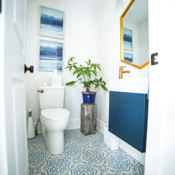
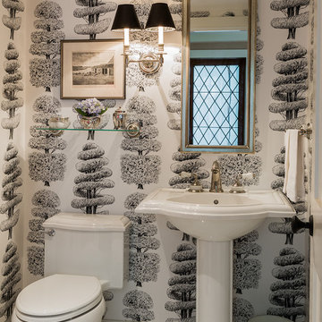
Black and white carry throughout this crisp powder room: black and white marble floor tiles, black and white graphic wallpaper, and a black and white double wall sconce. Elegant white bathroom fixtures, including the pedestal sink, and a long narrow silver framed rectangular mirror bring additional brightness to this small powder room.
WKD’s experience in historic preservation and antique curation restored this gentleman’s farm into a casual, comfortable, livable home for the next chapter in this couple’s lives.
The project included a new family entrance and mud room, new powder room, and opening up some of the rooms for better circulation. While WKD curated the client’s existing collection of art and antiques, refurbishing where necessary, new furnishings were also added to give the home a new lease on life.
Working with older homes, and historic homes, is one of Wilson Kelsey Design’s specialties.
This project was featured on the cover of Design New England's September/October 2013 issue. Read the full article at: http://wilsonkelseydesign.com/wp-content/uploads/2014/12/Heritage-Restored1.pdf
It was also featured in the Sept. issue of Old House Journal, 2016 - article is at http://wilsonkelseydesign.com/wp-content/uploads/2016/08/2016-09-OHJ.pdf
Photo by Michael Lee
 TKS Design Group
Free ebook, Creating the Ideal Kitchen. DOWNLOAD NOW
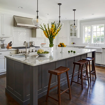
Our clients and their three teenage kids had outgrown the footprint of their existing home and felt they needed some space to spread out. They came in with a couple of sets of drawings from different architects that were not quite what they were looking for, so we set out to really listen and try to provide a design that would meet their objectives given what the space could offer.
We started by agreeing that a bump out was the best way to go and then decided on the size and the floor plan locations of the mudroom, powder room and butler pantry which were all part of the project. We also planned for an eat-in banquette that is neatly tucked into the corner and surrounded by windows providing a lovely spot for daily meals.
The kitchen itself is L-shaped with the refrigerator and range along one wall, and the new sink along the exterior wall with a large window overlooking the backyard. A large island, with seating for five, houses a prep sink and microwave. A new opening space between the kitchen and dining room includes a butler pantry/bar in one section and a large kitchen pantry in the other. Through the door to the left of the main sink is access to the new mudroom and powder room and existing attached garage.
White inset cabinets, quartzite countertops, subway tile and nickel accents provide a traditional feel. The gray island is a needed contrast to the dark wood flooring. Last but not least, professional appliances provide the tools of the trade needed to make this one hardworking kitchen.
Designed by: Susan Klimala, CKD, CBD
Photography by: Mike Kaskel
For more information on kitchen and bath design ideas go to: www.kitchenstudio-ge.com
 AXIS Productions
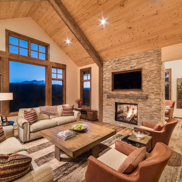
the great room was enlarged to the south - past the medium toned wood post and beam is new space. the new addition helps shade the patio below while creating a more usable living space. To the right of the new fireplace was the existing front door. Now there is a graceful seating area to welcome visitors. The wood ceiling was reused from the existing home.
WoodStone Inc, General Contractor
Home Interiors, Cortney McDougal, Interior Design
Draper White Photography
 Jamie Keskin Design
Kyle Caldwell
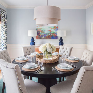
Transitional light wood floor dining room photo in Boston with blue walls
Transitional light wood floor dining room photo in Boston with blue walls
 Asha Maía Design
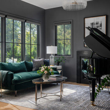
This moody and sophisticated piano room exudes timeless charm and modern refinement, creating a space that feels both dramatic and inviting. At its heart, a deep green velvet sofa draws you in with its luxurious texture, while the grand piano stands as a centerpiece, evoking an air of classic elegance and creativity. Floor-to-ceiling black-framed windows flood the room with soft natural light, beautifully contrasting the rich gray walls and enhancing the room’s layered design. A glass-top coffee table with metallic accents adds a touch of glamour, while a plush area rug and lush greenery bring warmth and life to the space. Thoughtfully curated decor ties it all together, creating an atmosphere that is both serene and striking—a room made for music, connection, and quiet inspiration.
 Robeson Design
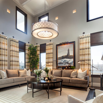
Custom furniture, paintings and iron screens elevate the room when combined with the visual interest of
geometric patterned light fixtures and horizontal striped curtains in a variation of colors. Beautiful espresso walnut hardwood flooring was installed, and we finished with a coffee table complete with spoke detailing. For the full tour, visit us at Robeson Design

Sponsored
Columbus, OH
Free consultation for landscape design!

Peabody Landscape Group
Columbus' Reliable Landscape Design & Contracting
 Dura Supreme Cabinetry
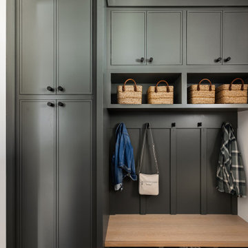
Explore this thoughtfully designed mudroom and laundry room sanctuary that is filled with both functionality and personality.
On the mudroom side, there is personalized organization for every member of the household. Thoughtfully integrated divided shoe shelves beneath a cozy boot bench, along with open storage perfectly sized for decorative baskets, and decorative coat hooks ensure every essential from seasonal accessories to everyday items (i.e. gloves, hats, scarves, shoes, jackets, etc.) has its designated place. Overhead, elegant closed storage conceals and organizes, maintaining a pristine aesthetic that endures.
On the laundry room side, experience the ultimate in ergonomic design with raised washer and dryers, seamlessly integrated for effortless access and reduced strain and bending. Below the machines, a locking roll-out shelf glides out smoothly creating a perfectly positioned platform to set a laundry basket at an easy-to-reach height for loading and unloading. All designed to transforming loading and unloading the washer and dryer into a seamless, comfortable task.
Design by Cedar Design Build, Minnesota. Architectural Design by Becky Watson of Niche Design.
Cabinetry and mudroom lockers featuring Dura Supreme Cabinetry’s Reese Inset skinny shaker door style in an Evergreen Fog painted finish with accents of Natural Cherry wood.
Request a FREE Dura Supreme Brochure Packet:
https://www.durasupreme.com/request-brochures/
Find a Dura Supreme Showroom near you today:
https://www.durasupreme.com/find-a-showroom/
Want to become a Dura Supreme Dealer? Go to:
https://www.durasupreme.com/become-a-dealer/
 TKS Design Group
Free ebook, Creating the Ideal Kitchen. DOWNLOAD NOW
One of my favorite things to work on is older homes with a bit of history because I find it an interesting challenge to marry the historical architectural features of a home with modern design elements that work well for my client’s current lifestyle.
This home was particularly fun because it was the second kitchen we had done for this family and was quite a departure from the style of the first kitchen.
The before shot of the kitchen shows a view from the family room. See the dropped ceiling? We were curious, was this just part of the design or was the dropped ceiling there to hide mechanicals? Well we soon found out that it was mostly decorative (yay!), and with the exception of a little bit of work to some plumbing from an upstairs bathroom and rerouting of the ventilation system within the original floor joists, we were in the clear, phew! The shot of the completed kitchen from roughly the same vantage point shows how much taller the ceilings are. It makes a huge difference in the feel of the space. Dark and gloomy turned fresh and light!
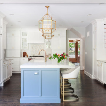
Another serious consideration was what do we do with the skinny transom window above the refrigerator. After much back and forth, we decided to eliminate it and do some open shelving instead. This ended up being one of the nicest areas in the room. I am calling it the “fun zone” because it houses all the barware, wine cubbies and a bar fridge — the perfect little buffet spot for entertaining. It is flanked on either side by pull out pantries that I’m sure will get a ton of use. Since the neighboring room has literally three walls of almost full height windows, the kitchen gets plenty of light.
The gold shelving brackets, large pendant fixtures over the island and the tile mural behind the range all pay subtle homage to the home’s prairie style architecture and bring a bit of sparkle to the room.
Even though the room is quite large, the work triangle is very tight with the large Subzero fridge, sink and range all nearby for easy maneuvering during meal prep. There is seating for four at the island, and work aisles are generous.
Designed by: Susan Klimala, CKD, CBD
Photography by: LOMA Studios
For more information on kitchen and bath design ideas go to: www.kitchenstudio-ge.com
 Thyme & Place Design LLC
When my client had to move from her company office to work at home, she set up in the dining room. Despite her best efforts, this was not the long-term solution she was looking for. My client realized she needed a dedicated space not on the main floor of the home. On one hand, having your office space right next to the kitchen is handy. On the other hand, it made separating work and home life was not that easy.
The house was a ranch. In essence, the basement would run entire length of the home. As we came down the steps, we entered a time capsule. The house was built in the 1950’s. The walls were covered with original knotty pine paneling. There was a wood burning fireplace and considering this was a basement, high ceilings. In addition, there was everything her family could not store at their own homes. As we wound though the space, I though “wow this has potential”, Eventually, after walking through the laundry room we came to a small nicely lit room. This would be the office.
My client looked at me and asked what I thought. Undoubtedly, I said, this can be a great workspace, but do you really want to walk through this basement and laundry to get here? Without reservation, my client said where do we start?
Once the design was in place, we started the renovation. The knotty pine paneling had to go. Specifically, to add some insulation and control the dampness and humidity. The laundry room wall was relocated to create a hallway to the office.
At the far end of the room, we designated a workout zone. Weights, mats, exercise bike and television are at the ready for morning or afternoon workouts. The space can be concealed by a folding screen for party time. Doors to an old closet under the stairs were relocated to the workout area for hidden storage. Now we had nice wall for a beautiful console and mirror for storage and serving during parties.
In order to add architectural details, we covered the old ugly support columns with simple recessed millwork panels. This detail created a visual division between the bar area and the seating area in front of the fireplace. The old red brick on the fireplace surround was replaced with stack stone. A mantle was made from reclaimed wood. Additional reclaimed wood floating shelves left and right of the fireplace provides decorative display while maintaining a rustic element balancing the copper end table and leather swivel rocker.
We found an amazing rug which tied all of the colors together further defining the gathering space. Russet and burnt orange became the accent color unifying each space. With a bit of whimsy, a rather unusual light fixture which looks like roots from a tree growing through the ceiling is a conversation piece.
The office space is quite and removed from the main part of the basement. There is a desk large enough for multiple screens, a small bookcase holding office supplies and a comfortable chair for conference calls. Because working from home requires many online meetings, we added a shiplap wall painted in Hale Navy to contrast with the orange fabric on the chair. We finished the décor with a painting from my client’s father. This is the background online visitors will see.
The last and best part of the renovation is the beautiful bar. My client is an avid collector of wine. She already had the EuroCave refrigerator, so I incorporated it into the design. The cabinets are painted Temptation Grey from Benjamin Moore. The counter tops are my favorite hard working quartzite Brown Fantasy. The backsplash is a combination of rustic wood and old tin ceiling like porcelain tiles. Together with the textures of the reclaimed wood and hide poofs balanced against the smooth finish of the cabinets, we created a comfortable luxury for relaxing.
There is ample storage for bottles, cans, glasses, and anything else you can think of for a great party. In addition to the wine storage, we incorporated a beverage refrigerator, an ice maker, and a sink. Floating shelves with integrated lighting illuminate the back bar. The raised height of the front bar provides the perfect wine tasting and paring spot. I especially love the pendant lights which look like wine glasses.
Finally, I selected carpet for the stairs and office. It is perfect for noise reduction. Meanwhile for the overall flooring, I specifically selected a high-performance vinyl plank floor. We often use this product as it is perfect to install on a concrete floor. It is soft to walk on, easy to clean and does not reduce the overall height of the space.
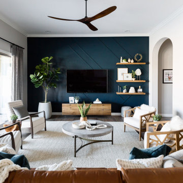
 Lace and Grace Interiors
Mid-sized transitional open concept brown floor, dark wood floor and wall paneling living room photo in Phoenix with blue walls, a wall-mounted tv and no fireplace
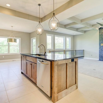
Sponsored
Fredericksburg, OH

High Point Cabinets
Columbus' Experienced Custom Cabinet Builder | 4x Best of Houzz Winner
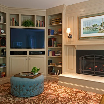
 Designline
This room was redesigned to accommodate the latest in audio/visual technology. The exposed brick fireplace was clad with wood paneling, sconces were added and the hearth covered with marble.
photo by Anne Gummerson
 Roomscapes Cabinetry and Design Center
Designed by Cameron Snyder, CKD and Julie Lyons.
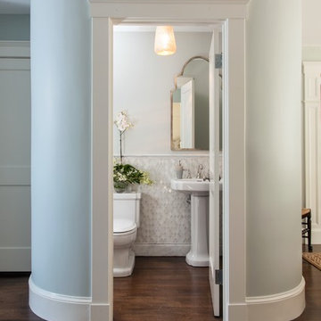
Removing the former wall between the kitchen and dining room to create an open floor plan meant the former powder room tucked in a corner needed to be relocated.
Cameron designed a 7' by 6' space framed with curved wall in the middle of the new space to locate the new powder room and it became an instant focal point perfectly located for guests and easily accessible from the kitchen, living and dining room areas.
Both the pedestal lavatory and one piece sanagloss toilet are from TOTO Guinevere collection. Faucet is from the Newport Brass-Bevelle series in Polished Nickel with lever handles.
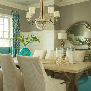
 O’Hara Interiors
Martha O'Hara Interiors, Interior Design | L. Cramer Builders + Remodelers, Builder | Troy Thies, Photography | Shannon Gale, Photo Styling
Please Note: All “related,” “similar,” and “sponsored” products tagged or listed by Houzz are not actual products pictured. They have not been approved by Martha O’Hara Interiors nor any of the professionals credited. For information about our work, please contact design@oharainteriors.com.
4