
Search results for "Hinting" in Home Design Ideas

 Flooret
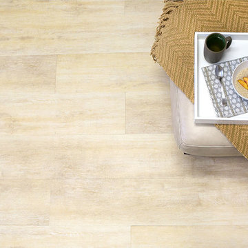
Beach house luxury. Stavern evokes the soft hues of Mediterranean living, with soft hints of peach and sand.
REDEFINING DURABILITY
The most important specification for determining the durability of vinyl flooring is the thickness of the wear-layer. The best wear-layers are made of thick, clear virgin PVC, which covers the paper print-film that gives the floor its unique appearance. Once the wear-layer wears through, the paper is damaged and the floor will need replacement.
Most vinyl floors come with a 8-12 mil wear-layer (0.2-3 mm). The top commercial specs in the industry are higher, at 20-22 mil (0.5 mm). A select few manufacturers offer a “super” commercial spec of 28 mil (0.7 mm).
For Modin, we decided to set a new standard: 40 mil (1.0 mm) of premium virgin PVC. This allows us to offer an industry-leading 20 year Commercial Warranty (Lifetime Residential), compared to nearly all other commercial vinyl floors’ 10 year Commercial Warranty.
Beyond our superior wear-layer, we also use a patented click mechanism for superior hold, and a ceramic-bead coating.
SIZE MATTERS
Wider and longer planks create a sense of space and luxury. Most vinyl floors come in 6” or 7” widths, and 36” or 48” lengths.
For Modin, we designed our planks to be 9” wide, and 60” long. This extra large size allows our gorgeous designs to be fully expressed.
DETAILS THAT COUNT
We made sure to get all the details right. Real texture, to create the feel of wire-brushed wood. Low sheen level, to ensure a natural look that wears well over time. 4-sided bevels, to more accurately emulate the look of real planks. When added together they help create the unique look that is Modin.
DESIGNS THAT INSPIRE
We spent nearly a year just focusing on our designs, to ensure they provide the right mix of color and depth. Focusing on timeless wire-brush and European Oak styles, as well as more contemporary modern washes, our collection offers truly beautiful design that is both functional and inspiring.
 Dream Kitchens
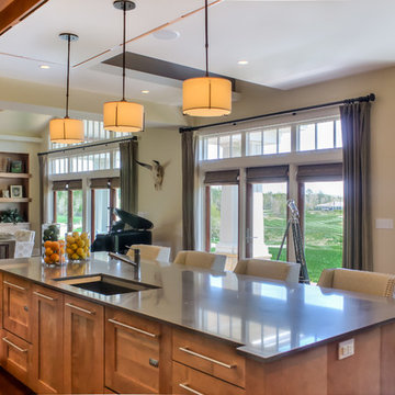
Imagine a lazy morning in this casually elegant kitchen, sipping your freshly brewed coffee as natural light pours through floor to ceiling windows. Then imagine being in this kitchen sipping your morning coffee and gazing out at the beautiful rolling landscape of one of New England’s prestigious golf clubs. Imagine . . .
The owner of this beautiful contemporary kitchen with its idyllic setting imagined ! And her kitchen designer captured her imagination and brought this inspired space to life in both style and function.
Columns of stainless steel are balanced by columns with the warmth of birch wood with just a hint of stain. On an adjacent wall one more wood column rises from floor to ceiling. A strong horizontal line of cabinetry seemingly intersects the vertical columns. While contemporary in design, the cabinetry in this kitchen found its beginnings with the Shakers and the designers of the Craftsman period. Increasing the size of the framing on the doors, accenting the cabinet shapes with square-edged trim and blocks of wood at varying depths, thinly slicing and randomly sizing the natural stone on the accent wall, and choosing oversized stainless steel handles definitively bring this kitchen forward in time. Recycled glass countertops in a soft, quiet color continue to help this kitchen live so harmoniously with its surroundings.
As the day unfolds and the lazy morning turns into ambitious meal preparation, it is clear that this kitchen is a chef’s delight. The stainless steel columns incorporate double ovens, a microwave and a steam oven. Two wood columns house a refrigerator and a freezer. The separate wood column reveals pantry storage, and a TV is hidden behind a lift-up door.
On the island with its clean, rectangular shape two dishwashers flank the sink. Imagine ! how much more pleasant the task of clean-up is when you overlook the family living space and vista beyond.
In the cook center, a complement of drawers provides excellent storage for pots and pans, utensils, spices and herbs around the 5-burner cooktop. A powerful vent with a rear exhaust maintains the horizontal design of the space. And the freshly-brewed coffee in the morning ? It comes from a built-in coffee maker that’s just around the corner from the refrigerator. Along with a wine refrigerator, it creates a beverage and serving center between the kitchen and the dining room.
The homeowner envisioned a kitchen that is as beautiful as its surroundings. Her kitchen designer wanted her kitchen to be as functional as it is beautiful. Both agree that this kitchen lives up to their expectations!
Find the right local pro for your project
 Nardini Custom
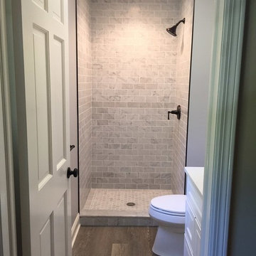
Example of a mid-sized transitional 3/4 gray tile and stone tile porcelain tile alcove shower design in New York with white cabinets, a one-piece toilet, gray walls, recessed-panel cabinets and quartz countertops
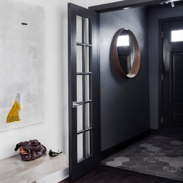
 catlin stothers design
Well situated in Mont Royal, this split-level home had many positives apart from its dated interior, and layout of many small and inefficient rooms. This was all at odds with the owners’ lifestyle and aesthetic.
The client had architectural plans designed for a third floor addition that were to include a master bedroom and ensuite bathroom. The desired look for the entire house influenced all aspects of construction. Apart from the removal most walls on the main floor, everything was stripped back to the most simple and pure of finishing materials.
The existing floors were refinished in a smoked grey matte palette and offset the rich warm walnut accents in the kitchen and soft white walls.
With an abundance of white walls throughout, feature walls were essential in both the master bedroom and ensuite. The deep charcoal wall in the bedroom provides dramatic contrast to the teak headboard and hammered silver light fixture. The ensuite’s feature wall is made of pewter ceramic tiles that add texture and elegance to this simple space.
Materials and furnishings throughout were selected for their simplicity and form.
Photo : Drew Hadley
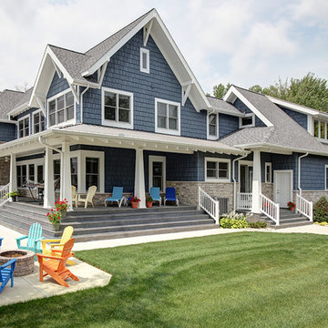
 Helman Sechrist Stoelting Architecture
Inspiration for a coastal blue two-story concrete fiberboard gable roof remodel in Chicago
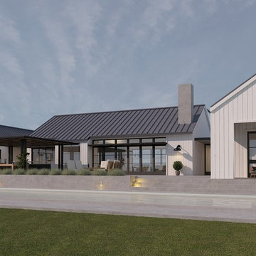
 Nick Lee Architecture
Example of a country white one-story wood exterior home design in San Francisco with a metal roof
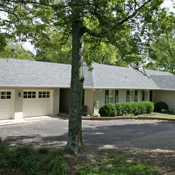
 Trace Ventures
Photography by Tom Gatlin
Inspiration for a 1950s gray one-story brick exterior home remodel in Nashville with a hip roof
Inspiration for a 1950s gray one-story brick exterior home remodel in Nashville with a hip roof

 Noz Design
Colin Price Photography
Trendy master light wood floor bedroom photo in San Francisco with blue walls
Trendy master light wood floor bedroom photo in San Francisco with blue walls
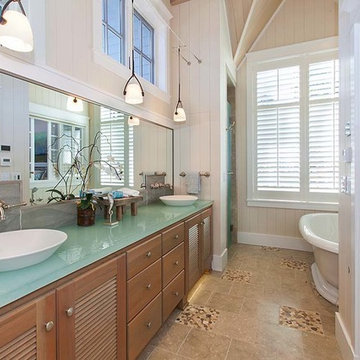
 Signature Design & Cabinetry LLC
Light, bright, spa-like bath with cherry cabinets done with an 'aged cedar' finish. Free-standing tub invites relaxation and adds glamor to this master bath retreat.
Stephen Armstrong, Cascade Pro Media
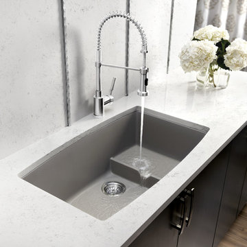
 Studio41 Home Design Showroom
Color your kitchen beautiful with SILGRANIT® sinks. | Available in a palette of eight on-trend colors designed to coordinate with a range of warm and cool toned countertops, BLANCO SILGRANIT® sinks offer endless possibilities for your kitchen. Our newest and most elegant shade, Cinder, is a striking shade of dark grey with a natural, stone-like appeal mixed with delicate hints of brown that give it an inviting warmth. A timeless modern color, positioned somewhere between Anthracite and Metallic Grey, Cinder is a shade that is reminiscent of dark natural stones such as slate. | Available at ShopStudio41.com

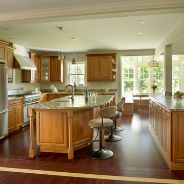
 Cummings Architecture + Interiors
An open house lot is like a blank canvas. When Mathew first visited the wooded lot where this home would ultimately be built, the landscape spoke to him clearly. Standing with the homeowner, it took Mathew only twenty minutes to produce an initial color sketch that captured his vision - a long, circular driveway and a home with many gables set at a picturesque angle that complemented the contours of the lot perfectly.
The interior was designed using a modern mix of architectural styles – a dash of craftsman combined with some colonial elements – to create a sophisticated yet truly comfortable home that would never look or feel ostentatious.
Features include a bright, open study off the entry. This office space is flanked on two sides by walls of expansive windows and provides a view out to the driveway and the woods beyond. There is also a contemporary, two-story great room with a see-through fireplace. This space is the heart of the home and provides a gracious transition, through two sets of double French doors, to a four-season porch located in the landscape of the rear yard.
This home offers the best in modern amenities and design sensibilities while still maintaining an approachable sense of warmth and ease.
Photo by Eric Roth
 Kitchen Design Concepts
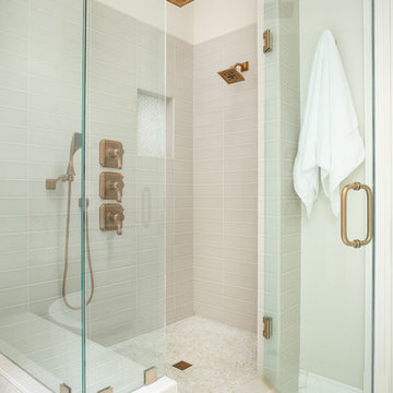
An updated master bath with hints of traditional styling really helped create the perfect oasis for these empty nesters. A few things on the wish list: a large mirror, and seated vanity space, a new freestanding tub, and a more open shower look with lots of options! Take a look at all of the fun materials that brought this space to life.
Cabinetry: Ultracraft, Charlotte door, Maple in Arctic White paint
Hardware: Emtek Windsor Crystal Knob, French Antique
Counters and backsplash: Cambria quartz, Highgate, 3cm with demi-bullnose edge
Sinks: Decolav Andra Oval Semi-Recessed Vitreous China Lavatory in white
Faucets, Plumbing fixtures and accessories: Brizo Virage collection in Brilliance Brushed Bronze
Tub: Jason Hydrotherapy, Forma collection AD553PX soaking tub
Tile floor: main floor is Marble Systems Calacatta Gold honed 12x12 with matching formed base molding; tiled rug is the Calacatta Gold Modern Polished basket weave with a border made of the Allure light 2.75x5.5 pieces
Shower/Tub tile: main wall tile is Arizona Tile H-Line Pumice Glossy 4x16 ceramic tile; inserts are Marble Systems Show White polished 1x2 herringbone with the Calacatta Gold 5/8x5/8 staggered mosaic on the shower floor
Mirror: custom made by Alamo Glass with a Universal Arquati frame
 Schmidt Custom Homes
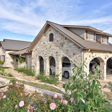
Photo by Casey Fry A mixture of roses and native color add a hint of romance to the elevation of this home. Just what the homeowner was looking for. These gardens are just outside the double limestone carriage house.

 Avalon Architectural, Inc.
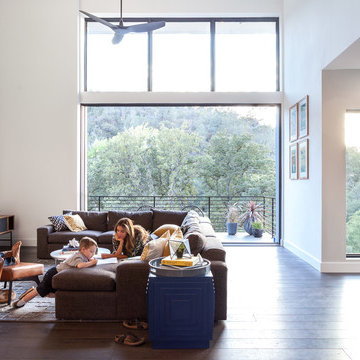
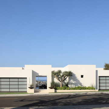
The exterior of this contemporary home protects the resident's privacy, and just hints at the stunning views seen once inside.
Photo by Erhard Pfeiffer
 Leslie Williams Interior Design
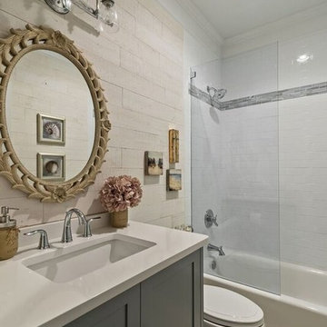
This client wanted a bathroom that would feel like an escape to her favorite coastal oasis. She supplied the mirror which we used for inspiration along with her artwork of coastal scenery and shells. We started with clean white subway tile with accents of sea glass. The blue custom made vanity hue came from the sea glass tile and we installed a white quartz top for simplicity. We used rustic whitewashed wood for the walls in a slightly creamier hue so the bathroom didn't come across as sterile and seemed a bit aged over time. The flooring material has hints of gray and colors from both the wood and subway tile to pull it all together. You do feel as though you just stepped into a beach cottage!
Photo by: Charlotte Real Estate Photograpy- Julie Legge
 Twelve Stones Designs, LLC
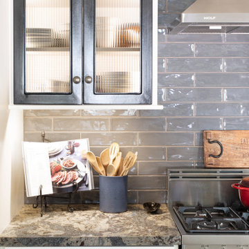
The owners of this kitchen had spent the money to upgrade the finishes in their kitchen upon building the home 12 years ago, but after living in the space for several years they realized how nonfunctional the layout really was. The (then) two preschool aged children had grown into busy, hungry teenagers with many friends who also liked to hang out at the house. So the family needed a more functional kitchen with better traffic flow, space for daily activities revolving around the kitchen at different times of day, and a kitchen that could accommodate cooking for and serving large groups. Furthermore, the dark, traditional finishes no longer reflected the homeowners’ style. They requested a brighter, more relaxed, coastal style that reflected their love of the seaside cities they like to visit.
Originally, the kitchen was U-shaped with a narrow island in the middle. The island created narrow aisles that bottle-necked at the dishwasher, refrigerator, and cooktop areas. There was a pass-through from the foyer into the kitchen, but the owners never liked that the pass-through was also located so close to the powder room. The awkward proximity was unappealing and made guests feel uncomfortable.
The kitchen’s storage was made up of lots of narrow cabinets, apothecary drawers, clipped corner units, and very few drawers. It lacked useful storage for the larger items the family used on a daily basis. And the kitchen’s only pantry was small closet that had only builder-grade, narrow shelving with no illumination to be able to see the contents inside.
Overall, the kitchen’s lighting plan was poorly executed. Only six recessed cans illuminated the entire kitchen and nook areas. The under cabinet lighting was not evenly distributed either. In fact, the builder had mis-placed the under cabinet lighting around the decorative pilasters which made for choppy, dark cubbies. Further, the builder didn’t include any lighting over the sink or the bar area, which meant whoever was doing the dishes was always in their own shadow. That, coupled with the steep overhang of the game room above made the bar area feel like a dim, cavernous space that wasn’t inviting or task oriented. The kitchen looked out into the main living space, but the raised bar and a narrow wall (which held the only large cabinet in the kitchen) created more of a barrier than a relationship to the living room or breakfast nook. In fact, one couldn’t even see the breakfast nook from the cooktop or sink areas due to its orientation. The raised bar top was too narrow to comfortably sit to either dine at or chat from due to the lack of knee space. The the homeowners confided that the kitchen felt more like a dark, dirty prison than place where the family, or their guests, wanted to gather and commune.
The clients' needs and desires were:
➢ to create a kitchen that would be a space the family loved to be in; to relate to the adjacent spaces all around, and to have better flow for entertaining large groups
➢ to remove the walls between the breakfast nook and living area and to be able to utilize the natural light from the windows in both those areas
➢ to incorporate a functional chopping block for prepping fresh food for home cooked meals, an island with a large sink and drain board, 2 pull out trash cans, and seating for at least the 2 teens to eat or do homework
➢ to design a kitchen and breakfast nook with an airy, coastal, relaxed vibe that blended with the rest of the house's coastal theme
➢ to integrate a layered lighting plan which would include ample general illumination, specific task lighting, decorative lighting, and lots of illuminated storage
➢ to design a kitchen with not only more storage for all the husband’s kitchen gadgets and collection of oils and spices, but smart storage, including a coffee/breakfast bar and a place to store and conceal the toaster oven and microwave
➢ to find a way to utilize the large open space between the kitchen, pantry area, and breakfast nook
Twelve Stones Designs achieved the owner's goals by:
➢ removing the walls between the kitchen and living room to allow the natural light to filter in from the adjacent rooms and to create a connection between the kitchen, nook, and living spaces for a sense of unity and communion
➢ removing the existing pantry and designing 3 large pantry style cabinets with LED tape lights and rollout drawers to house lots of kitchen appliances, gadgets, and tons of groceries. We also took the cabinets all the way up to the 9’ ceiling for additional storage for seasonal items and bulk storage.
➢ designing 2 islands - 1 with a gorgeous black walnut chopping block that houses a drawer for chopping and carving knives and a custom double pull out trash unit for point of use utilization - and 1 that houses the dishwasher, a large Blanco Gourmet sink with integrated drain board, woven baskets for fresh root vegetables and kitchen towels, plenty of drawer storage for kitchen items, and bar seating for up to 4 diners.
➢ closing off the space between the kitchen and the powder room to create a beautiful new private alcove for the powder room as well as adding some decorative storage. This also gave us space to include more tall storage near the new range for precision placement of the husband’s extensive oil and spice collection as well as a location for a combo-steam oven the wife wanted for baking and cooking healthy meals.
The project is enhanced functionally by:
➢ incorporated USB and standard receptacles for the kids’ laptops and phone charging in the large island
➢ designing the small island to include additional open shelving for items used on a daily basis such as a variety of bowls, plates, and colanders. This set up also works well for the husband who prefers to “plate” his dinners in restaurant-style fashion before presenting them to the table.
➢ the integration of specific storage units, such as double stacked cutlery drawers, a custom spice pull-out, a Kuerig coffee and tea pod drawer, and custom double stacked utensil drawers
➢ moving the refrigerator to the old oven location - this eliminated the bottle neck as well as created a better relationship to the eating table. It also utilizes the floor space between the pantry, nook, and kitchen
➢ creating a banquet style breakfast nook - this banquette seating not only doubles the amount of seating for large gatherings but it better utilizes the odd space between the kitchen and the previous nook area. It also helps to create a distinct pathway from the mudroom room through the pantry area, kitchen, nook, and living room.
➢ the coffee/breakfast bar area which includes the perfect location for the concealed microwave and toaster oven, convenient storage for the coffee pods and tea accoutrements. Roll-out drawers below also house the smoothie maker, hot water kettle, and a plethora of smoothie-making ingredients such as protein powders, smoothie additives, etc. Furthermore, the drawers below the Keurig house measuring utensil, cutlery, baking supplies and tupperware storage.
➢ incorporating lots of wide drawers and pullouts to accommodate large cookware.
➢ utilizing as much vertical space as possible by building storage to the ceiling which accommodates the family’s abundant amount of serving platters, baking sheets, bakeware, casserole dishes, and additional cutting boards.
The project is enhanced aesthetically by:
➢ new 5-piece Versailles pattern porcelain tile that now seamlessly joins the entire down stairs area together creating a bright, cohesiveness feeling instead of choppy separated spaces - it also adds a coastal feeling
➢ designing a cabinet to conceal the microwave and toaster oven
➢ the coastal influenced light fixtures over the nook table and island
➢ the sandy colors of the Langdon Cambria countertops. The swirling pattern and sparkling quartz pieces remind the homeowner of black-and-tan sandy beaches
➢ the striped banquet seating whose creamy white background and blue-green stripes were the inspiration for the cabinet and wall colors.
➢ All the interior doors were painted black to coordinate with the blacks and grays in the backsplash tile and countertop. This also adds a hint of tailored formality to an otherwise casual space.
➢ the use of WAC's Oculux small aperture LED units for the overhead lighting complimented with Diode LED strips for task lighting under the cabinets and inside the pantry and glass wall cabinets. All of the lighting applications are on separate dimmer switches.
Innovative uses of materials or construction methods by Realty Restoration LLC:
➢ Each 1-1/2” x 3” block of reclaimed end-grain black walnut that makes up the center island chopping block was hand milled and built in the shop. It was designed to look substantial and proportional to the surrounding elements, executed by creating the 4 inch tall top with a solid wood chamfered edge band.
➢ The metal doors on either side of the vent hood were also custom designed for this project and built in the Realty Restoration LLC shop. They are made 1x2, 11-gauge mild steel with ribbed glass. Weighing 60 lbs a piece, heavy duty cabinet hinges were added to support the weight of the door and keep them from sagging.
➢ Under-cabinet receptacles were added along the range wall in order to have a clean, uninterrupted backsplash.
Design obstacles to overcome:
➢ Because we were removing the demising walls between the kitchen and living room, we had to find a way to plumb and vent the new island. We did this by tunneling through the slab (the slab had post tension cables which prevented us from just trenching) to run a new wet vent through a nearby structural wall. We pulled the existing hot and cold lines between upper floor joists and ran them down the structural wall as well and up through a conduit in the tunnel.
➢ Since we were converting from wall overs to a gas range it allowed us to utilize the 220 feed for the wall ovens to provide a new sub panel for all the new kitchen circuits
➢ Due to framing deficiencies inherited from the original build there was a 1-1/2” differential in the floor-to-ceiling height over a 20 foot span; by utilizing the process of cutting and furring coupled with the crown moulding details on the cabinet elevations we were able to mask the problem and provide seamless transitions between the cabinet components.
Evidence of superior craftsmanship:
➢ uniquely designed, one-of-a-kind metal “X” end panels on the large island. The end panels were custom made in the Realty Restoration LLC shop and fitted to the exact dimensions of the island. The welding seams are completely indistinguishable - the posts look like they are cut from a single sheet of metal
➢ square metal posts on the small island were also custom made and designed to compliment and carry through the metal element s throughout the kitchen
➢ the beautiful, oversized end panels on the pantry cabinets which give the breakfast nook a tailored look
➢ integrating a large format 5 piece Versailles tile pattern to seamlessly flow from the existing spaces into the new kitchen space
➢ By constructing a custom cabinet that jogged around a corner we could not remodel (housing the entry way coat closet) we were able to camouflage the adjacent wall offset within the upper and lower cabinets. By designing around the existing jog in the structural walls we accomplished a few things: we were able to find the space to house, and hide, the microwave and toaster oven yet still have a clean cohesive appearance from the kitchen side. Additionally, the owners were able to keep their much needed coat closet and we didn’t have to increase the budget with unnecessary structural work.
 Jessica Cain
Photo: Jessica Cain © 2017 Houzz
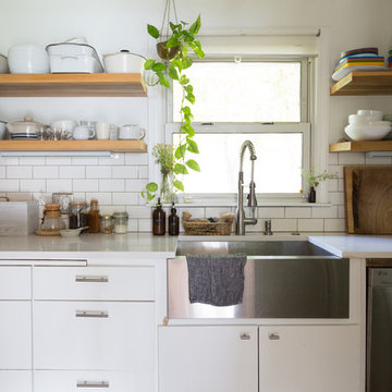
Inspiration for a small eclectic single-wall enclosed kitchen remodel in Kansas City with open cabinets, white backsplash, subway tile backsplash, stainless steel appliances and an island
Inspiration for a small eclectic single-wall enclosed kitchen remodel in Kansas City with open cabinets, white backsplash, subway tile backsplash, stainless steel appliances and an island
109