
Search results for "Honing problem solving" in Home Design Ideas
 Studio Dearborn
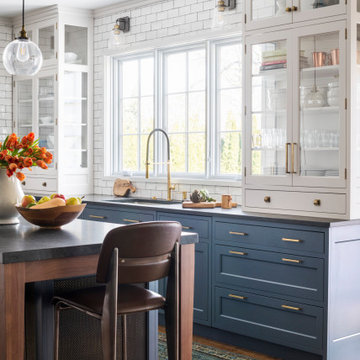
Designer Sarah Robertson of Studio Dearborn helped a neighbor and friend to update a “builder grade” kitchen into a personal, family space that feels luxurious and inviting.
The homeowner wanted to solve a number of storage and flow problems in the kitchen, including a wasted area dedicated to a desk, too-little pantry storage, and her wish for a kitchen bar. The all white builder kitchen lacked character, and the client wanted to inject color, texture and personality into the kitchen while keeping it classic.
 Decks by Kiefer LLC
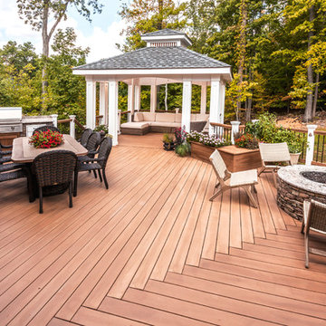
Solving the problem of a wet backyard is accomplished by including all the entertaining needs in the deck. (Photo by Frank Gensheimer.)
Example of a large transitional backyard deck design in New York with no cover and a fire pit
Example of a large transitional backyard deck design in New York with no cover and a fire pit
 Studio Dearborn
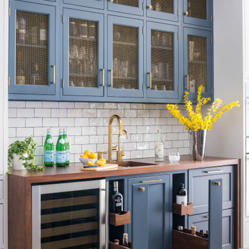
Designer Sarah Robertson of Studio Dearborn helped a neighbor and friend to update a “builder grade” kitchen into a personal, family space that feels luxurious and inviting.
The homeowner wanted to solve a number of storage and flow problems in the kitchen, including a wasted area dedicated to a desk, too-little pantry storage, and her wish for a kitchen bar. The all white builder kitchen lacked character, and the client wanted to inject color, texture and personality into the kitchen while keeping it classic.
Find the right local pro for your project
 Studio Dearborn
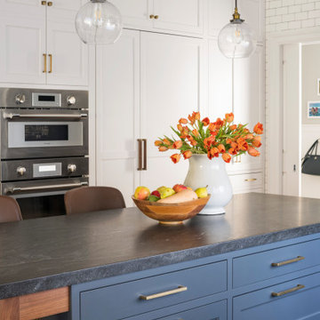
Designer Sarah Robertson of Studio Dearborn helped a neighbor and friend to update a “builder grade” kitchen into a personal, family space that feels luxurious and inviting.
The homeowner wanted to solve a number of storage and flow problems in the kitchen, including a wasted area dedicated to a desk, too-little pantry storage, and her wish for a kitchen bar. The all white builder kitchen lacked character, and the client wanted to inject color, texture and personality into the kitchen while keeping it classic.
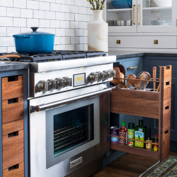 Studio Dearborn
Designer Sarah Robertson of Studio Dearborn helped a neighbor and friend to update a “builder grade” kitchen into a personal, family space that feels luxurious and inviting.
The homeowner wanted to solve a number of storage and flow problems in the kitchen, including a wasted area dedicated to a desk, too-little pantry storage, and her wish for a kitchen bar. The all white builder kitchen lacked character, and the client wanted to inject color, texture and personality into the kitchen while keeping it classic.
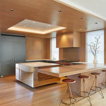
 Natural Stone Institute
Formerly the workshop of mid-century artisans, this manufacturing building in NYC's SoHo neighborhood was transformed into an 11,000 sf townhouse. The home features a full level spa, two-story living room, six bedrooms, eleven bathrooms, and rooftop addition with pool.
Neighboring buildings were underpinned to lower the cellar to accommodate the spa which features dry stacked stone walls that blend into the swimming pool and hot tub and are featured throughout the entire level. The architect’s vision was to have visual recognition that the space was below ground. Thinking about the striations of the earth beneath its surface, he was inspired by the Therme Baths and Spa in Zurich where all the walls are clad with narrow strips of Vals quartzite. After seeing a rendering, the stone supplier advised that only certain stones could survive constant submersion in pool water and the stone should not have the cleft face he had originally imagined due to bacteria issues. Honed, Super Grey granite with white veining was used – the slabs cut into long 3” wide strips installed at random lengths to accentuate the concept of layering as found in the Earth.
The kitchen was designed to feel more like a furnished room to integrate with the family room. The architect addressed this through materials and the design of the over-sized island. The countertop is the only veined stone in the kitchen – a beautiful single slab of Super White marble. The island is clad in mirror-polished stainless steel, transforming it into a beautiful piece of furniture that blends into the space.
A two-story living room with 22' ceilings created a problem of comfortable scale. The key was the fireplace – the strongest vertical element in the room. By using horizontal vein-cut slabs of light-colored Driftwood marble, the scale of the space instantly became more intimate.
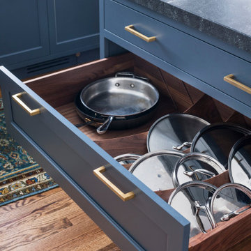 Studio Dearborn
Designer Sarah Robertson of Studio Dearborn helped a neighbor and friend to update a “builder grade” kitchen into a personal, family space that feels luxurious and inviting.
The homeowner wanted to solve a number of storage and flow problems in the kitchen, including a wasted area dedicated to a desk, too-little pantry storage, and her wish for a kitchen bar. The all white builder kitchen lacked character, and the client wanted to inject color, texture and personality into the kitchen while keeping it classic.

 Dream Kitchens
CONTACT
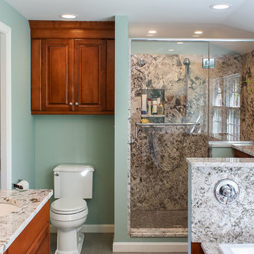
These home owners initially contacted their Designer to identify the reason that the floor in their upstairs bedroom suffered from a noticeable slant. The floor problem actually impacted a small bathroom and adjoining study also.
Early on, the decision was made to re-design the footprint for the 3 rooms in conjunction with repairing the uneven floor. The approach was to gut all three spaces of walls and floors and start from scratch. The new spaces were designed with the clients needs for accessibility in mind.
DESIGN
The design effort included identifying the products to be used throughout the spaces. This included everything from the flooring to the wall paint. Kohler plumbing fixtures and Adelphi cabinetry were decided on first. A radiant heat grid was included for the bathroom floor. Lighting, paint and tile soon followed. Wood flooring was installed throughout the adjoining spaces.
The master bedroom was redesigned to allow for entry from the study or the master bath via pocket doors. The study was given an access to the master bath also. The hardwood flooring ties the bedroom and study together and gives each room a very spacious feel. The original master bedroom was changed to incorporate a large walk-in closet that features custom storage throughout. The study that also doubles as the IT center for the home was updated with custom book cases and cabinetry from Adelphi Cabinets.
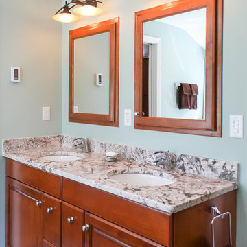
When discussing the reapportioning of the entire space for the individual rooms the bathroom was given priority. The previous small bathroom did not include a window for natural light. The new design corrected that in a big way by incorporating an existing bedroom window into the new space. The decision was made early on to allow for the inclusion of a large shower with full granite walls and custom plate glass surround. The shower system includes both fixed and hand held shower heads. A thermostatic control system was included to eliminate scalding. A large bench seat of matching granite allows for relaxing while getting squeaky clean. A separate air massage tub from Kohler centered under the new windows allows for a relaxed moment while being caressed by all those tiny bubbles. His and her side by side vanity sinks allows for efficient use of the space. The Caxton sinks and coordinated toilet were selected to match the color of the tub and do so beautifully!
CONSTRUCTION
We started the project not knowing what we were going to find. The slanting floor upstairs was not evident in the ceiling of the first floor
Once the demolition had been completed it was evident that the floor joists were at the heart of the problem. The home had been framed with floor joists that had been strung together to increase their length. Over time and with the house settling, the strung together joists started to droop from their connection point. This was concealed on the first floor by a large HVAC duct running through the garage. This was corrected by the addition of two laminated beams in the ceiling of the first floor (luckily in the garage) that re-supported the offending joists.
THE END
The project was a huge success in terms of problem solving and designing with budget and time frame in mind. The overall impact of the new space is impressive both visually and from a practicality point of view. The new master suite with upscale bathroom and study adds significant value to the home and the home owners quality of life!
 mcbrowne85
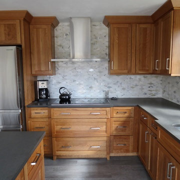
Full remodel of a 40 year old kitchen. The goal was to have a beautiful, functional space for an avid cook in a style that would stand the test of time. The natural cherry cabinetry blends with the natural woodwork in the home. Honed quartz countertops are beautiful and durable. The marble mosaic backsplash is the crown jewel which pulls it all together.
 Dream Kitchens
CONTACT
These home owners initially contacted their Designer to identify the reason that the floor in their upstairs bedroom suffered from a noticeable slant. The floor problem actually impacted a small bathroom and adjoining study also.
Early on, the decision was made to re-design the footprint for the 3 rooms in conjunction with repairing the uneven floor. The approach was to gut all three spaces of walls and floors and start from scratch. The new spaces were designed with the clients needs for accessibility in mind.
DESIGN
The design effort included identifying the products to be used throughout the spaces. This included everything from the flooring to the wall paint. Kohler plumbing fixtures and Adelphi cabinetry were decided on first. A radiant heat grid was included for the bathroom floor. Lighting, paint and tile soon followed. Wood flooring was installed throughout the adjoining spaces.
The master bedroom was redesigned to allow for entry from the study or the master bath via pocket doors. The study was given an access to the master bath also. The hardwood flooring ties the bedroom and study together and gives each room a very spacious feel. The original master bedroom was changed to incorporate a large walk-in closet that features custom storage throughout. The study that also doubles as the IT center for the home was updated with custom book cases and cabinetry from Adelphi Cabinets.
When discussing the reapportioning of the entire space for the individual rooms the bathroom was given priority. The previous small bathroom did not include a window for natural light. The new design corrected that in a big way by incorporating an existing bedroom window into the new space. The decision was made early on to allow for the inclusion of a large shower with full granite walls and custom plate glass surround. The shower system includes both fixed and hand held shower heads. A thermostatic control system was included to eliminate scalding. A large bench seat of matching granite allows for relaxing while getting squeaky clean. A separate air massage tub from Kohler centered under the new windows allows for a relaxed moment while being caressed by all those tiny bubbles. His and her side by side vanity sinks allows for efficient use of the space. The Caxton sinks and coordinated toilet were selected to match the color of the tub and do so beautifully!
CONSTRUCTION
We started the project not knowing what we were going to find. The slanting floor upstairs was not evident in the ceiling of the first floor
Once the demolition had been completed it was evident that the floor joists were at the heart of the problem. The home had been framed with floor joists that had been strung together to increase their length. Over time and with the house settling, the strung together joists started to droop from their connection point. This was concealed on the first floor by a large HVAC duct running through the garage. This was corrected by the addition of two laminated beams in the ceiling of the first floor (luckily in the garage) that re-supported the offending joists.
THE END
The project was a huge success in terms of problem solving and designing with budget and time frame in mind. The overall impact of the new space is impressive both visually and from a practicality point of view. The new master suite with upscale bathroom and study adds significant value to the home and the home owners quality of life!
 Natural Stone Institute
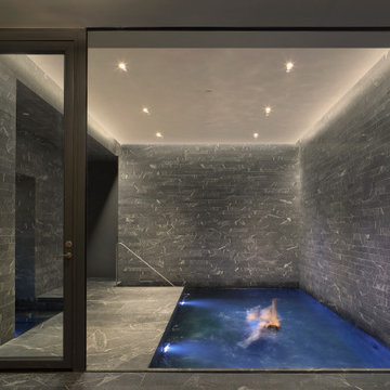
Formerly the workshop of mid-century artisans, this manufacturing building in NYC's SoHo neighborhood was transformed into an 11,000 sf townhouse. The home features a full level spa, two-story living room, six bedrooms, eleven bathrooms, and rooftop addition with pool.
Neighboring buildings were underpinned to lower the cellar to accommodate the spa which features dry stacked stone walls that blend into the swimming pool and hot tub and are featured throughout the entire level. The architect’s vision was to have visual recognition that the space was below ground. Thinking about the striations of the earth beneath its surface, he was inspired by the Therme Baths and Spa in Zurich where all the walls are clad with narrow strips of Vals quartzite. After seeing a rendering, the stone supplier advised that only certain stones could survive constant submersion in pool water and the stone should not have the cleft face he had originally imagined due to bacteria issues. Honed, Super Grey granite with white veining was used – the slabs cut into long 3” wide strips installed at random lengths to accentuate the concept of layering as found in the Earth.
The kitchen was designed to feel more like a furnished room to integrate with the family room. The architect addressed this through materials and the design of the over-sized island. The countertop is the only veined stone in the kitchen – a beautiful single slab of Super White marble. The island is clad in mirror-polished stainless steel, transforming it into a beautiful piece of furniture that blends into the space.
A two-story living room with 22' ceilings created a problem of comfortable scale. The key was the fireplace – the strongest vertical element in the room. By using horizontal vein-cut slabs of light-colored Driftwood marble, the scale of the space instantly became more intimate.
 KURV Architecture DPC (Alex Hughes Architects)
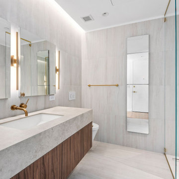
Located in the heart of Manhattan’s Lower East Side, the building was erected on a shallow commercial lot between two 120 year old masonry buildings and a new residential rental building. 330 Grand Street is a mix of 725 SF 1BRs and 1050 SF 2BR apartments. It also contains a 1100 SF two story duplex as well as private and public rooftop space, large private balconies for most units and two large private terraces for the ground floor units.
330 Grand Street was originally designed and approved at the NYC DOB as a prefabricated modular building. During the pandemic, as shipping costs skyrocketed putting the project at risk, we suggested redesigning the building as a reinforced cast-in-place concrete structure. Concrete was readily available and prices had not been affected by the demand increase that many other materials suffered in the pandemic. We took this opportunity to raise floor to ceiling heights, enlarge high performance windows and redistribute the buildings MEPFS and Structural Systems to create very open floor plans.
The challenge was to create a luxurious sensorial living experience with very limited means. In a city with very high construction costs, low cost residential buildings in the area are usually devoid of good quality, design and character. Our approach was to aim high for the end user, prioritizing natural light, open space with long visual perspectives, high ceilings and as always, rejecting the use of predefined building templates.
Our biggest challenge was to ensure that the small spaces feel as clean cut, large and bright as possible. Several unique design decisions were made to ensure low cost and high quality;
Floor plans were laid out so that spaces were wide open and free of clutter from mechanical or structural interruptions. Therefore all infrastructure was placed in lateral demising walls, which in turn act as the unit’s storage and kitchen. The apartments feel wide open, are super quiet and have more storage space than any other comparable apartment in the city.
To solve the problem of the site’s shallow commercial lot which is typically prone to dark interior spaces we focused our attention on the building’s envelope. Instead of the usual small punched window openings, oversized high performance windows were designed to ensure that light penetrated as far as possible into the units. In the smaller 1BR units, the full 50’ depth of the lot is perceived by partitioning spaces with sliding pocket doors that can be retracted to allow deep visual perspectives, making the sight lines in the space feel longer, larger, more ample than normal. In addition to the full height glazing, each unit above the 2nd floor receives a 7 foot covered balcony, adding 120 to 240 sf to each apartment, something unusual in New York City buildings. The space is large enough for a full size dining table, when the weather permits being outside.
We also worked hard to ensure modularity. For example, all kitchen units are all identical throughout the building. The idea of modularity and the economy of the repetitive unit is exercised to the maximum through the building.
Hardware, appliances, flooring, wall coverings and material finishes are all carefully selected to feel bespoke, high quality and unique.
It was important to KURV that the result of this work manifest into something that would deeply connect with the end user and sustain relationships with the consumers of this space.
All images by KURV Architecture ©
 Dream Kitchens
CONTACT
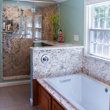
These home owners initially contacted their Designer to identify the reason that the floor in their upstairs bedroom suffered from a noticeable slant. The floor problem actually impacted a small bathroom and adjoining study also.
Early on, the decision was made to re-design the footprint for the 3 rooms in conjunction with repairing the uneven floor. The approach was to gut all three spaces of walls and floors and start from scratch. The new spaces were designed with the clients needs for accessibility in mind.
DESIGN
The design effort included identifying the products to be used throughout the spaces. This included everything from the flooring to the wall paint. Kohler plumbing fixtures and Adelphi cabinetry were decided on first. A radiant heat grid was included for the bathroom floor. Lighting, paint and tile soon followed. Wood flooring was installed throughout the adjoining spaces.
The master bedroom was redesigned to allow for entry from the study or the master bath via pocket doors. The study was given an access to the master bath also. The hardwood flooring ties the bedroom and study together and gives each room a very spacious feel. The original master bedroom was changed to incorporate a large walk-in closet that features custom storage throughout. The study that also doubles as the IT center for the home was updated with custom book cases and cabinetry from Adelphi Cabinets.
When discussing the reapportioning of the entire space for the individual rooms the bathroom was given priority. The previous small bathroom did not include a window for natural light. The new design corrected that in a big way by incorporating an existing bedroom window into the new space. The decision was made early on to allow for the inclusion of a large shower with full granite walls and custom plate glass surround. The shower system includes both fixed and hand held shower heads. A thermostatic control system was included to eliminate scalding. A large bench seat of matching granite allows for relaxing while getting squeaky clean. A separate air massage tub from Kohler centered under the new windows allows for a relaxed moment while being caressed by all those tiny bubbles. His and her side by side vanity sinks allows for efficient use of the space. The Caxton sinks and coordinated toilet were selected to match the color of the tub and do so beautifully!
CONSTRUCTION
We started the project not knowing what we were going to find. The slanting floor upstairs was not evident in the ceiling of the first floor
Once the demolition had been completed it was evident that the floor joists were at the heart of the problem. The home had been framed with floor joists that had been strung together to increase their length. Over time and with the house settling, the strung together joists started to droop from their connection point. This was concealed on the first floor by a large HVAC duct running through the garage. This was corrected by the addition of two laminated beams in the ceiling of the first floor (luckily in the garage) that re-supported the offending joists.
THE END
The project was a huge success in terms of problem solving and designing with budget and time frame in mind. The overall impact of the new space is impressive both visually and from a practicality point of view. The new master suite with upscale bathroom and study adds significant value to the home and the home owners quality of life!

 Anthony J. Vallée
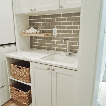
The client was excited to purchase a home in the beautiful resort of Sandestin, but was not pleased with the dark interiors, heavy mouldings, tile floors, dated fixtures and heavy feel of the interior of the home. We solved their problems by completely renovating the interiors. Ceilings were raised, floors were replaced, cabinetry and fixtures were replaced and a problem area in the living room was solved. They now have the open, clean, airy beach home of their dreams and I couldn't be more pleased with how this home turned out for them.
anthony vallee
 Studio Dearborn
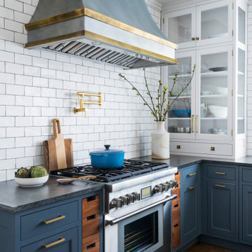
Designer Sarah Robertson of Studio Dearborn helped a neighbor and friend to update a “builder grade” kitchen into a personal, family space that feels luxurious and inviting.
The homeowner wanted to solve a number of storage and flow problems in the kitchen, including a wasted area dedicated to a desk, too-little pantry storage, and her wish for a kitchen bar. The all white builder kitchen lacked character, and the client wanted to inject color, texture and personality into the kitchen while keeping it classic.
 O’Hara Interiors
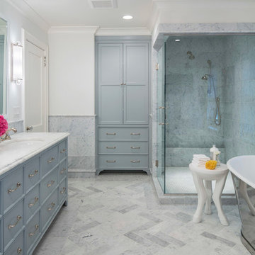
Martha O'Hara Interiors, Interior Design & Photo Styling | John Kraemer & Sons, Remodel | Troy Thies, Photography
Please Note: All “related,” “similar,” and “sponsored” products tagged or listed by Houzz are not actual products pictured. They have not been approved by Martha O’Hara Interiors nor any of the professionals credited. For information about our work, please contact design@oharainteriors.com.
 Stacey Kocevar Designs, LLC
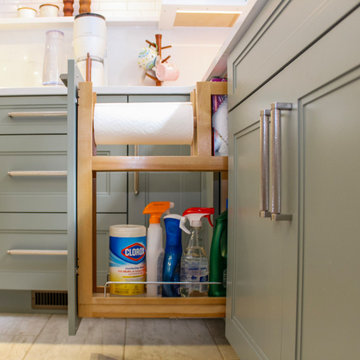
No paper towels on this countertop! This custom pull-out keeps the paper towel roll concealed yet conveniently located directly beside the main sink. Dedicated storage below keeps trash bags, cleaning supplies and other everyday essentials organized and easily accessible—solving a common kitchen storage problem without adding countertop clutter.
 Simply Home Decorating
This beautiful North Vancouver home belongs to a nature-loving and health-conscious couple, Emma and Vince (names changed), their two young children, and their dog, Jasper. When they contacted us about renovating and furnishing their kitchen and family room, we walked in and saw a world of potential waiting to be uncovered.
Before: Larkhall Crescent Home:
Like many original North Vancouver homes, the interior was definitely dated. We encountered late ‘80s finishes in powder pink and teal green, old carpet, and a kitchen that wasn’t maximized to suit this family’s modern-day lifestyle. However, the size of the rooms offered us a ton of space with which to get creative.
Knowing our clients’ love of cooking, need for work spaces (Emma and Vince both work remotely), and growing family, we developed a design concept that would increase usable space, optimize storage, and create intimacy in this large area. As for the style, we were inspired by their European roots, inventing a new and modern take on “Belgian Farmhouse” style. Now, the home is truly one-of-a-kind.
After: Warm & Cozy Family Room:
Fresh, bright, and comfortable, this living area has been transformed! We started with the fireplace as a focal point, selecting aged brick tiles for added texture and a crisp wood mantle. The taupe-coloured sectional infuses the room with visual warmth and serves the added purpose of separating the family room from the kitchen.
Emma and Vince were also keen on using non-toxic materials in their home, and we were happy to oblige. To meet their needs, we sourced natural wood elements and sought out Canadian-made products - that adhere to high health standards - whenever possible.
Look closer at the elements of this space, and you will find this stunning, honeycomb-patterned rug in earthy gold, beige, and charcoal tones. It’s plush to the touch and full of visual texture that brings this room’s colour palette together. We sourced these two-tone chairs with caning, petrified wood side table, black sconces, and botanical prints in greyscale from local artist, Heather Johnston.
We topped off the space with this dark wood and rattan console that offers storage facing the kitchen and presents an opportunity to display cherished items. The result is a cozy lounging space brimming with comfort and functionality. It’s perfect for enjoying quality family time, or Emma can simply slide the coffee table away to make room for her morning yoga practice.
Now, let’s turn around and give some attention to the kitchen. Do you remember what the original kitchen looked like? If not, scroll back up, because the transformation is shocking…
Moody & Welcoming Kitchen for Healthy Living:
This kitchen looks very different from how it started, right? Though we didn’t touch any walls, the kitchen has almost doubled in usable space! We created a long, extended island with storage, an outlet for small appliances, and seating for comfortable prep, after-school snacking, or mingling among friends.
On the other side of the island, the family has even more storage and an integrated dishwasher within easy reach of the sink, perfect for quick clean-up. From this angle, you can also see the expansive custom Shaker cabinetry in white and the integrated double ovens. These facilitate their cooking experience and gave us the opportunity to add an additional surprise…
A coffee garage station and more hidden storage! Keeping these items located along the perimeter allows them to be accessed by the family or their guests without someone getting under the cook’s feet. These are the little details that make everyday life easier and more enjoyable.
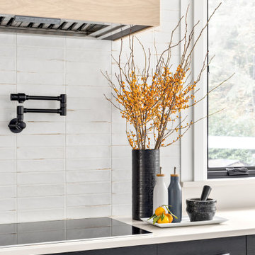
Moving deeper into the kitchen, the seamless induction cooktop topped with a freestanding concealed hood fan commands attention in a soft yet prominent way. The natural wood accent mirrors the fireplace mantle, and the choice of off-black wood-grain cabinets not only continues our black-and-white colour palette but adds a sense of depth and contrast. The corner sink is located to the right and perfectly positioned with a view of their thriving backyard.
To invite more of this family’s character into the space, we mixed metals for interest — matte black, dark pewter, and warm brass — and created open shelves in white oak for their plants and decor. You can also glimpse the tumbled edge of the backsplash tile, which echoes the rustic brick of the fireplace. It adds that farmhouse charm while still feeling timeless and sophisticated.
Last but not least, we designed this dining banquette in the bay window (with integrated bench storage, of course), where the family can share a meal together, the kids can do homework, or Emma and Vince can work and enjoy a change of scenery from their offices. Like the other spaces in the home, it was designed to be beautiful, multi-functional, and long-lasting.
Praise from Our Clients:
It is clear that we love this home, but what did our clients have to say?
“Lori is a visionary and masters execution to the finest detail all at the same time. When she first met us to know more about who we are and how we live, she could right away envision how we could use the space in our kitchen and living room…The results exceeded our expectations.
Lori and her team were also a delight to work with — coordination with all the trades, fast problem-solving, regular updates, professional and friendly attitude of her entire team — made it the dream team. Thank you SHD for making our space so beautiful!”
In turn, we are so grateful for this family’s trust, their open communication, and for being wonderful people with whom to work. (So, thank you!)
 Ralf Poerschke
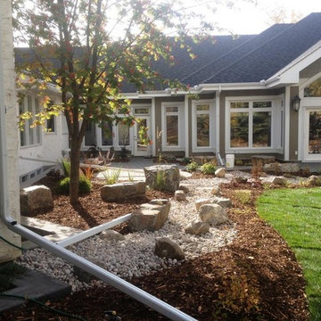
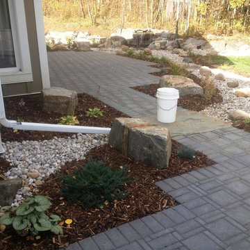
A back yard with only a small exit for the rain water to drain out. The problem got solved with a rainwater catching system. Rocked drainage swales collect the rainwater from the downspouts and feed an underground basin made of Aquascape Aquabloxes. A natural waterfall at the brush line helps keeping the stored water fresh and adds an accent. Planting beds soften the look of the rocks and hard surfaces, unmaintained areas allow nature to get closer to the house.
 Ralf Poerschke
A back yard with only a small exit for the rain water to drain out. The problem got solved with a rainwater catching system. Rocked drainage swales collect the rainwater from the downspouts and feed an underground basin made of Aquascape Aquabloxes. A natural waterfall at the brush line helps keeping the stored water fresh and adds an accent. Planting beds soften the look of the rocks and hard surfaces, unmaintained areas allow nature to get closer to the house.
10