
Search results for "House accommodation" in Home Design Ideas
 Tamara Rosenbloom Design LLC
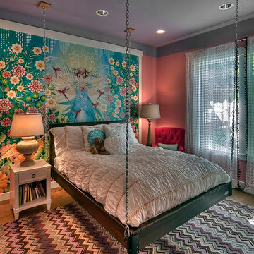
My clients had outgrown their builder’s basic home and had plenty of room to expand on their 10 acres. Working with a local architect and a talented contractor, we designed an addition to create 3 new bedrooms, a bathroom scaled for all 3 girls, a playroom and a master retreat including 3 fireplaces, sauna, steam shower, office or “creative room”, and large bedroom with folding glass wall to capitalize on their view. The master suite, gym, pool and tennis courts are still under construction, but the girls’ suite and living room space are complete and dust free. Each child’s room was designed around their preference of color scheme and each girl has a unique feature that makes their room truly their own. The oldest daughter has a secret passage hidden behind what looks like built in cabinetry. The youngest daughter wanted to “swing”, so we outfitted her with a hanging bed set in front of a custom mural created by a Spanish artist. The middle daughter is an elite gymnast, so we added monkey bars so she can cruise her room in style. The girls’ bathroom suite has 3 identical “stations” with abundant storage. Cabinetry in black walnut and peacock blue and white quartz counters with white marble backsplash are durable and beautiful. Two shower stalls, designed with a colorful and intricate tile design, prevent bathroom wait times and a custom wall mural brings a little of the outdoors in.
Photos by Mike Martin www.martinvisualtours.com
 Twelve Stones Designs, LLC
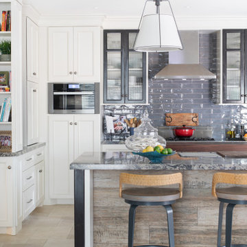
The owners of this kitchen had spent the money to upgrade the finishes in their kitchen upon building the home 12 years ago, but after living in the space for several years they realized how nonfunctional the layout really was. The (then) two preschool aged children had grown into busy, hungry teenagers with many friends who also liked to hang out at the house. So the family needed a more functional kitchen with better traffic flow, space for daily activities revolving around the kitchen at different times of day, and a kitchen that could accommodate cooking for and serving large groups. Furthermore, the dark, traditional finishes no longer reflected the homeowners’ style. They requested a brighter, more relaxed, coastal style that reflected their love of the seaside cities they like to visit.
Originally, the kitchen was U-shaped with a narrow island in the middle. The island created narrow aisles that bottle-necked at the dishwasher, refrigerator, and cooktop areas. There was a pass-through from the foyer into the kitchen, but the owners never liked that the pass-through was also located so close to the powder room. The awkward proximity was unappealing and made guests feel uncomfortable.
The kitchen’s storage was made up of lots of narrow cabinets, apothecary drawers, clipped corner units, and very few drawers. It lacked useful storage for the larger items the family used on a daily basis. And the kitchen’s only pantry was small closet that had only builder-grade, narrow shelving with no illumination to be able to see the contents inside.
Overall, the kitchen’s lighting plan was poorly executed. Only six recessed cans illuminated the entire kitchen and nook areas. The under cabinet lighting was not evenly distributed either. In fact, the builder had mis-placed the under cabinet lighting around the decorative pilasters which made for choppy, dark cubbies. Further, the builder didn’t include any lighting over the sink or the bar area, which meant whoever was doing the dishes was always in their own shadow. That, coupled with the steep overhang of the game room above made the bar area feel like a dim, cavernous space that wasn’t inviting or task oriented. The kitchen looked out into the main living space, but the raised bar and a narrow wall (which held the only large cabinet in the kitchen) created more of a barrier than a relationship to the living room or breakfast nook. In fact, one couldn’t even see the breakfast nook from the cooktop or sink areas due to its orientation. The raised bar top was too narrow to comfortably sit to either dine at or chat from due to the lack of knee space. The the homeowners confided that the kitchen felt more like a dark, dirty prison than place where the family, or their guests, wanted to gather and commune.
The clients' needs and desires were:
➢ to create a kitchen that would be a space the family loved to be in; to relate to the adjacent spaces all around, and to have better flow for entertaining large groups
➢ to remove the walls between the breakfast nook and living area and to be able to utilize the natural light from the windows in both those areas
➢ to incorporate a functional chopping block for prepping fresh food for home cooked meals, an island with a large sink and drain board, 2 pull out trash cans, and seating for at least the 2 teens to eat or do homework
➢ to design a kitchen and breakfast nook with an airy, coastal, relaxed vibe that blended with the rest of the house's coastal theme
➢ to integrate a layered lighting plan which would include ample general illumination, specific task lighting, decorative lighting, and lots of illuminated storage
➢ to design a kitchen with not only more storage for all the husband’s kitchen gadgets and collection of oils and spices, but smart storage, including a coffee/breakfast bar and a place to store and conceal the toaster oven and microwave
➢ to find a way to utilize the large open space between the kitchen, pantry area, and breakfast nook
Twelve Stones Designs achieved the owner's goals by:
➢ removing the walls between the kitchen and living room to allow the natural light to filter in from the adjacent rooms and to create a connection between the kitchen, nook, and living spaces for a sense of unity and communion
➢ removing the existing pantry and designing 3 large pantry style cabinets with LED tape lights and rollout drawers to house lots of kitchen appliances, gadgets, and tons of groceries. We also took the cabinets all the way up to the 9’ ceiling for additional storage for seasonal items and bulk storage.
➢ designing 2 islands - 1 with a gorgeous black walnut chopping block that houses a drawer for chopping and carving knives and a custom double pull out trash unit for point of use utilization - and 1 that houses the dishwasher, a large Blanco Gourmet sink with integrated drain board, woven baskets for fresh root vegetables and kitchen towels, plenty of drawer storage for kitchen items, and bar seating for up to 4 diners.
➢ closing off the space between the kitchen and the powder room to create a beautiful new private alcove for the powder room as well as adding some decorative storage. This also gave us space to include more tall storage near the new range for precision placement of the husband’s extensive oil and spice collection as well as a location for a combo-steam oven the wife wanted for baking and cooking healthy meals.
The project is enhanced functionally by:
➢ incorporated USB and standard receptacles for the kids’ laptops and phone charging in the large island
➢ designing the small island to include additional open shelving for items used on a daily basis such as a variety of bowls, plates, and colanders. This set up also works well for the husband who prefers to “plate” his dinners in restaurant-style fashion before presenting them to the table.
➢ the integration of specific storage units, such as double stacked cutlery drawers, a custom spice pull-out, a Kuerig coffee and tea pod drawer, and custom double stacked utensil drawers
➢ moving the refrigerator to the old oven location - this eliminated the bottle neck as well as created a better relationship to the eating table. It also utilizes the floor space between the pantry, nook, and kitchen
➢ creating a banquet style breakfast nook - this banquette seating not only doubles the amount of seating for large gatherings but it better utilizes the odd space between the kitchen and the previous nook area. It also helps to create a distinct pathway from the mudroom room through the pantry area, kitchen, nook, and living room.
➢ the coffee/breakfast bar area which includes the perfect location for the concealed microwave and toaster oven, convenient storage for the coffee pods and tea accoutrements. Roll-out drawers below also house the smoothie maker, hot water kettle, and a plethora of smoothie-making ingredients such as protein powders, smoothie additives, etc. Furthermore, the drawers below the Keurig house measuring utensil, cutlery, baking supplies and tupperware storage.
➢ incorporating lots of wide drawers and pullouts to accommodate large cookware.
➢ utilizing as much vertical space as possible by building storage to the ceiling which accommodates the family’s abundant amount of serving platters, baking sheets, bakeware, casserole dishes, and additional cutting boards.
The project is enhanced aesthetically by:
➢ new 5-piece Versailles pattern porcelain tile that now seamlessly joins the entire down stairs area together creating a bright, cohesiveness feeling instead of choppy separated spaces - it also adds a coastal feeling
➢ designing a cabinet to conceal the microwave and toaster oven
➢ the coastal influenced light fixtures over the nook table and island
➢ the sandy colors of the Langdon Cambria countertops. The swirling pattern and sparkling quartz pieces remind the homeowner of black-and-tan sandy beaches
➢ the striped banquet seating whose creamy white background and blue-green stripes were the inspiration for the cabinet and wall colors.
➢ All the interior doors were painted black to coordinate with the blacks and grays in the backsplash tile and countertop. This also adds a hint of tailored formality to an otherwise casual space.
➢ the use of WAC's Oculux small aperture LED units for the overhead lighting complimented with Diode LED strips for task lighting under the cabinets and inside the pantry and glass wall cabinets. All of the lighting applications are on separate dimmer switches.
Innovative uses of materials or construction methods by Realty Restoration LLC:
➢ Each 1-1/2” x 3” block of reclaimed end-grain black walnut that makes up the center island chopping block was hand milled and built in the shop. It was designed to look substantial and proportional to the surrounding elements, executed by creating the 4 inch tall top with a solid wood chamfered edge band.
➢ The metal doors on either side of the vent hood were also custom designed for this project and built in the Realty Restoration LLC shop. They are made 1x2, 11-gauge mild steel with ribbed glass. Weighing 60 lbs a piece, heavy duty cabinet hinges were added to support the weight of the door and keep them from sagging.
➢ Under-cabinet receptacles were added along the range wall in order to have a clean, uninterrupted backsplash.
Design obstacles to overcome:
➢ Because we were removing the demising walls between the kitchen and living room, we had to find a way to plumb and vent the new island. We did this by tunneling through the slab (the slab had post tension cables which prevented us from just trenching) to run a new wet vent through a nearby structural wall. We pulled the existing hot and cold lines between upper floor joists and ran them down the structural wall as well and up through a conduit in the tunnel.
➢ Since we were converting from wall overs to a gas range it allowed us to utilize the 220 feed for the wall ovens to provide a new sub panel for all the new kitchen circuits
➢ Due to framing deficiencies inherited from the original build there was a 1-1/2” differential in the floor-to-ceiling height over a 20 foot span; by utilizing the process of cutting and furring coupled with the crown moulding details on the cabinet elevations we were able to mask the problem and provide seamless transitions between the cabinet components.
Evidence of superior craftsmanship:
➢ uniquely designed, one-of-a-kind metal “X” end panels on the large island. The end panels were custom made in the Realty Restoration LLC shop and fitted to the exact dimensions of the island. The welding seams are completely indistinguishable - the posts look like they are cut from a single sheet of metal
➢ square metal posts on the small island were also custom made and designed to compliment and carry through the metal element s throughout the kitchen
➢ the beautiful, oversized end panels on the pantry cabinets which give the breakfast nook a tailored look
➢ integrating a large format 5 piece Versailles tile pattern to seamlessly flow from the existing spaces into the new kitchen space
➢ By constructing a custom cabinet that jogged around a corner we could not remodel (housing the entry way coat closet) we were able to camouflage the adjacent wall offset within the upper and lower cabinets. By designing around the existing jog in the structural walls we accomplished a few things: we were able to find the space to house, and hide, the microwave and toaster oven yet still have a clean cohesive appearance from the kitchen side. Additionally, the owners were able to keep their much needed coat closet and we didn’t have to increase the budget with unnecessary structural work.

 Ward Jewell Architect AIA
These clients came to my office looking for an architect who could design their "empty nest" home that would be the focus of their soon to be extended family. A place where the kids and grand kids would want to hang out: with a pool, open family room/ kitchen, garden; but also one-story so there wouldn't be any unnecessary stairs to climb. They wanted the design to feel like "old Pasadena" with the coziness and attention to detail that the era embraced. My sensibilities led me to recall the wonderful classic mansions of San Marino, so I designed a manor house clad in trim Bluestone with a steep French slate roof and clean white entry, eave and dormer moldings that would blend organically with the future hardscape plan and thoughtfully landscaped grounds.
The site was a deep, flat lot that had been half of the old Joan Crawford estate; the part that had an abandoned swimming pool and small cabana. I envisioned a pavilion filled with natural light set in a beautifully planted park with garden views from all sides. Having a one-story house allowed for tall and interesting shaped ceilings that carved into the sheer angles of the roof. The most private area of the house would be the central loggia with skylights ensconced in a deep woodwork lattice grid and would be reminiscent of the outdoor “Salas” found in early Californian homes. The family would soon gather there and enjoy warm afternoons and the wonderfully cool evening hours together.
Working with interior designer Jeffrey Hitchcock, we designed an open family room/kitchen with high dark wood beamed ceilings, dormer windows for daylight, custom raised panel cabinetry, granite counters and a textured glass tile splash. Natural light and gentle breezes flow through the many French doors and windows located to accommodate not only the garden views, but the prevailing sun and wind as well. The graceful living room features a dramatic vaulted white painted wood ceiling and grand fireplace flanked by generous double hung French windows and elegant drapery. A deeply cased opening draws one into the wainscot paneled dining room that is highlighted by hand painted scenic wallpaper and a barrel vaulted ceiling. The walnut paneled library opens up to reveal the waterfall feature in the back garden. Equally picturesque and restful is the view from the rotunda in the master bedroom suite.
Architect: Ward Jewell Architect, AIA
Interior Design: Jeffrey Hitchcock Enterprises
Contractor: Synergy General Contractors, Inc.
Landscape Design: LZ Design Group, Inc.
Photography: Laura Hull
Find the right local pro for your project

 Beth Howley Creative LLC
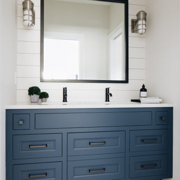
Inspiration for a coastal double-sink and shiplap wall bathroom remodel in Grand Rapids with blue cabinets, white walls, an undermount sink, quartz countertops, white countertops and a floating vanity
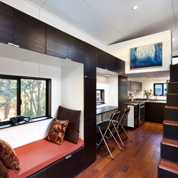
 The Morrison hOMe Tiny House
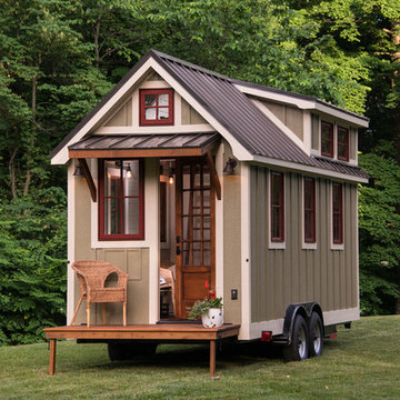
This interior shot of hOMe, our 207sf (+110sf in lofts) tiny house shows what you see when you walk in through the front door. The window seat acts as our sofa, comfortable stairs go up to the master bedroom loft (which has a queen bed), a fold down desk serves as our working and eating table, and at the end a full sized kitchen with full sized appliances provides abundant space for cooking meals.
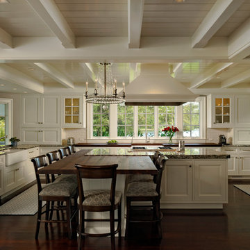
 Jennifer Gilmer Kitchen & Bath
Easton, Maryland Traditional Kitchen Design by #JenniferGilmer with a lake view
http://gilmerkitchens.com/
Photography by Bob Narod

Sponsored
Columbus, OH

Wannemacher Interiors
Customized Award-Winning Interior Design Solutions in Franklin Cnty OH
 BC&J Architecture
The Back Bay House is comprised of two main structures, a nocturnal wing and a daytime wing, joined by a glass gallery space. The daytime wing maintains an informal living arrangement that includes the dining space placed in an intimate alcove, a large country kitchen and relaxing seating area which opens to a classic covered porch and on to the water’s edge. The nocturnal wing houses three bedrooms. The master at the water side enjoys views and sounds of the wildlife and the shore while the two subordinate bedrooms soak in views of the garden and neighboring meadow.
To bookend the scale and mass of the house, a whimsical tower was included to the nocturnal wing. The tower accommodates flex space for a bunk room, office or studio space. Materials and detailing of this house are based on a classic cottage vernacular language found in these sorts of buildings constructed in pre-war north america and harken back to a simpler time and scale. Eastern white cedar shingles, white painted trim and moulding collectively add a layer of texture and richness not found in today’s lexicon of detail. The house is 1,628 sf plus a 228 sf tower and a detached, two car garage which employs massing, detail and scale to allow the main house to read as dominant but not overbearing.
Designed by BC&J Architecture.
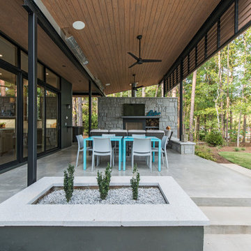
 Architectural Collaborative
We designed this 3,162 square foot home for empty-nesters who love lake life. Functionally, the home accommodates multiple generations. Elderly in-laws stay for prolonged periods, and the homeowners are thinking ahead to their own aging in place. This required two master suites on the first floor. Accommodations were made for visiting children upstairs. Aside from the functional needs of the occupants, our clients desired a home which maximizes indoor connection to the lake, provides covered outdoor living, and is conducive to entertaining. Our concept celebrates the natural surroundings through materials, views, daylighting, and building massing.
We placed all main public living areas along the rear of the house to capitalize on the lake views while efficiently stacking the bedrooms and bathrooms in a two-story side wing. Secondary support spaces are integrated across the front of the house with the dramatic foyer. The front elevation, with painted green and natural wood siding and soffits, blends harmoniously with wooded surroundings. The lines and contrasting colors of the light granite wall and silver roofline draws attention toward the entry and through the house to the real focus: the water. The one-story roof over the garage and support spaces takes flight at the entry, wraps the two-story wing, turns, and soars again toward the lake as it approaches the rear patio. The granite wall extending from the entry through the interior living space is mirrored along the opposite end of the rear covered patio. These granite bookends direct focus to the lake.
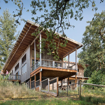
 M.O.Daby Design
modern farmhouse
Dundee, OR
type: custom home + ADU
status: built
credits
design: Matthew O. Daby - m.o.daby design
interior design: Angela Mechaley - m.o.daby design
construction: Cellar Ridge Construction / homeowner
landscape designer: Bryan Bailey - EcoTone / homeowner
photography: Erin Riddle - KLIK Concepts
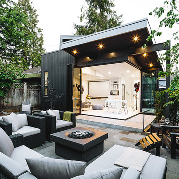
 Nakamoto Forestry
Project Overview:
This project was a new construction laneway house designed by Alex Glegg and built by Eyco Building Group in Vancouver, British Columbia. It uses our Gendai cladding that shows off beautiful wood grain with a blackened look that creates a stunning contrast against their homes trim and its lighter interior. Photos courtesy of Christopher Rollett.
Product: Gendai 1×6 select grade shiplap
Prefinish: Black
Application: Residential – Exterior
SF: 1200SF
Designer: Alex Glegg
Builder: Eyco Building Group
Date: August 2017
Location: Vancouver, BC
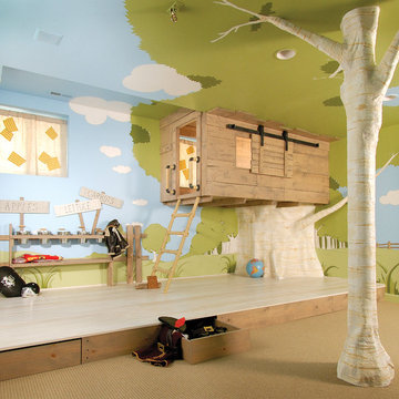
 Thinkterior LLC
THEME Inspired by the Magic Tree
House series of children’s books,
this indoor tree house provides
entertainment, fun and a place for
children to read about or imagine
adventures through time. A blue sky,
green meadows, and distant matching
beech trees recreate the magic of Jack
and Annie’s Frog Creek, and help bring
the characters from the series to life.
FOCUS A floor armoire, ceiling swing
and climbing rope give the structure
a true tree house look and feel. A
drop-down drawing and writing table,
wheeled work table and recessed
ceiling lights ensure the room can be
used for more than play. The tree house
has electric interior lighting, a window
to the outdoors and a playful sliding
shutter over a window to the room. The
armoire forms a raised, nine-foot-wide
play area, while a TV within one of the
wall’s floor-to-ceiling cabinets — with
a delightful sliding ladder — transforms
the room into a family theater perfect
for watching movies and holding Wii
competitions.
STORAGE The bottom of the drawing
table is a magnetic chalk board that
doubles as a display for children’s art
works. The tree’s small niches are for
parents’ shoes; the larger compartment
stores children’s shoes and school
bags. Books, games, toys, DVDs, Wii
and other computer accessories are
stored in the wall cabinets. The armoire
contains two spacious drawers and
four nifty hinged storage bins. A rack of
handy “vegetable buckets” above the
armoire stores crayons, scissors and
other useful items.
GROWTH The room easily adapts
from playroom, to party room, to study
room and even to bedroom, as the tree
house easily accommodates a twin-size
mattress.
SAFETY The rungs and rails of the
ladder, as well as the grab bars beside
the tree house door are wrapped
with easy-grip rope for safe climbing.
The drawing table has spring-loaded
hinges to help prevent it from dropping
dangerously from the wall, and the
table door has double sets of locks
up top to ensure safety. The interior of
each storage compartment is carpeted
like the tree house floor to provide extra
padding.


Sponsored
Westerville, OH

Custom Home Works
Franklin County's Award-Winning Design, Build and Remodeling Expert
 Isla Homes
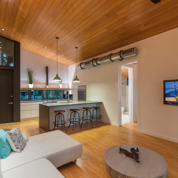
I built this on my property for my aging father who has some health issues. Handicap accessibility was a factor in design. His dream has always been to try retire to a cabin in the woods. This is what he got.
It is a 1 bedroom, 1 bath with a great room. It is 600 sqft of AC space. The footprint is 40' x 26' overall.
The site was the former home of our pig pen. I only had to take 1 tree to make this work and I planted 3 in its place. The axis is set from root ball to root ball. The rear center is aligned with mean sunset and is visible across a wetland.
The goal was to make the home feel like it was floating in the palms. The geometry had to simple and I didn't want it feeling heavy on the land so I cantilevered the structure beyond exposed foundation walls. My barn is nearby and it features old 1950's "S" corrugated metal panel walls. I used the same panel profile for my siding. I ran it vertical to match the barn, but also to balance the length of the structure and stretch the high point into the canopy, visually. The wood is all Southern Yellow Pine. This material came from clearing at the Babcock Ranch Development site. I ran it through the structure, end to end and horizontally, to create a seamless feel and to stretch the space. It worked. It feels MUCH bigger than it is.
I milled the material to specific sizes in specific areas to create precise alignments. Floor starters align with base. Wall tops adjoin ceiling starters to create the illusion of a seamless board. All light fixtures, HVAC supports, cabinets, switches, outlets, are set specifically to wood joints. The front and rear porch wood has three different milling profiles so the hypotenuse on the ceilings, align with the walls, and yield an aligned deck board below. Yes, I over did it. It is spectacular in its detailing. That's the benefit of small spaces.
Concrete counters and IKEA cabinets round out the conversation.
For those who cannot live tiny, I offer the Tiny-ish House.
Photos by Ryan Gamma
Staging by iStage Homes
Design Assistance Jimmy Thornton
 Twelve Stones Designs, LLC
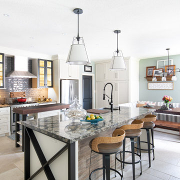
The owners of this kitchen had spent the money to upgrade the finishes in their kitchen upon building the home 12 years ago, but after living in the space for several years they realized how nonfunctional the layout really was. The (then) two preschool aged children had grown into busy, hungry teenagers with many friends who also liked to hang out at the house. So the family needed a more functional kitchen with better traffic flow, space for daily activities revolving around the kitchen at different times of day, and a kitchen that could accommodate cooking for and serving large groups. Furthermore, the dark, traditional finishes no longer reflected the homeowners’ style. They requested a brighter, more relaxed, coastal style that reflected their love of the seaside cities they like to visit.
Originally, the kitchen was U-shaped with a narrow island in the middle. The island created narrow aisles that bottle-necked at the dishwasher, refrigerator, and cooktop areas. There was a pass-through from the foyer into the kitchen, but the owners never liked that the pass-through was also located so close to the powder room. The awkward proximity was unappealing and made guests feel uncomfortable.
The kitchen’s storage was made up of lots of narrow cabinets, apothecary drawers, clipped corner units, and very few drawers. It lacked useful storage for the larger items the family used on a daily basis. And the kitchen’s only pantry was small closet that had only builder-grade, narrow shelving with no illumination to be able to see the contents inside.
Overall, the kitchen’s lighting plan was poorly executed. Only six recessed cans illuminated the entire kitchen and nook areas. The under cabinet lighting was not evenly distributed either. In fact, the builder had mis-placed the under cabinet lighting around the decorative pilasters which made for choppy, dark cubbies. Further, the builder didn’t include any lighting over the sink or the bar area, which meant whoever was doing the dishes was always in their own shadow. That, coupled with the steep overhang of the game room above made the bar area feel like a dim, cavernous space that wasn’t inviting or task oriented. The kitchen looked out into the main living space, but the raised bar and a narrow wall (which held the only large cabinet in the kitchen) created more of a barrier than a relationship to the living room or breakfast nook. In fact, one couldn’t even see the breakfast nook from the cooktop or sink areas due to its orientation. The raised bar top was too narrow to comfortably sit to either dine at or chat from due to the lack of knee space. The the homeowners confided that the kitchen felt more like a dark, dirty prison than place where the family, or their guests, wanted to gather and commune.
The clients' needs and desires were:
➢ to create a kitchen that would be a space the family loved to be in; to relate to the adjacent spaces all around, and to have better flow for entertaining large groups
➢ to remove the walls between the breakfast nook and living area and to be able to utilize the natural light from the windows in both those areas
➢ to incorporate a functional chopping block for prepping fresh food for home cooked meals, an island with a large sink and drain board, 2 pull out trash cans, and seating for at least the 2 teens to eat or do homework
➢ to design a kitchen and breakfast nook with an airy, coastal, relaxed vibe that blended with the rest of the house's coastal theme
➢ to integrate a layered lighting plan which would include ample general illumination, specific task lighting, decorative lighting, and lots of illuminated storage
➢ to design a kitchen with not only more storage for all the husband’s kitchen gadgets and collection of oils and spices, but smart storage, including a coffee/breakfast bar and a place to store and conceal the toaster oven and microwave
➢ to find a way to utilize the large open space between the kitchen, pantry area, and breakfast nook
Twelve Stones Designs achieved the owner's goals by:
➢ removing the walls between the kitchen and living room to allow the natural light to filter in from the adjacent rooms and to create a connection between the kitchen, nook, and living spaces for a sense of unity and communion
➢ removing the existing pantry and designing 3 large pantry style cabinets with LED tape lights and rollout drawers to house lots of kitchen appliances, gadgets, and tons of groceries. We also took the cabinets all the way up to the 9’ ceiling for additional storage for seasonal items and bulk storage.
➢ designing 2 islands - 1 with a gorgeous black walnut chopping block that houses a drawer for chopping and carving knives and a custom double pull out trash unit for point of use utilization - and 1 that houses the dishwasher, a large Blanco Gourmet sink with integrated drain board, woven baskets for fresh root vegetables and kitchen towels, plenty of drawer storage for kitchen items, and bar seating for up to 4 diners.
➢ closing off the space between the kitchen and the powder room to create a beautiful new private alcove for the powder room as well as adding some decorative storage. This also gave us space to include more tall storage near the new range for precision placement of the husband’s extensive oil and spice collection as well as a location for a combo-steam oven the wife wanted for baking and cooking healthy meals.
The project is enhanced functionally by:
➢ incorporated USB and standard receptacles for the kids’ laptops and phone charging in the large island
➢ designing the small island to include additional open shelving for items used on a daily basis such as a variety of bowls, plates, and colanders. This set up also works well for the husband who prefers to “plate” his dinners in restaurant-style fashion before presenting them to the table.
➢ the integration of specific storage units, such as double stacked cutlery drawers, a custom spice pull-out, a Kuerig coffee and tea pod drawer, and custom double stacked utensil drawers
➢ moving the refrigerator to the old oven location - this eliminated the bottle neck as well as created a better relationship to the eating table. It also utilizes the floor space between the pantry, nook, and kitchen
➢ creating a banquet style breakfast nook - this banquette seating not only doubles the amount of seating for large gatherings but it better utilizes the odd space between the kitchen and the previous nook area. It also helps to create a distinct pathway from the mudroom room through the pantry area, kitchen, nook, and living room.
➢ the coffee/breakfast bar area which includes the perfect location for the concealed microwave and toaster oven, convenient storage for the coffee pods and tea accoutrements. Roll-out drawers below also house the smoothie maker, hot water kettle, and a plethora of smoothie-making ingredients such as protein powders, smoothie additives, etc. Furthermore, the drawers below the Keurig house measuring utensil, cutlery, baking supplies and tupperware storage.
➢ incorporating lots of wide drawers and pullouts to accommodate large cookware.
➢ utilizing as much vertical space as possible by building storage to the ceiling which accommodates the family’s abundant amount of serving platters, baking sheets, bakeware, casserole dishes, and additional cutting boards.
The project is enhanced aesthetically by:
➢ new 5-piece Versailles pattern porcelain tile that now seamlessly joins the entire down stairs area together creating a bright, cohesiveness feeling instead of choppy separated spaces - it also adds a coastal feeling
➢ designing a cabinet to conceal the microwave and toaster oven
➢ the coastal influenced light fixtures over the nook table and island
➢ the sandy colors of the Langdon Cambria countertops. The swirling pattern and sparkling quartz pieces remind the homeowner of black-and-tan sandy beaches
➢ the striped banquet seating whose creamy white background and blue-green stripes were the inspiration for the cabinet and wall colors.
➢ All the interior doors were painted black to coordinate with the blacks and grays in the backsplash tile and countertop. This also adds a hint of tailored formality to an otherwise casual space.
➢ the use of WAC's Oculux small aperture LED units for the overhead lighting complimented with Diode LED strips for task lighting under the cabinets and inside the pantry and glass wall cabinets. All of the lighting applications are on separate dimmer switches.
Innovative uses of materials or construction methods by Realty Restoration LLC:
➢ Each 1-1/2” x 3” block of reclaimed end-grain black walnut that makes up the center island chopping block was hand milled and built in the shop. It was designed to look substantial and proportional to the surrounding elements, executed by creating the 4 inch tall top with a solid wood chamfered edge band.
➢ The metal doors on either side of the vent hood were also custom designed for this project and built in the Realty Restoration LLC shop. They are made 1x2, 11-gauge mild steel with ribbed glass. Weighing 60 lbs a piece, heavy duty cabinet hinges were added to support the weight of the door and keep them from sagging.
➢ Under-cabinet receptacles were added along the range wall in order to have a clean, uninterrupted backsplash.
Design obstacles to overcome:
➢ Because we were removing the demising walls between the kitchen and living room, we had to find a way to plumb and vent the new island. We did this by tunneling through the slab (the slab had post tension cables which prevented us from just trenching) to run a new wet vent through a nearby structural wall. We pulled the existing hot and cold lines between upper floor joists and ran them down the structural wall as well and up through a conduit in the tunnel.
➢ Since we were converting from wall overs to a gas range it allowed us to utilize the 220 feed for the wall ovens to provide a new sub panel for all the new kitchen circuits
➢ Due to framing deficiencies inherited from the original build there was a 1-1/2” differential in the floor-to-ceiling height over a 20 foot span; by utilizing the process of cutting and furring coupled with the crown moulding details on the cabinet elevations we were able to mask the problem and provide seamless transitions between the cabinet components.
Evidence of superior craftsmanship:
➢ uniquely designed, one-of-a-kind metal “X” end panels on the large island. The end panels were custom made in the Realty Restoration LLC shop and fitted to the exact dimensions of the island. The welding seams are completely indistinguishable - the posts look like they are cut from a single sheet of metal
➢ square metal posts on the small island were also custom made and designed to compliment and carry through the metal element s throughout the kitchen
➢ the beautiful, oversized end panels on the pantry cabinets which give the breakfast nook a tailored look
➢ integrating a large format 5 piece Versailles tile pattern to seamlessly flow from the existing spaces into the new kitchen space
➢ By constructing a custom cabinet that jogged around a corner we could not remodel (housing the entry way coat closet) we were able to camouflage the adjacent wall offset within the upper and lower cabinets. By designing around the existing jog in the structural walls we accomplished a few things: we were able to find the space to house, and hide, the microwave and toaster oven yet still have a clean cohesive appearance from the kitchen side. Additionally, the owners were able to keep their much needed coat closet and we didn’t have to increase the budget with unnecessary structural work.

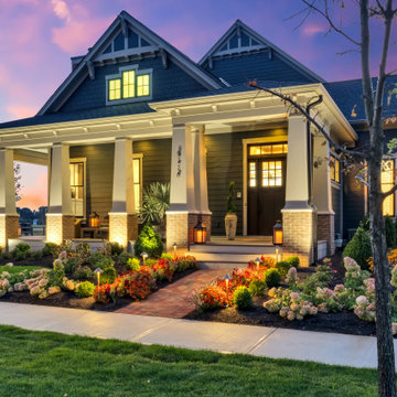
 MSR Design
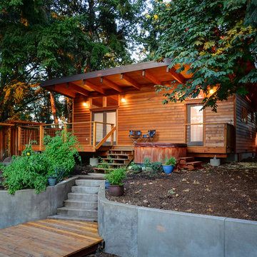
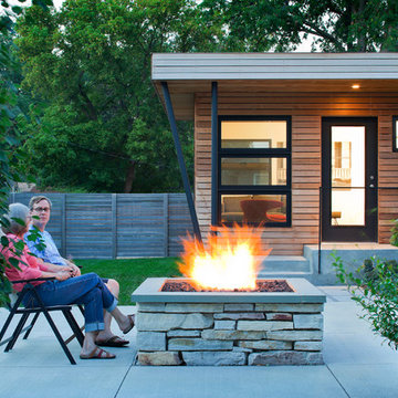
The patio is an outdoor room centered on a raised, gas fire pit and shaded by a row of Swedish Aspens the photographer is peeking through.
The porch's cedar siding will weather to match the fence/arbor built 5 years prior.
Peter J Sieger Architectural Photography

 Convene Architecture
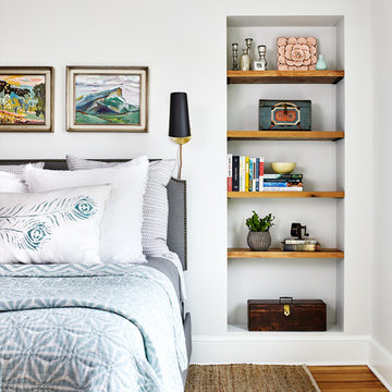
Bedroom
Photography: Stacy Zarin Goldberg Photography; Interior Design: Kristin Try Interiors; Builder: Harry Braswell, Inc.
Inspiration for a coastal medium tone wood floor and brown floor bedroom remodel in DC Metro with white walls
Inspiration for a coastal medium tone wood floor and brown floor bedroom remodel in DC Metro with white walls
 Albertsson Hansen Architecture and Interior Design
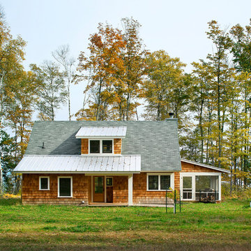
Photograph by Pete Sieger
Cottage beige two-story wood gable roof idea in Minneapolis with a mixed material roof
Cottage beige two-story wood gable roof idea in Minneapolis with a mixed material roof
 Kaplan Thompson Architects
A young family with a wooded, triangular lot in Ipswich, Massachusetts wanted to take on a highly creative, organic, and unrushed process in designing their new home. The parents of three boys had contemporary ideas for living, including phasing the construction of different structures over time as the kids grew so they could maximize the options for use on their land.
They hoped to build a net zero energy home that would be cozy on the very coldest days of winter, using cost-efficient methods of home building. The house needed to be sited to minimize impact on the land and trees, and it was critical to respect a conservation easement on the south border of the lot.
Finally, the design would be contemporary in form and feel, but it would also need to fit into a classic New England context, both in terms of materials used and durability. We were asked to honor the notions of “surprise and delight,” and that inspired everything we designed for the family.
The highly unique home consists of a three-story form, composed mostly of bedrooms and baths on the top two floors and a cross axis of shared living spaces on the first level. This axis extends out to an oversized covered porch, open to the south and west. The porch connects to a two-story garage with flex space above, used as a guest house, play room, and yoga studio depending on the day.
A floor-to-ceiling ribbon of glass wraps the south and west walls of the lower level, bringing in an abundance of natural light and linking the entire open plan to the yard beyond. The master suite takes up the entire top floor, and includes an outdoor deck with a shower. The middle floor has extra height to accommodate a variety of multi-level play scenarios in the kids’ rooms.
Many of the materials used in this house are made from recycled or environmentally friendly content, or they come from local sources. The high performance home has triple glazed windows and all materials, adhesives, and sealants are low toxicity and safe for growing kids.
Photographer credit: Irvin Serrano
4