
Search results for "House accommodation" in Home Design Ideas
 FINNE Architects
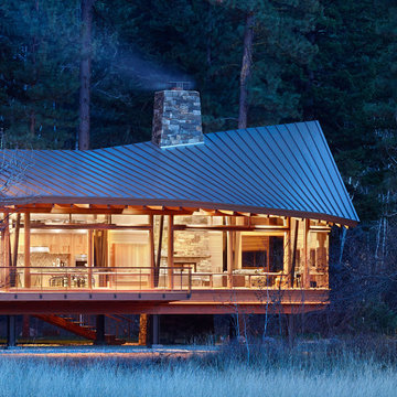
The Mazama house is located in the Methow Valley of Washington State, a secluded mountain valley on the eastern edge of the North Cascades, about 200 miles northeast of Seattle.
The house has been carefully placed in a copse of trees at the easterly end of a large meadow. Two major building volumes indicate the house organization. A grounded 2-story bedroom wing anchors a raised living pavilion that is lifted off the ground by a series of exposed steel columns. Seen from the access road, the large meadow in front of the house continues right under the main living space, making the living pavilion into a kind of bridge structure spanning over the meadow grass, with the house touching the ground lightly on six steel columns. The raised floor level provides enhanced views as well as keeping the main living level well above the 3-4 feet of winter snow accumulation that is typical for the upper Methow Valley.
To further emphasize the idea of lightness, the exposed wood structure of the living pavilion roof changes pitch along its length, so the roof warps upward at each end. The interior exposed wood beams appear like an unfolding fan as the roof pitch changes. The main interior bearing columns are steel with a tapered “V”-shape, recalling the lightness of a dancer.
The house reflects the continuing FINNE investigation into the idea of crafted modernism, with cast bronze inserts at the front door, variegated laser-cut steel railing panels, a curvilinear cast-glass kitchen counter, waterjet-cut aluminum light fixtures, and many custom furniture pieces. The house interior has been designed to be completely integral with the exterior. The living pavilion contains more than twelve pieces of custom furniture and lighting, creating a totality of the designed environment that recalls the idea of Gesamtkunstverk, as seen in the work of Josef Hoffman and the Viennese Secessionist movement in the early 20th century.
The house has been designed from the start as a sustainable structure, with 40% higher insulation values than required by code, radiant concrete slab heating, efficient natural ventilation, large amounts of natural lighting, water-conserving plumbing fixtures, and locally sourced materials. Windows have high-performance LowE insulated glazing and are equipped with concealed shades. A radiant hydronic heat system with exposed concrete floors allows lower operating temperatures and higher occupant comfort levels. The concrete slabs conserve heat and provide great warmth and comfort for the feet.
Deep roof overhangs, built-in shades and high operating clerestory windows are used to reduce heat gain in summer months. During the winter, the lower sun angle is able to penetrate into living spaces and passively warm the exposed concrete floor. Low VOC paints and stains have been used throughout the house. The high level of craft evident in the house reflects another key principle of sustainable design: build it well and make it last for many years!
Photo by Benjamin Benschneider
 Erica Bryen Design
Lido House, Autograph Collection
Photographer: Ryan Garvin
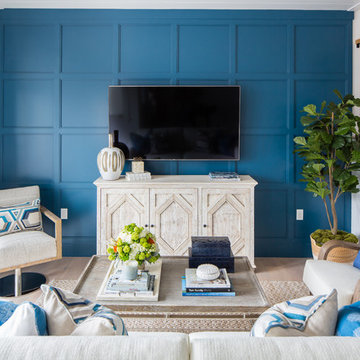
Inspiration for a coastal open concept light wood floor family room remodel in Orange County with blue walls and a wall-mounted tv
Inspiration for a coastal open concept light wood floor family room remodel in Orange County with blue walls and a wall-mounted tv
 Visbeen Architects
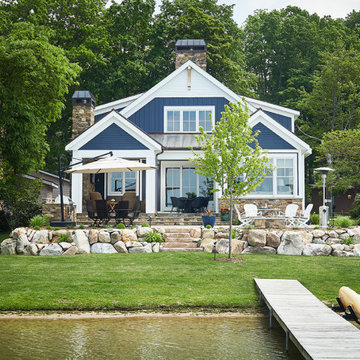
This cozy lake cottage skillfully incorporates a number of features that would normally be restricted to a larger home design. A glance of the exterior reveals a simple story and a half gable running the length of the home, enveloping the majority of the interior spaces. To the rear, a pair of gables with copper roofing flanks a covered dining area that connects to a screened porch. Inside, a linear foyer reveals a generous staircase with cascading landing. Further back, a centrally placed kitchen is connected to all of the other main level entertaining spaces through expansive cased openings. A private study serves as the perfect buffer between the homes master suite and living room. Despite its small footprint, the master suite manages to incorporate several closets, built-ins, and adjacent master bath complete with a soaker tub flanked by separate enclosures for shower and water closet. Upstairs, a generous double vanity bathroom is shared by a bunkroom, exercise space, and private bedroom. The bunkroom is configured to provide sleeping accommodations for up to 4 people. The rear facing exercise has great views of the rear yard through a set of windows that overlook the copper roof of the screened porch below.
Builder: DeVries & Onderlinde Builders
Interior Designer: Vision Interiors by Visbeen
Photographer: Ashley Avila Photography
Find the right local pro for your project
 Johnston Home Interior Design
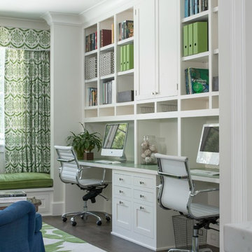
This study off the kitchen acts as a control center for the family. Kids work on computers in open spaces, not in their rooms. Green linoleum covers the desk for a durable and cleanable surface. The cabinets were custom built for the space. The chairs are from Overstock.com. photo: David Duncan Livingston
 Twelve Stones Designs, LLC
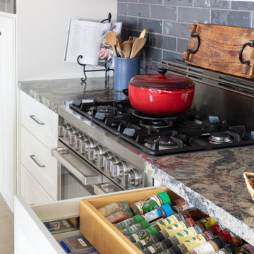
The owners of this kitchen had spent the money to upgrade the finishes in their kitchen upon building the home 12 years ago, but after living in the space for several years they realized how nonfunctional the layout really was. The (then) two preschool aged children had grown into busy, hungry teenagers with many friends who also liked to hang out at the house. So the family needed a more functional kitchen with better traffic flow, space for daily activities revolving around the kitchen at different times of day, and a kitchen that could accommodate cooking for and serving large groups. Furthermore, the dark, traditional finishes no longer reflected the homeowners’ style. They requested a brighter, more relaxed, coastal style that reflected their love of the seaside cities they like to visit.
Originally, the kitchen was U-shaped with a narrow island in the middle. The island created narrow aisles that bottle-necked at the dishwasher, refrigerator, and cooktop areas. There was a pass-through from the foyer into the kitchen, but the owners never liked that the pass-through was also located so close to the powder room. The awkward proximity was unappealing and made guests feel uncomfortable.
The kitchen’s storage was made up of lots of narrow cabinets, apothecary drawers, clipped corner units, and very few drawers. It lacked useful storage for the larger items the family used on a daily basis. And the kitchen’s only pantry was small closet that had only builder-grade, narrow shelving with no illumination to be able to see the contents inside.
Overall, the kitchen’s lighting plan was poorly executed. Only six recessed cans illuminated the entire kitchen and nook areas. The under cabinet lighting was not evenly distributed either. In fact, the builder had mis-placed the under cabinet lighting around the decorative pilasters which made for choppy, dark cubbies. Further, the builder didn’t include any lighting over the sink or the bar area, which meant whoever was doing the dishes was always in their own shadow. That, coupled with the steep overhang of the game room above made the bar area feel like a dim, cavernous space that wasn’t inviting or task oriented. The kitchen looked out into the main living space, but the raised bar and a narrow wall (which held the only large cabinet in the kitchen) created more of a barrier than a relationship to the living room or breakfast nook. In fact, one couldn’t even see the breakfast nook from the cooktop or sink areas due to its orientation. The raised bar top was too narrow to comfortably sit to either dine at or chat from due to the lack of knee space. The the homeowners confided that the kitchen felt more like a dark, dirty prison than place where the family, or their guests, wanted to gather and commune.
The clients' needs and desires were:
➢ to create a kitchen that would be a space the family loved to be in; to relate to the adjacent spaces all around, and to have better flow for entertaining large groups
➢ to remove the walls between the breakfast nook and living area and to be able to utilize the natural light from the windows in both those areas
➢ to incorporate a functional chopping block for prepping fresh food for home cooked meals, an island with a large sink and drain board, 2 pull out trash cans, and seating for at least the 2 teens to eat or do homework
➢ to design a kitchen and breakfast nook with an airy, coastal, relaxed vibe that blended with the rest of the house's coastal theme
➢ to integrate a layered lighting plan which would include ample general illumination, specific task lighting, decorative lighting, and lots of illuminated storage
➢ to design a kitchen with not only more storage for all the husband’s kitchen gadgets and collection of oils and spices, but smart storage, including a coffee/breakfast bar and a place to store and conceal the toaster oven and microwave
➢ to find a way to utilize the large open space between the kitchen, pantry area, and breakfast nook
Twelve Stones Designs achieved the owner's goals by:
➢ removing the walls between the kitchen and living room to allow the natural light to filter in from the adjacent rooms and to create a connection between the kitchen, nook, and living spaces for a sense of unity and communion
➢ removing the existing pantry and designing 3 large pantry style cabinets with LED tape lights and rollout drawers to house lots of kitchen appliances, gadgets, and tons of groceries. We also took the cabinets all the way up to the 9’ ceiling for additional storage for seasonal items and bulk storage.
➢ designing 2 islands - 1 with a gorgeous black walnut chopping block that houses a drawer for chopping and carving knives and a custom double pull out trash unit for point of use utilization - and 1 that houses the dishwasher, a large Blanco Gourmet sink with integrated drain board, woven baskets for fresh root vegetables and kitchen towels, plenty of drawer storage for kitchen items, and bar seating for up to 4 diners.
➢ closing off the space between the kitchen and the powder room to create a beautiful new private alcove for the powder room as well as adding some decorative storage. This also gave us space to include more tall storage near the new range for precision placement of the husband’s extensive oil and spice collection as well as a location for a combo-steam oven the wife wanted for baking and cooking healthy meals.
The project is enhanced functionally by:
➢ incorporated USB and standard receptacles for the kids’ laptops and phone charging in the large island
➢ designing the small island to include additional open shelving for items used on a daily basis such as a variety of bowls, plates, and colanders. This set up also works well for the husband who prefers to “plate” his dinners in restaurant-style fashion before presenting them to the table.
➢ the integration of specific storage units, such as double stacked cutlery drawers, a custom spice pull-out, a Kuerig coffee and tea pod drawer, and custom double stacked utensil drawers
➢ moving the refrigerator to the old oven location - this eliminated the bottle neck as well as created a better relationship to the eating table. It also utilizes the floor space between the pantry, nook, and kitchen
➢ creating a banquet style breakfast nook - this banquette seating not only doubles the amount of seating for large gatherings but it better utilizes the odd space between the kitchen and the previous nook area. It also helps to create a distinct pathway from the mudroom room through the pantry area, kitchen, nook, and living room.
➢ the coffee/breakfast bar area which includes the perfect location for the concealed microwave and toaster oven, convenient storage for the coffee pods and tea accoutrements. Roll-out drawers below also house the smoothie maker, hot water kettle, and a plethora of smoothie-making ingredients such as protein powders, smoothie additives, etc. Furthermore, the drawers below the Keurig house measuring utensil, cutlery, baking supplies and tupperware storage.
➢ incorporating lots of wide drawers and pullouts to accommodate large cookware.
➢ utilizing as much vertical space as possible by building storage to the ceiling which accommodates the family’s abundant amount of serving platters, baking sheets, bakeware, casserole dishes, and additional cutting boards.
The project is enhanced aesthetically by:
➢ new 5-piece Versailles pattern porcelain tile that now seamlessly joins the entire down stairs area together creating a bright, cohesiveness feeling instead of choppy separated spaces - it also adds a coastal feeling
➢ designing a cabinet to conceal the microwave and toaster oven
➢ the coastal influenced light fixtures over the nook table and island
➢ the sandy colors of the Langdon Cambria countertops. The swirling pattern and sparkling quartz pieces remind the homeowner of black-and-tan sandy beaches
➢ the striped banquet seating whose creamy white background and blue-green stripes were the inspiration for the cabinet and wall colors.
➢ All the interior doors were painted black to coordinate with the blacks and grays in the backsplash tile and countertop. This also adds a hint of tailored formality to an otherwise casual space.
➢ the use of WAC's Oculux small aperture LED units for the overhead lighting complimented with Diode LED strips for task lighting under the cabinets and inside the pantry and glass wall cabinets. All of the lighting applications are on separate dimmer switches.
Innovative uses of materials or construction methods by Realty Restoration LLC:
➢ Each 1-1/2” x 3” block of reclaimed end-grain black walnut that makes up the center island chopping block was hand milled and built in the shop. It was designed to look substantial and proportional to the surrounding elements, executed by creating the 4 inch tall top with a solid wood chamfered edge band.
➢ The metal doors on either side of the vent hood were also custom designed for this project and built in the Realty Restoration LLC shop. They are made 1x2, 11-gauge mild steel with ribbed glass. Weighing 60 lbs a piece, heavy duty cabinet hinges were added to support the weight of the door and keep them from sagging.
➢ Under-cabinet receptacles were added along the range wall in order to have a clean, uninterrupted backsplash.
Design obstacles to overcome:
➢ Because we were removing the demising walls between the kitchen and living room, we had to find a way to plumb and vent the new island. We did this by tunneling through the slab (the slab had post tension cables which prevented us from just trenching) to run a new wet vent through a nearby structural wall. We pulled the existing hot and cold lines between upper floor joists and ran them down the structural wall as well and up through a conduit in the tunnel.
➢ Since we were converting from wall overs to a gas range it allowed us to utilize the 220 feed for the wall ovens to provide a new sub panel for all the new kitchen circuits
➢ Due to framing deficiencies inherited from the original build there was a 1-1/2” differential in the floor-to-ceiling height over a 20 foot span; by utilizing the process of cutting and furring coupled with the crown moulding details on the cabinet elevations we were able to mask the problem and provide seamless transitions between the cabinet components.
Evidence of superior craftsmanship:
➢ uniquely designed, one-of-a-kind metal “X” end panels on the large island. The end panels were custom made in the Realty Restoration LLC shop and fitted to the exact dimensions of the island. The welding seams are completely indistinguishable - the posts look like they are cut from a single sheet of metal
➢ square metal posts on the small island were also custom made and designed to compliment and carry through the metal element s throughout the kitchen
➢ the beautiful, oversized end panels on the pantry cabinets which give the breakfast nook a tailored look
➢ integrating a large format 5 piece Versailles tile pattern to seamlessly flow from the existing spaces into the new kitchen space
➢ By constructing a custom cabinet that jogged around a corner we could not remodel (housing the entry way coat closet) we were able to camouflage the adjacent wall offset within the upper and lower cabinets. By designing around the existing jog in the structural walls we accomplished a few things: we were able to find the space to house, and hide, the microwave and toaster oven yet still have a clean cohesive appearance from the kitchen side. Additionally, the owners were able to keep their much needed coat closet and we didn’t have to increase the budget with unnecessary structural work.
 Lars Remodeling & Design
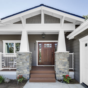
The goal for this Point Loma home was to transform it from the adorable beach bungalow it already was by expanding its footprint and giving it distinctive Craftsman characteristics while achieving a comfortable, modern aesthetic inside that perfectly caters to the active young family who lives here. By extending and reconfiguring the front portion of the home, we were able to not only add significant square footage, but create much needed usable space for a home office and comfortable family living room that flows directly into a large, open plan kitchen and dining area. A custom built-in entertainment center accented with shiplap is the focal point for the living room and the light color of the walls are perfect with the natural light that floods the space, courtesy of strategically placed windows and skylights. The kitchen was redone to feel modern and accommodate the homeowners busy lifestyle and love of entertaining. Beautiful white kitchen cabinetry sets the stage for a large island that packs a pop of color in a gorgeous teal hue. A Sub-Zero classic side by side refrigerator and Jenn-Air cooktop, steam oven, and wall oven provide the power in this kitchen while a white subway tile backsplash in a sophisticated herringbone pattern, gold pulls and stunning pendant lighting add the perfect design details. Another great addition to this project is the use of space to create separate wine and coffee bars on either side of the doorway. A large wine refrigerator is offset by beautiful natural wood floating shelves to store wine glasses and house a healthy Bourbon collection. The coffee bar is the perfect first top in the morning with a coffee maker and floating shelves to store coffee and cups. Luxury Vinyl Plank (LVP) flooring was selected for use throughout the home, offering the warm feel of hardwood, with the benefits of being waterproof and nearly indestructible - two key factors with young kids!
For the exterior of the home, it was important to capture classic Craftsman elements including the post and rock detail, wood siding, eves, and trimming around windows and doors. We think the porch is one of the cutest in San Diego and the custom wood door truly ties the look and feel of this beautiful home together.
 SJS Studios Inc.
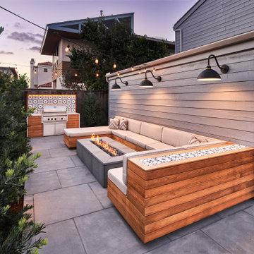
Bluestone Pavers, custom Teak Wood banquette with cement tile inlay, Bluestone firepit, custom outdoor kitchen with Teak Wood, concrete waterfall countertop with Teak surround.


 ZeroEnergy Design
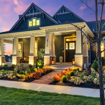
This LEED Platinum certified house reflects the homeowner's desire for an exceptionally healthy and comfortable living environment, within a traditional neighborhood.
INFILL SITE. The family, who moved from another area of Wellesley, sought out this property to be within walking distance of the high school and downtown area. An existing structure on the tight lot was removed to make way for the new home. 84% of the construction waste, from both the previous structure and the new home, was diverted from a landfill. ZED designed to preserve the existing mature trees on the perimeter of the property to minimize site impacts, and to maintain the character of the neighborhood as well as privacy on the site.
EXTERIOR EXPRESSION. The street facade of the home relates to the local New England vernacular. The rear uses contemporary language, a nod to the family’s Californian roots, to incorporate a roof deck, solar panels, outdoor living space, and the backyard swimming pool. ZED’s careful planning avoided to the need to face the garage doors towards the street, a common syndrome of a narrow lot.
THOUGHTFUL SPACE. Homes with dual entries can often result in duplicate and unused spaces. In this home, the everyday and formal entry areas are one and the same; the front and garage doors share the entry program of coat closets, mudroom storage with bench for removing your shoes, and a laundry room with generous closets for the children's sporting equipment. The entry area leads directly to the living space, encompassing the kitchen, dining and sitting area areas in an L-shaped open plan arrangement. The kitchen is placed at the south-west corner of the space to allow for a strong connection to the dining, sitting and outdoor living spaces. A fire pit on the deck satisfies the family’s desire for an open flame while a sealed gas fireplace is used indoors - ZED’s preference after omitting gas burning appliances completely from an airtight home. A small study, with a window seat, is conveniently located just off of the living space. A first floor guest bedroom includes an accessible bathroom for aging visitors and can be used as a master suite to accommodate aging in place.
HEALTHY LIVING. The client requested a home that was easy to clean and would provide a respite from seasonal allergies and common contaminants that are found in many indoor spaces. ZED selected easy to clean solid surface flooring throughout, provided ample space for cleaning supplies on each floor, and designed a mechanical system with ventilation that provides a constant supply of fresh outdoor air. ZED selected durable materials, finishes, cabinetry, and casework with low or no volatile organic compounds (VOCs) and no added urea formaldehyde.
YEAR-ROUND COMFORT. The home is super insulated and air-tight, paired with high performance triple-paned windows, to ensure it is draft-free throughout the winter (even when in front of the large windows and doors). ZED designed a right-sized heating and cooling system to pair with the thermally improved building enclosure to ensure year-round comfort. The glazing on the home maximizes passive solar gains, and facilitates cross ventilation and daylighting.
ENERGY EFFICIENT. As one of the most energy efficient houses built to date in Wellesley, the home highlights a practical solution for Massachusetts. First, the building enclosure reduces the largest energy requirement for typical houses (heating). Super-insulation, exceptional air sealing, a thermally broken wall assembly, triple pane windows, and passive solar gain combine for a sizable heating load reduction. Second, within the house only efficient systems consume energy. These include an air source heat pump for heating & cooling, a heat pump hot water heater, LED lighting, energy recovery ventilation, and high efficiency appliances. Lastly, photovoltaics provide renewable energy help offset energy consumption. The result is an 89% reduction in energy use compared to a similar brand new home built to code requirements.
RESILIENT. The home will fare well in extreme weather events. During a winter power outage, heat loss will be very slow due to the super-insulated and airtight envelope– taking multiple days to drop to 60 degrees even with no heat source. An engineered drainage system, paired with careful the detailing of the foundation, will help to keep the finished basement dry. A generator will provide full operation of the all-electric house during a power outage.
OVERALL. The home is a reflection of the family goals and an expression of their values, beautifully enabling health, comfort, safety, resilience, and utility, all while respecting the planet.
ZED - Architect & Mechanical Designer
Bevilacqua Builders Inc - Contractor
Creative Land & Water Engineering - Civil Engineering
Barbara Peterson Landscape - Landscape Design
Nest & Company - Interior Furnishings
Eric Roth Photography - Photography
 Burmeister Woodwork
Reagen Taylor Photography
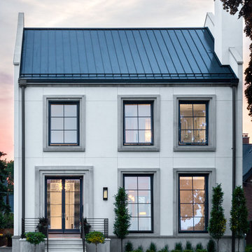
Mid-sized trendy white two-story stucco exterior home photo in Chicago with a metal roof
Mid-sized trendy white two-story stucco exterior home photo in Chicago with a metal roof
 Foursquare Builders
Casey Dunn
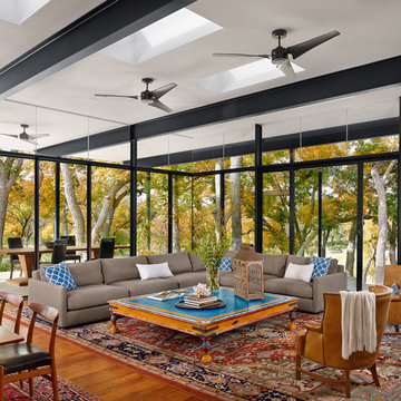
Inspiration for a large modern open concept medium tone wood floor living room remodel in Austin with white walls, a stone fireplace and a wall-mounted tv
Inspiration for a large modern open concept medium tone wood floor living room remodel in Austin with white walls, a stone fireplace and a wall-mounted tv
 BRADSHAW DESIGNS LLC
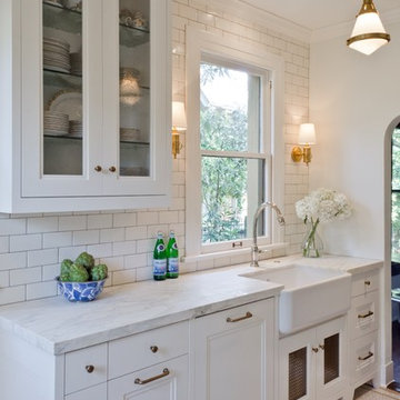
This Award-winning kitchen proves vintage doesn't have to look old and tired. This previously dark kitchen was updated with white, gold, and wood in the historic district of Monte Vista. The challenge is making a new kitchen look and feel like it belongs in a charming older home. The highlight and starting point is the original hex tile flooring in white and gold. It was in excellent condition and merely needed a good cleaning. The addition of white calacatta marble, white subway tile, walnut wood counters, brass and gold accents keep the charm intact. Cabinet panels mimic original door panels found in other areas of the home. Custom coffee storage is a modern bonus! Sub-Zero Refrig, Rohl sink, brass woven wire grill.
 TVL Creative Ltd.
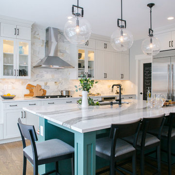
Our clients had just recently closed on their new house in Stapleton and were excited to transform it into their perfect forever home. They wanted to remodel the entire first floor to create a more open floor plan and develop a smoother flow through the house that better fit the needs of their family. The original layout consisted of several small rooms that just weren’t very functional, so we decided to remove the walls that were breaking up the space and restructure the first floor to create a wonderfully open feel.
After removing the existing walls, we rearranged their spaces to give them an office at the front of the house, a large living room, and a large dining room that connects seamlessly with the kitchen. We also wanted to center the foyer in the home and allow more light to travel through the first floor, so we replaced their existing doors with beautiful custom sliding doors to the back yard and a gorgeous walnut door with side lights to greet guests at the front of their home.
Living Room
Our clients wanted a living room that could accommodate an inviting sectional, a baby grand piano, and plenty of space for family game nights. So, we transformed what had been a small office and sitting room into a large open living room with custom wood columns. We wanted to avoid making the home feel too vast and monumental, so we designed custom beams and columns to define spaces and to make the house feel like a home. Aesthetically we wanted their home to be soft and inviting, so we utilized a neutral color palette with occasional accents of muted blues and greens.
Dining Room
Our clients were also looking for a large dining room that was open to the rest of the home and perfect for big family gatherings. So, we removed what had been a small family room and eat-in dining area to create a spacious dining room with a fireplace and bar. We added custom cabinetry to the bar area with open shelving for displaying and designed a custom surround for their fireplace that ties in with the wood work we designed for their living room. We brought in the tones and materiality from the kitchen to unite the spaces and added a mixed metal light fixture to bring the space together
Kitchen
We wanted the kitchen to be a real show stopper and carry through the calm muted tones we were utilizing throughout their home. We reoriented the kitchen to allow for a big beautiful custom island and to give us the opportunity for a focal wall with cooktop and range hood. Their custom island was perfectly complimented with a dramatic quartz counter top and oversized pendants making it the real center of their home. Since they enter the kitchen first when coming from their detached garage, we included a small mud-room area right by the back door to catch everyone’s coats and shoes as they come in. We also created a new walk-in pantry with plenty of open storage and a fun chalkboard door for writing notes, recipes, and grocery lists.
Office
We transformed the original dining room into a handsome office at the front of the house. We designed custom walnut built-ins to house all of their books, and added glass french doors to give them a bit of privacy without making the space too closed off. We painted the room a deep muted blue to create a glimpse of rich color through the french doors
Powder Room
The powder room is a wonderful play on textures. We used a neutral palette with contrasting tones to create dramatic moments in this little space with accents of brushed gold.
Master Bathroom
The existing master bathroom had an awkward layout and outdated finishes, so we redesigned the space to create a clean layout with a dream worthy shower. We continued to use neutral tones that tie in with the rest of the home, but had fun playing with tile textures and patterns to create an eye-catching vanity. The wood-look tile planks along the floor provide a soft backdrop for their new free-standing bathtub and contrast beautifully with the deep ash finish on the cabinetry.
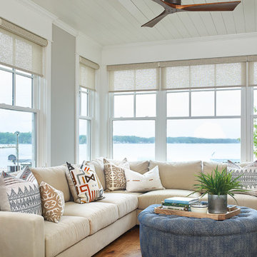 Visbeen Architects
This cozy lake cottage skillfully incorporates a number of features that would normally be restricted to a larger home design. A glance of the exterior reveals a simple story and a half gable running the length of the home, enveloping the majority of the interior spaces. To the rear, a pair of gables with copper roofing flanks a covered dining area that connects to a screened porch. Inside, a linear foyer reveals a generous staircase with cascading landing. Further back, a centrally placed kitchen is connected to all of the other main level entertaining spaces through expansive cased openings. A private study serves as the perfect buffer between the homes master suite and living room. Despite its small footprint, the master suite manages to incorporate several closets, built-ins, and adjacent master bath complete with a soaker tub flanked by separate enclosures for shower and water closet. Upstairs, a generous double vanity bathroom is shared by a bunkroom, exercise space, and private bedroom. The bunkroom is configured to provide sleeping accommodations for up to 4 people. The rear facing exercise has great views of the rear yard through a set of windows that overlook the copper roof of the screened porch below.
Builder: DeVries & Onderlinde Builders
Interior Designer: Vision Interiors by Visbeen
Photographer: Ashley Avila Photography
Sponsored
Westerville, OH

Custom Home Works
Franklin County's Award-Winning Design, Build and Remodeling Expert
 Cummings Architecture + Interiors
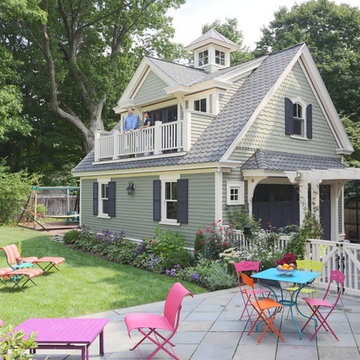
Looking at this home today, you would never know that the project began as a poorly maintained duplex. Luckily, the homeowners saw past the worn façade and engaged our team to uncover and update the Victorian gem that lay underneath. Taking special care to preserve the historical integrity of the 100-year-old floor plan, we returned the home back to its original glory as a grand, single family home.
The project included many renovations, both small and large, including the addition of a a wraparound porch to bring the façade closer to the street, a gable with custom scrollwork to accent the new front door, and a more substantial balustrade. Windows were added to bring in more light and some interior walls were removed to open up the public spaces to accommodate the family’s lifestyle.
You can read more about the transformation of this home in Old House Journal: http://www.cummingsarchitects.com/wp-content/uploads/2011/07/Old-House-Journal-Dec.-2009.pdf
Photo Credit: Eric Roth
 River Valley Landscapes
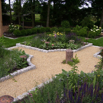
The property is one of the original farm houses located on the main street of a small town. It has been in the family for many years and our client just inherited the property. They were trying to have balance of preserving the old while realizing modern day living has its benefits too. The house had a large addition added using mostly old style materials, but designed with function and modern day luxuries. Our goal was to carry that theme to the outside.
Our first problem we had to address was how to transition between the first floor elevation changes. The lower room was the husband’s office. He stated in the future he may have clients over and it would be nice to have an area to sit outside. The wife’s main concern was to renew the four corner garden. She also felt it was very important to be able to see it from the kitchen area. Finally there was an old wishing well stuck right outside the kitchen. They both felt it would be neat to be able to incorporate this in some how. They wanted a patio area with a built in grill to accommodate there family and friends. They also wanted to keep a large play area for the kids.
We were able to pull this off successfully. We addressed the first issue by having a small lower level flagstone area. This area is large enough for 1 to 2 people to sit comfortably. It also provides a transition from his office to the larger patio area. We installed a simple small gravel sitting area opposite of the main patio. This provides our client a secluded place to relax or do business. Mrs.... told me she is amazed how much her and her husband enjoys this area. It is so peaceful looking at the small creek over a glass of wine.
We built a natural limestone retaining wall to create the patio terrace. The stone was chosen to extend the houses architectural elements into the landscape. Irregular broken flagstone was used to give it a more casual feel. We installed three Serviceberries into the patio terrace to replace some trees that were taken down during the remodeling. She was very concern that they would block the view of the four corner garden. We new they were crucial to nestle in the terrace, so we placed them for a couple days for her to decide. Fortunately she agreed they not only kept the view open, but helped frame the garden.
The four corner garden was designed to be viewed from afar and experienced up close. We wanted the space to have some formal structure while keeping with the casual farm house feel. Another natural limestone retaining wall was created. This leveled the garden terrace and helped associate it with the rest of the property. The four corner garden is nestled into the existing woods edge. This provides three distinct experiences to entering the garden; a more formal from the driveway, an open feel from the lower lawn, and a more natural / casual experience from the wooded area. The Plymouth brown gravel was used for the center of the garden. This helped highlight the stone post that was found during construction. The gravel also brings the sense of sound into the garden space. Lamb’s ear was chosen as a fun way to get kids interest in horticulture.
The balance of using the new to create the old feel is what makes this project a success. The property has already hosted a local historical society event and won an award for its preservation efforts. When Mrs.... can’t find her husband, she knows he is either reading the newspaper by the grill or resting in the hammock along the wood’s path.
 Vision Interiors
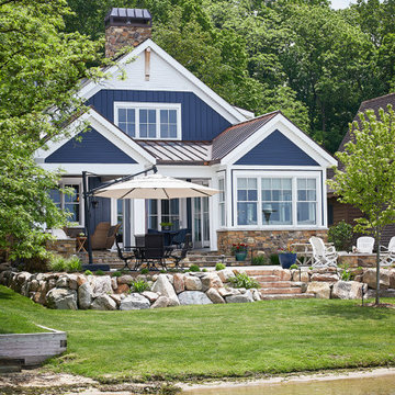
This cozy lake cottage skillfully incorporates a number of features that would normally be restricted to a larger home design. A glance of the exterior reveals a simple story and a half gable running the length of the home, enveloping the majority of the interior spaces. To the rear, a pair of gables with copper roofing flanks a covered dining area and screened porch. Inside, a linear foyer reveals a generous staircase with cascading landing.
Further back, a centrally placed kitchen is connected to all of the other main level entertaining spaces through expansive cased openings. A private study serves as the perfect buffer between the homes master suite and living room. Despite its small footprint, the master suite manages to incorporate several closets, built-ins, and adjacent master bath complete with a soaker tub flanked by separate enclosures for a shower and water closet.
Upstairs, a generous double vanity bathroom is shared by a bunkroom, exercise space, and private bedroom. The bunkroom is configured to provide sleeping accommodations for up to 4 people. The rear-facing exercise has great views of the lake through a set of windows that overlook the copper roof of the screened porch below.

 Ward Jewell Architect AIA
These clients came to my office looking for an architect who could design their "empty nest" home that would be the focus of their soon to be extended family. A place where the kids and grand kids would want to hang out: with a pool, open family room/ kitchen, garden; but also one-story so there wouldn't be any unnecessary stairs to climb. They wanted the design to feel like "old Pasadena" with the coziness and attention to detail that the era embraced. My sensibilities led me to recall the wonderful classic mansions of San Marino, so I designed a manor house clad in trim Bluestone with a steep French slate roof and clean white entry, eave and dormer moldings that would blend organically with the future hardscape plan and thoughtfully landscaped grounds.
The site was a deep, flat lot that had been half of the old Joan Crawford estate; the part that had an abandoned swimming pool and small cabana. I envisioned a pavilion filled with natural light set in a beautifully planted park with garden views from all sides. Having a one-story house allowed for tall and interesting shaped ceilings that carved into the sheer angles of the roof. The most private area of the house would be the central loggia with skylights ensconced in a deep woodwork lattice grid and would be reminiscent of the outdoor “Salas” found in early Californian homes. The family would soon gather there and enjoy warm afternoons and the wonderfully cool evening hours together.
Working with interior designer Jeffrey Hitchcock, we designed an open family room/kitchen with high dark wood beamed ceilings, dormer windows for daylight, custom raised panel cabinetry, granite counters and a textured glass tile splash. Natural light and gentle breezes flow through the many French doors and windows located to accommodate not only the garden views, but the prevailing sun and wind as well. The graceful living room features a dramatic vaulted white painted wood ceiling and grand fireplace flanked by generous double hung French windows and elegant drapery. A deeply cased opening draws one into the wainscot paneled dining room that is highlighted by hand painted scenic wallpaper and a barrel vaulted ceiling. The walnut paneled library opens up to reveal the waterfall feature in the back garden. Equally picturesque and restful is the view from the rotunda in the master bedroom suite.
Architect: Ward Jewell Architect, AIA
Interior Design: Jeffrey Hitchcock Enterprises
Contractor: Synergy General Contractors, Inc.
Landscape Design: LZ Design Group, Inc.
Photography: Laura Hull

 Pool Environments, Inc.
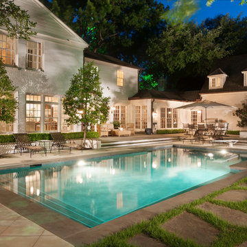
Originally designed by one of the most notable landscape architects in town, this once impressive project had faltered in recent years. The pool and spa still functioned well, and the client wanted to keep it intact. In addition, they wanted to keep as much of the existing landscaping as possible. The surrounding decks, walls, and steps were fair game. At first glance, one might think that our changes were simple material changes. Upon closer inspection, however, one can see the subtle, yet transformative changes that come together to update this classic pool in a tasteful, timeless manner, and improve the flow and usability of the deck areas, while softening the feel of the massive hardscape.
The subtle changes begin as soon as you walk out the back door of the house. The existing decking had a lot of what we call “tweeners”; areas that are overly generous walkways, yet not large enough to house furniture. The awkwardly small bluestone patio was expanded to accommodate a generous seating area, by pushing the step-down closer to the pool. Our talented stone mason carefully married the new bluestone into the existing, resulting in an imperceptible difference between the two. As you descend the new bluestone steps to the pool level, your bare feet will be thankful for the new smooth-finished limestone colored concrete, with a hand cut pattern carefully etched into its surface. The old red brick decking was so hot that the owners could not walk around the pool in bare feet. The brick coping was also replaced with an eased edge Pennsylvania Premier Stone which matches the new step treads throughout the project. Between the house and the pool, a large raised planter was reconfigured, giving additional space to the pool deck for a shaded lounge chair area.
Across the pool, a bank of rather tall painted brick retaining walls were cut down, shortened, and moved. This lessened the visual impact of the walls, which were rather overwhelming in the space, as well as opening up a new seating area, nestled under the arms of the massive pecan at the back of the property. Rather than continuing solid decking around the entire pool, the area near these walls has been transformed to large stone stepper pads set in a sea of beautiful St. Augustine lawn. This creates a visually softened area that is still suited to setting tables and chairs when the guest list calls for additional seating.
The spa area is quite possibly the most dramatic change on this project. Yet more raised planter walls divided this area into awkward spaces, unsuited to proper furniture placement. The planters were removed, new stone decks, once again expertly married into the existing, opening the area to house a large dining table and new built in bbq area. The spa itself was re-imagined with the bluestone coping, and painted brick veneer. The most impressive addition though is the new handmade glazed tiles that surround the existing cast stone water feature. This water feature was almost unnoticeable against the painted brick wall, but now the dramatic arch and pop of color draw the eye to this quaint little corner of the property.
 Dillard-Jones Builders
Inspiro 8
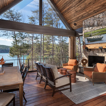
Mountain style deck photo in Other with a fire pit and a roof extension
Mountain style deck photo in Other with a fire pit and a roof extension

 Barbara Grushow Designs Inc.
Jim Bartsch Photography
Bathroom - mid-sized transitional master white tile and subway tile mosaic tile floor and gray floor bathroom idea in Los Angeles with a wall-mount sink, gray walls, a hinged shower door and a niche
Bathroom - mid-sized transitional master white tile and subway tile mosaic tile floor and gray floor bathroom idea in Los Angeles with a wall-mount sink, gray walls, a hinged shower door and a niche
3