
Search results for "How to paint wall mural" in Home Design Ideas
 Interiors by Natasha
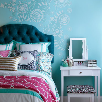
I was hired by the parents of a soon-to-be teenage girl turning 13 years-old. They wanted to remodel her bedroom from a young girls room to a teenage room. This project was a joy and a dream to work on! I got the opportunity to channel my inner child. I wanted to design a space that she would love to sleep in, entertain, hangout, do homework, and lounge in.
The first step was to interview her so that she would feel like she was a part of the process and the decision making. I asked her what was her favorite color, what was her favorite print, her favorite hobbies, if there was anything in her room she wanted to keep, and her style.
The second step was to go shopping with her and once that process started she was thrilled. One of the challenges for me was making sure I was able to give her everything she wanted. The other challenge was incorporating her favorite pattern-- zebra print. I decided to bring it into the room in small accent pieces where it was previously the dominant pattern throughout her room. The color palette went from light pink to her favorite color teal with pops of fuchsia. I wanted to make the ceiling a part of the design so I painted it a deep teal and added a beautiful teal glass and crystal chandelier to highlight it. Her room became a private oasis away from her parents where she could escape to. In the end we gave her everything she wanted.
Photography by Haigwood Studios
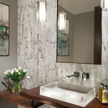
Example of a small trendy beige tile and marble tile marble floor and white floor powder room design in Phoenix with gray walls, a vessel sink, wood countertops, open cabinets, a one-piece toilet and brown countertops
 Jenni Leasia Interior Design
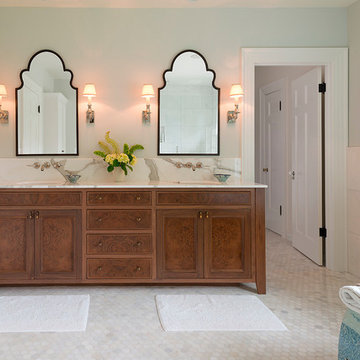
The bathroom enjoys great views. The standalone white bathtub placed beside a large window is equipped with a Hans Grohe tub filler. The window features a soft custom made roman shade. We furnished the area with a blue patterned garden stool. The bathroom floor features a hexagon mosaic tile. We designed the walnut vanity with a marble countertop and backsplash, and his and her undermount sinks. The vanity is paired with unique mirrors flanked by tiny lamp sconced lighting.
Project by Portland interior design studio Jenni Leasia Interior Design. Also serving Lake Oswego, West Linn, Vancouver, Sherwood, Camas, Oregon City, Beaverton, and the whole of Greater Portland.
For more about Jenni Leasia Interior Design, click here: https://www.jennileasiadesign.com/
To learn more about this project, click here:
https://www.jennileasiadesign.com/breyman
Find the right local pro for your project
 Morgan Mural Studios
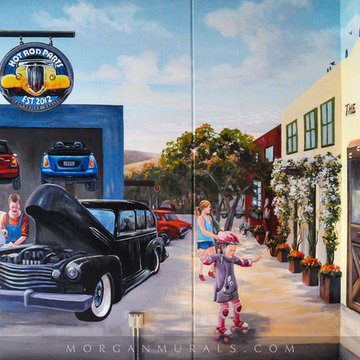
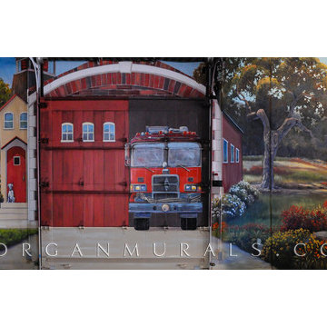
This is a hand painted mural on a 2000 SF retaining wall that wraps around an indoor play space for a large family. The mural includes images of the family, their friends and extended family. The quaint town scene is a sweet, inviting backdrop for their pool and foosball table, or for a game of indoor soccer on the artificial turf flooring. I incorporated trompe l'oeil elements with realistic scale and also long vistas, so the viewer feels like they can walk right in to the scene.
 Paintzen, Inc.
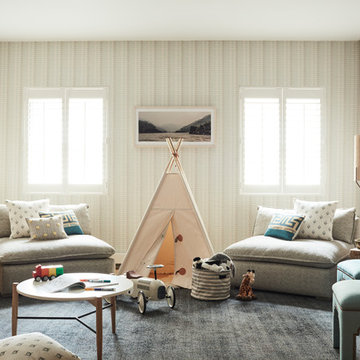
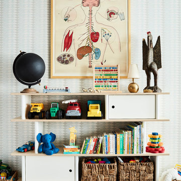
When we imagine the homes of our favorite actors, we often think of picturesque kitchens, artwork hanging on the walls, luxurious furniture, and pristine conditions 24/7. But for celebrities with children, sometimes that last one isn’t always accurate! Kids will be kids – which means there may be messy bedrooms, toys strewn across their play area, and maybe even some crayon marks or finger-paints on walls or floors.
Lucy Liu recently partnered with One Kings Lane and Paintzen to redesign her son Rockwell’s playroom in their Manhattan apartment for that reason. Previously, Lucy had decided not to focus too much on the layout or color of the space – it was simply a room to hold all of Rockwell’s toys. There wasn’t much of a design element to it and very little storage.
Lucy was ready to change that – and transform the room into something more sophisticated and tranquil for both Rockwell and for guests (especially those with kids!). And to really bring that transformation to life, one of the things that needed to change was the lack of color and texture on the walls.
When selecting the color palette, Lucy and One Kings Lane designer Nicole Fisher decided on a more neutral, contemporary style. They chose to avoid the primary colors, which are too often utilized in children’s rooms and playrooms.
Instead, they chose to have Paintzen paint the walls in a cozy gray with warm beige undertones. (Try PPG ‘Slate Pebble’ for a similar look!) It created a perfect backdrop for the decor selected for the room, which included a tepee for Rockwell, some Tribal-inspired artwork, Moroccan woven baskets, and some framed artwork.
To add texture to the space, Paintzen also installed wallpaper on two of the walls. The wallpaper pattern involved muted blues and grays to add subtle color and a slight contrast to the rest of the walls. Take a closer look at this smartly designed space, featuring a beautiful neutral color palette and lots of exciting textures!
 building Lab, inc.
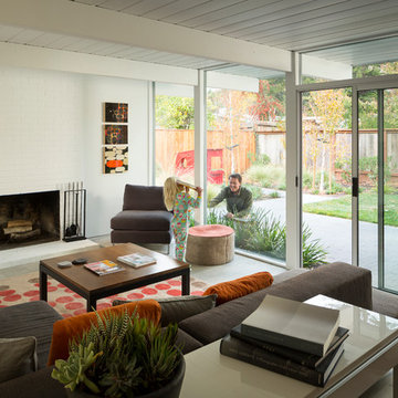
Eichler in Marinwood - In conjunction to the porous programmatic kitchen block as a connective element, the walls along the main corridor add to the sense of bringing outside in. The fin wall adjacent to the entry has been detailed to have the siding slip past the glass, while the living, kitchen and dining room are all connected by a walnut veneer feature wall running the length of the house. This wall also echoes the lush surroundings of lucas valley as well as the original mahogany plywood panels used within eichlers.
photo: scott hargis
 L. Weatherbee Design Studio
Lisa Weatherbee
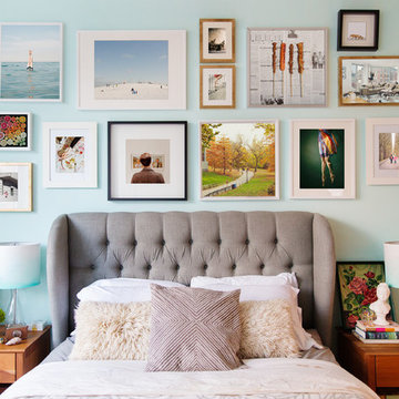
Example of an eclectic bedroom design in New York with blue walls
Example of an eclectic bedroom design in New York with blue walls

 Earth Clay Works. American Clay
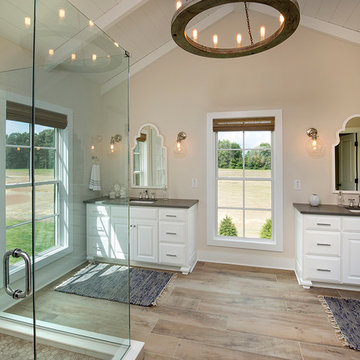
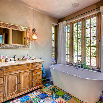
Freestanding bathtub - southwestern multicolored floor freestanding bathtub idea in Denver with medium tone wood cabinets, beige walls, an undermount sink and recessed-panel cabinets
 Carl Mattison Design
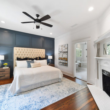
The master bedroom is split into this room with original fireplace, a sitting room and private porch. A wainscoting wall painted Sherwin Williams Mount Etna anchors the bed.
 Beckwith Interiors
Designed by Senior Designer, Samantha Culbreath
Photographed by Chip Pankey
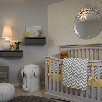
Example of a transitional gender-neutral carpeted nursery design in Nashville with gray walls
Example of a transitional gender-neutral carpeted nursery design in Nashville with gray walls
 Morrone Interiors
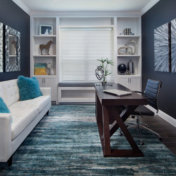
Our client asked for a home office he could actually enjoy. This is what we came up. It features, a custom built in with shelving and a bench, a blue rug by Dalyn Rugs, blue pillows, white leather couch, wall mirrors, blue artwork by Leftbank Art, and a modern desk by Sunpan. He Loved it. So can you! Ask about our E-Design services today.
 Paintzen, Inc.
When we imagine the homes of our favorite actors, we often think of picturesque kitchens, artwork hanging on the walls, luxurious furniture, and pristine conditions 24/7. But for celebrities with children, sometimes that last one isn’t always accurate! Kids will be kids – which means there may be messy bedrooms, toys strewn across their play area, and maybe even some crayon marks or finger-paints on walls or floors.
Lucy Liu recently partnered with One Kings Lane and Paintzen to redesign her son Rockwell’s playroom in their Manhattan apartment for that reason. Previously, Lucy had decided not to focus too much on the layout or color of the space – it was simply a room to hold all of Rockwell’s toys. There wasn’t much of a design element to it and very little storage.
Lucy was ready to change that – and transform the room into something more sophisticated and tranquil for both Rockwell and for guests (especially those with kids!). And to really bring that transformation to life, one of the things that needed to change was the lack of color and texture on the walls.
When selecting the color palette, Lucy and One Kings Lane designer Nicole Fisher decided on a more neutral, contemporary style. They chose to avoid the primary colors, which are too often utilized in children’s rooms and playrooms.
Instead, they chose to have Paintzen paint the walls in a cozy gray with warm beige undertones. (Try PPG ‘Slate Pebble’ for a similar look!) It created a perfect backdrop for the decor selected for the room, which included a tepee for Rockwell, some Tribal-inspired artwork, Moroccan woven baskets, and some framed artwork.
To add texture to the space, Paintzen also installed wallpaper on two of the walls. The wallpaper pattern involved muted blues and grays to add subtle color and a slight contrast to the rest of the walls. Take a closer look at this smartly designed space, featuring a beautiful neutral color palette and lots of exciting textures!
 Morgan Mural Studios
This is a hand painted mural on a 2000 SF retaining wall that wraps around an indoor play space for a large family. The mural includes images of the family, their friends and extended family. The quaint town scene is a sweet, inviting backdrop for their pool and foosball table, or for a game of indoor soccer on the artificial turf flooring. I incorporated trompe l'oeil elements with realistic scale and also long vistas, so the viewer feels like they can walk right in to the scene.

 Sciuga Custom Builders
Revette Photography
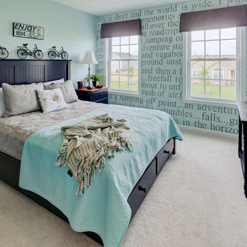
Example of a transitional guest carpeted bedroom design in New York with no fireplace and blue walls
Example of a transitional guest carpeted bedroom design in New York with no fireplace and blue walls
 Lindsey Runyon Design
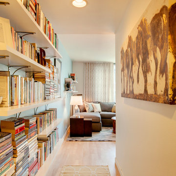
Our client’s love of books directed much of the use of the wall space in the entry and living room. The books provide areas of color and visual interest against the newly painted accent wall in Silken Blue by Benjamin Moore.
 Morgan Mural Studios
This is a hand painted mural on a 2000 SF retaining wall that wraps around an indoor play space for a large family. The mural includes images of the family, their friends and extended family. The quaint town scene is a sweet, inviting backdrop for their pool and foosball table, or for a game of indoor soccer on the artificial turf flooring. I incorporated trompe l'oeil elements with realistic scale and also long vistas, so the viewer feels like they can walk right in to the scene.


Sponsored
Columbus, OH

Wannemacher Interiors
Customized Award-Winning Interior Design Solutions in Franklin Cnty OH
 TKS Design Group
Download our free ebook, Creating the Ideal Kitchen. DOWNLOAD NOW
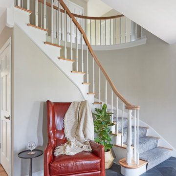
Lakefront property in the northwest suburbs of Chicago is hard to come by, so when we were hired by this young family with exactly that, we were immediately inspired by not just the unusually large footprint of this 1950’s colonial revival but also the lovely views of the manmade lake it was sited on. The large 5-bedroom home was solidly stuck in the 1980’s, but we saw tons of potential. We started out by updating the existing staircase with a fresh coat of paint and adding new herringbone slate to the entry hall.
The powder room off the entryway also got a refresh - new flooring, new cabinets and fixtures. We ran the new slate right through into this space for some consistency. A fun wallpaper and shiplap trim add a welcoming feel and set the tone for the home.
Next, we tackled the kitchen. Located away from the rest of the first floor, the kitchen felt a little isolated, so we immediately began planning for how to better connect it to the rest of the first floor. We landed on removing the wall between the kitchen and dining room and designed a modified galley style space with separate cooking and clean up zones. The cooking zone consists of the refrigerator, prep sink and cooktop, along with a nice long run of prep space at the island. The cleanup side of the kitchen consists of the main sink and dishwasher. Both areas are situated so that the user can view the lake during prep work and cleanup!
One of the home’s main puzzles was how to incorporate the mudroom and area in front of the patio doors at the back of the house. We already had a breakfast table area, so the space by the patio doors was a bit of a no man’s land. We decided to separate the kitchen proper from what became the new mudroom with a large set of barn doors. That way you can quickly hide any mudroom messes but have easy access to the light coming in through the patio doors as well as the outdoor grilling station. We also love the impact the barn doors add to the overall space.
The homeowners’ first words to us were “it’s time to ditch the brown,” so we did! We chose a lovely blue pallet that reflects the home’s location on the lake which is also vibrant yet easy on the eye. Countertops are white quartz, and the natural oak floor works well with the other honey accents. The breakfast table was given a refresh with new chairs, chandelier and window treatments that frame the gorgeous views of the lake out the back.
We coordinated the slate mudroom flooring with that used in the home’s main entrance for a consistent feel. The storage area consists of open and closed storage to allow for some clutter control as needed.
Next on our “to do” list was revamping the dated brown bar area in the neighboring dining room. We eliminated the clutter by adding some closed cabinets and did some easy updates to help the space feel more current. One snag we ran into here was the discovery of a beam above the existing open shelving that had to be modified with a smaller structural beam to allow for our new design to work. This was an unexpected surprise, but in the end we think it was well worth it!
We kept the colors here a bit more muted to blend with the homeowner’s existing furnishings. Open shelving and polished nickel hardware add some simple detail to the new entertainment zone which also looks out onto the lake!
Next we tackled the upstairs starting with the homeowner’s son’s bath. The bath originally had both a tub shower and a separate shower, so we decided to swap out the shower for a new laundry area. This freed up some space downstairs in what used to be the mudroom/laundry room and is much more convenient for daily laundry needs.
We continued the blue palette here with navy cabinetry and the navy tile in the shower. Porcelain floor tile and chrome fixtures keep maintenance to a minimum while matte black mirrors and lighting add some depth the design. A low maintenance runner adds some warmth underfoot and ties the whole space together.
We added a pocket door to the bathroom to minimize interference with the door swings. The left door of the laundry closet is on a 180 degree hinge to allow for easy full access to the machines. Next we tackled the master bath which is an en suite arrangement. The original was typical of the 1980’s with the vanity outside of the bathroom, situated near the master closet. And the brown theme continued here with multiple shades of brown.
Our first move was to segment off the bath and the closet from the master bedroom. We created a short hall from the bedroom to the bathroom with his and hers walk-in closets on the left and right as well as a separate toilet closet outside of the main bathroom for privacy and flexibility.
The original bathroom had a giant soaking tub with steps (dangerous!) as well as a small shower that did not work well for our homeowner who is 6’3”. With other bathtubs in the home, they decided to eliminate the tub and create an oversized shower which takes up the space where the old tub was located. The double vanity is on the opposite wall and a bench is located under the window for morning conversations and a place to set a couple of towels.
The pallet in here is light and airy with a mix of blond wood, creamy porcelain and marble tile, and brass accents. A simple roman shade adds some texture and it’s top-down mechanism allows for light and privacy.
This large whole house remodel gave our homeowners not only the ability to maximize the potential of their home but also created a lovely new frame from which to view their fabulous lake views.
Designed by: Susan Klimala, CKD, CBD
Photography by: Michael Kaskel
For more information on kitchen and bath design ideas go to: www.kitchenstudio-ge.com
 cg interiors group
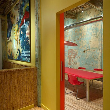
Two adjacent warehouse units in a circa 1915 building, listed on the National Register of Historic Places, were combined into a single modern live / work space. Careful consideration was paid to honoring and preserving original elements like exposed brick walls, timber beams and columns, hardwood and concrete floors and plaster walls.
 Roomscapes Cabinetry and Design Center
Designed by Cameron Snyder, CKD and Julie Lyons.
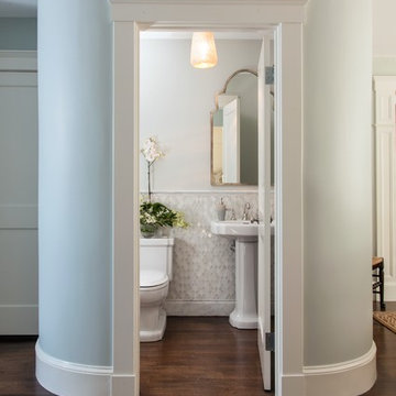
Removing the former wall between the kitchen and dining room to create an open floor plan meant the former powder room tucked in a corner needed to be relocated.
Cameron designed a 7' by 6' space framed with curved wall in the middle of the new space to locate the new powder room and it became an instant focal point perfectly located for guests and easily accessible from the kitchen, living and dining room areas.
Both the pedestal lavatory and one piece sanagloss toilet are from TOTO Guinevere collection. Faucet is from the Newport Brass-Bevelle series in Polished Nickel with lever handles.
10