
Search results for "Immediately's digital" in Home Design Ideas

 My House Design|Build|Team
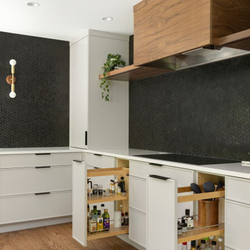
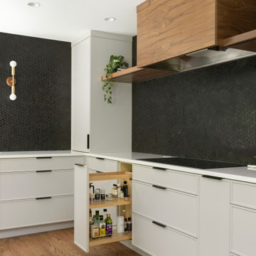
My House Design/Build Team | www.myhousedesignbuild.com | 604-694-6873 | Duy Nguyen Photography -------------------------------------------------------Right from the beginning it was evident that this Coquitlam Renovation was unique. It’s first impression was memorable as immediately after entering the front door, just past the dining table, there was a tree growing in the middle of home! Upon further inspection of the space it became apparent that this home had undergone several alterations during its lifetime... The kitchen was once a space that revealed the home’s layered history. It was evident there had been an addition as the dropped ceiling exposed where garage space had been captured to become part of the kitchen. By re-configuring the layout, we were able to create a gathering area at the peninsula, additional storage space, as well as add a hood fan – something the original space was lacking. Details like the Grand Canal paint colour from Sherwin Williams paired with the vertical grain walnut cabinets create a modern-vintage feel for this kitchen.
 Pinnacle Design & Remodeling
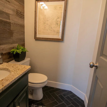
Powder bathroom off of the laundry room!
Bathroom - transitional bathroom idea in Minneapolis
Bathroom - transitional bathroom idea in Minneapolis
 Evgeniya Vlasova_Healing Art for Healthcare Spaces
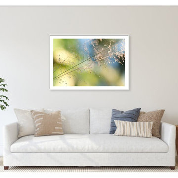
"The Beauty of the Earth. Natural Watercolor"
Healing Art for Healthcare project.
Offering as ready metal, wood, acrylic, or farmed prints or canva in a different sizes. Also available as image licensing for your own local printing.
Worldwide delivery.
I seem to have lost track of countless times this grass photo has sold, as prints or as digital licenses to interior design and art advisors companies for healthcare projects. Just couple of months ago this image license was sold once again for wall art project in one of USA clinic.
The reasons why it will be suitable almost for any wall art solution for healthcare spaces:
- It immediately meets strict hospital Evidence-Based Design (EBD) criteria, which require realistic, non-threatening nature imagery.
- Zero Cognitive Fatigue. The composition lacks complex abstract shapes
- Flawless Color Compatibility. The natural green and blue undertones perfectly match standard healthcare finish palettes.
Research from The Center for Health Design shows that a balanced green-blue palette operates as a natural visual sedative, lowering acute environmental tension.
- Soft Fascination. For an image to restore mental energy, it must possess "soft fascination", visual properties that catch the eye gently without requiring active cognitive processing.
- Macro Minimalism. The viewer's eyes easily rest on central, glowing blades of grass, shifting the nervous system from a sympathetic state to a parasympathetic (rest-and-recover) state.
- Sunlight and Hope. Neurologically, sunlight signals a brand-new day, triggering the release of serotonin and offsetting the sterile, windowless spaces.
Find the right local pro for your project
 Nicole Arnold Interiors
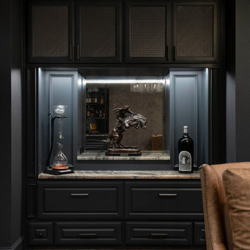
We had a ball turning an “original garage turned media room” into a dreamy bourbon lounge for our special clients. The extensive bourbon collection deserved all the best highlights including custom bistro shelving, ambient lighting and both beautiful and functional cabinetry. The vibe is moody and mysterious and the finishes are sophisticated. Cork metallic wallpaper, deep hued paint and the quartzite countertops, which immediately draw the eye with their beauty, all culminate to this amazingly relaxing space that make one want to put up their feet, light a cigar and enjoy a fine pour. The traditionally inspired furnishings keep the room cozy and comfortable, and ever so plush. The lounge and its adjacent bathroom were designed with masculine inspired finishes and speaks to the client’s love for music. The powder bath on the other side of the home is a jewel box of a room with a custom mural and vanity, dancing crystal lights and a pink lacquered ceiling. The two distinctly different spaces delivered exactly what each spouse was hoping for!
 Two Men And A Truck Santa Ana
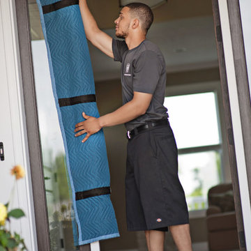
We take care of your property, doing everything we can to prevent scratches and damage. Let us know of any areas of concern and we will address it immediately.
 E_ Designs
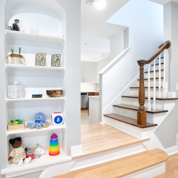
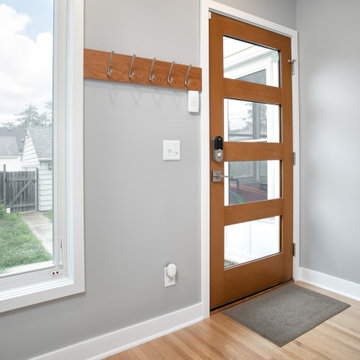
The home owner of this two-story south Minneapolis house, built in 1937, decided it was time to make some changes. One of the main wishes of the homeowners was to transform their boxed in multiple room layout into an open floor plan that would accommodate the needs of their growing family. To do this, structurally a lot of changes had to be made. The wall between the kitchen and dining room was torn out and an island took its place, creating a touch down zone to help define the space. The original tiny front entry was eliminated so that you immediately walked into open floor plan. The ½ bath became completely gutted and then relocated as a ¾ bath to where the original breakfast nook was, thus allowing for more kitchen cabinet space and then opening up the space of the heavily used back entry.
The aesthetic goal of the project was to create a minimal, clean look. White Oak hardwood to match existing oak floors were installed throughout the kitchen, back entry, and dining room. In the Kitchen, the countertop selected was a White Silestone’s Quartz and the upper cabinets continued the color white for a flawless look. To balance and warm up the space, a cherry was selected for the base cabinets and then incorporated in the floating shelves to tie the design together.
The upgraded ¾ bathroom’s aesthetics were similar to the kitchen to keep the cohesiveness of the project. Floors were done in Adura Flex tile. The shower was completed with large tile formatted in a horizontal straight set to give it a simple lines. The shower incorporates a Kohler Choreograph Shower barre.
Overall, the homeowners were able to achieve their minimal open floor plan and in turn, they plan to work with Castle again for their future project of tackling their upstairs.
 Patrick A. Finn, Ltd
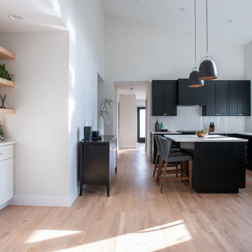
Looking from the living room directly through to the kitchen, this perspective beautifully showcases the dramatic transformation of the home’s layout. By significantly enlarging the opening between these two spaces, we removed the original claustrophobic, closed-off feeling and replaced it with a bright, semi-open concept flow.
Key Design Highlights of This View:
Enlarged Architectural Opening: Widening this passageway allows natural light to flood deep into the interior, immediately connecting the cozy living room seating area with the heart of the kitchen and beyond.
Seamless Sightlines: This expanded view draws the eye all the way through to the other end of the house. The kitchen’s sleek black cabinetry, modern pendant lighting, and central island make the entire home feel twice as spacious.
Consistent Design Language: The light hardwood flooring runs uninterrupted from the living room straight into the kitchen, visually unifying the two areas while maintaining distinct, functional zones.
Perfect for Entertaining: This semi-open layout strikes the perfect balance—offering enough separation to keep kitchen prep work slightly tucked away while keeping the cook fully connected to family and guests in the living room.

 Amy Pearson Design
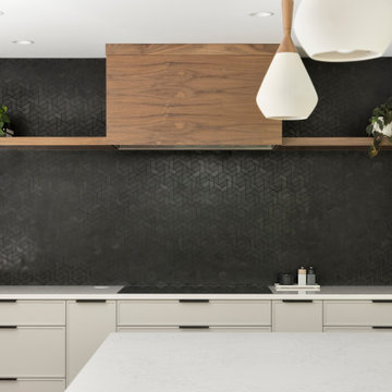
While the root of the scope stayed the same - open the kitchen to the dining and living rooms - this project grew into so much more than just reconfiguring spaces. The design team loved the creativity that comes from working with a trusting client and our opportunity to flex our design muscles in the mid century category. The goal was to not be literal with the design style, but to be respectful of the home’s original architecture and features while making it decidedly Pacific Northwest by letting it’s setting in the trees really shine!
We doubled the size of the kitchen, taking over an unused second eat-in space that sat immediately next to the homes dining room. We opened the walls between the dining/kitchen/and hallway creating an expansive open feel. Step in pantry closet that was lacking in efficiency and took up precious walk-way space was removed in favor of a custom pantry cabinet with roll-out shelves for easy use. The custom walnut stair railing is a welcomed greeting near the front door and ties all of the spaces together.
 E_ Designs
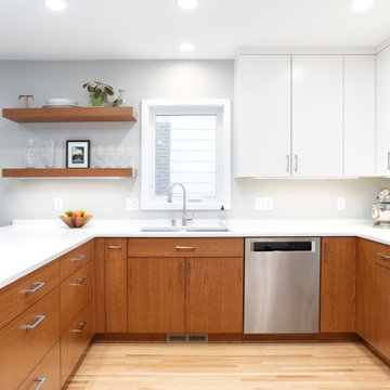
The home owner of this two-story south Minneapolis house, built in 1937, decided it was time to make some changes. One of the main wishes of the homeowners was to transform their boxed in multiple room layout into an open floor plan that would accommodate the needs of their growing family. To do this, structurally a lot of changes had to be made. The wall between the kitchen and dining room was torn out and an island took its place, creating a touch down zone to help define the space. The original tiny front entry was eliminated so that you immediately walked into open floor plan. The ½ bath became completely gutted and then relocated as a ¾ bath to where the original breakfast nook was, thus allowing for more kitchen cabinet space and then opening up the space of the heavily used back entry.
The aesthetic goal of the project was to create a minimal, clean look. White Oak hardwood to match existing oak floors were installed throughout the kitchen, back entry, and dining room. In the Kitchen, the countertop selected was a White Silestone’s Quartz and the upper cabinets continued the color white for a flawless look. To balance and warm up the space, a cherry was selected for the base cabinets and then incorporated in the floating shelves to tie the design together.
The upgraded ¾ bathroom’s aesthetics were similar to the kitchen to keep the cohesiveness of the project. Floors were done in Adura Flex tile. The shower was completed with large tile formatted in a horizontal straight set to give it a simple lines. The shower incorporates a Kohler Choreograph Shower barre.
Overall, the homeowners were able to achieve their minimal open floor plan and in turn, they plan to work with Castle again for their future project of tackling their upstairs.
 Advance Design Studio, Ltd.
Richard and Monica of Huntley, IL, needed to make better use of their kitchen as well as more storage for pots, pans, and countertop appliances. Their space was laid out unconventionally, making cooking a challenge. A triangular nook held their refrigerator, hard-to-reach cabinets, and a cramped pantry. They needed to find a solution, so they searched Facebook for home remodeling companies in their area. Soon they found Advance Design Studio’s profile and were immediately impressed.
“Advance Design was the first and last studio I contacted,” Richard said.
Richard called Advance Design and felt an immediate connection with Project Designer Nicole. She was knowledgeable and thorough and offered many unique solutions to their kitchen layout problem.
A week later, Nicole came out to their home to meet the couple. They talked about their kitchen remodeling project and told Nicole what they wanted in their dream kitchen. Nicole saw that the kitchen had weird angles that hindered the cabinets you could use. She knew that designing a space that met both the client’s needs and dreams would be challenging.
Nicole worked with Richard and Monica to create an innovative design. When the couple came out to Advance Design Studio in Gilberts, they were blown away by the 3D illustrations Nicole showed them.
“I incorporated a hidden pantry cabinet to not only be a cool feature but also allowed me to square off the walls to gain more cabinet space,” Nicole said.
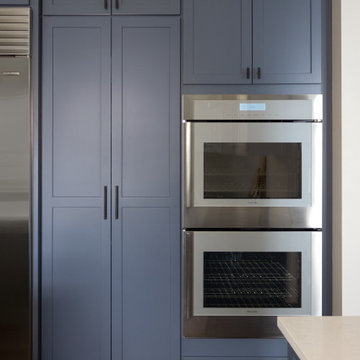
The hidden pantry added storage and squared off the strange triangular nook, creating a more traditional and functional kitchen layout. With the layout problems solved, they worked together to select materials. Richard and Monica wanted something brighter than their previous dark brown kitchen. They chose a combination of blue and white cabinetry with a white subway tile backsplash and white quartz countertops. The design was finalized, the materials were selected. It was time to begin construction.
One fear most homeowners have when beginning a home remodel is dust. Advance Design uses BuildClean HEPA filters to eliminate dust throughout the house while construction is going on. Project Manager Jason and his crew created temporary walls and cleaned up after every day of work.
“We were very impressed with how clean and organized the crew kept things while the remodeling process was underway,” Richard said.
The result is just what Richard and Monica envisioned when they began the process. Richard’s love for cooking can be explored through all-new Thermador appliances, featuring an easy-to-use induction cooktop, built-in double oven, and spacious refrigerator. Matte black hardware contrasts the bright white backsplash, countertops, and cabinets, while the stunning blue cabinets complement the dark hardwood floor and stainless-steel appliances. The dual pendant light fixtures over the reconfigured island are eye-catching and add necessary lighting.
This Huntley kitchen renovation turned out better than Richard and Monica hoped. Their experience with Advance Design’s Common Sense Remodeling process has them thinking about other projects they could do in the future.
Our award-winning design team would love to create a beautiful, functional, and spacious place for you and your family. With our “Common Sense Remodeling” approach, the process of renovating your home has never been easier. Contact us today at 847-665-1711 or schedule an appointment.
 E_ Designs
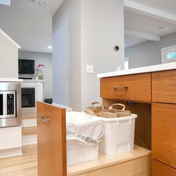
The home owner of this two-story south Minneapolis house, built in 1937, decided it was time to make some changes. One of the main wishes of the homeowners was to transform their boxed in multiple room layout into an open floor plan that would accommodate the needs of their growing family. To do this, structurally a lot of changes had to be made. The wall between the kitchen and dining room was torn out and an island took its place, creating a touch down zone to help define the space. The original tiny front entry was eliminated so that you immediately walked into open floor plan. The ½ bath became completely gutted and then relocated as a ¾ bath to where the original breakfast nook was, thus allowing for more kitchen cabinet space and then opening up the space of the heavily used back entry.
The aesthetic goal of the project was to create a minimal, clean look. White Oak hardwood to match existing oak floors were installed throughout the kitchen, back entry, and dining room. In the Kitchen, the countertop selected was a White Silestone’s Quartz and the upper cabinets continued the color white for a flawless look. To balance and warm up the space, a cherry was selected for the base cabinets and then incorporated in the floating shelves to tie the design together.
The upgraded ¾ bathroom’s aesthetics were similar to the kitchen to keep the cohesiveness of the project. Floors were done in Adura Flex tile. The shower was completed with large tile formatted in a horizontal straight set to give it a simple lines. The shower incorporates a Kohler Choreograph Shower barre.
Overall, the homeowners were able to achieve their minimal open floor plan and in turn, they plan to work with Castle again for their future project of tackling their upstairs.


 E_ Designs
The home owner of this two-story south Minneapolis house, built in 1937, decided it was time to make some changes. One of the main wishes of the homeowners was to transform their boxed in multiple room layout into an open floor plan that would accommodate the needs of their growing family. To do this, structurally a lot of changes had to be made. The wall between the kitchen and dining room was torn out and an island took its place, creating a touch down zone to help define the space. The original tiny front entry was eliminated so that you immediately walked into open floor plan. The ½ bath became completely gutted and then relocated as a ¾ bath to where the original breakfast nook was, thus allowing for more kitchen cabinet space and then opening up the space of the heavily used back entry.
The aesthetic goal of the project was to create a minimal, clean look. White Oak hardwood to match existing oak floors were installed throughout the kitchen, back entry, and dining room. In the Kitchen, the countertop selected was a White Silestone’s Quartz and the upper cabinets continued the color white for a flawless look. To balance and warm up the space, a cherry was selected for the base cabinets and then incorporated in the floating shelves to tie the design together.
The upgraded ¾ bathroom’s aesthetics were similar to the kitchen to keep the cohesiveness of the project. Floors were done in Adura Flex tile. The shower was completed with large tile formatted in a horizontal straight set to give it a simple lines. The shower incorporates a Kohler Choreograph Shower barre.
Overall, the homeowners were able to achieve their minimal open floor plan and in turn, they plan to work with Castle again for their future project of tackling their upstairs.
Sponsored
Columbus, OH

Snider & Metcalf Interior Design, LTD
Leading Interior Designers in Columbus, Ohio & Ponte Vedra, Florida

 One SEED Architecture + Interiors
Architecture: One SEED Architecture + Interiors (www.oneseed.ca)
Photo: Martin Knowles Photo Media
Builder: Vertical Grain Projects
Multigenerational Vancouver Special Reno
#MGvancouverspecial
Vancouver, BC
Previous Project Next Project
2 780 SF
Interior and Exterior Renovation
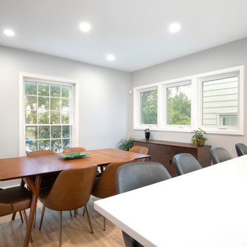
We are very excited about the conversion of this Vancouver Special in East Van’s Renfrew-Collingwood area, zoned RS-1, into a contemporary multigenerational home. It will incorporate two generations immediately, with separate suites for the home owners and their parents, and will be flexible enough to accommodate the next generation as well, when the owners have children of their own. During the design process we addressed the needs of each group and took special care that each suite was designed with lots of light, high ceilings, and large rooms.
 E_ Designs
The home owner of this two-story south Minneapolis house, built in 1937, decided it was time to make some changes. One of the main wishes of the homeowners was to transform their boxed in multiple room layout into an open floor plan that would accommodate the needs of their growing family. To do this, structurally a lot of changes had to be made. The wall between the kitchen and dining room was torn out and an island took its place, creating a touch down zone to help define the space. The original tiny front entry was eliminated so that you immediately walked into open floor plan. The ½ bath became completely gutted and then relocated as a ¾ bath to where the original breakfast nook was, thus allowing for more kitchen cabinet space and then opening up the space of the heavily used back entry.
The aesthetic goal of the project was to create a minimal, clean look. White Oak hardwood to match existing oak floors were installed throughout the kitchen, back entry, and dining room. In the Kitchen, the countertop selected was a White Silestone’s Quartz and the upper cabinets continued the color white for a flawless look. To balance and warm up the space, a cherry was selected for the base cabinets and then incorporated in the floating shelves to tie the design together.
The upgraded ¾ bathroom’s aesthetics were similar to the kitchen to keep the cohesiveness of the project. Floors were done in Adura Flex tile. The shower was completed with large tile formatted in a horizontal straight set to give it a simple lines. The shower incorporates a Kohler Choreograph Shower barre.
Overall, the homeowners were able to achieve their minimal open floor plan and in turn, they plan to work with Castle again for their future project of tackling their upstairs.
 Amy Pearson Design
While the root of the scope stayed the same - open the kitchen to the dining and living rooms - this project grew into so much more than just reconfiguring spaces. The design team loved the creativity that comes from working with a trusting client and our opportunity to flex our design muscles in the mid century category. The goal was to not be literal with the design style, but to be respectful of the home’s original architecture and features while making it decidedly Pacific Northwest by letting it’s setting in the trees really shine!
We doubled the size of the kitchen, taking over an unused second eat-in space that sat immediately next to the homes dining room. We opened the walls between the dining/kitchen/and hallway creating an expansive open feel. Step in pantry closet that was lacking in efficiency and took up precious walk-way space was removed in favor of a custom pantry cabinet with roll-out shelves for easy use. The custom walnut stair railing is a welcomed greeting near the front door and ties all of the spaces together.

 Décor Aid
Million Dollar Listing’s celebrity broker Ryan Serhant reached out to Decor Aid to stage a luxurious Brooklyn condo development. The only caveat was that our interior designers had 48 hours to come up with the design, concept, and source all the furniture. Always up for a challenge, we partnered with Mitchell Gold & Bob Williams to create this contemporary gem.
Staying true to their contemporary vision, our interior decorators sourced all pieces through MGBW. Starting in the living room, we placed the Gunner Sofa, a piece that offers clean-lined living. The thin arms and slanted profile emphasize the modern elegance of the home. Through the use of various contemporary patterns and textures we were able to avoid the one-dimensional ambiance, and instead, the apartment’s living room feels detailed and thought out, without making anyone who enters overcrowded with home decor.
The Melrose cocktail table was sourced for its sleek, stainless steel and glass design that contrasts with more substantial pieces in the space, while also complementing the contemporary style. The glass design gives the illusion that this table takes up less space, giving the living room design a light and airy feel all around. The living space transformed into something out of a decor catalog with just the right amount of personality, creating a room that follows through with our starting design, yet functional for everyday use.
After the living room area, we set our eyes on designing the master bedroom. Our interior decorators were immediately drawn to the Celina Floating Rail Bed, it’s opulent nailhead trim, and dramatic design brings fresh sophistication to the bedroom design, while also standing out as a timeless piece that can complement various trends or styles that might be added later on to the bedroom decoration. We sourced the Roland Table Lamp to add texture, with its elaborate ribbed design, that compliments the air of masculinity the Carmen Leather Ottoman add while contrasting with the light, sleeker pieces. This difference in weight left us with a bedroom decoration that lives up to the trending modern standards, yet a space that is timeless and stylish no matter the decor trends.
Once we finished and the project was completed, our senior designers took a step back and took in all of their hard labor. Decor Aid was able to make this newly built blank space and design it into a modern wonder small brooklyn apartment. The MGBW furnishings were all hand-picked to keep an even balance of complementing and contrasting contemporary pieces, which was one of our more critical apartment decorating ideas. The apartment home decor brings to life this modern concept in a way that isn’t overbearing and shows off their style making the space in every sense an accurate reflection of a chic contemporary style.
Sponsored
Fredericksburg, OH

High Point Cabinets
Columbus' Experienced Custom Cabinet Builder | 4x Best of Houzz Winner
 Amy Pearson Design
While the root of the scope stayed the same - open the kitchen to the dining and living rooms - this project grew into so much more than just reconfiguring spaces. The design team loved the creativity that comes from working with a trusting client and our opportunity to flex our design muscles in the mid century category. The goal was to not be literal with the design style, but to be respectful of the home’s original architecture and features while making it decidedly Pacific Northwest by letting it’s setting in the trees really shine!
We doubled the size of the kitchen, taking over an unused second eat-in space that sat immediately next to the homes dining room. We opened the walls between the dining/kitchen/and hallway creating an expansive open feel. Step in pantry closet that was lacking in efficiency and took up precious walk-way space was removed in favor of a custom pantry cabinet with roll-out shelves for easy use. The custom walnut stair railing is a welcomed greeting near the front door and ties all of the spaces together.
 Amy Pearson Design
While the root of the scope stayed the same - open the kitchen to the dining and living rooms - this project grew into so much more than just reconfiguring spaces. The design team loved the creativity that comes from working with a trusting client and our opportunity to flex our design muscles in the mid century category. The goal was to not be literal with the design style, but to be respectful of the home’s original architecture and features while making it decidedly Pacific Northwest by letting it’s setting in the trees really shine!
We doubled the size of the kitchen, taking over an unused second eat-in space that sat immediately next to the homes dining room. We opened the walls between the dining/kitchen/and hallway creating an expansive open feel. Step in pantry closet that was lacking in efficiency and took up precious walk-way space was removed in favor of a custom pantry cabinet with roll-out shelves for easy use. The custom walnut stair railing is a welcomed greeting near the front door and ties all of the spaces together.
 Schloegel Design Remodel
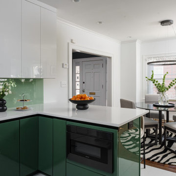
From the kitchen, the sleek, contemporary design becomes immediately apparent through the use of high-gloss custom cabinetry and crisp white quartz countertops. The reflective cabinet finish adds depth and light to the space, while the clean slab fronts maintain the minimalist aesthetic that defines the kitchen’s modern style. Paired with the bright quartz surfaces, the cabinetry creates a polished and streamlined workspace that feels both sophisticated and highly functional.
A rich green glass backsplash and matching lower cabinetry introduce a bold yet refined contrast, grounding the otherwise light palette and adding visual interest. Integrated appliances and minimal hardware keep the lines uninterrupted, allowing the materials and craftsmanship to take center stage.
Beyond the island, the kitchen flows effortlessly into the dining area, where natural light and modern furnishings continue the home’s contemporary feel. This open connection between spaces enhances both everyday living and entertaining, making the kitchen not only a place to cook, but a central gathering point within the home.
108