
Search results for "Implies" in Home Design Ideas
 Axis Mundi Design
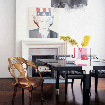
"Revival” implies a retread of an old idea—not our interests at Axis Mundi. So when renovating an 1840s Greek Revival brownstone, subversion was on our minds. The landmarked exterior remains unchanged, as does the residence’s unalterable 19-foot width. Inside, however, a pristine white space forms a backdrop for art by Warhol, Basquiat and Haring, as well as intriguing furnishings drawn from the continuum of modern design—pieces by Dalí and Gaudí, Patrick Naggar and Poltrona Frau, Armani and Versace. The architectural envelope references iconic 20th-century figures and genres: Jean Prouvé-like shutters in the kitchen, an industrial-chic bronze staircase and a ground-floor screen employing cast glass salvaged from Gio Ponti’s 1950s design for Alitalia’s Fifth Avenue showroom (paired with mercury mirror and set within a bronze grid). Unable to resist a bit of our usual wit, Greek allusions appear in a dining room fireplace that reimagines classicism in a contemporary fashion and lampshades that slyly recall the drapery of Greek sculpture.
Size: 2,550 sq. ft.
Design Team: John Beckmann and Richard Rosenbloom
Photography: Adriana Bufi, Andrew Garn, and Annie Schlecter
© Axis Mundi Design LLC
 Axis Mundi | SF
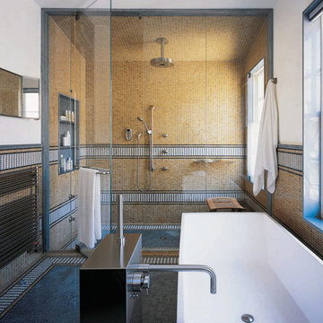
"Revival” implies a retread of an old idea—not our interests at Axis Mundi. So when renovating an 1840s Greek Revival brownstone, subversion was on our minds. The landmarked exterior remains unchanged, as does the residence’s unalterable 19-foot width. Inside, however, a pristine white space forms a backdrop for art by Warhol, Basquiat and Haring, as well as intriguing furnishings drawn from the continuum of modern design—pieces by Dalí and Gaudí, Patrick Naggar and Poltrona Frau, Armani and Versace. The architectural envelope references iconic 20th-century figures and genres: Jean Prouvé-like shutters in the kitchen, an industrial-chic bronze staircase and a ground-floor screen employing cast glass salvaged from Gio Ponti’s 1950s design for Alitalia’s Fifth Avenue showroom (paired with mercury mirror and set within a bronze grid). Unable to resist a bit of our usual wit, Greek allusions appear in a dining room fireplace that reimagines classicism in a contemporary fashion and lampshades that slyly recall the drapery of Greek sculpture.
Size: 2,550 sq. ft.
Design Team: John Beckmann and Richard Rosenbloom
Photography: Adriana Bufi, Andrew Garn, and Annie Schlecter
Contractor: Stern Projects
© Axis Mundi Design LLC.
 Axis Mundi Design
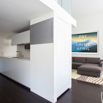
When the Gimbels department store chain closed in 1986, many of its selling floors were converted into luxury apartments, including those of this branch at 86th Street and Lexington Avenue. The retailer’s soaring ceilings allowed Axis Mundi to create bedroom mezzanine spaces overlooking the living and dining rooms. Defining them with translucent glass welcomed natural light while retaining privacy. Downstairs, spaces bleed one into another, their basic monochromatic black-and-white palette acting as a unifying leitmotif. Yet each space feels distinct, with its own programmatic purpose, a feat largely achieved by varying floor and wall treatments—a graphic tile pattern in the entry, a red wall in the hall leading to the master suite, a colorful area rug in the living room. In the retailer’s heyday, the then-common saying, “Would Macy’s tell Gimbels?” implied the strategies the competitors kept from each other to gain the upper hand. Here, a structure iconic in its day also conceals something: a handsome, wholly contemporary repurposing that represents just the sort of innovation that made Gimbels the celebrated name that it was.
Project Team: John Beckmann, Nick Messerlian and Richard Rosenbloom
Kitchen by Minimal USA
Photography: Federica Carlet
© Axis Mundi Design LLC
Find the right local pro for your project
 Wine Cellar Specialists
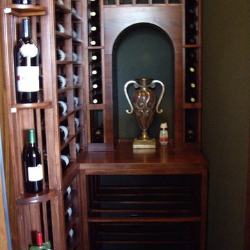
The quarter round displays, solid arch and lovely wine racks make this custom wine cellar Texas a definite success. The arch is the focal point of the wine cellar. We added a tabletop to provide the owner a place for decanting and serving his favorite wines. Below the tabletop is a 3-level case storage.
Above the tabletop are standard bottle openings.
Take a video tour of this project: http://www.youtube.com/watch?v=CorlG_1Ex3Q&feature=youtu.be
Wine Cellar Specialists
+1 (773) 234-0112
info@winecellarspec.com
Follow us on Twitter: https://twitter.com/winecellarspec
 Sia Moore Architecture Interior Design
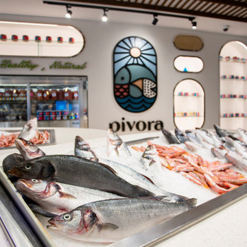
Sia Moore's design objective for Pivora, was to create a Mediterranean, luxurious and a boho-chic modern restaurant design. The restaurant is a two-storey space, composed of ground floor with the main hall and a mezzanine with dishwashing unit, electrical room and staff room. For the ground floor, the space was divided into two zones - the main dining room and the bar with three elliptical seafood showcase, refrigerators, wine racks and wall-mounted divided into two parts with the main hall on the ground floor and the banquet hall on the first floor. The restaurant space was originally built as one-storey area. However, during the design stage, building a mezzanine was proposed to client to provide a dining area with high ceiling and spacious feeling. Electrical and mechanical rooms, staff room and dishwashing unit was then located to the mezzanine floor, which was covered by glass film with an attempt to conceal the space from the gazes of guest dining area.
Capturing the Mediterranean Spirit
The restaurant is filled with rough unprocessed surfaces - complex brickwork, terrazzo flooring, exposed ceiling design. Many of the decoration details implies the seafood and organic life. Connotations that are vastly related to marine theme appear in the paintings or large elliptical seafood showcase and in the large kitchen window where the fresh food is cooked in front of the dining tables, and in the emerald green bar tiles, that is inspired by the colors of the fascinating underwater habitat.
Reflecting the vibrant and energetic spirit of the Mediterranean culture, Pivora presents a warm seafood restaurant experience. From its custom design wooden furniture and bar decorations to the brickworks on the wall of main dining room and its boho-chic lighting solutions completed by indoor plants hanging over the ceiling are aiming to set the mood for a comfortable dining experience; an experience in which the joy rises with sharing. Not to forget, Pivora offers a wide selection of local shrimps, sea bass and a large assortment of white wines from all around the world.
 Sia Moore Architecture Interior Design
Sia Moore's design objective for Pivora, was to create a Mediterranean, luxurious and a boho-chic modern restaurant design. The restaurant is a two-storey space, composed of ground floor with the main hall and a mezzanine with dishwashing unit, electrical room and staff room. For the ground floor, the space was divided into two zones - the main dining room and the bar with three elliptical seafood showcase, refrigerators, wine racks and wall-mounted divided into two parts with the main hall on the ground floor and the banquet hall on the first floor. The restaurant space was originally built as one-storey area. However, during the design stage, building a mezzanine was proposed to client to provide a dining area with high ceiling and spacious feeling. Electrical and mechanical rooms, staff room and dishwashing unit was then located to the mezzanine floor, which was covered by glass film with an attempt to conceal the space from the gazes of guest dining area.
Capturing the Mediterranean Spirit
The restaurant is filled with rough unprocessed surfaces - complex brickwork, terrazzo flooring, exposed ceiling design. Many of the decoration details implies the seafood and organic life. Connotations that are vastly related to marine theme appear in the paintings or large elliptical seafood showcase and in the large kitchen window where the fresh food is cooked in front of the dining tables, and in the emerald green bar tiles, that is inspired by the colors of the fascinating underwater habitat.
Reflecting the vibrant and energetic spirit of the Mediterranean culture, Pivora presents a warm seafood restaurant experience. From its custom design wooden furniture and bar decorations to the brickworks on the wall of main dining room and its boho-chic lighting solutions completed by indoor plants hanging over the ceiling are aiming to set the mood for a comfortable dining experience; an experience in which the joy rises with sharing. Not to forget, Pivora offers a wide selection of local shrimps, sea bass and a large assortment of white wines from all around the world.
 Jack Calderone
This bedroom and full bathroom are part of an adventuresome project my wife and I embarked upon to create a complete apartment in the basement of our townhouse. We designed a floor plan that creatively and efficiently used all of the 385-square-foot-space, without sacrificing beauty, comfort or function – and all without breaking the bank! To maximize our budget, we did the work ourselves and added everything from thrift store finds to DIY wall art to bring it all together.
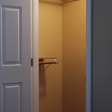
A partial double closet bar adds a little extra space while still leaving room for longer hanging clothes.
 Michael Nash Design, Build & Homes
2013 NKBA MEDIUM BATH
When this young couple purchased their nearly 25-year-old colonial, the master bathroom was the first thing they wanted to change. Drab looking with worn out cabinets and a shower that was too small, it didn’t fit their modern vision for the space.
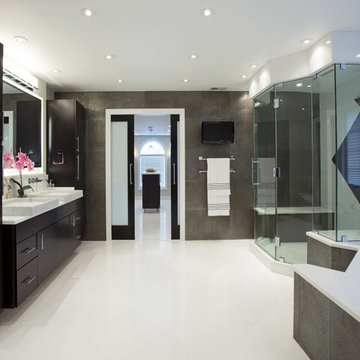
Working with Michael Nash Design, Build & Homes, they came up with a plan to enlarge the bathroom, stealing space from the master bedroom. The new design includes a much larger shower, the addition of a walk-in shower and more. And the results are nothing less than stunning.
A new, frameless glass shower stall is equipped with a steam unit, body sprays, rain shower head, and thermostatic valve and control. A double-sided fireplace overlooks a large whirlpool tub (also visible from the master bedroom).
Modern wall hanger espresso finish vanities are topped with a marble top and his and her tumbled marble vessel sinks. Two tall linen cabinets bookend the vanity for additional storage. A recessed mirror with back lighting effect was also installed.
Large 20” × 20” white marble floor and walls with dark metallic tile were placed on featured walls for added effects. The floors in both the bathroom and closet are heated.
An enlarged doorway from bathroom to walk-in closet offers double French glass doors which are pocketed for better traffic flow. Built-in closet systems are his and hers with matching cherry espresso finish cabinetry covered by obscure glass doors and a touch pad lighting system. The middle island features shoe racks and tie and socks storage.
Clean, streamlined and functional, the homeowners love this award-winning space.
 Progressive Design Build
Transforming a Master Bathroom
When our clients purchased their beautiful home in South Fort Myers, FL they fell in love with the expansive, sweeping space. It wasn’t long, however, before they realized the master bathroom just didn’t suit their taste. The large walk-in shower was practically cave-like. Consequentially, it completely dwarfed the bathroom. Along with bland colors, outdated finishes, and a dividing wall in the middle of the room, the whole space felt smaller than its ample dimensions implied. There was no question about it – the bathroom needed an update.
Making Room for More
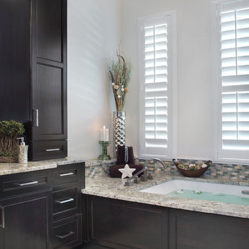
First, we demolished the existing finishes and cut the concrete slab for new underground plumbing. We minimized the imposing shower and moved it to the other side of the room. Moving the shower also allowed for the installation of our Dura Supreme Alectra style cabinetry in cocoa brown. For increased functionality, we created split his-and-hers vanities. Then we added towers to match the cabinets. With interior outlets, the towers added smart storage for bathroom appliances, helping to keep the counters clutter-free. For a finishing touch, we outlined the large mirrors with crown molding trim in a complimentary finish – an essential detail to tie all the cabinetry together.
The Spa
To bring the feel of the spa to this gorgeous home, we installed our luxurious drop-in 72”x42” Kohler Air Massage bathtub. We completely surrounded it with 3cm granite countertops in Delicatus green and added a tub deck with tile backsplashes for a sumptuous ambiance.
Lighting
On either side of the his-and-hers vanity, we installed George Kovach tube sconces. Vertical placement of the sconces provided ample lighting while enhancing the contemporary style of the space. To frame the room, we added a drop ceiling with recessed lighting and outlined the tray ceiling with crown molding to match the rest of the design. To complete the bath remodel, we installed the final element – a stunningly unique 10-light polished chrome chandelier from Maxim lighting.
A Complete Transformation
When we met with our clients, it was instantly clear to us why they were unhappy with their master bathroom. The cave-like shower and cumbersome dividing wall overpowered a room in dire need of a modernizing. Furthermore, with two small children and a busy lifestyle, we could sense our clients not only desired a bathroom renovation, they needed a relaxing retreat.
Ultimately, this project was nothing less than a complete transformation of space. In fact, by the time we had finished, the only original fixtures left were the windows! With beautifully updated finishes and an improved layout, we were able to achieve the functionality our clients craved along with a new, spa-like feel. The end result was nothing short of a haven at home – the perfect spot to recharge at the end of a long day.
 Hyrum McKay Bates Design, Inc.
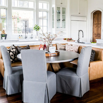
This Modern Kitchen takes cues from its traditional roots with a Burled Walnut stained island and its classic 'Scullery' Kitchen White, face-frame cabinets. The leather upholstered banquette maximizes the space for an intimate breakfast sitting & table area. The 'L' shaped island, countertops & kitchen work space gives ample room for preparing and serving meals in this hard-working kitchen for an active family of 5. Tonya Olsen Interiors; Lindsay Salazar Photography
 Estero Builders, Inc.
Sandprints Photography
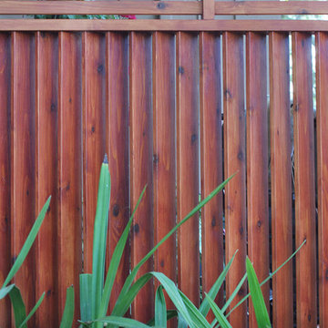
Inspiration for a mid-sized contemporary backyard deck remodel in San Luis Obispo with a fire pit and no cover
Inspiration for a mid-sized contemporary backyard deck remodel in San Luis Obispo with a fire pit and no cover
 ODS Architecture
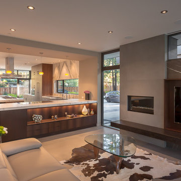
Atherton has many large substantial homes - our clients purchased an existing home on a one acre flag-shaped lot and asked us to design a new dream home for them. The result is a new 7,000 square foot four-building complex consisting of the main house, six-car garage with two car lifts, pool house with a full one bedroom residence inside, and a separate home office /work out gym studio building. A fifty-foot swimming pool was also created with fully landscaped yards.
Given the rectangular shape of the lot, it was decided to angle the house to incoming visitors slightly so as to more dramatically present itself. The house became a classic u-shaped home but Feng Shui design principals were employed directing the placement of the pool house to better contain the energy flow on the site. The main house entry door is then aligned with a special Japanese red maple at the end of a long visual axis at the rear of the site. These angles and alignments set up everything else about the house design and layout, and views from various rooms allow you to see into virtually every space tracking movements of others in the home.
The residence is simply divided into two wings of public use, kitchen and family room, and the other wing of bedrooms, connected by the living and dining great room. Function drove the exterior form of windows and solid walls with a line of clerestory windows which bring light into the middle of the large home. Extensive sun shadow studies with 3D tree modeling led to the unorthodox placement of the pool to the north of the home, but tree shadow tracking showed this to be the sunniest area during the entire year.
Sustainable measures included a full 7.1kW solar photovoltaic array technically making the house off the grid, and arranged so that no panels are visible from the property. A large 16,000 gallon rainwater catchment system consisting of tanks buried below grade was installed. The home is California GreenPoint rated and also features sealed roof soffits and a sealed crawlspace without the usual venting. A whole house computer automation system with server room was installed as well. Heating and cooling utilize hot water radiant heated concrete and wood floors supplemented by heat pump generated heating and cooling.
A compound of buildings created to form balanced relationships between each other, this home is about circulation, light and a balance of form and function.
Photo by John Sutton Photography.
 Studio Upwall Architects
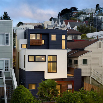
This project was a retrofit and expansion of an existing house in San Francisco's Noe Valley Neighborhood. The original house, built in 1910, had been insensitively remodeled in the 1950’s to mimic the Spanish Mediterranean style. Located on a typical narrow San Francisco lot, the interior of the existing house consisted of a series of disconnected rooms, lacking daylight and lacked daylight and open “flow”. The homeowners had lived in the house for nearly 20 years, becoming familiar with its shortcomings, and wanted to overhaul the majority of the building. The new design includes an enlarged 2 car garage and garden master bedroom suite on the ground level, and a 400 square foot addition with two bedrooms and a full bath at the third floor. While enlarging the home the new design strategically incorporates several small courtyard spaces which are carved into the footprint to bring daylight and views to all areas of the house. These spaces create much needed relief to the interior of the long narrow footprint so that every space has a connection, actual or visual, to the outside. The narrow driveway at the front of the house was widened and repurposed to incorporate a covered front walkway to the elevated porch. The original entrance was trapped along the side of the house opening to a long narrow hallway. The new entrance has been relocated allowing one to enter at the center of the house rather than the corner. The new entrance opens to an implied vestibule that is contiguous with the dining and living areas. The glazing at the entry brings daylight to the interior and allows occupants visual access to the porch, sidewalk and street beyond, adding a degree of security. The mid garden court defines the boundary between the formal living areas to toward the front and the kitchen at the heart of the house. Hallways are eliminated in the new open plan replaced by a central circulation zone that terminates at the through the windows in the raised Media room at the rear. The high wall of the stair tower forms the south facing edge of the garden court, and faced in light colored stucco, reflects light into the formal living areas. The stairway walls are perforated by large translucent vertical widows bringing diffuse illumination as a backdrop to the adjacent kitchen. The stairway wraps lightly through the space around a pedestal altar-like drybar. This creates a bridge from the kitchen into the core of the circulation space which bridges spatially to the new living levels above and below. The slightly raised floor of the Media Room with its built-in window seat, and access to a private deck provide a greater sense of intimacy and create a comfortable transition zone facing the rear yard. Windows at the rear wall are strategically placed to provide “snapshot” views and to screen out the less desirable views of the neighboring buildings to the sides and rear.
photography by: Cesar Rubio
 In Your Space Interior Design
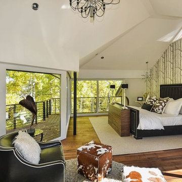
A Beautiful Master Bathroom with extended exterior surrounding deck with a breath taking view and custom pop up TV console.
Designed by Runa Novak of In Your Space Interior Design: Chicago, Aspen, and Denver.


 Neumann & Rudy Architecture
**I. Spatial Composition & Architectural Volume**
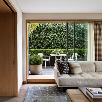
This interior operates on a strategy of framed extension, in which the room's perceived volume is borrowed from the garden beyond rather than asserted through internal grandeur. The composition is governed by a rigorous orthogonal discipline: a full-height sliding glazing system, set within a deep oak-lined reveal, functions as both aperture and proscenium, its slender mullions dividing the exterior into a triptych of vegetal planes. The generous depth of that reveal — expressed as a substantial threshold plinth and continuous jamb casing — reads less as trim than as tectonic gesture, giving weight and thickness to the enclosure and reinforcing the sense of a pavilion pressed against a green wall. To the left, a floor-to-ceiling pocketing door of book-matched, quarter-sawn oak establishes a monolithic vertical counterpoint, its recessed flush pull the only interruption of an otherwise uninflected plane; the shallow return of the wall beyond it creates a compressed entry sequence that releases into the primary volume. The flat, shadowless plaster ceiling maintains a neutral lid over the composition, while the furniture plan is deliberately low-slung and horizontal — a deep sectional set parallel to the glazing, a leather-topped ottoman, and a low occasional table — so that no element rises to compete with the sightline. Circulation is implied along the wall's edge, funnelling toward the terrace and its al fresco dining vignette, which acts as the room's terminal focal point and extends the interior axis outward.
**II. Materiality, Color & Texture**
The palette is a study in low-contrast tonal layering, calibrated within a narrow band of warm neutrals and animated almost entirely by the saturated chlorophyll green of the ivy screen. Rift-cut white oak, finished in a matte oil that reveals rather than glosses its medullary figure, provides the room's structural warmth — appearing in the joinery, the window surround, and the herringbone parquet, whose fine chevron rhythm introduces a subtle graphic pattern at foot level. Walls are treated in what appears to be a woven grasscloth or linen-effect wallcovering in a pale oatmeal tone, its faint horizontal striation catching raking light and lending textile softness to the perimeter. Against this, the seating is upholstered in a tightly woven, undyed linen-cotton blend with a biscuit-tufted seat platform, its slubbed irregularity a deliberate foil to the precision of the millwork. The cushion program provides the composition's only chromatic incident: an indigo-ground ikat or *kasuri* resist-dyed weave, with its blurred weft-broken banding, paired with a heavier blanket-stitched wool in glaucous blue-grey and buff stripes. Underfoot, a hand-knotted silk-and-wool rug in slate and mineral grey carries an attenuated ogee lattice, its lustrous pile providing cool relief beneath the warmer wood tones. The plinth-mounted travertine or reconstituted-stone planter — matte, porous, faintly chalky — and the honed grey stone paving beyond introduce lithic gravity, balancing the prevailing softness with a mineral edge.
**III. Lighting, Atmosphere & Style Profile**
Illumination here is almost entirely diurnal and indirect: north-oriented or hedge-filtered daylight arrives diffuse and green-cast, washing the space in a soft, even luminance that suppresses hard shadow and privileges texture over drama. The ivory sheer, hung on a discreet recessed track, tempers glare while retaining silhouette legibility, and the adjacent pinch-pleated overdrape in a taupe-bronze silk-blend — with its subtle vertical striation and slight sheen — offers the option of full blackout while contributing a note of drapery-weight formality. Artificial sources are conspicuously concealed; no decorative fixture interrupts the ceiling plane, implying a scheme of recessed low-glare downlights or perimeter cove washing designed to sustain the daytime ambience after dusk. The resulting atmosphere is one of composed reticence — quiet, tactile, and deeply oriented toward the garden. Stylistically, the project synthesises Japandi restraint (the pocketing timber plane, the shadow-gap detailing, the reverence for the framed view) with the material sensuality and drapery conventions of European Soft Modernism, yielding a warm minimalism in which luxury is communicated through joinery tolerance, textile hand, and the disciplined editing of the palette rather than through ornament or statement furniture. It is an interior conceived as a calm neutral ground — an armature for light, landscape, and the slow accretion of daily life.




 Cachet Wine Cellars
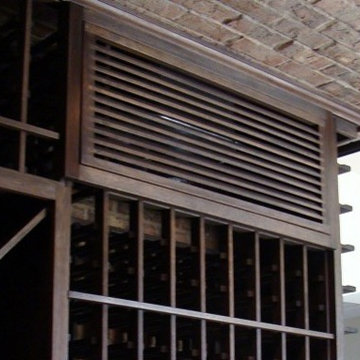
This operable louvered grill conceals the wine cellar cooling CA unit, so as to maintain wine cellar aesthetics.
We used a split wine cellar refrigeration system from Arctic Metalworks Inc. The condenser, which is the noisier component, was placed outside the wine cellar.
Follow us on Twitter: https://twitter.com/#!/WineCellarsByC
Wine Cellars by Coastal
8 Waltham Rd., Ladera Ranch, CA 92694
(949) 200-8134
contactus@coastalcustomwinecellars.com
Request a wine cellar design for FREE: https://www.winecellarsbycoastal.com/free-3d-drawing.aspx
 Tile Doctor Ltd
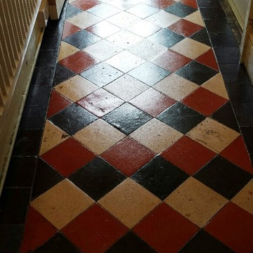
The pictures below were taken at a house in the town of Merthyr Tydfil, which is located not too far north of Cardiff. My client was keen to keep her very old Quarry tiled floor – which dated back to 1905 – intact. The floor had understandably seen a large amount of traffic in its lifetime, and was now in dire need of a professional restoration, including a thorough clean and seal.
First, I completed a survey of the area and provided my client with a quote. After completing many similar jobs in the past, I generally have a good idea of what the final result will look like. I passed on some images of a final result to my client, who was happy for me to begin my work.
On the first day, my first task was to take run some damp tests which were fine; it’s always good to know up front if there are likely to be any damp issues. Next I covered the floor with water to take the surface suction out and waited fifteen minutes before applying a cocktail of Tile Doctor NanoTech Heavy Build-Up cleaner mixed with Pro-Clean and Grout clean-up covering the whole floor. I then immediately starting to work the solution into the floor with a rotary machine fitted with a coarse black pad. The solution was then rinsed off with water which was then extracted with a wet vacuum as I worked. For stubborn areas I applied more of the previously mixed solution scrubbed into the floor with coarse wire wool by hand followed by further rinsing with water.
Each of the products used serves a particular purpose. Pro-Clean is a strong high-alkaline cleaner for natural stone, while NanoTech HBU is a particularly powerful cleaner that uses nano-sized particles to penetrate deep into the stone to get underneath and lift out ingrained dirt and stains. Grout Clean-Up, as the name implies, is a product for resolving grout related problems such as removing grout smears from tile surfaces aka grout haze.
After completing the clean I left the house for 48 hours, to leave enough time for the floor to dry completely in preparation for sealing. Upon my arrival back at the house I conducted some more damp tests to check that the floor was dry enough to seal using the previous readings as a benchmark. The results indicated that I was fine to proceed with the seal, so I applied a total of eight coats of Tile Doctor Seal & Go for durable protection. This was the product I recommended to my client as she wanted a nice, soft shine for her surface seal.
As you can see from the photos, the desired result was achieved to a high standard and needless to say my client was delighted with the transformation.
Julian Iancono
South East Wales
25