
Search results for "Improve flow" in Home Design Ideas

 Blackline Renovations
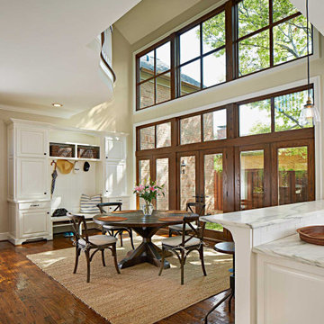
The new open layout gave us the space we needed to improve the flow in the kitchen. It also allowed us to install a custom mudroom cabinet near the garage, which was designed with much needed storage for the growing family.
 C. Goodman Carpentry
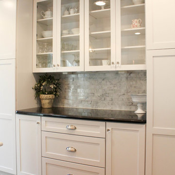
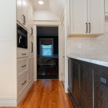
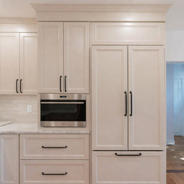
For this project, we turned a dining room into the kitchen. This dramatically improved the layout of the house and enabled us to open up the kitchen to the rest of the house creating good flow. We refinished the original hardwood floors and blended new with the old where necessary for a seamless look. The beautiful white cabinets, glass panels, and carrara marble back-splash and island counter-top help balance the black granite counters and black center island. The layout helps this medium-sized kitchen space feel large and incredibly functional.
Find the right local pro for your project
 Integrity Home Solutions
The Ideal Home Improvement
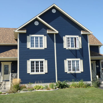
Whether you're looking for an upgrade for your siding, soffits or fascia, Integrity Home Solutions has got you covered. We work with care and efficiency so that you can get the most out of your home improvement investment. Our insulated siding combines the look of real wood with the energy efficiency of insulation that reduces the flow of hot and cold air through the walls. When you upgrade, you can count on:
Lower Energy Costs
Greater Thermal Efficiency
A Paint-free, Stain-free and Virtually Maintenance-Free Solution
Protection for Your Home from the Elements
External Noise Reduction
 LBK Design Build
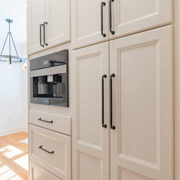
This kitchen was reimagined to improve flow, increase usable storage, and create a cleaner, more cohesive layout while maintaining the existing footprint. The original space felt segmented with a closed-off pantry, heavy stone elements, and inconsistent cabinetry that limited function. The new design removes visual and physical barriers, introduces a more efficient working layout, and incorporates a warm, neutral palette with layered textures. A mix of painted cabinetry, natural wood tones, and copper accents creates contrast while still feeling cohesive. The addition of a peninsula adds prep space and casual seating, while improved lighting and a taller window bring more light into the space.
 LBK Design Build
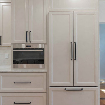
This kitchen was reimagined to improve flow, increase usable storage, and create a cleaner, more cohesive layout while maintaining the existing footprint. The original space felt segmented with a closed-off pantry, heavy stone elements, and inconsistent cabinetry that limited function. The new design removes visual and physical barriers, introduces a more efficient working layout, and incorporates a warm, neutral palette with layered textures. A mix of painted cabinetry, natural wood tones, and copper accents creates contrast while still feeling cohesive. The addition of a peninsula adds prep space and casual seating, while improved lighting and a taller window bring more light into the space.
 LBK Design Build
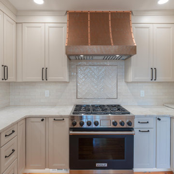
This kitchen was reimagined to improve flow, increase usable storage, and create a cleaner, more cohesive layout while maintaining the existing footprint. The original space felt segmented with a closed-off pantry, heavy stone elements, and inconsistent cabinetry that limited function. The new design removes visual and physical barriers, introduces a more efficient working layout, and incorporates a warm, neutral palette with layered textures. A mix of painted cabinetry, natural wood tones, and copper accents creates contrast while still feeling cohesive. The addition of a peninsula adds prep space and casual seating, while improved lighting and a taller window bring more light into the space.

 LBK Design Build
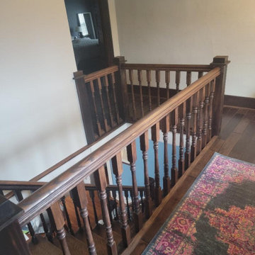
This kitchen was reimagined to improve flow, increase usable storage, and create a cleaner, more cohesive layout while maintaining the existing footprint. The original space felt segmented with a closed-off pantry, heavy stone elements, and inconsistent cabinetry that limited function. The new design removes visual and physical barriers, introduces a more efficient working layout, and incorporates a warm, neutral palette with layered textures. A mix of painted cabinetry, natural wood tones, and copper accents creates contrast while still feeling cohesive. The addition of a peninsula adds prep space and casual seating, while improved lighting and a taller window bring more light into the space.
 LBK Design Build
This kitchen was reimagined to improve flow, increase usable storage, and create a cleaner, more cohesive layout while maintaining the existing footprint. The original space felt segmented with a closed-off pantry, heavy stone elements, and inconsistent cabinetry that limited function. The new design removes visual and physical barriers, introduces a more efficient working layout, and incorporates a warm, neutral palette with layered textures. A mix of painted cabinetry, natural wood tones, and copper accents creates contrast while still feeling cohesive. The addition of a peninsula adds prep space and casual seating, while improved lighting and a taller window bring more light into the space.
 Irene Kun Interiors
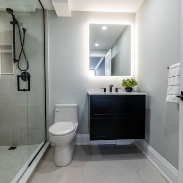
The foot print of this Condo ensuite could be lengthened to improve circulation space & improve access / room within the walk-in shower by removing an old built-in toiletry cupboard and changing the adjoining primary bedroom closet space. Condo plumbing, venting & structural walls could not allow for any changes to the width of the ensuite.
 Randy Angell Designs
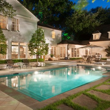
The subtle changes begin as soon as you walk out the back door of the house. The existing decking had a lot of what we call "tweeners"; areas that are overly generous walkways, yet not large enough to house furniture. The awkwardly small bluestone patio was expanded to accommodate a generous seating area. This was done by pushing the step-down closer to the pool.
Our talented stone mason carefully married the new bluestone into the existing portion of the patio, resulting in an imperceptible difference between the two.
As you descend the new bluestone steps to the pool level, your bare feet will be thankful for the new smooth-finished, limestone-colored concrete, with a hand cut pattern carefully etched into it's surface.
The old red brick decking was so hot that the owners could not walk around the pool with their bare feet. The brick coping was also replaced with an eased edge, Pennsylvania Premier Stone which matches the new step treads throughout the project.
Between the house and the pool, a large raised planter was reconfigured, giving additional space to the pool deck for a shaded lounge chair area. Across the pool, a bank of rather tall painted brick retaining walls were cut down, shortened and moved. This lessened the visual impact of the walls (which were overwhelming in the space) and also opened up a new seating area, nestled under the arms of the massive Pecan tree at the back of the property.
Rather than continuing solid decking around the entire pool, the area near these walls has been transformed to large stone stepper pads set in a sea of beautiful St. Augustine lawn. This creates a visually softened area that is still suited to setting tables and chairs when the guest list calls for additional seating.
The spa area is possibly the most dramatic change on this project. Yet more raised planter walls divided this area into awkward spaces, unsuited for proper furniture placement. The planters were removed, new stone decks added, and once again expertly married into the existing decks, opening the area to house a large dining table and a newly built-in BBQ area.
The spa itself was re-imagined with the bluestone coping and painted brick veneer. The most impressive addition though is the new handmade glazed tiles that surround the existing cast stone water feature. This water feature was almost unnoticeable against the painted brick wall, but now the dramatic arch and pop of color draw the eye to this quaint little corner of the property.
Originally designed by one of the most notable landscape architects in town, this once impressive project had faltered in recent years. The pool and spa still functioned well, and the client wanted to keep it intact. In addition, they wanted to keep as much of the existing landscape as possible. But, the surrounding decks, walls and steps were fair game.
At first glance, one might think that our changes were simple material changes. However, upon closer inspection, one can see the subtle-yet-transformative changes that came together to update this classic pool in a tasteful, timeless manner, as well as to improve the flow and usability of the deck areas, while softening the feel of this massive hardscape.
 LBK Design Build
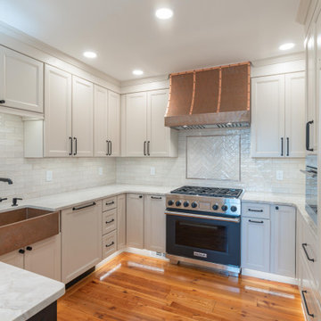
This kitchen was reimagined to improve flow, increase usable storage, and create a cleaner, more cohesive layout while maintaining the existing footprint. The original space felt segmented with a closed-off pantry, heavy stone elements, and inconsistent cabinetry that limited function. The new design removes visual and physical barriers, introduces a more efficient working layout, and incorporates a warm, neutral palette with layered textures. A mix of painted cabinetry, natural wood tones, and copper accents creates contrast while still feeling cohesive. The addition of a peninsula adds prep space and casual seating, while improved lighting and a taller window bring more light into the space.
 LBK Design Build
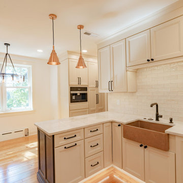
This kitchen was reimagined to improve flow, increase usable storage, and create a cleaner, more cohesive layout while maintaining the existing footprint. The original space felt segmented with a closed-off pantry, heavy stone elements, and inconsistent cabinetry that limited function. The new design removes visual and physical barriers, introduces a more efficient working layout, and incorporates a warm, neutral palette with layered textures. A mix of painted cabinetry, natural wood tones, and copper accents creates contrast while still feeling cohesive. The addition of a peninsula adds prep space and casual seating, while improved lighting and a taller window bring more light into the space.
Sponsored
Delaware County, OH

Whisler Home Improvement
Franklin County's Committed Home Improvement Professionals
 LBK Design Build
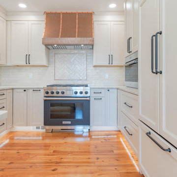
This kitchen was reimagined to improve flow, increase usable storage, and create a cleaner, more cohesive layout while maintaining the existing footprint. The original space felt segmented with a closed-off pantry, heavy stone elements, and inconsistent cabinetry that limited function. The new design removes visual and physical barriers, introduces a more efficient working layout, and incorporates a warm, neutral palette with layered textures. A mix of painted cabinetry, natural wood tones, and copper accents creates contrast while still feeling cohesive. The addition of a peninsula adds prep space and casual seating, while improved lighting and a taller window bring more light into the space.
 DMC Home Improvement
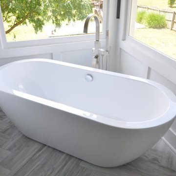
Free standing tub perfectly centered in the corner window. Finished the walls with wainscoting to mimic the cabinets to provide a consistent seamless flow around the bathroom.
 MH Baker, LLC
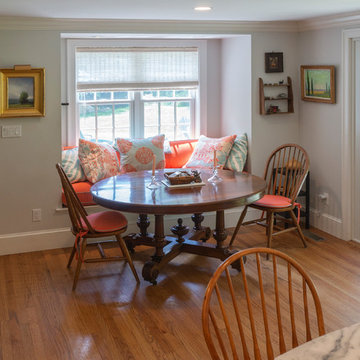
Windows & one of two 5' patio doors overlook the gardens. The large island & perimeter offer numerous prep & entertainment options. Features: plentiful storage in custom wall, base & pantry cabinets; Micro/Speed oven on pantry wall; window wall cabs in varying depths improve traffic flow & offer space for 2nd sink, books, dishes, etc.
 SV Design
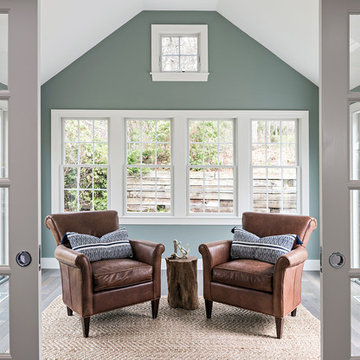
The layout of this colonial-style house lacked the open, coastal feel the homeowners wanted for their summer retreat. Siemasko + Verbridge worked with the homeowners to understand their goals and priorities: gourmet kitchen; open first floor with casual, connected lounging and entertaining spaces; an out-of-the-way area for laundry and a powder room; a home office; and overall, give the home a lighter and more “airy” feel. SV’s design team reprogrammed the first floor to successfully achieve these goals.
SV relocated the kitchen to what had been an underutilized family room and moved the dining room to the location of the existing kitchen. This shift allowed for better alignment with the existing living spaces and improved flow through the rooms. The existing powder room and laundry closet, which opened directly into the dining room, were moved and are now tucked in a lower traffic area that connects the garage entrance to the kitchen. A new entry closet and home office were incorporated into the front of the house to define a well-proportioned entry space with a view of the new kitchen.
By making use of the existing cathedral ceilings, adding windows in key locations, removing very few walls, and introducing a lighter color palette with contemporary materials, this summer cottage now exudes the light and airiness this home was meant to have.
© Dan Cutrona Photography

 Milwaukee/NARI Home Improvement Council, Inc.
AB&K Bath and Kitchen
Greenfield, WI
Kitchen $80,000-$120,000
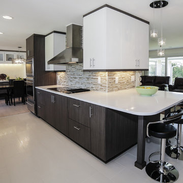
A family of seven needed an updated kitchen to accommodate multiple cooks, improve traffic flow, and add a large counter for food preparation. New stainless steel appliances were added and the refrigerator was relocated to allow easy access without interfering with the cooking area.
A large table style peninsula was created and a closet in the dining room was removed to allow room for a china hutch. An electrical subpanel was added to power the new appliances and additional recessed and overhead lighting.
 Gardner/Fox Associates, Inc
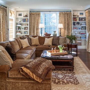
The owners of this 1950s colonial on Philadelphia’s Main Line wanted to preserve its traditional architecture and take advantage of the kitchen’s ample footprint. In addition to reworking the floorplan and improving the flow, the owner wanted a large island with several seating options, a desk area and a small table for dining.
One of the design goals was to transform the spacious room into a functional kitchen that still felt intimate and comfortable for everyday use. Furniture style inset cabinetry kept the room in tune with the home’s original character and made it feel less utilitarian. Removing the wall that hindered the flow and views between the kitchen and the adjacent family room ensured that the main entertaining areas flowed together. Stylistically, we wanted to avoid the typical white kitchen, opting instead to pull in rich wood tones to create a warmer and more classic look.
 Kon-strux Developments
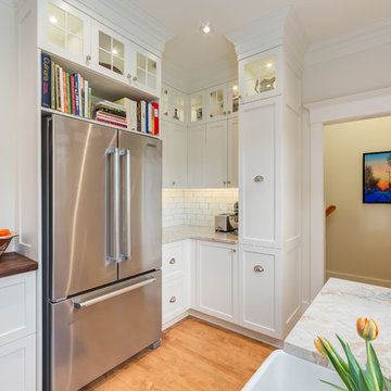
This little nook beside the fridge makes great use of the available space. Under- and in-cabinet lighting creates depth and visual interest - always illuminate kitchen corners to improve the flow of the space. This countertop houses lesser-used but handsome appliances.
38